7,763 search results
(0.033 seconds)
- IA Airship Captain by Invisible Art Studio,
$14.99 IA Airship Captain is a good readable comic book dialogue font made with a marker with wavy lines, giving it uniqueness and recognition. The family includes Regular, Italic, Bold, and Bold Italic. And contains a large number of kerning pairs. Added extended Latin, extended Cyrillic and contextual autoreplacing crossbar "I" in words like I, I'm, etc.
 - Mountty by Meutuwah,
$20.00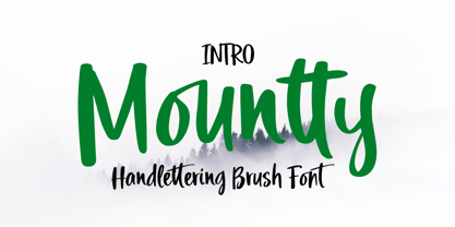 INTRODUCING Mountty is handwritten font with a modern Brush feel. Mountty is perfect for modern projects, headings, blogs, logos, brandings, web design, card, coffee shop, t-shirt, invitations and more! Programs that support in this font is a Microsoft Office Adobe Photo Shop, Adobe Illustrator, Adobe Indesign, and Corel Draw, badges etc. Thank You Font Lovers....!
 - Bakson Marinel by TypeClassHeroes,
$15.00 Bakson Marinel is a modern display sans, simplistic, high-contrast sans that is at home in high-end fashion and cultural environments that you can explore and combine. use this font for any branding, product packaging, invitation, fashion, label, poster, logo etc. Feature Uppercase & Lowercase Number & Symbol International Glyphs Multilingual support Alternative Ligature Hope you enjoy it.
 - Bologna Script by Hrz Studio,
$16.00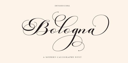 Welcome to the Bologna Script font is a modern, casual, and beautiful calligraphic typeface with a swash. It can be used for many purposes. such as titles, signatures, logos, wedding invitations, letterheads, nameplates, labels, newsletters, posters, badges, etc. Bologna Script Features Open type, including initial and terminal letters, alternatives, binders, and International support for most Western languages included.
 - Meatball by Parkinson,
$25.00 Meatball is a fat and happy display font based on some lettering on a mid-20th century poster for the movie Bringing Up Baby. The lettering for the names of the stars, AudryHepburn, Cary Grant and Charles Ruggles, was the basis for Meatball. The sample was all caps and as it evolved, a lower case started to appear, etc.
 - Delighter Script by Uncurve,
$20.00 Delighter Script is simply perfect blended fonts with 3 style. Including 10 font and extras. Delighter is inspired from many lettering, poster, quotes, logos and brands. It's perfect for advertising, magazines, editorial, poster, branding, logo type, header, titles, packaging, display etc. A good combination for helping your design, just mix and match and you'll be very authentic.
 - Quentes Fleur by FallenGraphic,
$20.00 Quentes Fleur is stands out as a diverse selection of typefaces, beautiful alternates character that maintain a coherent look and feel throughout. font is perfect for branding, headings, signatures, logos, blog, wedding invitations, t-shirts, letterhead, merchandise, signage, labels, news, posters, badges etc. FEATURES: Character Set A-Z Numeral Accents (Multilingual characters) PUA encode Alternates MULTILINGUAL ACCENT žŠŒšŸÀÁÂÃÄÅÆÇÈÉÊËÌÍÎÏÐÑÒÓÔÕÖØÙÚÛÜÝßàáâãäåæçèéêëìíîïðñòóôõöøùúûüýÿ
 - Gilton by Jolicia Type,
$19.00 Gilton by Jolicia Type is a display font inspired by retro playful style writing.This font comes with a unique shape where every corner and There are 16 font family for the choice of the desired letter design, Support for 93 languages This font suitable with your projects such as poster, user interface, magazine, logo, apparel design, etc.
 - WOODTYPE Collection by Borutta Group,
$19.00 WOOD TYPE COLLECTION from Mateusz Machalski is a set of wonderful, warm, and weathered hand made typefaces designed by Mateusz Machalski. The Inspiration for this collection comes from a wooden letter blocks and other old technologies used for printing. WTC supports 40 different languages and contains over 300 glyphs per style. The Family consists of 20 typefaces. ENJOY!
 - Hipsterious by Letterhend,
$15.00 Hipsterious is casual and fun script that stands out from the crowd. Consist of two types, a regular and rough. Perfect to be used especially for logo type, signature, photography, quotes, apparel design, and any design needs. As usual, the font comes with many opentype features such as ligatures, stylistic set alternate, etc and also support multilingual.
 - The Boldstyle by Almeera Studio,
$15.00 Introducing The Boldstyle a retro bold script which will bring yo back to 70s feel.comes with Extrude versions. So you don't need extra effort to create extrude effects. Its features include: Stylistic Alternate, Swash, Ligatures, Stylistic set and multilingual support. You can choose alternatives for substitution with various variants Glyphs. Very suitable for logos, tshirts, posters, branding, etc.
 - Spectacular Americanos by Youngtype,
$17.00 Spectacular Americanos & Spectacular Americanos Outline is a hand brush font made with brushes and ink. This typeface is ideal for use in thick watercolor designs or handwriting styles, such as blog titles, posters, wedding elements, t-shirts, clothing, book covers, business cards, greeting cards, branding, merchandise etc. Contains full set : Uppercase Lowercase Ligatures Punctuation number multilingual support. Thank you!
 - Mane by BaronWNM,
$14.00 Mane is a display font with a slant block shape. thick on the vertical line and thin on the horizontal line. have a firm and solid impression. Suitable for writing titles, posters, games, ad taglines, sports, space, etc. has an alternate start and end on each capital letter and several ligatures in order to add variations to each usage.
 - Love Squall by Meutuwah,
$16.00 INTRODUCING Love Squall is handwritten font with a modern Brush feel. Love Squall is perfect for modern projects, headings, blogs, logos, brandings, web design, card, coffee shop, t-shirt, invitations and more! Programs that support in this font is a Microsoft Office Adobe Photo Shop, Adobe Illustrator, Adobe Indesign, and Corel Draw, badges etc. Thank You Font Lovers....!
 - Supremely Luxurious by TypeClassHeroes,
$15.00 Introducing Supremely Luxurious, Access your OpenType features to access the large selection of alternate letters and ligatures. Use this font for any branding, product packaging, invitation, quotes, t-shirt, label, poster, logo etc. Feature Uppercase & Lowercase Number & Symbol International Glyphs Multilingual support Alternative Ligature Feel free to drop us a message any time Hope you enjoy it.
 - Gexo Sans by Java Pep,
$19.00 Proudly present newest elegant sans serif font, Gexo Sans font is the family font that has 5 weights and 5 italics. Gexo Sans designed for elegant and outstanding purposes for your project. This font is perfect for logotype, advertising poster, title, headline, publishing, text font, and etc. Gexo Sans is supporting multilingual more than 30 languages.
 - Kite Script by Fontdation,
$20.00 Kite Script: my another hand-lettering that comes to font. A script typeface that combined thick-thin lines, inconsistent height, loose-tight kerning and unique baseline combinations for natural hand-writing feels. Easy and super playful to customize, suits best for almost all of your designing project; wedding invitations, t-shirt designs, fancy logotype, quote writings, etc.
 - Vida Bandida by Vozzy,
$20.00 Introducing vintage label font named Vida Bandida. It is based on my other font, Black Widow. All available characters you can see at the screenshots. This font has six styles: Regular, Full, Shadow, Shadow FX, Texture and Texture FX. This font will look good on any vintsge styled designs like a poster, T-shirt, label, logo, etc.
 - Cielo by Wilton Foundry,
$29.00 Cielo font family consists of Cielo Light, Cielo Light Italic, Cielo Regular, Cielo Italic, Cielo Bold, Cielo Bold Italic, and Cielo Stencil (Regular weight) Cielo is a versatile contemporary typeface family that will serve you well in many design situations like advertising, corporate communications, etc. Buying all seven weights make it an excellent value for money!
 - Bulgary Reagans by Letterhend,
$12.00 Bulgary Reagans is a pair of font that brings the playful looks with casual feel. The handwritten sans serif combined with the natural hand writing script are the perfect match for you who needs a typeface for headline, logotype, apparel, invitation, branding, packaging, advertising etc. Features : Uppercase & lowercase Numbers and punctuation Alternates & Ligatures Multilingual PUA encoded
 - Black Cycle 2 by Vozzy,
$10.00 Introducing vintage label font duo named Black Cycle. These two fonts has an additional characters and multilungual support (check out all available characters on previews). Both of font familes has four styles: Clean, Clean Shadow, Aged and Aged Shadow. This font will look good on any vintage styled designs like a poster, T-shirt, label, logo, etc.
 - Introblues Script by Dhan Studio,
$19.00 Introblues Script is a modern brush font, organic, dynamic and energetic style. It can be used for various purposes. such as for titles, signatures, logos, correspondence, wedding invitations, letterhead, signage, labels, newsletters, posters, badges, etc. Introblues Script features 228 Glyphs, 118 alternate characters, including initial and terminal letters, alternates, ligatures and International support for most Western Languages is included.
 - Retro Pica by Creativemedialab,
$18.00 Introducing Retro Pica, a bold and fun display font. Retro Pica features a bold retro style with many alternate characters ideal for design, such as posters, t-shirts, branding, logos, etc. Retro Pica Lite, with this style, we replaced the uppercase character with the alternate version for those who use applications that do not support open-type features.
 - Astronoma by Milan Pleva,
$7.00 Astronoma is a clean modern and geometric sans serif typeface inspired by industrial design and technical fonts. Includes OpenType features & supports many languages. Astronoma is ideal for headlines, headers, logos, labels, packaging, presentations, magazines, invitations, etc. Features: Basic latin alphabet A-Z 11 Ligatures & Alternates 56 Accented characters Numbers, Punctuation, Currency, Symbols, Math symbols & Diacritics Enjoy Astronoma!
 - Shamant by Hazztype,
$20.00 Shamant is a cursive handwriting style that gives you a modern vintage vibe. It has a hand-drawn monoline font look, an excellent choice for old-school-inspired designs and modern adaptations with a handwriting look. So for all the vintage-inspired branding, logos, wedding invites, book covers, etc., this authentically flowing font is your one-stop place.
 - SK Skrynka by Shriftovik,
$10.00 SK Skrynka™ is a strict monospaced geometric accidental typeface. He absorbed both industrialism and simplicity, and futurism along with modernism. It is imbued with the spirit of the distant future and refers to the culture of cyberpunk. With its features, it resembles a computer's electrical circuit and fits perfectly into a futuristic design. SK Skrynka font supports many languages: extended Latin (Western European, Eastern European and Central European, etc.), extended Cyrillic (Russian, Ukrainian, Belarusian, Serbian, etc.), Greek and even Hebrew. This allows you to use it in absolutely any direction and style of design. Also, this font has many stylistic alternatives that bring variety to the monospaced typeface, further expanding its expressive capabilities. The SK Skrynka typeface will look great in headlines, or in stylized text and will become a functional addition to design work or game design.
 - Fioritura by Michael Rafailyk,
$11.00 Fioritura is a floral display typeface inspired by Sandro Botticelli's "Primavera" ("Spring") and Guiseppe Arcimboldo's "The Four Seasons" paintings. Fioritura means flowering in Italian, and the character composition consists of stems, leaves, flowers, and flying pollen. Scripts: Latin, Greek, Cyrillic. Language count: 480+. Glyph count: 1103. Kerning: 936 class pairs. Hinting: Not applied. Contextual Alternates: AA BB CC DD EE FF GG LL MM NN OO PP RR SS TT ZZ aa bb cc dd ee ff gg ll mm nn oo pp rr ss tt zz. To keep the writing natural, every second of two frequently repeated letters is automatically replaced by its alternative version. Turned on by default. Contextual Alternates: ΆΈΉΊΌΎΏ. Greek uppercase accented characters lose their tonos accent and retain only dieresis in All Caps mode. Turned on by default. If you need tonos accents in All Caps then turn off Contextual Alternates (calt) feature. Stylistic Alternates: ABCDEFGLMNOPRSTZ abcdefglmnoprstz. Supported languages: Abenaki, Abron, Acheron, Achinese, Achuar-Shiwiar, Adamawa Fulfulde, Adangme, Afar, Afrikaans (Latin), Aghem, Aguaruna, Aja, Akan, Albanian, Alsatian, Amahuaca, Amarakaeri, Amis, Andaandi (Dongolawi), Anuta, Ao Naga, Apinayé, Arabela, Aragonese, Aranese, Aromanian, Arrernte, Arvanitic (Latin), Asháninka, Asturian, Asu, Atayal, Awa-Cuaiquer, Awetí, Aymara, Azerbaijani (Latin, Cyrillic), Baatonum, Bafia, Bagirmi Fulfulde, Balinese, Balkan Romani, Bambara (Latin), Baoulé, Bari, Basaa, Bashkir (Latin), Basque, Batak (Latin), Belarusian (Latin, Cyrillic), Bemba, Bena, Biali, Bikol, Bini, Bislama, Boko, Bora, Borgu Fulfulde, Bouna Kulango, Bosnian, Breton, Buginese (Latin), Bulgarian, Buryat, Bushi, Candoshi-Shapra, Cape Verdean Creole, Caquinte, Caribbean Hindustani, Cashibo-Cacataibo, Cashinahua, Catalan, Cebuano, Chachi, Chamorro, Chavacano, Chayahuita, Chechen, Chewa (Latin), Chickasaw, Chiga, Chiltepec Chinantec, Chokwe, Chuukese, Cimbrian, Cofán, Colognian, Cornish, Corsican, Creek (Muscogee), Croatian, Czech, Dagaare, Dagbani, Danish, Dawan, Dehu, Delaware, Dendi, Dholuo, Dimli, Dinka, Ditammari, Drehu, Duala, Dutch, Dungan, Dyula, Embu, English, Erzya, Ese Ejja, Esperanto, Estonian, Ewe, Ewondo, Falam Chin, Fanti, Faroese, Fijian, Filipino, Finnish, Folkspraak, Fon, French, Friulian, Frisian, Fula, Gagauz (Latin), Galician, Ga’anda, Garifuna, Gen, Genoese, German, Gikuyu, Gilbertese, Gonja, Gooniyandi, Greek, Greenlandic (Kalaallisut), Guadeloupean Creole, Guarani, Gusii (Latin), Gwich’in, Haitian, Hakha Chin (Latin), Hän, Hani, Hausa (Latin), Hawaiian, Hiligaynon, Ho-Chunk, Hopi, Hotcąk (Latin), Huastec, Hungarian, Icelandic, Ido, Igbo (Latin), Ilocano, Indonesian, Interglossa, Interlingua, Irish, Istro-Romanian, Italian, Ixcatlán Mazatec, Jamaican, Javanese (Latin), Jèrriais, Jola, Kabuverdianu, Kabiyè, Kabuverdianu, Kabyle (Latin), Kaingang, Kako, Kala Lagaw Ya, Kalaallisut, Kalenjin, Kalmyk (Cyrillic), Kamba, Kanuri, Kaonde, Kapampangan (Latin), Kaqchikel, Karachay (Cyrillic), Karakalpak (Latin), Karelian, Kashubian, Kazakh, Kekchí, Kenzi, Khalkha (Cyrillic), Khasi, Khoekhoe, K’iche’, Kikuyu, Kimbundu, Kinyarwanda (Ruanda), Kiribati, Kirmanjki, Kirundi (Rundi), Kissi, Kituba, Klingon, Kölsch, Kongo, Konzo, Koyra Chiini, Koyraboro Senni, Kpelle, Krio, Kuanyama, Kumyk, Kurdish, Kven Finnish, Kwasio, Kyrgyz (Cyrillic), Ladin, Ladino, Lakota, Lamnso’, Langi, Latgalian, Latin, Latino sine Flexione, Latvian, Ligurian, Limba, Lingala, Lithuanian, Lobi, Lojban, Lombard, Low German, Lozi, Luba-Katanga, Luba-Lulua, Luo, Luxembourgish, Luyia, Maasai, Maasina Fulfulde, Macedonian, Machame, Madurese (Latin), Makhuwa, Makonde, Makwe, Malagasy (Latin), Malaysian Malay (Latin), Maltese, Mam, Maninkakan, Manx, Maore Comorian, Māori, Mapudungun, Marquesan, Marshallese, Masai, Matsés, Mauritian Creole, Mbelime, Megleno-Romanian, Mende, Meriam Mir, Meru, Meta’ (Latin), Metlatónoc Mixtec, Mezquital Otomi, Mi’kmaq, Minangkabau, Mirandese, Mískito, Miyobe, Mizo, Mohawk, Moksha, Moldovan, Mongolian (Cyrillic), Montagnais, Montenegrin (Latin, Cyrillic), Mossi, Mundang, Munsee, Murrinh-Patha, Murui Huitoto, Mwani, Naga Pidgin, Nagamese Creole, Nahuatl, Nama, Nateni, Navajo, Ndebele, Ndonga, Neapolitan, Ngazidja Comorian, Ngiemboon, Ngiyambaa, Ngomba, Nigerian Fulfulde, Niuean, Nobiin, Nomatsiguenga, Noongar, Norwegian (Bokmål, Nynorsk), Novial, Nuer, Nyamwezi, Nyanja, Nyankole, Nyemba, Nzima, Occidental (Interlingue), Occitan, Ojitlán Chinantec, Old Icelandic, Old Norse, Onĕipŏt, Oromo, Oroqen, Oshiwambo (Ovambo), Ossetian (Latin, Cyrillic), Otuho, Páez, Palauan, Paluan, Pampanga, Papantla Totonac, Papiamentu, Pedi, Picard, Pichis Ashéninka, Piedmontese, Pijin, Pintupi-Luritja, Pipil, Pohnpeian, Polish, Portuguese, Potawatomi, Prussian, Pulaar, Pular, Purepecha, Qiandong Miao, Quechua, Rarotongan, Romani, Romanian, Romansh, Rombo, Rotokas, Russian, Rusyn, Rwa, Sakha, Samburu, Sami (Inari, Lule, Northern, Southern, Pite, Skolt, Ume), Samoan, Sango, Sangu, Saramaccan, Sardinian, Scottish Gaelic, Secoya, Sena, Serbian, Seri, Seychellois Creole, Shambala, Sharanahua, Shawnee, Shilluk, Shipibo-Conibo, Shona, Shuar, Sicilian, Silesian, Siona, Slovak, Slovene (Slovenian), Slovio (Latin), Soga, Somali, Soninke, Sorbian (Lower, Upper), Sotho (Nothern, Southern), Spanish, Sranan, Sukuma, Sundanese (Latin), Susu, Swahili, Swazi, Swedish, Swiss German, Tachelhit (Latin), Tagalog, Tahitian, Taita, Tajik (Cyrillic), Talysh, Tasawaq, Tatar (Cyrillic, Latin), Tedim Chin, Teso, Tetum, Ticuna, Timne, Tiv, Toba, Tojolabal, Tok Pisin, Tokelauan, Tonga, Tongan, Tosk, Totontepec Mixe, Tsafiki, Tshiluba, Tsonga, Tswana, Tumbuka, Turkish, Turkmen (Latin, Cyrillic), Tuvaluan, Tuvan, Twi, Tzeltal, Tzotzil, Uab Meto, Ukrainian, Ulithian, Umbundu, Urarina, Uyghur (Cyrillic), Uzbek (Latin, Cyrillic), Vai, Venda, Venetian, Veps, Vietnamese, Volapük, Võro, Vunjo, Waama, Waci Gbe, Wallisian, Walloon, Walser, Wangaaybuwan-Ngiyambaa, Waorani, Waray, Warlpiri, Wasa, Wayuu, Welsh, Wik-Mungkan, Wiradjuri, Wolof (Latin), Xavante, Xhosa, Xwela Gbe, Yagua, Yanesha’, Yangben, Yanomamö, Yao, Yapese, Yindjibarndi, Yoruba (Latin), Yucateco, Záparo, Zapotec, Zarma, Zazaki, Zulu, Zuni. The promo images used photos of Cottonbro, Maria Lindsey from Pexels, and Andreea Popa, Wyron A from Unsplash.
 - Reina Neue by Lián Types,
$29.00 Hey! See Reina Neue in action here! INTRODUCTION When I designed the first Reina¹ circa 2010, I was at the dawn of my career as a type designer. The S{o}TA, short for the Society of Typographic Aficionados, described it as complex display typeface incorporating hairline flourishes to a nicely heavy romantic letterform². And it was like that; that’s what I was pursuing at that time since I was very passionate about ornaments and accolades of Calligraphy. Why? I felt that Typography, in general, needed more of them. These subtle flourishes could breathe life into letters. Maybe, I thought it was the only way I could propose something new into the field of type. However, after some years, I came across a very interesting quote: –Beautiful things don’t ask for attention– Wow! What did this mean? How could something be attractive if it’s not actually showing it. Could this be applied to my work? Sure. I think every type-designer goes through this process (aka crisis) regarding his or her career. At the beginning we love everything. We are kind of blind, we only see the big picture of a project. And that’s not because we are lazy. We actually can’t see the small mistakes nor the subtleties that make something simpler beautiful. We are not able. But, the small subtleties… They are actually everything: With experience, one puts more attention into the details and learns that every single decision in type has to be first meticulously planned. Here I am now, introducing a new Reina, because I felt there was a lot of it that could be improved, also the novelty of Variable Fonts caught my attention and I had to take that to my type library. THE FONT A thing of beauty is a joy forever Now, a decade later, I’m presenting Reina Neue. This font is not just an update of its predecessor: –A thing of beauty is a joy forever– is the first line of the poem ‘Endymion’ by John Keats, and despite the meaning of “beauty” may vary from person to person, and even from time to time (as read in the last paragraph), with Reina I always wanted to bring joy to the eye. In 2010, and now, in 2020. I believe the font is today much better in every aspect. It was entirely re-designed: Its shapes and morphology in general are much more clean and pure. The range of uses for it is now wider: While the old Reina consisted in just one weight, Reina Neue was converted into a big family of many weights, even with italics, smallcaps and layered styles. The idea behind the font, this kind of enveloping atmosphere made out of flourishes, is still here in the new Reina. This time easier to get amazing results due to the big amount of available alternates per glyph and also more loyal from a systemic point of view. However, and as read in the introduction -Beautiful things don’t ask for attention-, if none of the flourishes are activated the font will look very attractive anyway. Reina Neue is ready to be used in book covers, magazines, wedding cards, dazzling posters, storefronts, clothing, perfumes, wine labels and logos of all kind. Like it happened with the previous Reina, I hope this new font satisfies every design project around the world if used, and can be a joy forever. SOME INSTRUCTIONS Before choosing the right style for your project, hear my advice: -Reina Neue Display was meant to be used at big sizes. If you plan to print the font smaller than 72pt, I suggest using Reina Neue, not Display. Otherwise, if the font will be BIG or used on a digital platform, Reina Neue Display should be your choice. For even smaller sizes, use Reina Neue Small. This style was tested and printed in 12pt with nice results. (Note for variable fonts: Print them in outlines) -Reina Italic is not a slanted version of the roman, and this means some flourishes are different between each other. The Italic version has other kind of swirls. More conservative, in general. -All the styles of Reina Capitals have Small Capitals inside. -Reina Capitals Shine should be used/paired ONLY with Reina Capitals Black. The engraved feeling can be achieved if Reina Capitals Black and Reina Capitals Shine are used as layers, with the same word. Variable fonts instructions: -For more playful versions, choose Reina Neue VF, Reina Neue Italic VF or Reina Neue Capitals VF: With them you can adjust between 3 axes: Weight (will change the weight of the font) – Optic Size (will thicken/lighten the thin strokes and open/close the tracking) – Accolades (will modify the weight of the active flourishes). SOME VIDEOS OF REINA NEUE VF https://youtu.be/8cImmT5bpQM https://youtu.be/1icWfPmKAkg https://youtu.be/YC9GkJDL1a8 NOTES 1. The original Reina, from a decade ago: https://www.myfonts.com/fonts/argentina-lian-types/reina/ 2. In 2011, Reina received an honourable mention by S{o}TA. “Great skill is shown in the detailing, and an excellent feel for the correct flow of curves and displacement of stroke weight.” https://www.typesociety.org/catalyst/2011/ Reina was featured in the “Most Popular Fonts of the year” in MyFonts in 2011 https://www.myfonts.com/newsletters/sp/201201.html In 2012, the font was also selected in Tipos Latinos, the most prestigious competition of type in Latinoamerica. https://www.tiposlatinos.com/bienales/quinta-bienal-tl2012/resultados Also, chose as a “Favorite font of the year” in Typographica. https://typographica.org/typeface-reviews/reina/
 - Brahma by Tall Chai,
$15.00 Brahma V2 is here. The new version has been three years in the making. It has multiple new updates and improvements based on user feedback. The focus for this version has been improved readability while maintaining the unique, modern identity of Brahma type family that has received so much love since V1 was launched in Dec 2020. Brahma is a modern geometric sans-serif font family with weights ranging from Thin (100) to Black (900). Features: Available in 9 weights Over 550 glyphs supporting extended Latin Ideal for display texts: Titles, Logos and Headlines etc. Perfect for branding and rebranding Supports OpenTypes features like Ligatures and Stylistic Alternates Tabular Numerals included Symbols for 10 major currencies including Bitcoin provided in all weights Description: The name comes from Brahmā who is known as the god of creation. And manifesting the same spirit, the Brahma font family focuses on modern creativity. Every character effortlessly integrates with current design standards and interfaces. The fonts are professional yet have a hint of informal personality in them. This makes Brahma perfect for use in modern apps and websites. Brahma is built for the designing and marketing squads. It has a trendy geometric characteristic which is ideal for any branding and rebranding. Brahma has lot of OpenType features (like ligatures and tabular numerals) and the Extended Latin character set supports over a hundred languages. Start Creating!
 - Aramis - Unknown license

- Bethlehem Ephrath by HiH,
$10.00 One menorah that I have long found particularly appealing was named The Tree of Life Menorah, a replica of which I gave as a gift one holiday to a kindly old couple who were neighbors and became friends. It had a simple, organic elegance that I see in the best of Art Nouveau sculpture. To me personally, Judeism is a celebration of life, like the triumph of the flower that blossoms in the crack of the city sidewalk. Just as Hanukkah celebrates the rededication of the temple and the miracle of the oil, it celebrates the victorious quest for freedom of the Hebrew people led by Judah Maccabee. Hanukkah represents determination and courage and faith — and it represents the presence of God in the lives of His people. It is interesting to note that the founding of the Albanian nation in the early twentieth century grew out of the resistance of the Albanian people to the imposition of Greek language and culture in the aftermath of the dissolution of the Ottoman Empire. The typeface, HADASSAH, designed by Henri Friedlander (1904-1996), is my favorite Hebrew typeface. Thirty years in the crafting, I believe it is unsurpassed for its shear beauty, combining a subtle modulation of stroke with a simplicity and clarity of form. No doubt, that is why it has become so popular. For me, the Sîyn/Shîyn characters are especially satisfying. For a Hanukkah message in Hebrew, I would choose HADASSAH LIGHT for a headline and print it as large as I could. If, however, you are looking for a friendly, warm face for a seasonal message in a roman-letter based language, may I suggest BETHLEHEM EPHRATH. It will be as comfortable as a bulky, hand-knit sweater on a frosty afternoon and reflects the solid, encompassing, family orientation of this holiday. It was on the way to Ephrath that Jacob’s beloved wife Rachel gave birth to Benjamin and then died from her labor. It was to Ephrath that Naomi and Ruth returned and in Ephrath that we have the wonderful, heart-warming story of the marriage between Ruth and her Redeemer-Kinsman, Boaz. And it was to Ephrath that prophet, Samuel, went to find a new king and there in Ephrath that the prophet annointed a small shepherd boy named David. The Proverbs tell us to seek wisdom. Never underestimate the impact you have on others. Words of kindness can change people’s lives. The Talmud says that the highest form of wisdom is kindness. Be wise this holiday season. The font BETHLEHEM EPHRATH is based on the typeface Accent with the permission of URW++ of Hamburg, Germany. Like most display fonts, it is most effective at 18 points and larger. Like most script fonts, it is most effective when set with both upper and lower case. Although this font is readable in all caps (many scripts are not), that does not make it a good idea. Do so only with caution.
 - Paverify by Esintype,
$14.00 Paverify is an all-caps geometric slab serif display face inspired by a particular pavement tile component which is evoking a blocky “I” letter. All other characters were interpreted based on its look and drawn accordingly. There are three uppercase Roman fonts in different weights and widths substantially. With the additional versions, type family consisting of 7 fonts in total. Over 220 Latin, Cyrillic and Greek script languages supported. Each font contains an extensive multilingual support with more than 1600 glyphs and OpenType features, including number forms, fractions, and stylistic alternate sets those provide different looks by the typographic preferences. For the lowercase letters there are small caps variants, i.e., shorter caps. These also have identical glyphs and matching marks to enable “Small Capitals From Capitals” feature. Narrower Medium and Bold styles was produced to accompany the Black first design. Paverify comes with an ornaments font named as “Extras”, which contains geometric graphical elements, i.e., paver stone patterns, banner/sticker background sets, star comps and a collection of catchwords to simplify creating feature rich layouts. As is known as interlocking paver in certain regions — a rectangular shape with the distinctive diagonal tabs — transcribing the simplest letter to draw into the whole alphabet was a challenging task. Not only it was the single thing that can be used as a source, considering its thick form in roughly 1.2:1 proportions compared to the sophistication of letterforms was the challenge. Starting point was keeping design consistent while both avoiding and preserving a particular appearance to achieve a similar texture, basically a repeating pattern on the streets. In contrary of a traditional approach, Paverify tend to have more contrast than the other slab serifs which helps to reduce massive stem weight of the source form. This look contributes to its hand painted sign effect achieved in a certain degree, which may otherwise impractical to transform because the source material is an inorganic, static form by definition. Tight and even spacing of the pavement tiles was inspirational for the kerning balance of the letters. Although the lighter weights have more space between the letter pairs, black weight adjusted as to be close to each other as the original grid. Tight spacing can be ignored by using Capital Spacing OpenType feature for the Outline versions as layer fonts. In one stroke, this gives an extra space between the letters to avoid diagonal armed letter terminals overlap. Black typographic colour and texture gives a sturdy appearance to the lines, it is useful for the projects where a robust display faces preferred for the titling, strong headlines, letter stacks, dropcaps, initials, short names on materials such as advertisements, book covers, posters, logotypes, wordmarks, package designs, and more in print or digital. Paverify can be paired as a complimentary face in a combination with broader type systems, where vintage look compositions and woodcut style fusions requiring an extra stunning texture.
 - TT Ricordi Allegria by TypeType,
$29.00 Please note! If you need OTF versions of the fonts, just email us at commercial@typetype.org TT Ricordi Allegria useful links: Specimen | Graphic presentation | Customization options TT Ricordi Allegria is a sleek and intelligent contemporary Florentine grotesque inspired by the half-erased lettering in Basilica di Santa Croce, Florence. TT Ricordi Allegria was drawn by Antonina Zhulkova and reflects in its graphics the transitional stage between the classic serif with varying proportions, gravitating towards the Roman capital type, and the Florentine sans serif. The font is characterized by variability in the proportions of characters, contrast between strokes, wedge-shaped triangular characters, and the absence of traditional serifs. The main visual feature of the typeface is its diversity and the ability, using different stylistic sets, to completely change the character and perception of the typeface. The drawing of the characters from the main set is strict, thanks to which the font looks stern, as if the inscription in the font was really carved out of stone. And with the help of another set, we can add roundness, or even smoothness, to the font. This is due to the fact that the letters (E R K Q J Y in Latin, and Л К Ж Э in Cyrillic) from the second set have either very noticeable "curls" or smooth, rounded "legs". In addition, the typeface includes a set of beautiful ligatures for use in display inscriptions, such as large headlines. An interesting moment when working on the typeface was the creation of the Cyrillic typeset, since the Cyrillic alphabet does not so easily fit into the concept of the Florentine grotesque and stressed semi-serif. The most difficult thing in working on the Cyrillic alphabet was to create a system of spacing for characters, as it was done in the Latin alphabet, and to make sure that when typing in Cyrillic, the drawing of the text remained beautiful. That is why the letters Д Л У Ы appearing in the font family are somewhat unusual to the eye, and the proportions of other characters in Cyrillic are not quite “classic” either. In general, the Cyrillic set looks more display than its Latin prototype, but at the same time it lacks the sense of historicity or legacy of the Soviet past, which often comes to the foreground when working on the design of the Cyrillic alphabet in this type of serifs. TT Ricordi Allegria consists of two weights (Regular and Bold) and one variable font. Each style includes over 750 characters, as well as 19 OpenType features. Interesting features of the typeface include three stylistic sets that greatly change the perception of the font, a set of bright display ligatures, a few neat icons that are suitable for breaking text and will emphasize the visual language of the font. Please note! If you need OTF versions of the fonts, just email us at commercial@typetype.org FOLLOW US: Instagram | Facebook | Website
 - FS Untitled Variable by Fontsmith,
$319.99Developer-friendly The studio has developed a wide array of weights for FS Untitled – 12 in all, in roman and italic – with the intention of meeting every on-screen need. All recognisably part of a family, each weight brings a different edge or personality to headline or body copy. There’s more. Type on screen has a tendency to fill in or blow so for each weight, there’s the choice of two marginally different versions, allowing designers and developers to go up or down a touch in weight. They’re free to use the font at any size on any background colour without fear of causing optical obstacles. And to make life even easier for developers, the 12 weight pairs have each been designated with a number from 100 (Thin) to 750 (Bold), corresponding to the system used to denote font weight in CSS code. Selecting a weight is always light work. Easy on the pixels ‘It’s a digital-first world,’ says Jason Smith, ‘and I wanted to make something that was really functional for digital brands’. FS Untitled was made for modern screens. Its shapes and proportions, x-height and cap height were modelled around the pixel grids of even low-resolution displays. So there are no angles in the A, V and W, just gently curving strokes that fit, not fight, with the pixels, and reduce the dependency on font hinting. Forms are simplified and modular – there are no spurs on the r or d, for example – and the space between the dot of the i and its stem is larger than usual. The result is a clearer, more legible typeface – functional but with bags of character. Screen beginnings FS Untitled got its start on the box. Its roots lie in Fontsmith’s creation of the typeface for Channel 4’s rebrand in 2005: the classic, quirky, edgy C4 headline font, with its rounded square shapes (inspired by the classic cartoon TV shape of a squidgy rectangle), and a toned-down version for use in text, captions and content graphics. The studio has built on the characteristics that made the original face so pixel-friendly: its blend of almost-flat horizontals and verticals with just enough openness and curve at the corners to keep the font looking friendly. The curves of the o, c and e are classic Fontsmith – typical of the dedication its designers puts into sculpting letterforms. Look out for… FS Untitled wouldn’t be a Fontsmith typeface if it didn’t have its quirks, some warranted, some wanton. There’s the rounded junction at the base of the E, for example, and the strong, solid contours of the punctuation marks and numerals. Notice, too, the distinctive, open shape of the A, V, W, X and Y, created by strokes that start off straight before curving into their diagonal path. Some would call the look bow-legged; we’d call it big-hearted. - FS Untitled by Fontsmith,
$80.00 Developer-friendly The studio has developed a wide array of weights for FS Untitled – 12 in all, in roman and italic – with the intention of meeting every on-screen need. All recognisably part of a family, each weight brings a different edge or personality to headline or body copy. There’s more. Type on screen has a tendency to fill in or blow so for each weight, there’s the choice of two marginally different versions, allowing designers and developers to go up or down a touch in weight. They’re free to use the font at any size on any background colour without fear of causing optical obstacles. And to make life even easier for developers, the 12 weight pairs have each been designated with a number from 100 (Thin) to 750 (Bold), corresponding to the system used to denote font weight in CSS code. Selecting a weight is always light work. Easy on the pixels ‘It’s a digital-first world,’ says Jason Smith, ‘and I wanted to make something that was really functional for digital brands’. FS Untitled was made for modern screens. Its shapes and proportions, x-height and cap height were modelled around the pixel grids of even low-resolution displays. So there are no angles in the A, V and W, just gently curving strokes that fit, not fight, with the pixels, and reduce the dependency on font hinting. Forms are simplified and modular – there are no spurs on the r or d, for example – and the space between the dot of the i and its stem is larger than usual. The result is a clearer, more legible typeface – functional but with bags of character. Screen beginnings FS Untitled got its start on the box. Its roots lie in Fontsmith’s creation of the typeface for Channel 4’s rebrand in 2005: the classic, quirky, edgy C4 headline font, with its rounded square shapes (inspired by the classic cartoon TV shape of a squidgy rectangle), and a toned-down version for use in text, captions and content graphics. The studio has built on the characteristics that made the original face so pixel-friendly: its blend of almost-flat horizontals and verticals with just enough openness and curve at the corners to keep the font looking friendly. The curves of the o, c and e are classic Fontsmith – typical of the dedication its designers puts into sculpting letterforms. Look out for… FS Untitled wouldn’t be a Fontsmith typeface if it didn’t have its quirks, some warranted, some wanton. There’s the rounded junction at the base of the E, for example, and the strong, solid contours of the punctuation marks and numerals. Notice, too, the distinctive, open shape of the A, V, W, X and Y, created by strokes that start off straight before curving into their diagonal path. Some would call the look bow-legged; we’d call it big-hearted.
 - Ysans Std by Typofonderie,
$59.00 Fashion style meets typography in 9 styles The Ysans designed by Jean François Porchez is a sanserif influenced by Cassandre lettering pieces and the geometric sanserif style from the inter-war period. Since Chanel logo, the geometric sanserif style is the favorite typographic thing in fashion. Ysans asserts this reference. Not only Haute-Couture houses use these categories of typefaces for their visual identity, but fashion magazines usually strength their layout with these geometric sanserif when a Didot isn’t used. Details of Ysans drawings Nevertheless, Ysans takes its sources in certain details imagined by the graphic designer Adolphe Mouron Cassandre for the monogram then logotype Yves Saint Laurent (1961 …). One thing keeps coming in again and again in Cassandre’s post-war graphic work: the pointed finish and endings, the references to the Roman capitals engraved and unique features such as the open R or other details influenced by Antiqua and calligraphic forms or ductus (you should have in mind that an earlier typeface by Cassandre is the Peignot, a modern uncial based on researches of the palaeographer Jean Mallon.) Certain letters from the Ysans are directly an homage to the Yves Saint Laurent logo, the R, the narrow U, the apex of the N, and all the details of such pointed endings on the f and t lowercases. The Ysans, a typeface between diversity and synthesis There are several ways to approach the design of a new geometric sanserif. The first approach is to follow the Bauhaus philosophy by designing in the most rational way, typographic forms based on simple geometric elements: square, round, triangle. Another approach is to start a revival based on an historical geometric typeface and optimize the original ideas, in order to adapt certain details to the contemporary needs. For Ysans, the approach is somewhat different because this project started in 2011 at ZeCraft as a typeface designed specifically for Yves Saint Laurent Beauty, still in use by the brand under its original name Singulier. The Singulier-Ysans has been conceptualized by ZeCraft, both drawing its sources from Cassandre and various historical geometric typefaces. Some will spot specific traits as in Futura, others in Metro or Kabel. By closely observing the Ysans, the result can also recall the way Eric Gill draw the curves and endings of his typefaces, of which Jean François Porchez is a fervent admirer. In the end, Ysans is like fashion as envisioned by Yves Saint Laurent who constantly revealed multiple references in his new collections, without being recognisable any other than with his unique style. “Fashions pass, style is eternal. Fashion is futile, not style.” Cherry on the cake: Ysans Mondrian Ysans Mondrian, named in reference to the Mondrian dress created by Yves Saint Laurent, is the multi-layer version of the family. Ysans, fashion style meets typography Club des directeurs artistiques, 49e palmarès
 - Deva Ideal by DizajnDesign,
$49.95 Deva Ideal was inspired by women’s beauty. It didn’t come only from the desire to create a new typeface. It also seeks to materialize beauty in a visual form. Instead of imitating the shapes of the female body or other formal attributes, Deva Ideal is an abstract expression of the women’s beauty. The unique character of the typeface is achieved by the use of soft, almost invisibly bent strokes, since one of the priorities of the typeface is not to disturb the eye of the reader with odd design details. Deva Ideal excels in her cold beauty and shows her sex appeal. The soft curves present in Deva Ideal differ from the masculine and technical shapes used in most contemporary typefaces. Deva Ideal has ideal proportions (90 / 60 / 90) and its shapes are essential and simple. Because of this, it is ideal for setting text in all kinds of printed matter: catalogues, books and magazines. The letter forms are wide and open, so text can be set in small sizes and thus space can be saved, while keeping the same degree of readability. The author wishes to acknowledge František Štorm for his invaluable opinions. Also to Palo Bálik and Peter Bilak for their contributions. I am specially grateful to all the devas (archaic expression for beautiful young girl), who inspired me to design this typeface. This is dedicated to Janka Ráczová, Jarka Krajčiová, Mariana Felgueiras and obviously to Martinka Filípková! Every use of Deva Ideal is a little homage to these interesting women.
 - Typist Slab Mono by VanderKeur,
$25.00 The typeface Typist originated during an extensive research on the origin and development of typewriter typestyles. The first commercially manufactured typewriter came on the market in 1878 by Remington. The typestyles on these machines were only possible in capitals, the combination of capitals and lowercase came available around the end of the nineteenth century. Apart from a few exceptions, most typestyles had a fixed letter width and a more or less unambiguous design that resembled a thread-like structure. A lot of this mechanical structure was due to the method the typestyles were produced. Looking at type-specimens for print before the first typewriters were good enough to came on the market we can see that in 1853 and in 1882 Bruce’s Type Foundry already had printing type that had a structure of the typewriter typestyles. Of course printing types were proportional designed as typewriter typestyles had a fixed width. So it is possible that except from the method of production for typewriter typestyles, the design of printing types were copied. In the design of the Typist, the purpose was – next to the monospace feature – to include some of the features of the early typewriter typestyles. Features such as the ball terminals and the remarkable design of the letter Q. This new typeface lacks the mechanical and cold look of the early typewriter typestyles. The Typist comes in six weights with matching italics in two versions. One that resembled the early typewriter typestyles (Typist Slab) and a version designed with coding programmers in mind (Typist Code).
 - Typist Code Mono by VanderKeur,
$25.00 The typeface Typist originated during an extensive research on the origin and development of typewriter typestyles. The first commercially manufactured typewriter came on the market in 1878 by Remington. The typestyles on these machines were only possible in capitals, the combination of capitals and lowercase came available around the end of the nineteenth century. Apart from a few exceptions, most typestyles had a fixed letter width and a more or less unambiguous design that resembled a thread-like structure. A lot of this mechanical structure was due to the method the typestyles were produced. Looking at type-specimens for print before the first typewriters were good enough to came on the market we can see that in 1853 and in 1882 Bruce’s Type Foundry already had printing type that had a structure of the typewriter typestyles. Of course printing types were proportional designed as typewriter typestyles had a fixed width. So it is possible that except from the method of production for typewriter typestyles, the design of printing types were copied. In the design of the Typist, the purpose was – next to the monospace feature – to include some of the features of the early typewriter typestyles. Features such as the ball terminals and the remarkable design of the letter Q. This new typeface laks the mechanical and cold look of the early typewriter typestyles. The Typist comes in six weights with matching italics in two versions. One that resembled the early typewriter typestyles (Typist Slab) and a version designed with coding programmers in mind (Typist Code).
 - LFT Etica Sheriff by TypeTogether,
$35.00 "LFT Etica, the moralist type family by Leftloft, began at the end of 2000, but its development is ongoing as it expands to fill the astute designer’s needs. The starting point was the common, cold grotesque sans typefaces — ubiquitous and often badly applied in their everyday visual environment. The challenge was to obtain the same force, versatility, and colour, but with a much warmer feel. LFT Etica resides aesthetically somewhere between a grotesque and a humanist sans serif, resulting from a design of soft strokes with open counters and terminals. LFT Etica successfully combines forcefulness and delicacy, wrapping both with sober charm. Milan-based Leftloft studio teamed up with Octavio Pardo to develop 24 additional styles for the very successful LFT Etica type family. This expansion is a direct response to type users’ requests who found in LFT Etica a de facto choice for web design. The new styles come in two series — 12 condensed widths and 12 compressed ones — and have proven versatile in applications where the ratio between information and space becomes an important challenge. Each letter was scrutinised to ensure durability throughout time and adaptability within circumstance, so LFT Etica meets the challenge of balance head-on. With its wide current range of 40 styles and many OpenType features (four sets of numerals, fractions, arrows, and dingbats, as well as stylistic alternates), LFT Etica is a versatile typeface suitable for corporate or casual use, for printed publications as well as web design. The complete LFT Etica family, along with our entire catalogue, has been optimised for today’s varied screen uses."
