10,000 search results
(0.021 seconds)
- SF Piezolectric SFX - Unknown license
- SF Intermosaic B - Unknown license
- Cafe Lounge 19 - Personal use only
- Molot - Personal use only
- Scienide - Unknown license
- SF RetroSplice SC - Unknown license
- SF DecoTechno - Unknown license
- SF RetroSplice Outline - Unknown license
- Applejuiced - Unknown license
- SF Baroquesque - Unknown license
- EPF - 100% free
- Kingthings Embroidery - Unknown license
- Futurex SCOSF - Unknown license
- SF Wasabi - Unknown license
- SF Wasabi - Unknown license
- SF Beaverton - Unknown license
- Engebrechtre - Unknown license
- SF Proverbial Gothic - Unknown license
- SF Speedwaystar - Unknown license
- SF Retroesque - Unknown license
- Don Giovonni Makin Enemies - Unknown license
- Eat your heart out - Unknown license
- SF Beaverton - Unknown license
- SF Chaerilidae Shaded - Unknown license
- SF Archery Black - Unknown license
- TypographerFraktur - Personal use only
- Sudbury Basin 3D - Unknown license
- SF Retroesque - Unknown license
- SF Laundromatic - Unknown license
- TypographerGotisch Schatten S - Unknown license
- SF DecoTechno - Unknown license
- TypographerFraktur - Unknown license
- DT 104 in outbreak - Unknown license
- Vtks Relaxing Blaze - 100% free
- SF Speedwaystar - Unknown license
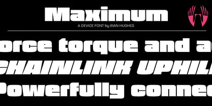
- Maximum by Device,
$39.00 - Equinox by ITC,
$29.99 - Minsky by Solotype,
$19.95 - Spice by BA Graphics,
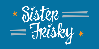
$45.00 - Sister Frisky by Chank,
$99.00


