10,000 search results
(0.03 seconds)
- Bridge Style by Sensatype Studio,
$15.00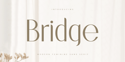 A Sans serif that we created special for elegant branding needs, with extra ligatures in unique shape will be ready to add value of your brand. It so nice to leverage designer or product owner that need solutions to make their design look more classy and modern. And specially for this font, We prepared any ligatures characters to help you create unlimited variations for your creative needs. Bridge Sans serif font ready with: Any options to get creative variations (combination of Ligatures) Preview as a inspirations that you can do with Bridge font Ready with Lowercase and Uppercase characters Wish you enjoy our font. :)
 - Magic Growing by Sensatype Studio,
$15.00 A Sans serif that we created special for elegant branding needs, with extra style will be ready to add value of your brand. It so nice to leverage designer or product owner that need solutions to make their design look more elegant and modern. And specially for this font, We prepared any Styles to help you create unlimited variations for your creative needs. Magic Growing Elegant Sans Serif Font ready with: Any styles to get creative variations (regular, bold, italic, bold italic) Preview as a inspirations that you can do with Magic Growing font Ready with Lowercase and Uppercase characters Wish you enjoy our font. :)
 - Basically by Sensatype Studio,
$15.00 An Elegant Modern Sans Serif font that we created special for elegant branding needs, with extra alternates in unique shape will be ready to add value of your brand. It so nice to leverage designer or product owner that need solutions to make their design look more classy and modern. And specially for Basically font, We prepared any alternate characters to help you create unlimited variations for your creative needs. Basically Elegant Modern Sans Serif ready with: Any options to get creative variations Preview as a inspirations that you can do with Basically font Ready with Lowercase and Uppercase characters Wish you enjoy our font. :)
 - Proach by Grontype,
$10.00 Poarch is a clean and modern condensed font, the font well designed as a sans serif font with all caps. It has round tip angle and different style as a sans font in common. The font is perfect for any project such as Brochure/Magazine Header, Logo Tagline, Flyer Titles and it also can be a paragraph text font. Features: Uppercase and Lowercase Regular, Light and Italic Version Numeral and Punctuation Ligatures Multilingual Support Modern Look Thankyou for Choosing This font Regards, Grontype
 - Segule by Sensatype Studio,
$15.00 A new San Serif Font that we created special for Headline, Title and more stand out typography needs. It's so perfect to add your style and headline overview. And specially for Headline font, we crafted for unique style and modern feels so enjoy to create any project that will show your main idea out. Segule Modern Humanist Sans Serif Font ready with: Preview as a inspirations that you can do with Segule font Ready with All characters Wish you enjoy our font. :)
 - Quenione Unico by WNGSTD,
$10.00 Quenione Unico - Unique sans serif is a playful and modern font. featuring a lightweight, it offers support for all characters. standard punctuation glyphs are included. Quenione Unico - Unique sans serif is perfectly suited for traditional media and the web. great for the crafter and graphic artists. compatible with all tools. its playfulness makes it great for creative project., be inspirational wall poster, or for communicating your brand. This font can be used for any variety of purposes. FEATURES : uppercase lowercase symbol & number
 - NERMOLA Scripcy Font by Alit Design,
$12.00 Introducing NERMOLA Scripcy Font from alitdesign. The rise of typeface duos in the marketplace made us not want to be left behind so we created a pairing of our own. This font duo launch contains both a sans serif and signature script. NERMOLA Scripcy sans serif has characters that are unique, elegant, formal and assertive. It is suitable for the heading or subheading of any text. The uppercase of the sans looks very unique and elegant. The script letters are also unique and natural in character. Additionally, it has several alternatives that can be replaced using OpenType features. NERMOLA Scripcy fonts are the perfect addition to your font collection library. The designs are elegant and romantic and are equally suitable for logotype design and for any phrase, poem, or quote.
 - The Shoreman by Hustle Supply Co,
$18.00 The Shoreman This typeface is a vintage Sans Serif Display Typeface. The Shoreman comes packed with over 450 glyphs containing many alternates and decorative characters. With so many options of characters, you can give any of your projects it's own unique character. What's Included? Over 450 Glyphs with tons of alternates Western European characters Thanks!
 - Bunday Clean by Buntype,
$22.50 Bunday Clean is a minimalist and friendly font family with different moods. It drops everything unnecessary like spurs and ears and appears crisp and contemporary with a slightly squarish touch. Like the other members of the superfamily (Bunday™ Sans and Bunday™ Slab), Bunday Clean provides uprights, a second set of styles with characters that reference handwritten cursive. These curvy styles give words a distinct look and are especially attractive for use in display applications and logotype design. Bunday™ Clean is space-saving and creates a homogenous text color with good legibility. The font was manually hinted and contains extensive handcrafted kerning tables to ensure perfect appearance in all media. It ships with 9 standard, 9 upright, and the corresponding italic styles from a considerably thin hairline to a quite thick heavy. It supports at least 99 languages and provides OpenType® features for ligatures, alternative glyphs, localized forms, and much more. Feature Summary*: -4 Moods: Normal, Upright, Italic and Upright Italic -9 weights: Hair, Light, Thin, SemiLight, Regular, SemiBold, Bold, ExtraBold and Heavy -Supports at least 99 Languages incl. eastern european -Overall width: Narrow or Space-Saving -Advanced f- ligature set including fb -Discretionary s- and c- ligatures -Alternative Characters: a, e, f, g, l, t, y, A, E, F, L, and more -Capital German Eszett -Extra characters with Polish Kreska -Catalan Punt Volat -More than 570 characters per font * Some features may only be available in OpenType®-savvy applications Please, take a look at the other Bunday superfamily members: Bunday™ Sans Bunday™ Slab
 - Tech Tools by DNC,
$25.00An attempt to insert a hammer into a work will require that such hammer be drawn, scanned, resized and inserted -- a laborious work. With TechTools such drawing, scanning, resizing to fit is a thing of the past. Technical Tools can now be inserted directly into any application. - Bunday Slab by Buntype,
$22.50 The new Bunday™ Slab Font Family consist of three main states with different moods: the crisp and distinctive slab serif, the cute script styled italic and the matching upright italic. All states of Bunday™ Slab share the same contemporary, clear and open base forms and create a space-saving and pretty homogeneous text colour with good legibility. The font was manually hinted and contains extensive handcrafted kerning tables to ensure perfect appearance in all media. Bunday™ Slab ships with 9 standard, 9 upright italic and 8 italic styles from a considerable thin “Hair” to a pretty fat “Heavy” weight. It supports at least 99 languages and provides OpenType® features for ligatures, alternative glyphs, localised forms and more. Please take a look at the other members of the Bunday superfamily: Bunday™ Clean Bunday™ Slab Further information: Bunday Slab Specimen PDF Feature Summary: 9 weights: Hair, Light, Thin, SemiLight, Regular, SemiBold, Bold, ExtraBold and Heavy 3 Moods: Sans, Upright and Upright Italic Overall width: Narrow or Space-Saving Advanced “f” ligature set* “s” and “c” ligatures* Alternates Characters: a, ç, e, f, g, l, t, y and more* Capital German Esszett* Supports at least 99 Languages * Only available applications with advanced OpenType® support
 - Schism One by Alias,
$55.00 Schism is a modulated sans-serif, originally developed from our Alias Didot typeface, as a serif-less version of the same design. It was expanded to three sub-families, with the thin stroke getting progressively heavier from Schism One to Schism Three. The different versions explore how this change in contrast between thick and thin strokes changes the character of the letterforms. The shape is maintained, but the emphasis shifts from rounded to angular, elegant to incised. Schism One has high contrast, and the same weight of thin stroke from Light to Black. Letter endings are at horizontal or vertical, giving a pinched, constricted shape for characters such as a, c, e and s. The h, m, n and u have a sharp connection between curve and vertical, and are high shouldered, giving a slightly square shape. The r and y have a thick stress at their horizontal endings, which makes them impactful and striking at bolder weights. Though derived from an elegant, classic form, Schism feels austere rather than flowery. It doesn’t have the flourishes of other modulated sans typefaces, its aesthetic more a kind of graphic-tinged utility. While in Schism Two and Three the thin stroke gets progressively heavier, the connections between vertical and curves — in a, b, n etc — remain cut to an incised point throughout. The effect is that Schism looks chiselled and textural across all weights. Forms maintain a clear, defined shape even in Bold and Black, and don’t have the bloated, wide and heavy appearance heavy weights can have. The change in the thickness of the thin stroke in different versions of the same weight of a typeface is called grading. This is often used when the types are to used in problematic print surfaces such as newsprint, or at small sizes — where thin strokes might bleed, and counters fill in and lose clarity, or detail might be lost or be too thin to register. The different gradings are incremental and can be quite subtle. In Schism it is extreme, and used as a design device, giving three connected but separate styles, from Sans-Didot to almost-Grotesk. The name Schism suggests the differences in shape and style in Schism One, Two and Three. Three styles with distinct differences, from the same start point.
 - Schism Three by Alias,
$55.00 Schism is a modulated sans-serif, originally developed from our Alias Didot typeface, as a serif-less version of the same design. It was expanded to three sub-families, with the thin stroke getting progressively heavier from Schism One to Schism Three. The different versions explore how this change in contrast between thick and thin strokes changes the character of the letterforms. The shape is maintained, but the emphasis shifts from rounded to angular, elegant to incised. Schism One has high contrast, and the same weight of thin stroke from Light to Black. Letter endings are at horizontal or vertical, giving a pinched, constricted shape for characters such as a, c, e and s. The h, m, n and u have a sharp connection between curve and vertical, and are high shouldered, giving a slightly square shape. The r and y have a thick stress at their horizontal endings, which makes them impactful and striking at bolder weights. Though derived from an elegant, classic form, Schism feels austere rather than flowery. It doesn’t have the flourishes of other modulated sans typefaces, its aesthetic more a kind of graphic-tinged utility. While in Schism Two and Three the thin stroke gets progressively heavier, the connections between vertical and curves — in a, b, n etc — remain cut to an incised point throughout. The effect is that Schism looks chiselled and textural across all weights. Forms maintain a clear, defined shape even in Bold and Black, and don’t have the bloated, wide and heavy appearance heavy weights can have. The change in the thickness of the thin stroke in different versions of the same weight of a typeface is called grading. This is often used when the types are to used in problematic print surfaces such as newsprint, or at small sizes — where thin strokes might bleed, and counters fill in and lose clarity, or detail might be lost or be too thin to register. The different gradings are incremental and can be quite subtle. In Schism it is extreme, and used as a design device, giving three connected but separate styles, from Sans-Didot to almost-Grotesk. The name Schism suggests the differences in shape and style in Schism One, Two and Three. Three styles with distinct differences, from the same start point.
 - Schism Two by Alias,
$55.00 Schism is a modulated sans-serif, originally developed from our Alias Didot typeface, as a serif-less version of the same design. It was expanded to three sub-families, with the thin stroke getting progressively heavier from Schism One to Schism Three. The different versions explore how this change in contrast between thick and thin strokes changes the character of the letterforms. The shape is maintained, but the emphasis shifts from rounded to angular, elegant to incised. Schism One has high contrast, and the same weight of thin stroke from Light to Black. Letter endings are at horizontal or vertical, giving a pinched, constricted shape for characters such as a, c, e and s. The h, m, n and u have a sharp connection between curve and vertical, and are high shouldered, giving a slightly square shape. The r and y have a thick stress at their horizontal endings, which makes them impactful and striking at bolder weights. Though derived from an elegant, classic form, Schism feels austere rather than flowery. It doesn’t have the flourishes of other modulated sans typefaces, its aesthetic more a kind of graphic-tinged utility. While in Schism Two and Three the thin stroke gets progressively heavier, the connections between vertical and curves — in a, b, n etc — remain cut to an incised point throughout. The effect is that Schism looks chiselled and textural across all weights. Forms maintain a clear, defined shape even in Bold and Black, and don’t have the bloated, wide and heavy appearance heavy weights can have. The change in the thickness of the thin stroke in different versions of the same weight of a typeface is called grading. This is often used when the types are to used in problematic print surfaces such as newsprint, or at small sizes — where thin strokes might bleed, and counters fill in and lose clarity, or detail might be lost or be too thin to register. The different gradings are incremental and can be quite subtle. In Schism it is extreme, and used as a design device, giving three connected but separate styles, from Sans-Didot to almost-Grotesk. The name Schism suggests the differences in shape and style in Schism One, Two and Three. Three styles with distinct differences, from the same start point.
 - Jannson Map by RM&WD,
$35.00 For best results, use of OpenType features is strongly recommend. This font is inspired by Johannes Janssonius, well know as Jan Janszoon o Jan Janssonius (Arnhem, 1588 – Amsterdam, 1664), was a Dutch cartographer, publisher and engraver. Married to Hondius's daughter. He was the author of many masterpieces of cartography of the 1700s like Willem Blaeu and Hondius, famous maps with heavy use of decorations in the letterig to fill the spaces of oceans, seas, lakes and scrolls. Now you can easily recreate not just ancient maps without effort, but you can use this font creatively, to make unique, modern logos, product names, fresh packaging, hip fashion outfits, refined labels, signs, coordinated images ... Hundreds of alternatives to choose from and maybe to combine with other fonts in an original way. One extra font with 27 castles in Janszoon style are also usefull for map, of course, but also for many different creative artworks. Warning: Jannson Map having oversized swashes compared to the normal standards cannot be used with Windows Word because Word does not give the possibility to manage the line spacing professionally. Jannson Map works great with applications like Illustrator, In Design, quark Xpress, mac Text etc ...
 - IRR3V3RSIBL3 - Unknown license

- Heft by Device,
$39.00 Heft is a heavy slab serif that packs a powerful punch. Available in square-cornered and rounded versions, each with italics, plus two distressed variants — an inky version that evokes the urgency of cheap hot-metal printing, and a worn, distressed version that suggests vintage woodtype or photocopied text.
 - PAG Smoke by Prop-a-ganda,
$19.99Prop-a-ganda offers retro-flavored fonts inspired by lettering on retro propaganda posters, retro advertising posters, retro packages all the world over. This is perfect font for your retrospective project. PAG Smoke is very heavy geometric font. Its unique shape is like a monster for your design project. - RMU Herkules by RMU,
$25.00 At the end of the 19th century, the fin de siècle, both Bauer and Berthold released ‚Herkules‘, a heavy Art Nouveau font for ads and posters. This font was carefully redesigned and makes it a great font in Jugendstil surroundings and a splendid partner of the Carlsbad font family.
 - Fortuner by Variatype,
$20.00 Fortuner is a heavy all-caps display serif with a stencil-style typeface. It’s a perfect font for your design project with a military or sports theme. FONT FEATURES Additional Accents 66 Languages Kerning Alternates SOFTWARE RECOMMENDATION Adobe Photoshop CC 2020 or later Adobe Illustrator CC 2020 or later
 - Furriatt by DVType,
$16.00 Furriatt is a heavy weight bold all caps display typeface. It’s perfect for posters, logos, merch, covers and all stuff you want to print or display in larger format. Font also contain alternative characters set, you could match it with standard glyph to get the best rhythm of letters.
 - McAnni by Tour De Force,
$30.00 McAnni is single weight display serif font and our 130th release. Heavy, wide and stable, McAnni is fully recognizable font that will bring new values to your design project. Charming design with vintage details ideal for titles, headlines, product names, posters, editorial use and more. Contains standard ligatures.
 - Buck by Here East Fonts,
$16.00 BUCK HEAVY is an extremely monumental, architectural and brutal unicase font, designed for maximum visual and emotional impact. Use it in big and really big scales. It's great for headlines, prints, branding, editorial and websites — everything that strives for being really bold, vibrant and super strong and masculine.
 - Japoneh by Okaycat,
$29.50 Japoneh is a dynamic font set in all bold heavy brushed characters. It practically jumps off the page with the action of these fluid strokes! Take your design to the next level with Japoneh. Japoneh is extended, containing West European diacritics & ligatures, making it suitable for multilingual environments & publications.
 - Spartan by Linotype,
$29.99This typeface is Mergenthaler Linotype’s unlicensed version of Futura, copied weight by weight from Bauer. It was produced in 1939 when Metro failed to gain a significant share of the market, and was later adopted by ATF. The small sizes of Book and Heavy cut for classified are original. - Barb by chicken,
$17.00 Heavy as hell, awkward, asymmetric, sort-of-gothic… Four alternates for every letter, carefully kerned together and nicely shuffled for you by OpenType apps… Blunt has the sharp corners ever so slightly rounded off for a softer look at large sizes. Wired chops everything up for an origami angle…
 - Wataha by Soar Studio,
$22.00 Wataha (in polish - wolf pack) is a sharp, robust uppercase family of 3 fonts: Bold, Heavy and Black. Perfect for posters, headlines and logotypes. With a range of OpenType features you have access to alternative letter shapes, fractions, arrows etc. Wataha supports most Latin-based languages and few others.
 - Monarky by YXType,
$22.00 Monark family is designed with legibility and wide language support in mind. Rooted in Fyodor Dostoevsky's Crime and Punishment, it captures the anguish & distortion atmosphere and suppresses them into ruthless letterforms. Top-heavy stems, heavy serifs, and low-contrast forms are all extractions of Dostoevsky's dilemma. Rest assure this typeface would bring you all the needs for advanced typography with true small caps with symbols, 4 styles of figures, support for inferior/superiors, and more than 200 Latin languages. Features: • Support for 200+ Latin languages • Low contrast with unique details • Unique Italic letterforms • Small caps with symbols • Arbitrary and pre-defined fractions • Support for superscript & subscript in normal & scientific alignments • Proportional lining, proportional old-style, tabular lining, tabular old-style
 - Winter Miracle by Larin Type Co,
$12.00 Inspired by winter and Christmas, this modern calligraphy font duo is right for any of your projects. These fonts are in perfect harmony with each other and complement each other. With them you can create a beautiful composition. You can also use them individually. There are alternatives in the script that will help make your project more attractive, in a sans font you will see bold and thin letters that diversify your design.
 - Leronine by Wildan Type,
$15.00 Leronine is an elegant, modern and contrast sans-serif font. It includes upright and Oblique style. This is perfect for any project, it is contrasted, modern and easy to read. With it, you can create logos, use in advertising, packaging, book covers and magazines, headings, descriptions and much more. Leronine includes stylistic alternates and ligature. with them, you can change the style of your project and add personality to it and make it more stylized.
 - Supra Demiserif by Wiescher Design,
$29.00 »Supra Demiserif« is the demi serif addition to the Supra family. I am no fan of slab serif fonts, so I designed this one with half serifs, that makes the serifs less important. Then I found, that the italic does not look nice with slab serifs, so I did only one italic cut for the normal weight. The light and normal weights and the dominant x-height with its high ascenders make for easy reading of long copy. The heavy and x-light weights are great for elegant headlines. Supra is an OpenType family for professional typography with an extended character set of over 700 glyphs. It supports more than 40 Central- and Eastern-European as well as many Western languages. Ligatures, different figures, fractions, currency symbols and smallcaps can be found in all cuts. with each other.
 - Axalp Grotesk by ROHH,
$39.00 Axalp Grotesk™ is a post-Swiss-Style modernist sans serif type family characterized by the play between elegant rounded shapes and sharp angular details. It is minimal, legible, well balanced and charismatic. Its heavy weights deliver powerful yet friendly impact. Thin ones emanate elegance, fine lines and precision. The family has very versatile proportions and generous x-height allowing a successful use for user interfaces, all sorts of display and branding scenarios, as well as a paragraph text typeface. Contemporary minimalistic approach makes Axalp Grotesk an outstanding design tool for creating modern visual identities and user interfaces. A truly universal sans serif family where beautiful forms and proportion work together with careful spacing, kerning and hand-hinting. Axalp Grotesk is an attractive contemporary alternative to the classics of Swiss Design School such as Akzidenz-Grotesk, Univers and Helvetica. It is bright, crisp, modern and friendly in character, and features an alternative stylistic set for more minimalistic and neutral look, simplifying such characters as “Q”, “J”, “a” and “y”. The family has extended latin language support, as well as broad number of OpenType features, such as stylistic alternates, case sensitive forms, ligatures, contextual alternates, lining, oldstyle, tabular and circled figures, slashed zero, fractions, superscript and subscript, ordinals, currencies and symbols.
 - Jantar Sharp by CAST,
$45.00 Jantar Sharp is a text family with flared terminals that eludes the categories of serif or sans. Its most recognisable features are taken from both styles to achieve proper design and high legibility standards. Jantar Sharp performs especially well when used for continuous reading including texts on web platforms. Its personality lies in the flared stroke endings and certain details which make its shapes neither sans nor serifs. Rather than following any particular historical model, it picks up elements from various periods to achieve an organically dynamic look which is entirely compatible with the reading process. Jantar Sharp Italic makes a nice contrast, though the pace and proportions are not drastically different from the upright. This allows for effortless reading of longer passages of italicised text. Jantar Sharp – as well as its teammate Jantar Flow – has been designed in seven weights from ExtraLight to Heavy, all with accompanying italics; it has a tabular and proportional set of figures in both old style and lining options are included together with a special set of hybrid figures sitting between x-height and capitals. Superscripts and subscripts are provided together with a vast collection of diacritics covering all European language and a set of case-sensitive characters.
 - Blank Moment by Sarid Ezra,
$15.00 Blank Moment is a quotable handwritten sans. You can use this font for any project. This font will make your project more natural and humanist. Blank Moment is a nice and never goes wrong choice for your instagram post! This font also contains unique lowercase that will make your project less ordinary. This font also support multilingual.
 - Beer Time by Vozzy,
$10.00 Introducing a vintage look label font named "Beer Time". This font support multilingual characters and punctuation symbols. All available characters you can see at the screenshot. This font have 2 basic styles (Serif and sans serif) and 4 effect styles for each. This font will good viewed on any retro design like poster, t-shirt, label, logo etc.
 - Variant by Letterara,
$14.00 Variant is a wild style outstanding sans serif font. Urban and incredibly bold, this font will most certainly make your designs stand out. It will add a unique spark to any design project that you wish to create! This font is PUA encoded which means you can access all of the amazing glyphs and ligatures with ease!
 - Ambatah by Differentialtype,
$10.00 Ambatah is a sans serif font family that comes with 18 styles. Specially designed to be your favorite font of choice. Add it to any of your creative projects, and it will make it stand out! Ambatah has a set of expanded alternate characters, and all is PUA coded, which means you can access all glyphs and swashes easily!
 - Sanstara by Prasetype,
$12.00 Sanstara is rounded, modern all caps sans serif font. This font is PUA encoded which means you can access all of the glyphs and swashes with ease! Add it confidently to your favorite creations and let yourself be amazed by the outcome generated. -Letters, numbers, punctuation, multilingual support. -Italic and regular versions Any Questions? just ask!
 - Grand Scoth by Rhd Studio,
$11.00 Introducing, Grand Scoth - The Essential Duo Font Collection Grand Scoth is the perfect and essential combination of a duo of fonts including , round sans and authentic signature. This font duo also supports multilingual, numeric and symbol. You can use this font for any purpose. The best part is, you don't have to look for a partner Thank you....
 - Romantis Natalies Duo by Rastype Studio,
$12.00 Romantis Natalies Script and Sans are beautiful and romantic writing fonts. Looks amazing on wedding invitations, thank you cards, quotes, greeting cards, logos, business cards and any other design. This font is PUA encoded which means you can access all glyphs and swashes with ease! The font includes OpenType features with alternative styles, ligatures, and multiple language support.
