3,754 search results
(0.019 seconds)
- Kruda Handcrafted Sans by Akufadhl,
$29.00 Kruda is a Handcrafted display sans with 3 widths and 5 weights with accompanying slanted version. inspired by a vintage grotesk on a worn out signs and this was an initial sketch for our typeface Naratif, but it went too far. so we completed the language support for LATIN, CYRILLIC, and GREEK. and decided to take the risk to release it.
 - Sport News by WAP Type,
$15.00 SPORT NEWS headline magazine, logo racing Awesome sport font with italic wide letters, modern letter cutout and dynamic slant. Ideal for sports headline of Megazine, car race, logo and monogram of automotive game or other modern dynamic text Font “Sport News” compares favorably with its readability and massiveness, creates the effect of power and speed. but with a slightly different font design.
 - Beat Street by Andrey Font Design,
$9.00 Beat Street is a strong display font inspired by the world of car racing, suitable for racing-themed projects such as magazines, games, logos branding, and much more! Fall in love with its incredible style, and use it to create spectacular designs! This font is PUA encoded, which means you can access all of the glyphs and swashes with ease!
 - Sauerkrauto Pro by Martin Lexelius Core,
$33.00 In the late 90’s, there were many German cars coming into Malmö (where I lived at the time). I was blown away by the font on the license plates. So strange, so strong, peculiar – but still macho. I built the uppercase from my own photos. After this I completed the font with my own lowercase, small caps and punctuation.
 - Cuteness Persimmon by Abo Daniel,
$17.00 introducing CUTENESS PERSIMMON -unique bouncy script- it is great for branding, packaging, quotes, wedding card, logo, signature, tote bag design, card, banner, and anything craft project. I created some doodles to make this font perfect. you can add underscore twice after a to k. Features: - Uppercase - Lowercase - Numeral - Multilingual - doodles - PUA encoded I hope you love it. regards, Abo Daniel Studio
 - Sintyabelinda by Zeenesia Studio,
$16.00 Sintyabelinda - Sintysbelinda is Signature Font, suitable for any projects such as logos, branding projects, homeware designs, product packaging, mugs, quotes, posters, shopping bags, t-shirts, book covers, name card, invitation cards, greeting cards, label, photography, watermark, special events, and more. stylistic set alternate and swash make this font so classy, this is a font worthy of your collection. Thank you.
 - Delysian NF by Nick's Fonts,
$10.00If you wanted to send out a party invitation in 1923, Barnhart Brothers & Spindler recommended this typeface, which was originally called, simply, "Greeting Card". It also appears to be suitable for greetings from Mars. Available in two weights, regular and bold. Both versions of the font include the 1252 Latin and 1250 CE character sets (with localization for Romanian and Moldovan). - Castaway by Studio K,
$45.00 Fun, footloose and fancy free, Castaway is a font family that knows no boundaries: equally at home in Naples and Nairobi, Rimini and Rio, Tijuana and Timbuktu. It was inspired by those ‘far away places with strange sounding names’, and will bring a touch of the exotic to tourist and travel promotions, and a breath of fresh air to any graphics project.
 - Douglas Adams Hand - Unknown license

- Scrapt Script by Brainware Graphic,
$12.00 ScraptScript is a classic casual script typeface inspired by signpainter and autotechno typography, developed with a little bit bold and contrast on horizontal stroke. Comes with a lot of opentype features, ScraptScript also supports multilingual covering Latin based language (Latin Extended-A & Latin Extended Additional), including Celtic, Sami, Maltese, Turkish, England, USA, Germany, France, Italy, Poland & etc. ScraptScript would be nice on logo design, posters, etc. with any design characteristic.
 - Hathaway by Lunas Type,
$19.00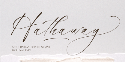 Introducing, Hathaway! Hathaway is a modern and stylish handwritten font. With natural flow it can add a human touch to your designs. Hathaway is perfect for many design needs such as merch, T-shirts, titles, wedding, book covers, social media posts, websites, events, and many more. What's you get : - Ending Swashes - Underline Swashes (just type _1, _2, etc) - Numeral & Punctuation. - ligature. - Multilingual Support. Enjoy Designing! Thanks! Lunas Type
 - Vintage Loving by Lunas Type,
$19.00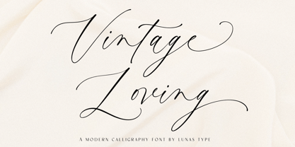 Introducing, Vintage Loving! Vintage Loving is a vintage and luxury calligraphy font. Vintage Loving have a chic and natural curves to add charm impression for your design. VIntage Loving is perfect for many design needs such as merch, T-shirts, signature logo, wedding, book covers, social media posts, websites, events, and many more. What’s you get : – Ending Swashes & beginning swashes. – Numeral & Punctuation. – ligature. – Multilingual Support. Enjoy Designing! Thanks! Lunas Type
 - Hand of Linda by Lunas Type,
$19.00 Introducing, Hand of Linda! Hand of Linda is a signature notes and handwritten font. Hand of Linda have a chic and natural curves to add charm impression for your design. Hand of Linda is perfect for many design needs such as merch, T-shirts, signature logo, wedding, book covers, social media posts, websites, events, and many more. What's you get : - Numeral & Punctuation. - ligatures. - Multilingual Support. Enjoy Designing! Thanks! Lunas Type
 - North Shore by Bruised Goods,
$18.00 NORTH SHORE – The ultimate Hawaiian surf spot typeface, both groovy and mid century inspired. Designed by Lauren Kilbane (on the other coast!) in sunny South Florida, USA. USE THIS FONT FOR: ads, album covers, apparel, cards, flyers, invitations, logos, menus, merchandise, packaging, signage, web, and more. 204 Glyphs Total: Uppercase ONLY, Numbers, Symbols, Punctuation, Emojis, & Language Support. Language Support: Danish, English, French, German, Irish, Italian, Portuguese, Spanish, Swedish, & Swiss German.
 - Quota by Ryan Williamson,
$- Quota is an investigation into the modularity of the Cyrillic alphabet. Unlike Latin and Greek, the Cyrillic alphabet owes much of its form to its development in early industrious printing and movable type. This lead the Cyrillic alphabet to be dominated by hard edge and straight lines, giving it a much more modular overall construction. The forms within the Cyrillic alphabet therefor allow for all the characters themselves to have somewhat unified side bearings without compromising ease of reading. Within Quota the default character set has only unified side bearing, giving a more relaxed mono-spaced appearance. While the first stylistic set unifies the entire character set with the same character width, creating a true mono-spaced typeface. Quota was initially designed in Cyrillic, catering to all languages using the alphabet. While the Latin was designed after, and is loosely based of the forms present within the Cyrillic alphabet.
 - Brassens by Typorium,
$53.00 Le Typorium présente une nouvelle famille de caractères calligraphiques basés sur une écriture étudiée à travers les manuscrits et autographes de Georges Brassens, poète et musicien (1921-1981). Son tracé, rigoureux et appliqué, souvent minutieux, est à l’image d’une œuvre unique et singulière, immédiatement reconnaissable. Le script Brassens offre des fonctionnalités OpenType telles que des caractères alternatifs pour les majuscules et les minuscules afin de renforcer la fluidité d’une écriture manuelle, des chiffres alternatifs, des fractions et un jeu de caractères accentués étendu pour prendre en charge de nombreuses langues étrangères. Trois graisses ont été créées afin d’offrir une large palette de possibilités graphiques. 60 images d’un poète qui a cassé sa pipe à l’âge de 60 ans., classées en trois séries de vignettes (pictogrammes, symboles, portraits), elles illustrent l’univers imagé et la richesse symbolique de la poésie de Georges Brassens où les représentations mythologiques et allégoriques y tiennent une part importante. Georges Brassens est un poète, auteur-compositeur-interprète né à Sète le 22 octobre 1921, mort à Saint-Gély-du-Fesc le 29 octobre 1981 et enterré au cimetière Le Py de Sète. Auteur de plus de deux cents chansons populaires, il met en musique et interprète ses poèmes en s’accompagnant à la guitare. Outre ses propres textes, il met également en musique des poèmes de François Villon, Victor Hugo, Paul Verlaine, Paul Fort, Antoine Pol, ou encore Louis Aragon. Il reçoit le Grand Prix de Poésie de l’Académie Française e 1967. Un grand nombre d’écoles, salles de spectacle, voies, parcs et jardins portent également son nom, dont à Paris le parc Georges-Brassens, tout proche de l’impasse Florimont où il vécut ses premières années parisiennes, de sa maison de la rue Santos-Dumont et du café Les Sportifs Réunis – Chez Walczak – rue Brancion qui lui inspira « Le Bistrot ». À Sète, l’Espace Georges Brassens ainsi que de nombreux festivals et associations redonnent vie au poète et à son œuvre. The Typorium presents a new calligraphic typeface family based on a writing studied through the manuscripts and autographs of Georges Brassens, poet and musician (1921-1981). Its layout, rigorous and applied, often meticulous, is in the image of a unique and singular work, immediately recognizable. Brassens script offers OpenType features such as alternate characters for upper and lower case to enhance the fluency of handwriting, alternate numbers, fractions and an extended accented character set to support many foreign languages. Three weights have been created to offer a wide range of graphic possibilities. 60 images of a poet who broke his pipe (French expression for passing away) at the age of 60, classified into three series of vignettes (pictograms, symbols, portraits), they illustrate the imagery world and the symbolic richness of Georges Brassens poetry where mythological and allegorical representations hold an important part. Georges Brassens is a poet, singer-songwriter born in Sète on October 22, 1921, died in Saint-Gély-du-Fesc on October 29, 1981 and buried in Le Py cemetery of Sète. Author of more than two hundred popular songs, he sets to music and performs his poems, accompanying himself on the guitar. In addition to his own texts, he also sets to music poems by François Villon, Victor Hugo, Paul Verlaine, Paul Fort, Antoine Pol, or Louis Aragon. He received the Grand Prix of Poetry from the Académie Française in 1967. A large number of schools, theaters, streets, parks and gardens also bear his name, including in Paris the Georges-Brassens park, very close to the impasse Florimont where he lived his first years in Paris, his house in the rue Santos-Dumont and the café Les Sportifs Réunis - Chez Walczak - rue Brancion which inspired "Le Bistrot". In Sète, the Espace Georges Brassens as well as numerous festivals and associations bring the poet and his work back to life.
 - Look by insigne,
$25.00 Look, folks! From what may just be the vernacular sign capital of the world, Chattanooga, Tennessee, it’s a brand new hyperfamily from insigne! Look includes three different related fonts, with three weights each. That’s over 70 fonts! Imagine: you turn onto a stretch of open country road. On the distressed, red background of an old barn wall, a large block of crisp white letters shout out: “See Rock City.” You soon realize this barn is not alone in competing for the passing eye. Far from it, ladies and gentlemen. This is just one of the many pieces of historic, hand-painted advertisements dotting the great Southern United States. Yes, these are the pieces of true Americana--the barns, the roadside signs, the machinery, the soda fountains, and more--that now inspire this splendid new set of three font families. This new, easily readable type from insigne digs deep to capture the very heart and passion of this splendid country’s lettering of the post-war era. Look’s compact frame quickly draws the audience to your headline, logo, subheading, or pull quote, working well in those compact spots of text without overpowering your content. You'll easily put the feeling of those days gone by into every piece with the natural beauty and simple usefulness of the Look hyperfamily. Each of the individual sub-families incorporates a variety of font weights with distressed attributes. Think Woodtype. Jeans. Antiques, folks. That deep, ingrained texture--that quality that will stand the test of time. And Look is flexible, too. Take, for example, Look Script. This powerhouse of a font offers thinner weights to give your work an easy-going, down-to-earth design. But bring in those heavier weights, and you'll have a muscular, assertive font that will go the whole nine rounds. Combine any of the Look families with Ornaments to really give your layouts a zing. Build an extraordinary design as well with Look’s swashes and alternates. To activate any of these alternates, just click on Swash, Stylistic or Titling Alternates in any OpenType-savvy application, or choose from the Glyph Palette. Explore hundreds of included extras to find that “cherry on top” for your one-of-a-kind project. There are over 70 fonts to choose from, including subfamily sans, serif, script and ornament fonts! You can't go wrong. To get the most bang for your buck, order the whole Look family now! Note on SHADOWS: Increase depth and make your designs pop! Add shadows to any of the Look fonts by duplicating the text content layer in place and switching it to its corresponding shadow. Color and offset to taste. Look shadows are offset automatically. In Illustrator, you may need to turn on Em Box Top for proper shadow alignment.
 - Huai by Positype,
$29.00 Huai and Huai Thai marks the first professional typeface release by Potch Auacherdkul and represents the culmination of research into the duality of influences between handwritten, vernacular Thai lettering and Latin typefaces. The result is a warm, expressive typeface that doesn’t abandon the human hands and the language that produced them. With Thai script, there are two different terminal styles—the Loop terminal style, associated with the original forms of Thai glyphs; and the Loopless, which has evolved to best coordinate with Latin sans serif typefaces. In recent years, this Thai Loopless style has continued to influence and even change to become ‘more Latin.’ One would go so far as to define these heavily Latin-influenced typefaces as Thai Latinized. This curiosity with shifting influences, turns the idea around and explores what would happen if the vernacular Thai scripts actually influenced their Latin counterparts instead. An Inversion of Thai Latinized is the result. The street signs of Bangkok, local vernacular writing, quick, fluid strokes… these influences form the DNA behind the Huai Thai typeface. Refining and systematizing those natural, handwritten strokes into a Thai typeface and then using those solutions to serve as the pioneer proportions behind the development of its Latin script companion was the product. Huai adopted the essence of these Thai glyphs into the Latin and uniquely embraced the contemporary writing system (and soul) of the Thai people in its letterforms.
 - Renner Antiqua by Linotype,
$29.99First published in 1939 by Stempel, Renner Antiqua is a classic serif text typeface. Designed by Paul Renner, the father of Futura, this design stands out as strikingly different from his other designs. The letterforms are relatively compact and space saving and the strokes have a strong contrast to look as if made by a pen. This design is extremely distinctive and individualized, but without being overly distracting. Notice many of the small details such as the serifs on the uppercase C, E, and L and the bar at the top of the uppercase A. Also observe the special curve in the bowl of the lowercase b, the dot of the i, and the tail of the y. This design is wonderful for extended amounts of text at 10pt, but the subtle details will be fully appreciated when used larger for titles and display settings. - Feisty by Fauzistudio,
$20.00 Feisty (2020) is a straight script bold using magic OpenType automatically at mimic real hand lettering. Use it for magazine, fashion, invitations, greeting cards, bussines card, logo, t-shirt, web banner, book cover, campaign and watermark photography. Feature Presents an advanced OpenType to automatically choose the appropriate letter shape as you type based on whether the letter appears at the beginning, middle or end of a word. The width of the bar in the lowercase "t" can be changed as desired. Has two different styles of caps: Normal caps, which are the same style as the lowercase; and a type of Comic font, plain caps for setting acronyms, roman numerals or any other case that calls for all caps. With extended language support for most Latin-based Western and Central European languages. Automatic all fractions. *Requires an application with support for OpenType advanced typography, such as Adobe Creative Suite and QuarkXPress.
 - Paiute by insigne,
$9.99 Feast your eyes on Paiute, the sultry script that'll have your design looking hotter than a Vegas summer! This font is so seductive, it'll make your audience swoon harder than when Elvis was at the Sands. The exaggerated top stroke and sharply slanted terminals give Paiute a look that's straight out of the vintage Vegas scene. It's like the Rat Pack meets Marilyn Monroe in a smoky casino bar. Whether you're designing a magazine cover, book cover, or movie poster, Paiute is the perfect choice for that extra touch of va-va-voom. It's like sprinkling glitter on your design - except it won't get stuck in your hair. So why settle for boring fonts when you can make your project stand out like a sequined jumpsuit? Let Paiute help you bring that authentic 1960s Vegas vibe to your marketing. Your audience will be shouting "Viva Las Paiute" in no time!
 - Balter Serif by Art Grootfontein,
$19.00 Balter Serif is a hand-drawn layered typeface family inspired by sign painting, 1960’s movie posters and jazz album lettering. It can look fresh and modern or exquisitely vintage. Combine upper, lowercase and alternates to create a handmade custom lettered look, then layer the styles using colors to add value and depth to your designs ! Balter Serif works perfectly in short headlines. It is suitable to create a wide range of projects from posters to branding, logos, packaging, magazines and more. Features Uppercase & Small caps Numbers & Symbols International Glyphs 60 Alternates & swashes 70 Ligatures 30 Letter combinations Quick tip for layered fonts in Adobe Illustrator : Click and drag out a text frame to start (don’t just click with the cursor on the page). Then select the stacked text frames, go to Type in the menu bar > Area Type Options > Offset: First Baseline and select “Fixed”.
 - Plectrum CP by CounterPoint Type Studio,
$29.95 As the first multi-font family designed for the CounterPoint font library, Plectrum offers designers and font lovers an alternative to the usual display style fonts of CounterPoint with a low key yet elegant sans serif family that can serve a variety of functions. Designed as a humanist style sans serif, the letters have variation in stroke weight. The italic faces have some variation in the letter design making them more of a true italic rather than simple oblique faces. The complete family consist of four weights: Regular, Italic, Bold and Bold Italic which can be purchased separately or as a complete package. The typeface has some unique features which add warmth to the design such as a slanted cross bar on the lowercase e and a large x-height. This is a solid, versatile family. Available in OpenType and contains support for Latin based and Eastern European languages.
 - BeachBar by DearType,
$40.00 BeachBar is a modern bold script with a sunny mood. It is inspired by, well, Beach bars, the summer and the sea, the hot afternoons with a cocktail in your hand and the sound of splashing waves. Beachbar turns our love for summer into a dynamic and vivacious font that comes in three different styles to choose from: BeachBar (connecting small letters, disconnected basic caps, ideal for text), BeachBar Alt (all letters are disconnected) and last but not least BeachBar Script (connecting letters, script-like caps and a bold set of swash capitals for more eye-catching designs). All three styles come in six weights making the font versatile and useful both for web and print; think websites, posters, menus, logotypes, cards, signage, packaging and whatnot. BeachBar is friendly, sturdy and it makes a statement, but most of all, it is fun to play with.
 - Blue Plaque by K-Type,
$20.00 Blue Plaque is a distressed font that simulates the low relief, white-painted lettering on English Heritage plaques attached to buildings where famous people have lived. For creating mock plaques, a blank disk, with the English Heritage title at the top and the logo at the bottom, is included at the brace left { keystroke, and also at the section § keystroke. A blank plaque without the English Heritage title and logo is included at the bar | keystroke. A distressed English Heritage logo is included at the asterisk * keystroke. he outer ring of the blue plaques, which is glazed in dark grey, is included at the brace right } keystroke, and also at the plusminus ± keystroke. Photoshop's Outer Bevel Layer Style is perfect for adding a relief appearance to the letters. Buyers are welcome to request a 1000px jpeg image of a blank blue plaque by emailing K-Type directly https://www.k-type.com/contact/
 - Something Exquisite by Ana's Fonts,
$12.00 Something Exquisite is a cute but elegant font family which includes: - a script font with accents, numbers, symbols, punctuation, and ligatures for the double letters - an all caps font with different uppercase and lowercase letters - a small caps font based on the all caps - two sets of swashes, including 1 swash for each uppercase letter and 2 swashes for each lowercase - a set of ornaments and frames you can access easily through A-Z, a-z, and 0-9 (0b-9b for textured frames) keys respectively Something Exquisite is perfect for both short and longer texts, and can be used for making postcards and notes, creating logotypes, social media posts, branding and packaging. Please note: No special software is needed in order to access the small caps and swashes, as they are in different font files. You simply access them directly in your font bar.
 - Josefa Rounded Pro by Ingo,
$42.00 A sans serif without rough edges Josefa Rounded is a beautiful text typeface. It’s unostentatious forms and balanced narrow proportions along with the softened round edges make it to appear gentle and pleasing even in longer texts. modern very legible narrow proportions high x-height distinctive forms Dtermining for the personality of Josefa Rounded are also particular idiosyncratic letters. For instance B P and R is designed openly; the bars of E and F equal each other; lower case c and e are distinctly withdrawn in their lower zone; y is symmetrical. Short ascenders generate compact word images. Cap height is shorter than the ascenders, so capitals are only little higher than x-height. Josefa Rounded is provided in 7 weights including the corresponding italics. Tabular figures and proportional figures are available through the appropriate OpenType function as well as ligatures and discretionary ligatures.
 - FS Split Sans by Fontsmith,
$80.00 Quirky and irregular FS Split is no ordinary typeface. Its irregular proportions make it unique, with round letters appearing wide, and straight letters narrow. Other quirks include its eclectic crossbars – the uppercase ‘A’ has an unusually low bar, while the bar on ‘G’ is particularly long. The uppercase has many interesting features in fact, including large counters, closed terminals on certain letters like ‘J’, and a cap-height that lines up with ascenders. The lowercase also holds surprises – the dots on ‘i’ and ‘j’ are unusually large, and some characters, such as ‘g’, feature double-storey counters. An extreme but stylish italic The italic versions of FS Split Sans and Serif are particularly striking. While similar in style to their upright, Roman versions, they take on a larger-than-usual 18-degree angle, making the forward-slant more dramatic. Although the main purpose of any italic is to help words and phrases stand out, this unique execution helps to make the italic variants of FS Split stylish fonts in their own right – they would work brilliantly on magazine covers, in titles and headlines, pull quotes, and even used commercially in logos and corporate branding. Serif and sans: a split personality FS Split Sans and Serif have their differences but also their similarities, contrasting and complementing each other perfectly. This ‘love hate’ relationship inspired the name of the typeface family, and means the two variants provide a versatile, typographic palette for use in graphics and branding. While its proportions are similar to the sans, the serif has a bigger contrast between its weights of bold, regular and light, bracketed serifs, and different styles of terminals, some being straight and others ball-shaped. FS Split Sans has more subtlety and simplicity, with a smaller weight contrast, less flamboyant terminals, and more consistent counter sizes. The two variants are distinct yet alike, so can be used successfully either in isolation or together.
 - FS Split Serif by Fontsmith,
$80.00 Quirky and irregular FS Split is no ordinary typeface. Its irregular proportions make it unique, with round letters appearing wide, and straight letters narrow. Other quirks include its eclectic crossbars – the uppercase ‘A’ has an unusually low bar, while the bar on ‘G’ is particularly long. The uppercase has many interesting features in fact, including large counters, closed terminals on certain letters like ‘J’, and a cap-height that lines up with ascenders. The lowercase also holds surprises – the dots on ‘i’ and ‘j’ are unusually large, and some characters, such as ‘g’, feature double-storey counters. An extreme but stylish italic The italic versions of FS Split Sans and Serif are particularly striking. While similar in style to their upright, Roman versions, they take on a larger-than-usual 18-degree angle, making the forward-slant more dramatic. Although the main purpose of any italic is to help words and phrases stand out, this unique execution helps to make the italic variants of FS Split stylish fonts in their own right – they would work brilliantly on magazine covers, in titles and headlines, pull quotes, and even used commercially in logos and corporate branding. Serif and sans: a split personality FS Split Sans and Serif have their differences but also their similarities, contrasting and complementing each other perfectly. This ‘love hate’ relationship inspired the name of the typeface family, and means the two variants provide a versatile, typographic palette for use in graphics and branding. While its proportions are similar to the sans, the serif has a bigger contrast between its weights of bold, regular and light, bracketed serifs, and different styles of terminals, some being straight and others ball-shaped. FS Split Sans has more subtlety and simplicity, with a smaller weight contrast, less flamboyant terminals, and more consistent counter sizes. The two variants are distinct yet alike, so can be used successfully either in isolation or together.
 - La storia by Abo Daniel,
$15.00 Introducing La storia - a fine tip signature font. Beautiful monoline signature, looking so classy and natural. There are 2 version, - Regular - Bold La storia is perfect for branding, photography, invitations, quotes, watermarks, advertisements, product designs, labels, and more that needs a natural sign feel. Includes number-punctuations and multilingual support. I created 89 ligatures to keep this font looks natural. at ct dt et ft gt ht it jt kt lt mt nt ot qt rt st tt ut vt wt xt zt an in un en on ar ir ur er or aa ant int unt ent ont att itt utt ett ott ii ee oo uu ff rr ss xx zz ll adl idl udl edl odl ald ild uld eld old art irt urt ert ort fl fh fb jl Fr Gr Hr Ir Kr Mr Nr Or Pr Tr Ur Vr Wr Dr space-r Titling and Ending Swash - Quick Access Add underscore 2x before or after a lowercase (you can see this on the presentation posters). For example a_ _ or _ _a Swash Lines make this font complete. Add underscore 2x before numbers from 1 to 9, you'll get 9 variations of swash line (as shown in the posters). For example _ _1 Thank You so Much!
 - PreussischeIV44Ausgabe3 - 100% free

- Mavericks Original by Bruised Goods,
$18.00 MAVERICKS ORIGINAL – A smooth and sturdy, handcrafted font, inspired by California surf culture and all things midcentury modern. Designed by Lauren Kilbane (on the other coast!) in sunny South Florida, USA. Use this font for: ads, album covers, apparel, cards, flyers, invitations, logos, menus, merchandise, packaging, signage, web, and more. 257 Glyphs Total: Uppercase, Lowercase, Numbers, Symbols, Punctuation, & Language Support. Language Support: Danish, English, French, German, Irish, Italian, Portuguese, Spanish, Swedish, & Swiss German.
 - Sweetmaroon by Lunas Type,
$19.00 Sweetmaroon is a sweet and modern handwritten font. Sweetmaroon comes with begining and ending swashes. Just type "-" at the beginning or the end of the letters. Or you can access it via alternates option. Sweetmaroon is perfect for many design needs such as merch, T-shirts, titles, wedding, book covers, social media posts, websites, events, and many more. What's you get : - Beginning & Ending Swashes - Numeral & Punctuation. - Ligature. - Multilingual Support. Enjoy Designing! Thanks! Lunas Type
 - Funky Rundkopf NF by Nick's Fonts,
$10.00A 1990s-vintage Radiohead poster by Jermaine Rogers provided the go-by for this tight, trippy techno face. Jermaine's design, it turns out, was an adaptation of a Ray Larabie font, Dignity of Labour. This version cleverly combines stark geometry with Art Nouveau sensibilities to produce a kind of Digital DNA feel. This font contains the complete Latin language character set (Unicode 1252) plus support for Central European (Unicode 1250) languages as well. - Paradox by Dawnland,
$13.00 Hand drawn narrow enigmatic grotesque for headlines, preamble and shorter or longer texts. Paradox X contain upper- and lowercase letters (A-Z + swedish characters Å Ä Ö), numbers and many many special characters and glyphs. Common ligatures fi, fl, AE, OE, ae and oe. (open type version of the font and open type compatible layout application required). Paradox X goes perfect with the font Paradox Runa (hand drawn elder norse “futhark” runes)!
 - Loophole by ArtyType,
$23.00 Loophole is a visually striking display typeface in 3 weights (Light, Regular & Bold), its DNA firmly rooted in the Cyclic Sans family which makes the perfect foil to this somewhat decorative font styling. The Loophole name is quite simply based on the ubiquitous hole motif, which is strategically deployed on each character across the 3 font styles. Each font contains an extended Latin character set covering Western & Central Europe, the Baltic States & Turkey.
 - Automoto by Device,
$39.00 Automoto is built from a limited number of curved and straight segments that have been flipped and rotated. It has an extensive set of two- and three-letter ligatures that form a triple ribbon resembling a model car racetrack. For clarity, some character combinations were excluded as they proved to be ambiguous in context. The upper- and lowercase characters can be freely intermixed according to taste.
 - WBP Red Tape by Studio Jasper Nijssen,
$20.00 A wise orange cat said once: There are three things certain in life. Death, taxes and teddy bears. The closest thing to a fourth is red tape. Restricting you, bounding you to the rules of a bureaucratic organisation. My advise, carry a scissor with you all the time to cut through it. WBP Red Tape is a great monospace font specifically designed for headings and logo design.
 - Cardinal Script by FadeLine Studio,
$12.00 This is a beautiful handmade script font made with neat and clean. This font that will make your designs even more fun! With a style like this, this font will be suitable in use for logo's, branding projects, homeware designs, product packaging, mugs, quotes, posters, shopping bags, logo's, t-shirts, book covers, name card, invitation cards, greeting cards, and all your other lovely projects.
 - Lets get crazy by Pedro Teixeira,
$14.00 Let's get crazy is a font inspired by modern lettering and calligraphy with pronounced swashes, ascending / descending and crazy ear in "r" (btw you have more ordinary alternates) and so on, challenging the boundaries of reasonable. This font is good for titles or short sentences in combo with Let's get crazy sans serif majuscule letters, giving you a nice pairing of the modern lettering.

