10,000 search results
(0.048 seconds)
- Metro Capitals by Letterhend,
$19.00 Introducing, Metro Capitals, a fun handwritten typeface. This font is perfectly made for branding, packaging, headline, logos, magazines, books, greeting / wedding cards, packaging, fashion, make up, stationery, novels, labels or any type of advertising purpose. Features : uppercase & lowercase numbers and punctuation multilingual alternates PUA encoded We highly recommend using a program that supports OpenType features and Glyphs panels like many of Adobe apps and Corel Draw, so you can see and access all Glyph variations.
 - Winter Beautys by IM Studio,
$19.00 Winter Beauty is a romantic and sweet calligraphic typeface with characters dancing along the baseline. This will add a spark of luxury to any design project you want to create! This font is PUA coded which means you can access all the amazing glyphs and ligatures with ease! This font is perfect for all your farmhouse designs, rustic decor, branding, logos, t-shirt designs, wedding invitations, svg designs, wall art, quotes, social media and more!
 - Georude by Letterhend,
$17.00 Introducing, Georude, a quick geometry font. This font is perfectly made for branding, packaging, headline, logos, magazines, books, greeting / wedding cards, packaging, fashion, make up, stationery, novels, labels or any type of advertising purpose. Features : uppercase & lowercase numbers and punctuation multilingual PUA encoded We highly recommend using a program that supports OpenType features and Glyphs panels like many of Adobe apps and Corel Draw, so you can see and access all Glyph variations.
 - Stellafox by ZetDesign,
$15.00 Stella fox is a font with a neat brush stroke style. This font gives you a free and boundless impression. This font is available in two styles, regular and italic. and is equipped with an open type feature to give creative designers many style options to create stunning works. so you can use and enjoy again and again, for anything from promotional material and handwritten quotes, to product packaging, merchandise and branding projects.
 - Blastatic by Remedy667,
$18.00 Blastatic! is a highly versatile and unique sans-serif display typeface, but still desires an offbeat, modern style. Blastatic!, new from Remedy667, has the power to turn your designs into masterpieces. With ligatures, extended glyphs, and complimentary alternates, this typeface can do it all. Whether you’re designing for a Jazz Album, Godzilla Movie, or Hot Rod Magazine, Blastatic! will give you an irresistible style. Saul Bass fans take note, this stuff’ll give you vertigo.
 - Bing by Galapagos,
$39.00The Bing family is an experimental series of type designs inspired by classic movie marquees and contemporary fabricated signage. The Bing family consists of a multiple contour Inline, a single contour monoline Script derived from the Inline interior, and a single contour Black derived from the Inline exterior. All Bing fonts can be specified independently at medium and larger point sizes, or all three may complement one another as a type system. - Typograph Pro by Aleksandar Aleksandrov,
$19.00 Note: The 'Pro' in the name of this font should not be interpreted as having OpenType features. It has none. What was the inspiration for designing the font? Inspired from the basic shapes like circle, cube and triangle. Closer to basics means more useful in various projects. What are its main characteristics and features? Clean graphic shapes. Usage recommendations: Graphic design, Motion design, 3D, Posters, Magazine covers, Outdoor. See Typograph Pro in action:http://www.amateurmedia.net/typographpro/
 - Marinaga by Almarkha Type,
$25.00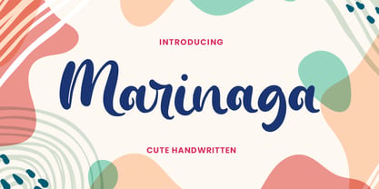 Marinaga - Cute Handwritten font with a natural handwritten feel. This handmade font will make your design has a beautiful natural touch for each details. It is perfect for any design project as Invitation,logo, book cover, craft or any design purposes. This font is PUA encoded which means you can access all of the magical glyphs and swashes with ease! It also features a wealth of special features including alternate glyphs and ligatures.
 - Jackleen by Create Big Supply,
$15.00 Jackleen is a signature font with ligature. Be mesmerized by its beautiful style and use it to create beautiful wedding invitations, beautiful stationary art, eye-catching social media posts and more! This font is PUA encoded which means you can access all the amazing glyphs and ligatures easily Features: Uppercase & lowercase Numbers and punctuation Multilingual Ligatures PUA Encoding Full Character Set !"#$%&'()*+,-./0123456789:;?@ABCDEFGHIJKLMNOPQRSTUVWXYZ[\]^_`abcdefghijklmnopqrstuvwxyz{|}~¡¢£¤¥§¨©ª«®¯°±²³´¹º»¿ÀÂÃÄÅÆÇÈÉÊËÌÍÎÏÑÒÓÔÕÖ×ØÙÛÜÝÞßàáâãäåæçèéêëìíîïñòóôõö÷øùúûüýþÿ•†‹›‒–ˆˇ˜€“‘ŸœŒš˚”’ıžŠ
 - Bardi by ParaType,
$30.00 An original typeface designed for ParaType in 2004 by Armenian designer Manvel Shmavonyan. Based on the lettering created in 1970s by outstanding Armenian type designer Henrik Mnatsakanyan (1923-2001) of the same name. In Armenian 'Bardi' means 'Poplar'. Extra compressed decorative stenciled typeface. Its letterforms resemble many Neo-Classicism extra compressed faces and magazine lettering of the 1950s-60s. For use in advertising and display typography especially in magazine headlines and logos.
 - Rocker Squad by Letterara,
$14.00 Rocker Squad is a natural dry brush font that has a cool bold display. It’s perfect for logos, quotes, posters, movies, and every other design which needs a unique bold touch. No matter the topic, this font will be an incredible asset to your fonts’ library, as it has the potential to elevate any creation. This font is PUA encoded which means you can access all of the amazing glyphs and ligatures with ease!
 - Flower Hill by Olivetype,
$18.00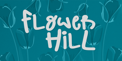 Introducing Flower Hill, a fun and quirky display font! With its vibrant and playful design, Flower Hill will instantly bring a touch of fun to any project. Whether you're designing a party invitation or creating social media graphics, this font can adapt to any theme or style effortlessly. Flower Hill Font features : Standard Latin Numbers, symbols, and punctuations Multilingual Support. Fully accessible without additional design software Simple Installations Works on PC & Mac Thank You.
 - Yellow Cute by Sakha Design,
$10.00 Yellow Cute is a lovely and modern script font that exudes elegance and sophistication. Each letter is delicately crafted with fluid and graceful strokes, creating a timeless look that’s perfect for everything from wedding invitations to branding projects. Its sleek and chic style will add a touch of class to any design. Keep in mind that the font is PUA encoded, meaning that you can access all delightful glyphs and swashes effortlessly.
 - Allesia by AEN Creative Studio,
$14.00 Allesia is a gorgeous handwritten font that brings its own unique style to any design project. It will elevate a wide range of design projects to the highest level, be it branding, headings, wedding designs, invitations, signatures, logos, labels, and much more! This font is PUA encoded which means you can access all of the cute glyphs and swashes with ease! It also features a wealth of special features including alternate glyphs and ligatures.
 - Midas Style by Sensatype Studio,
$15.00 Midas Vintage Retro Ligature Font is a well-balanced contemporary font with a fancy, unique, and versatile vintage serif, font that you can combine to get any variations and unique shapes easily just in seconds with choose alternates of them. I What's Included: Character set A-Z Uppercase & Lowercase Numerals & Punctuation Accented Characters (West Europe) Stylistic alternates Works on PC & Mac Recommended using Adobe Illustrator or Adobe Photoshop. Wish you enjoy our font. :)
 - Balloon Duwoor by Sealoung,
$12.00 Balloon Duwoor is a cute and playful display font. It looks wonderful on a variety of designs, both formal and informal. Whether you’re using it for crafting, digital designS, presentations or greeting cards, it’s perfect! What's Included: - glyphs - Works on PC & Mac - Simple installation - Can be accessed in Adobe Illustrator, Adobe Photoshop, Affinity Design. - Fonts include multilingual support. Thank you very much, this font will make your project easier. Saiful Anwar - Sealoung studio
 - Bonalisha by Almarkha Type,
$33.00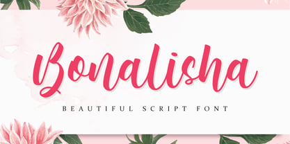 Bonalisha Beautiful Script font perfect for any creative design. This handmade font will make your design has a beautiful natural touch for each details. It is perfect for any design project as Invitation,logo, book cover, craft or any design purposes. This font is PUA encoded which means you can access all of the magical glyphs and swashes with ease! It also features a wealth of special features including alternate glyphs and ligatures.
 - Melatie by Almarkha Type,
$29.00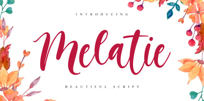 Melatie Beautiful Script font perfect for any creative design. This handmade font will make your design has a beautiful natural touch for each details. It is perfect for any design project as Invitation,logo, book cover, craft or any design purposes. This font is PUA encoded which means you can access all of the magical glyphs and swashes with ease! It also features a wealth of special features including alternate glyphs and ligatures.
 - Snemand by Hanoded,
$15.00 Snemand, in Danish, means Snowman. Quite appropriate for the last month of the year! The font is all caps, but upper and lower case letters can be interchanged and it includes alternates for all lower case letters. Snemand is a very legible font and has that great 'unevenish' look - making it a great typeface for packaging and books. Enjoy the snow - while it lasts and go out. You might even build a Snemand!
 - Tulk's Victorian Banner by Greater Albion Typefounders,
$14.50 Tulk's Victorian Banner revives the tradion of 'Banner' typefaces-lettering within their own lozenge or cartouche, that made such an appealing feature in many old type foundries catalogues. Tulk's Victorian Banner makes a wonderful feature of lettering in any piece of period inspired design. It compleiments our recent Fitzgerald space especially well, but can be used alongside any typeface of your choice where you want to bring a touch of period flamboyance.
 - Norden by Heinzel Std,
$17.00 Norden is an elegant and modern all caps serif font. Fall for its ravishing style and use it to create gorgeous logos, headline, title, branding, wedding invitations, beautiful stationary art, eye-catching social media posts, and much more! This font is PUA encoded which means you can access all of the amazing glyphs with ease! Features : Norden Regular version, serif font All Caps, Numerals and more punctuations. Multilingual support for various languages
 - Branch by Peliken,
$15.00 Branch font with Cyrillic support is perfect for branding, Slavic motives, Russian menu design and many more Font includes a full set of gorgeous uppercase and lowercase letters, numbers, a large selection of punctuation. You can use this font for design logos, quotes prints on t-shirts and other. Ethnic serif font. Authentic slavic stylized alphabet bold symbols. Creative minimal latin character set. Please NOTE - Mock ups and photo are NOT included.
 - Dramatic Style by Juncreative,
$19.00 Dramatic Style is a delicate, elegant and flowing handwritten font. It has beautiful and well balanced characters and as a result, it matches a wide pool of designs. Add it to your most creative ideas and notice how it makes them come alive! This font is PUA encoded which means you can access all of the glyphs and swashes with ease! It features a varying baseline, smooth lines, gorgeous glyphs and stunning alternates.
 - Whale Show by Olivetype,
$18.00 Whale Show is a fun display font with a youthful, whimsical, and bubbly feel, great if you need to create a friendly, playful mood in your design. This font is also quite versatile and easy to work with. You can use it for logos, posters, headlines, etc. So what’s included : Basic Latin Uppercase and Lowercase Numbers, symbols, and punctuations Multilingual Support. Fully accessible without additional design software Simple Installations Works on PC & Mac Thank You.
 - Mochalosta by Almarkha Type,
$23.00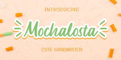 Mochalosta - Cute Handwritten font with a natural handwritten feel. This handmade font will make your design has a beautiful natural touch for each details. It is perfect for any design project as Invitation,logo, book cover, craft or any design purposes. This font is PUA encoded which means you can access all of the magical glyphs and swashes with ease! It also features a wealth of special features including alternate glyphs and ligatures.
 - Felicity by Fenotype,
$35.00 Felicity is a tightly cut heavyweight display serif. Felicity has strict kerning and it creates strong looking words just by typing - but if you need even more try any of Felicity’s many OpenType features: Discretionary Ligatures, Stylistic, Titling or Swash Alternates. Felicity has also a small selection of ornaments you can from the Character Window. Felicity is also equipped with Contextual Alternates and Standard Ligatures that prevents letters from colliding. Both features are automatically on.
 - Debora Celina Script by Gatype,
$5.00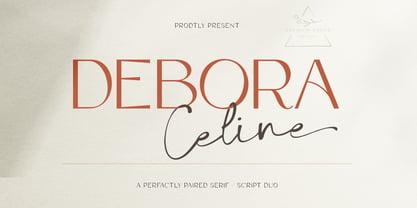 Debora Celina is a font Duo Script and Serif that is simple and unique looking.This customizable font will look great on a variety of design ideas such as Christmas themes,valentines, posters, invitations, weddings, branding projects, social media posts, magazines, book covers and more. This will add a fun and friendly touch to any of your projects.This font is PUA encoded which means you can access all the glyphs and sweeps easily.
 - Shooting Star by Stefani Letter,
$10.00 Shooting star is a cool and playful handwritten font. It is defined by smooth curves and is perfect for kids theme or cheerful designs. but also It’s ideal for book, packaging and logo projects. Add this lettered font to your designs and notice how it makes them come alive!. This font is PUA encoded which means you can access all of the cute glyphs with ease! It also features a wealth of including ligatures.
 - Fierce by Sensatype Studio,
$15.00 Fierce is a Futuristic Sport Font that special created for Sport and Technology design needs with Modern style. A New Sport font that we created special for Modern branding needs, with Futuristic style that ready to add value of your brand. Fierce Futuristic Sport Font ready with: Uppercase and Lowercase characters Numbers and Punctuations Preview as a inspirations that you can do with Fierce font Available for PC and Mac Wish you enjoy our font. :)
 - Summering by Letterara,
$12.00 Summering is a fresh, sweet, and friendly handwritten font. Its friendly feel makes this font incredibly versatile, fitting a wide range of contexts. Its distinct and well-rounded letters make this font a masterpiece. Add it to your creative ideas and notice how it makes them stand out! This font is PUA encoded which means you can access all of the awesome glyphs with ease! It also features a wealth of special features including ligatures.
 - Family Queen by Rotterlab Studio,
$15.00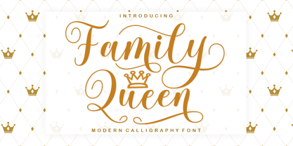 Family Queen is a beautiful script font with many alternative styles, this font looks natural, elegant and perfect for any extraordinary project. Family Queen is suitable for various products such as invitations, product packaging, product design, crafter, labels, photography, watermarks, logos & branding. Everything can be accessed using software that supports Opentype, such as Adobe Indesign, Adobe CS Illustrator, Adobe Photoshop CC, and Corel Draw. Please send a message if you have questions, Thank you :)
 - Debaya by Sensatype Studio,
$15.00 Debaya is an Old Retro Vintage Font An Old Retro Vintage font that special created with Display style for Headline Vintage Retro Project, Unique branding needs, with extra alternates in unique style that ready to add value of your brand. Debay Old Retro Vintage Font ready with: Lowercase and Uppercase characters Numbers and Punctuations Preview as a inspirations that you can do with Montainous font Available for PC and Mac Wish you enjoy our font.
 - Houstoner Script by Martype co,
$19.00 Houstoner Script is a signature script font designed with carefully handcrafted. Also suitable for branding, T-shirt, Wedding Invitation, Classic Design, Logotype, and any project. With two style make you easier to design everything. Comes with many ampersand set to make your design prettier than yesterday, this font also can make you happy when you design something even that you don't like, and of course this font make your design classy, elegant, luxury!
 - Jerhiyof by Stringlabs Creative Studio,
$29.00 Jerhiyof is a delicate, elegant and flowing handwritten font. It has beautiful and well balanced characters and as a result, it matches a wide pool of designs. Add it to your most creative ideas and notice how it makes them come alive! This font is PUA encoded which means you can access all of the glyphs and swashes with ease! It features a varying baseline, smooth lines, gorgeous glyphs and stunning alternates.
 - Vennesia by Andrey Font Design,
$10.00 Vennesia is a sweet handwritten font. Fall in love with its authentic feel and use it to create gorgeous social media posts, wedding invitations, beautiful stationary art and much more! It also features a wealth of special features including alternate glyphs and ligatures. This font is PUA encoded which means you can access all of the cute glyphs and swashes with ease! Whether you’re looking for fonts for Instagram or calligraphy scripts for DIY projects.
 - Asterlight by NREY,
$19.00 Hi, friends! Introducing new typeface - Asterlight. It is a new display font with 2 styles and cool characters. Asterlight has multilingual support includes cyrillic. Many ligatures make your typography most variable. It works well with normal size text and for large displays or short words. You may combine uppercase and smallcase in the text body, as alternates symbols. The Asterlight typeface is suitable for : product packaging, labeling, logo, classic shop, ethnic shop, titles, etc
 - Solvetta by Grezline Studio,
$12.00 Solvetta is a light and charming handwritten font with a unique feel. It will add a bold feel to any design project! You can use Solvetta font to make a logo for branding, typography design, magazine or book cover, website header, product packaging, invitation, quotes, t-shirt design, label poster and more. Feature : - Multilingual Language - Works on PC & Mac - Simple installations - Accessible in the Adobe Illustrator, Adobe Photoshop, Adobe InDesign, even works on Microsoft Word.
 - Antique Slabserif JNL by Jeff Levine,
$29.00 Antique Slabserif JNL is a reinterpretation of Monotype's Modern Antique 26, released in 1909. The name of the typeface is an oxymoron because Modern conflicts with Antique. Despite many critics of the "mechanical" look of the font's design, it has developed a bit of charm with age and the passing of time. Available in both regular and oblique versions, Antique Slabserif JNL can be used as both a text and headline font.
 - Autumnilla by Almarkha Type,
$29.00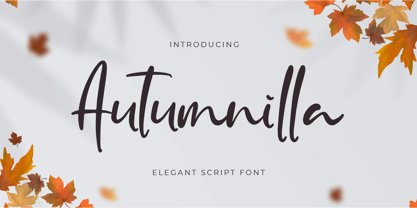 Autumnilla – Elegant Script font with a natural handwritten feel. This handmade font will make your design has a beautiful natural touch for each details. It is perfect for any design project as Invitation,logo, book cover, craft or any design purposes. This font is PUA encoded which means you can access all of the magical glyphs and swashes with ease! It also features a wealth of special features including alternate glyphs and ligatures.
 - Lazy Kids by Gassstype,
$22.00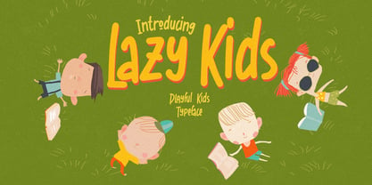 Hello Everyone, introduce our new product Lazy Kids is a Playful Kids Typeface with a natural feel. This handmade font will make your design has a beautiful natural touch for each details. It is perfect for any design project as Invitation,logo, book cover, craft or any design purposes. This font is PUA encoded which means you can access all of the magical glyphs. It also features a wealth of special features including ligatures glyphs.