10,000 search results
(0.052 seconds)
- Newshawk JNL by Jeff Levine,
$29.00Jeff Levine's Newshawk JNL emulates the tall, condensed headline fonts often used years ago when an urgent story broke and a newspaper rushed an "Extra" edition to the streets. - ITC Portago by ITC,
$29.99 ITC Portago was designed by Luis Siquot, who admits to a tendency toward unusual typefaces that can be read in text yet also work well in display settings. ITC Portago is a robust alphabet of caps and slightly smaller caps. It is a stencil face, based on the lettering on crates and luggage. Siquot says that his intention drawing Portago was to obtain a neutral, classical, very condensed grotesque stencil shape that is readable in text sizes, showing at the same time the 'movement' produced by the nicked edges. And of course the more obvious rough effect in headline sizes." At small sizes, Portago is best set with slightly looser letterspacing, as capital combinations usually do. Portago includes numerals in both full and small caps proportions.
 - Corsica by AVP,
$19.00 Corsica is an all-purpose geometric sans-serif typeface of visually uniform stroke thickness. The design seeks to be reminiscent of classic 20th Century grotesques with a crisp modern appearance and opentype features that are now expected. Coverage includes most Roman languages, Greek and basic Cyrillic. Each font contains a standard set of features including fractions, small capitals etc. The family contains six weights, two widths and three lowercase size options, together with an italic variant for each. The are three standard 4-font families for each size variant and a further three corresponding families for Condensed versions. The versatility provided by this extensive family has many useful applications. In particular, the choice of small, medium and large lowercase letter sizes (SX, MX, LX) allows designers to select an appropriate style for suitable impact and legibility in different situations such as headlines, captions, signage, web menus etc. Although each of the three size options will work equally well in most situations, the middle size (Corsica MX) would generally be the preferred choice for lengthy texts.
 - VLNL Kouseband by VetteLetters,
$30.00 The starting point for VLNL Kouseband was spotted by Donald DBXL Beekman on the Christian Reformed Church in the Dutch town of Naarden. The iron wire lettering contained a number of unusual characters and details, which eventually led to this five weight family. The Kouseband fonts mix elements of geometric sans serifs and upright unconnected scripts, with a hint of Dutch school writing. VLNL Kouseband is monolinear and has an very large cap height compared to the (lowercase) x-height, giving the capital letters an elongated condensed appearance. Kouseband is the Dutch word for ‘garter (belt)’ and also gave the name to a long tropical bean known as Yardlong bean. Kouseband beans are a common ingredient in Roti and other Surinamese dishes. As the Dutch Christian church is sometimes referred to as ‘Zwarte kousenkerk’ (Black stocking church), and stockings are held up by garter belts, we have come full circle and VLNL Kouseband has a name. VLNL Kouseband contains a set of oldstyle numbers matching the lowercase letters, and a couple of wider alternate capitals (HMNOQ) to enhance the liveliness of your designs.
 - Grenale by insigne,
$24.00 The elegant Grenale brings a new look to the classic didone. This shimmering sans-serif family with its mild deco shades alters the typical serifs and terminals of the classic style to form a gracefully eye-catching, high-contrast font. While high-contrast, sans serif forms tend to disappear in the copy, Grenale's meticulously designed features exhibit proper balance in the spacing and in the thorough improvements of its contours. The rigorous consideration given these details leaves a delicate typeface that doesn't get washed out in certain applications. Its pure, polished, geometric structure has a glamorous sensitivity, drawing heavily from the inspiration of the haute couture influence. Grenale's thin weights are simple but vibrant--elegant forms that naturally lend themselves to high fashion journals, high-end branding, and other five star applications. With added energy and power, the thicker weights with their ink traps and optical compensation intensify the gravitas for a statelier look to the graceful forms. Grenale's upright versions are also matched by optically adjusted italics, intentionally tailored to maintain their counterparts' sharp edge, causing the font's fierce characteristics to shine through the refined face. The typeface also includes a wide variety of alternates that can be accessed in any OpenType-enabled application. The stylish features include a large group of alternates, swashes, and meticulously precise details with teardrop terminals and alternate titling caps to accessorize the font. Also included are capital swash alternates, old style figures, and small caps. Take a look at the informative PDF brochure to see these features in action. OpenType enabled applications such as the Adobe suite or Quark can take full advantage of the automatic replacing ligatures and alternates. This family also offers the glyphs to support a wide range of languages. It's time to think high-class. Graceful and confident, Grenale's carefully crafted features transfer pleasantly to each page with elegant charm. With its variety of alternate glyphs and its high, classy contrast, this five star font is a great option for bringing a more refined look to your work. Production assistance for Grenale provided from Lucas Azevedo and iKern.
 - Refrankt by Groteskly Yours,
$35.00 Refrankt is a multifunctional sans-serif type family with 18 styles, ranging from Thin to Black with matching italic styles. The key visual feature of Refrankt is its wider characters and expanded proportions, which accentuate the character of the type family and extend its application. Refrankt works well as a display font but can also be used comfortably in headings and larger bodies of text. Refrankt offers a clean and thoughtful take on the functional grotesque sans-serif style and can be used in a wide variety of projects, from UI/UX design to packaging and branding. It can also be employed as a font for logos and word marks. Whether you're looking for bold, sturdy letterforms or dynamic flexibility, Refrankt readily adapts to any task. Refrankt would look at home in projects related to technology, athletics, industrial design and many more. The functionality of Refrankt is defined by its multilingual support (200+ languages) and its extensive OpenType features, such as Case-Sensitive Punctuation and Stylistic Alternates, among many others. In addition to a standard set of figures, Refrankt includes tabular figures, old-style figures, superiors, inferiors, and fractions. The entire character set comprises over 800 glyphs. Free trials available on our website: https://groteskly.xyz/ Refrankt Features: • 18 Fonts (9 Upright & 9 Italic) • Variable Font • 800+ characters/font • 200+ languages supported • Extensive OpenType Features • Versatile and Multifunctional
 - Dosca by Ardyanatypes,
$10.00 Dosca is a unique and elegant display font with a unique Sans serif style. This font offers nine different thickness options, ranging from Thin to Black, providing a variety of options for a variety of applications. Each Dosca thickness has its own unique characteristics, so you can choose the one that best suits your design aesthetic. For example, Thin may be suitable for a light and elegant design, while Black may be used for a more dramatic and bold appearance. Additionally, Dosca comes with various OpenType features. These include features such as ligatures, which allow certain characters to be combined beautifully, and alternative letterforms that provide more design options. With this feature, you can create more interesting and unique text elements in your designs. Dosca is designed to support multiple languages so it is suitable for use in many countries. This makes it very versatile and suitable for a variety of multilingual design projects. So, if you're looking for a font that combines the beauty of Sans serif with a variety of thickness options, useful OpenType features, and multilingual support, Dosca is the perfect choice to meet your design needs. A guide to accessing all alternatives can be read at http://adobe.ly/1m1fn4Y Adobe Photoshop go to Window - glyphs Adobe Illustrator go to Type - glyphs Features: A – Z Character Set a – z Characters set Numerals & Punctuations Ligatures & Alternates Multilingual
 - Kadigan by Missy Meyer,
$12.00 Kadigan: (noun) A placeholder word. A kadigan can be used to substitute for any other noun: persons (John Doe, Acme Company), places (Anytown, 123 Main Street) or things (whatchamacallit, thingamajig). Just like kadigans can be used in nearly any situation, the members of the Kadigan font family can be used in nearly any design! These sans-serif beauties are clear and easy to use, but they also have a little bit of wiggle in their strokes and weights, for a fun hand-lettered look! The three members of the family: - Kadigan Light: An all-purpose lightweight stroke, with sharp corners. - Kadigan: A nice mid-weight stroke, with slightly rounded corners. - Kadigan Heavy: A thick, chonky stroke with pillowy rounded corners. And each member of the family is packed with features, including: - All of the basic stuff you expect from every font; - 340+ extended Latin characters; - Cyrillic character set; - Greek character set; - Those character sets? Support over 110 languages! - 52 double-letter ligatures for variety (That's right, EVERY letter. I'm looking at you, savvy revved trekkers!); - A full set of small caps (including Cyrillic & Greek); - And more! (Seriously, it was hard to stop.) So whether your work is in English, Español, български, ελληνικά, Türkçe, or over a hundred other languages, this cute and fun sans-serif may be just what you've been looking for!
 - ALS Direct by Art. Lebedev Studio,
$63.00 ALS Direct is an open and dynamic typeface with clear-cut letterforms that make it instantly readable. It lends text a neutral, yet agreeable and modern feel. Direct has nine font styles convenient for the purposes of navigation signage. Regular-style letterforms are rather wide, because direction signs are likely to appear before readers at an angle, so the type needs to withstand perspective distortions. And as signs and boards may vary in size, Direct was developed to include several width variations. Condensed fonts can be used where horizontal space is limited, allowing you to keep proper height and readability of the characters. A signage typeface must be easily readable from some distance away and have simple letterfoms with clear-cut features to quickly identify characters. Designing a type for a potentially wide range of purposes calls for a universal approach. If not destined to be used for navigation in a particular building, it shouldn’t incorporate any peculiar elements to agree with certain design or architecture. All of the above determined our choice of a sans serif with large apertures and definite features allowing readers to instantly recognize letters. Descenders are made compact not to interfere with the line below. And the low contrast between thick and thin strokes renders all elements equally perceptible. The x-height is significant, close to the cap height, which inhances readability of the lowercase type. There are two reasons why directions must not be set in all caps. Firstly, lowercase letters are more diverse and include ascenders and descenders identifying some of the letters in the line. And secondly, having learned to read, people recognize word shapes rather than individual letters, which makes lowercase text more readable. With Direct being a signage typeface, first to be developed were its width variations, and different weight styles and italics were added later. Another thing to be kept in mind was that signs often use dark background colors, and black type on a white background appears smaller than white type on a black background. Direct is the first Cyrillic typeface created for navigation purposes. Before that, designers could use the Cyrillic version of Frutiger (Freeset) developed by Adrian Frutiger for the Paris Charles de Gaulle International Airport, and a number of other, mostly body copy, neutral sans serif types. However, signs and boards were dominated by Arial, which Direct would be glad to replace offering elegance and lucidity of form instead of type bluntess. Direct was designed as a signage typeface, but its neutral style and clear-cut letterforms suggest various other ways of application.
 - Calicanto by Sudtipos,
$39.00 Alejandro Freitez’s first commercial typeface is inspired by contemporary serifs and newspaper typography. Calicanto is a compact typeface with strong serifs, symmetrical curves and a vertical axis. It has open counters and a generous x-height with slightly condensed characters and low contrast strokes. The design of its letters are simple (with a precise rationale), and it is ideal for combining different variables and typographic bodies, for digital and printed media. Each of the 12 variables has 750 glyphs (supporting more than 90 languages), with small caps, ligatures, lining figures by default, OldStyle and tabular, mathematical and currency symbols for each set of numerals, intelligent fractions, lower and upper numerals, glyphs sensitive to capital letters and circular numerals, among other OpenType functions that make it ideal for composing demanding texts for books, magazines, newspapers, annual reports, and much more.
 - Aurelux by Andfonts,
$16.00 Just imagine, You are searching for the font that should be modern and elegant at the same time, which is not possible with typical sans or serif fonts. So, Aurelux is what You need. This font in your library can be with you for decades, because it is useful and It's open border to create graphic designs that require "modern but elegant touch". : cafe, bar, theatre, spa, hotels, overall entertainment industry, travel, vintage, retro signs. Font is gender neutral. But, when You see Bold and black styles You understand that this font can be in the design of some industrial companies, factories, construction companies that want to show that they have history and heritage. You can contact me if You need questions: andfontscontact@gmail.com
 - Pergamon by URW Type Foundry,
$39.99 The Pergamon series is a creation of Alfons Schneider (1890–1946) and was issued by the foundry of Ludwig Wagner in Leipzig in 1937/1940, though the website of the Klingspor-Museum says that several of the faces were probably produced after the death of Schneider. This digital version is extended with the necessary OT characters and signs, while also the “символы кириллицы” are added. Also, in addition to the members of the family designed by Schneider, regular, italic, bold and bold italic extended versions were produced. The specimens of Ludwig Wagner stated emphatically: “In allen Graden werden beide K K geliefert”, so these two forms are in all the faces, while the two condensed members also have k k, as the specimens said that this alternative character was also in these two faces.
 - Nursery Rhyme Initials by Celebrity Fontz,
$24.99High-quality ornamental initials superimposed on nursery rhyme backgrounds such as Humpty Dumpty, Ride a Cock Horse, Baa Baa Black Sheep, Tom Tom the Piper's Son, Rub-A-Dub-Dub, the Queen of Hearts, Old King Cole, and many others. Includes one set of A-Z ornamental initials conveniently assigned to both the upper and lower case alphabet characters. Ornate and accurate renderings that can be used for the beginning of paragraphs in any children's publication or texts relating to nursery rhymes and fairy tales. - Shpinoza MF by Masterfont,
$59.00 A practical font family with 5 weights for all your day by day design needs: headlines, body text, signage etc. High legibility at small sizes. An extended sans serif typeface with rounded endings that provides unique softness appearance without losing legibility.
 - Editorial Comment JNL by Jeff Levine,
$29.00Editorial Comment JNL is another wood type in the Grotesk (also spelled Grotesque) style of sans serif faces. Popular in newspaper headlines as well as posters, the slightly irregular stroke widths add an old-fashioned charm to any print project. - Martend by Balevgraph Studio,
$12.00 Martend elegant classic sans serif typeface with many style alternatives to choose from. This typeface is perfect for elegant logos, interior magazines, beauty products, packaging products, quotes, and more. What's Included? Uppercase, Lowercase, Numbers, Punctuation Ligatures & Alternates Multilingual support PUA encoded
 - Childos Arabic by NamelaType,
$29.00 The sibling of Childos, with with additional Arabic glyphs for more international fun. Handwritten rough sans serifs style, as well as the development of free and attractive ligature to fill the space between letters and make playful children feel designs.
 - PUJI by pororoca,
$25.00 PUJI is an experimental sans serif perfectly suited for graphic design and any display use. It could work for web, print, motion graphics etc. PUJI has the other version "PUJI narrow" which has different letter's width in "A","V","W".
 - Diane Amorta by Grezline Studio,
$10.00 Diane Amorta is a cute handdrawn sans serif font crafted very carefully. Diane Amorta is perfect use for a logo for branding, typography design, product packaging, invitation, quotes, t-shirt design, label poster, special events and anything that need handwriting taste.
 - Lacerika by Iwm Design,
$10.00 Introducing Lacerika font family, a versatile and sleek sans serif font designed to elevate your projects, whether you're creating a stunning website, captivating app, eye-catching brochure, or unforgettable branding materials. Unlock the potential of your creativity with Lacerika today!
 - Littera Plain by ABSTRKT,
$30.00Littera project is a modern interpretation of one of the most widespread sans serifs in USSR "TextBook font". It is not an exact revival, but an interpretation of its typographic feel executed in two different ways: Littera Plain and Littera Text. - Hujan by Ezzazebra,
$15.00 A sans-serif font that I created when long raining in my city. The shape is clean with a dynamic semi-bold stroke. It's suitable for a minimalistic, "less is more" design and useful for display and larger body text.
 - HV Harietta by Harmonais Visual,
$12.00 Harietta - a semi-geometric, clean sans serif with a retro, humanist and elegant touch.. Specially designed for simple, clean, humanist projects. The font is perfectly suitable for creating elegant, clean, retro design such as logo, packaging, social media, and more.
 - Franie by That That Creative,
$50.00 Franie is a variable geometric sans serif font family with 72 styles. Fully customize the width, weight and italic angle. This modern clean typeface is perfect for contemporary layouts for print, magazines, posters, web, social media, branding logos, or whatever.
 - Reflex Pro by RMU,
$30.00 Reflex Pro with its two styles - Regular and Solid - is a great sans serif all-caps font family, ideal for headlines, posters and signboards. The solid style makes it easy for you to fill the letters with photographs or background patterns.
 - Wonderella by Almarkha Type,
$29.00 Wonderella is a cute and casual sans serif font with an incredibly friendly feel. Whether you’re looking for fonts for Instagram or calligraphy scripts for DIY projects, this font will turn any creative idea into a true piece of art!
 - Crossten by Horizon Type,
$25.00 Crossten is a rounded sans serif type family based on geometric forms. It comes in 20 styles, 10 uprights and matching italics. Each weight includes extended language support and many opentype features. Crossten is incredibly useful for nearly any creative design.
 - Akbeatso by Koval TF,
$39.99 Akbeatso is a modern contemporary font for posters, visual identity and striking visual communications. Though Akbeatso is ready to be a text typeface. Modern sans serif with emotional contrast in stems and some irregular construction brings actual vibes to your designs.
 - Darbuka MF by Masterfont,
$59.00 A practical font family with 4 weights for all your day by day design needs: headlines, body text, signage etc. High legibility at small sizes. An extended sans serif typeface with rounded endings that provides unique softness appearance without losing legibility.
 - BigBang by Pesic,
$19.00 BigBang is geometrically monoline, modular sans serif font, square looks glyphs. It is suitable for use in the fields of architecture, urban planning, techniques, electronics, advertising, futuristic themes, film, computers, phones, video games, logos... BigBang contains Latin and Cyrillic glyphs.
 - Littera Text by ABSTRKT,
$30.00Littera project is a modern interpretation of one of the most widespread sans serifs in USSR "TextBook font". It is not an exact revival, but an interpretation of its typographic feel executed in two different ways: Littera Plain and Littera Text. - Vartek by Inhouse Type,
$44.55 Vartek is a geometric sans-serif type family. Inspired by the "space-age" and functionalist aesthetics, Vartek is a high-contrast utilitarian design. It comes in a variety of weight and width options. Opentype features include inferiors, superiors, fractions and ligatures.
 - Tanto by Lomax Design,
$17.00 Tanto is a boxy, futuristic sans-serif that is not directly inspired by any particular typestyle, but is more of an exploration of shapes. It has a very modern feel and although very geometric, still has a character that's not robotic.
 - Coldera by Haniefart,
$12.00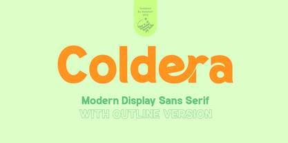 Coldera is a sans serif typeface deliberately modified to make it look beautiful, attractive and modern, available in uppercase, lowercase, ligature and alternative letters. Coldera is suitable for business brands, brochures, posters, magazines, comics, t-shirts, banners and many others.
 - Otomo by The Northern Block,
$18.00 A super wide san serif typeface inspired by event graphics for Sheffield music venues in the 1990s. Most influential work by The Designers Republic (TDR). Details include four unique styles, extended European character set, manually edited kerning and Euro symbol.
 - Aircheck JNL by Jeff Levine,
$29.00 Inspired by building signage for the old CBS broadcasting facility in Los Angeles, Aircheck JNL is a bold, wide sans serif - reminiscent of Art Deco lettering of the 1940's, and perfectly suited for headlines and titles that get attention.
 - Seriatim by David Thometz Design,
$24.95 As seen on Typophile.com, DTD Seriatim is a new and innovative take on the geometric sans-serif, with a wide variety of alternate characters and elegant ornaments to make it a highly versatile type for display or more discreet text use.
 - TOMO Bossa by TOMO Fonts,
$12.00 TOMO Bossa is a cartoon inspired sans serif, ideal for kids related stuff, in print or digital, like posters, video, websites or books! This beauty also speak Cyrillic! The complete family comes with a Black and Black Rough style. Enjoy!
 - MBF Space Habitat by Moonbandit,
$18.00 Space habitat is a modern minimalist sans serif display font. Wide and wavy with a lot of rounded corner and sharp edge, emphasize the futuristic scifi theme. Perfect usage includes logo, poster, display, headline, t-shirt design and many more.
 - Hanibal by Hazztype,
$20.00 Hanibal is a Bauhaus-inspired display sans serif, simple geometric letter shapes, and low contrast across all styles. Comes in three styles, hanibal is perfectly made to be applied especially in logos, headlines, signage, store front, and any other advertising purpose.