6,134 search results
(0.014 seconds)
- KD Hachure by Kassymkulov Design,
$9.95 KD Hachure is a display, geometric font with layering possibilities. Combine the two layers to achieve different color combinations or use them separately to achieve a completely different look. Kerning is optimized so that all latin letters are connected. With the default leading 120%, descenders connect with the top of accents. Set the leading to 100% manually if you want to connect descenders with the top of uppercase or ascender letters.
 - KD Bombarda by Kassymkulov Design,
$9.95 KD Bombarda is a piano-key, stencil and display face that will make your projects stand out from the crowd by introducing some interesting letter shapes. Originally designed in 2013, it's now been edited to provide smoother curves with broader character and feature support including Cyrillic.
 - Kis FB by Font Bureau,
$40.00 Transylvanian punchcutter Nicholas Kis cut a leading figure in 18th century Amsterdam. Series of his matrices survived at the Ehrhardt typefoundry. From these Chauncey Griffith at Mergenthaler cut the Janson series in 1936. Morison at Monotype followed with Ehrhardt. David Berlow takes full advantage of current techniques to produce these splendid and adventurous display series to complement one of the great oldstyle texts; FB 2007
 - KD Dekorat by Kassymkulov Design,
$12.00 KD Dekorat - Artdeco font for display use. Initially submitted for a font design competition, it's now redrawn and polished with extra glyphs incl. Cyrillic script. All letters stay true to the uniformity of the modular design. Create catchy headlines, logos, large billboard messages that will drag client's attention. Pairs nicely with sans families.
 - Paper Cut - Personal use only

- Oh You Klid NF by Nick's Fonts,
$10.00This “Anglican” style typeface is based on an 1880s release from St. Louis’ Central Type Foundry originally named Euclid. It’s amazingly versatile, easily at home in both formal and fun settings. All versions of this font include the Unicode 1250 Central European character set in addition to the standard Unicode 1252 Latin set. - there goes the neighborhood - Unknown license

- Crop©Bats AOE - Unknown license

- 101! Dad Goes Formal - Unknown license

- Good Eatin Pro AOE by Astigmatic,
$24.95 A heavy weight - softened sans serif that is not only friendly, but easy on the eyes. Good Eatin was inspired by the title screen from the 1942 Warner Bros. cartoon titled, "Dog Tired". The original all capitals setting had a charming & quiet nature to it, which became even more pronounced when drawn out to include a lowercase set. Later expanded upon to include a Small Caps set, Good Eatin Pro achieves a wider, even more electric appeal. Loaded with personality, Good Eatin Pro is joyful and stands out without being an eyesore, and while being based on vintage lettering it has a contemporary feel.
 - Franken Jr AOE Pro by Astigmatic,
$24.95 Franken Jr. Pro was inspired by the title screen from the 1966 Hanna Barbera cartoon titled, "Frankenstein Jr." The original titling had a unique presence to it, overflowing with charm and offbeat personality. The addition of a Small Caps set, Unlimited Fractionals, Superiors & Inferiors, and Ordinals gave the a bit more serious, but not too serious) titling stance to the Franken Jr. Pro typestyle. Franken Jr. Pro truly embodies the comic lettering of its time, and gives designs a lively retro spark.
 - Maybe I Was Joking by PizzaDude.dk,
$20.00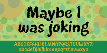
- Customs Paperwork Pro AOE by Astigmatic,
$24.00 Customs Paperwork Pro brings the unique style of the NuMode Type No. 61 vintage typewriter keyset to the digital age. Antique typewriters have an incredible warmth and appeal to them, primarily because of their unpredictable "grunge" results that were a mix from the force of keystrokes to the wear of the ribbon and paper texture. This typeface is further fleshed out with SmallCaps and extensive figure sets to add a more serious note to the nature of the typeface, when needed. WHAT'S INCLUDED: Extensive language support. Customs Paperwork Pro has accented and special characters that support the following languages: Afrikaans, Albanian, Basque, Bosnian, Breton, Catalan Cornish, Corsican, Croatian, Czech, Danish, Dutch, Embu, English, Esperanto, Estonian, Faroese, Filipino, Finnish, French, Galician, German, Hungarian, Icelandic, Irish, Indonesian, Italian, Kurdish, Leonese, Luxenbourgish, Malay, Maltese, Manx, Maori, Meru, Morisyen, North Ndebele, Norwegian Bokmål, Norwegian Nynorsk, Nyankole, Occitan, Oromo, Polish, Portuguese, Rhaeto-Romanic, Romanian, Scottish Gaelic, Scots, Serbian (Latin), Slovak, Slovenian, Spanish, Swahili, Swedish, Tagalog, Turkish, Walloon, & Welsh. Antique typewriters are incredible, but they aren't something easily accessible to everyone, nor do most people want to fiddle with white out edits and the like. That's why typewriter fonts that capture the flavor of vintage typewriters are a no brainer (convenient and easily editable). I hope you enjoy playing with it just as much as I had fun making it.
 - Restraining Order Pro AOE by Astigmatic,
$24.00 Restraining Order Pro brings the unique style of a vintage typewriter keyset to the digital age. Antique typewriters have an incredible warmth and appeal to them, primarily because of their unpredictable "grunge" results that were a mix from the force of keystrokes to the wear of the ribbon and paper texture. This typeface is further fleshed out with SmallCaps and extensive figure sets to add a more serious note to the nature of the typeface, when needed. WHAT'S INCLUDED: Extensive language support. Restraining Order Pro has accented and special characters that support the following languages: Afrikaans, Albanian, Basque, Bosnian, Breton, Catalan Cornish, Corsican, Croatian, Czech, Danish, Dutch, Embu, English, Esperanto, Estonian, Faroese, Filipino, Finnish, French, Galician, German, Hungarian, Icelandic, Irish, Indonesian, Italian, Kurdish, Leonese, Luxenbourgish, Malay, Maltese, Manx, Maori, Meru, Morisyen, North Ndebele, Norwegian Bokmål, Norwegian Nynorsk, Nyankole, Occitan, Oromo, Polish, Portuguese, Rhaeto-Romanic, Romanian, Scottish Gaelic, Scots, Serbian (Latin), Slovak, Slovenian, Spanish, Swahili, Swedish, Tagalog, Turkish, Walloon, & Welsh. Antique typewriters are incredible, but they aren't something easily accessible to everyone, nor do most people want to fiddle with white out edits and the like. That's why typewriter fonts that capture the flavor of vintage typewriters are a no brainer (convenient and easily editable). I hope you enjoy playing with it just as much as I had fun making it.
 - Bundle Of Joy NF by Nick's Fonts,
$10.00This in-yer-face kinda face is based on a broad brush font from "The New ABC of Showcard & Ticketwriting" by C. Milne, published in Australia in the late 1930s. Brought to my attention by Ms. Kat Black, and named in honor of Ms. Kat's grannie, to whom the book originally belonged. The Postscript and Truetype versions contain a complete Latin language character set (Unicode 1252); in addition, the Opentype version supports Unicode 1250 (Central European) languages as well. - Data Error AOE Pro by Astigmatic,
$24.00 The Data Error AOE Family was one of my earliest typefaces, at a time when I had become obsessed with all forms of "digital/techology" typestyles. It's been awhile since the early 2000's, but I've had a hankering for awhile now to revisit this typeface, giving it a more expansive language character set and fill it out with some Opentype features. Inspired by some old printouts of BASIC programs and an Atari 1050 Disk Drive manual with pin printer examples, comes the familiar yet oddly restricted style with this Data Error family. This family comes complete with Regular and Bold versions with their respective Oblique versions. Odd pin printer restrictions inherent in this typeface are: no characters extend below baseline or above ascender line, (except international accents). A nostalgic typeface for computer programmers everywhere, strong and legible at any size, Data Error is perfect for so many purposes, get it today!
 - Bobolha by Intellecta Design,
$24.90Bobolha is a funny font good to use in kids stuff, like birthday decorations and this kind of joy things... - Acaphy by Craft Supply Co,
$20.00 Introducing Acaphy – Bubble Font: Fun and Playful Typography for Kids Playful and Vibrant Looking for a font that radiates fun and playfulness for your kids’ themed projects? Acaphy – Bubble Font is your ideal choice! With its bubbly and rounded characters, it instantly infuses joy and excitement into your display. Clear and Readable Acaphy – Bubble Font ensures easy readability, making it perfect for young readers. Its simple letterforms help children recognize and understand text effortlessly. Whether it’s educational materials, invitations, or posters, this font does the job brilliantly.
 - id-Kaiou-LightOT - Personal use only

- id-Kaze2OT-Light - Personal use only

- id-POPMARU-LightOT - Personal use only

- id-Cinema-LightOT - Personal use only

- id-isi-LightOT - Personal use only

- id-kairyu1OT-Light - Personal use only

- KD Arguru Stencil by Kassymkulov Design,
$20.00 KD Arguru Stencil is a geometric display font that will give your projects an elegant look. It breaks away from traditional stencil faces by using circle as a main design element. Originally published in 2014, it's now been updated with changes to letter shapes, curves, OT features.
 - Kis Antiqua Pro by RMU,
$45.00 These Typoart fonts were redesigned and revived for modern use. The italic style got an entire set of swash caps, and both styles contain superior and inferior numerals as well as the historical long s.
 - ID Larques One by Izouuss Design,
$16.00 Introducing Larques One, a display sans-serif typeface that brings a fun, friendly and delightful vibe to your projects. Larques One is not too serious and has a touch of playfulness that makes it perfect for branding, packaging, headlines, posters and more. Larques One is also equipped with multi-language support and offers excellent versatility and customisation.
 - Zone23_Two Kinds of Love III - Unknown license

- Collins OE Demo - Unknown license

- WHEN THE GOES SUN . SCENE - Unknown license

- Shanks Antique 5 AOE Pro by Astigmatic,
$24.95 Shanks Antique 5 Pro is an iconic antique English typestyle rooted in tradition. It is the historical revival and elaboration of the “Antique No. 5” typeface created by Stevens, Shanks & Sons in 1865. What began as a basic character set of Capitals, lowercase, numerals, and a small handful of punctuation characters has been expanded to a full character set including unlimited fractionals, superiors & inferiors, ordinals, tabular & proportional figures, and an expanded language glyph set, all with a smallcaps and Caps to Smallcap set to match. Reviving history looks and feels good. Perfect for wedding invitations, historical ephemera recreations, and classically elegant text settings.
 - Data Error Vert AOE Pro by Astigmatic,
$24.00 The Data Error Vert AOE Pro family is another spinoff of my Data Error AOE Pro family. Quite simply, it takes on a slightly different feel than the original pin matrix grid by stroking across all vertical glyph lines. The vertical lines break up the readability somewhat of the original grid and lend a more tech vibe to the family. Check out the range of posters created to see the various Capitals, Lowercase, smallcaps and varying styles that the family has to offer and how it both differs from and compliments the original Data Error AOE Pro family.
 - Data Error Horiz AOE Pro by Astigmatic,
$24.00 The Data Error Horiz AOE Pro family is a spinoff of my Data Error AOE Pro family. Quite simply, it takes on a slightly different feel than the original pin matrix grid by stroking across all horizontal glyph lines. The horizontal lines add more readability to the original grid and lend a more sci-fi vibe to the family. Check out the range of posters created to see the various Capitals, Lowercase, smallcaps and varying styles that the family has to offer and how it both differs from and compliments the original Data Error AOE Pro family. Be sure to note that the "family" price is the same as the "individual" price, so buy the family for the price of a single font!
 - Lollipop - Personal use only

- KG What Does The Fox Say by Kimberly Geswein,
$5.00 Kid-friendly left-tilted ball and stick handwriting.
 - Yoko Smile - Personal use only

- Kinder Garten by Artyway,
$18.00 Vibrant, lively color font with a Mexican fiesta flair for joyful, child-centric designs. Celebrate the joy of childhood with this vibrant and colorful font. Perfect for creating a lively atmosphere in schools, kindergartens, and festive events. The playful, funny design captures the essence of a child's world, making it ideal for projects that speak to the hearts of both kids and adults. From birthday parties to school logos, this font adds a touch of joy to every design.
 - GothicHorror by Ingrimayne Type,
$9.00 What would a typeface look like that used a gothic arch, a feature of medieval architecture, as its motif? I decided to find out and the result was not beautiful but frightful. GothicHorror uses a pointed arch almost everywhere that it can be used and is unlike anything else. It is ugly, but for some uses that ugliness is a virtue.
 - Organic Weekend by Bogstav,
$14.00 It is monospaced and organic. Two words that often not goes hand in hand, but in this case it does. You have 6 different versions of each letter to choose from, or just let the Contextual Alternates do the job by automatically cycles as you type.
 - Kis Antiqua Now TB Pro by Elsner+Flake,
$99.00 In the course of the re-vitalization of its Typoart typeface inventory, Elsner+Flake decided in 2006 to offer the “Kis Antiqua” by Hildegard Korger, in a re-worked form and with an extended sortiment, as an OpenType Pro-version. After consultation with Hildegard Korger, Elsner+Flake tasked the Leipzig type designer Erhard Kaiser with the execution of the re-design and expansion of the sortiment. Detlef Schäfer writes in “Fotosatzschriften Type-Design+Schrifthersteller”, VEB Fachbuchverlag Leipzig, 1989: No other printing type has ever generated as far-reaching a controversy as this typeface which Jan Tschichold called the most beautiful of all the old Antiqua types. For a long time, it was thought to have been designed by Anton Janson. In 1720 a large number of the original types were displayed in the catalog of the „Ehrhardische Gycery“ (Ehrhardt Typefoundry) in Leipzig. Recently, thanks to the research performed by Beatrice Warde and especially György Haimann, it has been proven unambiguously that the originator of this typeface was Miklós (Nicholas) Tótfalusi Kis (pronounced „Kisch“) who was born in 1650 in the Hungarian town of Tótfal. His calvinistic church had sent him to the Netherlands to oversee the printing of a Hungarian language bible. He studied printing and punch cutting and earned special recognition for his Armenian and Hebrew types. Upon his return to Hungary, an emergency situation forced him to sell several of his matrice sets to the Ehrhardt Typefoundry in Leipzig. In Hungary he printed from his own typefaces, but religious tensions arose between him and one of his church elders. He died at an early age in 1702. The significant characteristics of the “Dutch Antiqua” by Kis are the larger body size, relatively small lower case letters and strong upper case letters, which show clearly defined contrasts in the stroke widths. The “Kis Antiqua” is less elegant than the Garamond, rather somewhat austere in a calvinistic way, but its expression is unique and full of tension. The upper and lower case serifs are only slightly concave, and the upper case O as well as the lower case o have, for the first time, a vertical axis. In the replica, sensitively and respectfully (responsibly) drawn by Hildegard Korger, these characteristics of this pleasantly readable and beautiful face have been well met. For Typoart it was clear that this typeface has to appear under its only true name “Kis Antiqua.” It will be used primarily in book design. Elsner+Flake added two headline weights, which are available as a separate font family Kis Antiqua Now TH Pro Designer: Miklós (Nicholas) Tótfalusi Kis, 1686 Hildegard Korger, 1986-1988 Erhard Kaiser, 2008


