10,000 search results
(0.026 seconds)
- BDR A3MiK by Typedifferent,
$35.00 The BDR A3MIK is an uppercase alphabet with alternatives including European/Eastern European, Russian Cyrillic, Greek and Japanese Katakana characters. Its strong, constructive, futuristic appearance works perfectly for titling in science fiction related media.
 - San Pedro de Atacama by RodrigoTypo,
$25.00 San Pedro de Atacama is inspired by the north of Chile, which was based on rustic elements, 4 elements were added, which contains linear, filled and textured, also accompanied by "Ruina" for the titles.
 - Alamanda by ErlosDesign,
$19.00 Allamanda is a handwritten monoline script. It features an incredibly classic style, while still keeping a friendly feel. Perfect for titles, headings and logotypes for blog, products and lifestyle imagery like quotes and stuff.
 - How Dare You by Typefactory,
$14.00 How Dare You is a Retro Vintage typeface, perfectly suitable for creating quotes, Fashion, lifestyle design such as logos, title, and magazine and more. Features: – Uppercase – Lowercase – Symbols & Punctuation – Numeral – Ligature – Alternate – Multilingual Support
 - Racerz by Almarkha Type,
$29.00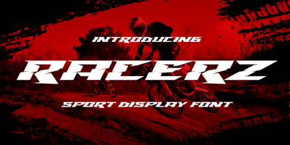 Introducing Racerz - Sport Display with strong and Sport nuances. very suitable for the title, logo, typography, clothes, magazines, brochures, packaging and much more for your design needs, making your designs more modern and professional.
 - Headline Nouveau JNL by Jeff Levine,
$29.00 The hand lettered title for the 1890s book called “The Octopus” featured extra bold Art Nouveau lettering with rounded serifs. This is now available as Headline Nouveau JNL in both regular and oblique versions.
 - Aquacia by Coniglio Type,
$9.95A stencil font you won't find anywhere else. Part of Market LTD, a collection of limited faces, mostly alpha-numeric and some just plain numeric, used primarily in retail and display situations and titling. - Hexadot Thin by Konst.ru,
$6.00Font with hexagonal dots for texts, names, logotypes, titles, headers, topics etc. Big sizes of this font can be used for posters, t-shirts and other surfaces. Also good for the three-dimensional inscriptions. - Industriality JNL by Jeff Levine,
$29.00 Industriality JNL is a slab serif based on a classic typeface. Its condensed design allows for placing more copy inside a smaller area, and is best suited for ad headlines, titling or short blurbs.
 - Wood Factory by Kustomtype,
$25.00 Wood Factory is a western styled typeface created by Kustomtype. Wood Factory is an old Wood Type favorite. It was designed specifically for display, headlines and titles where a wanted poster look is desired.
 - Never Give Up by Seemly Fonts,
$14.00 Never Give Up is a simple and friendly handwritten font, featuring the perfect amount of trendiness. This original look will appeal to a wide range of crafty ideas, from letterheads and titles to stationery.
 - Section by Monotype,
$29.99The Section Bold Condensed font is patterned with lines dividing each letter into small sections. Section Bold Condensed is a headline face with uses ranging from book titles on technological subjects to embroidery books. - Chisel Brush by A New Machine,
$14.00 Chisel Brush is a handmade font created with a, um, chisel brush... It has a casual handmade feel that works well at larger sizes in headers or titles. Also works great in branding applications.
 - Brando by Studio K,
$45.00 Brando is a rounded slab serif that is both firm and gentle, soft and strong. It’s a versatile display face ideal for branding, titling and headlines where warmth and weight are of equal importance.
 - Hexadot by Konst.ru,
$-Font with hexagonal dots for texts, names, logotypes, titles, headers, topics etc. Big sizes of this font can be used for posters, t-shirts and other surfaces. Also good for the three-dimensional inscriptions. - Slab Compact JNL by Jeff Levine,
$29.00 Slab Compact JNL was based on the printed title found on the box cover of a 1950s-era word games set called “Lex-O-Grams” and is available in both regular and oblique versions.
 - Christmas Celebration by Yoga Letter,
$14.00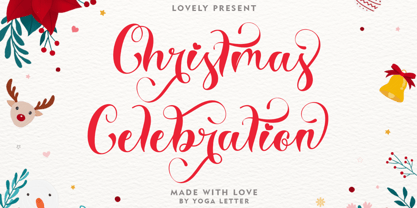 "Christmas Celebration" is a beautiful and unique handwritten font. This font features uppercase, lowercase, lowercase alternative, swashes, titling, multilingual support, binders, numbers, and punctuation. great for Christmas, weddings, invitations, promotions, social media, and more.
 - Bernhard Cursive by RMU,
$25.00 Bernhard Cursive ExtraBold is one of Lucian Bernhard's most expressive fonts which are worth to get preserved for now and times to come. An ideal font face for advertisements, posters, flyers, titles and subtitles.
 - Haworthia by Cmeree,
$12.00 Haworthia is a handwritten font. Its shape is inspired by self-titled succulent plant - the font has long and a bit swirled endings. Haworthia provides multi-language support which includes cyrillic glyphs as well.
 - Stallman by Par Défaut,
$9.00 Stallman is a Display font family containing 100 Fonts (Regular, Oblique and Variables). It's a perfect font for titles There are also 6 OpenType features (Numerator; Denominator; Fraction; Case Sensitive; Ordinals; Access All Alternates)
 - Stable by WAP Type,
$15.00 stable logo font stable is a new font for design of sharp and powerful logos. The font is suitable for creating wordmarks, Logo, titles, taglines. Use alternates to emphasize separate letters in your text.
 - Shine Glitter by Skinny Type,
$15.00 Shine Glitter is a handwritten font with a modern calligraphy feel. Shine Glitter is perfect for modern projects, titles, blogs, logos, branding, invitations and more! Accent characters are included at this time. Thank you!
 - Tralee by Tanincreate,
$12.00 Tralee Font family consist of 2 styles, regular with outline and bold filled with background colour. Originally designed for packaging typography, also would be suitable for titles, headlines, greeting cards, adverts, books and more.
 - George Town by FoxType,
$12.00 Introducing George Town new generation Typeface with 6 Weights. George Town Typeface created with the vision of to attract the audience to your brand . The finest details of this typeface are methodically and mathematically created. George Town is created with all the tasks of a corporate font and also for the usage in a variety of projects, including branding, logos, titles, headlines, servers, screens, display, digital ads, and everything else. We are putting a lot of effort on this font as a long-term project. The Typeface includes Six Weights. Thin, ExtraLight, Light, Regular, Medium, and SemiBold Features: Numerals, extended punctuation & Basic Symbols(200+ Glyphs). Expert kerning and quality crafting. Uppercase Letters & Lowercase Letters 24x7 Support Thank you for taking the time to look into the font.
 - Aracne by Antipixel,
$15.00 The all-caps Aracne collection features tall, slightly scrawled letterforms, and is available in regular, condensed and ultra condensed styles for maximun functionality. With a spiritted quality and casual character, it will add a personal style to your work. Aracne is a full of energy handwritten font, with light and regular styles, including italics. It provides a wide range of possibilities, including the Aracne Soft and Stamp, which offer softer and cleaner edges. It’s has a glyph coverage supports languages such as English, Spanish, French, German, Polish, Czech, among many others. It’s recommended usage is for display titles, and small ammount of text, because of its good legibility and quality of glyphs. Check out her sisters Aracne Condensed and Aracne Ultra Condensed!
 - Gucina by Yukita Creative,
$11.00 Introducing the elegant and modern Gucina Geometric Font Family - a versatile typeface that will add a touch of sophistication to your designs. With its clean lines and geometric shapes, this font type is perfect for creating minimalistic logos, advertisements, web designs, and branding materials. The Gucina Geometric Font Family comes in a variety of weights, making them ideal for a variety of design projects. Whether you need a bold and impactful font for titles, or a light and airy font for body text, Gucina has you covered. Its timeless design ensures that your creations will remain relevant and stylish for years to come. Don't settle for plain fonts - improve the quality of your designs with the Gucina Geometric Font Family.
 - Sansmatica by Fontop,
$14.00 Sansmatica is a clean and modern sans serif typeface. It has 28 fonts that work as a multi-purpose design solution. It consists of regular and condensed fonts that can be used for different cases: regular fonts are perfect for copy while Sansmatica condensed fonts are more specific - they make emotional associations and are perfect when you want your headlines or advertising to be noticeable. Also suite great for greeting cards, posters, branding, name card, stationary, design title, blog header, art quote, typography. Sansmatica has 7 weights with light looking more modern, fashionable and the bold giving a more rugged impression is perfect for headlines, logos, quotes, and more! It is interesting to use bold condensed fonts – both vertical lines and weight draw attention.
 - North Bay Grotesk by FoxType,
$16.00 Introducing NorthBay Grotesk new generation Typeface with 5 Weights. NorthBay Typeface created with the vision of to attract the audience to your brand . The finest details of this typeface are methodically and mathematically created. NorthBay is created with all the tasks of a corporate font and also for the usage in a variety of projects, including branding, logos, titles, headlines, servers, posters, screens, display, digital ads, and everything else. We are putting a lot of effort on this font as a long-term project. The Typeface includes Five Weights. Light, Regular, Medium, SemiBold and Bold Features: Numerals, extended punctuation & Basic Symbols(200+ Glyphs). Uppercase Letters & Lowercase Letters 24x7 Support Thank you for taking the time to look into the font.
 - Leco 1976 by CarnokyType,
$- LECO 1976 is a headline display typeface in OpenType format. The title at the 1976 bottle of Lečo became an inspiration for creating this font. Besides the regular weight of the font, the font is drawn in light and bold font styles too, while each of these typefaces consists of a special alternative of an embedded diacritic. The font contains several specific styles as Stencil, Pixel, Tride, Shadow which combinations offer interesting possibilities for the typesetting. The metrics and kerning of every glyph of the font (except several glyphs in Bold) are identical. All the signs share the same character and size of the capital letters. This font is best used on strong posters or as a headline display typeface.
 - HS Ali by Hiba Studio,
$59.00 HS Ali was designed in memoriam of my brother - Ali Abu Afash who was martyred during the last aggression on Gaza in summer 2014. HS Ali introduced a modern OpenType Arabic typeface, which had the characterstic, features of Kufi style with noticeable both curvy and sharp segments; beside the refinements of its letters that made it more readable. HS Ali is a display font that has been designed to be used in titles in modern graphic and publication projects. It supports Arabic, Persian, Urdu and Kurdish languages and contains four weights: Light, regular, medium and bold which can be condsiderd as and elaboration to the library of Arabic fonts contemporary models that meet the variant purposes of designs for all tastes.
 - Appetite Pro by Serebryakov,
$39.00 Appetite Pro is a total upgrade of the world wide popular display font Appetite (2011). It is based on original lettering and belongs to the upright script like. Appetite Pro consists of 10 weights of the refreshed curves — 5 regular and 5 italic — from Light to Heavy. It’s a multilingual and international font, with a full Western Latin, Cyrillic (Russian, Belarusian, Ukrainian) and basic Greek support. The Appetite Pro font family is specially designed for food identity and packaging design projects. In addition to standard letter cases, Appetite Pro also includes dingbats set. Due to the 10 weights font palette, you can solve a wide variety of professional problems without spending money on extra fonts for titles, subtitles, and main text. Try and buy!
 - Altissimo by Soneri Type,
$32.00 Altissimo is a display type family, derived from the Ample typeface, it has large x-height, optical mono linear and a bit squarish in nature. It has a smooth curve instead of sharp angles formed by the junction of two strokes, which is a prominent feature of its design. It is designed to be a little eye-catching yet legible. It has clear and distinguishable letterforms, which helps to elaborate and emphasise the message. It is graphically strong and commands viewer's attention. The overall appearance of this type is suitable in setting it as heading, title, headline, etc. The type family consists of seven weights viz. Thin, ExLight, Light, Regular, Medium, Bold and ExBold. Altissimo is designed by Aakash Soneri in a period between 2017 and 2018.
 - Brant Ford by FoxType,
$16.00 Introducing BrantFord new generation Typeface with 5 Weights. BrantFord Typeface created with the vision of to attract the audience to your brand . The finest details of this typeface are methodically and mathematically created. BrantFord is created with all the tasks of a corporate font and also for the usage in a variety of projects, including branding, logos, titles, headlines, servers, screens, display, digital ads, and everything else. We are putting a lot of effort on this font as a long-term project. The Typeface includes Five Weights. Light, Regular, Medium, SemiBold and Bold Features: Numerals, extended punctuation & Basic Symbols(200+ Glyphs). Expert kerning and quality crafting. Uppercase Letters & Lowercase Letters 24x7 Support Thank you for taking the time to look into the font.
 - Cal Roman Modern by Posterizer KG,
$19.00 Cal Roman Modern is one more font from PKG “Cal” (Calligraphic) group. This time for calligraphic sketches we used a wide brush instead of the iron pen. Instead of minuscule letters, there are Small Caps (which are the same weight as capitals). Because there is no difference in the stroke thickness of capital letters and lowercase capital letters the difference in height is only one pen width, because of that, it is possible to use small capitals together with capital letters without noticing a difference in the thickness of the letters. Cal Roman Modern font is rhythmic, informal elegant, bright and light. As such, this font is widely used in the typographic creation of shorter text forms: magazine, catalogs and book titles, logos, posters, movie spots, banners...
 - Cantiga by Isaco Type,
$19.00 Cantiga is a monophonic song or melody, sometimes repetitive, often with unpretentious themes. In the same simplicity, this font family combines robustness with some very fine details, with 44 versions for various purposes. Choose thinner (or thicker) versions for titles, and intermediate versions (normal, medium, etc.) to small sizes. Explore the condensed versions when you need to save space. Use the light versions for special cases in huge sizes. Cantiga intended to be your new "Swiss army knife" sans typeface. The Cantiga family consists of 2 widths (normal and condensed) with 11 weights each, plus their respective italic versions. The fonts are available in OpenType PS format and have extended character set to support CE, Baltic, Turkish as well as Western European languages.
 - Capital Love by Harald Geisler,
$68.34 Capital Love just contains capital letters decorated with hearts. By pressing a lowercase button a alternative to the uppercase letter will appear. All shapes are drawn individually and do not oblige a geometrical system. The lighthearted vivid ductus remind me of a quality that can be found in the dynamics of Keith Haring drawings. Capital Love is a part of the Light Hearted Font Collection that is inspired by a recording of Jean Baudrillard with the title, "Die Macht der Verführung" (The Power of Seduction) from 2006. Further inspiration came from the article, "The shape of the heart: I'm all yours". The heart represents sacred and secular love: a bloodless sacrifice. by British writer Louisa Young printed in EYE magazine (#43) London, 2002.
 - Ample by Soneri Type,
$50.00 Ample is a display type family, optical mono linear and a bit squarish in nature. It has a smooth curve instead of sharp angles formed by the junction of two strokes, which is a prominent feature of its design. It is designed to be a little eye-catching yet legible. It has clear and distinguishable letterforms, which helps to elaborate and emphasise the message. It is graphically strong and commands viewer’s attention. The overall appearance of type is suitable in setting it as heading, title, headline, etc. The type family consists of six weights viz. Thin, ExLight, Light, Regular, Medium and Bold. Considering the nature of this type family, italics have been excluded. Ample is designed by Aakash Soneri in a period between 2013 and 2014.
 - Natom Pro by Mostardesign,
$25.00 A family of fonts with rhythm. Natom Pro is a modern and geometric font family adapted to the professional requirements of graphic designers, web designers and mobile application developers. Comprised of 19 styles including 8 styles designed especially for the design of headlines, Natom Pro is a very versatile family of fonts that can be used in many projects such as editorial design, branding or corporate identity creation, design of posters or logos, the creation of websites or the development of mobile applications. This font, with a resolutely contemporary aspect, also hides a unique typographic design since it has 2 distinct styles (Title and Roman) which have 2 different typographic rhythms in order to graphically differentiate the appearance of titles, subtitles and long paragraphs. With this design of rhythmically differentiated glyphs according to the styles, the headlines have a very graphic aspect while the long texts have a more classic aspect in order to keep optimal readability in all scenarios. Its architecture is also very modern since it was designed and drawn with particular attention to the geometry of the forms with clear and open endings cut at 90 degrees. The number of styles has also been simplified with the most used thicknesses (Extra Light, Light, Regular, Medium, Bold and Black) in order to speed up your graphic design process. For the more experienced designers, Natom Pro is also available in a variable version. Natom Pro is also equipped with powerful OpenType features like case sensitivity, true small caps, full ligature set, tabular figures for tables, « old styles figures » to elegantly insert figures into your sentences, numbers circled or even alternative characters to satisfy the most demanding professionals.
 - Bankal by Hugo Kuder,
$10.00 After a few months my new typeface "Bankal" is here! To create it, I always tried to keep a 90 degree angle. In French when you say that something is "bancal" it means that it's not right. This is why I choose this as a name because despite the name she is right. And for the K it's just for the style here. Bankal is a sans-serif font with 3 variations (bold, regular, light) Check more on my website : https://www.hugokuder.com/ or my instagram : hugokuderdesign
 - ZiGzAgEo - Personal use only

