10,000 search results
(0.029 seconds)
- HeavyLOUDedge by TypoGraphicDesign,
$19.00 Headline Font / Display Font / Techno Fat Font HeavyLoundEdge with 4 styles (regular, bold, light, line) & 304 glyphs, including accents & €.
 - Eight Track program 4 is a distinctive font that carries the groovy and unapologetic essence of the 1970s. Designed by Fontalicious, this font encapsulates the nostalgia of an era known for its bold ...
- Limitless by SG Type,
$6.00 Say hello to “Limitless” – A versatile, modern, condensed font family, perfect for creating powerful, beautiful text. This all caps typeface contains 10 individual styles, making "Limitless" super versatile and fun to experiment with. Limitless includes 10 all caps weights: Limitless ExtraLight – Nearly weightless and very delicate Limitless Light – Beautiful and elegant Limitless Regular – A great midground between lights and bolds Limitless Bold – Big, bold and beautiful Limitless ExtraBold – Visually strong and authoritative 5x Limitless Italic (ExtraLight Italic, Light Italic, Regular Italic, Bold Italic, ExtraBold Italic) With its many weights and limitless possibilities, this typeface looks amazing in magazines, on posters, logos, for branding and headlines.
 - Diediedie - Unknown license

- Times New Romance - Unknown license

- HURTMOLD_ - Personal use only

- Mahaputra by Putracetol,
$14.00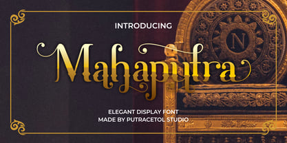 Mahaputra is a vintage display font that is classic, elegant, and unique. Mahaputra is great for any kind of display purpose from logos, t-shirt, apparel, quotes, product packaging, tittle headers, posters, merchandise, social media, labels, branding and greeting cards.
 - Afterthought JNL by Jeff Levine,
$29.00 Afterthought JNL is a light, bouncy and playful typeface . Perfect for any project that exudes a fun or casual theme.
 - Handana by Ingrimayne Type,
$9.95 Handana is an informal face with a simple but distinctive calligraphic look in four weights: light, plain, medium, and bold.
 - FT Brush by Fenotype,
$14.95 FT Brush is a calligraphy style font family of three members - light, regular & bold. Combine different cuts for vivid outcome.
 - Czaristane by Typotheticals,
$5.00 A rather light humorous font that can be used for many purposes. Updated in 2022 to add further bold versions
 - Northport by profonts,
$41.99 Northport is a jaunty,casual and non-connecting script that comes with six styles as light, medium, bold plus italics.
 - Anadolu by Glyphobet,
$24.99 Anadolu was inspired by the distinct style of sign lettering in rural Turkey, and refined based on sign lettering in Hungary. Shown here are samples in Turkish and Hungarian, as well as Finnish and Estonian, two other languages in the Finno-Ugric language group with Hungarian. The slight curve at the tops of ascenders and bottoms of descenders is inspired by the linguistic process of "vowel harmony" in Turkish and Hungarian. Anadolu is the Turkish name for Anatolia, the peninsula where Turkey lies. The name recalls another sans-serif typeface named for its country of origin. The tittle on the i is reimagined as a diacritic, and the dotless ı is reimagined as the basic, prototypical i. Too many typefaces treat diacritics as afterthoughts. Since diacritics are integral to the languages that inspired Anadolu, they were designed as core components of the typeface.
 - As of my last update in April 2023, "Fresh" by La Toya Grey may not be specifically known in mainstream font directories or among widely recognized graphic design communities. However, let's create a...
- Fauna Pro by Pasternak,
$12.00 Fauna Pro is the second generation of its previous version. Now it is more futuristic with a strange sci-fi spirit. Fauna Pro has more solid contours and thick letters. It compares with futuristic thematic, including such elements like robots, spaceships, electronics, cosmos, planets, nature, and modern architecture. Font family includes 6 font styles: extra light, light, regular, medium, semibold and bold. Every style contains 266 glyphs.
 - Rolan by Larin Type Co,
$12.00 Rolan This is a light elongated font that includes light, regular and bold weights, as well as these weights in a rough style. It is versatile and will perfectly fit into any project in both modern and vintage style, it is perfect for creating a logo, banners, flyers, labels, branding and much more This font family has only Capital letters and some of them are different.
 - Constellation Pro by Tilde,
$39.75 Constellation started with a simple geometric concept in the manner of Art Deco which gradually developed to a complete typeface, both upright and italic, total of seven weights. The concept allowed the font to be designed from Ultra Light in both very light and quite black styles. This Pro font is packed with all European and Cyrillic alphabets, small caps, variable figure sets and features .
 - VLNL TpLlum by VetteLetters,
$35.00 TpLlum is a typeface designed by TwoPoints for a festival in Barcelona called ‘Montjuïc de Nit’. Llum means light in Catalan. In the Montjuïc de Nit project the font was used in white over a dark grey background, letting the light of a backlit poster shine through. For this purpose the typeface had to be very bright, which was made possible by its heavy cut.
 - Draghord by Alit Design,
$19.00 Introducing Draghord, a bold and dynamic typeface that embodies the essence of superheroic power and adventure. This font is a visual journey into the realm of fire, swords, skulls, and wings, capturing the spirit of mighty heroes and formidable villains alike. Characteristics: Flaming Elements: Each letter of Draghord is adorned with fiery accents, reminiscent of a blazing inferno. The flames dance around the characters, conveying a sense of untamed power and intensity. Sword-Inspired Strokes: The letterforms draw inspiration from the sleek and sharp edges of legendary swords. The angular and precise strokes give the font a cutting-edge aesthetic, symbolizing strength and precision. Skull Motifs: Intricately integrated skull motifs within the font add an element of danger and mystery. The skulls serve as a visual reminder of the challenges faced by our superheroic characters, embodying both mortality and defiance. Dynamic Winged Elements: The font incorporates dynamic winged elements that soar across certain letters, emphasizing the theme of flight and freedom. These wings symbolize the superhero's ability to rise above adversity and transcend limitations. Usage Scenarios: Comic Books: Draghord is perfect for comic book titles, captions, and speech bubbles, adding a dramatic and visually striking element to the narrative. Movie Posters: Use Draghord to create attention-grabbing titles and taglines for superhero movies. Its bold and adventurous design will set the tone for epic storytelling. Gaming Graphics: Ideal for in-game text, Draghord adds a heroic touch to video game interfaces, especially in fantasy or superhero-themed games. Event Promotion: For superhero-themed events, Draghord can be utilized in promotional materials, posters, and banners to convey a sense of excitement and power. In Conclusion: Draghord is not just a font; it's a visual experience that transports you into the heart of superheroic tales. With its fiery, sword-inspired design, skull motifs, and dynamic wings, Draghord is the perfect typographic companion for any project seeking to channel the thrilling energy of the superhero genre. Unleash the power of Draghord and let your words ignite the imagination!
 - Cinema Macabre by Wing's Art Studio,
$10.00 Cinema Macabre: Horror Fonts Torn from the Pages of Giallo A Hand-drawn Display Font for Creating the Most Diabolical Horror Titles This loose and inky brush font takes its inspiration from the classic Giallo film posters of the 1960s to 1980s - a cult cinematic subgenre beloved for its stylish visuals, haunting soundtracks and exploitation led marketing. It's a devilishly drawn design that aims to capture the feeling of vintage horror, preserving analogue details of old print while remaining versatile enough to work across a variety of digital designs. The Cinema Macabre font family boasts six fonts, each containing a unique set of uppercase and lowercase characters, as well as numerals, punctuation and language support. Add to this a host of custom ligatures, underlines and graphic elements and you have an essential toolbox for creating truly hand-made looking title designs. Cinema Macabre if a font that rewards experimentation by mixing all the various upper and lowercase alternatives, with interesting combinations waiting to be found and inspire terror across your own movie posters, book covers, albums and editorials. Few other fonts offer the versatility to create such diabolical designs! A Brief Introduction to Giallo: In popular cinema, Giallo is a genre of mystery fiction and thrillers often containing slasher, psychological horror, exploitation, supernatural and erotic elements. The term giallo (meaning yellow) derives from a series of pulp novels published by Mondadori from 1929 taking the name from its trademark yellow covers. The series consisted of Italian translations of mystery novels by well-known authors such as Agatha Christie, Edgar Allan Poe and Raymond Chandler. The popularity of these cheap paperbacks eventually established the word Giallo as a synonym in Italian for a mystery novel. The cinematic Giallo subgenre developed during the 1960-80s and are noted for their vivid cinematography, memorable soundtracks and inventive gore-filled scenarios. Key examples include Dario Argento's Suspiria, Tenebrae and Deep Red - stylish films that at once influenced the American slasher (see Black Christmas and Friday 13th) up to todays horror in Censor and Last Night In Soho.
 - Rinzler AOE by Astigmatic,
$19.00 Rinzler AOE is a revival of a LetterGraphics film type called Caren. A modular, mechanical, sans-serif stencil all rolled up into one retro typeface. It's not an all-purpose typeface, it's not an everyday typeface, but it is a cool typeface for the right design projects. Rinzler AOE carries itself with a bold weighted style, and stencil cutouts that don't follow standard stencil formatting. It might be considered more of a techno stencil (if there is such a thing). It reminded me in a vague way of TRON, hence the main poster graphic styling, although it looks NOTHING like the Tron titling typeface. Nevertheless, it's a fun typeface that needed to be preserved and used again. WHAT'S INCLUDED: Extensive language support. Rinzler has accented and special characters that support the following languages: Afrikaans, Albanian, Basque, Bosnian, Breton, Catalan Cornish, Corsican, Croatian, Czech, Danish, Dutch, Embu, English, Esperanto, Estonian, Faroese, Filipino, Finnish, French, Galician, German, Hungarian, Icelandic, Irish, Indonesian, Italian, Kurdish, Leonese, Luxenbourgish, Malay, Maltese, Manx, Maori, Meru, Morisyen, North Ndebele, Norwegian Bokmål, Norwegian Nynorsk, Nyankole, Occitan, Oromo, Polish, Portuguese, Rhaeto-Romanic, Romanian, Scottish Gaelic, Scots, Serbian (Latin), Slovak, Slovenian, Spanish, Swahili, Swedish, Tagalog, Turkish, Walloon, & Welsh. One of my guilty pleasures is in taking the time to recreate historical typefaces as digital fonts, but a lot of incredible historical typestyles created as wood or metal or film type usually have bare bones character sets and have been lost or only exist as limited specimen proofs in old books. These typefaces may have more niché uses than modern typefaces, but I believe it is important nonetheless to preserve these typefaces for future generations. These typefaces, if nothing else, can often inspire new creations.
 - Moonstar is a font that captures the imagination, twinkling like a distant galaxy in a sea of darkness. It is more than just a collection of characters; it embodies a sense of wonder and cosmic adven...
- Love Wins by Resistenza,
$19.00 In 2007 we shared our first pride together. More than 1 million people took the streets of Madrid for this huge celebration … seeing the diversity of people supporting love was incredibly touching. Gay Pride is a celebration of freedom, human rights and the right to love whoever we want. It’s a memorial for the battles, the lives lost and the pain suffered while fighting for a growing list of equal rights. But let’s not forget there are still places where LGTBQ community is repressed and persecuted. As Letter crafters we love seeing the signs people design for their different pride parades, and we wondered… Why don’t we create a collection of handcrafted lettering to share some love and to add a typographic realness to the party? Love Wins Font is a series of 60 phrases handwritten with expertise and love specially designed to celebrate diversity. The lettering was crafted with different calligraphic tools creating diverse aesthetics. You can use them to create your signs, t-shirts, stickers, poster, banners.. all you need is to spread love during your Pride Celebrations (or day-to-day life!).
 - Liebelei Pro by Wannatype,
$29.90 “Liebelei” – dalliance, flirtation, hanky-panky; kind of diminutive of “Liebe” (German for love) The typeface Liebelei has its roots back in 1932, when Vienna-based painter Rudolf Vogl created the poster for a movie called Liebelei after the popular play by Arthur Schnitzler. Only the title letters existed of that typeface. I loved the letters from first sight and proceeded by adventurously interpreting the missing characters. The goal was to create letterforms that fit to the original from the 1930s and represent a modern multi-purpose font. It should be an easy-to-use italic font with warm and friendly details and a huge variety of alternates and languages. The characteristic curled ends of most letters provide a script touch to the Liebelei. The first font entirely designed was the bold one which corresponds to the original poster lettering, although I tweaked the proportions a tiny bit to a more contemporary shape. Liebelei covers Western, Central European, and Central Eastern European Languages and contains also complete Greek and Cyrillic character sets. Liebelei is best for poster design as well as detailed usage, for example handsome tables, since it supports small caps, different kinds of numerals and fractions.
 - Henrician by Greater Albion Typefounders,
$16.50 Henrician can claim two sources of inspiration. One of these was a set of beautiful capital letterforms seen on the cover of a 19th century album of engravings. The engravings contained therein depicted lovely examples of half-timbered Tudor architecture and there was a clear 'Tudor' intent behind the letterforms. The second source of inspiration is more conceptual-the title lettering of period films from the 30's to the 60's…think if the opening text when Errol Flynn plays Robin Hood, or think of Richard the Lionheart, or even that great comedy Classic 'Carry on Henry', and it's discussion of Sir Thomas de Cobbler….but we digress! Henrician is a set of eight display and text (but perhaps not Body Text) faces in a 'Tudor Revival' spirit. Like any good revival design they are somehow at home with a wide range period themed design work, covering the medieval until, perhaps, the 18th century, just so long as we're more concerned with fun and appearance than strict historical accuracy. The family will be at home in the realms of advertising, posters, cover design and web design. Try Henrician out today!
 - 1514 Paris Verand by GLC,
$20.00 This set of initial decorated letters was inspired by a font in use in the beginning of 1500s in Paris. Exactly, we have used the set that Barthélémy Verand employed for the printing of Triumphus translatez de langage Tuscan en François, (from “Triumph” of Petrarque) in the year 1514. Some letters, lacked, have been reconstructed to propose a complete alphabet. It appears that the printer used some letters to replace others, as V, turned over to make a A, or D to make a Q. The original font’s letters were drawn in white on a black background only, but it was tempting to propose a negative version in black on white. It is used as variously as web-site titles, posters and flyers design, publishing texts looking like ancient ones, or greeting cards, all various sorts of presentations, as a very decorative, elegant and luxurious additional font. This font supports strong enlargements remaining very smart and fine. It’s original medieval hight is about one inch equivalent to about four lines of characters. This font may be used with all blackletter fonts, but works particularly well with 1543 Humane Jenson, 1557 Italic and 1742 Civilite, without any anachronism.
 - Trapezoidal by Ingrimayne Type,
$9.00 The letters of Trapezoidal are like sheep: they do not like being alone but want to be part of a flock. Many of the individual letters of Trapezoidal look strange and unshapely in isolation because they are designed to fit into a pattern with other letters. That pattern is formed by alternating asymmetric trapezoids, with trapezoids that are wide at the top alternating with trapezoids that are wide at the bottom. The magic of the OpenType feature of contextual alternatives (calt) automatically alternates them. The fonts in the family are largely monospaced and have very tight letter spacing. (If for some reason one wants to use only one set of the letters, the letters will overlap unless one widens character spacing.) (If D and O are too similar, use the alternative versions of D.) The family has five weights and each weight has an italics formed by flipping the trapezoidal pattern over a vertical line. Like other alternating-character typeface families from IngrimayneType, this distinctive and visually-arresting family can be used for titles or advertising. (For another but very different typeface based on alternating trapezoids, see PoultrySign.)
 - Neo Latina by deFharo,
$12.00 Neo Latina is a classic sans serif typography in small caps of square proportions and rectilinear character with the ends of the rounded horns and a semi-stencil design that gives a futuristic aspect and of science fiction. Neo Latina is the right heiress of geometric fonts from the early 20th century inspired by the Bauhaus school and is specially designed for use in any size for both screen and print. Neo Latina is a very versatile typography for graphic design, you can use it in advertising posters, video games, film titles, logos, editorial design, etc. The Commercial version includes: - Two fonts: Regular & Bold - 460 glyphs. Latin Extended-A • OTF & TTF - Neo Latina fonts can be used unlimited for both Commercial and Personal projects. - The download file includes a PDF with the specimen sheet of typography. - OpenType features compatible with: Photoshop, Illustrator, QuarkXpress, Indesign. - OpenType Features: Subscript, Additional languages, Alternate Annotation Forms, Capital Spacing, Denominators, All Alternates, Oldstyle Figures, Superscript, Superiors, Superior letters, Standard Ligatures, Kerning, Extended Fractions, Small Capitals, Historical Forms, Inferiors, Fractions, Localized Forms, Numerators, Ordinals, Discretionary Ligatures, Scientific Inferiors, Slashed Zero. - Bitcoin & Chaos symbol: b# - a#(ligatures)
 - Quijote Sauvage by Lián Types,
$45.00 It was in the beginning of 2008 when I designed a font named Quijote, its predecessor. In the middle of 2009, I looked at it again and thought it could be a good idea to make an update of it. Variables and Features: Quijote Sauvage Pro is the most complete variable. It includes all the ligatures, alternates and swashes. It has the OpenType function in order to alternate glyphs easily when running applications which support this. The font is also offered separately. Quijote Sauvage Standard has the right glyphs to get an equilibrium between wildness and softness. It includes standard and discretionary ligatures. Quijote Sauvage Stylistic has the sharpest glyphs. Its decorative traces are discreet in order not to have problems as regards legibility. Its upper case are less wild than the other variables. Quijote Sauvage Text is the most discreet of its partners. This one was thought in order to improve legibility. Its ascenders and descenders are shorter, so the words are easier to read in small sizes. Quijote Sauvage Contextual, Swash and Titling, are the ones with wonderful terminals. They decorate words, adding a wonderful look of wildness or passion.
 - Last Dance by Wing's Art Studio,
$10.00 Last Dance: Redux - The 80s Feel-Good Script Font - Updated! Welcome to Last Dance: Redux, a new and improved version of my popular brush-script font inspired by 80s movie posters, VHS covers and Friday nights at the video store! This hand-drawn script aims to capture the feel-good vibes of movie blockbusters that won our teenage imaginations, while serving as the go-to font for recreating this unique and nostalgic period. The original Last Dance font features a gritty, hand-drawn texture that looks equally at home on an aerobics competition poster or steamy urban thriller - making great titles that look distinctly cinematic. Last Dance: Redux takes that original design and strips it back to it’s bare essentials resulting in a clean, uniform look that improves letter flow and readability. It’s also much lighter on system resources making it the preferred choice when using extensively across print and web projects. Both versions come with upper and lowercase characters along with punctuation, numerals and language support, plus two full sets of alternatives and a selection of underlines. Check out the visuals to see it in action!
 - Helen Bg by HS Fonts,
$19.00 The font package Helen Bg Family is in 5 weights and two widths, 18 styles: Thin, Thin Italic, Light, Light Italic, Regular, Italic, Bold, Bold Italic, Black, Black Italic, Light Condensed, Light Condensed Italic, Condensed, Condensed Italic, Bold Condensed, Bold Condensed Italic, Black Condensed and Black Condensed Italic. Helen Bg is made with Bulgarian Design of Cyrillic and is recommended for the publications for Bulgaria. Other version with standard Cyrillic is available from HermesSoft Limited. Typeface design: Vassil Nikolov. Release date: 1991 - 96, HermesSOFT Design notes and Technical data Helen belongs to the typefaces from the humanistic sanserif grotesk fonts. The font is for wide use – from the classical typesetting to the display typography. In the Bulgarian Code Page are included all vowels with accents that are really necessary for the typesetting in Bulgarian language, and are not included in the Cyrillic Code Page: Helen Is available in OpenType PostScript and WEB font formats.
 - Hoofer by Scholtz Fonts,
$15.00 Light and flexible, slightly retro, casual and readable, Hoofer combines 28 brush script, mono line script and sans-serif styles with ornaments into one Mega-Family. The different styles of the Hoofer Mega-family have been chosen to work together and to harmonize in a pleasing way. The Hoofer Mega-Family of fonts can be divided into three sub-families: Hoofer BRUSH subfamily: An eclectic group of five fonts. These are mainly joined scripts. Hoofer LINE subfamily: Seven mono-line scripts with joined letters in a number of weights, widths and styles. Hoofer SANS subfamily: Sixteen casual, Sans-Serif fonts. They are very readable and in a variety of weights & styles The mood of the Hoofer mega-family is light and flexible, slightly retro, casual and readable. It combines script and many sans-serif styles with ornaments into one Mega-Family. The different styles of the Hoofer Mega-family have been chosen to work together and to harmonize in a pleasing way. The Brush Sub-Family is designed for titling, packaging and display purposes, The Line Sub-Family can also be used for titling, packaging and display, however, it is less “showy”, and conveys an air of informality. The Sans Sub-Family is designed to shine as sub-heads and as body text. The wide range of Hoofline styles gives you, the designer, great flexibility in creating just the mood or impression that you want. Most of the fonts can use one or more OpenType Features. These can be accessed in a number of ways. The reason for this is that the major software producers provide different (and often conflicting) ways of accessing OpenType Features. In some cases such software manufacturers provide NO way of accessing certain OpenType Features. We have tried to remedy this by providing a highly flexible family of fonts. OPENTYPE (these OpenType features are only available in the “otf” fonts and not in the “ttf” fonts.) OpenType features that Hoofer makes use of are: Swashes (Word-Begin and Word-End Features); Alternate Numerals; and True Small Caps. ORNAMENTS In addition the Hoofer family has a font containing 94 ornaments. ALTERNATE NUMERALS You can access two sets of figures (numbers) in Hoofer Sans fonts. Both sets are tabular and lining but they differ in the height (but not the width) of the figures. The height of the alternate figures has been chosen so that they are compatible with the small caps. However, these alternate figures are available in ALL Hoofer Sans fonts, whether they feature small cap fonts or not. Hoofer has all the features usually included in a fully professional font. Language support includes all European character sets, Greek symbols and all punctuation. Opentype features include automatic replacement of some characters and discretionary replacement of stylistic alternatives.
 - Blackrocky by Letterara,
$18.00 Blackrocky is a natural dry brush font. a tough-looking font with natural strong brush touch ready to rock every design you make. this font has a striking look and a good flow font that can add a stylish to your designs. It’s perfect for logos, quotes, posters, packaging, movie title, youtube banner, clothing, and every other design which needs a strong touch. It is PUA encoded which means you can access all of the glyphs with ease! Add it confidently to your projects, and you will love the results.
 - Liveria by Subectype,
$17.00 Liveria is an urban font with natural hand-painted style. Suitable for any design needs, branding, urban design, modern advertising design, Book/Cover Title, special events, adventures, headlines, any brush lettering needs and more. Liveria comes with upper and lowercase Standard Characters, Punctuation, Numerals. And some glyphs variation of the OpenType features such as Standard Ligatures and Stylistic Set. Includes a range of multilingual support WHATS INCLUDED : Multilingual Support Ligatures and alternates font If you have any questions please don't hesitate to drop me a message :) Thank You, Subectype Studio
 - Galagar by Jadatype,
$12.00 Galagar is a font with a strong look. The font is suitable for your branding name, poster title, event, or group name, supported by the font that gives a strong effect to the reader. has its own market and fans. can be used in adobe illustrator, photoshop, or microsoft word. By purchasing this font, you will get: - Uppercase and Lowercase letters - Alternates Characters - Ligatures - Numbering and Punctuations - Multilingual Support - Works on PC or Mac - Simple Installation - Support Adobe Illustrator, Adobe Photoshop, Adobe InDesign, also works on Microsoft Word. Thank you
 - Chroman by Larin Type Co,
$16.00 Chroma this is a modern and elegant typeface. It carries a bold weight and with it in highlight the main thing, make a title or logo and much more. It can also be more expressive and playful, thanks to the many alternates that are harmoniously combined in this font and make it more attractive and expressive. Try to change the alternatives, ligatures and you will get a lot of options for your project that will make it unique. This font is easy to use and has OpenType features.
 - Hermit by Davide Romito,
$106.00 Hermit was born like a modern and personal reinterpretation of Gothic-style alphabets, where improvisation and personal taste have led the design towards a new aesthetic mix between gothic and modern typefaces, creating new glyphs with tweaked strokes to achieve a good level of legibility. Hermit is a modern gothic font designed for brave designers and for epic designs, available in three weights and variable fonts. It is good to use for Branding and Editorial projects with texts not too small, Advertising, Packaging, Labeling, and Book or Magazine titles.
 - Rhomer by Fargun Studio,
$14.00 Introducing Rhomer Serif Font This beautiful font will engage your audience and make your promotions and projects stand out. This font is designed with a bada curve in the middle so it looks really cool and brings your brand to life and add a touch of modernity and style with the Rhomer Serif Font. Use it for titles, logos, business cards, printed quotes, all kinds of invitations, cards, packaging and branding of your website or social media. Our font always includes Multilingual option to make your branding globally recognized.
 - Arcaro JNL by Jeff Levine,
$29.00 There are times when a typeface is used so consistently that it becomes somewhat synonymous with the subject it's used in. The opening and end titles for the ABC-TV series "Naked City" (1958-1963) were set in a bold version of a popular font emulating the look of calligraphic hand lettering. Arcaro JNL is a somewhat lighter and slightly modified version of this typeface and is offered in both regular and oblique versions. The name Arcaro comes from one of the regular characters in this superbly-written police drama, Detective Frank Arcaro.
 - Hello Kartina by madjack.font,
$14.00 Hello Kartina Script is a beautiful, organic, and fun hand-painted script with different basics and handkerchiefs that can be applied at the beginning and end of all lowercase letters. International support for most Western languages is included. For separate font swash, type lowercase a-z for initial swash and final swash. This font can be used for various purposes. Such as titles, signatures, , wedding invitations, t-shirts, letterhead, signage, labels, news, posters, badges etc. Thank you very much for searching and letting me know if you have questions.


