10,000 search results
(0.041 seconds)
- Eknaton by T4 Foundry,
$21.00The powerful Eknaton comes with slanted slabserifs, a new way to add some spring to the old Egyptian slabs. Eknaton echoes the tradition that started with Napoleon's Egyptian campaign 1798, and the simultaneous looting of Egyptian art. The imports led to new ladies fashion in Europe, new architecture and new typefaces like Antique (Figgins, 1815) and Egyptian (Caslon, 1816). The Egyptian faces were also the origin of the famous Clarendon (1845) and Ionic No.5 (1925) as well as the rest of "the legibility types". In the 20th century the slabserifs became popular again with Bauhaus incarnations like Memphis (Wolf, 1929) and Beton (Jost, 1931). The Bauhaus movement, otherwise anti-serif, liked the architectural influence in Egyptian slabserifs. The Bo Berndal design of Eknaton puts some speed into the old Sphinx - the cat is back, in better form than ever! Bo Berndal, born 1924, has been designing typefaces for 56 years, for Monotype, Linotype and other foundries. Eknaton comes in five different widths, from Tight to Expanded, and is an OpenType typeface for both PC and Mac. Swedish type foundry T4 premiere new fonts every month. Eknaton is our eleventh introduction. - Ceria Style by Sensatype Studio,
$15.00 Ceria is a Modern Vintage Display Font A New Vintage font that we created special for Unique branding needs, with extra ligature in unique style that ready to add value of your brand. It's so nice to leverage designer or product owner that need solutions to make their design look more unique and vintage. Ceria Modern Vintage Display font ready with: Lowercase and Uppercase characters Numbers and Punctuations Preview as a inspirations that you can do with Ceria font Available for PC and Mac Wish you enjoy our font.
 - Dope Display by Designova,
$9.00 Dope is a unique typeface perfect for headlines, big text, branding, logotypes & display usage. This font can be an excellent choice for creating outstanding logos, promotional content, and marketing graphics that can bring uniqueness and freshness at its level best. The typeface will be perfect for creating unique monograms, logos, and identities with these combinations. Please see the examples shown above to get an idea of the capability of this typeface. The typeface comes with Extended Latin character sets including Western European, Central European, and South-Eastern European character sets (total of 281 glyphs).
 - Luazerva by Ilhamtaro,
$14.00 LUAZERVA is a font that is quite unique because the base is a classic serif font with the Victorian genre, why is it unique, because this font has a characteristic that is broken and loses the thin body of the letter itself, so besides being unique this font also has a rather difficult readability. So this font is really a display font that is not suitable for making long text. To enable the OpenType Stylistic alternates, you need a program that supports OpenType features such as Adobe Illustrator CS, Adobe Indesign & CorelDraw X6-X7. Cheers!
 - Rainbow Style by Sensatype Studio,
$15.00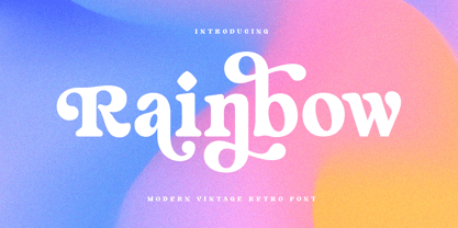 Rainbow is a Modern Vintage Display Font A New Vintage font that we created special for Unique branding needs, with extra ligature in unique style that ready to add value of your brand. It's so nice to leverage designer or product owner that need solutions to make their design look more unique and vintage. Rainbow Modern Vintage Display font ready with: Lowercase and Uppercase characters Numbers and Punctuations Preview as a inspirations that you can do with Rainbow font Available for PC and Mac Wish you enjoy our font.
 - Astone Nouvea by Gatype,
$12.00 Astone Nouvea is a unique and very elegant font for brand and logo designs. With this font, it will be easy for you to fulfill the wishes of customers who are often asked to design a logo with a unique style but with an elegant shape. So, we tried to brainstorm and come up with this font to get ideas out. It is perfect for BRANDING and LOGO DESIGN. You will get a classy, elegant, and of course unique logo with this font. Hope you enjoy this font!!
 - Aestetik by The Letter Builder,
$10.00 This font is specially made for use in your various works. We created this font with its own uniqueness, such as the feel of writing with a brushpen, a simple yet elegant style, and beauty of brushpen handwriting. Besides being able to stand alone, you can combine this font with various other typefaces, such as Serif, Sans Serif, and Script. This font is ready for you to use to make your products and services look more unique because of the basic concept of making this font is "unique".
 - Play Toon by Twinletter,
$14.00 Playtoon is a playful display typeface that may be used for a variety of projects. Each letter in this typeface has been specifically created to emphasize a fun, distinctive, and distinct personality. also in a unique pattern on each letter, greatly enhancing the uniqueness and enjoyment of your project. Of course, this typeface is appropriate for a wide range of creative applications, including game covers, titles, book covers, outdoor events, posters, banners, promotional material, movie titles, YouTube covers and thumbnails, children’s games, cartoon projects, and other unique projects.
 - Publio by Tour De Force,
$25.00 Publio is small unusual and unique font family, characterized with sharp, triangular semi-serifs.
 - Orient MF by Masterfont,
$59.00 Far east font flavor in Hebrew letters. So fresh so unique, yet so legible.
 - Zany by BA Graphics,
$45.00A unique font that falls in that extreme catagory, Zany has that happy look. - Politica MF by Masterfont,
$59.00 Unique square letter design enhanced with round edges that make any signage stand out.
 - Maxim MF by Masterfont,
$59.00 A special high contrast font with unique geometrical shapes for logos, titles, signage etc.
 - Kaushan Script - 100% free

- Yorkten Slab by insigne,
$- The Yorkten family of fonts is back with another satisfying addition to its clean style. The rhythmic, new Yorkten Slab expands Yorkten’s basic, contemporary form of geometric and simple lines and adds a level of self-confidence and elegance to your work. Slab's basic structure is compact. It’s more condensed than most slabs, so you can save space yet still have clear, consistent readability. The added serifs create a fresh text color, too, that syncs well with the new font’s inherited features. Like its predecessor, Yorkten Slab offers its natural, simple structure with more than fifty fonts in the family and three different widths - extended, normal or condensed. Each group has eight weights from a lean thin to tough looking black, giving Yorkten Slab plenty of bragging rights among its peers. And like Yorkten, too, Yorkten Slab’s greatest value is the ability of its members to work easily and well together and with a variety of other fonts. Yorkten Slab ensures that you have the necessary tools for any challenge. In combination with its superior functionality and excellent readability, this versatile font can be effectively used for many print and screen operations: e-books, applications, headlines, banners, posters and websites to name a few options. Don’t wait any longer. Start tapping the possibilities that Yorkten Slab offers your work.
 - Sabine by Arabetics,
$45.00 Sabine is an Arabetic type design with a calligraphic flavor. It follows the guidelines of the Mutamathil Taqlidi type style with one glyph for every basic Arabic Unicode character or letter, as defined in Unicode Standards version 5.1, and one additional, final-position, glyph for each Arabic letter that is normally connected with other letters from both sides in traditional cursive Arabic strings. Sabine employs variable x-height values. It includes all required Lam-Alif ligatures and uses ligature substitutions and selected marks positioning but it does not use any other glyph substitutions or forming. Text strings composed using types of this family are non-cursive with stand-alone isolated glyphs. Tatweel (or Kashida) glyph is a zero width space. Keying it before any glyph will display that glyph isolated form. In Sabine Kashidah, Irsal, and Tasmim keying Tatweel (shift J) after certain glyphs will replace it with a long stroke glyph. In Sabine Tasmim, keying it a second time will replace glyph with a final form swash (Irsal) glyph. In Sabine Irsal all final forms are swash glyphs. Keying Tatweel before Alif Lam Lam Ha will display the Allah ligature. Sabine family includes both Arabic and Arabic-Indic numerals; all required diacritic marks, Allah ligature, in addition to standard English keyboard punctuations and major currency symbols. Fonts are available in regular and italic styles.
 - Sada by Arabetics,
$45.00 Sada is a text font designed with hand held devices and ebooks in mind. Glyphs are designed to be larger than usual and very clear with soft visual characteristics and many traditional Arabic calligraphic transitional features incorporated to improve legibility. The word “sada” means “echo” in Arabic. Even though Sada is a cursive style font it offers clearly distinguished and visually unified letter shapes in every position of a word. Sada supports all Arabetic scripts covered by Unicode 6.1, and the latest Arabic Supplement and Extended-A Unicode blocks, including support for Quranic texts. It comes with three weights, regular, bold, and ultra-light. Each weight has normal and left-slanted “italic” styles. The script design of this font family follows the Arabetics Mutamathil Taqlidi style and utilizes varying x-heights. The Mutamathil Taqlidi type style uses one glyph per every basic Arabic Unicode character or letter, as defined by the Unicode Standards, and one additional final form glyph, for each freely-connecting letter in an Arabic text. Sada includes the required Lam-Alif ligatures in addition to all vowel diacritic ligatures. Sada’s soft-vowel diacritic marks (harakat) are only selectively positioned with most of them appearing on similar lower or upper positions to emphasize they are not part of letters. Kashida is zero width glyph.
 - DT Skiart Serif Mini by Dragon Tongue Foundry,
$9.00 ‘Skiart Serif Mini’ is now available online. Originally inspired by the san serif font ‘Skia’ by Mathew Carter for Apple. ‘Skiart’ was designed to feel more like a serifed font, but without any serifs. It took a step between sans serif and serif fonts. Next on the path towards a serif font comes Skiart Serif Mini, with tiny serifs added. This is a true serif font, all be it on the small side. It remains fully readable and feels as clean and normal as any of the best body copy serifs, and yet still has the strong solid bones of all the other Skiart font familys. If compared to one of the more commonly used serifs like ‘Times New Roman’, the ‘Skiart Serif Mini’ lowercase is more open with a taller x-height, increasing its readability and friendliness. The serifs are smaller and less distracting. They are not pretending to be ligatures. Where ‘Times’ makes its p q b d forms out of a barely touching oval and stem, the ‘Serif Mini’ forms are much more firmly attached, appearing clearly as single letters. The standard setting for the g’s are round single storied, (the italic a’s are also), feeling warmer and more inviting in the ‘Serif Mini’ font. Much more friendly than the stuffy double storied versions in fonts such as ‘Times’ etc.
 - ION A by Setup,
$19.95 ION A is a part of the ION superfamily, which consists of 3 families: condensed (ION A), normal (ION B) and wide (ION C), each having a compelling range of 10 weights. Styles Thin to Black have 436 glyphs supporting more than 70 Latin-based languages and the three heaviest weights, named U1, U2 and U3 have 94 basic glyphs. ION glyphs are based on the classic 7-segment display, but for readability and aesthetic reasons, some alphabetic characters don't follow this matrix strictly. In case you like things in order, don't worry, there's a stylistic set that replaces all characters with their strict alternatives. The special characters, such as #, @ or % are composed of special segments, but are designed to fit seamlessly within the whole character set. ION was designed with the needs of contemporary graphic design in mind. There are alternative characters, discretionary ligatures, slashed zero, superior & inferior numbers, fractions, ordinals and three handy stylistic sets. The ten styles of ION A are accompanied with a special 11th style called Cells, allowing you to design a special underlying layer of black or outlined cells. This way you can create various containers and boxes for your text, highlight what's important or go wild and draw a space invader, using the cells as building blocks. Learn more about the OpenType features and Cells at www.urtd.net/ion.
 - Weiss Rundgotisch by Linotype,
$67.99The German designer Emil Rudolf Weiss originally created Weiss Rundgotisch for the Bauer typefoundry in 1937. In their catalog for the typeface, Bauer began with this quote from Leonhard Wagner: The round gothic (rundgotisch) script is the most beautiful kind of script; she is called the mother and the queen of all the rest." While designing Weiss Rundgotisch, Weiss was inspired by Renaissance types cut by the Augsberg printer Erhard Ratdolt. Ratdolt had spent some time in Venice, which is most likely where he became familiar with round gothic letters. This sort of letterform was never as popular in Germany as Fraktur or Gotisch may have been, but round gothic types were used there for centuries to represent arts and craft feelings, as well as old-fashioned handwork. For a blackletter typeface, Weiss Rundgotisch is very similar to normal serif and sans serif designs, especially its uppercase letters, which seem to have some uncial influence in them as well. Therefore, Weiss Rundgotisch is more legible for contemporary readers, making this an excellent choice for anyone looking to set text, logos, or headlines with in blackletter. Weiss Rundgotisch was apparently quite a difficult typeface to design, even for a master designer like Weiss. He began work on the face in 1915; Weiss Rundgotisch's development took over 20 years to complete." - Arturo by Hackberry Font Foundry,
$24.95 Arturo is a brand new font family drawn from the original inspiration of an old alphabet in one of Dan Solo 's Dover Clip Art books. It has moved far away from those raw roots, however. Every character has been redrawn. For example, I had a light version that I never could get working. Arturo is based on that light style and called Arturo Book. The name comes from a good friend of mine in El Paso. He was the guinea pig upon whom I foisted off the beginnings of this style so many years ago. I did several marketing pieces for him using the raw drawings. I figured that he deserved to have the family named after him, at the very least. This is a normal font family for me in that it has caps, lowercase, small caps with the appropriate figures for each case. This font has all the OpenType features in the set for 2009. There are several ligatures for your fun and enjoyment: bb gg ff fi fl ffi ffl ffy fj ft tt ty Wh Th and more. Like all of my fonts, there are: caps, lowercase, small caps, proportional lining figures, proportional oldstyle figures, & small cap figures, plus numerators, denominators, superiors, inferiors, and a complete set of ordinals 1st through infinity. Enjoy!
 - Yasmine by Arabetics,
$39.00 The Yasmine type family follows the guidelines of the Mutamathil Taqlidi type style. It has one glyph for every basic Arabic Unicode character or letter and one additional, final-position, glyph for each Arabic letter that is normally connected with other letters from both sides in traditional cursive Arabic strings. Yasmine employs four fixed x-height values, two above and two below the x-axis. Values are high to give a slight vertical overall look. Its design uses full curves with equally distributed weight. Yasmine family includes all required Lam-Alif ligatures and uses ligature substitutions, and marks positioning but it does not use any other glyph substitutions or forming. Text strings composed using types of this family are non-cursive with stand-alone isolated glyphs. It employs our “natural Arabic input” method where first glyph is displayed in its non-isolated form. Tatweel (or Kashida) glyph is a zero width space. Keying it before any glyph will display that glyph isolated form. Keying it before Alif Lam Lam Ha will display the Allah ligature. Yasmine family includes both Arabic and Arabic-Indic numerals, all required diacritic marks, Allah ligature, in addition to all standard English keyboard punctuations and major currency symbols. The fonts in this family support the following scripts: Arabic, Persian, Urdu, Pashtu, Kurdish, Baluchi, Kashmiri, Kazakh, Sindhi, Uyghur, Turkic, and all extended Arabic scripts.
 - Amudi by Arabetics,
$39.00 The Amudi type family follows the guidelines of the Mutamathil Taqlidi type style. It has one glyph for every basic Arabic Unicode character or letter and one additional, final-position, glyph for each Arabic letter that is normally connected with other letters from both sides in traditional cursive Arabic strings. Amudi employs four fixed x-height values, two above and two below the x-axis.. Values are high to give a slight vertical overall look. Amudi family includes all required Lam-Alif ligatures and uses ligature substitutions, and marks positioning but it does not use any other glyph substitutions or forming. Text strings composed using types of this family are non-cursive with stand-alone isolated glyphs. It employs our “natural Arabic input” method where first glyph is displayed in its non-isolated form. Tatweel (or Kashida) glyph is a zero width space. Keying it before any glyph will display that glyph isolated form. Keying it before Alif Lam Lam Ha will display the Allah ligature. it Amudi family includes both Arabic and Arabic-Indic numerals, all required diacritic marks, Allah ligature, in addition to all standard English keyboard punctuations and major currency symbols. The fonts in this family support the following scripts: Arabic, Persian, Urdu, Pashtu, Kurdish, Baluchi, Kashmiri, Kazakh, Sindhi, Uyghur, Turkic, and all extended Arabic scripts.
 - Sketchnote by Delve Fonts,
$29.00 The Sketchnote typeface was born of necessity: designer Mike Rhode needed a series of hand-drawn fonts to illustrate and produce his book, “The Sketchnote Handbook.” Because of its origin, this typeface was designed to be practical and convey the human character and quirks of his normal handwriting and hand-drawn lettering. The family is comprised of five fonts: Sketchnote Text in Regular, Bold, and Italic, the somewhat compressed and bold Sketchnote Square for headlines, and the playful Sketchnote Dingbats. Sketchnote Text is a casual script with a slightly bouncy baseline. In order to mimic the differences present in natural handwriting, OpenType features are built-in that automatically switch between multiple versions of each letter or number. In total, over 240 alternates in each of the text fonts are employed, making for a more authentic appearance. The warm texture of Sketchnote is the result of actual ink-spread on paper captured in the scans of written letterforms and was intentionally left intact during the digitization process to preserve that feeling. Rhode created Sketchnote Square as a display type to complement Sketchnote Text. Drawn instead of written, the letters often have neat little happenstance voids within the strokes. Sketchnote Dingbats features a selection of icons, rules, and arrows to provide some functional and fun tidbits, handy for bringing additional life to any design.
 - ION C by Setup,
$19.95 ION C is a part of the ION superfamily, which consists of 3 families: condensed (ION A), normal (ION B) and wide (ION C), each having a compelling range of 10 weights. Styles Thin to Black have 436 glyphs supporting more than 70 Latin-based languages and the three heaviest weights, named U1, U2 and U3 have 94 basic glyphs. ION glyphs are based on the classic 7-segment display, but for readability and aesthetic reasons, some alphabetic characters don't follow this matrix strictly. In case you like things in order, don't worry, there's a stylistic set that replaces all characters with their strict alternatives. The special characters, such as #, @ or % are composed of special segments, but are designed to fit seamlessly within the whole character set. ION was designed with the needs of contemporary graphic design in mind. There are alternative characters, discretionary ligatures, slashed zero, superior & inferior numbers, fractions, ordinals and three handy stylistic sets. The ten styles of ION C are accompanied with a special 11th style called Cells, allowing you to design a special underlying layer of black or outlined cells. This way you can create various containers and boxes for your text, highlight what's important or go wild and draw a space invader, using the cells as building blocks. Learn more about the OpenType features and Cells at www.urtd.net/ion.
 - ION B by Setup,
$19.95 ION B is a part of the ION superfamily, which consists of 3 families: condensed (ION A), normal (ION B) and wide (ION C), each having a compelling range of 10 weights. Styles Thin to Black have 436 glyphs supporting more than 70 Latin-based languages and the three heaviest weights, named U1, U2 and U3 have 94 basic glyphs. ION glyphs are based on the classic 7-segment display, but for readability and aesthetic reasons, some alphabetic characters don't follow this matrix strictly. In case you like things in order, don't worry, there’s a stylistic set that replaces all characters with their strict alternatives. The special characters, such as #, @ or % are composed of special segments, but are designed to fit seamlessly within the whole character set. ION was designed with the needs of contemporary graphic design in mind. There are alternative characters, discretionary ligatures, slashed zero, superior & inferior numbers, fractions, ordinals and three handy stylistic sets. The ten styles of ION B are accompanied with a special 11th style called Cells, allowing you to design a special underlying layer of black or outlined cells. This way you can create various containers and boxes for your text, highlight what’s important or go wild and draw a space invader, using the cells as building blocks. Learn more about the OpenType features and Cells at www.urtd.net/ion.
 - Tube Script by Ingo,
$42.00 A font from the tube: an individual handwriting with a slightly wet character. In this case, the “pen” was a tube of black paint. It’s easy to see that you can’t really write “beautifully” with it. Nevertheless, the “Tube Script” is a beautiful, personal handwriting whose clumsy origins are not at all obvious in small font sizes. But if it’s big enough, then all the peculiarities of the paint container misused as a writing implement become apparent. Sometimes the line is very thin and delicate, sometimes it’s just a thick blob meant to represent a letter, depending on how hard the tube was squeezed. A few spills are inevitable. These coincidences of painterly writing are what make this font so appealing. This creates organic forms, random effects, breaks, streaks, where the writer normally determines the form. As such, this font is a great match for anything organic, picturesque, handmade, personal, or even random, unpredictable, or just plain natural. Hundreds of ligatures make the letters appear in a different form each time depending on it’s combination. And more than a hundred alternate characters can be selected using the corresponding OpenType features, thus enabling even more variety in the typeface. This creates the typically restless, extremely varied impression of a really individual script – almost as if it were really handwritten.
 - Stellie by Olivetype,
$18.00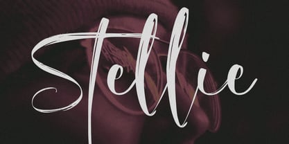 Stellie is a stylish script font with unique textures. Embrace this eye-catching script font to create something truly unique. With its versatility, you can use it on anything from logos, web design, and social media posts to branding material and more. Give your designs the wow factor with Stellie Script Font!
 - Aligarh by NamelaType,
$23.00 Aligarh is a semi-slab serif font formed with a smooth rounded bracket whose edges end with unique shapes, an exploration of combining unique styles in a typefaces. Designed to be used in a variety of media both print and digital media. 18 fonts built from 9 sizes and supported by open types.
 - Burgie by Alit Design,
$9.00 Burgie Typeface Modern Serif font with swash alternate and unique style, a display font in a groovy and bold style that makes your designs unique and distinctive. This font has an elegant and from thin until heavy family. It is perfect for designs with classic themes, retro design, poster design and others.
 - Brolachess by Almarkha Type,
$35.00 Hello Introducing, Brolachess - Luxury Ligatures Serif is an elegant, unique font that uses 30 ligatures to smoothly link letters. inspired by the famous minimalist logo, perfect for the purposes of designing templates, brochures, videos, advertising branding, logos and more. Perfect for adding a unique twist to word-mark logos, monograms or pull quotes.
 - Northgate by Stringlabs Creative Studio,
$25.00 Northgate delivers an incredibly bold and unique font experience. This script will make a great addition to any crafter’s toolbox. Northgate Path is a flowing and elegant handwritten font, created with the help of a brush pen. Get inspired by its unique and beautiful style and add it to your favorite designs!
 - Mahdani by Nandatype Studio,
$13.00 Mahdani is a unique handwritten brush font. Its unique flow and style makes it perfect to use for prints, logos, signatures, quotes, badges, labels, packaging design, blog headlines or simply use it to add a fancy text on a photo. Mahdani comes with upper and lowercase Basic Characters, Numbers, Marks and Punctuation
 - Ghoist by Canden Meutuah,
$20.00 is a fun and unique display font, a cool scary font for Halloween and other scary themed activities. Add this unique and spooky display font to any of your creative ideas and watch how it makes it stand out! Enjoy, I hope you are satisfied with the results of my font. thank you
 - Setir Paghoni by Attract Studio,
$20.00 Setir Paghoni is a modern serif font that uses unique ligatures to connect letters smoothly. Setir Paghoni comes with matching slanted trim. Perfect for adding a unique touch to wordmark logos, fashion headlines, editorial designs, branding projects, magazine titles and more. Included: 2 Weights (Roman & Oblique) PUA Encoded Ligatures Opentype Feature Multilanguange.
 - Rudelskopf deutsch by Peter Wiegel is an exquisitely crafted font that embarks on a journey through the rich heritage of German typography, bringing historical essence into modern design practices. D...
- The font named GoodPeace by Dirt2 can be characterized as embodying a unique blend of artistic flair and a message of harmony. It is a testament to the power of type design in conveying more than jus...
- Yoko Smile - Personal use only

- Club - Personal use only

- Grandesign Neue Roman - Unknown license


