10,000 search results
(0.013 seconds)
- BR Omega by Brink,
$30.00 A highly functional geometric type family of 16 finely crafted styles. BR Omega is a clear and contemporary family. Accurately drawn and tested to transmit a clean and modern aesthetic. Slightly open apertures and well balanced letterforms result in a highly legible and versatile sans serif. BR Omega provides advanced typographic support with features such as case sensitive forms, fractions, slashed zeros and multiple figure sets. For custom enquiries please contact: mail@brinktype.com
 - Conifer by Ryan Keightley,
$15.00 Conifer is a blocky geometric sans serif font that adheres to strict grid rules in order to define its corner angles. Its seemingly rigid form is tempered by the soft, rounded corners, and fine notched details present at acute angles in the glyphs. Available in a clean solid and a varied, textured rough. The result is a rugged, retro, typeface that is at home in fashion lookbooks and wood-carved park signage alike.
 - TE Al Thuluth by Tharwat Emara,
$75.00 This Font is similar to the calligraphic style AL THULUTH. I added many glyphs to each other to get this feature and it become easier to graphic designer to write with Arabic AL THULUTH font without being a real calligrapher. It works beautiful in Headlines of Arabic books and photos and it is Fine Art . It also used in writing on T-shirts and clothes . This Font contains many Glyphs in Latin, Farsi, Urdu, Arabic ).
 - Hoofer by Scholtz Fonts,
$15.00 Light and flexible, slightly retro, casual and readable, Hoofer combines 28 brush script, mono line script and sans-serif styles with ornaments into one Mega-Family. The different styles of the Hoofer Mega-family have been chosen to work together and to harmonize in a pleasing way. The Hoofer Mega-Family of fonts can be divided into three sub-families: Hoofer BRUSH subfamily: An eclectic group of five fonts. These are mainly joined scripts. Hoofer LINE subfamily: Seven mono-line scripts with joined letters in a number of weights, widths and styles. Hoofer SANS subfamily: Sixteen casual, Sans-Serif fonts. They are very readable and in a variety of weights & styles The mood of the Hoofer mega-family is light and flexible, slightly retro, casual and readable. It combines script and many sans-serif styles with ornaments into one Mega-Family. The different styles of the Hoofer Mega-family have been chosen to work together and to harmonize in a pleasing way. The Brush Sub-Family is designed for titling, packaging and display purposes, The Line Sub-Family can also be used for titling, packaging and display, however, it is less “showy”, and conveys an air of informality. The Sans Sub-Family is designed to shine as sub-heads and as body text. The wide range of Hoofline styles gives you, the designer, great flexibility in creating just the mood or impression that you want. Most of the fonts can use one or more OpenType Features. These can be accessed in a number of ways. The reason for this is that the major software producers provide different (and often conflicting) ways of accessing OpenType Features. In some cases such software manufacturers provide NO way of accessing certain OpenType Features. We have tried to remedy this by providing a highly flexible family of fonts. OPENTYPE (these OpenType features are only available in the “otf” fonts and not in the “ttf” fonts.) OpenType features that Hoofer makes use of are: Swashes (Word-Begin and Word-End Features); Alternate Numerals; and True Small Caps. ORNAMENTS In addition the Hoofer family has a font containing 94 ornaments. ALTERNATE NUMERALS You can access two sets of figures (numbers) in Hoofer Sans fonts. Both sets are tabular and lining but they differ in the height (but not the width) of the figures. The height of the alternate figures has been chosen so that they are compatible with the small caps. However, these alternate figures are available in ALL Hoofer Sans fonts, whether they feature small cap fonts or not. Hoofer has all the features usually included in a fully professional font. Language support includes all European character sets, Greek symbols and all punctuation. Opentype features include automatic replacement of some characters and discretionary replacement of stylistic alternatives.
 - Nefertiti by JAB,
$12.00As you can see, Nefertiti is a font based on ancient Egyptian hieroglyphs and could be classified as a fun-font. I've always been really interested in Egyptology and a couple of years ago I thought it would be great to be able to write in hieroglyphs. I started to study them but soon realized it would take me a long time to be able to do this. Still, I was determined to find a way around this problem. At some point I came up with the idea of rearranging and reforming the hieroglyphs so as to resemble the English alphabet. During this process I tried as much as possible to preserve their ethos and appearance. However, since they are designed to write in English with, it's obvious that they are not always going to look like the real thing. Despite this, I'm really happy with the final result and I think many Pharaohphiles who just want to have some fun will be also. The only difference in this font between lower and upper case characters, is that the latter are set between two parallel, horizontal lines. These are for use with brackets (motif ends) to form cartouches - elongated ovals for names and/or titles. Try typing the following using the upper case in the sample text box. e.g. (JOHN} The zigzagged vertical lines at each end, separate the motifs from the hieroglyphs. Note the three types of ends/brackets. These lines are also used to separated words from one another and to give a more authentic appearance. So pressing the space bar gives a zigzagged line - not a space. They can also be used at any point within a cartouche to separate first and last names or titles. e.g. ; (JOHN;BROWN} walked straight home after work. Notice the eye glyph (period/full stop) at the end of the sentence. This is the only punctuation mark which can be used within a cartouche, e.g. after Mr. or to add a more Egyptian appearance to a name or title. e.g. (MR>;JOHN;BROWN} Parallel lines dividing hieroglyphical inscriptions and writing into rows or columns are very common. To incorporate these in a body of text, simple use the underline U. e.g. (OSIRUS) and {ISIS} were important gods of the ancient Egyptians. (HORUS) {HATHOR} and [RA],the sun god, were also highly revered deities. The punctuation marks available are shown below. . , " " ' ! ? "where is the king?" The font also includes the numbers 0-9, the following mathematical symbols and the hash sign(Scarab beetle). Once again, I've tried to make them look as Egyptian as possible; whether I've succeeded or not is open to debate. e.g. + - x / = # This font is named after Akhenaten's beautiful wife, Nefertiti, who's image can be seen in the graphic on this page. - Battista by preussTYPE,
$29.00 The BATTISTA typeface stands in the long tradition of the designs developed by Giambattista Bodoni, who made his famous typefaces in the end of the eighteenth century. Similar designs can be found on various specimen books e.g. Alexander Wilson, John Bell, Edmund Fry and Alexander Thibaudeau. One of the best italics was available by Stephenson Blake & Co. foundry form Sheffield, England. In the end of the nineteenth century an unknown punch cutter at the German type foundry Schelter & Giesecke made an very bold cut of this Bodoni design. He brought both designs, the regular and the italic to an new level of harmony. Compared to the original Bodoni designs the new typeface was a lot bolder, which was well taken by the audience in this time. The BATTISTA typeface is an remarkable design, assembled of ultra bold and very fine shapes, but in all, the spirit of Bodonis design was well preserved. BATTISTA is a classic display design. The fine details are best shown on larger text sizes.
 - Archive Garamond by Archive Type,
$59.99Archive Garamond is a typeface roughly based on the designs of Claude Garamond (ca. 1480 – 1561), a French publisher and a leading typeface designer of that period. Garamond’s influence on type design is reflected in many typefaces that are today known under different commercial names. While the majority of contemporary digital interpretations of the “Garamond types” are cleaner and more polished versions of that genre, Archive Garamond tries to keep the rough nature which was typical in the early days of printing. Archive Garamond has a rather unique, distinctive temperament which is even more emphasised with the preserved non-uniformity, such as irregular glyph shapes or a variable baseline. Although Archive Garamond was clearly made to be used for display sizes it works surprisingly well in text. Archive Garamond is availale in three versions, each containing approximately 600 glyphs (in Pro versions). Archive Garamond Pro A Professional version of the typeface contains all glyphs, including the advanced typographic forms, such as different sets of figures, small caps, swashes, historical forms, etc. The font also enables full use of the OpenType features. It fully supports the languages listed in the language list. Archive Garamond Std A Standard version of the typeface is meant to be used for the basic typographic work. It typically contains the most common glyphs. The standard figures are proportional lining. Besides kerning this version does not contain any advanced OpenType features. A Standard file type fully supports the languages listed in the Language list. Archive Garamond Exp An Expert version contains glyphs that are supposed to be used in advanced typographic works. This type of file contains uppercase and small cap glyphs with the proportional oldstyle figures as the default set. Besides kerning this version does not contain any advanced OpenType features (all OTF features have to be replaced manually). An Expert file type fully supports the languages listed in the Language list. - Pinafore by Up Up Creative,
$10.00 Introducing Pinafore Complete, a broad, brush-style display font in four styles. Pinafore comes with upright and oblique styles as well as paper cut versions of each. It includes 363 glyphs such as small caps (see note below for more on this), multilingual support (including multiple currency symbols), an awesome ampersand, math symbols, and more. A note about small caps: There are TWO ways to access the small caps in this font family. For OpenType-savvy programs such as Adobe Illustrator and Adobe InDesign, these can be accessed from within the main font files using the character panel or the glyphs panel. For programs that do not access these OpenType features, I have also included small-caps-specific font files. In these files, the regular caps are accessed by typing capital letters and the small caps are accessed by typing lowercase letters.
 - Flight Feather by moriztype,
$10.00 Flight Feather is a font that has a modern and elegant design. This font has smooth and firm lines, as well as balanced and proportional letter proportions. Each letter in this font has interesting details and a beautiful appearance, making it suitable for classy and elegant designs. View of the Flight Feather font with supple and smooth lines. This font has a light and alluring impression, but still strong and firm, so it is suitable for graphic designs, posters or brochures that require an elegant and professional impression. The combination of thin and thick lines in the Flight Feather font provides an interesting visual effect and helps make words or sentences stand out and impress. With its uniqueness, the Flight Feather font can be the right choice to strengthen the message you want to convey in visual design.
 - Why Square by Linotype,
$29.99The different fonts in the Why Square family are an extension of the designs begun in Zoran Kostic's Just Square family. Why Square's lowercase letters are all more condensed versions of Just Square's letters, and in some of the fonts, the uppercase letters are wider. The first five fonts are the different weights of Why Square (UltraThin, UltraLight, Thin, Light, and Regular). Here, all of the characters--both upper and lowercase--are more condensed versions of the geometric letters from the Just Square family. The next five fonts (UltraThin, UltraLight, Thin, Light, and Regular weights) include identical lowercase letters to those from the first five fonts in the family, but their capitals are considerably wider. These may be used as initials, either with the other fonts in the Why Square family, or with the Just Square family. - VA Fluttered Lashes by V Anderson Designs,
$14.00 Fluttered Lashes is a handwritten monoline font with both discretionary and standard ligatures to give your products that handwritten feel. It's perfect for greeting cards, fun branding, and crafting files.
 - Griba by Decade Typefoundry,
$20.00 GRIBA Typeface is an experimental display typeface, based on every shape of each characters and transformed into double lines. This font is perfect for poster, titles, and t-shirt designs.
 - Cardilan Tatto by Romie Creative,
$21.00 Introducing our new product called Cardilan font. Cardilan includes upper and lower case letters, numbers, various kinds of punctuation and ligatures. All lowercase letters include line endings and alternative fonts.
 - LD Enquirer by Illustration Ink,
$3.00Have you Enquired lately? It's time...so choose the thick lines and slightly uneven character placement of LD Enquirer...perfect for light-hearted scrapbook pages, journaling, greeting cards, and tags. - Rose Boutique by Supfonts,
$15.00 Rose Boutique it is cute handwritten chick font with exquisite accents. This font is perfect for branding, cricut projects, wedding invitations, logos, vinyl, svg files, stickers, cards, signs and more!
 - Ristabella by Coredeon,
$9.00 inspired by my beloved wife's handwriting, starting with a scribble, consists of thick and thin lines These fonts are suitable for letter writing, decoration, display, birthday, wedding and for logos
 - FF Stealth by FontFont,
$41.99 British type designer Malcolm Garrett created this display FontFont in 1995. The font is ideally suited for film and tv and editorial and publishing. It comes with tabular lining figures.
 - Boott Stitch by Aboutype,
$24.99Pen drawn in line, outline typeface originally designed for embroidery application. Boott was designed for print media in a wide point size range. Boott requires subjective display kerning and compensation. - Deco Style JNL by Jeff Levine,
$29.00 The hand lettered title on the 1943 sheet music for "This Love of Mine" formed the basis for Deco Style JNL, which is available in both regular and oblique versions.
 - Mango Tango by Supfonts,
$15.00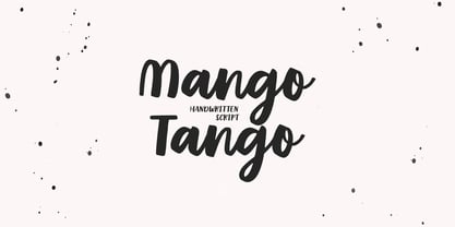 Mango Tango it is cute handwritten chick font with exquisite accents. This font is perfect for branding, cricut projects, wedding invitations, logos, vinyl, svg files, stickers, cards, signs and more!
 - Warm Script by Supfonts,
$15.00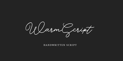 Warm Script it is cute handwritten chick font with exquisite accents. This font is perfect for branding, cricut projects, wedding invitations, logos, vinyl, svg files, stickers, cards, signs and more!
 - Magyar Symbols Pi by CheapProFonts,
$10.00Two fonts with traditional hungarian flower illustrations and repeatable line patterns - combine and enjoy! No "multilingual character set" as fonts from CheapProFonts usually have, but still with an international flair... - Penmanshift JNL by Jeff Levine,
$29.00Penmanshift JNL by Jeff Levine is actually a semiscript - a vertical text font with the curved lines of a script alphabet, but the look and feel of a poster letter. - Mollis Lux by Blendy wine,
$9.00 This font is designed using straight lines and circle segments. The font is simple and universally usable. But there are some unique characters such as S,K,X, and Y.
 - Century Oldstyle by Bitstream,
$29.99Century Oldstyle is Linn Boyd Benton’s and Morris Fuller Benton’s renovation of Phemister’s Miller & Richard Old Style for ATF forty-five years later, using the Century name for marketing purposes. - Gumela Arabic by NamelaType,
$25.00 Arabic font version of Gumela, still with Gumela latin style, based on rounded sans serif whose edges end with unique shapes, to line up in harmony between Latin and Arabic.
 - Enigma Heights by Supfonts,
$15.00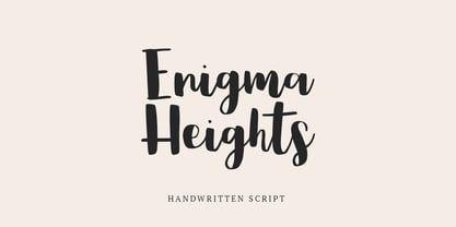 Enigma Heights it is cute handwritten chick font with exquisite accents. This font is perfect for branding, cricut projects, wedding invitations, logos, vinyl, svg files, stickers, cards, signs and more!
 - Escheresk - Personal use only

- Spoonge Punk - Personal use only

- Denala by Attype Studio,
$16.00 Denala is a delicate signature font with ending swash. Fall in love with its incredibly versatile style and use it to create spectacular designs! Denala is perfect for branding, logo, invitation, stationery, social media post, product packaging, merchandise, blog design, game titles, cute style design, Book/Cover Title and more. What's Included : - Ending Swash - Ligatures - Multilingual Support - Made it into separated file to make it easier to use by beginner & separated file user can use the font with software which doesn't accept open type features.
 - Timothea Signature by Timurtype,
$14.00 Introducing by Timurtype Studio! Timothea Signature is a Stylish Signature Font This font resembles handwriting. With attention to detail and stylish strokes in every line, this font adds a touch of sophistication and distinctive style to any design or text it is applied to. The distinctive nature of small lines makes them perfect for creating attention-grabbing titles, logos, or other elements. Timothea Signature Font also supports multilingualism. Enhance your designs with our original fonts, feel free to comment or provide feedback, Enjoy the fonts 😊
 - Reading Frequency by Vladvertising,
$10.00 Ever wonder what language looks like? This type decided to dive into this idea... how audible and visual forms play with each other. The forms you see also have been waterjet-cut out of stainless steel sheets. With these physical forms, one day in a recording studio and a mallet in hand later... we get this. Link to Audio Files: http://vladrudakov.com/files/Reading%20Frequency%20Audio.zip (If you use for samples– have fun, just shoot me an email w/ final product) vlad (at) vladvertising.com
 - Knul by The Northern Block,
$38.95 Knul is an elegant modern typeface with a subtle mono-line appearance. Balanced engineered geometry with delicate hand touches allows for practical typesetting without complications. Knuls' mechanical simplicity is best suited to identity, editorial, advertising and software applications. Details include six weights with italics and over 600 characters per style. Opentype features consist of six variations of numerals, including inferiors, superiors, fractions, lining and tabular. Language support covers Western, South, Central Europe and Cyrillic—Remastered to version 2.0 for improved OpenType features and usability.
 - Fermata by Fermata Fonts,
$15.00 Fermata is an original calligraphic textface inspired by humanist serif typefaces from the 16th century, characterized by the translation contrast of a handwritten pen stroke, monumental Roman capitals, and true italics. Fermata has been modernized for 21st century textual requirements, with clean lines, moderated contrast, and a seamless blending of italics and lining characters into the text form, while still retaining the warmth and subtle idiosyncracies of the handwritten origins of old style serifs. The font was developed with invaluable advice and mentorship from Hannes Famira.
 - FF Cst Berlin East by FontFont,
$41.99 German type designers Verena Gerlach and Ole Schäfer created this sans FontFont in 2000. The family has 5 weights, ranging from Regular to Bold and is ideally suited for editorial and publishing and poster and billboards. FF CST Berlin East provides advanced typographical support with features such as ligatures, alternate characters, case-sensitive forms, and stylistic alternates. It comes with proportional lining and tabular lining figures. This FontFont is a member of the FF creative industriesty Street Type super family, which also includes FF CST Berlin West.
 - FF Blur by FontFont,
$68.99 British type designer Neville Brody created this display FontFont in 1991. The family contains 3 weights: Light, Medium, and Bold and is ideally suited for advertising and packaging, festive occasions, editorial and publishing, logo, branding and creative industries as well as poster and billboards. FF Blur provides advanced typographical support with features such as ligatures, alternate characters, and case-sensitive forms. It comes with tabular lining and proportional lining figures. In 2011, FF Blur was added to the MoMA Architecture and Design Collection in New York.
 - Alogical by Nathatype,
$29.00 Alogical is a script font that captures a touch of eloquence. Each letter in this font is crafted with high contrast outlines, adding a dynamic and eye-catching quality to the font. The combination of bold strokes and delicate lines enhancing the overall visual appeal. The swaying circular finish lines bring a sense of movement and grace to the font. With its flowing letterforms, Alogical offers a natural writing style. For the best legibility you can use this font in the bigger text sizes.
 - Puchiflit by sugargliderz,
$44.00 Puchiflit is a typeface disguised as a pen script. I didn't create this typeface by importing the letters on paper and tracing them into a computer with a draw application. So I think it's a pseudo-pen script typeface. By the way, I used a famous Japanese maker's felt-tip pen as a reference for line widths. I thought, "Isn't this what it would look like if I wrote with this pen? I drew a line in the draw application while fantasizing about this.
 - Titulata by Tipo,
$85.00 The design for Titulata was based on the need for a titles of extreme weight, dynamics and soft morphology. Strong and clear, it takes graceful form in the line and is legible even in small bodies. The script variable is softer and features some punch-line touches, providing another vision and incorporating traits of manual writing. One important feature is that both styles have the same rendering in text box, reason why signs can be combined without other alteration that the form of the printed word.
 - Noras Blooming by Slex Studio,
$18.00 Introducing, Nora's Blooming is a chic + modern sans serif font. Nora's font is perfect for branding, logos, social media, prints, stickers, shirts, svg files, and more! Nora's Blooming is unique in that it can be used for a variety of design styles. Me Great for free-spirited boho designs as well as for a classier editorial look! There are fun style alternatives available for use with this font. These letters are embedded in font files and easily accessible in programs such as Photoshop and Illustrator. thank you!

