10,000 search results
(0.016 seconds)
- Camy by Scholtz Fonts,
$9.50 I wanted to create a "handwriting" font which could be used professionally. I have often needed such a font with a variety of weights and styles for a particular project and have had to resort to mixing fonts, creating a rather messy, amateur job. Camy is named for a little village in South West France where I did much of the initial work on this font. Camy is ideal for contemporary display work, comes in ten styles, and has a contemporary appeal with its casual, easy to read letters. Camy was designed as a total professional package for designers looking for a handwritten font suitable for all kinds of contemporary display work: the idea being that once you have the Camy Professional Pack you don't have to waste time searching for other handwritten fonts. The Family: LIGHT -- NARROW - light weight, condensed width, delicate line -- MEDIUM - light weight, delicate line -- WIDE - light weight, expanded width, delicate line NORMAL WEIGHT -- NARROW - of medium weight and condensed width - perfect for limited space -- MEDIUM - of medium weight -- WIDE - of medium weight and expanded width BLACK - for best readability -- NARROW - condensed width for bolder statements in small areas without losing legibility -- MEDIUM - for bolder statements -- WIDE - expanded width for bolder statements FAT -- WIDE - for maximum impact Use a combination of styles for product branding, book covers, invitations, greeting cards. The Camy combination works well for both headings and body text. Camy contains over 250 characters - (upper and lower case characters, punctuation, numerals, symbols and accented characters are present). It has all the accented characters used in the major European languages.
 - Burger Elbow by Putracetol,
$24.00 Burges Elbow - Playful Font In 2 Styles Created with the idea of bringing happiness and joy to any project, Burges Elbow is a perfect choice for those who want to add a touch of playfulness to their design. To use Burges Elbow to its full potential, it would be great for designs aimed towards children such as book covers, posters, and flyers. Its playful and quirky nature would also make it a great choice for branding aimed at a younger audience or products that want to add a sense of fun and whimsy. Burges Elbow comes with a variety of features, including uppercase and lowercase characters, opentype alternates and ligatures, and support for multiple languages. These features allow for a wide range of creative possibilities and make it easy to use in various projects. Included in the zip package are three different file types: OTF, TTF, and WOFF, which can be used in any design software that supports font installation. With these different file types, you can use Burges Elbow on any platform or device, making it a versatile choice for any project. Add a touch of fun and playfulness to your design with Burges Elbow. Its cute and whimsical nature will surely make your design stand out and bring a smile to anyone's face. In summary, Burges Elbow is a playful font in 2 styles that is perfect for designs aimed at children or those looking to add a sense of fun and whimsy to their branding. With its various features and file types, Burges Elbow is a versatile choice that can be used in any design project.
 - Mojacalo AH - Unknown license

- Lens Grotesk by Typedepot,
$39.99 Lens Grotesk is a Neo-grotesque type family of 16 fonts born as a result of a very conscious research in the field of the neutral Swiss aesthetic. There's a reason for all the prominent examples of this design like Helvetica and Univers to be used on a daily basis for more than 70 years and it's a simple one - they just work. The closed terminals, the low contrast, uniform widths and proportions makes the Neo-grotesques feel just right. Although very often branded as stiff, the neutral Neo grotesques are here to stay and Lens Grotesk is our own reading of the popular style. Lens Grotesk takes the Neo-grotesk model one step further adding a pinch of Geometric sans-serif to the mix thus creating a way more modern and contemporary looking design. Characterized with more generous oval proportions and slightly more open terminals, Lens Grotesk keeps the modulation and rhythm needed for a slightly longer texts while visibly keeping everything in order. Zooming in you'll find traces of the Geometric aesthetic - the robust almost right angled approach of the arches and tails (look t, f, j, y) and the way more circular rounded shapes. Like all our fonts, Lens Grotesk is equipped with a range of OpenType features, stylistic alternatives and of course Cyrillic support. It comes in a pack of 16 fonts with 8 styles and their matching italics or one variable font file available with all full family purchases. Live Tester | Download Demo Fonts | Subscribe
 - Gunec by Twinletter,
$17.00 Introducing Gunec, a cutting-edge and futuristic font ideal for technology- and science-related designs. Gunec is the ideal choice for anyone looking to add a touch of futurism to their work thanks to its distinctive letterforms and svelte lines. The versatile font Gunec can be used for a variety of tasks, such as branding, packaging design, book covers, and more. However, Gunec is more than just a pretty face. This font is ideal for all of your design projects, from print to digital, as it is made to be highly legible and simple to read. Additionally, Gunec has all the elements required to produce a comprehensive and professional design, including a full set of upper- and lowercase letters, punctuation, and numerals. With Gunec font, you’ll be able to create designs that are both stylish and professional, with a futuristic look that’s sure to stand out. This font is perfect for those who want to be ahead of the curve in design, and for those who want to add a touch of innovation to their work. So don’t wait, make Gunec your font of choice today, and take your designs to the next level! What’s Included : - File font OTF, TTF, WOFF, WOFF2, CSS, HTML - All glyphs Iso Latin 1 - Alternate - Simple installations - We highly recommend using a program that supports OpenType features and Glyphs panels like many Adobe apps and Corel Draw so that you can see and access all Glyph variations. - PUA Encoded Characters – Fully accessible without additional design software. - Fonts include Multilingual support
 - Mantika Informal Paneuropean by Linotype,
$67.99Jürgen Weltin's Mantika Informal is pretty difficult to categorize, but very easy to like. This particularly reader-friendly typeface in regular and bold weights, brings to the table the informal fluidity of a script, the consistency of an inclined italic, and the open and airy forms and contrast of a humanist sans. The result is a warm, approachable, and very legible typeface that is never static and staid, but rather invites an attentive, reading eye. The original idea behind Mantika Informal lay in the challenge to create a typeface for setting children's books. German designer Jürgen Weltin aimed to create a reading typeface for those just starting to learn how to read. On the one hand, it should help create clear word-images; on the other, its letterforms should remain uncomplicated but resist mechanical and industrial sterility. Mantika?s subtle cursive lines stress the printed word's connection with handwriting, in addition to making the transition from school writing exercises to printed texts seamless and effortless. The resulting slightly organic and cursive forms that developed during the design process are so captivating that Mantika Informal may be used for a multitude of unintended applications - anywhere a friendly and informal yet sophisticated character could lend a helping hand, Mantika is there, giving a fresh accent to anything from packaging design to food products. With a broad character set encompassing support for Cyrillic and Green, Mantika Informal's two fonts make for a versatile and dynamic typeface that surely will find its place in a broad range of applications. - Jack History by Ditatype,
$29.00 Jack History is a unique, amazing font inspired by creative, experimental handwritings of which letters are always connected to each other to create surprising, dynamic flows, and adopt unconventional proportions and variations. Some of the letters may actually seem bigger or smaller than the others in free moving and curvy lines to express bravery and freedom nuances of the font. Differences in proportions and letter style changes of the font have become the design’s integral parts. Despite the absence of strict rules, creativity and courage to combine the connected letters in a unique way is all that matters because this script font offers extraordinary attractiveness and uniqueness in all designs. Furthermore, the connected letter flows in various proportions reflect some explorations and innovations in the handwritings. You may then apply this font for big text sizes for a legibility reason and enjoy the available features here. Features: Alternates Ligatures Multilingual Supports PUA Encoded Numerals and Punctuations Jack History fits best for any design projects requiring artistic, elegant displays such as wedding invitations, greeting cards, merchandise designs, and more. For such artistic and elegant displays, this script font is also applicable for logo designs, posters, and packaging. Find out more ways to use this font by taking a look at the font preview. Thanks for purchasing our fonts. Hopefully, you have a great time using our font. Feel free to contact us anytime for further information or when you have trouble with the font. Thanks a lot and happy designing.
 - Verve by Altered Ego,
$65.00Called by some the "Archetype of the millennium", Verve is a seven-weight typeface family. It features a complete Adobe character set with kerning and fit to match. The alternate characters offer some variations on s,f,h,j,k,S,T,Y and others, plus this font has the Euro symbol. Verve is the fourth in an on-going series of condensed typefaces that I’ve been designing since 1989. My concept was to create an elegant condensed typeface that would be a "typeface for the millennium," in style and functionality. At the very core of all my designs is a typographic problem I wanted to solve, or a market niche that I think needs filled. Verve addresses both of those concerns, without copying or borrowing from its predecessors. There’s the challenge of creating a rich and interesting typeface with an austerity of line and elegance of form. I’m a minimalist by nature – but I wanted Verve to have a sensuous feel in certain respects – yet have that sensuality balanced by the uniformity of the uniform character widths. Gottfried Pott always stresses "theme and variation," and "point and counterpoint," and that’s what I’m doing in Verve. What one finds in musical composition is evident in Verve. Perfect for book covers, CD packaging, club flyers, retail packaging (especially bottles!), identity design and multimedia. The adventurous can try it in text, but it will give you a headache. The beauty of Verve is in thesize and weight variations which create a rich typographic texture in this font. - Masheu by Twinletter,
$17.00 Masheu is a classic serif font that depicts elegance and perfection in every line and curve of the letters. With a distinct touch of classic modernism, this font is the perfect solution for creating designs that exude a timeless beauty. Each Masheu character is designed with captivating detail and subtlety. With well-proportioned proportions and elegant serif forms, this font strikes a harmonious balance between simplicity and elegance. The typography styles brought to you by Masheu will add a touch of luxury and professionalism to any of your design projects. Not only has an attractive appearance but Masheu is also equipped with creative features. With the available ligatures and alternates, you can create unique and interesting style variations to suit your project needs. Also, multilingual support ensures that this font can be used in multiple languages easily. Are you looking for a font that combines classic beauty and modern sophistication in one perfect unit? Masheu is the answer. With benefits that include a stunning classic serif style, creative features such as ligatures and alternates, and extensive multilingual support, this font will quickly grab the attention of your potential customers and deliver eye-catching designs in no time. What’s Included : File font All glyphs Iso Latin 1 Alternate, Ligature Simple installations We highly recommend using a program that supports OpenType features and Glyphs panels like many Adobe apps and Corel Draw so that you can see and access all Glyph variations. PUA Encoded Characters – Fully accessible without additional design software. Fonts include Multilingual support
 - Disruptor's Script by Piñata,
$15.00 Disruptor's Script is the alter ego of our previous project Gentlemen's Script. Unlike the Gentlemen's Script, the new font is an elegant rebel and defies traditions. The font is painted with a brush pen, which is especially noticeable in the characteristic shabbiness and different thicknesses of the strokes. While the Gentlemen's Script is an embodiment of a classic costume, dress shoes and an expensive watch, Disruptor's Script is a fashionable suit, sneakers, an iWatch and a tattoo that peeks from under the shirt. The font retained the incline, speed and overall sense of dynamics inherent in Gentlemen's Script, but got a bit more chaotic and unpredictable. This is especially noticeable in the newly added shabbiness, elongated extenders, a large number of contextual alternates and different ligatures. For some high-frequency letters (10 for the Latin alphabet and 10 for the Cyrillic alphabet), we painted alternative versions that are substituted in the word instead of the standard characters when following our preceding certain groups of letters. In addition, in the Disruptor's Script you can find functional ligatures, including some of the frequently occurring two- and three-letter combinations. All these solutions dilute the monotonous line of the set, add a bit of unpredictability to the font and a touch of chaos to inscriptions. To fully enjoy usage of the font, we recommend that you always keep the features contextual alternates (calt) and standard ligatures (liga) turned on. If you do not have access to applications that support OpenType features, it does not matter—even without these features you can use and enjoy our font!
 - Mantika Informal by Linotype,
$50.99 Jürgen Weltin's Mantika Informal is pretty difficult to categorize, but very easy to like. This particularly reader-friendly typeface in regular and bold weights, brings to the table the informal fluidity of a script, the consistency of an inclined italic, and the open and airy forms and contrast of a humanist sans. The result is a warm, approachable, and very legible typeface that is never static and staid, but rather invites an attentive, reading eye. The original idea behind Mantika Informal lay in the challenge to create a typeface for setting children's books. German designer Jürgen Weltin aimed to create a reading typeface for those just starting to learn how to read. On the one hand, it should help create clear word-images; on the other, its letterforms should remain uncomplicated but resist mechanical and industrial sterility. Mantika?s subtle cursive lines stress the printed word's connection with handwriting, in addition to making the transition from school writing exercises to printed texts seamless and effortless. The resulting slightly organic and cursive forms that developed during the design process are so captivating that Mantika Informal may be used for a multitude of unintended applications - anywhere a friendly and informal yet sophisticated character could lend a helping hand, Mantika is there, giving a fresh accent to anything from packaging design to food products. With a broad character set encompassing support for Cyrillic and Green, Mantika Informal's two fonts make for a versatile and dynamic typeface that surely will find its place in a broad range of applications.
 - Goxac by Twinletter,
$17.00 Introducing Goxac is a boldly shaped font that gives any project a cutting-edge, futuristic feel. Goxac’s slick lines and distinctive letterforms give your text a contemporary appearance, making it ideal for designs with a science fiction or technological theme. Goxac is the perfect tool for designing eye-catching headlines, posters, and social media graphics because of its bold aesthetic and futuristic theme. They are ideal for branding projects, packaging designs, book covers, and more due to their distinctive letter shapes. With a complete set of punctuation and numbers, Goxac is available in both upper- and lowercase letters. This multipurpose font is ideal for designers, marketers, and anyone looking to add a touch of futurism to their work because it has four different variants. With the Goxac font, rest assured that your designs will look unique, stylish, and futuristic. This font is perfect for those who want to stand out in the modern era, and for those who want to give their designs a touch of innovation. Goxac is a must-have for anyone looking to create a plan that really stands out. So don’t wait, make Goxac your font of choice today, and take your design to the next level! What’s Included : - File font - All glyphs Iso Latin 1 - Alternate, Ligature - Simple installations - We highly recommend using a program that supports OpenType features and Glyphs panels like many Adobe apps and Corel Draw so that you can see and access all Glyph variations. - PUA Encoded Characters – Fully accessible without additional design software. - Fonts include Multilingual support
 - Rainbow Night by Nathatype,
$29.00You may want your designs to look sharp, professional, and interesting without exaggerations, but how would you do it amid the abundance of font options available to choose? Rainbow Night is a perfect answer to your design needs. Rainbow Night is an elegant, prominent display serif font to attract everyone who sees it. A serif font is a font with hooks and tiny scratches attached to the letters’ edges. The huge serif size adjacent to each other in such a font makes the letters look heavier. Moreover, this font is deliberately created in thick lines and strong contrasts as the characters of a display font to produce strong visual displays. Generally, such a display serif font can show elegant, classy nuances to assign a strong identity to the brand, to stand the desired messages out, and to get the messages easily recognized by readers. You can apply this font for various text sizes due to its great legibility. In addition, you can make use of the available features here as well. Features: Stylistic Sets Ligatures Multilingual Supports PUA Encoded Numerals and Punctuations Rainbow Night fits best for various design projects, such as brandings, posters, banners, headings, magazine covers, quotes, printed products, merchandise, social media, etc. Find out more ways to use this font by taking a look at the font preview. Thanks for purchasing our fonts. Hopefully, you have a great time using our font. Feel free to contact us anytime for further information or when you have trouble with the font. Thanks a lot and happy designing. - Tasman by Re-Type,
$30.00 Originally published by OurType, Dan Milne’s Tasman has found a new home at Retype. Milne first conceived Tasman as a typeface for newspapers. This influenced the proportions and look of the face considerably: the goal was to keep the personality as warm and playful as possible without losing the credible tone required to deliver all kinds of news. A sturdy, warm type family that is neither mechanical nor fragile. It borrows its name from Abel Janszoon Tasman (1603–1659), a Dutch seafarer, explorer, and merchant who mapped parts of Australia in 1642, including Van Diemen’s Land (now known as Tasmania). Tasman’s primary purpose is an unbiased presentation of information; it strives for neutrality over elegance. Its characters are sturdy and unambiguous, sporting strong serifs, punctuation, and diacritics, as well as generously sized small caps and hybrid figures. Rationalized letterforms give the face enough robustness to withstand the stress of screen applications and laser printing. The figures’ three-quarter x-height makes them considerably larger than traditional oldstyle numerals, yet they still integrate with the lowercase much better than lining figures do. Although initially intended for newspapers, Tasman’s somewhat corporate, objective appearance also makes it an excellent candidate for digital and print magazines, websites, annual reports, and corporate identities. Tasman is a suite of feature-rich OpenType fonts fully equipped to tackle complex, professional typography. The character set includes small caps, fractions, case-sensitive forms, bullets, arrows, special quotes, and nine sets of numerals. Besides standard Latin, its extensive character set supports Central European, Baltic, and Turkish languages.
 - Elido by Kontour Type,
$50.00 Elido (Odile in reverse) is the sans counterpart to the Odile type. Together they form a sans/serif superfamily with a wide range of variations for editorial use. Elido follows Odile’s proportions and matches the weight and typographic color of its serif twin. Elido is a sans with classical proportions. A slight geometric hint and open counters convey an airy feel. Elido’s family structure and relations within echo the conceptual approach of Odile. The arched stroke low off the stem reveals a script characteristic most pronounced in the Elido Upright Italic. This particular interpretation is gradually diminished in the Italic and becomes even less emphasized in the Regular. Six balanced weights, from an elegant Light to a pronounced Black, are in tune with three display solutions and a set of beautiful Ornaments. These variants allow for a diverse and multifaceted typography for the discerning type user. Sans serif initials amount to a rare finding. The charming monolinear Elido Initials come in two flavors, elaborate and rational, designed to hold their own in editorial and headline sizes. This type design boasts an extensive character set, many OpenType features including roman and italic Small Caps, five sets of numerals, beautiful ligatures, and many more. OT stylistic variants (with accents) offer a one-story “a” for the roman weights, alternate “g” and “s” designs for the italics, and a variant glyph “s” for the Upright Italic. These distinct qualities with its versatile and sincere traits make Elido an excellent choice for text and display use.
 - Palsam Pro by Abjad,
$110.00 Since the beginning, Palsam was intended to be a super multilingual family, with a real cursive Arabic companion, and a display cut. The typeface was designed to be used for setting text and titles of contemporary Arabic content, specially magazines, and websites. The Arabic and Latin scripts were designed at the same time, to make a true authentic bilingual typeface. Both scripts have affected each other in several ways through the entire design process, which happened within ten years. Palsam has an inviting, approachable, fashionable and humanist look. Thanks to its low contrast, open apertures, detailed calligraphic strokes, and smooth counters, which also make it easy to read at smaller sizes. The main highlight for Palsam was the Cursive companion. For the first time, the calligraphic Ijaza style was used as a model for designing the Arabic cursive. Since the Ijaza is a hyper combination of Naskh and Thuluth, which makes it perfect to be a companion for the upright Naskh. Moreover this script was used in margins, and to highlight specific content inside a paragraph in older manuscripts. With true cursive companions in five weights, and many opentype features, Palsam grants all the tools needed to set complex information and editorial designs applications. More than 1000 characters are included per weight, including small caps, fractions, old style and lining numbers, ligatures, contextual ligatures, and discretionary ligatures. It supports over 40 languages that use the Latin extended, as well as Arabic, Farsi, and Urdu Languages. The latin script was designed in collaboration with the Slovenian type designer Alja Herlah.
 - Mastadoni by Eclectotype,
$40.00 Mastadoni is a bold headliner/masthead typeface, with high vertical contrast in a Didone style. That's the starting point at least. There's much more to this font than another modern clone. It is a specialized (only one weight) typeface that comes in five optical grades. Use G1 at very large sizes and G5 at smaller sizes. The grades can be combined so that the thins of type set at different point sizes appear the same thickness - a very useful feature for magazine layouts. Optical grades could also be used in circumstances where a logo needs to be size-specific; the text on your bistro sign can afford to be more delicate than that on your coffee cups. This is a typeface with a big x-height, small cap-height and stubby ascenders and descenders, which contribute to an overall appearance somewhat different from must Didones, and make for some interesting layout possibilities in tight spaces. Mastadoni features a number of useful OpenType features. All fonts include standard ligatures and automatic fractions. In the discretionary ligature feature, you'll find the esoteric "percent off" glyph. Just type '%ff' with dlig engaged and there it is! Case-sensitive forms are available in all the fonts. The contextual alternates feature performs a subtle trick that resolves an optical illusion whereby two ascenders next to each other appear to be different heights. The Roman and Italic styles have a different group of stylistic sets as follows: Roman: SS01 substitutes a less decorative 4; SS02 is a different eszett; SS03 substitues the # with an attractive numero glyph; and SS04 gives an alternate K. Italic: SS01 and SS03 are the same as in the Romans; SS02 gives you more bulbous variants of v, w, and y letters; SS04 is a single storey g; SS05 changes C, G and S to non-ball-terminal varieties; and SS06 changes the swash versions of E, L, N and Q (when the swash feature is engaged). Speaking of the swash feature, the italic fonts feature swash capitals from A to Z, and swash variations for lower case h k m n v w and z. Lastly, the discretionary ligature feature in the italic fonts has vi, wi, KA and RA ligatures. Mastadoni is a typeface that would find itself immediately at home in glossy magazines, while offering a different aesthetic palette from the more standard choices of Didones.
 - Lubaline by Lián Types,
$39.00 Who haven't heard the phrase that ‘any past time was better’?. Although I sometimes find this phrase a little too pessimistic (because I try to think that the best is yet to come), it may be true regarding my passion, typography. I'm too young (29) unfortunately, and this means I did not have the pleasure of being contemporary with maybe the man who has influenced my work the most (1). The man that showed that letters are more than just letters to be read. Herb Lubalin (1918-1981), also called sometimes as ‘the rule basher’ (2), smashed the taboos and sacred rules of type design and gave it personality. He rejected the functionalist philosophy of europeans in favor of an eclectic and exuberant style. To him, letters were not merely vessels of form, they were objects of meaning. (3). Nowadays, when looking at his portfolio, who dares to deny that the term ‘typography’ and ‘beauty’ may go hand-in-hand without any problem? Ed Benguiat, one of Herb’s partners, still likes making jokes with the phrase “screw legibility, type should be beautiful” and what I understand of this is not to forget the rules, but to know and break them carefully. In an era of pure eclecticism, we, the lovers of flourishes and swashes, can't do nothing but admire all the legacy that Lubalin, this wonderful type-guru, left. My font Lubaline read as “the line of Lubalin” is my humble tribute to him. Those who know his work, may see the influences easily like in his ‘Beards’ (1976) and ‘The Sound of Music’ (1965) posters; the art-deco forms in many of his amazing logos and practically in all his creations where letters seem to be alive just like you and me. I really hope that the future finds me still learning more and more about type-design and letterforms, and like him, always willing to make innovations in my field: Because letters are not just letters to be read. NOTES (1) These are some of my fonts in which some of Lubalin’s influences can be seen (in order of creation): Reina, Aire, Erotica, String, Beatle, Heroe, Selfie, Model, Seventies, and many others that are still in progress. (2) (3) Steven Heller. Herb Lubalin: Rule Basher. U&lc (1998) http://www.printmag.com/imprint/my-favorite-lubalin/
 - Huruvida by Cercurius,
$19.95 A decorative font with descending tails on the capital letters. The design is based on a popular typeface from the 1880s, mainly used for personal names on title-pages, advertisements and stationery. Today, you can use it e.g. on book and album covers, invitation cards, restaurant menus and concert programs to give a fin-de-siècle impression.
 - Rexlia Free - Unknown license

- Action Is, Shaded JL - Unknown license

- Futurex Arthur - Unknown license

- Koldby by Factory738,
$15.00 Koldby is a modern and elegant serif font family. The combination of modern and vintage elements renders an elegant design. The variety of weights provide a range of choices that will help you find the best typographic colour for your project. Lighter weights are well-suited for body text while heavier ones are ideal for high impact headlines. The available stylistic lignatures and alternates offer a number of different characters that give your project or logo a unique look.
 - Cybertroops by Maulana Creative,
$12.00 Cybertroops is a square letterform concept as mono handwritten display font. With light mono-line stroke, fun character with a bit of ligatures. To give you an extra creative work. Cybertroops font support multilingual more than 100+ language. This font is good for logo design, Social media, Movie Titles, Books Titles, a short text even a long text letter and good for your secondary text font with sans or serif. Make a stunning work with Cybertroops font. Cheers, MaulanaCreative
 - Ignazio by Figuree Studio,
$18.00 Ignazio is a powerfull sans serif font family with modern touches. A balance of hard lines and smooth curve makes them able to stand on their own dynamically Ignazio includes all-caps fonts Features - Support for MAC or PC - Simple installation for Adobe Illustrator, Corel Draw, Photoshop, or Procreate (New Updated) - Support Multi-language Ignazio works great in any branding, logos, magazines, films. The different styles give you a full range to explore a whole host of applications.
 - Loven Latte by IKIIKOWRK,
$17.00 Introducing Loven Latte - Handwriting Type created by ikiiko. Loven Latte is a handwriting font style with unique line and a natural feel. This typeface is perfect for an wedding invitiation, magazine layout, love letter, beauty product, packaging product, food & beverages, quotes, or simply as a stylish text overlay to any background image. What's included? Uppercase & Lowercase Number & Punctuation Stylistic Multilingual Support Enjoy our font and if you have any questions, you can contact us by email : ikiikowrk@gmail.com
 - AS Noqta by Sallam Type,
$25.00 AS Noqta Font is a modern Arabic typeface designed by Ahmed Salllam. The design is inspired by the circle style contemporary tastes with wide open counters and short ascenders and descenders that minimize the hight. And has a high - contrast between the vertical and the horizontal to line up in harmony with Latin. and ligatures set. This makes it suitable for branding, editorial, packaging and advertising. AS Noqta Font consists of 7-weight versions from thin to Heavy.
 - Quanta by Alphabets,
$17.95Quanta was designed without reference to existing sansserif faces. As an original design, Quanta draws on principles of letterform developed during my studies of lettercarving (in Wales with Ieuan Rees) and Roman proportion. My intention was to produce a highly legible and adaptable sans-serif, initially intended to be a TrueType GX font, then as a Multiple Master font, later as a five weight range from extremely thin to extra black. A related uncial design will be released shortly. - FF Ropsen Script by FontFont,
$47.99 German type designer Jürgen Brinckmann created this script FontFont in 2001. The family contains 2 weights: Regular and Bold and is ideally suited for advertising and packaging, festive occasions, editorial and publishing as well as poster and billboards. FF Ropsen Script provides advanced typographical support with features such as ligatures, small capitals, alternate characters, and case-sensitive forms. It comes with a complete range of figure set options – oldstyle and lining figures, each in tabular and proportional widths.
 - Starlight Ballroom NF by Nick's Fonts,
$10.00Cross the irrepressible Samuel Welo with a bit of found matchbook art and voilà! You have this retro charmer, proudly found on the kind of neon signs that offered an invitation to dine and dance. To continue the baseline treatment between words—or to extend it on either side—use the _Underscore character. Both versions of the font include complete Latin 1252, Central European 1250 and Turkish 1524 character sets, with localization for Moldovan, Romanian and Turkish. - Hacky by madeDeduk,
$17.00 Hacky is a stylish luxury serif family. It's clean and have the smooth angle with 9 variable weight and much alternative inside. Suitable to create any branding, product packaging, invitation, quotes, t-shirt, label, poster, logo etc. Feature UPPERCASE Lowercase Number & Symbol International Glyphs Uppercase Alternative Lowercase Alternative Ligatures If you need anything else just shoot me on email at: dedukvic@gmail.com or find more previews on my Instagram here : https://www.instagram.com/acekelgondolayu/?hl=en Hope you enjoy it.
 - Cheorcy by Ergibi Studio,
$18.00 Cheorcy, This font inspired by the famous logo is simple but classy perfect for logotype, apparel, branding, packaging, very good for combining your design work with a clear line with several different weights that are very comfortable in the design area you are easy to read and as title, magazine, label, advertising and anything elegant. This typeface is comes in uppercase, lowercase, punctuations, symbols & numerals, ligature. Also support multilingual What's Included : STANDAR GLYPSH LIGATURES Ergibi Studio
 - Neugrooms by Zamjump,
$17.00 Introducing "Neugrooms," a contemporary sans-serif display font that exudes a modern flair. Crafted for versatility, this font is ideal for a myriad of projects, including taglines, headlines, body text, logo design, and various other creative endeavors. Neugrooms combines sleek, clean lines with a touch of sophistication, making it the perfect choice for those seeking a stylish and impactful typography solution. Elevate your designs with the distinct and versatile aesthetic of Neugrooms, where modernity meets timeless elegance.
 - Restflaws by Maulana Creative,
$14.00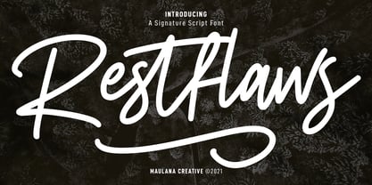 Restflaws is a casual script font. With medium mono-line stroke, fun character with a bit of ligatures and alternate characters. To give you an extra creative work. Restflaws font support multilingual more than 100+ language. This font is good for logo design, Social media, Movie Titles, Books Titles, a short text even a long text letter and good for your secondary text font with sans or serif. Make a stunning work with Restflaws font. Cheers, MaulanaCreative
 - Clockerts by Maulana Creative,
$13.00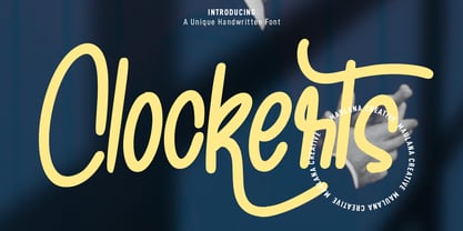 Clockerts is a fancy casual modern script font. With clean mono-line stroke, fun character with a bit of ligatures and alternates. To give you an extra creative work. Clockerts font support multilingual more than 100+ language. This font is good for logo design, Social media, Movie Titles, Books Titles, a short text even a long text letter and good for your secondary text font with sans or serif. Make a stunning work with Clockerts font. Cheers, MaulanaCreative
 - Luxury Modish by Ergibi Studio,
$20.00 Luxury Modish is Modern Calligraphy font presentation from Ergibi Studio. Inspired by beautiful writing that has a luxurious feel with additional swash lines This font includes uppercase, lowercase letters, numbers, punctuation, symbols, swash and multilingual support. Luxury Modish is perfect for branding, photography, invitations, quotes, watermarks, advertisements, product designs, social media posts, stationery, labels, and more! I hope you enjoy this font. If you have any questions please don't hesitate to drop me a message :) Thank You, Ergibi Studio
 - Linotype Agogo by Linotype,
$40.99Linotype Agogo is part of the Take Type Library, chosen from the contestants of Linotype’s International Digital Type Design Contests of 1994 and 1997. Designed by British artist Ed Bugg, the font is reminiscent of the elegant 1920s and 1930s. It is a calligraphy font with five weights, one regular and four swash. The regular weight alone is clear and legible enough even for longer texts, although when used with swash characters, the texts should be shorter or headlines. - Southavely Signature by Maulana Creative,
$14.00 Southavely is a casual signature font. With regular mono-line stroke, slanted and fun character with a bit of ligatures. To give you an extra creative work. Southavely font support multilingual more than 100+ language. This font is good for logo design, Social media, Movie Titles, Books Titles, a short text even a long text letter and good for your secondary text font with sans or serif. Make a stunning work with Southavely font. Cheers, MaulanaCreative
 - Varino by Arterfak Project,
$15.00 Varino is a futuristic font. A font family inspired by the visual of technology that we can find in logos, Sci-Fi movies, games, and the present gadgets. Designed with minimalist style and unique letterforms, Varino is a perfect choice to use for logos, labels, posters, packaging, books, movies, presentations, games, and much more! Varino, complete with some elegant ligatures, will make your design look more futuristic and dynamic. Varino comes in Light, Normal, Bold, Outline and Extrude.
 - Sahitya by Sulthan Studio,
$19.00 Sahitya Script is a stylish calligraphy font that features a varying baseline, smooth line, classic and elegant touch. It can be used for various purposes such as headings, signature, logos, wedding invitation, t-shirt, letterhead, signage, labels, news, posters, badges etc. Sahitya Script is built with OpenType features and includes start and end. It comes with OpenType Stylistice set, Initial, swashes, ligatures and everything to add a touch to your design and also supports other languages :)


