9,661 search results
(0.021 seconds)
- Crystania by RGB Studio,
$17.00 Crystania is a must-have signature script that has a diverse. This collection fills a void and separates itself from other scripts available. Crystania is a handwritten signature script with a natural & stylish flow. This collection of scripts is perfect for personal branding. But, this works well for many applications. Everything from personal branding & wedding invitations to advertising could benefit from this collection of signature fonts. These typefaces work well for many different aesthetics. They work well with something like 'cosmetics' for example but would also work well with Liquor Labels, Signage, & any type of signature-styled logo. Files Include : Basic Latin A-Z and a-z Numbers Symbols PUA Encode Multilanguage Support Thanks and have a wonderful day, If you have any questions, please get in touch with us Don't forget to check out our other products.
 - Walpurgis Night by NREY,
$25.00 Walpurgis Night is an elegant majuscule vintage serif font inspired by classic antique fonts. It perfectly represents modern and vintage aesthetics. The font includes special uppercase letters, many alternate characters and beautiful ligatures. The font is perfect for wedding elegant invitation cards, beauty and fashion package design, very suitable for books design, magazine typography, packaging, branding, and other creative projects. It supports many languages such as Czech, Danish and Norwegian, Deutsch, English, Espanol, French, Italiano, Magyar, Nederlands, Polish, Portuguese, Finnish, Swedish, Turkish and others based on extended Latin. To enable the OpenType Stylistic alternates, you need a program that supports OpenType features such as Adobe Illustrator, Indesign, Photoshop & CorelDraw X6-X7. More information about how to access alternate glyphs, you can see it on this link ( https://goo.gl/R1n7L8) Thank you and have a great day!
 - AW Conqueror Std Inline by Typofonderie,
$59.00 30s inspired geometric inline display typeface Several titling typefaces made their appearance at the start of the 20th century, notably Acier and Bifur, both created by French poster artist Cassandre. Later, in the Netherlands, S.H. de Roos designed a version of Inline for its Nobel family called, naturally, Nobel Inline. AW Conqueror Inline pays homage to this beautiful version. AW Conqueror superfamily AW Conqueror Didot is part of a larger family, who include 4 others subfamilies with great potential: They’re but based on same structure, with some connection between them (width for example), to offer a great & easy titling toolbox to any designers, from skillful to beginner. Each of the members try their best to be different from the others because of their features. They should work harmoniously in contrast. Club des directeurs artistiques Prix 2010 European Design Awards 2011
 - Brushability by My Creative Land,
$29.00The Brushability is a brush-written font family that contains 9 fonts, all united by a brushy look. All fonts compliment each other perfectly and can be used either together or with many other brush-looking fonts on the market. The script contains a lot of alternates, swashes, ligatures, arrows etc. while the Extras font has quite a few design elements with the same brush look - such as arrows, frames and swashes - to add more personality to the design. The 5 sans serif fonts (ranging from Light to Black) also contain alternate glyphs for certain letters - just to make your design process even more fun. All fonts, as usual, are fully unicode mapped so you can use them in any application. Just be aware that if your application doesn’t support OpenType features, you’ll have to choose the glyphs you need manually. - ST Stengazeta by ShimanovTypes,
$3.00 Introducing a retro grotesque called "Stengazeta". The name means "wall newspaper" - this is very popular in USSR genre of handmade artwork that is actually a mix of newspaper and poster. During the Soviet era you could find it everywhere - in factories, schools, research labs, and even in army and police. Sometimes it was a kind of official propaganda, but often just a way of expressing of creativity of co-workers. The letterforms are bold and grotesque with strong handmade feeling. It has Extended Eastern Europe Cyrillic and some of Extended Eastern Europe Latin letters. "Stengazeta" created for titles, poster design, web design, branding and packaging works, illustrations, badges and other typography works. ST-Stengazeta supports languages: Belarusian, Bosnian, Bulgarian, Croatian, Czech, Danish, English, Russian, Serbian, Slovenian, Spanish, Ukrainian, and probably others ) WHAT YOU GET Uppercase, numbers, punctuation, international characters.
 - Remesterad by Bosstypestudio,
$15.00 Remesterad - Modern & Signature Script Perfect, Font It includes a full set of upper and lower case letters, multilingual symbols, numbers, punctuation marks and 20 ligatures. This font has a smooth ballpoint pen texture. It has a lowercase start and end ligature! This font is PUA coded which means you can easily access all the glyphs full of signatures! It also features many special features including glyphs and alternate ligatures. font designs made for various vector designs, printing such as digital wedding blogs, online shops, social media, while printing can be used in the field of clothing products, accessories, bags, pins, logos, business cards, watermarks and many others... so it can make your product look cute and attractive, and also Multilingual support!!! If you have any other questions, feel free to drop me a message :) happy designing :), Mu Fazzal
 - Hokaplay by Afkari Studio,
$13.00 Hokaplay - Playful Display Font Hokaplay is a playful display font that creates with a very good concept and adjusted well to keep the legibility. Hokaplay Playful Display Font Comes with upper and lowercase Standard Characters, Punctuation, Numerals And other Glyphs variation of the OpenType features/ Ligatures. Hokaplay Playful Display Font is suitable for logos, posters, school flyers, university banners, modern advertising design, product labels, cartoons, kid books, custom mugs, pillows, t-shirts, youtube thumbnail/cover, poster quote, editorial design, book/cover Title, website/blog, social media post, packaging designs,, and other designs. Features; - 2 Styles; Regular and Rounded - Standart and special ligatures - Uppercase, Lowercase, Number, and Punctuation - Works on PC & Mac - Simple installations - Accessible in Adobe Illustrator, Adobe Photoshop, Adobe InDesign, even work on Microsoft Word - Fully accessible without additional design software. - Mültîlíñgúãl Sùppört for; ä ö ü Ä Ö Ü ß ¿ ¡
 - Brokson by Andrey Sharonov,
$25.00 This font pair was crafted by hand under inspiration of old-fashioned typography on different vintage labels, packages, sighs and others. It’s will be a godsend for those who want to add vintage mood to design project. Collection includes Script, Serif and it’s variations like Regular, Rough and Aged. This pair perfectly cooperating with each other. Brokson can be used in different purposes: lettering and logotype, labels, t-shirts, product packaging, advertising and many others. In addition to the basic set, Brokson Script has beautiful alternatives of Uppercase characters, variations of the end for Lowercase and some ligatures. Also, there are two types of end-swashes and eight lengths of each style. Brokson Serif was designed as a secondary and additional font after Script, but in the process of their use I realized it also look great as a priority. Quick combinations for Opentype features: Uppercase Alternates - just add for example «2, 3, or 4» after Uppercase; End-letter - just add «2» at the end of the word; End-swashes (tails) - just add _1, _2, _3… or /1, /2, /3…up to 8, where number is length of tail. This combinations works only with activated Standard Ligatures option in Opentype panel (Adobe Illustrator / Photoshop). Multilingual Support Danish, Dutch, English, Estonian, Faroese, Finnish, French, German, Hungarian, Icelandic, Italian, Norwegian, Polish, Portuguese, Slovene, Spanish, Swedish, Turkish.
 - Rolphie by Aah Yes,
$9.95 Rolphie can be your go-to sans-serif, with 16 easy-to-read weights and 10 versions for each weight, and the subtlety of choice that represents. The versions contained in each weight are: Regular; Condensed; Half-Condensed; Expanded; Small Capitals: and their italic counterparts. (At heavier weights particularly it seemed to be justified to have two Condensed versions). Plus there's 20 funky versions with the letters all shook up (that would make a good title for a song), or jumbled around, plus some Shadow, Doubled-Up, College, and other FX versions. In total there's 180 variations, giving a comprehensive selection of both standard and funky fonts, and that subtle degree of choice of weight. To make things easier, the weights are put in ascending numerical order from 01 to 16, and the FX versions have been stuck in the 80s and 90s, (like two musicians I know). There are grouped packages available for certain weights (which have 10 fonts in them) and the complete family package (180 fonts) which represent better value than the individual fonts, and there's a basic package containing the Normal and Italic versions of all 16 weights (32 fonts). A limit of 5 sub-family packages has been imposed, unfortunately, which precludes a more comprehensive selection. To let you know what's in the font that you might otherwise never know about . . . With Discretionary Ligatures on, you get special characters if you type Mc St. Rd. Bd. Ave. c/o No. (p) (P) - include the full-stop/period. With Stylistic Alternates switched on, you get plenty of extra characters - including a WiFi symbol (type Wifi or WiFi) / bullet numbers instead of ordinary numbers / that different U-dieresis / special characters for c/o No. Mc / an upside down ~ / a huge bullet, and different forms for cent, dollar, percent, per-thousand. As you'd expect, there's all the accented characters for all Western European scripts using Latin letters, and standard ligatures, plus other Open Type features including Class Kerning, Slashed-Zero, Historical Forms, Sub- and Superscript numbers, fractions for halves, thirds and quarters, Ornamental forms giving bullet numbers, etc. There's also the main mathematical operators, symbols like card-suits and male/female signs and so on, and some more obscure stuff like schwa and O-horn, U-horn - and there's lots more if you can Access All Alternates. Much will depend on what your software recognises. The Small Caps versions have (intentionally) lost the ligatures for lower case ff, fi, fj, fl, fr, fu, ffi, ffj, ffl, ffr, ffu. The names for the weights are not absolute - we had to make up some names to make them stretch out to sixteen - so rather - see them as relative to each other, being in ascending numerical order by weight.
 - Quercus 10 by Storm Type Foundry,
$69.00 Quercus is characterised by open, yet a little bit condensed drawing with sufficient spacing so that the neighbouring letters never touch. It has eight interpolated weights with respective italics. Their fine gradation allows to find an exact valeur for any kind of design, especially on the web. Quercus serif styles took inspiration from classicistic typefaces with vertical shadows, ball terminals and thin serifs. The italics have the same width proportion as upright styles. This “modern” attitude is applied to both families and calls for use on the same page, e g in dictionaries and cultural programmes. Serif styles marked by “10” are dedicated to textual point sizes and long reading. The sans-serif principle is rather minimalistic, with subtle shadows and thinned joints between curved shapes and stems. Quercus family comprises of the usual functionality such as Small Caps, Cyrillics, diacritics, ligatures, scientific and aesthetic variants, swashes, and other bells & whistles. It excels in informational and magazine design, corporate identity and branding, but it’s very well suited for book covers, catalogues and posters as well. When choosing a name for this typeface I've been staring out from my studio window, thinking helplessly without any idea in sight. Suddenly I realised that all I can see is a spectacular alley of oaks (Quercus in Latin) surrounding my house. These oaks were planted by the builders of local ponds under the leadership of Jakub Krčín in the fifteenth century.
 - Quercus Whiteline by Storm Type Foundry,
$69.00 Quercus is characterised by open, yet a little bit condensed drawing with sufficient spacing so that the neighbouring letters never touch. It has eight interpolated weights with respective italics. Their fine gradation allows to find an exact valeur for any kind of design, especially on the web. Quercus serif styles took inspiration from classicistic typefaces with vertical shadows, ball terminals and thin serifs. The italics have the same width proportion as upright styles. This “modern” attitude is applied to both families and calls for use on the same page, e g in dictionaries and cultural programmes. Serif styles marked by “10” are dedicated to textual point sizes and long reading. The sans-serif principle is rather minimalistic, with subtle shadows and thinned joints between curved shapes and stems. Quercus family comprises of the usual functionality such as Small Caps, Cyrillics, diacritics, ligatures, scientific and aesthetic variants, swashes, and other bells & whistles. It excels in informational and magazine design, corporate identity and branding, but it’s very well suited for book covers, catalogues and posters as well. When choosing a name for this typeface I've been staring out from my studio window, thinking helplessly without any idea in sight. Suddenly I realised that all I can see is a spectacular alley of oaks (Quercus in Latin) surrounding my house. These oaks were planted by the builders of local ponds under the leadership of Jakub Krčín in the fifteenth century.
 - Toby Font by Ingo,
$19.00 A playful handwriting of a child Twelve-year old Tobias Düsel designed the characters of this font in 2002 during his family’s furlough in the USA. He drew the alphabet freehand in pencil on a piece of stationery, and clearly had examples of the well-known college and military fonts in mind. The characters in their basic form are geometrically thought out, as well as the construction of the shadows. But remarkably, while drawing, Tobias Düsel did not reach for the obvious aid of a ruler. In fact, the strokes of the letters are not linear, rather are recognizably well-balanced with declining and increasing straights as can be seen in polished classical fonts. Originally this font consists only of upper case letters — all other characters (punctuation marks, figures and similar) have been modified from the components of the capital letters. Complementary to the original Outline-Shadow-Version TobyFont Empty, the variations TobyFont Inside and TobyFont Full are also available. ”Empty“ is, so to speak, the frame of the typeface as “Inside” is the filling, and “Full” is the sum of both. All three versions have the exact same body size so that they can be placed over one another congruently. In this way the effect of a font in two or three colors can be attained. TobyFont is excellently suitable for designing “picturesque” or “hand-carved” contents; large weights are especially charming and striking.
 - Quercus Serif by Storm Type Foundry,
$69.00 Quercus is characterised by open, yet a little bit condensed drawing with sufficient spacing so that the neighbouring letters never touch. It has eight interpolated weights with respective italics. Their fine gradation allows to find an exact valeur for any kind of design, especially on the web. Quercus serif styles took inspiration from classicistic typefaces with vertical shadows, ball terminals and thin serifs. The italics have the same width proportion as upright styles. This “modern” attitude is applied to both families and calls for use on the same page, e g in dictionaries and cultural programmes. Serif styles marked by “10” are dedicated to textual point sizes and long reading. The sans-serif principle is rather minimalistic, with subtle shadows and thinned joints between curved shapes and stems. Quercus family comprises of the usual functionality such as Small Caps, Cyrillics, diacritics, ligatures, scientific and aesthetic variants, swashes, and other bells & whistles. It excels in informational and magazine design, corporate identity and branding, but it’s very well suited for book covers, catalogues and posters as well. When choosing a name for this typeface I've been staring out from my studio window, thinking helplessly without any idea in sight. Suddenly I realised that all I can see is a spectacular alley of oaks (Quercus in Latin) surrounding my house. These oaks were planted by the builders of local ponds under the leadership of Jakub Krčín in the fifteenth century.
 - Technotyp by URW Type Foundry,
$39.99 The digital font Technotyp is based on the hot metal typeface created by the German typographer and type designer Herbert Thannhaeuser (1898-1963) for the former East German type foundry Typoart in Dresden. In the typography book ‘Der Schriftsetzer’ (Fachbuchverlag, Leipzig, 1952), by Paul Fritzsche, this absolutely beautiful slab serif design is presented in all its variations. Fritzsche remarked that – because of its rather condensed form and its relatively long ascenders – the 'Werkschrift' of the Technotyp (comparable with our 'Regular') seemed to be very well suited to serve as a text face, and recommended for this purpose that the face be cut for the composing machine. However, this never happened and the entire Technotyp family was made available for hand composition only. This is finally changing and being remedied for good now: URW++ proudly presents the new digital version of this really charming font family with its distinct flavor of the 1950s, adding it to the other digital renditions of Herbert Thannhaeuser fonts at URW++, namely Garamond No. 4 and Magna. The original Typoart family had an italic style for the light version only. The new digital version of Technotyp includes italic styles for the regular, medium and bold weights as well, enhancing the family to meet today’s standards and requirements for professional type setting. To further increase its usefulness, Cyrillic faces were created, too. True to the standard for all digital fonts at URW++, the character set for Technotyp covers all West- and East European languages.
 - Quercus Sans by Storm Type Foundry,
$69.00 “Quercus” is characterised by open, yet a little bit condensed drawing with sufficient spacing so that the neighbouring letters never touch. It has eight interpolated weights with respective italics. Their fine gradation allows to find an exact valeur for any kind of design, especially on the web. Quercus serif styles took inspiration from classicistic typefaces with vertical shadows, ball terminals and thin serifs. The italics have the same width proportion as upright styles. This “modern” attitude is applied to both families and calls for use on the same page, e g in dictionaries and cultural programmes. Serif styles marked by “10” are dedicated to textual point sizes and long reading. The sans-serif principle is rather minimalistic, with subtle shadows and thinned joints between curved shapes and stems. Quercus family comprises of the usual functionality such as Small Caps, Cyrillics, diacritics, ligatures, scientific and aesthetic variants, swashes, and other bells & whistles. It excels in informational and magazine design, corporate identity and branding, but it’s very well suited for book covers, catalogues and posters as well. When choosing a name for this typeface I've been staring out from my studio window, thinking helplessly without any idea in sight. Suddenly I realised that all I can see is a spectacular alley of oaks (Quercus in Latin) surrounding my house. These oaks were planted by the builders of local ponds under the leadership of Jakub Krčín in the fifteenth century.
 - Pinel Pro by URW Type Foundry,
$39.99 The characteristic ‘French face’ was originally made in 1899 under the supervision of Joseph Pinel. Thus, what was originally French 10 pt. Nº 2, got its present name. The Frenchman Joseph Pinel called himself a "typographical engineer", but was at the time employed as a type draughtsman at the Linotype Works in Altrincham. It appears that this and some other faces that he supervised, were, except for use on the Linotype, also meant for manufacturing matrices for the Dyotype. This composing machine was an invention of Pinel. The Dyotype was a rather complicated machine and consisted, like the Monotype, of two separate contraptions, a keyboard which produced a perforated paper ribbon and a casting machine which produced justified lines of movable type. Unlike the Monotype which has a square matrix carrier, the Dyotype had the matrices on a drum (in fact two drums, hence the name of the machine). A Pinel Diotype company was founded in Paris and a machine was built with the help of the printing press manufacturer Jules Derriey. As is often the case, a lack of sufficient capital prevented the commercializing of this ingenious composing machine. Coen Hofmann digitized the font from a batch of very incomplete, damaged and musty drawings, which he dug up in Altrincham. He redrew all characters, bringing up the hairstrokes somewhat in the process. The result is a roman and italic, while the roman font also includes Small Caps
 - Picture this: the font cabanyalZ is like that eccentric, flamboyant uncle who shows up at family parties wearing bold, exotic patterns with an attitude louder than his shirt. This font doesn't just e...
- The Osaka-Sans Serif font, crafted by the talented Vic Fieger, is a distinctive typeface that melds modernity with simplicity to offer a versatile and visually appealing font for various applications...
- Elfinotes by Gassstype,
$22.00 Hello Everyone, introduce our new product Elfinotes is a Fun Display Font .This is Cute & Lovely Craft font with a natural handwritten feel. This handmade font will make your design has a beautiful natural touch for each details. It is perfect for any design project as Invitation,logo, book cover, craft or any design purposes. Elfinotes is font with strong and challenging nuances. very suitable for the title, typography, Poster, magazines, brochures, packaging,Websites and much more for your design needs, making your designs more modern and professional
 - Mrs Lollipop by Hipopotam Studio,
$20.00 Mrs Lollipop is a hand drawn narrow typeface designed for one of our books. You can layer different styles over the background style to achieve lots of colorful effects. Check out the manual for details. Mrs Lollipop has upper and lowercase characters with up to three alternate glyphs. Build in OpenType Contextual Alternates feature will automatically set alternate glyphs depending on frequency of appearance of the same character (even in web font but only in HTML5 browsers). The script doesn’t throw random glyphs. It has lines, frames, hearts, stars, ladybird and two rabbits.
 - Lemonade Soda by Gassstype,
$23.00 Hello Everyone, introduce our new product Lemonade Soda - Bold Handmade Carefully Crafted All Caps Display, inspired by the title of the sports poster and We make it very energetically. Lemonade Soda font with strong and challenging nuances. very suitable for the title, typography, Poster, magazines, brochures, packaging,Websites and much more for your design needs, making your designs more modern and professional Inspired by Logo style and combination with Cute Craft style. that will fulfill your design needs for quotes,sporty theme, logotype, wordmark, etc. This has many opentype features and support multi language.
 - Bonsai Paufo by Intellecta Design,
$18.90 Bonsai Paufo are a collection of dingbats fonts inspired in the ancient art of Bonsai. A beautiful work with organic forms and sensibility with the taste of the vegetal world, by Chyrllene K, who brings you with an amazing extra gift: Buying the family pack (two fonts) you get a special free bonus: the Victorian Advertising EPS PACK 2 with ten beautiful artworks (in eps) inspired in the Victorian ages magazine advertisings (see the banners). See all the glyphs from BonsaiPaufo in the pdf brochures at the gallery section.
 - Orgovan by Suitcase Type Foundry,
$39.00Orgovan is based on calligraphic script models lettered with a flat brush, which have been a mainstay in the sign makers' and display artists' handbooks since the beginning of the 1960s. Careful adjustments to the construction of the character shapes made the glyphs more open. This ensures that the face is well legible in small sizes, making it suitable for more demanding typographic applications. The Punk and Rounded variations of the base model offer an even broader range of possible applications, while the Fat Cap, Flower Power and Hairy cuts are contemporary decorative alternatives. - Borden by La Boîte Graphique,
$25.00 Borden is a rounded hand-printed caps font ideal for your graphic project. Usage recommendations : Title, short text, children’s book, poster, book cover, brochure, label, magazine. "The friendly hand-drawn charms of the Borden family […] Designed by Ewen Prigent, the Borden family is a hand rendered, all-caps design ideal for all sorts of playful settings. With its narrow condensed letterforms and rough rendering, this family is a good fit when space is limited in your design but you don’t want to compromise its friendly tone." www.fonts.com - newsletter - march 2014
 - Vitro by The Northern Block,
$24.95 Vitro is a rectangular sans serif with a pinch of grotesque. The solid technical appearance has been achieved through careful optical adjustment, resulting in a modern and stylish font that stands out in the crowd. Vitro is suitable for a wide range of branding purposes, including brochures, logos, packaging, posters, signage, websites etc. Details include nine weights with italics and over 450 characters per style. Opentype features consist of digital numerals, numerators, denominators, tabular, fractions and language support covering Western, South and Central Europe—remastered to version 2.0 for enhanced OpenType features and usability.
 - Le Havre Sketch by insigne,
$22.00 Le Havre Rough, a letterpress variant of Le Havre is 72% off for a limited time! Le Havre Sketch is a hand-sketched geometric sans serif. The family contains three weights. All members of the family include Sixty-four OpenType ligatures that add a realistic, natural effect and ensure that no two letters in a word repeat, oldstyle figures and small caps. Please see the sample brochure to see these features in action. Le Havre Sketch is an excellent choice when you need a fun and interesting sans-serif.
 - Burdigala Semi Serif by Asgeir Pedersen,
$19.99Burdigala is a clean-cut, modern yet classic typeface inspired by Didones and Aicher’s Rotis family. The Semi Serif is ideal for larger amounts of (printed) texts in brochures, magazines and books. It is slighty narrow in order to conserve space, but spacious enough to faciliate reading and overall clarity. The expanded versions of the semi serif, being wider and more open, works equally well in media intended both for print and on-screen reading, e.g. in Pdf-documents etc. Burdigala is the ancient Roman name of the city of Bordeaux France. - Cronisse by Almarkha Type,
$35.00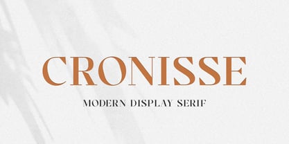 Introducing Cronisse – Modern Display Serif inspired by the famous minimalist logo, perfect for the purposes of designing templates, brochures, videos, advertising branding, logos and more. What’s Included : + Standard glyphs + Web Font + International Accent + Works on PC & Mac + Simple installations Accessible in the Adobe Illustrator, Adobe Photoshop, Adobe InDesign, even work on Microsoft Word. PUA Encoded Characters – Fully accessible without additional design software. Fonts include multilingual support Image used : All photographs/pictures/vector used in the preview are not included, they are intended for illustration purpose only. Cheers! Thank You
 - Kinship Sans by wearecolt,
$9.00 Introducing Kinship, a Grotesque 9 weight font family by We Are Colt. Kinship has been created to be your all-round go-to grotesque font that works well for copy and titles. With nine standard weights, this font is more flexible than a bungee rope. Kinship is a sans serif modern classic grotesque font, perfect for adding personality to logos and brochures. Pairs well with script and brush fonts: I recommend Stroom . Features: 9 separate font weights Western European, Central, South-eastern Upper and lowercase Numerals Free 300 font weight
 - Waluxe by Almarkha Type,
$27.00 Introducing Waluxe – Luxurious Roman Sans inspired by the famous minimalist logo, perfect for the purposes of designing templates, brochures, videos, advertising branding, logos and more. What’s Included : + Standard glyphs + Web Font + International Accent + Works on PC & Mac + Simple installations Accessible in the Adobe Illustrator, Adobe Photoshop, Adobe InDesign, even work on Microsoft Word. PUA Encoded Characters – Fully accessible without additional design software. Fonts include multilingual support +Image used : All photographs/pictures/vector used in the preview are not included, they are intended for illustration purpose only. Cheers! Thank You
 - Squabslab by Gassstype,
$23.00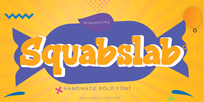 Hello Everyone, introduce our new product Squabslab - Handmade Bold Font Display, inspired by the title of the sports poster and We make it very energetically. Squabslab font with strong and challenging nuances. very suitable for the title, typography, Poster, magazines, brochures, packaging,Websites and much more for your design needs, making your designs more modern and professional This handmade font will make your design has a beautiful natural touch for each details. It is perfect for any design project as Invitation,logo, book cover, craft or any design purposes.
 - Raisin Muffin by Gassstype,
$23.00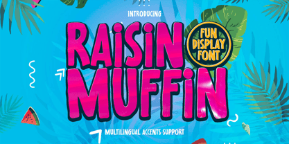 Hello Everyone, introduce our new product Raisin Muffin is a Fun Display Font .This is Cute & Lovely Craft font with a natural handwritten feel. This handmade font will make your design has a beautiful natural touch for each details. It is perfect for any design project as Invitation,logo, book cover, craft or any design purposes. Raisin Muffin is font with Creative Display Fun and challenging nuances. very suitable for the title, typography, Poster, magazines, brochures, packaging,Websites and much more for your design needs, making your designs more modern and professional.
 - Gamila Arabic by Zaza type,
$24.00 Gamila is a new Arabic font that is inspired by the traditional Naskh style. It is elegant and versatile, with five different weights ranging from light to bold. This font is perfect for a wide range of design projects, including book covers, brochures, posters, and more. The Naskh style is known for its legibility and readability, making Gamila a great choice for long-form text. Whether you are working on a formal document or a creative project, Gamila is sure to impress with its refined and sophisticated appearance.
 - Monasterka by DePlictis Types,
$31.00 Monasterka refers to the preservation of ancient traditions and the right orthodox faith. It is a bold, archaic typeface in two styles especially designed for printing purposes. It is a powerfull, expressive typeface inspired by old cyrillic writing and may do a great job for brochures and publications designs that has to do with religious or historical thematic, mostly as headlines and titles with great impact and personality. This family has an extended language coverage for many languages including latin, cyrillic and greek alphabets and comes in two styles.
 - Beckford Script by Dear Alison,
$29.00 Brush lettered scripts have such a quick expressive quality to them and have amazed me since I was a little girl. The quick whip of the wrist can make or break a letterform so easily. They are filled with personality and visual flavor. Beckford Script taps into that association and brings a quick handed sassiness reminiscent of vintage travel brochures and old pulp and romance novels. But for whatever you might need this script for, you'll find it up for the task. Spice up your font collection and pick up Beckford Script today!
 - Elegante Classica by Mokatype Studio,
$18.00 Hello Introducing, Elegante Classica - Luxurious Serif Display is an elegant, inspired by the famous minimalist logo, perfect for the purposes of designing templates, brochures, videos, advertising branding, logos and more. Perfect for adding a unique twist to word-mark logos, monograms or pull quotes. Accessible in the Adobe Illustrator, Adobe Photoshop, Adobe InDesign, even work on Microsoft Word. PUA Encoded Characters - Fully accessible without additional design software. Fonts include multilingual support Image used : All photographs/pictures/vector used in the preview are not included, they are intended for illustration purpose only. Thank You
 - Elfen Fraktur by FDI,
$25.00 Elfen-Fraktur is monolinear blackletter typeface, that was originally designed by M. Beck and published in 1919. This revival comes in two extended versions with a complete Latin 1 character set: Elfen-Fraktur A uses the original blackletter skeletons and is suitable for setting texts with traditional German typesetting and orthography rules. Elfen-Fraktur B includes modernized letter designs for a broader and more legible use in various languages. A free bonus is the set of 22 border elements called Elfen-Schmuck. Check out the type specimen PDF for more details and instructions.
 - Snow Crystals by Deniart Systems,
$20.00 It's time to just let it snow! Deniart’s Snow Crystals typeface is an original design featuring 62 unique symbols. These charming snow crystals are sure to add elegance to all your winter designs - the set includes traditional style snow crystals as well as an assortment of bonus characters such as star-bursts and holiday accents. This font comes with a PDF guide to put all these special characters right at your fingertips! Note - if you want an even broader range of snow flakes, you may also like our second snow font known as "Star Crystals".
 - Phat Chance by Scholtz Fonts,
$21.00Phat Chance is a funky, in-your-face font that has strong overtones of modern rap and hip-hop culture. Its broad, fluid line evokes the beat of modern music, the rhythm of contemporary dance, and the power of videogame computer graphics. It is essential for marketing companies targeting: ⁃ the music scene: CD covers, posters, music videos, presentations ⁃ the movie scene: posters, ads, promotion material, copy, movie titles ⁃ the theatre scene: posters, programs, ads, promotions ⁃ the fashion scene: hangtags, posters, brochures, signage, ads ⁃ the fast food market: packaging, promotions, menus, signage ⁃ general packaging ⁃ general advertising - Wilkysta by Graphicxell,
$19.00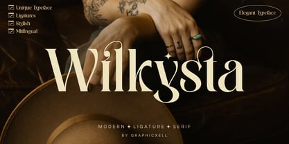 Wilkista Ligature Serif Typeface inspired by the famous minimalist logo perfect for the purposes of designing templates, brochures, videos, advertising branding, logos and more. What's Included : + Standard glyphs + Web Font + Ligatures + International Accent + Works on PC & Mac + Simple installations Accessible in the Adobe Illustrator, Adobe Photoshop, Adobe InDesign, even work on Microsoft Word. PUA Encoded Characters - Fully accessible without additional design software. Fonts include multilingual support Image used : All photographs/pictures/vector used in the preview are not included, they are intended for illustration purpose only. Thank You