10,000 search results
(0.032 seconds)
- Mount Gambier And Sidney by HafisHidayat,
$20.00 Introducing Mount Gambier And Sidney this is a very cool brush font that is deliberately made for your various personal and big business design needs such as design logos, business cards, advertisements, etc. - Web fonts EOT, SVG, WOFF, WOFF2 Thank you very much for buying, don't hesitate to contact me!
 - Kodaro by Vultype Co,
$39.00 Kodaro font is an unique and quirky display typeface with unique curves and a dreamy flow. It loops and swoops in a delicate dance that is never boring. Use this dainty serif as a memorable logotype or header and pair it with something contrasting and clean. ( My suggestions: Futura/Lato/Montserrat )
 - Retro Candy by Mvmet,
$10.00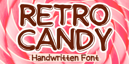 Retro Candy is a cool retro style candy display font. You can use it for anything ranging from t-shirts, kids’ book designs, greeting cards, stickers, and posters, or anything that needs a casual touch. Fall in love with its incredibly versatile style, and use it to create lovely designs!
 - Chilok by Dhan Studio,
$19.00 Chilok is a cool handwritten font that is also elegant and fashionable, which looks like a signature or logo, this font also has an alternative to beautify your design. Chilok is perfect for branding, logos, business cards, posters, invitations, greeting cards, news, product packaging, blog posters, all including personal charm, etc.
 - Aromi by Atom,
$15.00 Aromi is a modern and cool script font with amazing swashes. Use it to turn any design project into a standout! Just perfect for those who love to create whimsical collages, e-newsletters, web banners and quotes to skyrocket on social media, especially Pinterest! Have a great day! Thank you :)
 - Xmas Bubbles by Mvmet,
$18.00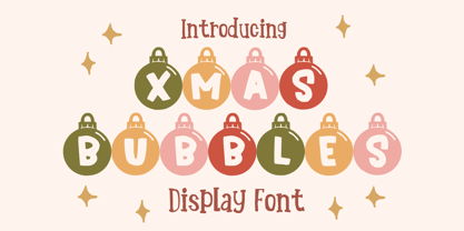 Xmas Bubbles is a cool ornamental Christmas display font. You can use it for anything ranging from t-shirts, kids’ book designs, and greeting cards to stickers and posters, or anything that needs a casual touch. Fall in love with its incredibly versatile style, and use it to create lovely designs!
 - Andron Corpus Publix by SIAS,
$49.90 The two fonts Andron Corpus Publix-General and Andron Corpus Publix-Transport offer a selection of most useful public orientation signs as occurring in public spaces as well as in digital and printed media. The unusual feature of these fonts is a thorough and fancyful typographical detailing, which makes the characters appear more sophisticated and less schematic. The ductus of these fonts matches the style of Andreas Stötzner’s Andron typeface family. Use these fonts for signage systems, marking, catalogues and brochures. Test the unusual high recognisability – with small sizes and at large distances – and compare to other, more template-like fonts!
 - Angkora Volk by Skinny Type,
$18.00 Angkora Volk - a stylish OpenType rich serif with letters that seem to dance and swirl in harmony - to form a unique & elegant typographic design. A large selection of interwoven Opentype binders and replacements, meaning lots of choice and variety in your final look. To access these OpenType features, you need Opentype-enabled software such as: Word, Textedit, Photoshop, Sketch, Pages, Keynote, Numbers, iBooks Author, QuarkXPress, Indesign and Illustrator. A wide variety of useful glyphs are included - see preview images of all glyphs. Angkora Volk also includes the full set: -uppercase and lowercase letters -multilingual symbols -number -punctuation -alternative style -fastener
 - Rosina by Hashtag Type,
$28.49 Rosina is a geometric typeface with a distinctive charm. With a captivating fusion of dashing 1920s style and 21st Century sensibility, geometric forms have been taken and optically adjusted to create a sturdy typeface. Tall ascenders and descenders attempt to simulate architectural features of the Art Deco period, striving for a look of the future, nevertheless form always follows function. Rosina explores typographic boundaries and lends itself well to branding, posters and other display uses. Full details include 6 weights from Thin to UltraBold and include a range of OpenType features such as case sensitive punctuation.
 - Bloxic by Studio Buchanan,
$20.00 Bloxic is a chunky, counter-less display typeface, packed full extra characters and some bonus icons! Bloxic comes packed with over 320 glyphs, including stylistic alternate characters, circled numbers, and a whole bunch of useful symbols and stuff. It started life back in 2008, when pop/punk/emo bands were all the rage. Pulled from a hand lettered t-shirt design, adapted and systemised – it now exists for your typographic pleasure. It still carries some of the hand rendered feel of the original design, and has some slightly different takes on a zero counter typeface (which the world clearly need more of...).
 - UT Laurelle by Uniontype,
$20.00 Laurelle is a polished and smooth script family. The family consists of light, regular, bold and press styles. Laurelle provides advanced typographical support with contextual alternates, final forms, ligatures and swashes. This font also includes Cyrillic, with all OpenType features. It is most suitable for the headlines of all sizes, as well as for the text blocks. Laurelle is versatile and can be used on cards, posters, merchandise, book covers, websites, packaging, and basically anywhere you like. The overall feel of the font is warm, elegant and informal and it is perfect if you want to convey a sense of friendliness and style.
 - Copenhagen Grotesk by David Engelby Foundry,
$- From Weimar to København/Copenhagen, picking up some decadent traits on its journey. The design of Copenhagen Grotesk is inspired by the great German grotesque type design history, although it will not fall into ranks in all aspects. Indeed, Copenhagen Grotesk will not be put into one single time pocket of style, so you'll notice that there's a hint of art deco style in its capital letters. The visual expression is first and foremost firmly rooted in the style of Scandinavian design, so feel free to use Copenhagen Grotesk for functional typographic design in relation to multiple media types.
 - Vandalismo 26 by CostaType,
$10.00 The type “Vandalismo 26” is a tribute to the calligraphy style that 'screams' over the front of the buildings in the center of São Paulo/Brazil. This underground calligraphy, known as "pichação" or "pixo”, is a movement that expresses disagreement and rejection against the system. For some critics, this “vandalism” is considered to be the most disruptive and conceptual contemporary art today. It is a type to be used in headlines. Vandalismo 26 is a mix of the chaotic pixo style representing the nonconformity of a generation. It is a protest to the system in a typographic format.
 - Harmonia Sans by Monotype,
$34.99 The Harmonia Sans™ typeface is a fine blend of contemporary geometric sans serif lettershapes and classic calligraphic proportions. Jim Wasco, who was aided by George Ryan in the production of the typeface family, began the design of Harmonia Sans with a single goal in mind. "I wanted to create a simple and legible typeface by pulling the best aspects of classic geometric sans designs, such as Futura and ITC Avant Garde Gothic," Wasco explained. The result is a design suitable for virtually all typographic applications, from text on low-resolution displays to high-resolution print and even architectural signage.
 - Conglomerate by Typetanic Fonts,
$39.00 Sans or serif? Square or rounded? Calligraphic or geometric? Conglomerate is both all and none of these things — a subtle yet unorthodox blend of typographic traits resulting in a clean, unique, and versatile font family with large, open counters for legibility in text yet crisp, sharp details that sparkle at display sizes. Conglomerate is sturdy but never stiff, crisp but never stark — perfect for projects that require a more contemporary feel than either a traditional serif or geometric sans might bring. Conglomerate received a PRINT Magazine Best in Class award, and was one of Typographica’s Favorite Typefaces of 2016.
 - Empira by Hoftype,
$49.00 Empira is a new high-contrasted face. While its principal structure shows some reference to transitional faces, the pronounced graphic shape of its elements are definitely of contemporary origin. It appears crisp, sharp and even somewhat fancy. Empira supports up to 80 languages and its OpenType format allows a wide range of typographic applications. 20 styles offer a fine gradation of the weights. All weights contain small caps, ligatures, superior characters, proportional lining figures, tabular lining figures, proportional old style figures, lining old style figures, matching currency symbols, fraction- and scientific numerals, matching arrows and alternate characters.
 - Timber by Pelavin Fonts,
$25.00 Hand-hewn from sturdy planks with nary a splinter, Timber is a font with origins in the forests of our imagination whose genesis is displayed in its undulating grain. Using just the fill attribute it can present a diverse range of species from mellowest Maple to deepest Ebony. Additional layers of fill and stroke attributes provide the option for an endless variety of outlines and shadows, all the while preserving its luscious texture. If you’ve ever pined for a typographic solution which combines legibility with an organic character, you just might like to get on board.
 - SK Greenland by Salih Kizilkaya,
$9.99 SK Greenland is a humanist sans serif font family with geometric and organic forms. Synthesizing Greenland's thousands of years of organic history and modern period, this font combines the organic nature of Greenland with the geometric structure of its urban areas. This font family, which contains 14 fonts and 9856 glyphs in total, contains all the typographic elements you will need in your designs. You can use this font family, which includes many unique ligatures, without any problems, from headlines to long text. Greenland offers full support for the Latin alphabet while also supporting many other alphabets.
 - Simplo Soft by Durotype,
$49.00 Simplo Soft is the soft companion of Simplo. In Simplo Soft, Simplo’s original sharp geometrics have been tempered by the moderate rounding of the edges of its characters — creating a softer and friendlier geometric typeface. Simplo Soft is ideal for use in display sizes. It is also quite legible in text, and is well suited for graphic design and corporate identity design. Simplo Soft has sixteen styles, extensive language support, eight different kinds of figures, sophisticated OpenType features — so it’s ready for advanced typographic projects. Free demo font available. For more information about Simplo Soft, download the PDF Specimen Manual.
 - Maximilian - Unknown license

- Monument - Unknown license

- Rabno by Baqoos,
$18.00 Rabo is a modernist duality linear sans apt for headline, editorial, branding, packaging, printed materials and typographic applications. 200+ glyphs with ligatures, fractions and alternatives(supported by Illustrator, Photoshop & InDesign) provided in opentype .otf and .woff format.
 - FF Assuri by FontFont,
$30.99 German type designer Fabian Rottke created this display FontFont in 1994. The font is ideally suited for poster and billboards. FF Assuri provides advanced typographical support with features such as ligatures. It comes with proportional lining figures.
 - Kisser by Tigade Std,
$15.00 Kisser is a strong, street-friendly brush font bursting with spirit. With extra attention to natural strokes and sharp details, Kisser is ideal for logos, apparel, quotes, product packaging, or anything which needs a typographic turbo-boost.
 - F2F OCRBczyk by Linotype,
$29.99The original OCR B was designed for optical character recognition systems and was therefore monospaced. Designer Alexander Branczyk made a more typographically tuned and fitted version, with both regular and bold weights, and called it OCRBczyk™. - FF Littles by FontFont,
$30.99 German type designer Simone May created this display FontFont in 1995. The font is ideally suited for poster and billboards. FF Littles provides advanced typographical support with features such as ligatures. It comes with proportional lining figures.
 - Prillwitz Pro by preussTYPE,
$49.00 Johann Carl Ludwig Prillwitz, the German punch cutter and type founder, cut the first classic Didot letters even earlier than Walbaum. The earliest proof of so-called Prillwitz letters is dated 12 April 1790. Inspired by the big discoveries of archaeology and through the translations of classical authors, the bourgeoisie was enthused about the Greek and Roman ideal of aesthetics. The enthusiasm for the Greek and Roman experienced a revival and was also shared by Goethe and contemporaries. »Seeking the country of Greece with one’s soul«. All Literates who are considered nowadays as German Classics of that time kept coming back to the Greek topics, thinking of Schiller and Wieland. The works of Wieland were published in Leipzig by Göschen. Göschen used typefaces which had been produced by until then unknown punch cutter. This punch cutter from Jena created with these typefaces master works of classicist German typography. They can stand without any exaggeration on the same level as that of Didot and Bodoni. This unknown gentleman was known as Johann Carl Ludwig Prillwitz. Prillwitz published his typefaces on 12th April 1790 for the first time. This date is significant because this happened ten years before Walbaum. Prillwitz was an owner of a very successful foundry. When the last of his 7 children died shortly before reaching adulthood his hope of his works was destroyed, Prillwitz lost his will to live. He died six months later. His wife followed him shortly after. The typeface Prillwitz as a digital font was created in three optical styles (Normal, Book and Display). The typeface Prillwitz Press was created especially for a printing in small sizes for newspapers. »Prillwitz Press« combines aesthetic and functional attributes which make written text highly readable. It was originally designed for a newspaper with medium contrast to withstand harsh printing conditions. Its structure is quite narrow which makes this typeface ideal for body text and headlines where space is at premium. For the Normal – even more for the Book – a soft and reader-friendly outline was created through a so-called »Schmitz« and optimized in numerous test prints. The arris character and the common maximal stroke width contrast of the known classicist typefaces (Didot/Bodoni) were edited by the study of the original prints. This was also done in order to reach a very good readability in small type sizes. This typeface is perfectly suited to scientific and belletristic works. Accordingly it has three styles: Regular, Bold and Italic as Highlighting (1). The typeface Prillwitz is a complete new interpretation and continuing development of the conservated originals from 1790. They have been kept in the German Library in Leipzig. It was always given the priority to keep the strong roughness and at the same time optimizing the readability of this striking font. The type family has all important characters for an efficient and typographic high quality work. ----------- (1) Accentuation of particular words or word orders (e.g. proper names, terms etc.). Typographic means for Highlighting could be Italic, SmallCaps or semi-bold.
 - Kosnat Trunks by Alit Design,
$22.00 Kosnat Trunks is a striking sans-serif display font that seamlessly blends retro aesthetics with a touch of modern design. With its wavy ligatures and a whopping 920 meticulously crafted glyphs, this font is a typographic masterpiece that will elevate your design projects to new heights. Key Features: Retro Charm: Kosnat Trunks exudes a delightful retro charm that harks back to the styles of the past, making it perfect for vintage-inspired designs. Wavy Ligatures: The unique wavy ligatures add a playful and dynamic element to the font, making your text visually captivating and memorable. Vast Glyph Library: With an extensive collection of 920 glyphs, Kosnat Trunks offers you unparalleled versatility in your design work. This includes uppercase and lowercase characters, punctuation, symbols, and special characters. PUA Unicode: Kosnat Trunks supports the Private Use Area (PUA) Unicode, ensuring compatibility across various platforms and applications. This feature allows you to access alternate characters and glyphs effortlessly. Multilingual Support: Whether your project requires Latin-based characters or extends to various international languages, Kosnat Trunks has you covered with its comprehensive multilingual support. Ideal Usage: Vintage Branding: Create eye-catching logos and branding materials for retro-inspired businesses and products. Poster Art: Craft attention-grabbing posters and promotional materials that demand attention. Editorial Design: Elevate your magazine layouts, book covers, and editorial spreads with this unique font. Packaging: Design packaging that stands out on the shelf and tells a compelling story. Web Design: Use Kosnat Trunks to add a touch of nostalgia and personality to your website headers and titles. Kosnat Trunks is not just a font; it's a design tool that empowers you to infuse your projects with a sense of nostalgia and style. Elevate your typography game with this versatile and captivating typeface.
 - Korpen Tag by Mans Greback,
$69.00 Korpen Tag is a cool and edgy graffiti font that captures the essence of street art and urban culture. With its tag-inspired handwriting and paintbrush strokes, this font brings an authentic and vibrant touch to your creative projects, making them feel dynamic and alive. Ideal for streetwear branding, album covers, posters, and other projects that require a cool, contemporary vibe, Korpen Tag is an uppercase font that adds a raw, energetic touch to your designs. Its distinctive style makes it a great choice for projects that need to stand out and make an impact. The Korpen Tag font family includes four high-quality styles to suit various design needs: Regular: A free-flowing, paintbrush-inspired graffiti style Upright: A more controlled, vertical version of the regular style Bold: A heavier, bolder version for more impactful designs Bold Upright: Combines the boldness of the bold style with the structure of the upright style Built with advanced OpenType functionality, Korpen Tag ensures top-notch quality and provides you with full control and customizability. It includes stylistic alternates, ligatures, and other features to make your designs truly unique. It has extensive lingual support, covering all Latin-based languages, from Northern Europe to South Africa, from America to South-East Asia. It contains all characters and symbols you'll ever need, including all punctuation and numbers.
 - Toothpaste Two by Eclectotype,
$20.00 Toothpaste Two is a reworking of Toothpaste . The new font has all the features of the original Toothpaste, but is now even crazier, with the line twisting and turning over and under itself, making a tangled string of text bordering on the edge of legibility. As in Toothpaste, every letter and number connects and there are numerous contextual alternates and ligatures to keep it all running smoothly. This is a fun, decorative font. It would look good on kids' websites, scrapbooks, party invitations and the like. It works best in brighter colors on darker backgrounds, which give the characters a neon light quality. Also, try it with a stroke for a cool cartoony effect.
 - Sequel 100 Black by OGJ Type Design,
$35.00 Sequel 100 Black is a neogrotesque font family for forceful headlines, confident titles, and striking posters. An extension of Sequel Sans and primarily designed for display use, it has wider proportions than the original typeface. It also sports a larger x-height that allows for maximum impact on the page. And Sequel 100 Black ain’t no lightweight: it’s the boldest member of the Sequel superfamily, with weights starting at 45 (a sturdy medium style) and going all the way up to an ultra-black 115. Use Sequel 100 Black whenever you want to combine a touch of cool mid-century modernism with the scintillating tension of maximum ink use and minimal whitespace.
 - Deberny by Typorium,
$15.00 The Deberny typeface is an interpretation–carrying a contemporary imprint–of a typographic style which appeared and spread at the end of the 19th century until the begining of the 20th. These typefaces were named Italian, Venetian, Veronese and were classified in the Hellenic category, a spontaneous typographic movement caracterized by triangular and heavy serifs. They found their inspiration among numerous references, from incised to slab serif typefaces and their extreme expressions in wood type letterforms. The Deberny font family is made of 26 styles in 3 complementary sets of style, offering a wide palette of visual resonance: • Deberny Line is ideally suited for editorial, branding, posters and billboards. It has sharp contrast between thick and thin strokes. Heavy horizontal strokes are not frequent in roman letters, but here they fit naturally with the italic letters. • Deberny Open is a stylish outline declination of Deberny Line Medium and Medium Italic. • Deberny Text is an adaptation of Deberny Line made for broader use. Its shapes are less contrasted, which makes it perfectly legible for print or screen reading in small size text. Old style figures and small caps complete Deberny Text in all its 8 styles. The Deberny typeface family supports Latin-based languages and will be available soon in Cyrillic and Greek. Deberny Narrow will be released this year in all its 26 styles.
 - Archeron Pro by Mostardesign,
$25.00 Archeron Pro is a modern serif font family with 18 fonts ranging from light to Heavy with the corresponding italics. This new font family revisits the neo-classical style of highly contrasted serifs and brings a resolutely contemporary touch to graphic or editorial projects. Archeron Pro has also been designed with high-contrast character ratios and a high x-height to give sentences more rhythm and legibility to long texts for on-screen display or printed materials. The italic styles of this family of characters are voluntarily removed from the calligraphic style to bring modernity to the italicized style, thus giving more of a typographic style. With these features, Archeron Pro is an elegant and contemporary serif specially adapted for modern communication as well as complex typographic projects. Archeron Pro also has a complete set of real small capitals with a little more tension than uppercase and generous proportions to give more emphasis to the texts you want to highlight. In terms of features, Archeron Pro is equipped with professional features such as case sensitivity, alternative glyphs, F-ligatures, circled numbers, localized letters, ordinals, or “Pro Kerning” with more than 5,000 pairs of glyphs which brings more clarity when reading long paragraphs. Archeron Pro also has a complete set of proportional and tabular numbers, fractions, and circled numbers for complex realizations such as tables or numerical lists.
 - Bello Pro by Underware,
$50.00 Now check this, Underware’s blockbuster type, Bello. Bello Pro is a brush typeface for headline point sizes - it’s big & beautiful. Bello has lots of ligatures and start and ending swashes. They are automatic in Bello Script Pro, which is a cross-platform OpenType font with many OpenType features. Bello has Underware’s world-dominating Latin Plus character set, supporting a total of 219 languages (Latin 1 + 2 and beyond). After a period of hand sketching and lettering, Bello got two main styles: Script and Caps. These two fonts create a strong typographic contrast - while Bello Script Pro is flourished and flowing, Bello Caps Pro provides upright and sturdy capital lettering. As sturdy as brush lettering allows, of course. Careful spacing and kerning ensures* that Bello appears like fluently written handwriting. However, that’s not enough for a hand-lettered feel. Therefore Bello comes with a set of 64 ligatures. Some of them are typographic, some made simply to create a more intimate, natural impression. For the same reasons we have added a few ornaments and a set of snap-on beginning and ending swashes which attach to the lowercase letters of Bello. With Bello Words Pro you can add some two-color words in your text by the pre-designed word logotypes. Trust the brush! *So take care: use ‘metrics’, not ‘optical’ as a spacing setting in layout apps.
 - Madame by Linotype,
$40.99 The font, Madame, first appeared in a sample with similar fonts, presented by the Fonderie Typographique Française in the 19th century. The font consists of three cuts, letters, accents and numericals. The flamboyant Madame is meant for titles and headlines, emphasis in text or as initials. It combines well with both serif and sans serif fonts, but should be used sparsely to maximize the advantages of its ornate forms.
 - Anderson The Secret Service - Unknown license

- Caslon Graphique by ITC,
$29.99 The Englishman William Caslon punchcut many roman, italic, and non-Latin typefaces from 1720 until his death in 1766. At that time most types were being imported to England from Dutch sources, so Caslon was influenced by the characteristics of Dutch types. He did, however, achieve a level of craft that enabled his recognition as the first great English punchcutter. Caslon's roman became so popular that it was known as the script of kings, although on the other side of the political spectrum (and the ocean), the Americans used it for their Declaration of Independence in 1776. The original Caslon specimen sheets and punches have long provided a fertile source for the range of types bearing his name. Identifying characteristics of most Caslons include a cap A with a scooped-out apex; a cap C with two full serifs; and in the italic, a swashed lowercase v and w. Caslon's types have achieved legendary status among printers and typographers, and are considered safe, solid, and dependable. Caslon Antique was designed by Berne Nadall and brought out by the American type foundry Barnhart Bros & Spindler in 1896 to 1898. It doesn't bear any resemblance to Caslon, but has the quaint crudeness of what people imagine type looked like in the eighteenth century. Use Caslon Antique for that old-timey" effect in graphic designs. It looks best in large sizes for titles or initials. Caslon Black was designed by David Farey in the 1990s, and consists of one relatively narrow and very black weight. It is intended exclusively for titles or headlines. Caslon Black has a hint of the original Caslon lurking in the shadows of its shapes, but has taken on its own robust expression. Caslon Graphique was designed by Leslie Usherwood in the 1980s. The basic forms are close to the original Caslon, but this version has wide heavy forms with very high contrast between the hairline thin strokes and the fat main strokes. This precisely drawn and stylized Caslon has verve; it's ideal for headlines or initials in large sizes."
 - Darah Erc - Unknown license

- Cosmic Hippie by Hipfonts,
$9.00 Transport yourself back to the vibrant era of the 1970s with Comisc Hippie, a groovy font that embodies the essence of that extraordinary decade. This typeface is a nostalgic journey through time, with its swirling curves and playful letterforms. Inspired by the counterculture movement, Comisc Hippie exudes a sense of peace, love, and individuality. Its bold and psychedelic style captures the free-spiritedness of the era, making it an ideal choice for adding a touch of retro charm to your designs. Whether you're working on posters, album covers, or any project that calls for a dose of nostalgia, Comisc Hippie will transport you to a groovy world of colorful expression and timeless coolness. Let the spirit of the 70s shine through with this font that embodies the era's iconic aesthetics.
 - JMTF Robin by John Moore Type Foundry,
$55.00 JMTF Robin is a new post-modernist typeface in the spirit of Art & Crafts, born as a concept of a reformulation of a Gothic traditional building structure. Interestingly medieval structural architectural rescue form is for creating a font of traits absolutely contemporary without losing its artisan flavor. JMTF Robin is then a modular typography with very specific characteristics that provides an innovative texts while an appearance of great personality. Early versions of Robin was winners in Letras Latinas 2006. JMTF Robin representing a before and after in terms of contemporary texts composition. JMTF Robin is a typeface family that is presented in a wide variety of forms, from JMTF Robin in condensed forms to other roman proportions like Robin9, ideal for text, also JMTF Robin comes in Shadow and Double Outline. I dedicate this letter to creative genius William Morris father of modernism.


