10,000 search results
(0.055 seconds)
- Le Monde Sans Std by Typofonderie,
$59.00 Humanist sans in 8 styles Designed by Jean François Porchez, Le Monde Sans is a sanserif based on Le Monde Journal — a practice that become commonplace from early nineties. Designed originally in 1994 for the Le Monde newspapers, it was expended over the years to the large family we know today. Le Monde Sans features a “traditional g” in addition to the usual 1994’s g. Le Monde Sans is offered in numerous weights — in roman, italic to meet all kinds of situations. It will help designers to select the best weights depending their needs, from glossy paper printing to high resolution screen. Superfamily The design of Le Monde Sans continues the basic common structure found in the members of the Le Monde family: its proportions, a relatively narrow width, a fairly oblique axis, etc. The typographer can, at all times, switch between Sans & Journal or Courrier without any disruption in the composition. The verticals metrics and proportions of Le Monde Sans are calibrated to match perfectly others Typofonderie families. This family was designed in 1994 as bespoke typeface family for the French newspaper Le Monde. The family is not used any more by this newspaper from November 2005. Type Directors Club .44 1998 European Design Awards 1998
 - ZT Bros Oskon 90 s by Zelow Type,
$13.00 ZT Bros Oskon 90s is a captivating typographic creation that seamlessly blends the aesthetic charm of the 1990s retro era with a modern touch. With unmatched serif elegance and a unique 90s style, this font offers 72 variations, including sharp Condensed forms, graceful Expanded, and captivating italic styles. Every character in ZT Bros Oskon 90s is meticulously crafted, creating a vintage ambiance that is truly enchanting. Featuring 6 font weights ranging from Extra Light to Bold, this font provides you with the flexibility to create a wide range of striking and memorable designs. Features of ZT Bros Oskon 90s: 72 Unique Variations Aesthetic Retro Vibes from the 1990s Elegant Serif Style Condensed, Expanded, and Italic Forms 6 Font Weights: Extra Light, Light, Regular, Medium, Semi-Bold, Bold Exceptional Creative Versatility ZT Bros Oskon 90s is the perfect choice for graphic design projects, branding, posters, and other promotional materials that require a captivating retro touch. Unleash limitless creativity with this font and infuse a nostalgic 1990s vibe into every one of your creations. ZT Bros Oskon 90s has 6 free styles, you can get them on my GUMROAD I hope you have fun using ZT Bros Oskon 90s. Thanks for using this font ~ Zelowtype
 - Rustery Mirages by Fikryal,
$25.00 Introducing Rustery Mirage, a striking modern serif font that effortlessly blends timeless elegance with contemporary flair. With its sleek and sophisticated design, Rustery Mirage is the perfect choice for projects that demand a touch of refinement and versatility. Crafted with meticulous attention to detail, Rustery Mirage exudes confidence and professionalism. Its clean lines and balanced proportions create a harmonious balance between classic charm and modern aesthetics. The font’s serifs add a touch of traditional grace, while it's sleek curves and subtle flourishes lend a fresh and stylish appeal. Rustery Mirage is highly legible, making it an excellent choice for various applications. Whether you’re designing branding materials, editorial layouts, website headers, or social media graphics, this font will effortlessly enhance your project’s visual impact. Its versatility allows it to shine in both print and digital mediums, adapting seamlessly to any design environment. Experience the allure of Rustery Mirage and elevate your designs to new heights. Captivate your audience with this modern serif font that exudes elegance, versatility, and a touch of contemporary sophistication. Let Rustery Mirage be your go-to choice for creating stunning typographic masterpieces that leave a lasting impression. If you have any questions please don’t hesitate to contact me follow my Instagram: @fkryall Thank you
 - Brun by Eurotypo,
$34.00 The font family Brun includes two styles Regular & Clean. Brun is a casual, modern and hand brushed font. I've designed Brun carefully with the intention to preserve in its glyphs the original tell-tale dry brush imperfections and a bouncy baseline for a more personalized effect even more authentic. Brun Clean preserves the characteristics of a brush font without being dry brush stroke. As an exclusively Open Type release, with 575 glyphs and 35 ornaments, it has several special alternatives for all letters with lots of possibility an an infinity of combinations. There are plenty of options to allow you to create something unique and special: standard and discretionary ligatures, swashes and stylistics alternates for each letter, beginning and ending letters. These lovely fonts have already an extended character set to support Central and Eastern as well as Western European languages. This will help your creativity and make it easier to make the impressive and elegant typographic work. This font is a perfect choice for greeting cards, posters, labels, t-shirt design, logos, and more. Brun was made to make your project more beautiful and attractive! Have fun with it! To activate the optional glyphs you may click on buttons in any OpenType savvy program or manually choose the characters from Glyph Palette. Enjoy it!
 - Neo Sans by Monotype,
$34.99 Designer Sebastian Lester describes his Neo Sans type collection as “legible without being neutral, nuanced without being fussy, and expressive without being distracting.” Featuring rounded, square sans letterforms, the Neo Sans family is available in six weights, ranging from light to ultra, with companion italics. Its forward-looking personality makes it an excellent choice for branding projects, as well as for editorial or publication design. Pair the Neo Sans collection with a serif design for interesting typographic contrast; for more direct continuity, consider the typeface's sister design—the Neo Tech family also from Lester, available in six weights with matching italics.
 - Bolandes by Arterfak Project,
$17.00 Introducing Bolandes, a handcrafted vintage monoline font, inspired by the vintage signage which visualizes a letterpress/inky looks and modern calligraphy. Perfect for logos, apparel, labels, posters, quotes, signage, packaging, and more! This font is all-caps font, recommended for displays. Bolandes has 340+ glyphs including many OpenType features that you can mix and match each character to get the more playful vintage typographic design. Available in three styles: Light, Bold, Aged. What you'll get : Uppercase Smallcaps Numbers & punctuation Accented characters SS01 - SS06 Stylistic Alternates Custom Ligature A great choice for the new spirit. Good luck!
 - Graffix Impact by Sipanji21,
$15.00 Graffix Impact" is a 3D layered graffiti font that includes a break or interruption within the characters. Fonts like this offer a three-dimensional appearance by employing multiple layers to create depth and dimensionality. The "break" in characters can introduce a stylistic element, enhancing the overall visual impact. Utilizing "Graffix Impact" enables you to incorporate a unique and visually striking text style with a three-dimensional effect and character breaks. This font is suitable for various design applications, especially those seeking a bold and dynamic typographic look, such as in graffiti art, posters, or designs where a visually captivating text is required.
 - Kopitha by Ekahermawan,
$15.00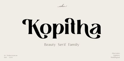 Kopitha is a beauty serif family with 5 weights from Light to ExtraBold. Kopitha also includes alternate characters (PUA Encoded) and ligatures to give you a wide range for create an unique typographic design results. Kopitha is suitable font for many different projects such as logo, branding, poster, magazines, label, merchandise, invitation, presentation, advertising, quotes and so much more! FEATURES: OpenType support Playfull to use (with ligatures and alternates options) Multilingual support PUA Encoded If you need support or more information about this item please kindly contact me : ekahermawanputu@gmail.com Thank you so much I really hope you enjoy when using it!
 - BR Shape by Brink,
$30.00 A contemporary geometric type family in 18 styles. Built with precision, simplicity and a subtle warmth. Flexibility is the founding principle around which BR Shape was designed. The family is open, accessible and puts content first. Perfect for displaying text with complete clarity and purity. BR Shape is available in 18 finely crafted styles, with nine weights ranging from Hairline to Super. The fonts also provide advanced typographic support with OpenType features such as case sensitive forms, icons, stylistic alternates and multiple figure sets. Also containing advanced language support as standard. For custom inquiries please contact: mail@brinktype.com
 - Elongated Roman by Red Rooster Collection,
$45.00 Elongated Roman is a Didone-style serif typeface. It was originally designed in 1950 by typographers at Stephenson Blake. After International TypeFounders, Inc. acquired exclusive licensing rights to the Stephenson Blake Collection, Steve Jackaman (ITF) digitally revived the typeface in 1997 for the Red Rooster Collection. Much like other Didone typefaces, Elongated Roman’s strong contrast between thick and thin strokes and hairline serif design strengthen its elegance as a “modern face.” Unlike other Didone typefaces in the Red Rooster Collection, Elongated Roman was designed with display size in mind thanks to its strong variance in stroke weight.
 - Hiper Hoper by Sipanji21,
$10.00 "Hyper Hoper" is a 3D layered graffiti font that includes regular, shadow, and inner styles within each character. Fonts with multiple layers like this are designed to provide a three-dimensional effect to the text, enhancing its depth and visual appeal. By utilizing the regular, shadow, and inner layers in "Hyper Hoper," you can create text that appears to have depth and dimension, with shadowed and inner details adding a dynamic quality to the font. This font is suitable for various design projects such as graffiti art, posters, or any creative work where a bold and three-dimensional typographic style is desired.
 - Joaquin by Mozatype,
$11.00 JOAQUIN is a vintage font family. This font's retro look and style is inspired from many vintage packaging and from typographic cover lettering. It is perfect for vintage logo design, labels, posters, signage, t-shirt, storefront, headlines, or packaging design. greeting cards and logotype. JOAQUIN includes 4 different styles; Normal, Regular, Inline, and Shadow. So you can combine them with each other and get fancy headlines. What’s Included : - Works on PC & Mac - Easy to use ( Installations ) - Compatibility Windows, Apple, Linux, Cricut, Silhouette, and Other cutting machines Thank you for purchasing this font. Please appreciate, if you like this. ENJOY it :)
 - Engel New by The Northern Block,
$30.36 EngelNewSans is sans serif family of 12 weights and an upgrade of the typeface Engel also published by Die Gestalten Verlag. The project began with an extension to the original Engel character set and freshening up the typeface to suit the OpenType format. EngelNewSerif came about as a sibling to EngelNewSans as a corresponding serif family also of 12 weights, matching those of EngelNewSans. Both families are designed for a wide usage in running text and headlines. EngelNewSans is an evolved version of the original Engel typeface, which undergone improvements to the individual letterforms and the overall look which resulted in this sans serif type family with a more mature confident character and with softer, rounder and more harmonious shapes. The characteristics between the two could perhaps, very fittingly, be compared to a person showing different sides to their personality at different stages in life. With EngelNewSans portraying the more mature role while the original Engel shows traits of a cool teenager with rough edges, not yet fully developed. To make the light weights function with serifs attached for EngelNewSerif, the same low stroke contrast as seen in EngelNewSans was applied. Further discovery found that the serifs and the stem width had to be optically similar for the light weights not to appear too fragile. In the heavy weights however, the stroke contrast was higher than in the Sans versions, this was done to open up the counters and make room for the serifs to breathe. The intention of the families is to motivate an element of play and give the designer a larger selection to work with.
 - PF Das Grotesk Pro by Parachute,
$79.00 Das Grotesk was inspired by earlier nineteenth-century grotesques, but it is much more related to American gothic designs such as those by M.F. Benton. Due to their pure geometric structure, most grotesque typefaces tend to have a rather monotonous and lifeless appearance, thus failing to express the ideals of the modern creed. Das Grotesk on the other hand is a lively design with several distinguishable characteristics which attract attention when set at large sizes, whilst they become subtle and blend evenly at small sizes, fostering a neutral identity. This is a very legible and space-saving typeface with a narrow structure. It was designed with slanted curved ends and sheared terminals applied on several straight strokes. It has two-storey ‘a’ and ‘g’ but includes single-storey alternates. The family consists of 14 weights ranging from Extra Thin to Black (including true-italics). It provides simultaneous support for Latin, Cyrillic and Greek and is loaded with several advanced typographic features such as small caps. Download its complehensive PDF Specimen Manual for further details.
 - Sinoreta by Mans Greback,
$69.00 Sinoreta is a classic serif font with a bold retro style that adds sophistication and elegance to any design. The decorative alternates add a touch of uniqueness, making Sinoreta perfect for projects that require a bold and proper typographic presence. Whether it's branding, logos, headlines, or editorial designs, Sinoreta will bring a timeless and tasteful touch to your work. This font is designed by Mans Greback in 2023 and combines traditional serif style with modern design elements. Choose Sinoreta for a retro, elegant and versatile font that will make your designs stand out. The Sinoreta family consists of four high-quality fonts: Regular, Italic, Bold and Bold Italic The font is built with advanced OpenType functionality and has a guaranteed top-notch quality, containing stylistic and contextual alternates, ligatures and more features; all to give you full control and customizability. It has extensive lingual support, covering all Latin-based languages, from Northern Europe to South Africa, from America to South-East Asia. It contains all characters and symbols you'll ever need, including all punctuation and numbers.
 - Swift by Linotype,
$30.99 Gerard Unger developed this newspaper font between 1984 and 1987 for Dr.-Ing. Rudolf Hell GmbH, Kiel. He was mainly influenced by William A. Dwiggins (1880-1956), the typographic consultant of Mergenthaler Linotype, who started to develop more legible, alternative fonts for newspaper printing as early as 1930. Swift was named after the fast flying bird. Austere and concise, firm and original, Swift is suited for almost any purpose. Swift has been specially developed to sustain a maximum of quality and readability when used in unfavorable print and display processes, e.g. newspapers, laser printing and low resolution screens. Its robust, yet elegant serifs and its large x-height provide an undeniable distinction to the typeface, making it suitable for corporate ID and advertising purposes as well. Swift 2.0 family was designed in 1995. It's an improved version with technical and aesthetic enhancements and new family members. The Cyrillic version was developed for ParaType in 2003 by Tagir Safayev. Please note that this family includes only basic latin characters; it does not include accented characters required for western and central Europe.
 - Goldbill by Wahyu and Sani Co.,
$20.00 Goldbill is modern sans serif typeface which designed based on geometric shapes. It is not just another geometric typeface, the uppercase letters were designed to have more squared form instead of circular and the lowercase retain the circular looks. It was designed with 2 axes variable; x-height and weight that generates 54 fonts with 3 different x-heights and 9 different weights. The basic version of Goldbill is the best for text, while the Goldbill XS with the narrowest x-height is ideal for display text, logo, etc, and the one with the largest x-height, Goldbill XL would be good for heading, shorter paragraph text or web font. Goldbill type family with its 3 different x-heights would be a great type system for any modern graphic design and typographic work. Each font has 470+ glyphs which covers Western and Eastern Europe Latin based languages, and also equipped with some OpenType Layout Features, such as: Denominators, Fractions, Standard Ligatures, Localized Forms, Numerators, Ordinals, Scientific Inferiors, Subscript, Superscript, and Tabular Figures.
 - Magpie by Elster Fonts,
$24.00 Magpie is a font family consisting of three sub-families with both regular and italic styles. Originally designed on squared paper, over time it has moved further and further away from this rigid grid, although its appearance is still based on it, so it can easily be used for logotypes or headlines with strict grid-based layouts. While Magpie Text is suitable for headlines and short texts, Magpie Display is ideal for logotypes or more playful headlines. Finally, Magpie Mix is a combination of both families. Magpie Text Regular represents stability, Magpie Display Italic is ideal for dynamic logos or headlines. To cover more languages, cyrillic and greek letters were added and Magpie can be used for nearly a hundred languages. In addition to the four common numeral variants, special numerals, punctuations and symbols for all-caps (c2sc) are included. Furthermore case-sensitive punctuations and symbols are available. To expand the typographic possibilities, four stylistic sets, different symbols, forms and standard- and discretionary ligatures have been added. Each Magpie-font contains more than 880 glyphs.
 - FF DIN by FontFont,
$104.99 Dutch type designer Albert-Jan Pool created this sans FontFont between 1995 and 2009. The family has 20 weights, ranging from Light to Black in normal and condensed styles (including italics). It is ideally suited for advertising and packaging, editorial and publishing, logo, branding and creative industries, poster and billboards, small text, wayfinding and signage as well as web and screen design. Looking for the new Thin and Extra Light weights? They are available through fontshop.com, linotype.com and fonts.com. FF DIN provides advanced typographical support with features such as case-sensitive forms, fractions, super- and subscript characters, and stylistic alternates. It comes with a complete range of figure set options – oldstyle and lining figures, each in tabular and proportional widths. As well as Latin-based languages, the typeface family also partly supports the Cyrillic and Greek writing systems. In 2011, FF DIN was added to the MoMA Architecture and Design Collection in New York. This FontFont is a member of the FF DIN super family, which also includes FF DIN Round.
 - FF Meta Hebrew by FontFont,
$79.99German type designer Erik Spiekermann, created this sans FontFont between 1991 and 2010. The family has 28 weights, ranging from Hairline to Black in Condensed and Normal (including italics) and is ideally suited for advertising and packaging, book text, editorial and publishing, logo, branding and creative industries, small text as well as web and screen design. FF Meta provides advanced typographical support with features such as ligatures, small capitals, alternate characters, case-sensitive forms, fractions, and super- and subscript characters. It comes with a complete range of figure set options—oldstyle and lining figures, each in tabular and proportional widths. As well as Latin-based languages, the typeface family also supports the Cyrillic, Greek, and Hebrew writing systems. FF Meta Variable are font files which are featuring two axis and have a preset instance from Hairline to Black and Condensed to Roman In 2011, FF Meta was added to the MoMA Architecture and Design Collection in New York. This FontFont is a member of the FF Meta super family, which also includes FF Meta Correspondence , FF Meta Headline , and FF Meta Serif . - Sequel Geo by OGJ Type Design,
$35.00 Sequel Geo is a geometric/neo-grotesque hybrid superfamily, influenced by formalized sans-serif typefaces from Germany and Swiss modernist type design—particularly Max Bill’s greek-styled lettering. 8 subfamilies and 120 individual fonts allow for a wide range of typographic expressions. Sequel Geo’s hallmark features, such as the circular “G” and punctuation, simple “t”, and two-story “a” turning one-story in bolder weights, persist throughout all styles. But it’s the formal and functional differences between subfamilies that let you really fine-tune your layouts. The three optical sizes of the core collection, “Body Text”, “Headline”, and “Display”, boast optimized spacing for the intended use. “Extended” packs some extra punch with 18 display-oriented styles. Finally, 48 “Graphic” styles in 4 subfamilies push to the Geometric side, replacing horizontal and vertical stroke endings with angular ones, simplifying letterforms. Sequel Geo is a journey through time and space. From 1920s Germany to 1950s Switzerland. All the while, its archetypal shapes are neutral yet confident, its appearance is classic.
 - Pagewalker by Kostic,
$40.00 The name of the font is chosen to suggest its main purpose—setting multiple pages of text. All the features in this family were made with that in mind—legibility, distinct italics, small caps and various OpenType features, all make this font a useful tool for typographers. On the other hand, for packaging, posters, logotypes, etc. setting heavier weights in large size brings out its display qualities. Pagewalker is very legible and appears to be larger than other text typefaces. That is because the lower-case characters are made large compared to the capital letters. This means it can be used for setting text in, e.g. 9 pt size—while appearing to be 10 pt, but occupying less space. Pagewalker has a character set to support Western and Central European languages, and an extended set for monetary symbols which, in combination with tabular numbers, is perfect for financial reports. Each weight includes small caps, ligatures, proportional lining and oldstyle numbers, tabular figures, fractions and scientific superior/inferior figures.
 - Steel Grrrder Script by ULGA Type,
$9.00 Steel Grrrder is an industrial-style joining script with a stencil effect, available in six weights ranging from Light to Black. Great for all kinds of display purposes including posters, film titles, book covers, magazines, advertising, signage, packaging, logos and tanks, this is a script with a sharp personality and a steely presence. However, if you’re searching for a “nice” script - sorry, bud - you’re looking in the wrong place. Steel Grrrder Script doesn’t entice the reader with voluptuous curves, flowing swashes or frisky letterforms, instead its sharp chiselled features compel the reader to pay attention. Characters muscle their way along like robotic bulldogs in steel-toe cap boots. Steel Grrrder Script is a veritable slab fest, best categorised as a constructivist joining script. Forged from carbon steel and wrapped in a layer of Graphene, this is a robust display typeface family able to withstand even the most demanding typographical situations. The Steel Grrrrder extended family also includes a six-weight sans-serif with corresponding italics and two display fonts, Groove & Nutjob - all designed to work with each other.
 - Belwe by ITC,
$29.99The typeface Belwe, created in 1926 by German typographer and teacher Georg Belwe, has an uncommon style that is difficult to describe. It is a synthesis of many different genres: it is a slab serif with Art Nouveau style but also with many blackletter influences. The angled serifs on the ascenders and the calligraphic flourishes on the the upper and lowercase V, W, and Ys reference marks made by pens. There are also many other special characters that are unlike any other designs. Have a look at the fun lowercase a, the quirky lowercase f and g, and the unique C, F, L, and R for the uppercase. This design works especially well for display sizes, but is also good for short amounts of text. The mood and image suggested by this typeface is great for menus, invitations, and signs when you want to send a personal and friendly message. It's Art Nouveau roots also give it a place in history for designs from the Victorian period up through the 1920's and 30's - Morelinia by Gatype,
$12.00 Morelinia is a modern, handwritten, modern calligraphy font. The shape is modern and unique and the writing style is very natural. Morelinia features a varied baseline, smooth lines, gorgeous glyphs, and stunning alternatives. Hand-drawn design elements allow you to create many beautiful typographic designs in an instant like branding, web design and editorial, prints, crafts, quotes, It's great for logotypes, wedding invitations, romantic cards, labels, packaging, spelling of names and others. Add to your most creative ideas and watch how they bring them to life! Morelinia is coded with PUA Unicode, which allows full access to all the extra characters without having special designing software. Mac users can use Font Book , and Windows users can use Character Map to view and copy any of the extra characters to paste into your favorite text editor/app. Morelinia includes OpenType stylistic alternates, ligatures and International support for most Western Languages. To enable the OpenType Stylistic alternates, you need a program that supports as Adobe Illustrator CS, Adobe Indesign & CorelDraw X6-X7, Microsoft Word 2010 or later versions.
 - Bilberry Muffin Cyr Gr by Ira Dvilyuk,
$17.00 Bilberry Muffin playful Cyrillic Greek script font is perfect for use in all your design projects be it logos, signatures, labels, packaging design, or blog headlines. Also, it will look great in mugs, cards, gorgeous typographic designs, wedding stationery, and much more. Bilberry Muffin playful Cyrillic Greek script font includes a complete set of uppercase and lowercase letters, numerals, a large range of punctuation, and 35 ligatures, giving a realistic hand-lettered style. Bilberry Muffin Symbols is a font with 26 unique, hand-drawn illustrations and elements that can help to make your design more original. A different symbol is assigned to every uppercase and lowercase standard character so you do not need graphics software just type the letter you need. Multilingual Support for 33 languages: Afrikaans, Albanian, Basque, Bosnian, Catalan, Danish, Dutch, English, Estonian, Faroese, Filipino, Finnish, French, Galician, Indonesian, Irish, Italian, Malay, Norwegian Bokmål, Portuguese, Slovenian, Spanish, Swahili, Swedish, Turkish, Welsh, Zulu. Font also contains Greek glyphs too. And Cyrillic glyphs support Russian, Belorussian, Bulgarian, Ukrainian, and Kazakh languages.
 - Belwe Mono by ITC,
$29.99 The typeface Belwe, created in 1926 by German typographer and teacher Georg Belwe, has an uncommon style that is difficult to describe. It is a synthesis of many different genres: it is a slab serif with Art Nouveau style but also with many blackletter influences. The angled serifs on the ascenders and the calligraphic flourishes on the the upper and lowercase V, W, and Ys reference marks made by pens. There are also many other special characters that are unlike any other designs. Have a look at the fun lowercase a, the quirky lowercase f and g, and the unique C, F, L, and R for the uppercase. This design works especially well for display sizes, but is also good for short amounts of text. The mood and image suggested by this typeface is great for menus, invitations, and signs when you want to send a personal and friendly message. It's Art Nouveau roots also give it a place in history for designs from the Victorian period up through the 1920's and 30's
 - Aviano Didone by insigne,
$24.99 First released in 2009, Aviano Didone has been completely remastered and expanded with new weights and optical sizes. Aviano Didone's high contrast forms lend elegant beauty, luxury and romance to your designs and it's extended letterforms provide strength and power. Aviano's foundational classical forms give the face a look that is unique for Didone faces. Aviano Didone is a bold interpretation of vertically contrasted type. Aviano Didone comes in eight different weights and is packed with OpenType features. Want ball terminals for that logotype or headline? Flat serifs? Swash forms? Aviano Didone includes 102 alternate characters. Five style sets are available, and Art Deco inspired alternates, small forms, swash, titling and stylistic alternates. Aviano Didone also includes 40 discretionary ligatures for artistic typographic compositions. The new optical sizes allow Aviano Didone to be used on the web or in print without losing detail. Be sure to check out the rest of the Aviano series which can be used as complementary faces, including Aviano, Aviano Serif, Aviano Sans and Aviano Flare.
 - Swift 2.0 Cyrillic by ParaType,
$100.00 Gerard Unger developed this newspaper font between 1984 and 1987 for Dr.-Ing. Rudolf Hell GmbH, Kiel. He was mainly influenced by William A. Dwiggins (1880-1956), the typographic consultant of Mergenthaler Linotype, who started to develop more legible, alternative fonts for newspaper printing as early as 1930. Swift was named after the fast flying bird. Austere and concise, firm and original, Swift is suited for almost any purpose. Swift has been specially developed to sustain a maximum of quality and readability when used in unfavorable print and display processes, e.g. newspapers, laser printing and low resolution screens. Its robust, yet elegant serifs and its large x-height provide an undeniable distinction to the typeface, making it suitable for corporate ID and advertising purposes as well. Swift 2.0 family was designed in 1995. It's an improved version with technical and aesthetic enhancements and new family members. The Cyrillic version was developed for ParaType in 2003 by Tagir Safayev. Please note that this family includes only basic latin characters; it does not include accented characters required for western and central Europe.
 - Bolgica by Soerat Company,
$25.00 Bolgica is a Neo-grotesque slab serif inspired by the slab serifs of the 1800’s century. By combining modern elements in several letter characters, the Bolgica family is very suitable for various design needs such as advertising, packaging, logos, editorial and publishing, branding and other creative industries. The family has 9 weights, as well as the matching true italics forms, provides typographical support with features such as ligatures, alternate characters, case-sensitive forms, fractions, and super and subscript characters. It comes with a complete range of figure set options – old style and lining figures, each in tabular and proportional widths. With over 752 glyphs per style, Elioth supports around 150+ languages in Latin and Cyrillic script. Family overview: 9 weights (from Thin to Heavy) + italics Extended Latin Cyrillic 726 glyphs Variable Font 150+ languages OpenType Features: Localized Forms Subscript and scientific inferiors Superscript (Superiors) Numerators and Denominators Fractions Lining Figures Tabular Figures Oldstyle Figures Circled Number Case-Sensitive Forms Standard and Discretionary Ligatures Stylistic Alternates Contextual Alternates
 - Enoway by Valentino Vergan,
$17.00 Enoway is a modern elegant typeface, which leans towards the Neue Nouveau style. The Enoway typeface was inspired by the early the Art Nouveau typographic designs, which was characterized by decorative designs and embellished stroke endings. The Enoway typeface has a high-contrast and a thin hairline, this gives the typeface a modern but nostalgic look. The Enoway typeface comes in two styles, Regular and Oblique. The Enoway typeface can be paired with a minimal sans serif or light script font, this combination will give your next project a modern and unique look. The Enoway typeface is very versatile and can cover a wide range of project such as: fashion branding, mastheads, magazines, feminine logos, facebook banners, wedding invitations, Instagram posts, websites, blog posts, pull quotes, editorials, product packaging, trendy social media posts, advertisements and much more. If you are looking for something modern and nostalgic for you next project, Enoway is the font for you. ENOWAY INCLUDES A FULL SET OF: Uppercase and lowercase letters. Numbers. Punctuation. Ligatures. Alternate characters. Multilingual symbols. We hope you enjoy using the Enoway typeface.
 - FS Sally by Fontsmith,
$80.00 Bookish A little bit bookish, but quietly elegant and well-proportioned, FS Sally is a graceful font family. It’s a refreshingly uncomplicated design that brings sophistication to text and display type, and a distinctive aplomb to both large and small volumes of text. Hidden talents There’s more to FS Sally than meets the eye. Choose Standard for the Latin alphabet or Pro if you work with Cyrillic and Greek typography. There’s a large range of special features, including elegant small caps and a set of discretionary ligatures to add a traditional flavour to figures and fraction sets. Rhythmic There’s a rhythm and flow to FS Sally – the result of the classic but asymmetric design of its serifed feet and shoulders. The inward curve of the serif at the shoulder and the outward curve at the foot subliminally guide the eye through each letterform, and the flicked feet of the “a”, “d” and “u” add an extra kick of energy to the rhythm. The italic forms have their own flow, too, with a pen-like fluency that retains the formal discipline required for a text type. Regular to heavy FS Sally’s five weights, all with italics, cover every kind of print application. The regular weight is elegant in display and an easy read in longer texts. A subtle step up from the regular is the medium, which was created to deliver a stronger colour and finish in poorer printing conditions. The semibold offers a strong alternative to the regular at smaller sizes, and its intermediate feel suits it to sub-headings, title pages and calmer designs. The bold works excellently in book and title headings, and FS Sally Heavy lends weight and punch to poster headlines and logotypes.
 - FS Sally Paneuropean by Fontsmith,
$90.00Bookish A little bit bookish, but quietly elegant and well-proportioned, FS Sally is a graceful font family. It’s a refreshingly uncomplicated design that brings sophistication to text and display type, and a distinctive aplomb to both large and small volumes of text. Hidden talents There’s more to FS Sally than meets the eye. Choose Standard for the Latin alphabet or Pro if you work with Cyrillic and Greek typography. There’s a large range of special features, including elegant small caps and a set of discretionary ligatures to add a traditional flavour to figures and fraction sets. Rhythmic There’s a rhythm and flow to FS Sally – the result of the classic but asymmetric design of its serifed feet and shoulders. The inward curve of the serif at the shoulder and the outward curve at the foot subliminally guide the eye through each letterform, and the flicked feet of the “a”, “d” and “u” add an extra kick of energy to the rhythm. The italic forms have their own flow, too, with a pen-like fluency that retains the formal discipline required for a text type. Regular to heavy FS Sally’s five weights, all with italics, cover every kind of print application. The regular weight is elegant in display and an easy read in longer texts. A subtle step up from the regular is the medium, which was created to deliver a stronger colour and finish in poorer printing conditions. The semibold offers a strong alternative to the regular at smaller sizes, and its intermediate feel suits it to sub-headings, title pages and calmer designs. The bold works excellently in book and title headings, and FS Sally Heavy lends weight and punch to poster headlines and logotypes. - Bumbel by Say Studio,
$12.00 Introducing Bumbel - Bubble Typeface Bumbel is a captivating font that combines the essence of bubble dynamics with a modern and funky style. Its unique design exudes energy and playfulness, making it perfect for projects that require a fresh and vibrant look. This typeface features rounded letterforms with soft edges, giving it a friendly and approachable feel. The bubbly contours of each character create a sense of movement and liveliness, capturing attention and adding a touch of whimsy to any design. With its modern twist, Bumbel brings a contemporary edge to traditional bubble fonts. It embraces clean lines, sleek curves, and a balanced composition, making it versatile for a wide range of applications. Whether you're designing a logo, branding materials, advertising campaigns, or social media graphics, this font will add a dynamic and eye-catching element to your project. Bumbel have Outline Version allowing you to customize and experiment with different letter combinations. This versatility empowers you to create unique typographic compositions that truly reflect your creative vision. Embrace the spirit of modernity and funk with Bumbel. Elevate your designs, stand out from the crowd, and infuse them with a sense of joy and energy. Let this captivating typeface be the perfect tool to express your creativity and make a memorable impact. You will get : - Bumbel Regular - Bumbel Italic - Bumbel Outline - Bumbel Outline Italic - Multilingual Support Thanks, Have a wonderful Day Say Studio
 - Daito by insigne,
$29.99 It’s alive! Insigne’s new creation, Daito, is now functional, built to process your logos, business cards, magazine layouts, packaging and more without the slightest glitch. But this new slab serif is no heartless churn of the same factory nuts and bolts. Daito is designed to greet your reader with a friendly face. Inspired by types from the era of the Space Race, this new take on some old faces brings a contemporized, unique set of serif forms to the font race. Daito comes complete with a variety of weights to help you find the best settings for your current needs or moods. Need soft and playful? Daito light communicates its message gently with softened serif. Need a different feel with more authority? With the touch of a few buttons, engage the powerful Black or striking Bold. Additional features with Daito include stylistic alternates, ligatures, titling capitals and small caps among other typographic features. Please note: use magical OpenType-savvy applications such as Adobe Creative Suite, QuarkXPress, etc to keep your font from malfunctioning, shorting, attacking people, or attempting a world takeover. Daito also speaks Western, Eastern, and Central European languages. However, Japanese is not available for this edition. It’s not every day you find a top-of-the-line font like Daito. This machine can handle most anything on your list, short of folding your laundry (though it may make your laundry look nicer). Don’t wait. Order yours today while supplies last.
 - Allrounder Monument by Identity Letters,
$22.00 An inscriptional titling font for truly epic headlines. Allrounder Monument is an inscriptional, dignified member of the Allrounder superfamily. This all-caps typeface with delicate serifs was inspired by ancient inscriptions on columns, monuments, and buildings in Rome: letters as old as two millennia that radiate their own classic charm. Allrounder Monument picks up this atmosphere in order to create a typographic tool that lives up to contemporary demands. It infuses today’s designs with a hint of history and an air of exclusivity. Allrounder Monument is a timeless titling typeface. You might use it for posters, magazines, book covers, greeting cards, advertising or packaging work, and even signage. If you want an even more spectacular and exciting headline or title, additional Discretionary Ligatures and a Stylistic Set provide the necessary OpenType power to achieve this goal with ease. As Allrounder Monument is a part of the Allrounder superfamily, you can combine the three weights Book, Regular and Medium with the corresponding weights of Allrounder Grotesk. The Allrounder superfamily is a series of typefaces sharing the same color and horizontal metrics (cap height, small cap height and x-height): a typesetting system whose components match each other perfectly. Any other part of this design kit, e. g., Allrounder Grotesk or Allrounder Antiqua, may be easily combined with Allrounder Monument. Whenever you need a truly epic headline, Allrounder Monument is the best horse in your barn. Ad astra!
 - Full Sans by Bülent Yüksel,
$19.00 Full Sans is a geometric sans in the tradition of Futura, Avant Garde and the like. It has a modern streak which is the result of a harmonization of width and height especially in the lowercase letters to support legibility. Full Sans is the younger brother of original Full Neue, Full Slab and Full Tools. Ideally suited for advertising and packaging, editorial and publishing, logo, branding and creative industries, poster and billboards, small text, wayfinding and signage as well as web and screen design. Full Sans provides advanced typographical support for Latin-based languages. An extended character set, supporting Central, Western and Eastern European languages, rounds up the family. The designation “Full Sans LC 50 Book” forms the central point. The first figure of the number describes the stroke thickness: 10 Thin to 90 Bold. Full Sans LC comes 5 weights and italics also Full Sans SC comes 5 weights and italics total 20 types. The family contains a set of 485 characters. Case-Sensitive Forms, Classes and Features, Small Caps from Letter Cases, Fractions, Superior, Inferior, Denominator, Numerator, Old Style Figures just one touch easy In all graphic programs. Full Sans is the perfect font for web use. You can enjoy using it. UPDATE: 08 March 2019 - Fixed extension of glyhps "y" and "g". - "LineGap" error has been fixed. - Fixed bug in "onum", "pnum", "tnum" and "tnum" software in OpenType feature.
 - Bodoni Highlight by Image Club,
$29.99Giambattista Bodoni (1740-1813) was called the King of Printers; he was a prolific type designer, a masterful engraver of punches and the most widely admired printer of his time. His books and typefaces were created during the 45 years he was the director of the fine press and publishing house of the Duke of Parma in Italy. He produced the best of what are known as modern" style types, basing them on the finest writing of his time. Modern types represented the ultimate typographic development of the late eighteenth and early nineteenth centuries. They have characteristics quite different from the types that preceded them; such as extreme vertical stress, fine hairlines contrasted by bold main strokes, and very subtle, almost non-existent bracketing of sharply defined hairline serifs. Bodoni saw this style as beautiful and harmonious-the natural result of writing done with a well-cut pen, and the look was fashionable and admired. Other punchcutters, such as the Didot family (1689-1853) in France, and J. E. Walbaum (1768-1839) in Germany made their own versions of the modern faces. Even though some nineteenth century critics turned up their noses and called such types shattering and chilly, today the Bodoni moderns are seen in much the same light as they were in his own time. When used with care, the Bodoni types are both romantic and elegant, with a presence that adds tasteful sparkle to headlines and advertising. This version of Bodoni was done by Morris Fuller Benton for American Typefounders between 1907 and 1911. Although some of the finer details of the original Bodoni types are missing, this family has the high contrast and vertical stress typical of modern types. It works well for headlines, logos, advertising, and text." - TE Mona Tharwat Emara by Tharwat Emara,
$35.00 TE Mona Tharwat Emara," a masterpiece of Arabic calligraphy crafted by the renowned Egyptian calligrapher, Tharwat Emara. This exquisite Ruqaa font seamlessly blends tradition with innovation, offering a timeless elegance that captures the essence of Arabic script. Tharwat Emara, a distinguished figure in the world of calligraphy, has lent his artistic prowess to create a font that is not merely a collection of characters but an embodiment of cultural richness. Each stroke of the pen reflects the heritage of Egyptian calligraphy, echoing the historical echoes of an ancient civilization. "TE Mona Tharwat Emara" stands as a testament to Emara's dedication to perfection. The font's graceful curves and meticulously designed letterforms pay homage to the classical Ruqaa style, while subtle contemporary touches infuse it with a modern flair. It is a harmonious blend of tradition and innovation, making it an ideal choice for projects that demand sophistication and cultural resonance. Designed with precision and passion, this font is not just a typographic tool; it's a work of art that brings the beauty of Arabic calligraphy to the forefront. Each character is a brushstroke of inspiration, contributing to a seamless flow that captures the eye and mesmerizes the reader. Whether you are working on a branding project, publication, or artistic endeavor, "TE Mona Tharwat Emara" adds a touch of timeless class. Embrace the elegance of Arabic script with this font, where every detail reflects the expertise of a master calligrapher. As you embark on your creative journey, let "TE Mona Tharwat Emara" be your muse. Elevate your designs, captivate your audience, and embrace the heritage of Arabic calligraphy with this exceptional font. Embrace the legacy, embrace the art – TE Mona Tharwat Emara awaits, a font that transcends time and tradition
 - Reline Rosery by Nathatype,
$29.00 Reline Rosery is an elegant serif font that radiates sophistication and grace. With its delicate letterforms and light weight, this typeface exudes a refined and gentle charm. The defining feature of this serif lies in its slender and graceful serifs, which add a touch of elegance to each letter. The light weight of the font enhances its delicate nature, giving it a subtle and airy appearance. This font is perfect for projects that require a refined and sophisticated typography choice. Reline Rosery captures the essence of timeless beauty. The serifs are meticulously crafted to create a sense of harmony and balance, while the light weight adds a contemporary twist. This font strikes the perfect balance between tradition and modernity. The letterforms are carefully designed to maintain legibility and clarity, even in the light weight. Each letter retains its distinctive characteristics, allowing your message to be easily understood. You can also enjoy the various features available in this font. Features: Alternates Ligatures Multilingual Supports PUA Encoded Numerals and Punctuations Reline Rosery fits in branding materials, book covers, wedding invitations, or any project that demands a touch of elegance, this font will bring a sense of refinement and beauty. It is particularly well-suited for applications related to luxury, fashion, beauty, and lifestyle. Find out more ways to use this font by taking a look at the font preview. Thanks for purchasing our fonts. Hopefully, you have a great time using our font. Feel free to contact us anytime for further information or when you have trouble with the font. Thanks a lot and happy designing.