10,000 search results (0.018 seconds)
  1. Creation - Unknown license
  2. KiddoTR - Unknown license
  3. My Puma Oblique - Unknown license
  4. ZoinkFat - Unknown license
  5. SF Cartoonist Hand SC - Unknown license
  6. Zoloft - Unknown license
  7. SF Foxboro Script Extended - Unknown license
  8. ZoloftSideffex - Unknown license
  9. Estrogen - Unknown license
  10. Sweden Funkis Outlined - Unknown license
  11. Sweden Funkis Regular - Unknown license
  12. Packet - Unknown license
  13. Mocha Java - Unknown license
  14. PuffedRice - Unknown license
  15. SF Junk Culture Condensed - Unknown license
  16. Westminster - Unknown license
  17. SF Junk Culture Shaded - Unknown license
  18. Kemuri - Unknown license
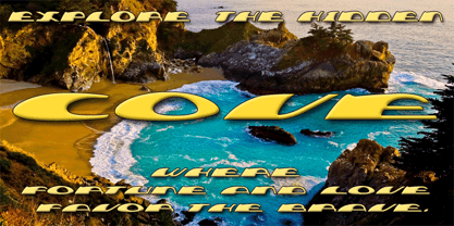
  19. Cove by FontMesa, $20.00
    Cove is a very modern wide type design sure to jazz up what ever you use it on.
  20. Scoto Koberger Fraktur N9 by Intellecta Design, $9.00
    a free digitization of ancient types of Ottaviano Scotus, from incunabula times, printed in Germany by Anton Koberger
  21. Gothic Unique by Wooden Type Fonts, $15.00
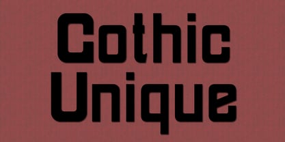
    A revival of an unusual wooden type font of the 19th century, a sans serif, suitable for display.
  22. Antique Wells Extra by Wooden Type Fonts, $15.00
    A revival of one of the popular wooden type fonts of the 19th century, extra bold, slab Antique.
  23. Bamberg by Solotype, $19.95
    A compressed wood poster type from the mid-1800s. Certainly handy for excessive copy on a single line.
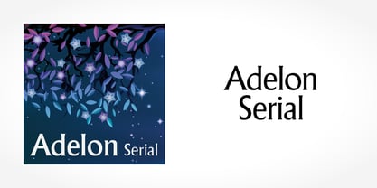
  24. Adelon Serial by SoftMaker, $15.99
    Adelon Serial is a classic flare serif typeface. Use it for titling, packaging, and other types of headlines.
  25. Hardal MF by Masterfont, $59.00
    A unique semi geometric type that is inspired by natural round forms that flow in a sweet harmony.
  26. Berengard Caps Two by Intellecta Design, $12.00
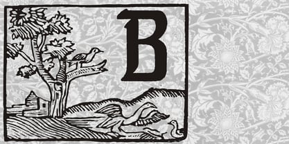
    a classical wood type era box ornament using blackletter... a beautiful arrangement for publishing edition and other jobs
  27. New Bodoni DT by DTP Types, $49.00
    A revival design by Malcolm Wooden of DTP Types Limited with associated Small Capitals and Old Style Figures.
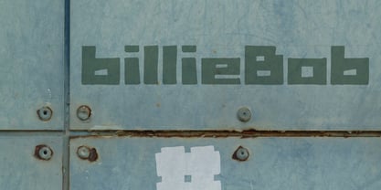
  28. BillieBob by JOEBOB graphics, $-
    BillieBob was made by cramping straight shapes into squares. Somewhat reminds me of pre cold-war Russian type.
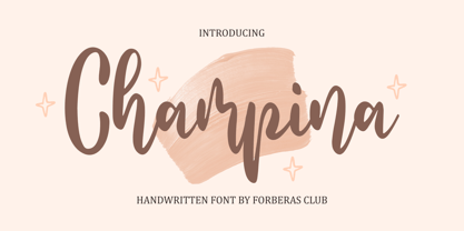
  29. Champina by Forberas Club, $16.00
    Champina is handwritten font, Recommended uses for simple write, wall type, decoration, and poster. Free for personal use.
  30. Antique Light by Wooden Type Fonts, $15.00
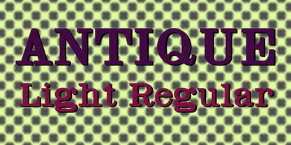
    One of the classic display types of the 19th century, a slab font, suitable for text and display.
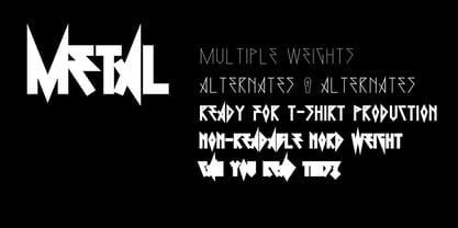
  31. 0Metal by DMTR.ORG, $13.00
    Evil Type in its purest form Multiple Weights, Alternates, Ready for t-shirt production non-readable NORD weight
  32. Caslon #540 by ITC, $29.00
    The Englishman William Caslon punchcut many roman, italic, and non-Latin typefaces from 1720 until his death in 1766. At that time most types were being imported to England from Dutch sources, so Caslon was influenced by the characteristics of Dutch types. He did, however, achieve a level of craft that enabled his recognition as the first great English punchcutter. Caslon's roman became so popular that it was known as the script of kings, although on the other side of the political spectrum (and the ocean), the Americans used it for their Declaration of Independence in 1776. The original Caslon specimen sheets and punches have long provided a fertile source for the range of types bearing his name. Identifying characteristics of most Caslons include a cap A with a scooped-out apex; a cap C with two full serifs; and in the italic, a swashed lowercase v and w. Caslon's types have achieved legendary status among printers and typographers, and are considered safe, solid, and dependable. A few of the many interpretations from the early twentieth century were true to the source, as well as strong enough to last into the digital era. These include two from the American Type Founders Company, Caslon 540 and the slightly heavier Caslon #3. Both fonts are relatively wide, and come complete with small caps, Old style Figures, and italics. Caslon Open Face first appeared in 1915 from the Barnhart Bros & Spindler Foundry, and is not anything like the true Caslon types despite the name. It is intended exclusively for titles, headlines and initials, and looks elegant whether used with the more authentic Caslon types or by itself.
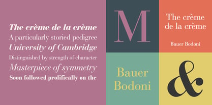
  33. Bauer Bodoni by Linotype, $45.99
    Giambattista Bodoni (1740-1813) was called the King of Printers; he was a prolific type designer, a masterful engraver of punches and the most widely admired printer of his time. His books and typefaces were created during the 45 years he was the director of the fine press and publishing house of the Duke of Parma in Italy. He produced the best of what are known as "modern" style types, basing them on the finest writing of his time. Modern types represented the ultimate typographic development of the late eighteenth and early nineteenth centuries. They have characteristics quite different from the types that preceded them; such as extreme vertical stress, fine hairlines contrasted by bold main strokes, and very subtle, almost non-existent bracketing of sharply defined hairline serifs. Bodoni saw this style as beautiful and harmonious-the natural result of writing done with a well-cut pen, and the look was fashionable and admired. Other punchcutters, such as the Didot family (1689-1853) in France, and J. E. Walbaum (1768-1839) in Germany made their own versions of the modern faces. Even though some nineteenth century critics turned up their noses and called such types shattering and chilly, today the Bodoni moderns are seen in much the same light as they were in his own time. When used with care, the Bodoni types are both romantic and elegant, with a presence that adds tasteful sparkle to headlines and advertising. The Bauer Bodoni was done by Heinrich Jost for Bauer Typefoundry in 1927. This version has finer details of the original Bodoni types. It works well for headlines, logos, advertising.
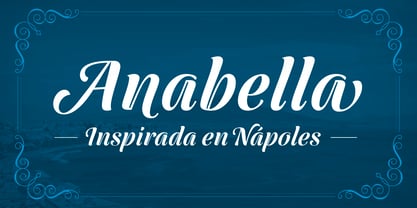
  34. Anabella by RNS Fonts, $33.00
    Anabella is a typeface made for the Master’s Degree in Typography at the University of Buenos Aires. It is inspired by the posters of pizzerias located in Naples, Italy; in order to be used in the pizza franchise Giuseppe in Buenos Aires, Argentina. The font preserves and rescues gestural features of these posters, adding a vertical axis and high contrast, typical of the Italian types that arrived in the city product of the immigration. The stroke with brush provides a more organic quality to the sign and provides connotative features. The family has three variables for the different applications that may be required in a pizza place: Italic for bodies greater than 16 pt, Roman for short texts up to 14 pt, and Stencil for use in brands and titles. Anabella was selected to participate in the eighth typography biennial Tipos Latinos.
  35. Advertising Script by Zetafonts, $39.00
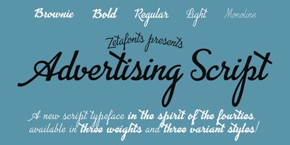
    Advertising Script is a brush script typeface inspired by a handmade sample drawn by the calligrapher Ross Frederic George and depicted in Speedball 1947 Textbook Manual. Advertising Script has a vintage brush script look, perfect for food packaging, display and logo design and period advertising. The original design has been completely reworked and extended by the Zetafonts Masterclass 2016 Team to provide three lighter weights, a rough and a monoline variant, and to produce an extended character set with open type support for ligatures, alternates, European languages and ending swashes. Advertising Script covers over 40 languages that use the Latin alphabet, with a full range of accents and diacritics. It comes in four weights plus a special monoline weight. Advertising Script makes full use of Open Type ligatures to provide swashes, alternates and a wide array of ligature characters for a more handmade, natural look. Swashes can be accessed through glyph palette or by typing one to six underscores after the letter. Take care: open type features are developed using open type technology, fully compatible with Adobe software and major design softwares and OS, but not supported by every software. Check before buying!
  36. Les Tulipes Pro by Fontforecast, $29.00
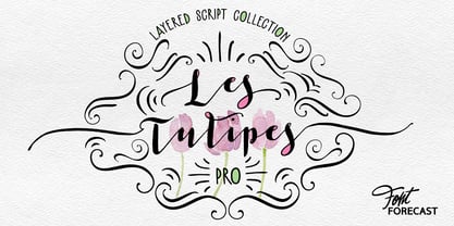
    We present Les Tulipes Pro. A smart, classy, modern calligraphy layered type system that offers an array of versatility. Les Tulipes Pro is hand drawn with dip pen and ink, with great attention for details. To name a few: - Elongated entrance and exit strokes ( type ++1 to ++10 in front and __1 to __10 at the back of any letter) - 5 different connecting spaces that make it appear as if the pen was never lifted from the paper (type space1 to space5 wherever you want the connecting spaces to appear) - 9 alternate ampersands (type &1 to &9) - 2 alternate at signs (type @1 or @2) - 5 stylistic sets for alternate characters Note: Discretionary ligatures must be ON The various designs of Les Tulipes Pro harmonize beautifully. Les Tulipes Pro Sans was designed to complement and support the other styles. The more straight forward appearance of the Sans styles enable you to balance out your designs perfectly. The Bold and Closed versions offer even more possibilities to combine or highlight words and phrases. On top of that Les Tulipes Pro Extra, with its 85 gorgeous swirls and swashes tempts you to further embellish your design.
  37. Cub Reporter JNL by Jeff Levine, $29.00
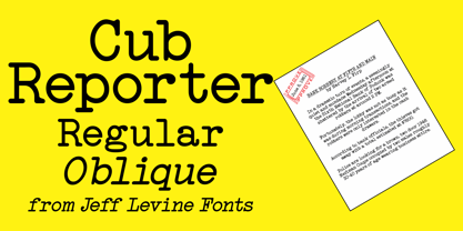
    In the 1934 edition of the American Type Foundry’s “Book of American Type” is a selection of letterpress fonts which emulate typewriter faces. One design named “Bulletin Typewriter” served at the model for Cub Reporter JNL, and is available in both regular and oblique versions. The font has been monospaced in order to add a more traditional typewriter look to any project.
Looking for more fonts? Check out our New, Sans, Script, Handwriting fonts or Categories
abstract fontscontact usprivacy policyweb font generator
Processing