10,000 search results
(0.026 seconds)
- West Byanetta Cyrillic by Ira Dvilyuk,
$20.00 I'm happy to present to you luxurious handwritten script font West Byanetta Cyrillic. It's the best option for your branding, logo designs, invitation designs wedding stationery, social media, product packaging and other projects that require an elegant touch. West Byanetta Cyrillic is an elegant, graceful handwritten script font, as well as a West Byanetta Symbols font with 36 lovely hand-drawn flourishes and illustrations. West Byanetta script font contains the Cyrillic glyphs too. West Byanetta script Latin part contains a full set of uppercase letters and 3 full sets of lowercase letters, (standard, initial and final forms). To make a needed form just type a letter with a number such as a1, b1, c1...after that selecting the word and apply the Open Type Features in programmes such as Adobe Illustrator, Photoshop, and others) And 40 ligatures - which can be used to create a handwritten look. The Cyrillic part of the font contains the uppercase letters and 3 full sets of lowercase letters, (standard, initial and final form. To make a needed form just type a letter with a number such as a1, б1 в1... After that select the word and apply the Open Type Features in programmes such as Adobe Illustrator, Photoshop, and others) Also Cyrillic part of the font contains 31 handwritten Cyrillic ligatures. West Byanetta Symbols is a font with over 36 hand-drawn elements, floral illustrations, and swashes and can help to make your design unique and matchless. Combine and merge swashes and illustrations to create your own designs and make borders, frames, dividers, logos, and more (just use A-Z or a-z and 0-9 keys in the included West Byanetta Symbols font). A different symbol is assigned to each uppercase or lowercase standard character, so you do not need graphics software, just type the letter you need. Language Support for 32 languages: Latin glyphs for Afrikaans, Albanian, Basque, Bosnian, Catalan, Danish, Dutch, English, Estonian, Faroese, Filipino, Finnish, French, Galician, Indonesian, Irish, Italian, Malay, Norwegian Bokmål, Portuguese, Slovenian, Spanish, Swahili, Swedish, Turkish, Welsh, Zulu. And Cyrillic glyphs support for Russian, Belorussian, Bulgarian, Ukrainian and Kazakh languages. Works perfectly on the Canva platform. For Cricut & Silhouette recommended.
 - Anselm Sans by Storm Type Foundry,
$63.00One of the good practices of today’s type foundries is that they release their type families as systems including both serif and sans serif type. Usually, the sources of inspiration need to be well tried with time and practice, since production of a type family is such a laborious and complex process. From the beginning, it needs to be clear that the result will be suited for universal use. Such systems, complete with the broad, multi-lingual variations permitted by the OpenType format, have become the elementary, default instrument of visual communication. Non-Latin scripts are useful for a wide scope of academic publications, for packaging and corporate systems alike. And what about outdoor advertisement designated for markets in developing countries? Cyrillics and Greek have become an integral part of our OpenType font systems. Maybe you noticed that the sans serif cuts have richer variety of the light – black scale. This is due to the fact that sans serif families tend to be less susceptible to deformities in form, and thus they are able to retain their original character throughout the full range of weights. On the other hand, the nature of serifed, contrasted cuts does not permit such extremes without sacrificing their characteristic features. Both weights were drawn by hand, only the Medium cut has been interpolated. Anselm Ten is a unique family of four cuts, slightly strengthened and adjusted for the setting in sizes around 10 pt and smaller, as its name indicates. The ancestry of Anselm goes back to Jannon, a slightly modified Old Style Roman. I drew Serapion back in 1997, so its spirit is youthful, a bit frisky, and it is charmed by romantic, playful details. Anselm succeeds it after ten years of evolution, it is a sober, reliable laborer, immune to all eccentricities. The most significant difference between Sebastian/Serapion and Anselm is the raised x-height of lowercase, which makes it ideal for applications in extensive texts. Our goal was to create an all-round type family, equally suitable for poetry, magazines, books, posters, and information systems. - Fairplex by Emigre,
$49.00 Zuzana Licko's goal for Fairplex was to create a text face which would achieve legibility by avoiding contrast, especially in the Book weight. As a result of its low contrast, the Fairplex Book weight is somewhat reminiscent of a sans serif, yet the slight serifs preserve the recognition of serif letterforms. When creating the accompanying weights, the challenge was to balance the contrast and stem weight with the serifs. To provide a comprehensive family, Licko wanted the boldest weight to be quite heavy. This meant that the "Black" weight would need more contrast than the Book weight in order to avoid clogging up. But harmonizing the serifs proved difficult. The initial serif treatments she tried didn't stand up to the robust character of the Black weight. Several months passed without much progress, and then one evening she attended a talk by Alastair Johnston on his book "Alphabets to Order," a survey of nineteenth century type specimens. Johnston pointed out that slab serifs (also known as "Egyptians") are really more of a variation on sans serifs than on serif designs. In other words, slab serif type is more akin to sans-serif type with serifs added on than it is to a version of serif type. This sparked the idea that the solution to her serif problem for Fairplex Black might be a slab serif treatment. After all, the Book weight already shared features of sans-serif types. Shortly after this came the idea to angle the serifs. This was suggested by her husband, and was probably conjured up from his years of subconscious assimilation of the S. F. Giants logo while watching baseball, and reinforced by a similar serif treatment in John Downer's recent Council typeface design. The angled serifs added visual interest to the otherwise austere slab serifs. The intermediate weights were then derived by interpolating the Book and Black, with the exception of several characters, such as the "n," which required specially designed features to avoid collisions of serifs, and to yield a pleasing weight balance. A range of weights was interpolated before deciding on the Medium and Bold weights.
 - Anselm Serif by Storm Type Foundry,
$63.00 One of the good practices of today’s type foundries is that they release their type families as systems including both serif and sans serif type. Usually, the sources of inspiration need to be well tried with time and practice, since production of a type family is such a laborious and complex process. From the beginning, it needs to be clear that the result will be suited for universal use. Such systems, complete with the broad, multi-lingual variations permitted by the OpenType format, have become the elementary, default instrument of visual communication. Non-Latin scripts are useful for a wide scope of academic publications, for packaging and corporate systems alike. And what about outdoor advertisement designated for markets in developing countries? Cyrillics and Greek have become an integral part of our OpenType font systems. Maybe you noticed that the sans serif cuts have richer variety of the light – black scale. This is due to the fact that sans serif families tend to be less susceptible to deformities in form, and thus they are able to retain their original character throughout the full range of weights. On the other hand, the nature of serifed, contrasted cuts does not permit such extremes without sacrificing their characteristic features. Both weights were drawn by hand, only the Medium cut has been interpolated. Anselm Ten is a unique family of four cuts, slightly strengthened and adjusted for the setting in sizes around 10 pt and smaller, as its name indicates. The ancestry of Anselm goes back to Jannon , a slightly modified Old Style Roman. I drew Serapion back in 1997, so its spirit is youthful, a bit frisky, and it is charmed by romantic, playful details. Anselm succeeds it after ten years of evolution, it is a sober, reliable laborer, immune to all eccentricities. The most significant difference between Sebastian/Serapion and Anselm is the raised x-height of lowercase, which makes it ideal for applications in extensive texts. Our goal was to create an all-round type family, equally suitable for poetry, magazines, books, posters, and information systems.
 - Mariage by Linotype,
$40.99Morris Fuller Benton, the principal designer of the American Type Founders, designed Mariage in 1901. Mariage, which has been sold under a plethora of different names during the last century, is a blackletter typeface belonging to the Old English category. The term blackletter refers to typefaces that stem out of the historical printing traditions of northern Europe. These letters, called gebrochene Schriften, or "broken type" in German, are normally elaborately bent and distorted. Their forms often print large amounts of ink upon the page, creating text that leaves a heavy, black impression. The Old English style is a subset of blackletter type that dates back to 1498, when Wynken de Worde introduced textura style printing to England. Continental printers had been printing with textura style letters since Gutenberg's invention of the printing press fifty years earlier. Italian printers stopped using them around 1470. For northern Europeans, texturas remained the most popular form of typeface design until the invention of the fraktur style in Nuremberg. Mariage is heavily classicized sort of Old English type. During the Victorian era, designers admired the Middle Ages for its chivalric, community-based values and its pre-industrial lifestyle. Yet they also found the basic medieval textura letterform too difficult to read by present standards. They desired to modernize this old style. Today, this sort of update is often referred to not as "modernization" but as classicism. Benton's design for ATF builds upon earlier Victorian classicist interpretations of Old English/textura letters. For an example of what these Victorian designs looked like, check out the popular 1990 revival of the genre, Old English . Old English style types often appear drastically different from other blackletters. For contrast, compare Mariage to a classical German fraktur design, Fette Fraktur , a schwabacher style face, or the popular early 20th Century calligraphic gothic from Linotype, Wilhelm Klingspor Gotisch . Especially in the United States, classicist Old English typefaces are thought to espouse tradition and journalistic integrity. These features, together with the inherent, complex beauty of Mariage's forms, make this typeface a perfect choice for certificates, awards, and newsletter mastheads. - AlienAutopsy - Unknown license

- JetJaneMono by Ingrimayne Type,
$9.00 JetJaneMono is a large family of sans-serif faces which are monospaced. It is very plain (plain=plane=jet). The font family has two widths and three weights, with each upright style paired with an italics style. These twelve fonts are then duplicated with another set in which small caps replace the lower-case letters. The typeface was created in 1994 and in 2021 the condensed widths were added.
 - Sollesty by Maulana Creative,
$13.00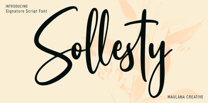 Sollesty is a modern signature script font. With upright contrast stroke, fun character. To give you an extra creative work. Sollesty font support multilingual more than 100+ language. This font is good for logo design, Social media, Movie Titles, Books Titles, a short text even a long text letter and good for your secondary text font with sans or serif. Make a stunning work with Sollesty font. Cheers, Maulana Creative
 - Bulletto by Zetafonts,
$39.00 Bulletto is a bold display script font. Made for logos and headlines, it features a slight slant, connecting letterforms and a big x-height. OpenType features include ligatures, swashes, alternate finals and a full set of uppercase alternates. The complete family features Bulletto Regular and its upright version Bulletto Straight with their light companions. Plus Bulletto Alto, an italic version with taller ascenders and descenders for a more calligraphic look.
 - Cyntho Slab Pro by Mint Type,
$- Cyntho Slab Pro is the slab serif companion to Cyntho Pro. It’s a modern geometric slab serif with extensive language support including Cyrillic and Greek scripts, rich with OpenType features, perfect for magazines, posters, advertising, corporate identity, and much more. It offers optional upright and real italic forms, wrapped in OpenType ‘stylistic alternates’ features, or stylistic set #02, where sets can be applied separately. Small caps are included as well.
 - Blunch by Estudio Calderon,
$35.00 Blunch is a new glyphic typeface that has flared slightly strokes. The design is based on many typographic references as Basilea, Stettler and Pascal. It includes three styles: Upright, slanted and backslanted. Blunch is equipped with an extended character set to support Central and Eastern European as well as Western European languages. I recommended use Blunch in the following design concepts: Brewing company Can beer desing Sports Branding Packaging design
 - Bindlestiff NF by Nick's Fonts,
$10.00Schmallfette Binder-Style, designed by Joseph Binder and released by D. Stempel AG in 1959 provided the template for this upright, set-tight display face. Its rather unconventional placement of the crossbars on the f and t is a subtle attention-grabber, and true to Binder's original design. Both versions include the complete Latin 1252, Central European 1250 and Turkish 1254 character sets, as well as localization for Moldovan and Romanian. - Counte by NamelaType,
$19.00 This is our first experience of creating serif fonts. It resulted in a modern slab serif family designed with symmetrical bracketed serifs for uprights and cursive serifs for Italics. Crafted with low contrast strokes, it makes this font versatile and can be used for text and printing. Counte contains many International diacritics and OpenType Features. It consists of 9 weight, going from Thin to Black with matching italics.
 - Cyntho Pro by Mint Type,
$- Cyntho Pro is a modern geometric sans with eight weights varying from Thin to Black and featuring Cyrillic and Greek scripts. Unlike most geometric sans faces, it offers optional upright and real italics, wrapped in OpenType ‘stylistic alternates’ features, or stylistic set #02, where sets can be applied separately. Small caps are included as well. This typeface can be used in magazines, posters, advertising, corporate identity, and more.
 - Agave by Jonahfonts,
$35.00 Agave a sans-serif family with 14 styles and 4 weights. The Light, Regular & Semibold contain Italics and Condensed styles, the Bold comes only in its' upright and Italic styles. A text family designed to easily be read in lower point sizes as well as larger display sizes. Providing a legible print, web or e-book family suitable for reading and not calling attention to its' letter-graphics.
 - Goofy Wakle by Maulana Creative,
$14.00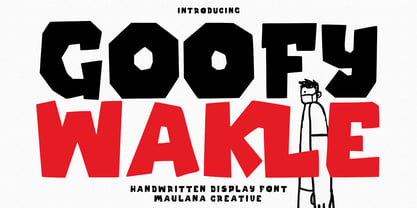 Berthillas is an upright casual script font. With high contrast stroke, fun character. To give you an extra creative work. Berthillas font support multilingual more than 100+ language. This font is good for logo design, Social media, Movie Titles, Books Titles, a short text even a long text letter and good for your secondary text font with sans or serif. Make a stunning work with Berthillas font. Cheers, Maulana Creative
 - Revx Neue by OneSevenPointFive,
$15.00 Revx Neue, an unsquared typeface is a modern sans serif. It contains 14 styles, 7 uprights, and the corresponding italics. The OpenType Latin Pro character set is crafted with powerful OpenType features, alternative glyphs, kerning pairs, and more which makes the font well featured. The typeface is suitable for all platforms (web, display, print, etc.). Revx Neue blends beautifully into your designs. Character request / Feedback: https://forms.gle/iY8Zswmsg689m95M8
 - Uplink by Sudtipos,
$59.00 Uplink is decorative upright lettering with heavy calligraphic influences and clear friendly forms. Alternate forms with artificial "tail" connections, swashing their way from one letter across the vertical stroke of the next, add an unusual yet distinctly human detail to the forms that shape the words. Uplink's reserved humor can be a little tolerant of mechanical abuses like shearing or stretching, which makes it ideal for food product packaging design.
 - Herzchen by Font-o-Rama,
$25.00Herzchen is a well developed sans serif font. The curving and swinging letter forms remind a little of serif fonts, on closer inspection, however, they rather remind of upright italics. Playful details give charm to the typeface and make Herzchen lively and distinctive. With four cuts the typeface is suitable for simple corporate and editorial design projects. In addition there are many ligatures in the expert-set for individual use. - Magr by Locomotype,
$18.00 Magr is a modern and powerful sans font designed to elevate your sports team and athletic designs. With its sleek and dynamic appeal, Magr brings a professional touch to your projects, leaving a lasting impression. Unlock your creativity with Magr's six styles and twelve fonts, including both upright and italic options. Stand out from the crowd and make a bold statement with this versatile font that complements your sports-themed materials.
 - Gambado by Shinntype,
$39.00 ‘Bounced’ is the technical (!) term for a higgledy-piggledy style of lettering in which characters are shaken up by a combination of rotation and vertical displacement from the presumed norm of upright stance on a baseline. Now, by utilizing pseudo-random contextuality in the OpenType format, Nick Shinn has created complex, default bouncing automatically through the agency of a font, rather than letter-by-letter manual adjustments at the layout level.
 - Arabetics Harfi by Arabetics,
$59.00 Arabetics Harfi is a Latin Serif typeface with a comprehensive support for the Arabetic scripts, including Quranic texts. Careful spacing and kerning was used to enhance resulting text legibility both scripts. Arabetics Harfi fully supports MS 1252 Western and 1256 Arabic code pages, in addition to all transliteration characters required by the ALA-LC Romanization tables. Users can either select an accented character directly or form it by keying the desired combining diacritic mark following an unaccented character. For Arabic, it fully supports Unicode 6.1, and the latest Arabic Supplement and Extended-A Unicode blocks. The Arabic design of this font family follows the Mutamathil Taqlidi type style with connected glyphs, but it emphasizes a horizontal look and feel rather than verticalone, utilizing slightly varying x-heights. The Mutamathil Taqlidi type style uses one glyph per every basic Arabic Unicode character or letter, as defined by the Unicode Standards, and one additional final form glyph, for each freely-connecting letter of the Arabic cursive text. Arabetics Harfi includes the required Lam-Alif ligatures in addition to all vowel diacritic ligatures. Soft-vowel diacritic marks (harakat) are selectively positioned with most of them appearing on similar high and low levels—top left corner—, to clearly distinguish them from the letters. Tatweel is a zero-width glyph. Arabetics Harfi includes both Arabic and Arabic-Indic numerals, in addition to generous number of punctuation and mathematical symbols. It includes two weights, regular and bold, each of which has normal, right slanted Italic, and left-slanted styles.
 - ATFAntique - Unknown license

- Finador by Julien Fincker,
$24.00 Finador is a modern, soft geometric sans family. The functional style of a geometric sans has been soften by open apertures and rounded corners. This makes it functional and friendly. The default version has open, modern apertures. Stylistic Set 2 includes the whole set with closed, classic apertures. A slightly different look. It´s like having a second font in just one font. So it´s up to you to choose the right look for your projects. The Finador family includes 8 weights, from thin to heavy + their matching italics. With 900+ glyphs per style it supports over 200+ latin based languages, includes an extended currency symbol set and a lot of Open Type Features like small caps, ligatures, fractions, alternates and many more. The lightest and boldest weights are good for display usage, while the middle weights can be also used for body text. As a versatile allrounder Finador supports almost every of your needs. It has the ability to become your next favorite workhorse family.
 - Unchain My Heart by Harald Geisler,
$68.34 Unchain My Heart is Font that renders hearts on a string with a capital letter in the middle. All hearts are designed to align to a perfect string by remaining the handmade look. Lowercase letters produce a heart with outline. Uppercase letters produce a filled heart. Type in a parenthesis and a loose string end will be rendered either on the right or left side. Look in the full character set to find out more about the special decoration. Ideal for individualized mailings and greeting cards. Unchain My Heart is a part of the Light Hearted Font Collection that is inspired by a recording of Jean Baudrillard with the title, "Die Macht der Verführung" (The Power of Seduction) from 2006. Further inspiration came from the article, "The shape of the heart: I'm all yours". The heart represents sacred and secular love: a bloodless sacrifice. by British writer Louisa Young printed in EYE magazine (#43) London, 2002.
 - Gilter by Shakira Studio,
$23.00 Start good day for new font! present to you, Gilter! Gilter is a font created specifically to give your designs a modern, stylish, and unique feel. With a combination of fun retro serif shapes and an elegant appearance, this font is the right choice for designs that want to display a creative impression and be different from the others. Gilter presents strong and tough-looking letter characters, but still maintains a friendly and welcoming impression. This makes this font very suitable for various types of projects, from branding, packaging, posters, to website design. What's you get? Gilter Regular Gilter Italic Unique letterforms Works on PC & Mac Simple Installations Accessible in the Adobe Illustrator, Adobe Photoshop, Microsoft Word even work on Canva! PUA Encoded Characters Fully accessible without additional design software. I really hope you'll get pleasure using Gilter font and it will be perfect addition to your font collection! If you have some questions, please write me a letter! Shakira Studio
 - 57-nao by ILOTT-TYPE,
$49.00 Designed in 1950s Japan by Okanao & Kushiro, the perfect partnership until artistic temperaments drove them apart. The duo spent years crafting the font with the working title “Messenjā”, Okanao bringing technical expertise to craft letterforms, while Kushiro made it his life, obsessively working late into the night to check pages for errors. For him the project was never about making money, it was an artistic endeavor to reprint the great Western works of literature. When he found out Okanao had secretly sold the rights to the font for use as a logo for a major Japanese manufacturer, Kushiro burned all evidence of the designs in a fit of passionate fury. The two reportedly never spoke again. “Messenjā” was thought lost forever until a type specimen was discovered in a vintage typewriter box bought on eBay. Now redrawn and available as 57-nao, a faithful and beautifully crafted monospace characterized by what is considered Okanao’s defining moment, the angular loop on the lowercase ‘a’.
 - Bonkard by Twinletter,
$15.00 Bonkard is a font created with great care to meet all of your requirements. Your project will be more flawless if you use this font; everyone will think it’s attractive and charming. We completed this font with standard and thick-thin families, so you may use it for subtitles and text titles because we made it with ease and flexibility in mind for you to use in all types of special projects. Not only that, but the unique shape of each letter is something we pay close attention to so that your customers fall in love at first sight. This graffiti font is great for product logos, poster titles, headlines, packaging, film titles, logotypes, gorgeous writing, and trendy graffiti designs, among other things. Of course, if you utilize this font in your numerous creative projects, they will be perfect and outstanding. Use this typeface right away for your one-of-a-kind and remarkable projects.
 - Impending Distaster by Hanoded,
$15.00 There's nothing really disastrous (impending or not) going on in my life right now, but I have always liked the expression. I thought about it when I watched a news item about the recent storm we had in Europe. The news showed footage of a person narrowly escaping a huge falling tree. Impending Disaster font is certainly no disaster. I created it using my fantastic Chinese ink and a broken tapas skewer (I seemed to have run out of my regular satay skewers). The result is a slightly rough, comic book kinda font. It comes with two sets of alternates for the lower case letters (which cycle as you type), one set of stylistic alternates for the 'O' glyph (and all accented O's), an alternate ampersand, asterisk, question mark and exclamation mark and a set of alternate numerals. Impending Disaster comes with extensive language support, including Vietnamese, Greek and Sami - so don't come running and say you didn't have any options! ;-)
 - Zilvertype Pro by Canada Type,
$29.95 Right on the heels of the tremendous popularity wave that made Hollandse Mediaeval the most used Dutch typeface during the Great War years, Sjoerd H. de Roos was asked to design a 15 point type for De Zilverdistel, Jean François van Royen’s publishing company. So between 1914 and 1916, de Roos and van Royen collaborated on the typeface eventually known as Zilvertype, and which both parties viewed as an improved version of Hollandse Mediaeveal. Like Hollandse Mediaeval, Zilvertype was based on the Jenson model, but it is simpler, with more traditional metrics, lighter and more classic in color. This Pro digital version of Zilvertype comes expanded in all directions. It contains a roman, a bold and an italic. Each font contains over 685 glyphs, including small caps, eight different sets of figures, plenty of ligatures, some Dutch ornaments, and extended language support covering most Latin languages. Zilvertype Initials is also there to round out this distinctively Dutch text family and make it ideal for immersive text design.
 - MFC Phonograph Monogram by Monogram Fonts Co.,
$19.00 The inspiration source for MFC Phonograph Monogram is a vintage monogram specimen named “Kent” showing only a CBA sample. It was a style I could find no other reference for, but was desperate to recreate this record like styling of monogram. Finally, it all comes to life in MFC Phonograph Monogram. I even threw in a little dog and phonograph icons hidden in the font as decorative icons reminicent of old Victrola records. Phonograph Monogram supports two and three letter monograms, although the two letter style break from the circular record design and creates a zulu style shield design. MFC Phonograph Monogram uses the Ligatures feature, available in most OpenType savvy applications, such as Adobe Illustrator CS (see Fig. 1). The Ligatures feature is typically enabled automatically, but you may need to confirm this in your program if you are not certain. If any second lowercase letter typed does not automatically switch to form the right side of the rounded form, you do not have Ligatures enabled.
 - Genera Grotesk by Wahyu and Sani Co.,
$25.00 Genera Grotesk is a strong & clean modern sans serif font family. It is total rework of Genera typeface which was released in late 2019. This totally new version of its predecessor has closer aperture, some new letterforms, new italic style and new weight distribution ranging from Thin to Extra Black. Genera Grotesk also available in variable fonts for more flexibility in choosing the right weight. This typeface also equipped with useful OpenType features such as Ordinal, Superior, Stylistic Alternates, Proportional Figure, Fraction, Numerator & Denominator. Each font file covers Western & Eastern Europe Latin language, as well as other Latin based languages – over 200 languages supported! This is a new real multi-purpose typeface that will be perfect for logo, packaging, greeting cards, presentations, headlines, lettering, posters, branding, quotes, titles, magazines, headings, web layouts, mobile applications, art quote, typography, advertising, invitations, packaging design, books, book title, & nearly any other type of creative design you’re working on.
 - Bandoengsche by Gumpita Rahayu,
$14.00 Bandung is home to numerous examples of Dutch colonial architecture, most notably the tropical Art Deco architectural style. This typeface was adapted from the finest Art Deco landmarks and signage in Bandung, Indonesia and strongly added native elements of traditional Art Deco typefaces style. The main character is an example of a harmonious mixture between West and East architectural styles, repackaged into the Art Deco type design. With two different styles, it comes as regular and Deco styles, the regular style is constructed with all caps setting, with some different characters between uppercase and lowercase. The Deco style uses more stripes in the right shapes, it was naturally inspired with the most common art deco typefaces. The additional Opentype Features loaded in this typeface; some stylistic alternates, accessible catchwords in the discretionary ligatures, and the art deco ornaments, This typeface is highly usable with large scaling size and will fit with posters, movie titles, and signage designs.
 - Selectric Century by Indian Summer Studio,
$45.00 Also known as Schoolbook. 900+ glyphs. After Linn Boyd Benton's and Morris Fuller Benton's 1894 lower contrast version of Scotch Modern, Didone. The part of the large project on revival and further development (by drawing many additional glyphs) of the 20th century’s typewriters’ fonts. And especially the most famous, versatile and beautiful typewriter: IBM Selectric’s golfball fonts, lost for the civilization for many decades after ‘80s, not being created since then in digital vector form. This new sub-project started in July 2018 for the restoration of the most beautiful classical typefaces, used during the 20th century on the extremely rare now IBM Selectric Composer typewriters / desktop publishing systems. Together with Nick Hamze and the Right Reverend Theodore Munk, the collectors of old typewriters. IBM showed the perfect taste by developing these best historical book typefaces of the human civilization for typewriters. So people could type then using both the real book faces, and the famous classical ones.
 - Tatty by Scrowleyfonts,
$- Tatty is a sans serif, monoline font that is distinguished by the gentle, rounded, backward curves on the ascenders. I created it because I had a picture in my mind of a font that I wanted to use when designing images and logos for clients' websites but I could never find one that was just exactly right. Many years ago I worked for a sign-writing company. My job was to copy and enlarge letter sets from printed copy and then cut masks for airbrushing. One morning I arrived at my desk to find that the airbrush artist had written on a rough, rubbed out, scribbled on drawing of the letter ‘a’ - “make a letter happy, make it beautiful”. That was the brief I set myself in the design of Tatty - to make every letter happy and beautiful. The result is a flowing, elegant yet simple type which I believe works particularly well for poetry.
 - Humato Broken - Personal use only

- 2 Prong Tree - Unknown license

- Brendisa by Jamalodin,
$20.00 Brendisa Script is modern calligraphy script font, every single letters has been carefully crafted to make your text looks beautiful. With modern script style this font will be perfect for many different project, examples: invitations, greeting cards, posters, name card, quotes, blog header, branding, logo, fashion, apparel, letter, stationery and more! Brendisa Script come with 540+ glyphs. The alternative characters were divided into several Open Type features such as Swash, Stylistic Sets, Stylistic Alternates, Contextual Alternates. The Open Type features can be accessed by using Open Type savvy programs such as Adobe Illustrator, Adobe InDesign, Adobe Photoshop Corel Draw X version, and Microsoft Word. And this Font has given PUA unicode (specially coded fonts) so that all the alternate characters can easily be accessed in full by a craftsman or designer. Brendisa Script : Uppercase & Lowercase International Language & Symbols Support Punctuation & Number PUA Unicode Range Standard Stylistic Alternates Stylistic Set 1-13 Character Variant Contextual If you don't have a program that supports OpenType features such as Adobe Illustrator and CorelDraw X Versions, you can access all the alternate glyphs using Font Book (Mac) or Character Map (Windows). If you have any question, don't hesitate to contact me by email: jamalodin11@gmail.com
 - Ribbons by Positype,
$20.00 Ribbon type. Holy grail of complex-lettering-turned typeface or an elusive Loch Ness monster that is often teased, possibly seen in the wild, but never confirmed? From the amazing lettering artist and author Martina Flor and masterful type designer Neil Summerour, comes the aptly named Ribbons. Ribbons is a sincere and well-conceived approach to providing a reliable solution to ribbon and ribbon-styled type for creative professionals when a lettering artist just isn’t available. Ribbons provides both flat and ‘folded’ options with the Regular and Fold styles, but then raises the bar with separate layer styles that will allow you to easily create the elegant back and forth movements produced with ribbon-style lettering we have all come to appreciate. These layer options are provided in both ‘smooth’ and ‘pleated’ connected styles. Flor and Summerour didn’t stop there. Each typeface was expanded with a number of stylistic alternates, additional swashed and flourished letters, ligatures, and even more in order to provide as many decorative options as possible to the creative. To round out the nine fonts available in the typeface and to ‘put a bow on it’, they’ve added a separate Shadow style and two different color fonts (available exclusively with family purchases).
 - Isabelle Pro by Canada Type,
$39.95 Isabelle is the closest thing to a metal type revival Jim Rimmer ever did. The original metal face was designed and cut in late 1930s Germany, but its propspects were cut short by the arrival of the war. This was one of Jim's favourite faces, most likely because of the refined art deco elements that reminded him of his youthful enthusiasm about everything press-related, and the face's intricately thought balance between calligraphy and typography. Not to mention one of the most beautiful italics ever made. Jim's early 2000s digitization included mathematical corrections to the original metal cut, as well as some functional improvements for digital use. In 2013, during the remastering of the entire Rimmer collection, Isabelle underwent a considerable rethinking/expansion and was rechristened Isabelle Pro. The new revisions include small caps, ligatures, seven types of figures, automatic fractions, extended Latin language support, stylistic alternates that include lowercase serif angle options in the roman and looped ascenders/descenders in the italic, and plenty of extra OpenType features like caps-to-small-caps substitution, case-sensitive positioning, ordinals, and extended class-based kerning. Now each of the Isabelle Pro fonts includes over 680 glyphs. 20% of this font's revenues will be donated to the Canada Type Scholarship Fund, supporting higher typography education in Canada.


