1,146 search results
(0.04 seconds)
- TiredOfCourier by Ingrimayne Type,
$14.95 Courier is the king of typewriter faces. But if you want an alternative, something with a look reminiscent of the older, manual typewriters, consider TiredOfCourier. The family includes true italics, something very unusual in a typewriter face.
 - Dr066 by 066.FONT,
$9.99 Dr066 is a display font that simulates the appearance of typewritten text. Each letter in Dr066 has been carefully designed to resemble the effect you get with a typewriter. This effect adds a sense of nostalgia to the text, as if it were from a bygone era, adding an authentic charm to the designs. Dr066 retains its varied and extravagant style, giving the text a lightness and a certain nonchalance. Its distinctive and daring letters make it ideal for projects that strive for a unique look.
 - Courier Now - Unknown license

- Mom´sTypewriter is a distinct font typified by its vintage, nostalgic charm, reminiscent of the classic typewritten documents of the mid-20th century. Designed by Christoph Mueller, this font capture...
- Swissa Piccola by Jeremia Adatte,
$30.00 The Swiss typewriters were famous for their unique precision. As complex digitalizations and macro shots were a start for the inspiration and studies, each character has been carefully re-crafted from the ultra high def scans of the printouts made on a special bleed-proof paper. Today’s characters such as @, euro sign and most of accents have been crafted according the original alphabet design. The idea was to digitize and keep a saving of the original typewriter including all its functions (e.g. underlining key) . It’s surprisingly very legible at small sizes. Thanks to an x-height tighter and more spaced, a glyph design less detailed and more neutral/simple than other fonts found on american or italian typewriters. The final artwork can be set at very large sizes due to the highly detailed glyph design. Swissa Piccola Regular is loaded with more than 150 glyphs created with the typewriter to avoid letter repetition in a word. This OpenType feature can be accessed through the 'discretionary ligatures' option. Plus it comes with two stylistic sets : one with an original underlining feature, another with a slashed-x feature. In which all characters are unique and also have been originally typed with the typewriter. It contains more 600 glyphs in total. The two features are separated in another two fonts (Swissa Piccola Slashed x and Underlined) in case a non OT-savvy app is used. If you wish to obtain exactly the same prints as the original Swissa Piccola typewriter, you should set your font at 11.3 pt and 19.5 pt of line spacing. The Swissa Piccola font was originally offered in a dedicated limited edition packaging.
 - LD Remington Portable by Illustration Ink,
$3.00This font represents the type style created by this very famous classic typewriter. Remington was considered the father of all typewriter companies. - Dulcyna Hand by Michael Browers,
$25.00 Dulcyna Hand is a casual hand-drawn typeface developed by Michael Browers and his son Eli. Seeking to bond over a collaborative creative project, this father-son duo leveraged Eli’s emerging interest in lettering and Michael’s font development experience to create Dulcyna Hand. Embedded with Eli’s youthful energy and fun personality, Dulcyna Hand is ideal for greeting cards, invitations, scrapbooking, children’s books and other projects in need of a light-hearted touch.
 - Click Clack by Fonthead Design,
$15.00ClickClack is a family designed by Ethan Dunham that is made of hand-drawn typewriter letters. An actual sample of a typewriter alphabet was blown up and carefully traced into the two versions, regular and light. This family has a bouncy, informal feel and is a departure from other typewriter fonts. - Apothecary by Pixel Colours,
$26.00 Apothecary is a modern stylish font duo that includes a sweet flowing script font and a typewriter font made from an authentic typewriting. Combine both fonts to create beautiful logos and branding. Design professional apothecary and botanical labels and packaging or make elegant wedding invitations. Includes: Apothecary regular: a script flowy monoline font Apothecary typewriter: an antique typewriter font perfect for small texts, taglines or info Lowercase and uppercase characters Numerals, alternates and ligatures. Language support
 - Linotype Typo American by Linotype,
$29.99Mark Stanczyk designed Linotype Typo American in 1999. The font is an excellent revival of American style typewriter type. As most of us can remember from our childhood years, or through old stories and movies, everyone used to type with typewriters before the invention of computers. Unlike computers, most individual typewriters only had one typestyle, or font, to chose from. To make matters worse, the letters in a typewriter font would wear down with use. Over time, text typed out on a typewriter would look more and more corroded, old, and uneven. Stanczyk has captured exactly these features in this “revival” font! Also like most older typewriter styles, Linotype Typo American’s letters are all mono-spaced, i.e., the letter i is the same width as the letter w. Typewriter letters also all tended to be cast in the same size, around 12 points or so. When using typewriter-style fonts, it is best to keep setting your text in similar sizes. (Of course, you can set really large and fun headlines with Linotype Typo American, too; if anything the unevenness of the design will come even more across in these applications.) - RM True To Type by Ray Meadows,
$19.00 Throw away the carbon paper, ribbons and Tippex ... now you can get that typewritten look with RM True to Type. Legible at all sizes, it is available in regular and bold. That faithful old typewriter has given many years of valiant service, but now the keys are worn and blocked with ink. The Old styles replicate the wear and tear of years of use. Includes: Western European, Central European, Baltic & Turkish sets Due to the modular nature of this design there may be a slight lack of smoothness to the curves at very large point sizes (around 100 pt and above).
 - Keystoned by TypeArt Foundry,
$45.00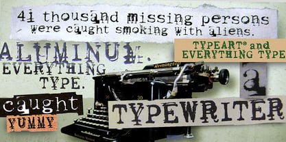 Typewriter with problem keys.
 - KG Wake Me Up by Kimberly Geswein,
$5.00 Fun blocky typewriter-esque lettering.
 - Speedwriter - Personal use only

- ChickClicks - Unknown license

- Romanstone by TypeArt Foundry,
$45.00 Typewriter simulation with extreme inking imperfections.
 - Dear John by TypeArt Foundry,
$45.00 Typewriter simulation with slight inking imperfections.
 - Writing Machine by TypeArt Foundry,
$45.00 Typewriter simulation with moderate inking imperfections.
 - KG Already Home by Kimberly Geswein,
$5.00 A cute doodled outline typewriter style font.
 - Remix by Intellecta Design,
$20.00a typewriter font with many style variations - Typist Slab Mono by VanderKeur,
$25.00 The typeface Typist originated during an extensive research on the origin and development of typewriter typestyles. The first commercially manufactured typewriter came on the market in 1878 by Remington. The typestyles on these machines were only possible in capitals, the combination of capitals and lowercase came available around the end of the nineteenth century. Apart from a few exceptions, most typestyles had a fixed letter width and a more or less unambiguous design that resembled a thread-like structure. A lot of this mechanical structure was due to the method the typestyles were produced. Looking at type-specimens for print before the first typewriters were good enough to came on the market we can see that in 1853 and in 1882 Bruce’s Type Foundry already had printing type that had a structure of the typewriter typestyles. Of course printing types were proportional designed as typewriter typestyles had a fixed width. So it is possible that except from the method of production for typewriter typestyles, the design of printing types were copied. In the design of the Typist, the purpose was – next to the monospace feature – to include some of the features of the early typewriter typestyles. Features such as the ball terminals and the remarkable design of the letter Q. This new typeface lacks the mechanical and cold look of the early typewriter typestyles. The Typist comes in six weights with matching italics in two versions. One that resembled the early typewriter typestyles (Typist Slab) and a version designed with coding programmers in mind (Typist Code).
 - Typist Code Mono by VanderKeur,
$25.00 The typeface Typist originated during an extensive research on the origin and development of typewriter typestyles. The first commercially manufactured typewriter came on the market in 1878 by Remington. The typestyles on these machines were only possible in capitals, the combination of capitals and lowercase came available around the end of the nineteenth century. Apart from a few exceptions, most typestyles had a fixed letter width and a more or less unambiguous design that resembled a thread-like structure. A lot of this mechanical structure was due to the method the typestyles were produced. Looking at type-specimens for print before the first typewriters were good enough to came on the market we can see that in 1853 and in 1882 Bruce’s Type Foundry already had printing type that had a structure of the typewriter typestyles. Of course printing types were proportional designed as typewriter typestyles had a fixed width. So it is possible that except from the method of production for typewriter typestyles, the design of printing types were copied. In the design of the Typist, the purpose was – next to the monospace feature – to include some of the features of the early typewriter typestyles. Features such as the ball terminals and the remarkable design of the letter Q. This new typeface laks the mechanical and cold look of the early typewriter typestyles. The Typist comes in six weights with matching italics in two versions. One that resembled the early typewriter typestyles (Typist Slab) and a version designed with coding programmers in mind (Typist Code).
 - Syke Mono by The Northern Block,
$39.00 A monospaced companion of the Syke type family. Using the proportional typeface as the reference details are carefully drawn into specially chosen characters to help improve centre alignment, function, and readability. Syke mono has a modern aesthetic style that is distinctive and stands out from the typewriter crowd without being too overpowering making it ideal for computer coding, database applications, ebooks and other screen-based interfaces. Details include five weights and true italics, over 590 characters with an alternative lowercase a, i, l and r. Five variations of numerals, manually edited kerning and Opentype features.
 - KG Somebody That I Used To Know by Kimberly Geswein,
$5.00 Narrow, playful, jaggedy letters inspired by a typewriter.
 - Magisk Time by Bogstav,
$11.00 This is my roughly handprinted typewrite-ish font. It has all the cool and classic moves of the traditional typewriter look, but with a more rough attitude due to the contextual alternates (which offer 6 different versions of each letter!)
 - Selectric by Indian Summer Studio,
$55.00 Selectric typewriter font. The part of the large, many years project on revival and further development (over 1000 glyphs) of the 20th century’s most famous typewriter Selectric golfball fonts, lost for many decades, not being created since then in digital vector form.
 - Olympia by Linotype,
$29.99The typewriter font Olympia was developed by Hell Design Studio and is available in one weight. A typical characteristic of a typewriter face is that it is monospaced, meaning all characters take up the same amount of space, whether a relatively wide m or a relatively narrow i. Typewriters have all but disappeared from the workplace and such faces have lost their original, practical use, but their style and effect has kept them alive and well, especially in advertisements. - Docket by Parker Creative,
$18.00 With it's distressed markings and rough edges, Docket mimics the appearance of a vintage typewriter from the 1940s. With Docket, you can quickly create graphics with an instant classic feel, and it's application is quite versatile. Create logos, stamps, sublimation designs, social media quotes, monogram products, and even websites with this bohemian typewriter font! Docket's characters are proudly hand-crafted, meticulously kerned, and come in two variations to capture the unique look of an old grunge typewriter.
 - NorB Type Writer Roughen by NorFonts,
$25.00 NorB TypeWriter Roughen is the roughen version of my NorB TypeWriter typeface witch's my emulation of the IBM Selectric 'Light Italic' ball witch was used by my grand-brother for his correspondance during the 70’s and 80’s. It's however a slanted mono-spaced looking typewriter font. You may want to use this font with any word processing program for text and display use, print and web projects, apps and ePub, comic books, graphic identities, branding, editorial, advertising, scrapbooking, cards and invitations and any casual lettering purpose… or even just for fun! NorB TypeWriter Roughen features 677 glyphs, OpenType features and comes in 6 weights each with their matching italics and in a Light, Normal and Bold version.
 - Selectric Pyramid by Indian Summer Studio,
$45.00 Selectric Pyramid is a typewriter font. Egyptian slab serif · Geometric slab serif Pyramid is version of Memphis (1929) by Dr. Rudolf Wolf. The part of the large project on revival and further development (by drawing many additional glyphs, sometimes over 1000) of the 20th century’s typewriters’ fonts.
 - Konscript by Michael Browers,
$25.00Konscript is a distressed typewriter face developed from analog samples from papers Mary Browers typed in the 1950s for her high school coursework. The model and age of the typewriter are not known. Additional characters were developed based on the analog samples to complete the character set. - Wire Type Mono by Thomas Käding,
$9.00 A monospaced typeface meant to look and feel like an old typewriter.
 - Selectric Century by Indian Summer Studio,
$45.00 Also known as Schoolbook. 900+ glyphs. After Linn Boyd Benton's and Morris Fuller Benton's 1894 lower contrast version of Scotch Modern, Didone. The part of the large project on revival and further development (by drawing many additional glyphs) of the 20th century’s typewriters’ fonts. And especially the most famous, versatile and beautiful typewriter: IBM Selectric’s golfball fonts, lost for the civilization for many decades after ‘80s, not being created since then in digital vector form. This new sub-project started in July 2018 for the restoration of the most beautiful classical typefaces, used during the 20th century on the extremely rare now IBM Selectric Composer typewriters / desktop publishing systems. Together with Nick Hamze and the Right Reverend Theodore Munk, the collectors of old typewriters. IBM showed the perfect taste by developing these best historical book typefaces of the human civilization for typewriters. So people could type then using both the real book faces, and the famous classical ones.
 - Punch Label - Unknown license

- BPtypewrite - 100% free

- Monotype Courier 12 by Monotype,
$29.99Designed as a typewriter face for IBM, Courier was redrawn by Adrian Frutiger for the IBM Selectric series. Courier is a typical fixed pitch design, monotone in weight and slab serif in concept. The Courier font is used to emulate typewriter output for reports, tabular work and technical documentation. - Quarterpound by Caput Mortuum,
$20.00 Quarterpound is loosely inspired by fonts used in Remmington typewriters. It has proportional design to create a more unique feel and improve its readability. It was created to fill a gap between edgy monospaced fonts and grungy typewriter imitations. It's meant to look credible in print and digital screens.
 - Courier Line Draw by Monotype,
$29.99Designed as a typewriter face for IBM, Courier was redrawn by Adrian Frutiger for the IBM Selectric series. Courier is a typical fixed pitch design, monotone in weight and slab serif in concept. The Courier font is used to emulate typewriter output for reports, tabular work and technical documentation. - Galexica Mono by Ingrimayne Type,
$6.00 GalexicaMono is an attempt to create a futuristic typewriter font, which may be an oxymoron. Unlike most typewriter fonts, it is sans-serif. The family has two weights, plain and bold, each with an oblique style. For a variant of the design that is not monospaced, see Galexica.
 - LD Underwood 5 by Illustration Ink,
$3.00This font represents the type style created by this very famous classic typewriter.


