1,593 search results
(0.02 seconds)
- Service Men JNL by Jeff Levine,
$29.00 Service Men JNL is a collection of twenty-six service industry-related messages carried by a courier. Each image is offered facing left and facing right. A blank message panel is available on both the period and comma keys for adding special text. The classic 1940s-era artwork adds a nostalgic touch to these simple reminders.
 - Tacky Font by Ingrimayne Type,
$14.95 Four letters for this font came from a puzzle in a 1983 Games magazine. After seeing them, I could not resist the temptation to do a complete set of letters made from push pins or tacks, a truly tacky font. Most of the letters on the lower case keys are alternatives--choose the one works best for your purposes.
 - P22 Hiromina 03 by IHOF,
$24.95 Hiromina03 is named after the wife of its designer, Hajime Kawakami. The three fonts in the set are based on Hiromi Kawakami's unique hand-lettering style. The distinctly feminine character of Hiromina03 is harmoniously integrated in all three writing systems, Katakana, Hiragana and Latin. The enclosed key charts give instructions for character placement in Katakana and Hiragana.
 - Flying Dutchman by FontMesa,
$25.00 In nautical folklore, the Flying Dutchman is a ship that can never go home and is doomed to sail the seas forever as a ghost ship. The story of the Dutchman appeared in print in the 1820s. With different versions written over the years, some date the legend to the 1640s or the early 1700s. The Flying Dutchman font is a revival of an 1876 font from MacKellar, Smiths & Jordan Co. The Truetype and OpenType formats include a larger extended character set with Central and Eastern European accented letters. Extra characters in this font are left and right pointing hands in place of the less than and greater than keys and a pirate flag is on the bracket keys. New to this style is the distressed version where the letters look like they've been hacked by a cutlass.
 - Rummage Sale by Ingrimayne Type,
$11.95 Several years ago I was asked to do a sign for a rummage sale. To print the words RUMMAGE SALE, I took letters from some of the ornate fonts I was working on at the time. I liked the results, so made them into a font. Fonts from which the letters come include HippityDippity, Tuskcandy, Letunical, OakPark, WyomingStrudel, NeuAltisch, WyomingMacroni, WyomingPastad, and Rundigsburg. The original typeface had two variants of each letter, one on the upper-case keys and the other on the lower-case keys. The name of the original font, RummageSaleOne, acknowledged that a greater selection of letters was desirable but it was only with the upgrade of 2020 that the greater selection was added. The additional variants were added in two ways: as a separate typeface (RummageSale-Two) and also as OpenType stylistic alternatives.
 - Colon by TipografiaRamis,
$30.00 COLÓN is a Slab Serif type family of three weights with matching italics. The typeface design was influenced by the nostalgia for the aesthetic of a typewriter. Colón extended family consists of two sub-families: Colón Mono with monospaced glyphs sets, and Colón (proportional glyphs sets) which is presented in these specimen pages. Colón is released in OpenType format with extended support for most Latin languages, and includes some opentype features – such as proportional/tabular figures, slashed zero, ligatures, fractions, etc.
 - Greenwood by Protimient,
$22.50Greenwood is a monospaced, cursive typewriter script, based on a typewritten letter from a Mr J. G. Greenwood Esq. to a branch of the National Westminster bank in Oxfordshire, Great Britain, dated 6th June 1904. This uncommon style of typeface is suitable for many tasks as it not only has the functionality of a monospaced font but it has a quirky distinctiveness that lends itself especially well to any setting that requires a decorative font that reads surprisingly well in extended text. - Hellschreiber by Jörg Schmitt,
$35.00 The birth of the monospaced types dates back to the past. There was a need for the creation of typesets for typewriters. The difficulty was to align the different glyphs in the same width. This led to particular problems with letters like “M” and “l”; the former seemed to be squeezed into the same width of all letters and the second one appeared way too streched. Despite – or perhaps because of – the impression of the typewriter is still popular with Graphic Designers. Nowadays there are even monospaced versions of primarily proportional types; for example the the Sans Mono designed by Lucas de Groot or the DIN Mono. Then again, why not the other way round?! In the first half of the Nineties, Erik Spiekermann developed a proportional type named ITC Officina based on the Letter Gothic. According to a survey on the 100 best fonts of all time conducted by FontShop, ITC Officina is in an eighth place, far ahead of its forerunner. This was the reason for me to create a wider design with a Serif and a Sans Serif based on the queen of all monospaced types – the Courier.
 - Blue On Blue by Gerald Gallo,
$20.00 Blue On Blue is a display font not intended for text use. It was designed specifically for display, headline, logotype, branding, and similar applications. Blue On Blue has an uppercase alphabet, numbers, and punctuation. For convenience, the uppercase alphabet is repeated under the lowercase keys. Only the portions of the characters that are outlined by the 3D-simulated depth are visible.
 - Signs Of Yesterday JNL by Jeff Levine,
$29.00Signs of Yesterday JNL brings another twenty-six vintage signs inspired by a series of decals once made by the Duro Decal Company (now Duro Art Industries) of Chicago. This font complements the original twenty-six designs found in Too Much Information JNL. There are two blank sign panels on the parenthesis keys for use in creating custom retro signage. - Human Rase by Graffiti Fonts,
$19.99This is a simple and legible tag style font as written with a bullet tip marker. HumanRase includes characters for all uppercase and lowercase keys as well as numbers, punctuation and dozens of other symbols (many more characters than most other tag style fonts). This font works well at large sizes but is also very legible when used for body copy. - Pristine Light by Gerald Gallo,
$20.00 Some words from the foundry: The Pristine Light fonts are clean and crisp, sans serif, uppercase only. They were designed specifically for those applications where uppercase text is appropriate, such as display, headline, logotype, branding, and similar applications. There are numbers, punctuation, accented characters, symbols, and miscellaneous characters. For convenience the uppercase alphabet is repeated under their respective lowercase keys.
 - Shard by Device,
$39.00 Shard was originally commissioned for Nickelodeon’s 3D reboot of the Teenage Mutant Ninja Turtles franchise. It complemented the show’s new angular logo, which Rian Hughes also designed. There are alternative versions of many letters available in the upper and lower case keys, and a selection of around 90 ligatures that automatically substitute themselves in running text to give a tight, interlocked fit.
 - Wicked Awesome by Nicky Laatz,
$22.00 Say hello to Wicked Awesome! A playful all caps cutout-style font. Lowercase letters have filled letters (A,O,B etc) and the Uppercase keys have the regular unfilled letters. Pick and choose which letters you want filled to get the look you are after :) Great for greeting cards, quotes, social media posts, posters, playful branding, and so much more!
 - Green On Green by Gerald Gallo,
$20.00 Green On Green is a display font not intended for text use. It was designed specifically for display, headline, logotype, branding, and similar applications. Green On Green has an uppercase alphabet, numbers, and punctuation. For convenience, the uppercase alphabet is repeated under the lowercase keys. Only the portions of the characters that are outlined by the 3D-simulated depth are visible.
 - Toddler JNL by Jeff Levine,
$29.00The fun, lighthearted appeal of Toddler JNL will bring out the inner child in you. Perfect for any layout or project that has to do with newborns, toddlers, preschool, playtime or anything related to little ones. There's a fairly complete character set - and two different width blank boxes on the brace keys - which can be used as spaces between words. - White On White by Gerald Gallo,
$20.00 White On White is a display font not intended for text use. It was designed specifically for display, headline, logotype, branding, and similar applications. White On White has an uppercase alphabet, numbers, and punctuation. For convenience, the uppercase alphabet is repeated under the lowercase keys. Only the portions of the characters that are outlined by the 3D-simulated depth are visible.
 - Keybies by Aah Yes,
$0.35Keybies is a font that produces an octave of a piano keyboard, with several variations. Type K or k repeatedly into the textbox above to see. The complete instructions are provided in the download file. One use is to print it in grey and draw big black dots on the relevant keys for chord diagrams, to help children or beginners. - Sport Numbers by Gerald Gallo,
$20.00 Sport Numbers contains classic sport number designs, similar to those that appear on sport uniforms and competition vehicles, in the proportions of 6 x 10, 8 x 10, 10 x 10, and 12 x 10, both vertical and oblique. The vertical numbers are located under the character set and the oblique numbers are located under the respective keys of the shift + character set.
 - Orange On Orange by Gerald Gallo,
$20.00 Orange On Orange is a display font not intended for text use. It was designed specifically for display, headline, logotype, branding, and similar applications. Orange On Orange has an uppercase alphabet, numbers, and punctuation. For convenience, the uppercase alphabet is repeated under the lowercase keys. Only the portions of the characters that are outlined by the 3D-simulated depth are visible.
 - Wieynck Gotisch by RMU,
$25.00 Wieynck Gotisch, a 1920s font family created by Heinrich Wieynck, was completely redrawn and redesigned for modern usage. Use this remarkable and eye-catching fonts in an appropriate context. This font contains a bunch of useful ligatures, and by typing 'N', 'o' and period plus activating the OT feature Ordinals you get an oldstyle numbersign. The round ‚s‘ lies on the #-key.
 - Derailer by Aerotype,
$29.00 Derailer’s eclectic character set is comprised mainly of disparate sans serif characters that claim to play well together. OpenType users also benefit from 52 ligature features that automatically substitute a unique pairing of letters when any upper or lower case character is keyed twice in a row. Derailer Pro extends the character set to support Eastern European Latin, Baltic, Greek and Turkish.
 - Red Border Labels JNL by Jeff Levine,
$29.00 In the pre-computer, pre self-adhesive label era of office supplies a number of companies (including Dennison, Maco and Denny-Reyburn) manufactured a wide variety of gummed labels for just about any use or purpose. Blank labels, specialty labels and decorative holiday seals were just a part of this line. One popular style was that of labels with parallel thick-and-thin borders of red lines and corners chamfered, rounded or straight cut. Occasionally, one could find similar labels with blue, green or gold borders but red was the mainstay, hence naming this typeface Red Border Labels JNL. Presented in this font is a collection of twenty-six standard and specialty shape label borders on the capital (A-Z keys) and twenty-six solid panel versions on the lower case (a-z) keys which can be used as backfills for the borders or as stand-alone labels.
 - Antoinette Monogrammes by Dharma Type,
$19.99 Antoinette Monogrammes is a monogram font based on old embroideries in the early 20th century by Janon Co. This font includes Upright script capitals and Normal slanted script capitals and 24 fancy frames. By combining each letters and frames, you can make your own monogram. And Every letters and frames were added handwritten effect to make warm and handcrafted impression. How about making monogram for wedding card, scrap book, stamp, logo? Upright script capitals can be accessed by typing Uppercase keys(A, B, C ....) and Slanted script capitals by lowercase key(a, b, c ...). Frames are 0-9 and exclamation mark(!), at mark(@), number sign(#), dollar($), percent(%), ascii circumflex(^), ampersand(&), asterisk(*), left and right brackets(()), period(.), comma(,), less and greater(). You need to arrange and set the position manually to finish making monograms. Please use graphic applications such as adobe illustrator or photoshop but not microsoft word.
 - Open Book ING by Ingrimayne Type,
$9.00 OpenBookING is a gimmick or novelty font that has letters on pages of a book. It is caps only and monospaced. The letters on the upper-case keys are on the left-handed pages of an open book and the letters on the lower-case keys are the same letters but on the right-handed pages of an open book. One could alternate upper and lower case keys to get letters on complete books, but the Opentype feature of contextual alternatives (calt) does this automatically. Several previous typefaces from IngrimayneType used the calt feature to alternate shapes that fit together in an interlocking pattern, such as alternating concave and convex shapes. OpenBookING uses the calt feature in a different way, to alternate two halves of a symmetrical shape. To provide two copies of numbers and common symbols, some non-alphabetical characters are unavailable because their slots were taken by the second form of the number or common symbol. If stylistic set one (ss01) is turned on, spaces are replaced with empty pages. This may leave you with unwanted spaces at the end of lines, and to eliminate them, turn off the feature (or change the font) for these spaces. The empty pages can be used in a layer to add color to the text. There is also a second set of empty pages with a filled page that can also be used in layers. (See poster for examples.) These pages are on the (logicalnot multiply) and (register divide) characters for the first set and on the (ordmasculine ellipsis) and (macron trademark) keys for the second set. Finally, OpenBookING has a large set of accented characters if anyone should need them. The letters used on the books were derived from the font Myhota-Bold. For a related typeface of letters on book covers, see NewLibrary. OpenBookING has limited uses and is priced accordingly.
 - Rick's Cafe by NorFonts,
$30.00 Rick's Cafe font is my emulation of those typefaces used in newspapers, it's being inspired from my "NorB TypeWriter" typeface. You may want to use this font with any word processing program for text and display use, print and web projects, apps and ePub, comic books, graphic identities, branding, editorial, advertising, restaurant menus, newspapers, scrapbooking, cards and invitations and any casual lettering purpose… or even just for fun! Rick's Cafe font comes in 4 styles, Normal and Bold each with Italic and Condensed versions.
 - DeForme by Ingo,
$39.00 A deconstructive variation of ”Clarendon“ DéFormé was born out of the distortion of the time-honored ”Clarendon“ letterforms, in which the stems and thin strokes have been reversed. Thus, a typeface was created which will remind some readers of a Western typeface, and others of the ordinary typeface of a typewriter. Actually, it is still a robust Clarendon, which has survived ists disfigurement quite well. DéFormé, like its ”mother“, is easily legible, in spite of the inherent emphasis which one is not used to seeing.
 - Fixga by Formatype Foundry,
$24.00 Behance Fixiga is a Modern rounded geometric sans with experiment forms to make powerful visual, a combining with the rounded and some sharp cutting edges. Fixga family comes with 8 weights, from ExtraLight to Black upright Italic, In addition Fixga also support OpenType alternate characters, Alternate SS.01 is offer with typewriter look and SS.02 is offer with neutral look with single storey "a" and "g" Fixga also support several OpenType features include: ligatures, tabular figures, fractions, and language support for extended Latin Icons and symbols.
 - Foundry Dit by The Foundry,
$50.00 Foundry Dit is created with a common horizontal dash grid structure for accurate layering when characters are superimposed. Foundry Dit functions as a legible correspondence font, with a ‘typewriter’ feel. Foundry Dit’s companion family Foundry Dat has an integrated background grid. Each family contains: light, regular, medium and bold weights. Foundry Dat comes with a series of dashes to extend the grid. Characters can also be offset to make different patterns – in the process becoming images – a graphic language with total integration of form and function.
 - Consolas by Microsoft Corporation,
$49.00OpenType Layout features: stylistic alternates, localized forms, uppercase-sensitive forms, oldstyle figures, lining figures, arbitrary fractions, superscript, subscript. Consolas is intended for use in programming environments and other circumstances where a monospaced font is specified. All characters have the same width, like old typewriters, making it a good choice for personal and business correspondence. The improved Windows font display allowed a design with proportions closer to normal text than traditional monospaced fonts like Courier. This allows for more comfortable reading of extended text on-screen. - Dr066 by 066.FONT,
$9.99 Dr066 is a display font that simulates the appearance of typewritten text. Each letter in Dr066 has been carefully designed to resemble the effect you get with a typewriter. This effect adds a sense of nostalgia to the text, as if it were from a bygone era, adding an authentic charm to the designs. Dr066 retains its varied and extravagant style, giving the text a lightness and a certain nonchalance. Its distinctive and daring letters make it ideal for projects that strive for a unique look.
 - Sweeep - Unknown license

- Museo Slab Rounded by exljbris,
$16.50 One of the most friendly Slab Serifs just got even more friendly. Museo Slab Rounded is the latest addition to the Museo font family. It has updated letterforms, spacing and kerning. It can perfectly be combined with Museo Sans Rounded. It comes in six weights with italics, that are not just slanted regulars. Key characters have been changed to give the italics more flow.
 - Calendar Blocks JNL by Jeff Levine,
$29.00Calendar Blocks JNL was inspired by old-fashioned wood type used to assemble calendar pages in the days of letterpress printing. The A-Z keystrokes contain the dates 1-26. The lower case a-z keystrokes have the remaining dates 27-31, along with the split dates 23/30 and 24/31 and blank boxes. The days of the week are located on the 1-7 keys. - Chantal by Device,
$29.00 A loose, casual felt-pen script, Chantal comes in three weights plus italics, and a Cyrillic version too. Alternate versions are available in the upper and lower case keys, so settings can be customised according to taste. Chantal communicates a hand-drawn light touch with character. Originally designed to letter the RoboHunter series that Peter Hogan and Rian Hughes produced for the comic 2000AD.
 - Sophisto by MAC Rhino Fonts,
$36.00 A successful collaboration between MRF and Psy/Ops Type Foundry. In search for a Sans Serif with a significant and strong character but still ”low-key” enough to be functional for most areas, Sophisto finally grew into an extensive family of 21 parts. Made carefully to fit both text- and display solutions. The buttons, images and patterns makes it even more complete as a family.
 - Dead Meat by wearecolt,
$8.00 DEAD MEAT - a bold, uppercase display font. Give your titles and logo types a hand made lettering look Features All uppercase font (use lower case key strokes for alternative character). Each glyph is unique from hand drawn originals. – Web font format included. The zip package contains both an opentype (.oft) and web font (.woff), DEAT MEAT has been created with all Western European characters.
 - Cuizy by Twinletter,
$13.00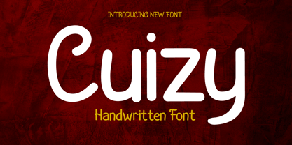 Introducing "Cuizy Font" - Where Handwriting Meets Distinctive Design. Cuizy Font is your key to adding a touch of personal charm and uniqueness to your projects. Crafted with precision, it effortlessly blends the warmth of handwritten text with contemporary style. What’s Included : File font All glyphs Iso Latin 1 Alternate, Ligature Simple installations PUA Encoded Characters – Fully accessible without additional design software. Fonts include Multilingual support
 - Schreibmeister by RMU,
$30.00 Schreibmeister is my interpretation of Arno Drescher’s design for Ludwig Wagner, Leipzig, completed in 1958. The letters X and x were improved as well as some ligatures. The letter E has an alternative, and the small d comes with two alternatives, of which one form can be reached by typing the partial different key. Generally it is recommended to activate both Standard and Discretionary ligatures.
 - Deco Banner JNL by Jeff Levine,
$29.00 Deco Banner JNL is composed of reverse lettering on a black background with Art Deco end caps. To create a banner, first type the plus sign for the left end cap, then your text. To add a space between words, use the bar on the shift position of the backslash key then continue on. To add the right end cap, type the equal sign.
