10,000 search results
(0.024 seconds)
- Latin by Wooden Type Fonts,
$15.00 A revival of one of the popular wooden type fonts of the 19th century, suitable for text or display, short ascenders and descenders, serifs triangular.
 - Grecian by Wooden Type Fonts,
$15.00 A revival of one of the popular wooden type fonts of the 19th century, suitable for display, geometric slab serifs unbracketed, short descenders, very condensed.
 - Fletcher by Solotype,
$19.95A special effect type from the French foundry of Beaudoire & Cie. We changed a couple of characters to improve the overall harmony of the alphabet. - Barkanon by wearecolt,
$29.00 Barkanon is not your ordinary humanist sans serif typeface. Blending modern styling with classic humanist flow creates a bold and captivating look. Designed to be expressive in the right places and legible where needed. Barkanon is great for headings, body copy, logos, etc. Barkanon was picked to be a part of the 2024 Typodarium and an early version of the font was featured on James Edmonson's (Oh No Type Co) YouTube channel Barkanon covers 96 languages, 9 styles plus italics, with stylistic alternates, ligatures, and other opentype features.
 - Woolen by Magpie Paper Works,
$32.00 Woolen is a hand-inked & italicized serif, based upon a 17th century type specimen by Jean Jannon. Many of the capital letters are decorated with subtle sprigs and leaves, while the lowercase letters remain classically styled, giving the font a warm and natural look with just the right amount of dignity. Woolen is perfect for logos and branding – she shines in retail identities, particularly for farms, markets, and restaurants. Even though the font is slanted, it reads beautifully as body text and display headlines. Multi-language support is included in the font.
 - Adverb Mono by Rumors Foundry,
$9.00 Adverb Mono is an atypical monospaced, squared proportional, slab-serif and low contrast typeface inspired by the American Type Founders' "OCR-A" and the latest work of Adrian Frutiger "OCR-B" designed during the second half of the 20th century. The typeface (in his 1.00 version) counts five different weight, from Thin to Bold, and a pixelated redesign of the regular weight inspired by the retrogaming consoles' graphics. It counts more than 240 different glyphs continuously updated. Designed by Gabriele Bellanca for IED Florence Typography Masterclass 2020/21. All rights reserved.
 - Distill by MADType,
$19.00 Distill draws its inspiration mainly from Theo van Doesburg's De Stijl era lettering. The type he designed for the Aubette Café, De Stijl Magazine, etc was used as a starting point and then expanded upon. While this typeface was inspired by historical references, it also has the ability to invoke a contemporary feel under the right conditions. Distill will work hard whether you are designing a neo-constructivist poster or a futuristic website. Distill is a family of 12 fonts: 4 weights, each containing condensed, regular, and expanded widths. It also features several alternate characters.
 - KG Manhattan Script by Kimberly Geswein,
$5.00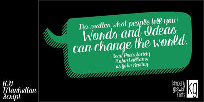 A connected, upright script font.
 - Volta by Linotype,
$29.99Volta is a robust typeface from the 1950s. A revisit to styles that were en vogue at the turn of the century, Bauer type foundry designers Walter Baum and Konrad Bauer designed this type family in1955. The form of Volta's letters are similar to those in New Transitional Serif typefaces, like Cheltenham and Century. Developed after the Didone (i.e., Bodoni) style types, New Transitional Serifs speak more to the zeitgeist of the late 19th Cntury, and were typographic adaptations to it's newer technologies. Already in the period of mass production, typographers and printers at the dawn of the 20th Century had to cope with larger print runs on cheaper materials. The robust letterforms of New Transitional Serifs were designed to compensate for this, but they were also ingenious little inventions in their own right. Form the beginning, the new, peculiar forms of New Transitional Serif letters were adopted for use by advertisers. Their robustness also allowed them to be used in virtually all sizes. Volta was designed especially with advertising display usage in mind. The x-height of Volta's letters is higher than average for serif faces. It is recommended that Volta be used exclusively for shorter tracks of text, above 12 point. Headlines look dashing set in Volta. Four different font styles are available for the Volta typeface: Regular, Medium, Medium Italic, and Bold." - Sisters by Type-Ø-Tones,
$40.00 Sisters is a lively set of stencil display typefaces designed by Type-Ø-Tones’ co-founder Laura Meseguer. The family features four fresh fonts that share foundational principles of construction yet complement each other—as sisters do—by celebrating their differences. Variations in contrast, weight, and design characteristics result in four distinct styles dubbed One through Four. This cool quartet contains no lowercase, asserting the family’s rightful place in the titling typography space. Like many Type-Ø-Tones typefaces, Sisters was conceived as a custom lettering project—in this case, the design was crafted for the identity of an art exhibition. Laura initially drew only the limited character set the show required, but from the outset, she saw great potential for a fully developed type family based on her lettering concept. The first member of Laura’s new family was, naturally, Sisters One. She later added contrast to produce Sisters Two, then equalized the weight of Sisters Two to create Sisters Three. To round out the group, Laura added a deco touch to Sisters Two, resulting in the festive but retro-elegant Sisters Four. Each Sister shares DNA with the other members of the family, just as human siblings do :). Credit for the Sisters name goes to Eider Corral and we couldn’t imagine a more fitting moniker for this little family.
 - Palmer Lake by Jen Wagner Co.,
$13.00 Features: Palmer Lake Print: Uppercase letters, numbers, & extended punctuation Palmer Lake Script: Lowercase letters, numbers, & extended punctuation Non-English support for the international designer Same stroke thickness with each font, so you don't need to make any time-consuming adjustments to get it looking right! Palmer Lake Print (uppercase font) letters are the same height as the Script lowercase letters, so making quotes is super easy! This is such a fun new duo, perfect for creating quotes, logos, or just adding a hand-written touch to any project! While other fonts usually take some size adjusting to look just right, Palmer Lake duo has the same stroke thickness for both fonts, so you can set each font to the same size and you're done! Plus, the uppercase letters of the Print font are the same height as the lowercase letters of the Script font (see the samples), so lining them up with one another is a breeze! Each font also has alternates for each letter, so when you type uppercase or lowercase for each font, the letters will change slightly. For example, tying in all caps with the Script font will connect each letter, whereas typing all lowercase will disconnect each letter. Test it out for yourself in the box above!
 - Dont Walk Run - Unknown license

- Business Helpers JNL by Jeff Levine,
$29.00 Duluth, Minnesota's Horace P. Brouillet Syndicate (later known as Syndicuts, Inc.) was one of a number of stock cuts providers to the letterpress trade in the decades preceding paper, then electronic clip art. Brouillet's "Typeps" catalogs offered a wide range of images covering numerous subjects, as well as cartoons, catch words and automotive logos. Many of these images have been reproduced in a number of royalty-free clip art publications over the years. Twenty-Six of these newly-redrawn catch words are found within Business Helpers JNL in two styles. On the capital keys are the original white-on-black designs, modeled from the vintage source material. The lower case keys have the phrases separated from the decorative ovals and are in black type.
 - One United Font by TypoGraphicDesign,
$9.00 The typeface One United Font is designed from 2020 for the font foundry Typo Graphic Design by mäd • madeleine maros × Manuel Viergutz as a political statement #leavenoonebehind The display font is inspired in the past and present. 3 font-styles (Bubble, Bubble Behind, Outline) + 1 icon-style with 390 glyphs (Adobe Latin 1) incl. 100+ decorative extras like icons, arrows, dingbats, emojis, symbols, geometric shapes (type the word #LOVE for ❤ or #SMILE for ☺ as OpenType-Feature dlig) and stylistic alternates (3 stylistic sets). For use in logos, magazines, posters, advertisement plus as webfont for decorative headlines. The font works best for display size. Have fun with this font & use the DEMO-FONT (with reduced glyph-set) FOR FREE!
 - Ebola - Unknown license

- DreamerOne - Unknown license

- Dreamspeak - Unknown license

- Dreamspeak - Unknown license

- Greenhorn by Juraj Chrastina,
$29.00 Greenhorn is a hand-traced comic type for headlines. Funky, irregular and smiling. The first inspiration comes from the unique lettering of a classic czech cartoonist.
 - Monotype Baskerville eText by Monotype,
$103.99The eText fonts from the Monotype Baskerville have been specially tuned by our type design experts for a better on screen readability for instance in PDFs. - Kvant by Fontfabric,
$35.00 Kvant is a custom font which is applicable for any type of graphic design - web, print, motion graphics etc. and perfect for t-shirts and logos.
 - Sudoku by Fontfabric,
$35.00 Sudoku is a custom font which is applicable for any type of graphic design - web, print, motion graphics etc and perfect for t-shirts and logos.
 - Tubo by Jonahfonts,
$35.00 2 font faces that combine together with attached lower case glyphs. A combo type-face that can be used with or without joining its lower case.
 - Colo by Fontfabric,
$25.00 Colo is a custom font which is applicable for any type of graphic design - web, print, motion graphics etc and perfect for t-shirts and logos.
 - Troubador JNL by Jeff Levine,
$29.00The charm of wood type -- especially in reproductions from worn specimens -- is the combination of hand-crafted letters and numbers and a connection with the past. - Duplex by Fontfabric,
$25.00 Duplex is a custom font which is applicable for any type of graphic design - web, print, motion graphics etc and perfect for t-shirts and logos.
 - Antique Shadow by Wooden Type Fonts,
$15.00A modified remake of one of the popular wooden type fonts of the 19th century. This is an extra bold, shadowed, sans serif suitable for display. - Backpage Article JNL by Jeff Levine,
$29.00Backpage Article JNL and its oblique counterpart are a variant to the popular sanserif wood types used in newspaper headlines and on broadsheets in years past. - Raffish by Wordshape,
$12.00 Raffish is a display typeface with its formal base in Dutch type designer Henk Krijger's seminal typeface Raffia - the most decorative and handsome of script typefaces.
 - Wigan by Fontfabric,
$25.00 Wigan is a custom font which is applicable for any type of graphic design - web, print, motion graphics etc and perfect for t-shirts and logos.
 - Pelago by Adobe,
$35.00Pelago is a semi-formal sans-serif type family by Adobe Principal Designer Robert Slimbach. The family has a crisp contemporary appearance and an understated elegance. - French Antique by Wooden Type Fonts,
$20.00A revival of one of the popular wooden type fonts of the 19th century, extremely condensed, bold, flat thick serifs, a very useful design for display. - Rolka by Fontfabric,
$21.00 Rolka is a custom font which is applicable for any type of graphic design - web, print, motion graphics etc and perfect for t-shirts and logos.
 - Hearst Roman by Solotype,
$19.95A product of the Inland Type Foundry, some say stolen from a hand lettering job done by Goudy. (Goudy was one of those who said it!) - Antique Six by Wooden Type Fonts,
$15.00 A revival of one of the popular English Antique styles of the 19th century. The slab serif style was also used by American wood type manufacturers.
 - Rancher JNL by Jeff Levine,
$29.00 Rancher JNL was inspired by classic wood type. This wide, slab serif typeface is reminiscent of wanted posters, broadsides and other printed matter from the 1800s.
 - Mosca by Hanoded,
$15.00 Mosca means 'fly' in Spanish - the flying type, not the one in your jeans…). The font is quite lively, loose and elegant at the same time.
 - Texarkana JNL by Jeff Levine,
$29.00 Texarkana JNL is based on classic condensed wood type from the 1800s, and is embellished with stars on the top and bottom for a decorative look.
 - Fango by Typo5,
$16.95A heavy one. For major impact use it only in caps, however typing randomly upper and lower case has interesting results too. Play with it please. - Pastel by Fontfabric,
$25.00 Pastel is a handmade font which is applicable for any type of graphic design - web, print, motion graphics etc. and perfect for t-shirts and logos.


