10,000 search results
(0.073 seconds)
- Nouveau LX Expanded by Vanarchiv,
$31.00 The original design came from Berthold Herold typeface, designed by Hermann Hoffmann during 1913 (Art Nouveau style) in Germany. This project started from flyer printed during 1947 with movable type, the specimen was scanned as a source to development some of the uppercase letterforms. However the most unusual and tricky element from this sample is the leg from the uppercase (R) which is different from the original Herold design, until now I didn’t found where this version originally came from. This expanded version only contain the bold weight, however there are also stencil (Nouveau LX Stencil) and condensed version (Nouveau LX) available.
 - Nouveau LX by Vanarchiv,
$27.00 The original design came from Berthold Herold typeface, designed by Hermann Hoffmann during 1913 (Art Nouveau style) in Germany. This project started from flyer printed during 1947 with movable type, the specimen was scanned as a source to development some of the uppercase letterforms. However the most unusual and tricky element from this sample is the leg from the uppercase (R) which is different from the original Herold design, until now I didn’t found where this version originally came from. This font family only contain the bold weight, but there are also a stencil and expanded versions available.
 - Modesty by Flawlessandco,
$9.00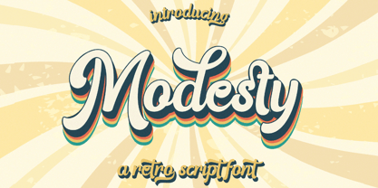 Modesty is an retro font type with a fun and groovy style that perfect for your retro vintage-themed projects. Try out some alternate characters for another visual result! There's some connected letters and some alternates that suitable for any graphic designs such as branding materials, t-shirt, print, business cards, logo, poster, t-shirt, photography, quotes .etc This font support for some multilingual. Also contains uppercase A-Z and lowercase a-z, alternate character, numbers 0-9, and some punctuation. If you need help, just write me! Thanks so much for checking out my shop!
 - Neue Frutiger Vietnamese by Linotype,
$29.00 Neue Frutiger Vietnamese''' was developed by a team of designers and font engineers from the Monotype Studio under the direction of Monotype type director Akira Kobayashi. The family is available in 10 weights from Ultra Light to Extra Black, with matching italics. Neue Frutiger Vietnamese embodies the same warmth and clarity as Adrian Frutiger's original design, but allows brands to maintain their visual identity, and communicate with a consistent tone of voice, regardless of the language. It is part of the Neue Frutiger World collection, offering linguistic versatility across environments – suited to branding and corporate identity, advertising, signage, wayfinding, print, and digital environments.
 - Gillcy by Scratch Design,
$9.00 Gillcy is a Modern script font with a beautiful shape and natural on each character comes with unique alternative glyphs and has multilingual support. Gillcy it's a very unique font that works great in large sizes with any background colors. Gillcy is perfect for Wedding invitations, Magazine Headlines, Branding Projects, Prints, labels, Price Tags, Clothing & Fashion Branding. Just open your Opentype features while using the script font to use the ligatures and swashes. As you type, your text will look like a natural and authentic script. Features: Stylistic Alternates & Ligatures Numerals & Punctuation Swashes Accented characters Format File: TTF, OTF, Web Multiple Languages Supported
 - Revolte by Wiescher Design,
$39.50 Whenever I see clippings on TV of demonstrations, protesting against this or that, with people holding up signs, I am surprised about the signs being professionally printed or plotted in Helvetica or Futura condensed. I've even seen signs in Zapfino! That doesn't really cut it, it doesn't look much like a real protest. So I decided to give the protesting world a real good font for the occasion. In German a Revolte is an uprising, I thought that was a good name for the font. Hasta la victoria siempre from your revolutionary type designer Gert Wiescher.
 - Festivo LC by Ahmet Altun,
$19.00 With the lowercases of Festivo Letters Font Family, Festivo LC comes with new sketches, new shadows and also ornaments. Festivo LC Font Family is a handmade layered font which includes several textures and shadows. Different font types can be created using various combinations of Festivo LC Fonts and colors. The kernings and the metrics of Festivo LC Fonts are not the same as Festivo Letters' kernings and metrics. It is advised not to use them together. The various possibilities of the Festivo Font Family allows you to create a lot of great works such as posters, magazines, printings, t-shirts etc.
 - Linotype Scott by Linotype,
$29.99Linotype Scott Mars, from German designer Hellmut Bomm, is part of the TakeType Library, chosen from the entries of the Linotype-sponsored International Digital Type Design Contest 1999 for inclusion on the TakeType 3 CD. Bomm constructed this typeface from a consciously limited repertoire of forms, producing a strictly constructed font with a cool, technical look. Worthy of note are also the exalted numeral forms and the unusual size relation of the lower case and capital letters. Scott Mars is best used for headlines and short to middle length texts in point sizes of 10 or larger. - Dezen Stencil 03 by DizajnDesign,
$39.00 Dezen is a contemporary, mechanical grotesque typeface. Its letters were first constructed from individual modules and then optically refined to enhance its rhythm. Its tight letter spacing and narrow proportions make the typeface particularly well suited for display sizes and headlines. When you add spacing, font can be used for shorter amount of text, bigger than 12 points. Dezen type family consists of a wide variety of styles – solid and stencils. Dezen Pro subfamily combines all 4 styles (Solid, Stencil 01, Stencil 02, Stencil 03) in a specific sequence, which originates a “pattern” for the alphabet (or dezen, in Slovak).
 - Monotype Clearface Gothic by Monotype,
$29.99Clearface Gothic first appeared in 1910, designed by Morris Fuller Benton, the world-famously prolific typeface artist. In addition to Clearface Gothic, Benton also designed classics like Franklin Gothic, Century Expanded, and many other types. Clearface Gothic is a sans serif face with light forms displaying the Zeitgeist of the turn of the 20th century. Distinguishing characteristics are the open forms of the a" and "c," the arched "k," and the upward-tilting horizontal stroke of the "e." The relatively narrow typeface, with its open inner white spaces, is extremely legible even in small point sizes. There is no accompanying italic." - Nubian by G-Type,
$39.00 Nubian was one of the first typefaces ever designed by G-Type and is an elegantly proportioned, crisply modern sans serif family. Comprising five weights from Thin to Bold with true matching italics, each font also includes two sets of figures (lining and old-style numerals) and an extended European character set. Nubian has a noticeably open, semi extended appearance providing very even 'colour' and excellent legibility when set as text. The contemporary letterforms work well at all sizes in print and on screen making Nubian a great choice across all media. The family has been updated to OpenType with extended language coverage.
 - Pen Swan by Great Lakes Lettering,
$40.00 Pen Swan is the latest offering from Jen Maton & Great Lakes Lettering. A Pen Swan is the species of an adult female swan. It is a fitting name as it contains ‘pen’ in the name which is the tool used to draw the letters. Pen swan demonstrates the same grace as the most elegant type of bird in the animal kingdom. It has a rolling gliding quality, as if the letters are waves forming spontaneously from your computer screen. Pen Swan is optimal for any project that needs an elegant touch. Great for Wedding Invites, Stationery, and Decorative prints.
 - M Ying Hei PRC by Monotype HK,
$523.99 M Ying Hei™ is designed by type designer Kenneth Kwok and Robin Hui. Unnecessary details have been eliminated to pursue a minimal form. The structure of characters are well balanced, neat and dignified. Different components of a character are cooperating perfectly in an appropriate proportion. Thickness of strokes are modified according to the number of strokes, thus achieving an even texture throughout the paragraphs. Therefore a perfect choice for prints, user interface and signages. M Ying Hei™ is equipped with 7 weights, which is sufficient for various occasions like matching with different Latin typefaces and handling complex information hierarchy.
 - Edda Script by URW Type Foundry,
$35.99 Edda Glaser’s digitized handwriting is a beautiful script containing many ligatures and alternates. The first lines were drawn in 2012 – however, there are now over 850 glyphs! The elegant and light typeface combines both connected and separate characters, in this way gaining a dynamic flow. The Open Type Features allow you to choose glyph alternates for the beginning and end of words. The script also contains lots of numbers as old-style and titling figures as well as sub- and superscript figures. The many alternates and swash uppercase letters let you create a versatile look which suits designing magazine and other print media.
 - The Blackport by Ironbird Creative,
$15.00 The Blackport Font Pack! is a Hand Drawn Font Pack. This Fonts gives a feel of vintage, classic, old, handmade looked like. This font also already PUA Encoded and I think this font is perfect for people looking for vintage aesthetic or Hand Made font. Come with 2 font styles, Regular and Stamp (Except The Blackport hand-drawn). Suitable for any graphic designs such as branding materials, t-shirt, print, label, logo, poster, t-shirt, photography, quotes .etc NOTE : For all the characters are also available, accessible in the Adobe Illustrator Glyphs Panel, or in Adobe Photoshop Character Open Type Panel.
 - P22 Cusp by IHOF,
$24.95 This typeface was originally inspired by Art Deco lettering. During the development of the letterforms a strick DeStijl grid was imposed. The lowercase letterforms were created with the influences of rave/techno design styles. The result is a distinctly contemporary display font. The P22 Cusp Family contains 4 fonts: P22 Cusp Round, P22 Cusp Round Slant, P22 Cusp Square, P22 Cusp Square Slant. This font was designed as a display font and may be a bit taxing on the eye at smaller point sizes. The P22 Cusp family is licensed exclusively to P22 type foundry/International House of Fonts.
 - Nettle Sans by Duck Soup Design,
$11.00 Influenced by Blackletter type and highway fonts, the Nettle Sans font family sets out to be both a quirky and confident headline font (at the heavier weights), and an easily legible body font for print or screen (at the lighter weights). Careful attention was taken in choosing distinct shapes for each letter to maximise legibility, and to balance a daring experimental form with function. Through its brutal angled cuts out of the ends of tapered links, ink-traps, ascenders and descenders, Nettle Sans' defining motif offers a visual language that communicates speed, efficiency, advancement and the "cutting edge".
 - Warfake by Ronny Studio,
$19.00 Warfake is a high-contrast blackletter typeface, it adds a bold touch to your projects and will inspire you to create something unique and modern. This font also comes with alternative characters, and multi-language support. This font is ideal for titles, flyers, greeting cards, product packaging, book covers, printed quotes, logotypes, clothing designs, branding and album covers. Files include: - TrueType (.ttf) - Open type (.otf) - Webfonts (.woff) Features : - Lowercase & Uppercase (All Caps) - numbers and punctuation - multilingual - alternates - PUA encoded Please contact us if you have any questions. Enjoy Crafting and thanks for supporting us! :) Thank you
 - Wild Heart by PeachCreme,
$19.00 Introducing you "Wild Heart", our new lovely script font. Featuring handwritten, refined flows, "Wild Heart" includes beautiful uppercase and lowercase letters, numerals, punctuation, and adorable heart swashes. Repeating every inch of it the ending heart swash is a mirrored replica of the beginning heart swash. Also, there is a connecting heart swash which serves to bind two words or letters together. The font characters are thick enough to fit perfectly for all types of printing techniques, especially Cricut, Silhouette, etc. "Wild Heart" can add a charming touch to your branding design, wedding invites, cards, monograms, and so many other projects.
 - Lucida Calligraphy by Monotype,
$40.99 Lucida Calligraphy is a chancery cursive script typeface family designed by Kris Holmes and Charles Bigelow. It is a very legible and readable typeface, designed for use on screen and in print environments. Lucida Calligraphy was originally released in one weight. It is now available in five weights, from Thin to Black. Lucida Calligraphy is part of the Lucida superfamily of fonts from Bigelow & Holmes. Lucida is highly regarded for legibility and its extensive range of type styles. The Lucida Calligraphy typeface family has a Standard character set with 255 glyphs supporting the basic range of Latin languages.
 - ITC Airstream by ITC,
$29.00Timothy Donaldson creates letterforms anywhere using anything: he is just as happy making letters with pens and brushes, many of which he makes himself. Applying his personal commitment to the beauty of hand-drawn letterforms to modern type design methods has ensured that his fonts frequently reveal the presence of a joyful creativity behind the design. Airstreams alphabet is composed of consciously irregular handwriting characters and the overall tone is set by the emphasized vertical strokes. The erratic Airstream with its cheerful, unconventional character is intended for shorter texts and headlines and should be used in point sizes 10 and larger. - Dezen Stencil 01 by DizajnDesign,
$39.00 Dezen is a contemporary, mechanical grotesque typeface. Its letters were first constructed from individual modules and then optically refined to enhance its rhythm. Its tight letter spacing and narrow proportions make the typeface particularly well suited for display sizes and headlines. When you add spacing, font can be used for shorter amount of text, bigger than 12 points. Dezen type family consists of a wide variety of styles – solid and stencils. Dezen Pro subfamily combines all 4 styles (Solid, Stencil 01, Stencil 02, Stencil 03) in a specific sequence, which originates a “pattern” for the alphabet (or dezen, in Slovak).
 - M Young Hei PRC by Monotype HK,
$523.99 M Ying Hei™ is designed by type designer Kenneth Kwok and Robin Hui. Unnecessary details have been eliminated to pursue a minimal form. The structure of characters are well balanced, neat and dignified. Different components of a character are cooperating perfectly in an appropriate proportion. Thickness of strokes are modified according to the number of strokes, thus achieving an even texture throughout the paragraphs. Therefore a perfect choice for prints, user interface and signages. M Ying Hei™ is equipped with 7 weights, which is sufficient for various occasions like matching with different Latin typefaces and handling complex information hierarchy.
 - VVDS Clementia by Vintage Voyage Design Supply,
$15.00 • Clementia – a stylish condensed serif font with Art Deco mood and huge variety of stylistic alternates and ligatures. Thereby your typographic gets a unique and authentic style for a vide variety of projects. Cafe's menu, wedding invitation, branding, magazine's headers, t-shirt prints, posters - all these projects will breathe uniqueness. Your typography may be more discreet with basic stylistic set or it can be more playful, artistic and expressive with any of ligatures or stylistic alternates. • 970 Glyphs total; True Italics; Open Type Features as stylistic alternates, ligatures, old style / tabular / fraction / superior figures, manicules and small caps; Multilingual (Include alternates)
 - VVDS Rashfield by Vintage Voyage Design Supply,
$20.00 Rashfield is a soft serif type family in 5 weights and italics. Inspired by classical Windsor mood in Woody Allen movie titles, with outward bent h, m, n and a lot of modern alternates. Softly character with a hint of retro feeling. Rashfield has a lots of stylistic alternates that makes it very playful in various uses like logos, prints, branding, web design, packaging and more. Use it to create short powerful phrases and headlines and also use it in longer text like paragraphs and block texts. Perfect for modern projects with a little retro mood feel.
 - Daphne by Ahmet Altun,
$20.00 In the beginning, this font had been designed for an affiche work as wood pattern which includes one font and medium weight. The stylish design of this font had been inclined us to create more weights and more styles. Daphne Font Family comes in three weights; normal and italic. Plus two additional styles which are wood pattern and shadow. You can get great wood pattern results with Daphne Font Family; also with colored shadows, you can get gorgeous results in poster works and t-shirt prints. Even in very small type sizes, it can be legible.
 - Neue Frutiger Arabic by Linotype,
$79.00 Neue Frutiger Arabic was created by Nadine Chahine and a team of designers and font engineers from the Monotype Studio, under the direction of Monotype type director Akira Kobayashi. The family is available in 10 weights from Ultra Light to Extra Black. Neue Frutiger Arabic embodies the same warmth and clarity as Adrian Frutiger's original design, but allows brands to maintain their visual identity, and communicate with a consistent tone of voice, regardless of the language. It is part of the Neue Frutiger World collection, offering linguistic versatility across environments – suited to branding and corporate identity, advertising, signage, wayfinding, print, and digital environments.
 - Dielust by Flawlessandco,
$9.00 Dielust is an retro font type with a fun and bold style that perfect for your retro vintage-themed projects. Try out some alternate characters for another visual result! There's some connected letters and some alternates that suitable for any graphic designs such as branding materials, t-shirt, print, business cards, logo, poster, t-shirt, photography, quotes .etc This font support for some multilingual. Also contains uppercase A-Z and lowercase a-z, alternate character, numbers 0-9, and some punctuation. If you need help, just write me! Thanks so much for checking out my shop!
 - Gutknecht by Proportional Lime,
$9.99 Jobst Gutknecht was a highly successful printer in the city of Nuremburg from 1514 to 1542. He published the "Achtliederbuch" (the first Lutheran hymnal, with a whole 4 tunes) and many works by Martin Luther. This font is an accurate "recutting" of the font face Gutknecht used for the body text in his printed works. It has been extended to over 900 glyphs adding hundreds for modern use. It also presents many ancient things like old ligatures such as "tz", a hedera, and alternate style pilcrow for visual interest. And for those conservative types the modern lower case "k" is also available.
 - Rovey by Craft Supply Co,
$15.00 Rovey is an all caps handwritten serif font. It can be used to create almost all types of design projects like print materials. Just use your imagination and some graphic design set in Extras and your project will become more alive and look greater than ever with Rovey. You want to make a greeting card or a package design, or even a brand identity, craft design, any DIY project, book title, wedding font, pop vintage design, retro design or any purpose to make your art / design project look pretty and trendy? Feel free to play with this fonts!
 - Gibbons Gazette by Comicraft,
$39.00HOLD THE FRONT PAGE! STOP THE PRESSES! We have a new Headline for our Cover Story! DAVE GIBBONS is all over the tabloids, the trades AND the quality papers today. Yes, it's the opening of the WATCHMEN movie, but we have a much BIGGER story; the REAL scoop -- and we're announcing it in 72 point type... yes, there's a new addition to the Dave Gibbons family, and our editorial staff have the baby's name and our paparazzi have the pictures! Dave's new little sprog is called... GAZETTE. Man, that kid is gonna get teased at school, Dave. - Niveau Grotesk by HVD Fonts,
$40.00 Niveau Grotesk—the companion of Niveau Serif —is a type family of six weights plus matching italics and small caps. It was designed by Hannes von Döhren in 2013. Influenced by classical nineteenth-century faces, the fonts are based on geometric forms. Because of its straight architecture, Niveau Grotesk has a “punch” in big sizes but is very legible in smaller sizes and longer texts—in print or on screen. Niveau Grotesk is equipped for complex, professional typography with alternate letters, arrows, fractions and an extended character set to support Central and Eastern European as well as Western European Languages.
 - DeDisplay by Ingo,
$24.99 A type designed in a grid, like on display panels Type is not only printed. There were always and still are a number of forms of type versions which function completely differently. Even very early in the history of script there were attempts to combine a few single elements into the diverse forms of individual characters and also efforts to construct the forms of letters within a geometric grid system. The “instructions” of Albrecht Dürer are probably most well-known. But although designers of past centuries assumed the ideal to basically be an artist’s handwritten script, the idea which developed in the course of mechanization was to “build” characters in a building block system only by stringing together one basic element — the so-called grid type was discovered, represented most commonly today by »pixel types.« But even before computers, there were display systems which presented types with the help of a mechanical grid display, like the display panels in public transportation (bus, train) or at airports and train stations. In a streetcar, I met up with a modern variation of this display which reveals the name of each tram stop as it is approached. This system was based on a customary coarse square grid, but the individual squares were also divided again diagonally in four triangles. In this way it is possible to display slants and to simulate round forms more accurately as with only squares. The displayed characters still aren’t comparable to a decent typeface — on the contrary, the lower case letters are surprisingly ugly — but they form a much more legible type than that of ordinary [quadrate] grid types. DeDisplay from ingoFonts is this kind of type, constructed from tiny triangles which are in turn grouped in small squares. The stem widths are formed by two squares; the height of upper case characters is 10, the x-height 7 squares. DeDisplay is available in three versions: DeDisplay 1 is the complex original with spaces between the triangles, DeDisplay 2 forgoes dividing the triangles and thus appears somewhat darker or “bold,” and DeDisplay 3 is to some extent the “black” and doesn’t even include spaces between the individual squares.
 - Lampoon Brush by Rocket Type,
$19.95 Lampoon Brush originates from a film strip of paint brush lettering. It has crisp deliberate brush strokes and is perfect for use in many different applications namely when you’re seeking that retro/vintage feel.
 - Mess Hall JNL by Jeff Levine,
$29.00Modeled from a set of individual painting stencils, Mess Hall JNL is named for the armed services cafeteria where thousands of enlisted men endured bland, boring meals day in and day out for years. - Poozer by Cool Fonts,
$24.00 Poozer is a hand drawn stencil font that started out as a doodle and ended up on a custom skate deck. It has a nice organic, painted feel. Definitely not your usual stencil font.
 - Juicy Fruit by Seemly Fonts,
$14.00 Juicy Fruit is a bold and paint-brushed display font. No matter the topic, this font will be an incredible asset to your fonts’ library, as it has the potential to elevate any creation.
 - Linoset by Ensor Creative,
$20.00 Linoset was created from cut and printed linoleum. The lettering is based on Helvetica Neue Condensed Bold – it has been cut, printed and re-drawn to take on a completely new life – it's rough, tough and downright nasty!
 - Linotype Brewery by Linotype,
$29.99Linotype Brewery is part of the Take Type Library, chosen from the contestants in the International Digital Type Design Contests of 1994 and 1997. This text font is available in six weights from light to black and was designed by Gustav A. Grinberg. An outstanding characteristic of the font is its light stroke contrast and its constructed forms. Its tiny, triangular serifs first become noticeable in very large typesizes, much like the Dutch fonts of the 17th century, Copperplate, for example. Linotype Brewery is cool and elegant and well-suited to middle-length texts and headlines. - DIN Neue Roman by Vibrant Types,
$43.00 The DIN Neue Roman adds something new to the established concept of the DIN 1451 type’s technical origin. As a serif counterpart it leaves its static appeal to bring some friendliness into this industrial idea. With more contrast than a slab serif and the dynamic stroke of transitional type DIN Neue Roman defies all conventions, but keeps its legibility. To have enough resources for diverse and complex typography this type family offers 7 weights with italics, small caps and all kind of opentype features. Type designer Philip Lammert likes to play with the great potential of contradictions. That brought him to this design combining two essentially different classics. DIN Neue Roman is part of his 2015’s master thesis at the HAW Hamburg which was supervised by Prof. Jovica Veljovic.