10,000 search results
(0.035 seconds)
- Ritts Cursive by Eurotypo,
$59.00 The most notable characteristic of this typeface is that it has a compact and regular shape that is slightly condensed but fluidly connected. Its glyphs emulate the look of handwritten, inked characters. Their exuberant graphic strokes and sharp edges maintain the influences of printed types produced by mechanical processes. Unlike most of the italic type of today, the capital letters are as high as the ascending lower-case letters. The brush script style (Originally designed in 1942 by Robert E. Smith for the ATF) inspired many contemporary and beautiful typefaces, such as Wisdom Script, Mission Script, Marketing Script, Motion Picture, Thirsty Script, Lauren Script, Deftone Stylus and many others. This font has more than 700 glyphs, Central European languages support, including Open Type features, swashes, and contextual stylistic alternates. It also includes old-style figures, discretional and standard ligatures, is case-sensitive and has a set of tails and ornaments.
 - Monkton Book Condensed by Club Type,
$36.99 Packing more copy in a narrow space is the main reason for using a condensed type. Characters with a more ovular shape tend to be less wide than their circular counterparts and will allow for more letters per line. In narrow columns for example, this typeface can provide up to 25% more copy than the regular typeface in the same space. Another reason is when a larger type size is called for — used sparingly it is useful for headings or headlines. For emphasis, narrower letters can provide a stark contrast in the flow of reading, creating impact while retaining typographic character. Condensed types can specially useful in tables and charts because typically both use few words in each block. If space now allows, you may think about the luxury of a larger point size. This optimizes space while keeping your typography more easily legible.
 - Estravaganza by Scholtz Fonts,
$19.95 Estravaganza is an elegant, finely crafted script, with an uneven, drizzled paint line. It has the delicacy of gossamer while boasting the extravagance of bold swashes and loops. Think "ballet-like femininity offset by the distressed paint drizzle of a jackson Pollock canvas." Use Estravaganza to brand perfume, clothing, jewelry, and to enhance wedding invitations, greeting cards and book covers. Language support includes all European character sets.
 - Skyline Hotel by Open Window,
$19.95 Skyline Hotel is a brand new hand painted font from Dathan Boardman of Open Window. It utilizes Art Deco structures but is greatly amplified by organic paint brush strokes. The font would be best used in designs that require an organic degraded look and feel. Skyline Hotel… optimal for back alley graffiti mural or a poster to begin a political revolution. Geometric essentials betrayed by fluid expression.
 - Ramkoers by Hanoded,
$10.00 Ramkoers means ‘Collision Course’ in Dutch. I made this font with a bit of salvaged plastic and thick black paint. I carved a wedge out of the plastic and used it as a spatula to apply the paint to the paper. Ramkoers is a bit of a rough & ready grunge font with some jagged edges and wobbly stems. Comes with an abundance of diacritics.
 - P22 Aglio by IHOF,
$24.95 Aglio was developed from letterforms originally painted by muralist/artist Tanya Zabinski. Aglio maintains the character of bold brushstrokes with random gaps and marks, and there are flourishes of articulated endstrokes. This typeface merges the looseness and freedom of hand painting with a decorative artistic sensitivity. Aglio (the Italian word for garlic) has an organic construction that evokes the spirit of this most assertive culinary favorite.
 - Mauritius by Canada Type,
$29.95 Ten years or so after his unique treatment of Garalde design with Trump Mediaeval, Georg Trump took on the transitional genre with Mauritius, which was to be his last typeface. He started working on it in 1965. The Stuttgart-based Weber foundry published a pamphlet previewing it under the name Barock-Antiqua in 1967, then announced the availability of the metal types (a roman, a bold and an italic) a year later. The global printing industry was already in third gear with cold type technology, so there weren't that many takers, and Weber closed its doors after more than 140 years in business. Subsequently, Trump’s swan song was unfairly overlooked by typography historians and practitioners. It never made it to film technology or scalable fonts. Thus, one of the most original text faces ever made, done by one of the most influential German type designers of the 20th century, was buried under decades of multiple technology shifts and fading records. The metal cuts of Mauritius seem to have been rushed in Weber’s desperation to stay afloat. So the only impressions left of the metal type, the sole records remaining of this design, show substantial problems. Some can be attributed to technological limitations, but some issues in colour, precision and fitting are also quite apparent, particularly in Mauritius Kursiv, the italic metal cut. This digital version is the result of obsessing over a great designer’s final type design effort, and trying to understand the reasons behind its vanishing from typography’s collective mind. While that understanding remains for the most part elusive, the creative and technical work done on these fonts produced very concrete results. All the apparent issues in the metal types were resolved, the design was expanded into a larger family of three weights and two widths, and plenty of 21st century bells and whistles were added. For the full background story, design analysis, details, features, specimens and print tests, consult the PDF available in the Gallery section of this page.
 - Ony by Cuda Wianki,
$20.00 Ony font was made by cutting letters in cardboard and printing them on paper. This non-perfect printing was used to get heavy, dirty letters. Font has alternate characters so it can imitate real printed words.
 - Nosara by Never Better,
$9.00 Inspired by a trip to Costa Rica and named after its famous beach town, Nosara is a layered vector font that's perfect for projects that require a realistic, hand-painted desert-island look. It comes in three styles: Regular, Outline, and Fill. The styles can be layered to create authentic-looking hand-painted letters and icons—in vector! You can create outlines from this font in order to customize to your heart's desire. Millions of bespoke combinations are possible. This typeface was made by hand, meaning each letter was painted with real paint and digitized, not created on an iPad, which is why this font looks great and has a warm natural quality even at large sizes. Nosara is perfect for packaging, parties, signage, and even looks great in long-form text! Nosara Xtra is a set of pictograms, also in 3 styles that can be layered for the same effect, evoking the imagery and happy vibes of a sunny tropical vacation.
 - Redbird by Eurotypo,
$34.00 Redbird is a modern hand-painted script with an irregular baseline. Rough edges and imperfect lines give to this brush font a unique and trendy look. All glyphs have been carefully painted giving your words a wonderful flow. Fat and thin stroke in this font impresses the harmony. Want to give your projects an organic, hand-painted look? Redbird font contains 584 glyphs, with inky lines, and "perfect or imperfect" painted edges, including a few extra character alternates, swashes and ligatures for a genuine hand-lettered effect. This font includes OpenType features that may only be accessible via OpenType-aware applications, a Central European language support. Bonus: 60 useful ornaments and a lot of catchwords that you use for the most demanding design project! Redbird looks lovely on wedding invitations, greeting cards, logos, business cards and is perfect for using in ink or watercolour based designs, fashion, magazines, food packaging and menus, book covers and more!
 - Out Back by chicken,
$17.00 A twice-painted sign in Tobago's back country was the seed for this weird grab-bag of chunky, slightly sleazy letterforms.
 - Arnold Boecklin SH by Scangraphic Digital Type Collection,
$26.00Since the release of these fonts most typefaces in the Scangraphic Type Collection appear in two versions. One is designed specifically for headline typesetting (SH: Scangraphic Headline Types) and one specifically for text typesetting (SB Scangraphic Bodytypes). The most obvious differentiation can be found in the spacing. That of the Bodytypes is adjusted for readability. That of the Headline Types is decidedly more narrow in order to do justice to the requirements of headline typesetting. The kerning tables, as well, have been individualized for each of these type varieties. In addition to the adjustment of spacing, there are also adjustments in the design. For the Bodytypes, fine spaces were created which prevented the smear effect on acute angles in small typesizes. For a number of Bodytypes, hairlines and serifs were thickened or the whole typeface was adjusted to meet the optical requirements for setting type in small sizes. For the German lower-case diacritical marks, all Headline Types complements contain alternative integrated accents which allow the compact setting of lower-case headlines. Arnold Böcklin SH is designed for Headline Type only. - Guzzo by Monotype,
$50.99 A playful caricature of a midcentury grotesque, Guzzo is a fresh addition to the Monotype Library. Somewhat eccentric and full of surprises, its unmistakable quirk can be found on closer inspection, stemming from details proudly borrowed from brush lettering and calligraphy. The wide range of weights and style can take you through any design space, from the condensed weights squeezing in larger headlines or dense blocks of text with the condensed range, to experimenting with small point sizes, labels or packaging with the extended cut. However, Guzzo’s real charm is probably best expressed through its wonderfully playful shapes, its unusual 'laid-back italics' feature cursive forms and a backslant. The different stylistic sets allow you to decide what you make of Guzzo, with several sets of alternate glyphs steering it in any direction you want. Guzzo is a happy-go-lucky character, and has a warm, humble and painterly quality that - at a glance - may be unrecognizable as a typeface. It can almost pass for hand-lettering. Guzzo pairs exceptionally well with scripts and slab typefaces, and feels most at home in situ with toys, packaging, menus, broadcasting, cartoons and merchandising! Guzzo encourages you to turn up the silliness and is for designers who want to emulate hand-painted and casual motifs. Taking its name from American artist Jeremy Pinc, aka the painter Guzzo Pinc, the typeface channels the quirky, funny and poignant qualities of his paintings - with wacky characters, loosely painted geometric forms and bright colors. For this mid century, authentic, nostalgic typeface - the story is really what you make of it.
 - Balter Serif by Art Grootfontein,
$19.00 Balter Serif is a hand-drawn layered typeface family inspired by sign painting, 1960’s movie posters and jazz album lettering. It can look fresh and modern or exquisitely vintage. Combine upper, lowercase and alternates to create a handmade custom lettered look, then layer the styles using colors to add value and depth to your designs ! Balter Serif works perfectly in short headlines. It is suitable to create a wide range of projects from posters to branding, logos, packaging, magazines and more. Features Uppercase & Small caps Numbers & Symbols International Glyphs 60 Alternates & swashes 70 Ligatures 30 Letter combinations Quick tip for layered fonts in Adobe Illustrator : Click and drag out a text frame to start (don’t just click with the cursor on the page). Then select the stacked text frames, go to Type in the menu bar > Area Type Options > Offset: First Baseline and select “Fixed”.
 - Pobla by Tipo Pèpel,
$22.00 Optimum readability in small bodies with scarce interlining, under poor printing conditions such as in newspapers, where velocity and bad quality’s irregular surface papers, truly distort strokes was the challenge taken. Pobla was designed with this in mind, hence Patau present a hybrid between the conventional strokes of a serif’s classical roman type and markedly “fractured” forms inside, providing a unique personality to this typographic family, where calligraphic’s humanistic axis is visibly broken with the straight axis of the fabricated letters. Subtle details in the serifs, give it a modern look to a classic skeleton. Very pronounced ink traps get the shapes rounded in the printed product to artificially increase the average medium-eye and promote reading in the small sizes it was designed for. An absolutely handwriting look for the italics, where the rupture of the stroke marks a white’s subtle change to only whisper in the printing surface a slight difference, but without fuss and so not to break the rhythm of reading. And as we are used to, a complete set of OpenType features, where you will find small caps, fractions, ligatures, old numerals and tabular, discretionary ligatures and support for 220 languages; and all available in twelve weights to meet the needs of any newspaper printing.
 - Arlen by Groteskly Yours,
$45.00 Meet Arlen, a funky, variable type family in 36 styles. Inspired by 20th century hand-painted signs and the visual culture of the 1980's, Arlen adds a little extra to this already charismatic mix. Arlen is a display sans serif that can be freely used for larger bodies of text. Among its most prominent visual features are high contrast, flaring stems and dynamic letterforms. With 860 characters in each font, Arlen supports most Latin-based languages and offers a large number of extra characters, dingbats, alternate glyphs, ligatures, and punctuation marks. Some of the most useful OpenType features are included too, such as Case-Sensitive Punctuation, Stylistic Alternates, Tabular Figures, Fractions, Localization, and a lot more. Some letters and characters come in two versions: thin and bold, and you can easily alternate between the two using a corresponding stylistic set. Arlen is a cheerful typeface that conveys kindness, good cheer, and only good vibes. It would feel at home both in digital and print mediums; it can be used in advertising, editorial design, social media, web design, packaging, or personal design projects. With versatility at its heart, Arlen would be a perfect typeface for large design systems that require multiple styles for typesetting.
 - Allerlei Zierat by Intellecta Design,
$14.90 Ornaments family with four different sets plus a decorative capitals font from the rare, valuable and amazing Allerlei Zierat book from Schelter & Gieseck (1902). A research and free interpretation by Intellecta Design. This encyclopedic specimen book of the Leipzig, Germany type foundry and printing supply house J.G. Schelter & Giesecke features, as the title indicates, all kinds of decoration for supplying printing of every type. On the title page, the firm boasts winning grand prize in 1900 in Paris (presumably at the Exposition Universelle). It is hard to do justice in a short description to the variety of styles (traditional, Jugenstil, etc.) and categories (certificates, letterheads, borders, ornaments, exotic motifs, flowers, animals, silhouettes, menus, greeting cards, vignettes humorous and otherwise, images of bicyclists, occupational symbols, portraits, Classical figures, religious art, heraldry, ships, trains, athletes, etc., etc.) offered in this volume. Some of the examples are printed in color, most are in black-and-white. The Jugenstil cover of this copy shows minor wear and soiling. The plate of “Gust. Carlsson & Co., Stockholm” is attached to the front pastedown. A small fraction of pages show minor soiling, a pencil notation or a short closed tear. Two of the fold-outs at the back have a little more damage-one is missing a 1x2 inch piece along the margin, the other has a 3-inch closed tear and an edge which is crumpled. A rare specimen from the Intellecta rare books library.
 - Revolution Gothic P by Dharma Type,
$19.99 Revolution Gothic P font family is designed based on Revolution Gothic and a distressed offshoot from the original. Revolution Gothic is an arranged and extended version of PAG Revolucion released from Prop-A-Ganda type foundry in 2008. The original font is inspired by retro propaganda posters and wallpainting in Cuba from the 60s to 80s. And the original PAG Revolucion is the most popular font from Prop-A-Ganda. The glyphs that damaged by printing the original had been tweaked by hand work with great care to be looked like natural damaged effect. This Revolution Gothic P family contains basic Roman, Italic, Bold and it’s Italic to suit a wide range of your creative works and it will be one of the most powerful solutions for printing and web.
 - OkayPaint by Okaycat,
$24.50The design process of OkayPaint began as hand-painted letters on paper. Thus, a variety of distressed paint effects can still be seen in the details, from splatters to dry-brush. This makes for a textured, artistic look. Use OkayPaint to create eye catching designs - perfect for grunge, surf, any casual cool setting. OkayPaint is extended, containing the West European diacritics & ligatures, making it also suitable for multilingual environments & publications. - American Signer by Dikas Studio,
$19.00 American Signer is a script brush font that inspired from traditional 1980’s Sign Painting. Made directly based on brush lettering and through a comprehensive digitization process, an American Signer was created that is suitable to help you get a sense of sign painting letter. American Signer comes with many ligature, alternate character and swashes that very suitable for makes logo, badge, label, packaging, certificate and other vintage design.
 - P22 Vincent by P22 Type Foundry,
$24.95 This set is inspired by the work of Vincent van Gogh. The alphabet captures the essence of van Gogh's handwriting style, using his extensive correspondence with his brother Theo as the primary reference. This lettering style presents a bold brush-stroke appearance which bears striking similarities to the painting style of Van Gogh. A full international charcter set is featured. The extras feature selected imagery from van Gogh's drawing and paintings.
 - Dansburg by Uncurve,
$30.00 Dansburg is an aesthetic vintage font, inspired from the past typography , elegant signage, gold leaf , sign painting and old label product. Dansburg comes with tons of alternates characters to make more eye cacthy . Dansburg Font is suitable for authentic logos, headings, sign painting, posters ,letterhead, branding, magazines, album covers, book covers, movies, apparel design, flyers, greeting cards, product packaging, and more. Finally BOOM..!! you get a great design for your project.
 - Ahkio by Melvastype,
$25.00 Ahkio is a brushed disconnected script family of 5 fonts. Ahkio’s roots are in 1930s sign painting and showcard lettering but with a modern and individual twist. Main characteristics are soft, rounded forms and a bit curved stems. Ahkio is a friendly and gentle font that suits well in titles, packages, logos and for example posters. 5 weights makes Ahkio a versatile font that gives you a possibility to add contrast and interest to your typography. Ahkio includes black and white manicules. You can use them easily with OpenType options. Just choose Stylistic set 1 and make sure Standard ligatures are on. Then just type: >> for Blackmaniculeright >> for Whitemaniculeright
 - Sigillium by ave,
$9.00 Sigillium is a flare serif typefaces, which inspired by early XX centuries sign painting advertising. It has strong historical nature. Letters proportions are very closed to the Roman Capital Letters. Sharp flare serifs endings give special medieval style to the typeface. Sigillium includes: 4 types in Upper- and Lowercases Each style contains more than 250 glyphs which support Latin, Western European, Central European languages (Cyrillic is also included) Files description: regular, carved empty, - not filled 2 styles carved with shadow, - different "light" directions Hope you are enjoying using Sigillium. Please do not hesitate to ask me any questions about the product. (c) Photo credit - Unsplash
 - Aeonus by Harvester Type,
$20.00 AEONUS is a gothic font, an attempt to combine a wide-edged and pointed pen, while giving the font a readability that many gothic fonts lack. Angular shapes made strictly in 45 degrees and straight lines give the font a touch of futurism. A gothic, futuristic font that retains readability and makes a unique impression is the goal that was followed when creating the font. Aeonus also conveys the spirit of the occult and something dark. Aeonus is good for prints on clothes, posters, packaging, tattoo, merchandising, large headlines, logos, product design, and any other large font compositions.
 - Alexandar by JMA,
$20.00Born into a world of serif fonts, where beautiful styling and script-like italics abound, Alexandar has neither. His appearance is, dare we say it, Spartan. Alexandar’s styling is minimal, it is stark—with uniform strokes and a high x-height. Alexandar’s goal is to conquer the world of legibility—to be readable in even 4 point text. We think he has succeeded and we are prepared to proclaim him The World’s Most Legible Serif Font. Of course, you may not want your clients to be able to read the small print—in that case, Alexandar is not for you! - CCS Wakatobi by Creative Corner Studio,
$19.00 Introducing Wakatobi, our newest font creation that exudes power and beauty through its condensed sans serif display. With a distinctive character and unique form, Wakatobi is a formidable typeface designed to captivate attention. Ideal for magazine spreads, covers, and posters in large print, this massive font is tailored for titles and wide spaces. Specifically crafted for covers and posters, Wakatobi ensures it doesn't go unnoticed, making a bold impact without compromising style or legibility. Whether in large-scale designs or smaller point sizes, Wakatobi stands out, delivering a visual punch that resonates with both impact and elegance.
 - Rattani by Allmo Studio,
$22.00 Rattani the graceful nature of the typeface, along with carefully designed details, allows to use it in large point sizes, for example in magazine layouts, packaging design and in many other ways. Rattani was unapologetically conceived as a display typeface meant to be used large as in magazine openings, drop caps or everywhere there’s a need for elegant impact. Rattani is perfect choice for people looking for clean, modern, minimalist, elegant, beauty design styles. Suitable for almost any graphic designs such as logo, business cards, t-shirt, cover, branding materials, poster, print, photography, thumbnail, gift cards.etc
 - Eckmann by Linotype,
$29.99The font Eckmann is named after its designer, Otto Eckmann, and appeared with the Klingspor font foundry in 1900. The influence of the Jugendstil is clear to see in the flowing floral contours of the letters. This font was made for larger point sizes, like on posters, and while relatively legible, it is not meant for smaller print. The font was often used in book titles and advertisements of the 19th century and today Eckmann is often used to suggest a feeling of nostalgia and is often found on the Jugendstil facades in Germany, Austria and Switzerland. - Zeitung Pro by Underware,
$50.00 Zeitung is a sans serif family which works equally well on print and web. First of all: Zeitung is a sans serif made according to contemporary standards: 8 weights, romans and italics, all equipped with small caps. Lots of OpenType features, like uppercase punctuation or 5 figure styles to make sure any of your mathematical or financial charts, tables and diagrams look cool. Zeitung’s typographic palette focuses on utility and legibility, but in the farthest corners you’ll discover a rich array of flavours: punchy black weights, fashionable thin styles, carefully hand crafted true italics, distinct small caps. But Zeitung has more to offer. Its optical sizes offer the best style for each size of your text. Zeitung fonts are devided to two optical families: Zeitung Standard and Zeitung Micro. Zeitung Standard works great in most sizes, while Zeitung Micro fonts are specially made for very small sizes in print and web. Zeitung Micro fonts are perfectly legible in web, where the same technical font styles have to survive in many environments, from older browsers to most up to date mobile screens. Next to that: the lightest weights also function as grades, because they share the same metrics. This can be very handy for selecting the optimal weight for your specific situation, especially on screens or when type is printed by a newspaper press. Letters are rendered in many various ways on different screens. Maybe the interface of your next app requires a different grade than your latest website? Zeitung allows you to change the weight of your text without any further consequence for the design. That is a welcome relief during the design process. Zeitung will help to bring your message across in many different circumstances, from large text in print to small type on screens.
 - DNP Shueitai by DNP,
$225.00 Shueitai is a typeface that has been undergoing development for more than a century, starting from the days when Dai Nippon Printing Co., Ltd. (DNP) was still known as Shueisha. As Japan underwent rapid modernization during the early years of the Meiji era, Shueisha, believing that printing was a business befitting a modern civilized society, began operations with a focus on letterpress. Before long the company expanded into developing its own typefaces. In 1912 it completed a full range of Mincho type, in sizes from Sho-go (#0 size, 42pt) through Hachi-go (#8, 4pt), which it called "Shueitai" a new style that came to form one of the two mainstreams of Japanese typefaces and continues to have a significant influence on font design even today. The Shueitai typeface is distinguished by abundant variations matching the size of type and the changing demands of the times. Whether it is the spirited and powerful Sho-go, the delicate and flowing San-go (#3, 16pt), or the bright and solidly reassuring Shuei-Mincho L, all Shueitai typefaces share a vibrant brushwork that adds an expression of eloquence and a burst of brilliance to every printed word. Currently, Shueitai is composed of 17 kinds of fonts useful for various purposes. The world has witnessed vast changes in the environment surrounding the printed world, with the tran-sition first from letterpress to Desktop Publishing, and most recently to e-books. But no matter how this environment might evolve, the written word remains the basis of communication, and the importance of beautiful and readable typefaces stays unchanged. In preparation for the changes that will inevitably come during the future, DNP will continue to evolve the Shueitai designs from now on. Through its continual reinvention, Shueitai, a typeface consistently adopted at the vanguard of the industry, perhaps represents Japanese innovation at its very best.
 - Emblema by Corradine Fonts,
$29.95 Emblema is an evocative font that exudes Art Deco style from early decades of the 20th Century. Its geometric shapes give a clean and modern look to any design where it is applied. Emblema was designed in 12 subtly different weights and is ideal for achieving the same weight in a single word when using different point sizes. Open Type users can access an extensive set of alternative and ornamental characters including 3 different size sets of caps, providing the utmost in versatility.
 - Chestra by Flawlessandco,
$9.00 Chestra is a Modern Serif, that gives a feel of Elegant font type. There's some connected letters and some alternates that suitable for any graphic designs such as branding materials, t-shirt, print, business cards, logo, poster, t-shirt, photography, quotes .etc This font support for some multilingual. Also contains uppercase A-Z and lowercase a-z, alternate character, numbers 0-9, and some punctuation. If you need help, just write me! Thanks so much for checking out my shop!
 - Moura by Flawlessandco,
$9.00 Moura is a handcrafted script, this style gives a feel of girly and Modern font type. An Original typeface that suitable for any graphic designs such as branding materials, t-shirt, print, business cards, logo, poster, t-shirt, photography, quotes .etc This font support for some multilingual. Modern script that contains uppercase A-Z and lowercase a-z, alternate character, numbers 0-9, and some punctuation. If you need help, just write me! Thanks so much for checking out my shop!
 - Arnold Boecklin by Linotype,
$36.99 The font, Arnold Boecklin, appeared in 1904 with the font foundry Otto Weisert. Traces of the floral forms of the Jugendstil can still be seen in this typeface. Alphabets of this type were mainly meant for larger point sizes, as on posters. A decorative feel was much more important than legibility, and Arnold Boecklin was of particular importance to the book design of the Jugendstil movement. Today the font is often used to remind people of “the good old days”.
 - Smilodon by astroluxtype,
$20.00 Smilodon an ancient distressed font made with raptor claws, cat’s teeth, stone and sky? It's a corroded, distressed, punk scrawl with lots of attitude. This is a basic minimal glyph set with uppercase and lowercase forms. This is a headline display font suggested use would be 60 point or larger. Note: The metric and kerning on this font is extremely tight spacing and user should letterspace to desired width within application type controls. This monster cat is pre-historic indeed.
 - Tropen by Ahmet Altun,
$12.00 Tropen Font Family comes in one weight with six different types of styles but compatible at the same time with each other. All fonts are hand-made. It can be accessed to the extras with the standard keyboard codes which makes the use of font files very practical and easy. Tropen Font Family was designed carefully to create elegant works. It would be a perfect choice to design posters, affiches, logos, t-shirt and magazine prints, eye-pleasing typographic designs and more.
 - Decennie JY Pro by JY&A,
$45.00 JY Décennie has been designed for both the web and print. Essentially applying the principles of newspaper typefaces, attention has been paid to the Windows versions of the family to ensure clarity when used in web browsers. It was originally conceived with an Australian broadsheet newspaper in mind, and ultimately launched to commemorate JY&A’s 10th anniversary. The design itself is based on Australian and New Zealand wood type, which was used widely by European settlers during the nineteenth century.
 - Nerves of Steel BB by Blambot,
$9.00 Here's a deluxe comic book dialogue font with a vintage feel! Nerves of Steel BB comes with Regular, Italic, Bold, and Bold Italic. Contextual Alternates and Auto-ligatures enable six versions of every letter, and three versions of each number, the exclamation point and question mark. Barred-I correction is included as well as bouncy baselines when three or more duplicate letters are typed. To top it off, you get glyphs included for manga letterers, and a large European set of characters!
 - Hookana by Flawlessandco,
$9.00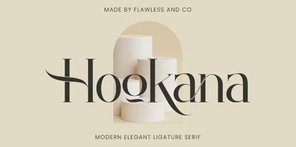 Hookana is a Modern Serif, that gives a feel of Elegant font type. There's some connected letters and some alternates that suitable for any graphic designs such as branding materials, t-shirt, print, business cards, logo, poster, t-shirt, photography, quotes .etc This font support for some multilingual. Also contains uppercase A-Z and lowercase a-z, alternate character, numbers 0-9, and some punctuation. If you need help, just write me! Thanks so much for checking out my shop!