10,000 search results
(0.035 seconds)
- Hands on Albrecht by URW Type Foundry,
$39.99 This typeface is based on Albrecht Dürer’s work “Die Underweysung der Messung” (Institutiones Geometricae, Instruction in Measurement). Please note that this font needs special treatment when typesetting text. If you need black text, you need to type just capital letters separated by spaces. If you need coloured text, type both lower case and upper case (with the lower case character first), and then assign a colour to the lowercase letters only.
 - Linotype Rory by Linotype,
$29.99Linotype Rory oblique is part of the Take Type Library, selected from contestants of Linotype’s International Digital Type Design Contests of 1994 and 1997. The font was designed by Canadian Tad Biernot with strictly constructed forms. The similarly formed figures seem mechanically created and their light slant gives the impression of strenght and dynamism. Linotype Rory oblique should only be used in the shorter texts of headlines in larger point sizes. - Fozzy by VladB,
$24.00 Fozzy is a modern sans serif geometric font, includes upper and lower case characters, Latin, Cyrillic, Latin Eastern Europe, Turkish, Baltic and other. Fozzy family consists of 9 fonts, divided into 3 subgroups (according to the type of style - St, Rg, Op), and have the 3 types of thickness in each subgroup. Fozzy fonts will be useful in developing a brand, creating posters and other graphic products, and for word processing.
 - Coiffeur by Komet & Flicker,
$15.00 NEW! Includes a set of 54 connecting word character glyphs! COIFFEUR is a bold vintage-style sans-serif display font that works great for logos, packaging, branding, menus, advertising, and posters. The lowercase letter set is a reduced version of the uppercase set for small caps use. In Illustrator, the custom connecting word set can easily be accessed in the "Type → Glyphs" panel and in Photoshop through "Type → Panels → Glyphs Panel".
 - Hathaway by Lunas Type,
$19.00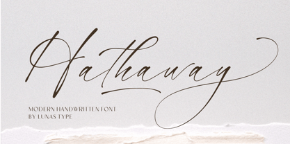 Introducing, Hathaway! Hathaway is a modern and stylish handwritten font. With natural flow it can add a human touch to your designs. Hathaway is perfect for many design needs such as merch, T-shirts, titles, wedding, book covers, social media posts, websites, events, and many more. What's you get : - Ending Swashes - Underline Swashes (just type _1, _2, etc) - Numeral & Punctuation. - ligature. - Multilingual Support. Enjoy Designing! Thanks! Lunas Type
 - Bergen Sans by Mindburger Studio,
$40.00 Bergen Sans is a contemporary sans serif font family of 6 fonts. Carrying clean and stylized Scandinavian geometry, partnered with explosive post Bauhaus type aesthetics, Bergen Sans is perfect companion in any designer's 'survival' kit. While being a small font family it has unlimited capabilities and plenty of Open Type features for highly professional use. Bergen Sans also includes Extended Latin, Cyrillic (including Bulgarian alternates) and Greek language support.
 - Suerte by Resistenza,
$39.00 Say hello to Suerte. This new typeface with inverted contrast and bifurcated serifs was inspired by Caslon’s Italian type and by Aldo Novarese’s Estro, published by the turinese foundry Nebiolo. Our aim was to develop a wood type typeface adding a new personality incorporating Tuscan serifs. The complete alphabet was designed with a flat long brush and Indian ink and then vectorized. Suerte contains a big set of icons and dingbats.
 - Parus by VladB,
$20.00 Parus is a impacted modern sans serif geometric font, includes upper and lower case characters, Latin, Cyrillic, Latin Eastern Europe, Turkish, Baltic and other. The Parus family consists of 8 fonts, divided into 2 subgroups (according to the type of style - St, Obl), and have the 4 types of thickness in each subgroup. Parus fonts will be useful in a word processing, developing a brand, creating posters and other graphic products.
 - Graffick by Graffiti Fonts,
$12.99 Graffick is a mechanical style created by merging a little traditional type design & typography with a little basic graffiti lettering theory. Extra ascenders and descenders have been added to many of the capital letters to add a more varied & specialized appearance. This layered type system provides for the easy creation of outline/fill effects with regular, italic, wide and outline styles as well as baseline & caps-height alignment options.
 - HT Espresso by Dharma Type,
$19.99 The biggest feature of HT Espresso is a mixture of straight line and curve.It is like a cup of espresso with a bite-sized piece of chocolate. You can connect all the letters with thin line and It would attract notice. Holiday Type Project offers retro hand drawing scripts. Inspired by retro script on shopfront lettering, wall paint advertisements in Italy around 1950s. Check out the script fonts from Holiday Type!
 - WL Lunatrix by Writ Large,
$12.00 Lunatrix is a conceptual type face for futuristic or fantastic treatments. Ideal for suggesting strange new worlds of science-fiction, it can also evoke a land of fantasy or even hint at the occult. In its lighter weights, Lunatrix is well suited for applications such as posters, album covers, video games, and graphic novels, while in its heavier weights, it’s appropriate for titling and more complex type treatments.
 - Necia Stencil by Graviton,
$20.00 Necia Stencil font family is the stencil version of Necia font family, it has been designed for Graviton Font Foundry by Pablo Balcells in 2014. Necia Stencil consists of 16 styles. The 8 “Stencil 1” styles contain a narrow stem for big sizes type and/or rigid materials printing, and the 8 “Stencil 2” styles contain a wide stem for small sizes type and/or light materials printing.
 - Aguda Stencil by Graviton,
$20.00 Aguda Stencil font family is the stencil version of the Aguda font family and has been designed for Graviton Font Foundry by Pablo Balcells in 2014. Aguda Stencil consists of 16 styles. The 8 “Stencil 1” styles contain a narrow stem for big sizes type and/or rigid materials printing, and the 8 “Stencil 2” styles contain a wide stem for small sizes type and/or light materials printing.
 - Tinman Pro by No Bodoni,
$35.00 TinmanPro is a mildly stressed humanist sans serif type based on the University of California Oldstyle type designed by Frederick Goudy. The design captures the warmth and friendly character of Goudy�s original in a monotone sans. Broad Latin support along with small caps, fraction support and other typographic niceties are included in the ten font family. Weight range includes Regular, Medium, DemiBold, Bold and ExtraBold with matching italics for each.
 - Breakfast Script by Fenotype,
$35.00 Breakfast Script is an elegant connected script family of three weights. Breakfast Script is equipped with Contextual Alternates that helps to keep connections smooth. Every standard character also has Swash Alternate for more funky letters. In addition there’s 26 ending swooshes placed in a-z that you can access from Stylistic Alternates. Breakfast Script is a great display type that works as a logotype or fancy headline type.
 - Mildstones by IKIIKOWRK,
$17.00 Proudly present Mildstones - Modern Bold Sans, created by ikiiko. A contemporary bold condensed sans serif typeface created to breathe life into headlines with its eye-catching presence. Mildstones attracts attention and takes any design project to a new level with its striking and fashionable look. Each letter in Mildstones has undergone meticulous design in order to convey a sense of power, assurance, and beauty. The font has a sense of verticality and compactness due to the condensed proportions, which also make it easy to fit into small places while keeping outstanding readability. The Mildstones experience is more than simply a font. It has been meticulously designed to be a dependable and powerful typographic in terms of both aesthetic and readability. This type is very suitable for making a headline news, sport advetorial, logotype, branding, poster, magazine layout, quotes, or simply as a stylish text overlay to any background image. What's Included? Uppercase & Lowercase Number & Punctuation Multilingual Support Works on PC & Mac
 - Ogelic by Ardyanatypes,
$17.00 Ogelic Typeface Serif is modern and elegant. It pairs well with san serif as pictured or stands firm as a title and brand representative for an elegant look. This Ogelic Typeface is equipped with a modern professional character that can present an elegant and attractive identity for your company for business purposes such as business cards, name tags, and uniforms as a brand enhancement. This modern Ogelic typeface is suitable to be embossed as a letter nameplate or even pasted in your office with a cutting sticker that looks elegant. This elegant Ogelic-type shape is also stunning for book covers or magazine writing. You can see all the available characters in the screenshot above, and you can try the modern & elegant Ogelic now for any design issues. Ogelic also comes with multiple languages, making it easy for any country and language use. It also comes with alternative Ligatures and stylistics to make your designs more attractive.
 - Glory Signature by Din Studio,
$29.00 Is your branding missing something that makes people amaze? Have you thought about how you can add that touch of magic to your branding and projects? What if we told you, you only need to change one element to engage and convert your clients? Introducing Glory Signature-A Modern Script Font Giving you a simple, yet gorgeous solution to your branding. This font is more than just another script font. It encapsulates the essence of elegance and modernity. With its clean script-type design and curved indentations, this font will take your projects to the next level! Use it for headings, logos, business cards, printed quotes, invitations of all sorts, cards, packaging, and your website or social media branding. Glory Signature includes Multilingual Options to make your branding globally acceptable. Features: Standard Ligatures Stylistic Sets Swashes Multilingual Support PUA Encoded Numerals and Punctuation Thank you for downloading premium fonts from Din Studio
 - Helter Slab by Dora Typefoundry,
$15.00 NEW! Helter is a slab-serif font that gives off a clean and very elegant feel that has a strong and bold look. the slab is thick and does not regret the size of the width. The slab-serif helter is perfect for your upcoming project which is applied especially to various other formal forms such as invitations, labels, logos, magazines, books, greeting / wedding cards, packaging, fashion, make up, stationery, novels, home decor labels, book / cover titles, special events and many more. Features: • Full set of uppercase letters, • Numbers & Punctuation • Characters with accents • Supports Multiple Languages This type of family has become a work of true love, making it as easy and enjoyable as possible. I really hope you enjoy it! I can't wait to see what you do with Helter Slab! Feel free to use the #Dora Typefoundry tag and # Helter Slab font to show what you've done visit my Instagram : https://www.instagram.com/doratypefoundry/
 - Ciubby by Krafted,
$10.00 Looking for a fun display font that makes your design bold and original? A great 3D font can be a real head-turner, leaving standard fonts in the dust. Introducing Ciubby - A Chubby Display Font. From T-shirts to headlines, Ciubby is perfect for any type of project. It works equally well for web and print, allowing you to use it across your brand. Let’s get creative! What you’ll get: Multilingual & Ligature Support Full sets of Punctuation and Numerals Compatible with: Adobe Suite Microsoft Office KeyNote Pages Software Requirements: The fonts that you’ll receive in the pack are widely supported by most software. In order to get the full functionality of the selection of standard ligatures (custom created letters) in the script font, any software that can read OpenType fonts will work. We hope you enjoy this font and that it makes your branding sparkle! Feel free to reach out to us if you’d like more information or if you have any concerns.
 - Arista Sans by Dora Typefoundry,
$18.00 Arista Sans is a true sans serif typeface enhanced with bold, high-contrast geometric shapes. Arista is perfect if you want to try to make your presentation perfect for all purposes, social media graphics or other designs. And of course you can use this font and pair it well with a bold sans serif. Features: All Caps Font with different uppercase and lowercase Number & Symbol Supported Languages Alternates and Ligatures PUA Encoded What is included: Arista Sans Regular Arista Sans Outline We highly recommend using a program that supports OpenType features and Glyphs panels like Adobe apps and Corel Draw, so you can see and access all Glyph variations. This type of family has become the work of true love, making it as easy and fun as possible.I really hope you enjoy it! if you have any questions or problems please contact email:doratypefoundry@gmail.com Thank you Enjoy the font and go get creative :)
 - Gallinari by Jehoo Creative,
$18.00 Modern Grotesk with attractive Display set Gallinari has it. . Gallinari is an attractive Grotesque suitable for all kinds of design needs. Starting from the Heading - Body font is reliable, Has a humanist and geometric character makes it a universal grotesque. Gallinari is equipped with very complete size variants, thin to black, not only that, this font has a condensed style which is paired with Oblique style for a total of 36 fonts in a complete family. What makes it interesting Gallinari has the Uppercase Display set on ss05 bold and sharp, for the letters C, G, O, Q, S, Z completely changed from their basic shape to meet the wild and cool type of display, ss01 ss02 ss03 ss04 is used to give alternative forms of the basic letters (A, P, R, Q, W, Y, a, w, y). Each Gallinari style has more than 680 glyphs and supports various Western European and Cyrillic languages.
 - Tintoretto by profonts,
$41.99 Tinteretto is a very beautiful, decorative Art-d�co font which is ideal for ad design about fine arts events and the world of arts and crafts as well as in restaurants, bars and for food packaging. Tintoretto harmonizes well with serif and sans serif fonts created at the beginning of the last century. It contains character sets for West and Central European as well as for Romania and Turkey. When Unger started his work on Tintoretto, he had the splendid idea of adding a Fill version to the original 3D characters. Combining both fonts make it even stronger and more beautiful. How to combine both fonts in order to achieve a color fill effect: Type your word or phrase and do not make any changes to the spacing or kerning. Duplicate or copy the original and change it to the Fill version (font change). Apply a color to the copy and position it exactly behind the original. See and love the result.
 - Eve Of Ocean by Look Minus Today,
$14.00 Introducing Eve Of Ocean - Modern elegant serif typeface by Rijesain x Look minus today Eve Of Ocean is an elegant and modern impression, this serif font will add an attractive and professional look to any design project you use it for. It features a harmonious balance of firmness and grace, making it suitable for a range of design projects such as wedding invitations, fashion magazines, and promotional posters. Eve of Ocean is a great choice for designers who want to add a touch of luxury and style to their work. Its readability and accessibility make it perfect for both print and digital designs. Features: - Lowercase and Uppercase - Beautiful Alternates & Ligatures - Numerals & Punctuation - Multilingual & Symbol HOW TO ACCESS ALTERNATE CHARACTERS Open glyphs panel: In Adobe Illustrator go to Window - Type – glyphs In Adobe Photoshop go to Window – glyphs Contact me with an inbox message If you have any question. Thank you and have a nice day !
 - Sandy Antoniuss by Asd Studio,
$12.00 Introducing the new font Sandy Antoniuss - Natural Handwritten. I made by using a brush pen that makes the impression seem natural. This typeface is suitable for use in a variety of design fields, such as event advertisements, product promotions, book titles, activity titles, logos, adventure, and others. This font can when paired with serif font types will make your design project more beautiful and perfect. I highly recommend using a program that supports OpenType featuresand Glyphs panels such as Adobe Illustrator, Adobe Photoshop CC, Adobe InDesign, or CorelDraw, so you can see and access all Glyph variations. This font is encoded with Unicode PUA, which allows full access toall additional characters without having special design software. Mac users can use Font Book, and Windows users can use Character Map to view and copy one of the extra characters to paste into your favorite text editor / application. I hope you enjoy the font, thank you.
 - Gummies by Heyfonts,
$15.00 Gummies - The fat bubble font is a stylish and playful typeface that features rounded and inflated letterforms, resembling bubbles. The letters are often chunky, with exaggerated curves and soft edges, giving them a plump and rounded appearance. This type of font is popular for its fun and whimsical nature, making it suitable for designs targeting a young audience or those looking to create a lighthearted and energetic atmosphere. The thick and rounded letterforms give a sense of friendliness and approachability, adding a touch of playfulness to any text. The fat bubble font is versatile and can be used in various design applications, such as logos, headlines, posters, invitations, stickers, or website headers. It adds a touch of personality and uniqueness to designs, helping them stand out and grab attention. Overall, Gummies font is an eye-catching and cheerful typeface that captures the joy and energy of bubbles, making it a popular choice for designs that want to exude a sense of fun and playfulness.
 - Roma by Canada Type,
$29.95 Tom Lincoln's award-winning type design work since the 1960s has been one way or another of expressing his fascination for the Roman majuscules inscribed at the base of the Trajan Column in Rome. This time he has really outdone himself by bringing us Roma, a definitive, contemporary, mature sans serif expression of those majuscules. With Roma, Lincoln is not satisfied with simply creating a proper "Trajan Sans". He goes on to make it a family of four weights, with built-in small caps and oldstyle figures, then he really goes to town with the options he makes available for shading and multi-color settings. Precise renderings of the Roma capitals are provided in different fonts that can function individually or be layered atop each other for two- or three-color treatments. The Roma family comes with extended language support that spans the majority of Latin-based languages. For more information on the design, complete character sets, technological features, and print tests, consult the accompanying PDF.
 - Deus by Renegade Fonts,
$22.00 Deus is when type design is brought to extreme. It tries to answer the question whether you can design all glyphs in one axis of stress. It does not try to be all purpose, useful at all sizes, legible or readable and most of all it does not try to be neutral. It has its own style you either accept or not. But if you do so, it has many great stuff inside. Every glyph has the same width across four masters, so you can change the style in one title or even make an animation out of that. It also has some cool animated emojis, so make sure you take all four styles! Deus has two sets of styles. "Deus" that has an expanded glyph set, and "Deus Basic" that comes with a limited glyph set. You can play around with "Deus Basic" since you get it for free, then fall in love with this font family and go for the full version.
 - Brake by Black Studio,
$19.00 New from Black Studio, presenting Brākė is a typeface that is feminine, adaptable, contemporary aesthetic and creates endless variations for your creative needs. Its striking contrasts and subtle details, together with its sumptuous strokes and voluptuous curves, create a beautiful and powerful statement for any typographic composition, blending glamor with a contemporary aesthetic. Brākė really helps you create unlimited variations for your creative needs in making your project titles: such as Books, fashion, magazines, logos, branding, photography, invitations, wedding invitations, quotes, blog headers, posters, advertisements, postcards, books, websites, etc. WHAT IS INCLUDED • Brākė – Regular • Brākė – Oblique • Brākė – Outline This type of family has become the work of true love, making it as easy and fun as possible. I can't wait to see what you do with Brākė! Feel free to use the #Black Studio tag and the #Brākė font to show what you've been up to, I really hope you enjoy it! Thank You!
 - Braston by Dora Typefoundry,
$23.00 Introducing our new typeface, Braston - A modern, unique and decorative serif typeface that comes with a binder and alternative characters that are perfect for creating variety in your designs. Braston is a mix of sweet curves with lowercase sets and strong impact fonts for uppercase sets making it even more elegant this typeface will allow you to create stunning and original layouts for print and web, Branding, Logo Design, invitations, quotes, blog headers , posters and advertisements. use it endlessly. Features • Full set of uppercase, lowercase letters • Ligatures • Alternates • Numbers, symbols & punctuation • Characters with accents • Supports Multiple Languages • PUA Encoded WHAT’S INCLUDED • Braston – Regular This type of family has become a work of true love, making it as easy and enjoyable as possible. I really hope you enjoy it! I can't wait to see what you do with Braston! Feel free to use the #Dora Typefoundry tag and # Braston font to show what you've done Thank You!
 - Publica Slab by FaceType,
$- ‘Publica Slab’ is the serifed sister of Publica Sans and Publica Play – packed with subtle open type features, tabular options, rare currencies signs and symbols and arrows, ‘Publica Slab’ provides everything you need for big design tasks like signage, corporate design and magazine design. Take a close look at our gallery (especially ‘OpenType Features 1–6’) to discover the versatility of Publica Slab. Alternates Give your typography a certain spin with the variety of alternate letters provided. Currency You need to set prices in exotic countries? No problem: Publica Slab gives you loads of rare currency symbols. Case Sensitive Forms Sometimes you write in all caps and there are some symbols (e.g. brackets) that need some extra treatment to make it look perfect – that’s what case sensitive forms are for. Figures Publica Slab provides 6 sets of figures, like lining, tabular, oldstyle, numerators ... Discretionary Ligatures Ligatures can make your logo or headline look spicy. So there are plenty of them.
 - Bentoga by Black Studio,
$25.00 New from Black Studio, presenting bentoga is a typeface that is feminine, adaptable, contemporary aesthetic and creates endless variations for your creative needs. Its striking contrasts and subtle details, together with its sumptuous strokes and voluptuous curves, create a beautiful and powerful statement for any typographic composition, blending glamor with a contemporary aesthetic. Bentoga really helps you create unlimited variations for your creative needs in making your project titles: such as Books, fashion, magazines, logos, branding, photography, invitations, wedding invitations, quotes, blog headers, posters, advertisements, postcards, books, websites, etc. WHAT IS INCLUDED • Bentoga – Regular • Bentoga – Italic This type of family has become the work of true love, making it as easy and fun as possible. I can't wait to see what you do with Bentoga! Feel free to use the #Black Studio tag and the #Bentoga font to show what you've been up to, I really hope you enjoy it! Thank You!
 - Publica Play by FaceType,
$- Publica Play is Publica Sans’ and Publica Slab’s playful sister. It comes with loads of subtle open type features, tabular options, rare currencies signs and symbols and arrows – ‘Publica Play’ has everything you need for playful design tasks. Take a close look at our gallery (especially ‘OpenType Features 1–7’) to discover the versatility of Publica Play. Alternates and Stylistic Sets Give your typography a certain spin with the variety of alternate letters provided. Explore the Stylistic Sets provided. Currency You need to set prices in exotic countries? No problem: Publica Play gives you loads of rare currency symbols. Case Sensitive Forms Sometimes you write in all caps and there are some symbols (e.g. brackets) that need some extra treatment to make it look perfect – that’s what case sensitive forms are for. Figures Publica Play provides 6 sets of figures, like lining, tabular, oldstyle, numerators ... Discretionary Ligatures Ligatures can make your logo or headline look spicy. So there are plenty of them.
 - Silverline by Fenotype,
$18.00 Silverline Script & Sans Silverline Script is a hand drawn signature style script. Silverline is fast and expressive -it’s great for contemporary branding and advertising. Silverline Script is equipped with Contextual Alternates and Standard Ligatures that keep the script eloquent and connections smooth. Contextual Alternates and Standard Ligatures are automatically on. In addition Silverline Script has Swash Alternates for A-Z and a-z that can be used for extra flair. From Discretionary Ligatures you’ll find specially designed ligatures for “and”, “for”, “the”, “at” and “in”. Silverline Script is PUA encoded so you can access extra glyphs in any graphic design software. Another half of the Silverline family is Silverline Sans -a three weight ultra-condensed sans serif that works great with the Script. Silverline Sans is great for making sturdy text word blocks - a great type for any display use from magazine covers to packaging. Try combining Silverline Script with Silver Script -they make a nice contrast together.
 - Cumbre by Antipixel,
$22.00 Cumbre is a slanted display type with unorthodox anatomy, a dynamic rhythmic structure, movement expression, and intense visual language. An eccentric rebel with ribbon-like moves, a balanced extrovert that makes meticulous use of ink traps. Both the name and design got inspiration from mountain peaks. "Cumbre" in Spanish means summit, and that's the motive for the spiked design and the angular serrated structure. Cumbre is built by balancing sharp angles and venturous curves. The stems are spiky, and they vary in width. Cumbre is slanted and unicase. It has condensed proportions, moderate weight contrast, spacious counters, pointy terminals, and square ink traps. Cumbre is meant for large display settings to make the most out of the precise outlines and the clean intersections. The font styles: 'Sharp' has straight paths and precise intersections. 'Round' has the same outlines but with round corners. 'Stamp' has irregular wavy contours and heavy swelling at intersections.
 - Vuelta by Dora Typefoundry,
$19.00 Vuelta display is a modern random style font that combines serifs and sans in one font file. With serif as uppercase and sans as lowercase. You can use both uppercase and lowercase in the same word which will make your text more distinct too plus some alternatives so this font really stands out. This font is perfectly made to be applied especially in logos, and other various formal forms such as display, header, headline, poster, logos, etc on a big typography. **Features:** - All Caps Font with different uppercase and lowercase - Number & Symbol - Supported Languages - Alternates and Ligatures - PUA Encoded **What is included:** - Vuelta Display Regular We highly recommend using a program that supports OpenType features and Glyphs panels like Adobe apps and Corel Draw, so you can see and access all Glyph variations. This type of family has become the work of true love, making it as easy and fun as possible.I really hope you enjoy it! Thank you Enjoy the font and go get creative :)
 - Fragtude by Letterhend,
$20.00 "Old is Gold".. Perhaps that's the best words to represent this typeface called Fragtude - a pair of vintage display typeface consist of bold script and serif. One of our finest typeface, crafted carefully to make sure its quality. Inspired by 40s 50s lettering and signage, the nostalgic feels will bring you back to the good ol' days. This typeface is perfectly made to be applied especially in logo, and the other various formal forms such as invitations, labels, logos, magazines, books, greeting / wedding cards, packaging, fashion, make up, stationery, novels, labels or any type of advertising purpose. Features : uppercase & lowercase numbers and punctuation multilingual swash and ligatures alternates PUA encoded We highly recommend using a program that supports OpenType features and Glyphs panels like many of Adobe apps and Corel Draw, so you can see and access all Glyph variations. How to access opentype feature : letterhend.com/tutorials/using-opentype-feature-in-any-software/ Email us to letterhend@gmail.com if you need something! Happy Designing!
 - Varidox by insigne,
$35.00 Varidox, a variable typeface design, allows users to connect with specific design combinations with slightly varied differences in style. These variations in design enable the user to reach a wider scope of audiences. As the name suggests, Varidox is a paradox of sorts--that is, a combination of two disparate forms with two major driving influences. In the case of type design, the conflict lies in the age-old conundrum of artistic expression versus marketplace demand. Should the focus center primarily on functionality for the customer or err on the side of advancing creativity? If both are required, where does the proper balance lie? Viewed as an art, type design selections are often guided by the pulse of the industry, usually emphasizing unique and contemporary shapes. Critics are often leading indicators of where the marketplace will move. Currently, many design mavens have an eye favoring reverse stress. However, these forms have largely failed to penetrate the marketplace, another major driving factor influencing the font world. Clients now (as well as presumably for the foreseeable future) demand the more conservative forms of monoline sans serifs. Typeface designers are left with a predicament. Variable typefaces hand a great deal of creative control to the consumers of type. The demands of type design critics, personal influences of the typeface designer and the demands of the marketplace can all now be inserted into a single font and adjusted to best suit the end user. Varidox tries to blend the extremes of critical feature demands and the bleeding edge of fashionable type with perceptive usability on a scalable spectrum. The consumer of the typeface can choose a number between one and one-thousand. Using a more conservative style would mean staying between zero and five hundred, while gradually moving higher toward one thousand at the high end of the spectrum would produce increasingly contemporary results. Essentially, variable fonts offer the ability to satisfy the needs of the many versus the needs of the few along an axis with a thousand articulations, stabilizing this delicate balance with a single number that represents a specific form between the two masters, a form specifically targeted towards the end user. Practically, a user in some cases may wish to use more conservative slab form of Varidox for a more conservative clientele. Alternatively, the same user may then choose an intermediate instance much closer to the other extreme in order to make a more emphatic statement with a non-traditional form. Parametric type offers a new options for both designers and the end users of type. In the future, type will be able to morph to target the reader, based on factors including demographics, mood or cultural influences. In the future, the ability to adjust parameters will be common. With Varidox, the level of experimentality can be gauged and then entered into the typeface. In the future, machine learning, for example, could determine the mood of an individual, their level of experimentality or their interest and then adjust the typeface to meet these calculated parameters. This ability to customize and tailor the experience exists for both for the designer and the reader. With the advent of new marketing technologies, typefaces could adjust themselves on web pages to target consumers and their desires. A large conglomerate brand could shift and adapt to appeal to a specific target customer. A typeface facing a consumer would be more friendly and approachable, whereas a typeface facing a business to business (B2B) customer would be more businesslike in its appearance. Through both experience, however, the type would still be recognizable as belonging to the conglomerate brand. The font industry has only begun to realize such potential of variable fonts beyond simple visual appearance. As variable font continues to target the user, the technology will continue to reveal new capabilities, which allow identities and layouts to adjust to the ultimate user of type: the reader.
 - Lubaline by Lián Types,
$39.00 Who haven't heard the phrase that ‘any past time was better’?. Although I sometimes find this phrase a little too pessimistic (because I try to think that the best is yet to come), it may be true regarding my passion, typography. I'm too young (29) unfortunately, and this means I did not have the pleasure of being contemporary with maybe the man who has influenced my work the most (1). The man that showed that letters are more than just letters to be read. Herb Lubalin (1918-1981), also called sometimes as ‘the rule basher’ (2), smashed the taboos and sacred rules of type design and gave it personality. He rejected the functionalist philosophy of europeans in favor of an eclectic and exuberant style. To him, letters were not merely vessels of form, they were objects of meaning. (3). Nowadays, when looking at his portfolio, who dares to deny that the term ‘typography’ and ‘beauty’ may go hand-in-hand without any problem? Ed Benguiat, one of Herb’s partners, still likes making jokes with the phrase “screw legibility, type should be beautiful” and what I understand of this is not to forget the rules, but to know and break them carefully. In an era of pure eclecticism, we, the lovers of flourishes and swashes, can't do nothing but admire all the legacy that Lubalin, this wonderful type-guru, left. My font Lubaline read as “the line of Lubalin” is my humble tribute to him. Those who know his work, may see the influences easily like in his ‘Beards’ (1976) and ‘The Sound of Music’ (1965) posters; the art-deco forms in many of his amazing logos and practically in all his creations where letters seem to be alive just like you and me. I really hope that the future finds me still learning more and more about type-design and letterforms, and like him, always willing to make innovations in my field: Because letters are not just letters to be read. NOTES (1) These are some of my fonts in which some of Lubalin’s influences can be seen (in order of creation): Reina, Aire, Erotica, String, Beatle, Heroe, Selfie, Model, Seventies, and many others that are still in progress. (2) (3) Steven Heller. Herb Lubalin: Rule Basher. U&lc (1998) http://www.printmag.com/imprint/my-favorite-lubalin/
 - Deep Mind by Ben Hodosi,
$19.00 Deep Mind font is a special appearance display type. You can easily create text, frames, and seamless patterns embedded in illusory type optical patterns in a variety of layouts. In addition to repeating and intertwining lines, the unique optical effect is provided by the use of variable line widths. Deep Mind basically uses two line widths. The base style pattern appears with a thicker line thickness. The other style is the opposite. The characters embedded in the pattern are rendered as a secondary image using a thinner thickness, which is provided by the use of a variable line width. This gives it a modern and unique look. All characters are the same width and height for easy and simpler use. The glyphs connect perfectly on both sides, also below and above each other. This guarantees the continuity and smoothness of the pattern. The basic pattern can also be selected and used with the thinner line thickness for variability and completeness of the optical illusion (by typing "z"). There are also tiles that provide a smooth transition from thin to thick or from thick to thin line thickness. Of course, in all four directions. You can access these tiles by typing the characters: “lmno and p". The negative version provides additional opportunities for versatile use. Type the same letter several times and the pattern will repeat. Type in: “zzzzzz". You can create a frame using the closing elements as follows: Type in: “abcdefgh and ijk" The font has a separate option for placing your own logo, in square and circular forms. Type in: “rs and tuvw and xy" The font contains 119 glyphs, which include uppercase, numbers, punctuation, symbols, patterns, frames, closing elements, and tiles that provide a continuous transition between different line widths. Deep Mind font is ideal for any use that has an innovative and modernist purpose, adaptable to display decorations, running borders or repeating patterns. It can be used in larger sizes as display fonts, as headers, and for attention-grabbing use. Small sizes are ideal for use in Security Printers as microtext and background printing system.