10,000 search results
(0.018 seconds)
- Boronia by Studioways,
$10.00 Meet Boronia, Studioways' latest typeface release! This six weight family was developed with the single idea of redefining the simple sans serif to pair with any style of font family. It is meant to blend with a variety of media, from editorial to bridal and fashion. The Boronia family weights range from an ultra sexy thin to a voluptuous bold, each with a companion italic, making it the 'perfect type' for all tastes. Each font supports the standard Western European character set. So scoop up this great sans serif font, BORONIA, and start making your work shine! Buy them individually or get a great deal on the family pack!
 - Binario Soft by Tarallo Design,
$14.99 Binario Soft is a friendly typeface with rounded edges, offering a warm and soft impression. It comes in three weights with matching obliques. Drawn with subtle references to Art Deco, this type is ideal for a clean, warm, and modern look in branding, posters, magazines, and screen-based projects. The light weight is good for short body text. The regular weight exudes confidence, making it suitable for both body and heading text. For impactful headlines, the bold weight is excellent. The clear weight distinction make it easy to create organized text. Binario Soft is a gently rounded version of Binario, which is also available on this vendor’s website.
 - Ahkio by Melvastype,
$25.00 Ahkio is a brushed disconnected script family of 5 fonts. Ahkio’s roots are in 1930s sign painting and showcard lettering but with a modern and individual twist. Main characteristics are soft, rounded forms and a bit curved stems. Ahkio is a friendly and gentle font that suits well in titles, packages, logos and for example posters. 5 weights makes Ahkio a versatile font that gives you a possibility to add contrast and interest to your typography. Ahkio includes black and white manicules. You can use them easily with OpenType options. Just choose Stylistic set 1 and make sure Standard ligatures are on. Then just type: >> for Blackmaniculeright >> for Whitemaniculeright
 - Whimster Glympse by Letterhend,
$19.00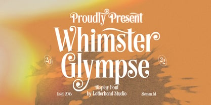 Whimster Glimpse is a stylish display font This font has unique letterform, make it looks great to be used for vintage & elegant design theme. This font perfectly made to be applied especially in logo, and the other various formal forms such as invitations, labels, logos, magazines, books, greeting / wedding cards, packaging, fashion, make up, stationery, novels, labels or any type of advertising purpose. Features : uppercase & lowercase numbers and punctuation multilingual alternates & ligatures PUA encoded We highly recommend using a program that supports OpenType features and Glyphs panels like many of Adobe apps and Corel Draw, so you can see and access all Glyph variations.
 - Road Race Extra by Craft Supply Co,
$19.00 Road Race Extra Font Family includes 4 Style Fonts. It can be used to create almost all types of design projects like print materials. Just use your imagination and some graphic design set in Extras, your project will become more alive and look great than ever with one of the Road Race Extra font. You want to make a greeting card or a package design, or even a brand identity, craft design, any DIY project, book title, wedding font, pop vintage design, retro design or any purpose to make your art / design project look pretty and trendy? Feel free to play with all the patterns and shape!
 - Road Race by Craft Supply Co,
$19.00 Road Race Font Family includes 4 Style Fonts. It can be used to create almost all types of design projects like print materials. Just use your imagination and some graphic design set in Extras, your project will become more alive and look great than ever with one of the Road Race font. You want to make a greeting card or a package design, or even a brand identity, craft design, any DIY project, book title, wedding font, pop vintage design, retro design or any purpose to make your art / design project look pretty and trendy? Feel free to play with all the patterns and shape!
 - Calfine by Letterhend,
$17.00 Introducing, Calfine, a Bold and strong serif with high contrast weight. This font very suitable to be used as a title or display, make it looks great and stands from the crowd. This font perfectly made to be applied especially in logo, and the other various formal forms such as invitations, labels, logos, magazines, books, greeting / wedding cards, packaging, fashion, make up, stationery, novels, labels or any type of advertising purpose. Features : uppercase & lowercase numbers and punctuation multilingual PUA encoded We highly recommend using a program that supports OpenType features and Glyphs panels like many of Adobe apps and Corel Draw, so you can see and access all Glyph variations.
 - Lovely Sonia by Attype Studio,
$13.00 Lovely Sonia is a layered script font with display extrude style perfect for 3D designs. Combine it with Lovely Sonia - ending swash & extrude style to make an effect on your letter! Lovely Sonia perfect for wedding promotion, branding, logo, invitation, stationery, social media post, product packaging, merchandise, blog design, game titles, cute style design, Book/Cover Title and more. What's Included : - Lovely Sonia Family Font - Layered Font - Multilingual Support - Made it into separated file to make it easier to use by beginner & separated file user can use the font with software which doesn't accept open type features. --- Hope you enjoy with our font! Attype Studio
 - Rogshire by Letterhend,
$14.00 Introducing, Roghsire.A stylish displa font with chic & classic looks. This typeface has been made carefully to make sure its premium quality and luxury feel. It comes with Slant Version. Very suitable for logo, headline, tittle, and the other various formal forms such as invitations, labels, logos, magazines, books, greeting / wedding cards, packaging, fashion, make up, stationery, novels, labels or any type of advertising purpose. Features : Uppercase & lowercase Numbers and punctuation Alternates & Ligatures Multilingual PUA encoded We highly recommend using a program that supports OpenType features and Glyphs panels like many of Adobe apps and Corel Draw, so you can see and access all Glyph variations.
 - Christian Crosses II - Unknown license

- Thunderblack by Dieza Design,
$11.00 Thunderblack is a type of display letter that is made with firm lines and angles. This font is very suitable when combined with various types of typography.
 - Best Choice Demo - Personal use only

- HWT Van Lanen by Hamilton Wood Type Collection,
$24.95 In 2002 Matthew Carter was commissioned to create a new design to be cut in wood by the then nascent Hamilton Wood Type Museum. This was significant in that this was the one format for which Carter had not yet designed type. The new design emerged as a two-part chromatic type to be cut specifically in wood. Originally called Carter Latin, the font was renamed Van Lanen after one of the Museum's founders. The first cutting and printing of the type took place in late 2009 and although it has been available through the Museum, contemporary wood-type production is expensive and few have acquired this font in wood. The digital version of the pair of Van Lanen fonts is now available. The design recalls Antique Latin wood type, but with a refined sensibility and intentional quirks (like the sideways ampersand). It is a wonderful addition to Carter's oeuvre, and to the ongoing history of wood type.
 - Modern Prestige by Letterhend,
$19.00 Modern Prestige is a unique serif which is combined with copperplate script letterform with all the swashes! This typeface has many alternates with swashes that can make your lettering / logotype become more interesting. The clean and neat of a serif combined with the swirl swashes makes this font one of a kind! This font perfectly made to be applied especially in logo, and the other various formal forms such as invitations, labels, logos, magazines, books, greeting / wedding cards, packaging, fashion, make up, stationery, novels, labels or any type of advertising purpose. Features : uppercase & lowercase numbers and punctuation multilingual ligatures alternates swashes PUA encoded We highly recommend using a program that supports OpenType features and Glyphs panels like many of Adobe apps and Corel Draw, so you can see and access all Glyph variations.
 - Outset by Alexander Phelps,
$5.98 Outset is a rough, display font family designed for a wide range of expression. It's all-caps design gives additional variants to make sure that you can create with your desired intention. Each letterform for the Outset font family was drawn by hand to insure natural deviations for it's roughness. These deviations help make this typeface feel authentic and relatable. The boldness of the letterforms makes this typeface an excellent choice for display type for posters, titles, merchandise, and specific marketing opportunities. Outset was originally drawn up for a range of t-shirt designs, and has now been extended into the full typeface you see now. It's rough edges interact perfectly with textures and overlays. Outset's multiple styles and variant letterforms allow for a very versatile range of outputs.
 - Matrixoid by Haksen,
$13.00 Matrixoid come with natural taste of letters. with the real hand done I created them, also additional variation in outline font to make good sensation feel. When you type with this font, I believe you will enjoy the sensation of the natural feel of this font, equipped with ligature and outline version features make the display even stronger for your projects such as posters, logos, advertisements, book covers and all brands for your requirement. I recommend for you to use photoshop or illustrator to make design with this font and let see when you will say WOW :) So what include when You want to use them ? OTF files Ligatures Numbers + Punctuation Non-English support Ligatures Please contact me if anything question, I'm glad to help :) Happy Designing, Haksen
 - Karatone by Letterhend,
$19.00 Introducing, Karatone, An Elegant Serif. This typeface has many alternates with swashes that can make your lettering / logotype become more interesting. The clean and neat of a serif combined with the swirl swashes makes this font one of a kind! This font perfectly made to be applied especially in logo, and the other various formal forms such as invitations, labels, logos, magazines, books, greeting / wedding cards, packaging, fashion, make up, stationery, novels, labels or any type of advertising purpose. Features : uppercase & lowercase numbers and punctuation multilingual ligatures alternates swashes PUA encoded We highly recommend using a program that supports OpenType features and Glyphs panels like many of Adobe apps and Corel Draw, so you can see and access all Glyph variations. Email us to letterhend@gmail.com if you need something! Happy Designing!
 - Stract by Look Minus Today,
$14.00 Present to you for New Modern Serif, Stract! Stract is a sophisticated ligature and alternate serif from us. This typeface has been made carefully to make sure its premium quality and luxury feel. The ligatures and alternates makes this typeface unique and stands out rather than the regular serif font. This font is very suitable for logo, headline, tittle, and the other various formal forms such as invitations, labels, logos, magazines, books, greeting / wedding cards, packaging, fashion, make up, stationery, novels, labels or any type of advertising purpose. Features : - Ligatures & Alternates - Letters, numbers, symbols, and punctuation - No special software is required to use this typeface even work in Canva - Multilingual Support Please contact us if you have any questions. Enjoy crafting and thanks for supporting us! Thank you.
 - Aeroport by Brownfox,
$45.00 Aeroport is a new typeface in the spirit of both German geometric sans serifs and Swiss neogrotesques. Its deliberately wide proportions and relatively short capitals account for the excellent way the type carries the line. Its short ascenders and descenders allow for very tight leading. When used in large point sizes, Aeroport reveals its industrial ancestry and its unconventional design: the somewhat unbalanced top of the lowercase a, the capital B that has deliberately not been compensated optically, the overly wide capital M. In smaller sizes the type creates a starkly different effect: its measured widths and low contrast make a text setting appear neutral and homogenous. This versatility is what makes Aeroport a multipurpose sans serif suitable for a wide variety of typographic applications. The family includes four weights with their italics and a monospased style. Character set includes an alternate lowercase a, two sets of figures and currency symbols, uppercase punctuation, and a set of arrows. Includes Latin and Cyrillic sets supporting over forty languages. Designed by Gayaneh Bagdasaryan & Vyacheslav Kirilenko, 2017.
 - The Mumbai Sticker by Roland Hüse Design,
$29.00 “The Mumbai Sticker” is a layered script font. I have created this font from the sticker I designed for my Mumbai trip for my friend’s wedding, you can watch a short video of the process and the story behind. https://youtu.be/bO8e9lQ0DNU instructions to use: • for smooth connections of v s, v r, v z, w s, w r, and w z please enable “standard ligatures” in open type features panel • Type a text with the “Regular” version, then copy and paste in back (cmd B) and switch to “Outline” version. Please make sure you give it a different color to make the main font visible. Looks best in Black and white as you can see in the poster image but feel free to play around! (Please refer to the PDF included within the downloadable .zip file. • • • For full version and commercial license please visit https://rolandhuse.com or contact@rolandhuse.com The full / commercial version contains Western and Eastern European accented characters and special characters, punctuation and ligatures. @rolandhusedesign Follow me on Instagram
 - Vocal by Ani Dimitrova,
$35.00 Vocal is a sans serif type family designed by Ani Dimitrova. The family has 28 weights, ranging from Hairline to Heavy with matching Italics and Small Caps. In addition, you get a nice alternate version of the Heavy weight with extra thin accents. Which is a pure joy for setting titles. Vocal comes with extended coverage of the Latin, Greek and Cyrillic Script. The Regular and Medium weights are perfect for body text while the extra drawn Italic gives an interesting texture to the text. The stems are a little tapered to the middle and the corners are cutted, which makes them a little rounded in small sizes. That gives the font an organic, warm and friendly touch. Vocal is equipped for complex, professional typography with Open Type Features including — small caps, localized forms, standard ligatures, subscripts, superscripts, numerators, denominators, numbers in circles arrows, currency symbols and fractions. The fonts are carefully hinted and its wide proportions make them a perfect choice for screen usage. Vocal suits also ideal for book and editorial design.
 - Carlino by Pío Pío,
$17.00 Carlino is named after the cutest dog on earth. Why? Because it’s the cutest font ever made. Especially intended for stationery use, it’s loaded with lots of alternates and ligatures, not only in the lowercase but in the uppercase. All of them are Open-Type programmed, so the possibilities of having something unique are endless. Following nowadays trend, Carlino is a multi-layered font: shades, holes and dots were made to work alone or all together with fantastic results! The way it works is so easy that It’s impossible not to enjoy it: Just type a word; then the same one set in another style and voilà! The font has also a lot of sweet ornaments to embellish your projects. Find inside: hearts, fleurons, party icons, flags, and the funniest animals. To accompany Carlino, there’s nothing better than Carlino Capitals. Its cute flavor makes everything more lovely. Have fun with Carlino and oh! don't forget to feed this little pug or it will bark all day long! Special thanks to Maximiliano Sproviero, whose advice helped me make this dream come true.
 - WL Circuits Circuits by Writ Large,
$12.00 This decorative tech typeface is inspired by the printed circuits boards of the twentieth century. Its default character set suggests commercially manufactured circuits while the OpenType alternates give more of a home-brew feel. The font is ideal for technical decorative titles in subjects as diverse as computers, techno music, ham radio, or “maker”-culture communications. It works well in large-type posters, logotypes, video games, album covers, or advertising. The OpenType font contains nearly 100 discretionary ligatures to give a varied appearance, along with several alternate cuts of common characters and ten electrical components (accessible as OpenType stylistic alternates).
 - JT Olifer by Jolicia Type,
$17.00 JT Olifer is family font of Jolicia Type designed by Laire Banyu Sandi Pawenang in October 2021, JT Olifer inspired by Modern Typography developed by us in our perspective, with a typeface detail in every corner we make more rounded, and give an inktrap accent to make unique impression special in every glyph, we really consider about aspect legibility, therefore we make family font amount 40 to assist the selection according to visual needs. Font type of JT Olifer contains several nuances that combain aesthetic, contemporary and modern, furthermore we make some alternates glyph that have a friendly and subtle impression, for example ‘f’ the alternate of this name our font we designed is more circular and smooth. JT Olifer has a total of 465 letters with regular, slanted and condensed styles support in 90 languages : Afrikaans Albanian Asu Basque Bemba Bena Breton Catalan Chiga Colognian Cornish Croatian Czech Danish Dutch Embu English Esperanto Estonian Faroese Filipino Finnish French Friulian GalicianGanda German Gusii Hungarian Inari Sami Indonesian Irish Italian Jola-Fonyi Kabuverdianu Kalaallisut Kalenjin Kamba Kikuyu Kinyarwanda Latvian Lithuanian Lower Sorbian Luo Luxembourgish Luyia Machame Makhuwa-Meetto Makonde Malagasy Maltese Manx Meru Morisyen Northern Sami North Ndebele Norwegian Bokmål Norwegian Nynorsk Nyankole Oromo Polish Portuguese Quechua Romanian Romansh Rombo Rundi Rwa Samburu Sango Sangu Scottish Gaelic Sena Serbian Shambala Shona Slovak Soga Somali Spanish Swahili Swedish Swiss German Taita Teso Turkish Upper Sorbian Uzbek (Latin) Volapük Vunjo Walser Zulu
 - Pelican by Monotype,
$29.00Pelican was designed by Arthur Baker and released by Agfa Compugraphic in 1989. Pelican is a calligraphic typeface that is distinguished by the irregular shapes of the lowercase letters. The rough-edged quality of Pelican makes it a good choice for informal display work and short texts. - Katvondy by Maulana Creative,
$14.00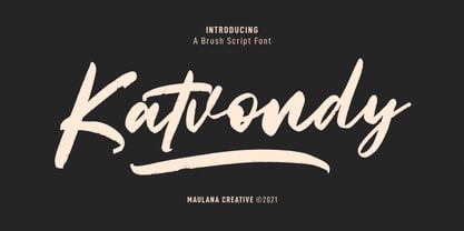 Katvondy is a marker handwritten font. With slanted bold marker stroke, fun character with a bit of ligatures and swashes. To give you an extra creative work. Katvondy font support multilingual more than 100+ language. This font is good for logo design, Social media, Movie Titles, Books Titles, a short text even a long text letter and good for your secondary text font with sans or serif. Make a stunning work with Katvondy font. Cheers, MaulanaCreative
 - Bahnhof by Storm Type Foundry,
$29.00Poster type faces from the twenties and thirties are enjoying a new wave of popularity. The summary, even rather hard principle of the sign is required for a view from a distance. The information appearing on the poster must be readable even from the opposite pavement. And, as is often the case with monumental type faces, these type faces are legible even in small sizes. The name Bahnhof suggests the hypothetical use of the type face on railway station buildings. - Storefront Pro by Sudtipos,
$79.00 Storefront is what the prolific and talented American sign painters of the 1920s and 1930s would have created if they had access to the advanced lettering and type technologies we have today. Rooted in an incomplete Alf Becker alphabet sample, Storefront is my usual overdose on alternates and swashes, my eternal attempt at giving typesetting that ever-elusive handmade impression. Though the main shapes, especially the majuscules, are almost a standard recitation of the natural evolution of nineteenth century scripts, the additional variants available within the font provide a leap in time to what sign makers and packagers are doing today. I can honestly say that Storefront’s influences are probably less historic and more in line with my recent travels and frequent supermarket visits. It’s difficult to avoid current visual culture when you're constantly bombarded with it. Not that I try. I certainly welcome the overflow. I'm probably addicted to it by now. With a very cool aesthetic, plenty of alternates and swashes, extended Latin language support, Storefront is over a thousand glyphs for your branding, packaging, and sign making pleasure.
 - Surf Bum by Jeff Levine,
$29.00 The term “Surf Bum” was a slang phrase used to casually describe anyone who spent as much of their time as possible at the beach catching waves in the 1960s. The Revell Company was a well-established maker of plastic model kits such as military airplanes, monsters from Universal horror films and other such items when it hooked up with custom car designer Ed “Big Daddy” Roth to develop a model kit line capitalizing on the surfing fad that was sweeping the West Coast at the time. A number of crazy-looking hot rods, dune buggies and what-have-you were turned out, and one such kit (“Surfite”, with Figure) featured a futuristic one-person dune buggy. It was on the box for the model that the words “with Figure” appear in a casual, brush design type face. Those few letters were the inspiration for creating a new retro type face entitled Surf Bum JNL, which is available in both regular and oblique versions.
 - American Advertise 003 by Intellecta Design,
$11.90wood type heritage - Shuttle by Volcano Type,
$19.00Type 3D letterforms. - Fandango by Solotype,
$19.95Curlicues galore on this modern version of a mid-victorian display type. We started with the caps from a type called Cellini, altered them considerably, and added a lowercase. - HT Arcadia Grotesk Expanded by Hype Type,
$34.00 The versatile neo-grotesk typefamily, inspired by the swiss academia with a contemporary mood. The shape of the letters are more pliable compered to classic grotesk typefaces. The Expanded series enlarges horizons... and type! -- Taking inspirations from classic grotesk letterforms, both from the European tradition (specifically the Swiss school) and the American tradition, HypeType's Arcadia Grotesk is modernized with its shorter ascenders and descenders to give more compact blocks of text and with more contemporary and dynamic forms. -- hype-type.com // kidstudio.it
 - Bixa by Novo Typo,
$26.00 Bixa is a chromatic typeface designed for display use. Bixa comes in 13 different layers containing 11 weights for beautiful color combinations. Bixa was originally designed for the Typewood project in 2015. Read more about this project here. In 2016 we launched the chromatic web version of Bixa. More information about Bixa Color here. Bixa was awarded by the Type Directors Club New York and the European Design Awards in 2016. Bixa is designed by Novo Typo in 2015. Youtube
 - Alphabet Soup Pro by Red Rooster Collection,
$60.00 Steve Jackaman. In the early 1980's, Steve worked at Typographic House in Boston, Massachusetts. At the time, 'Typo' House, as it was affectionately known, was the largest type house in New England. This font was designed and produced during his tenure. The design was so popular that it became available commercially through VGC, and was known as TH Alphabet Soup. Completely redrawn and remastered, Alphabet Soup Pro contains all the high-end features expected in a quality OpenType Pro font.
 - Fantini by Canada Type,
$29.95 Fantini is the revival and elaborate update of a typeface called Fantan, made in-house and released in 1970 by a minor Chicago film type supplier called Custom Headings International. In the most excellent tradition of seriously-planned American film faces back then, CHI released a full complement of swashes and alternates to the curly art nouveau letters. Fantan didn't fare much among the type scene's big players back then, but it did spread like electricity among the smaller ones, the mom-and-pop type shops. But by the late 1980s, when film type was giving up the ghost, most smaller players in the industry were gone, in some cases along with little original libraries that existed nowhere else and became instant rarities on their way to be forgotten and almost impossible to resurrect for future technologies. Fantini is the fun and curly art nouveau font bridging the softness and psychedelia of the 1960s with the flirtatious flare of the 1970s like no other face does. Elements of psychedelia and funk flare out and intermix crazily to create cool, swirly letters packed with a lot of joy and energy. This is the kind of American art nouveau font that made its comeback in the late 20th century and is now a standard visual in the branding drive of almost every consumer product, from coffee labels to book and music covers to your favorite sugar or thirst-crunching fix. Alongside Fantini's enormous main font come small caps and three extra fonts loaded with swashy alternates and variations on plenty of letters. All available in all popular font formats. Fantini Pro, the OpenType version, packs the whole she-bang in a single font of high versatility for those who have applications that support advanced type technologies. In order to make Fantini a reality, Canada Type received original 2" film specimen from Robert Donona, a Clevelander whose enthusiasm about American film type has never faltered, even decades after the technology itself became obsolete. Keep an eye out for that name. Robert, who was computer-reluctant for the longest time, has now come a long way toward mastering digital type design.
 - Overspray - Personal use only

- Gradation by Scratch Design,
$10.00 Introducing 'Gradation" is a realistic signature font style. Gradation font is perfect for you to make a realistic signature, it's so easy to use and you can combine it with the swashes to make your signature more real & natural. Gradation will be perfect for different projects such as logos & branding, wedding invitation designs, social media posts, advertisements, website & landing page, product packaging, product designs, label, photography, and watermark. Gradation has a modern shape and comes with a monoline stroke that will make your signature look clean and luxurious. How to use this font: Just open your Opentype features ( Minimum Compatible with Adobe Photoshop CS 6 and Adobe Illustrator CS 6 ) in Adobe photoshop go to Window - Glyphs and all the alternates will appear while using the script font to use the ligatures and swashes. As you type, your text will look like a natural signature or handwriting. What are you waiting for? Download now Gradation font and make your own Signature logo!
 - ITC Legacy Serif by ITC,
$40.99 ITC Legacy¿ was designed by American Ronald Arnholm, who was first inspired to develop the typeface when he was a graduate student at Yale. In a type history class, he studied the 1470 book by Eusebius that was printed in the roman type of Nicolas Jenson. Arnholm worked for years to create his own interpretation of the Jenson roman, and he succeeded in capturing much of its beauty and character. As Jenson did not include a companion italic, Arnholm turned to the sixteenth-century types of Claude Garamond for inspiration for the italics of ITC Legacy. Arnholm was so taken by the strength and integrity of these oldstyle seriffed forms that he used their essential skeletal structures to develop a full set of sans serif faces. ITC Legacy includes a complete family of weights from book to ultra, with Old style Figures and small caps, making this a good choice for detailed book typography or multi-faceted graphic design projects. In 1458, Charles VII sent the Frenchman Nicolas Jenson to learn the craft of movable type in Mainz, the city where Gutenberg was working. Jenson was supposed to return to France with his newly learned skills, but instead he traveled to Italy, as did other itinerant printers of the time. From 1468 on, he was in Venice, where he flourished as a punchcutter, printer and publisher. He was probably the first non-German printer of movable type, and he produced about 150 editions. Though his punches have vanished, his books have not, and those produced from about 1470 until his death in 1480 have served as a source of inspiration for type designers over centuries. His Roman type is often called the first true Roman." Notable in almost all Jensonian Romans is the angled crossbar on the lowercase e, which is known as the "Venetian Oldstyle e."" Featured in: Best Fonts for Logos
 - ITC Legacy Sans by ITC,
$40.99 ITC Legacy¿ was designed by American Ronald Arnholm, who was first inspired to develop the typeface when he was a graduate student at Yale. In a type history class, he studied the 1470 book by Eusebius that was printed in the roman type of Nicolas Jenson. Arnholm worked for years to create his own interpretation of the Jenson roman, and he succeeded in capturing much of its beauty and character. As Jenson did not include a companion italic, Arnholm turned to the sixteenth-century types of Claude Garamond for inspiration for the italics of ITC Legacy. Arnholm was so taken by the strength and integrity of these oldstyle seriffed forms that he used their essential skeletal structures to develop a full set of sans serif faces. ITC Legacy includes a complete family of weights from book to ultra, with Old style Figures and small caps, making this a good choice for detailed book typography or multi-faceted graphic design projects. In 1458, Charles VII sent the Frenchman Nicolas Jenson to learn the craft of movable type in Mainz, the city where Gutenberg was working. Jenson was supposed to return to France with his newly learned skills, but instead he traveled to Italy, as did other itinerant printers of the time. From 1468 on, he was in Venice, where he flourished as a punchcutter, printer and publisher. He was probably the first non-German printer of movable type, and he produced about 150 editions. Though his punches have vanished, his books have not, and those produced from about 1470 until his death in 1480 have served as a source of inspiration for type designers over centuries. His Roman type is often called the first true Roman." Notable in almost all Jensonian Romans is the angled crossbar on the lowercase e, which is known as the "Venetian Oldstyle e."" ITC Legacy® Sans font field guide including best practices, font pairings and alternatives.


