10,000 search results
(0.028 seconds)
- Deberny by Typorium,
$15.00 The Deberny typeface is an interpretation–carrying a contemporary imprint–of a typographic style which appeared and spread at the end of the 19th century until the begining of the 20th. These typefaces were named Italian, Venetian, Veronese and were classified in the Hellenic category, a spontaneous typographic movement caracterized by triangular and heavy serifs. They found their inspiration among numerous references, from incised to slab serif typefaces and their extreme expressions in wood type letterforms. The Deberny font family is made of 26 styles in 3 complementary sets of style, offering a wide palette of visual resonance: • Deberny Line is ideally suited for editorial, branding, posters and billboards. It has sharp contrast between thick and thin strokes. Heavy horizontal strokes are not frequent in roman letters, but here they fit naturally with the italic letters. • Deberny Open is a stylish outline declination of Deberny Line Medium and Medium Italic. • Deberny Text is an adaptation of Deberny Line made for broader use. Its shapes are less contrasted, which makes it perfectly legible for print or screen reading in small size text. Old style figures and small caps complete Deberny Text in all its 8 styles. The Deberny typeface family supports Latin-based languages and will be available soon in Cyrillic and Greek. Deberny Narrow will be released this year in all its 26 styles.
 - Gaulois by Canada Type,
$24.95 A couple of years before the second World War, Marcel Jacno, the popular French graphic designer who in the 1930s designed iconic posters for Gaumont and Paramount and famously illustrated the Gaulish helmet that first adorned the Gauloises cigarette packs in 1936, was asked by Deberny & Peignot to design a calligraphic typeface for the advertising market. Jacno's Scribe design, billed by D&P as a "virile ad writing" typeface, was released to some great fanfare in 1937, enjoyed some time of French spotlight, and was ready to make waves in the rest of Europe before the war broke out and snuffed its chances at international recognition. However, samples of it can still be found in some specialty post-war publications as an example of a trend that lasted a couple of decades, when Western European type manufacturers commissioned famous visual artists to design typefaces in order to capitalize on the artists' fame - the trend that brought us standards like Futura and the long list of Lucien Bernhard and Imre Reiner faces. This exclusive digital version of Jacno's design expands on the original concept with a large character set that includes plenty of alternates, a couple of different ways for seamless lowercase connections, three sets of figures, and extended Latin language support, adding up to over 540 characters in a one big, contextually-programmed font.
 - Lady Dodo by Sudtipos,
$49.00 And the day in which I introduce my second typographic family has arrived. In order to do this, I borrowed several passages from this beautiful book by Maurice Maeterlinck, “Life and Flowers”. His poetic observation of Nature made me reflect about the small discoveries behind the flow of my pen on paper. About that quick, spontaneous, overwhelmed stroke, with some awkwardness as well as certainty in it. About the writing that looms line after line. About the mischievous stains of ink flooding my writing tool. Lady Dodó was born as a product of these drawings, pieces of writing and reflections. Following the steps of its ancestor and friend, Lady René, it takes advantage of the goodness of the Open Type technology to propose a systematized as well as a personalized writing font. Both friendly and challenging. Due to the large number of alternate characters (both for lower and upper case as well as for numbers) and to its precise programming, it proposes to design diverse and rich typographical sets with multiple strokes in a simple way. However, Lady Dodó is not just made of typographical signs; it also proposes a set of modules to make patterns and another one to design frames. From the combination of these modular signs, an infinite universe of possibilities for decoration arises. Here is Lady Dodó, ready to get started and write its destiny. July 2015.
 - Megatype Script by Mega Type,
$16.00 Megatype Script is a handmade script that comes with a extrude effect. This font Inspired by Retro style and combination with Hand Lettering style. I hope this can make inspire you from your work. You don't need extra effort to create an extrude effect for this font. That's because we include the extrude with this font. This means you can saves your time by only adding the extrude font on the back layer. Megatype Script is great for Logotype, Branding Design, Logo Design, Digital Lettering Arts, Poster, T-Shirt/Apparel, Magazine, Quotes, Signs, Instagram Design, Advertising Design, and any Type Design needs. Megatype Script also has a standard Multilingual Support. Megatype Script features OpenType stylistic alternates, ligatures and International support for most Western Languages is included. To enable the OpenType Stylistic alternates, you need a program that supports OpenType features such as Adobe Illustrator CS, Adobe Indesign & CorelDraw X6-X7, Microsoft Word 2010 or later versions. Megatype Script is coded with PUA Unicode, which allows full access to all the extra characters without having special designing software. Mac users can use Font Book , and Windows users can use Character Map to view and copy any of the extra characters to paste into your favourite text editor/app. If you have any question, don't hesitate to contact me by email : megatype04@gmail.com Thanks so much for looking and Enjoy it!
 - Futura Now Variable by Monotype,
$383.99 For nearly 90 years, Paul Renner’s Futura has been as popular as it is versatile—from children’s books to fashion magazines to the plaque on the Moon. Futura is a typographic icon. Futura Now offers designers a chance to see Futura with fresh eyes. It’s more truly Futura-like than any digital version you’ve ever worked with. “It brings some much-needed humanity back to the world of geometric sans serifs,” says Steve Matteson, Monotype’s Creative Type Director who led the design team. “Despite its reputation as the ultimate modern typeface, Futura Now is surprisingly warm,” he explains. “It’s just as at home set next to a leafy tree as it is next to a stainless-steel table, because it skillfully navigates the border between super-clean geometry and humanist warmth.” Futura Now—the definitive Futura—contains 102 styles, including: new Headline and Text weights; new Script and Display weights and styles; and new decorative variants (outlines, inlines, shadows, and fill). Its contemporary alignment of names and weights makes the family easier to understand and use, and its comfortable Text and judicious Headline subfamilies provide instantly refined spacing. With a large Latin, Greek, and Cyrillic character-set, Futura Now serves a wider international creative community. Futura Now is available both as individual OpenType fonts and as a set of Variable fonts, delivering limitless styles in a tidy digital footprint.
 - Customs Paperwork Pro AOE by Astigmatic,
$24.00 Customs Paperwork Pro brings the unique style of the NuMode Type No. 61 vintage typewriter keyset to the digital age. Antique typewriters have an incredible warmth and appeal to them, primarily because of their unpredictable "grunge" results that were a mix from the force of keystrokes to the wear of the ribbon and paper texture. This typeface is further fleshed out with SmallCaps and extensive figure sets to add a more serious note to the nature of the typeface, when needed. WHAT'S INCLUDED: Extensive language support. Customs Paperwork Pro has accented and special characters that support the following languages: Afrikaans, Albanian, Basque, Bosnian, Breton, Catalan Cornish, Corsican, Croatian, Czech, Danish, Dutch, Embu, English, Esperanto, Estonian, Faroese, Filipino, Finnish, French, Galician, German, Hungarian, Icelandic, Irish, Indonesian, Italian, Kurdish, Leonese, Luxenbourgish, Malay, Maltese, Manx, Maori, Meru, Morisyen, North Ndebele, Norwegian Bokmål, Norwegian Nynorsk, Nyankole, Occitan, Oromo, Polish, Portuguese, Rhaeto-Romanic, Romanian, Scottish Gaelic, Scots, Serbian (Latin), Slovak, Slovenian, Spanish, Swahili, Swedish, Tagalog, Turkish, Walloon, & Welsh. Antique typewriters are incredible, but they aren't something easily accessible to everyone, nor do most people want to fiddle with white out edits and the like. That's why typewriter fonts that capture the flavor of vintage typewriters are a no brainer (convenient and easily editable). I hope you enjoy playing with it just as much as I had fun making it.
 - Dosca by Ardyanatypes,
$10.00 Dosca is a unique and elegant display font with a unique Sans serif style. This font offers nine different thickness options, ranging from Thin to Black, providing a variety of options for a variety of applications. Each Dosca thickness has its own unique characteristics, so you can choose the one that best suits your design aesthetic. For example, Thin may be suitable for a light and elegant design, while Black may be used for a more dramatic and bold appearance. Additionally, Dosca comes with various OpenType features. These include features such as ligatures, which allow certain characters to be combined beautifully, and alternative letterforms that provide more design options. With this feature, you can create more interesting and unique text elements in your designs. Dosca is designed to support multiple languages so it is suitable for use in many countries. This makes it very versatile and suitable for a variety of multilingual design projects. So, if you're looking for a font that combines the beauty of Sans serif with a variety of thickness options, useful OpenType features, and multilingual support, Dosca is the perfect choice to meet your design needs. A guide to accessing all alternatives can be read at http://adobe.ly/1m1fn4Y Adobe Photoshop go to Window - glyphs Adobe Illustrator go to Type - glyphs Features: A – Z Character Set a – z Characters set Numerals & Punctuations Ligatures & Alternates Multilingual
 - Sketchnote by Delve Fonts,
$29.00 The Sketchnote typeface was born of necessity: designer Mike Rhode needed a series of hand-drawn fonts to illustrate and produce his book, “The Sketchnote Handbook.” Because of its origin, this typeface was designed to be practical and convey the human character and quirks of his normal handwriting and hand-drawn lettering. The family is comprised of five fonts: Sketchnote Text in Regular, Bold, and Italic, the somewhat compressed and bold Sketchnote Square for headlines, and the playful Sketchnote Dingbats. Sketchnote Text is a casual script with a slightly bouncy baseline. In order to mimic the differences present in natural handwriting, OpenType features are built-in that automatically switch between multiple versions of each letter or number. In total, over 240 alternates in each of the text fonts are employed, making for a more authentic appearance. The warm texture of Sketchnote is the result of actual ink-spread on paper captured in the scans of written letterforms and was intentionally left intact during the digitization process to preserve that feeling. Rhode created Sketchnote Square as a display type to complement Sketchnote Text. Drawn instead of written, the letters often have neat little happenstance voids within the strokes. Sketchnote Dingbats features a selection of icons, rules, and arrows to provide some functional and fun tidbits, handy for bringing additional life to any design.
 - Porte by Groteskly Yours,
$18.00 - Unique Modernist Look - 590+ characters per font - Standard & Discretionary Ligatures - Multiple Stylistic Sets - Old Style Figures - Case-Sensitive Punctuation - Multilingual - Cyrillic Included - Uppercase + Lowercase Porte is an elegant sans serif font inspired by stone carving and modernist typefaces of early 20th century. While at its core Porte is a display font, it can also be used for larger bodies of text and in a variety of projects. Thanks to its unique proportions and feel Porte is reminiscent of early 20th century type, wherein aesthetic qualities often overweighed matters of practicality and applicability. Porte is at once delicate and sturdy, subtle and unyielding. Porte is very OpenType friendly, boasting an awesome selection of useful OpenType features, precise and exhaustive kerning (around 1000 pairs) and lots of discretionary ligatures to make your designs look amazing. A selection of wider and narrower alternate glyphs allow the designer to modify the rhythm of the typeface, extending its application and impact. With 590+ characters on board, Porte supports all major Latin based languages as well as a number of Cyrillic languages. Porte received its first major update in fall 2022. Not only was the character set expanded considerably, but also some glyphs were re-drawn to fix visual inconsistencies, and a large number of stylistic alternates was added. The kerning, too, was re-done to accommodate new letterforms. Trials available upon request.
 - Ruth Script by Estudio Calderon,
$68.99 Ruth Script is perfect for neon signs, we took as referents some of these signs found in the street, especially those hanging in bars, billiard halls, motels and night clubs, we also took into consideration the Photo-lettering One Line manual to solve ligatures and alternatives (We want to thank Ed Ronthaler for that treasure to study and learn). The scripts can be considered as a compendium of connections, aesthetic and functional alternatives, where all the possible word combination is a universe depending on the language and the user's creativity. We have developed a project that offers to our customers a bridge that connects the brush with the digital typography through a partial vowels and consonants control and ligatures with opentype programming. We know that the scripts make typography users, fall in love. That is why we have created a type font that achieves all the demands and requests for any project where our font can be applied. Ruth Script was designed with patience and love, with the purpose of recovering the work done by those people who have been working as letterer during decades and that have left us hundreds of guides, books and videos. A great legacy! We want to invite you to use Ruth Script in your projects and fall in love with ESTUDIO CALDERÓN's new daughter. ENJOY IT!
 - Futura Now for Leica by Monotype,
$53.99For nearly 90 years, Paul Renner’s Futura has been as popular as it is versatile—from children’s books to fashion magazines to the plaque on the Moon. Futura is a typographic icon. Futura Now offers designers a chance to see Futura with fresh eyes. It’s more truly Futura-like than any digital version you’ve ever worked with. “It brings some much-needed humanity back to the world of geometric sans serifs,” says Steve Matteson, Monotype’s Creative Type Director who led the design team. “Despite its reputation as the ultimate modern typeface, Futura Now is surprisingly warm,” he explains. “It’s just as at home set next to a leafy tree as it is next to a stainless-steel table, because it skillfully navigates the border between super-clean geometry and humanist warmth.” Futura Now—the definitive Futura—contains 102 styles, including: new Headline and Text weights; new Script and Display weights and styles; and new decorative variants (outlines, inlines, shadows, and fill). Its contemporary alignment of names and weights makes the family easier to understand and use, and its comfortable Text and judicious Headline subfamilies provide instantly refined spacing. With a large Latin, Greek, and Cyrillic character-set, Futura Now serves a wider international creative community. Futura Now is available both as individual OpenType fonts and as a set of Variable fonts, delivering limitless styles in a tidy digital footprint. - FF Bauer Grotesk Paneuropean by FontFont,
$40.99FF Bauer Grotesk is a revival of the metal type Friedrich Bauer Grotesk, released between 1933 and 1934 by the foundry Trennert & Sohn in Hamburg Altona, Germany. The geometric construction of the typeface, infused with the art deco zeitgeist of that era, is closely related to such famous German designs as Futura, Erbar, Kabel and Super Grotesk that debuted a few years earlier. However, FF Bauer Grotesk stands out for being less dogmatic with the geometry, lending the design a warmer, more homogenous feeling. The oval “O” is a good example of that, as well as characteristic shapes like the capital M or the unconventionally differing endings of “c” and “s” which make for a less constructed look. The design was started by Thomas Ackermann, and he collaborated with Felix Bonge to evolve his original ideas into this fresh, modern geometric typeface family. FF Bauer Grotesk contains 6 weights with accompanying italics, and a wide range of OpenType typographic features including small caps, figure styles, fractions and contextual alternates. NEW: the new FF Bauer Grotesk W1G versions features a pan-European character set for international communications. The W1G character set supports almost all the popular languages/writing systems in western, eastern, and central Europe based on the Latin alphabet including Vietnamese, and also several based on Cyrillic and Greek alphabets. - Mr Robot by Hipopotam Studio,
$16.00 Mr Robot is a typeface designed for our next book for children. We wanted to have a colorful, dimensional and edgy looking letters for headlines. There are three ways to use Mr Robot. You can align three text frames with same text but with different colors and font styles (Regular, Shadow 1 or Shadow 3 and Shadow 2) or with ALLinONE font style but select a different OpenType Stylistic Sets (set 1 is like Shadow 1, set 2 like Shadow 2 and set 3 like Shadow 3). This works great but we don’t like to have unnecessary text frames in our layouts so we added a very cool Contextual Alternates OpenType feature. You just need Mr Robot ALLinONE style and only one text frame. First make sure that Contextual Alternates is off. Type every character three times (RRROOOBBBOOOTTT), select colors for each letter (first letter of every three is a side shadow, second is bottom shadow and third is a front of the dimensional letter). When everything is set just turn Contextual Alternates back on. Styles and alignment will be set automatically. Check out the Users Manual for a visual explanation. For web fonts it is better (at least for now) to use the first method (with font styles) as the OpenType features are not supported in older browsers.
 - Futura Now by Monotype,
$53.99 For nearly 90 years, Paul Renner’s Futura has been as popular as it is versatile—from children’s books to fashion magazines to the plaque on the Moon. Futura is a typographic icon. Futura Now offers designers a chance to see Futura with fresh eyes. It’s more truly Futura-like than any digital version you’ve ever worked with. “It brings some much-needed humanity back to the world of geometric sans serifs,” says Steve Matteson, Monotype’s Creative Type Director who led the design team. “Despite its reputation as the ultimate modern typeface, Futura Now is surprisingly warm,” he explains. “It’s just as at home set next to a leafy tree as it is next to a stainless-steel table, because it skillfully navigates the border between super-clean geometry and humanist warmth.” Futura Now—the definitive Futura—contains 102 styles, including: new Headline and Text weights; new Script and Display weights and styles; and new decorative variants (outlines, inlines, shadows, and fill). Its contemporary alignment of names and weights makes the family easier to understand and use, and its comfortable Text and judicious Headline subfamilies provide instantly refined spacing. With a large Latin, Greek, and Cyrillic character-set, Futura Now serves a wider international creative community. Futura Now is available both as individual OpenType fonts and as a set of Variable fonts, delivering limitless styles in a tidy digital footprint.
 - Glorial by Runsell Type,
$17.00 Introducing Glorial - An Elegant Script Font The handwritten calligraphy script works perfectly for classy designs. Glorial Script includes a full set of uppercase & lowercase letters with beginning swashes , a full set of lowercase letters with ending swashes, a full set of contextual alternates lowercase letters , 50+ ligatures features that makes the font look more natural. Glorial fonts that special for fashion and matches applies in some designs such as the logotype, brand, magazine, website or blog headlines, packaging, branding, quotes, invitation cards, greeting cards, business cards, and wedding more. Glorial is coded with PUA Unicode, which allows full access to all the extra characters without having special designing software. Mac users can use Font Book, and Windows users can use Character Map to view and copy any of the extra characters to paste into your favorite text editor/app. Glorial Includes: - 50+ Ligatures, Contextual alternates, Stylistic alternates, and Swash - Uppercase, lowercase, numeral, punctuation and symbol - .OTF format files - PUA Encoded Characters - Fully accessible without additional design software - Multilingual support for English, French, Italian, Spanish, Portuguese, German, Swedish, Norwegian, Danish, Dutch, Finnish, Indonesian, Malay, Hungarian, Polish, Croatian, Turkish, Romanian, Czech, Latvian, Lithuanian, Slovak, Slovenian How to get access alternate glyphs with designing software to open type fonts check this link : http: //adobe.ly/1m1fn4Y If you have any question please do not hesitate to contact me. Happy creating!
 - Reiner Hand by Canada Type,
$24.95One of the earliest fonts published by Canada Type was Almanac, Phil Rutter's digitization of Imre Reiner's 1957 calligraphic typeface, London Script. In 2007, when the font was revisited for an update, it was shown that it too light for applications under 24 pt, and too irregular for applications over 64 pt. So the face was redigitized from scratch, using larger originals. This new digitization maintains a soft contour and, slightly darker and steadier stroke, and much better outlines for use at both extremes of scaling. Language support was also greatly expanded, and many alternates and ligatures were added to the redigitized character set. The name was also changed to Reiner Hand, to better reflect the origins of the design. Reiner Hand is soft and irregular jolts from a calligraphy master's hand. In a very Reineresque fashion, most characters include the one finishing stroke that makes professional calligraphers pause and ponder this additional touch to a letter's personality. Reiner Hand comes in all popular formats. The TrueType and PostScript versions come with 2 fonts, one of them loaded with alternates and ligatures. The OpenType version combines both fonts into one, and includes features for intelligent substitution in software that supports advanced typography. Language support includes Western, Central and Eastern European character sets, as well as Baltic, Esperanto, Maltese, Turkish, and Celtic/Welsh languages. - Maffa Latte by Yumna Type,
$15.00 Sometimes it is a boring, tiring process to find a proper font for your project, and what is worse is that the font type you find has no specific character preventing you from delivering messages effectively. For that reason, we have the best solution to your problems. Maffa Latte is a perfect display font for delivering your messages on every design you are working on. Such a display font generally shows you a unique, funny, fun impression for any necessities, increases the nuances of professionalism and attractiveness to the product or brand promoted. The right use of this font makes the design more interesting and fun to cheer up customers. This font, with a clipart as an extra bonus, is legible due to its simple forms and proportions along with high contrasts. You can enjoy the available features here as well. Features: Multilingual Supports PUA Encoded Numerals and Punctuations Maffa Latte fits best for various design projects, such as brandings, posters, banners, headings, magazine covers, quotes, invitations, name cards, printed products, merchandise, social media, etc. Find out more ways to use this font by taking a look at the font preview. Thanks for purchasing our fonts. Hopefully, you have a great time using our font. Feel free to contact us anytime for further information or when you have trouble with the font. Thanks a lot and happy designing.
 - FS Hackney by Fontsmith,
$80.00 Elliptical The squareness of curves. That was the elliptical – in more than one sense – notion being explored in the making of FS Hackney. The squareness of curves and vertical terminals to create a gentle, soft sans serif, with a little bit of magic. A momentary thought – “It doesn’t have to be like this” – provided the spur to explore the verticals and skeletons of letterforms beyond conventional type design limits. A 12-month gestation period gave rise to a font with a larger-than-usual character set, including non-lining figures, small caps and superior and inferior numbers. It’s a collection that speaks confidently for itself. Assertive It was the Hackney carriage – the black London cab – that gave this font its name, not the north London neighbourhood. Solid, dependable, effective and built to last, FS Hackney was honed to perform in all conditions. Cool, compelling lines and a satisfying overall simplicity lend FS Hackney its assertive air. Assured, versatile and effective; just like a black cab (but without the grumbling). Machined Over a string of meetings, Jason Smith and FS Hackney designer Nick Job worked out how to infuse Nick’s sketched letterforms with Fontsmith’s familiar geniality. “Nick is very meticulous and produces very clean design work,” says Jason. “Hackney is ideal for branding as it’s very clear and its quirks are sensible ones, not odd ones, that don’t distract from the message.”
 - Sedid by Fontuma,
$20.00 Sedid, “solidity; It is an Arabic term meaning “righteousness”. In particular, the correctness and soundness of a word is indicated by this word. The fact that I gave this name to the writing family is to point out its accuracy and robustness. This typeface, which is sans serif, consists of three families: ▪ Sedid: Font family containing Latin letters ▪ Sedid Pro: Font family including Latin, Arabic and Hebrew alphabets ▪ Sedid World: A family of typefaces including Latin, Cyrillic, Greek, Arabic and Hebrew alphabets Those who want to meet a new face of writing for their works and projects and make a difference in their work should meet the Sedid writing family. This typeface is as serious as it is affectionate, and solid as well as elegant. The Sedid font family can be used as a text and title font in all publishing and printing areas, magazines, newspapers, books, banner and poster designs, and websites. Sedid also has a pleasant-looking, flexible face with smooth lines and transitions. The inner and outer spaces of the font are proportioned so that the text can be read easily. Sedid font family consists of 14 fonts, seven plain and seven italic. The font family includes open type features, as well as a large number of ligatures, small caps, modifiers, and currency symbols of many countries.
 - Sign Helpers JNL by Jeff Levine,
$29.00Sign Helpers JNL is a collection of silhouette images carefully redrawn from two distinct sources. Prior to their bankruptcy in 1984, the Holes-Webway Company of St. Cloud, MN produced thousands of their "Webway" sign kits that were utilized by merchants, libraries and schools throughout the country. At one point they included in their sales catalog a selection of die-cut images for embellishing sign work. In the late 50s and throughout the 60s, the Joseph Struhl Company (now known as Magic Master Industries) produced cling vinyl sign kits for business, and a home movie titling set for do-it-yourself film makers. This set also featured die-cut embellishments. A generous selection of designs from both kits have been faithfully re-drawn in digital form to pay tribute to two innovative companies. Other fonts based on products from these companies are Sign Kit JNL (Webway® Sign Kit), Cling Vinyl JNL, and Sign Maker JNL (Magic Master® Sign Kits). Trademarked names are used purely for reference purposes. - Rumpled by Ingrimayne Type,
$9.00 TapedUp, Tinkerer, and Rumpled are based on the template I used for several letterbat fonts—fonts made of wrenches and bolts, hammers, or paper clips. TapedUp can be thought of as a font made from masking tape, and Rumpled is the same design but the tape pieces are wavy. Tinkerer is the same design but with elements that resemble what might happen if one constructed letters from Tinker Toys. All are caps only, but some of the shapes on the lower-case keys differ from the corresponding shapes on the upper-case keys. The Rumpled family has four members, the regular, an oblique, a shadowed, and an oblique shadowed.
 - TT Ricordi Allegria by TypeType,
$29.00 Please note! If you need OTF versions of the fonts, just email us at commercial@typetype.org TT Ricordi Allegria useful links: Specimen | Graphic presentation | Customization options TT Ricordi Allegria is a sleek and intelligent contemporary Florentine grotesque inspired by the half-erased lettering in Basilica di Santa Croce, Florence. TT Ricordi Allegria was drawn by Antonina Zhulkova and reflects in its graphics the transitional stage between the classic serif with varying proportions, gravitating towards the Roman capital type, and the Florentine sans serif. The font is characterized by variability in the proportions of characters, contrast between strokes, wedge-shaped triangular characters, and the absence of traditional serifs. The main visual feature of the typeface is its diversity and the ability, using different stylistic sets, to completely change the character and perception of the typeface. The drawing of the characters from the main set is strict, thanks to which the font looks stern, as if the inscription in the font was really carved out of stone. And with the help of another set, we can add roundness, or even smoothness, to the font. This is due to the fact that the letters (E R K Q J Y in Latin, and Л К Ж Э in Cyrillic) from the second set have either very noticeable "curls" or smooth, rounded "legs". In addition, the typeface includes a set of beautiful ligatures for use in display inscriptions, such as large headlines. An interesting moment when working on the typeface was the creation of the Cyrillic typeset, since the Cyrillic alphabet does not so easily fit into the concept of the Florentine grotesque and stressed semi-serif. The most difficult thing in working on the Cyrillic alphabet was to create a system of spacing for characters, as it was done in the Latin alphabet, and to make sure that when typing in Cyrillic, the drawing of the text remained beautiful. That is why the letters Д Л У Ы appearing in the font family are somewhat unusual to the eye, and the proportions of other characters in Cyrillic are not quite “classic” either. In general, the Cyrillic set looks more display than its Latin prototype, but at the same time it lacks the sense of historicity or legacy of the Soviet past, which often comes to the foreground when working on the design of the Cyrillic alphabet in this type of serifs. TT Ricordi Allegria consists of two weights (Regular and Bold) and one variable font. Each style includes over 750 characters, as well as 19 OpenType features. Interesting features of the typeface include three stylistic sets that greatly change the perception of the font, a set of bright display ligatures, a few neat icons that are suitable for breaking text and will emphasize the visual language of the font. Please note! If you need OTF versions of the fonts, just email us at commercial@typetype.org FOLLOW US: Instagram | Facebook | Website
 - FF Pastoral by FontFont,
$50.99 A sturdy workhorse with the grace of a gazelle, the FF Pastoral typeface family marries pure craftsmanship with rapturous excesses of form. With his fifteenth release under the FontFont brand, prolific French designer Xavier Dupré has filled a typographic toolbox with plentiful options ranging from a tender, feathery Thin to a robust, healthy Black. At a glance, FF Pastoral appears deceptively simple, particularly in the middle weights. That surface serenity is intentional and allows for easy reading and quick comprehension of short blocks of copy. Upon closer inspection, FF Pastoral is complex and nuanced, carrying a balanced tension in its forms. This plays particularly well in magazine spreads and corporate logos, where uniqueness is a virtue. In creating his latest design, Dupré drew inspiration from a tasteful mix of references, combining diverse elements with a deft hand. While its letter shapes were informed by humanist-geometric hybrid Gill Sans, FF Pastoral’s proportions have been optimized for contemporary typography. Slightly condensed but generously spaced, FF Pastoral features a tall x-height, open counters, and subtle, sprightly italics slanted at just 5°. Proportional oldstyle figures are the default in the family, with tabular and lining numbers and fractions accessible through OpenType features. Elegant details evocative of calligraphy judiciously pepper the FF Pastoral glyph set. The ‘e’ bears an oblique crossbar, while the right leg of the ‘K’ and the ‘R’ are insouciantly curved in both the upright and italic variants. Further flourishes appear throughout the italics, notably in the ‘T’ and the ‘Z’, the gloriously looped tail of the ‘G’, and an extraordinary ampersand. Sharp-eyed fans of Dupré’s work may feel like they’re in familiar territory, and they would be right. An early version of FF Pastoral sprang to life in 2017 as Malis, a family in four weights on the heavier side of the spectrum. Over time, Dupré refined his original design, expanding it with four lighter styles and including true italics for all. The lightest weights are ethereal, with exquisitely delicate strokes drawing the eye in and across a line of type. The most substantial styles are tremendous in their power, allowing text to make a deep impression in print or on screen. Fully fleshed out, FF Pastoral works sublimely in a vast array of text and display settings. Dupré sees his latest FontFont offering as a ‘cultural’ typeface, perfect for the pages of an oversized coffee-table book or business communications where warmth and informality will win the day. Born in Aubenas, France (1977), Xavier Dupré is a gifted user of type as well as an award-winning type designer and lettering artist. After training in graphic design in Paris, Dupré studied calligraphy and typography at the Scriptorium de Toulouse. Since releasing FF Parango in 2001, Dupré has published such FontFont classics as the FF Absara and FF Sanuk superfamilies, FF Megano, FF Tartine, and FF Yoga. A designer of Khmer fonts as well as Latin typefaces, Dupré splits his time between Europe and Asia.
 - Harimau by Hanoded,
$20.00 Harimau means Tiger in Bahasa Indonesia. It is a very easy to read, playful font, which makes it ideal for children's books and posters. Harimau comes with extensive language support.
 - Flixuble by PizzaDude.dk,
$20.00Flixuble is a mess! It was made involving an inky pen and sandpaper! Comes with more than 60 ligatures in order to make the font look more like handmade letters! - Cardhonie by Cititype,
$12.00 Cardhonie is a cute and elegant handwritten font, carefully handcrafted to become a true favorite. Its casual charm makes it appear wonderfully down-to-earth, readable and, ultimately, incredibly versatile.
 - Okay Berry by Okaycat,
$29.50 Okay Berry is a connected script with naturally beautiful handwritten style. Okay Berry is extended, containing is extended, containing West European diacritics & ligatures, making it suitable for multilingual environments & publications.
 - The Beast by Ronin Design,
$15.00 The Beast is a modern display font, featuring ligature and alternate will make your design look stunning. This font will work perfect for logo, poster, business card and cover design.
 - Summer Ink by Seemly Fonts,
$12.00 Summer Ink is a sweet and friendly handwritten font. Its natural and unique style makes it incredibly fitting to a large pool of designs. The only limit is your imagination!
 - Al Seg45 by Nihar Mazumdar,
$0.50 Al Seg45 is a very dense alphanumeric display with 45 segments. Thirty-two inner segments, the outer segments have been split as well, making twelve segments, and a central dot.
 - Almond Cake by Epiclinez,
$14.00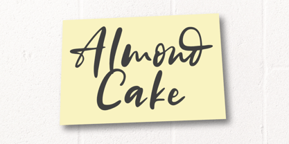 Almond Cake is a sweet and stylish handwritten font. Its natural and unique style makes it incredibly fitting for a large pool of designs. The only limit is your imagination!
 - Glorius Signature by Krakenbox Studio,
$15.00 Glorius is a fashionable sophisticated signature-style script with its own unique curves and an elegant inky flow. Its elegant, classy, and modern look will make your designs look lovely.
 - Jumping Unicorn by Subectype,
$15.00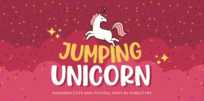 Jumping Unicorn is a sweet and friendly display font. Its natural and cute style makes it incredibly fitting to a large pool of designs. The only limit is your imagination!
 - Love Twins Solid by Sipanji21,
$10.00 Say hello to Love Twins font. Made with love and joy. Comic look, so it will make your design more beautiful, cute, fun, and colorful. outline and solid style inside.
 - Eraser by Turtle Arts,
$20.00Eraser Carved is based on an alphabet set that was hand carved from pencil erasers. A combination of upper and lower case letters makes this a fun and quirky alphabet. - Countless Blessings by Epiclinez,
$14.00 Countless Blessings is a fun and casual handwritten font. Defined by all-round characters and a flexible style, this font will make each of your designs look readable and trend
 - Grotley by Owl king project,
$39.00 Grotley is designed with a sweet shape, supported by several weights, making the equipment very supportive for all design needs or projects that look premium. let's start designing. Be happy
 - Waterlord by Raditya Type,
$14.00 Waterlord is made to support the work of designers who are used to making work with contemporary styles. This font is great for various design styles, modern or old school.
 - Time Christmas by Sealoung,
$12.00 Christmas Time is a flowing and festive handwritten font. With a retro style and a warm feel, this font will make each of your holiday cards and designs look outstanding!
 - Berona by Alex Camacho Studio,
$15.00 Berona font family is a variable geometric sans serif with a modern display purpose. The dynamic sharp edges makes it ideal to be used in a medium and big scale.