10,000 search results
(0.036 seconds)
- Lunokhod by ParaType,
$25.00 Lunokhod type family (four weights) was designed by Oleg Karpinsky for ParaType in 2005. Lunokhod is an original wide sans serif with square shapes of oval glyphs. Several Cyrillic glyphs such as Í, Ó, ×, ã, ä, ò have alternate letterforms. For example capital H has two shapes: Latin one with diagonal central stroke and traditional Cyrillic with horisontal bar. Capital Ó and × have symmetrical and asymmetrical shapes. For use in display typography and for short text passages.
 - Donkeyman by Hanoded,
$15.00 A Donkeyman is a person who is in charge of a ship’s engine room. I didn’t know this, but when I was looking for a nice name for this font, I sort of stumbled upon it. Donkeyman font is quite a useful font: it is a handmade, all-caps font that comes with two sets of alternate glyphs. The alternates cycle as you type, creating a ‘random’ effect. Comes with extensive language support, including Sami and Vietnamese.
 - Durer Display by iframe,
$28.00 Durer is a modern font, its soft curves and refined details create a sense of elegance. Inspired by the work of Albrecht Dürer (21 May 1471 – 6 April 1528), who was a German painter, printmaker, and theorist of the German Renaissance. Born in Nuremberg, Dürer established his reputation and influence across Europe in his twenties due to his high-quality woodcut prints. 551 Glyphs Upper / lower case, numbers, punctuation Language support: Latin / Greek Designed by iframe type foundry
 - Smothy Bubble by HansCo,
$15.00 Smothy Bubble is a cute and fun display font with bubble style. You will get three types of fonts in this pack, Regular, Bubble and Shadow version. Use this display font to add that special bubble touch to any design idea you can think of! Very suitable for logotype, Stickers, Packaging design, Cricut Project, headlines, brand identity, t shirt or apparel industry, posters, magazines, books, YouTube, Instagram, websites, or any of your creative design projects. Enjoy!
 - Salacious by PizzaDude.dk,
$18.00 Salacious is my soft/rough all-caps font, inspired by both comics and grafitti. The weight and width of the letters varies a bit. Not in a disturbing way, but more in a lively and organic way. I've added 5 (slightly) different versions of each letter (which automatically cycles as you type!) The letter shapes are a bit rough, due to the fact that they are handmade, and all corners are rounded, which gives a nice soft look!
 - Dear Rae, Love Dad by Outside the Line,
$19.00 Dear Rae, Love Dad is a modern calligraphy font drawn by hand using ink and a folded nib dip pen on rough watercolor paper. Best used in Open Type apps, it has automatically changing alternates. It is upright, dramatic, and personal. It is named Dear Rae, Love Dad because who wouldn't like to get a letter signed, Love Dad. There is also a freebie font of several blobs and some hearts. Because it just seems right.
 - Novaletra Sans CF by Connary Fagen,
$25.00 Smooth brushstrokes inform the construction of Novaletra Sans. As Novaletra Serif's sister typeface, Novaletra Sans shares its easy readability and excellent performance in a humanist design. Subtle flares and low stroke contrast provide warmth uncommon in sans-serif font families. Novaletra Sans CF pairs well with simple sans-serifs like Articulat® CF, or with detailed and airy display type like Quiverleaf® CF. All typefaces from Connary Fagen include free updates, including new features, and free technical support.
 - Cristal Stitches by Johannes Krenner,
$5.99 Whether it's your grandparents birthday, „Almabtrieb“ (ceremonial driving cattle down from the alpine pastures) or Oktoberfest (ceremonial drinking of huge amounts of beer): create the homely feeling of embroidery with this font. It comes with a vast language support, open type features, stylistic alternatives, boxes and frames, various numeral sets ... DEUTSCH: Ob Alm-Abtrieb oder Oktoberfest: Erzeuge das heimelige Gefühl großelterlicher Stickereien mit diesem Font. Große Sprachvielfalt, Opentype-Features, stylistische Alternativen, Boxen und Rahmen, diverse Zahlensysteme …
 - Abdo Misr by Abdo Fonts,
$29.50 Abdo Misr is a geometrical style. This is an OpenType Font supporting Arabic, Persian, Urdu, abd English to and compatible with the various operation systems and modern software. The combination of modern Kufi and Geometrical styles and varying between straight and curved parts made it a beautiful typeface appropriate to the titles and slogans, and able to meet the desire of the user in the design of ads and modern designs of various types of audio and visual.
 - Markisa by Showup! Typefoundry,
$34.00 Markisa is a simple, cool, and dynamic Humanist-flavored Sans Serif type family. It consists of eighteen weights from Thin to Black in both Upright and Italic styles. The resilient yet robust typeface. A san-serif with a humanist touch, a steady combination of seriousness and merriment. Works well as texture in small sizes, while at the same time claiming its space on the display. With its distinctive characteristic, can catch anyone’s attention wherever and whenever.
 - Happyfin by MNW,
$80.00 Happyfin is a sumptuous font based upon the free nature of a handwritten text, it balances the organic form with the necessary preciseness of a traditional typed font. With a smooth light hearted elegance, this font is perfect for designs involving organic produce and situations where a professional yet fun and friendly typeface is needed. The font has high readability level, and yet conveys a good deal of character and style within the simplest of forms.
 - Kamerik 105 Cyrillic by Talbot Type,
$19.50 Based on the popular Talbot Type Kamerik 105 , this Cyrillic variation is now available for the first time. Kamerik 105 is inspired by the classic, geometric sans-serifs such as Futura and Avant Garde, but has shallower ascenders and descenders for a more compact look. It's a versatile, modern sans, highly legible as a text font and with a clean, elegant look as a display font at larger sizes. The Kamerik 105 Cyrillic family comprises of five weights.
 - Ashery by Viswell,
$16.00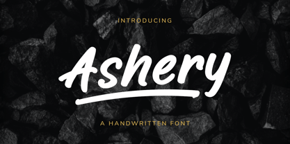 Ashery is a handwritten font, made with a natural marker brush. This font will be suit for your design project such as branding, logo design, packaging, quotes, and many more.
 - Fantazia MF by Masterfont,
$59.00 This font is a vivid choice when you want to effortlessly make your designs stand out with a remarkable clearly crafted handwriting.
 - Dganit MF by Masterfont,
$59.00 This font is a vivid choice when you want to effortlessly make your designs stand out with a remarkable clearly crafted handwriting.
 - Garden Party by Typadelic,
$19.00Garden Party has a calligraphic feel without appearing formal. The ample x-height, short ascenders and descenders make this a distinctive typeface. - Piki MF by Masterfont,
$59.00 This font is a vivid choice when you want to effortlessly make your designs stand out with a remarkable clearly crafted handwriting.
 - FG Rochelle by YOFF,
$16.95FG Rochelle has some special capitals like the B and R that makes it stand out from other script fonts. A beauty! - Oslo by Wilton Foundry,
$29.00 Oslo is an understated sans with subtle qualities that make it appropriate for many applications. It is simple, clean and very legible.
 - Rushline by Illushvara,
$14.00 Rushline is a fun display font. Add this font to your favorite creative ideas and notice how it makes them come alive!
 - Pluton Racing by Sipanji21,
$13.00 Pluton is a Futuristic Font which has a strong and decisive form, making it very suitable for logotypes, merchandise, especially racing teams
 - Samuri by Twinletter,
$15.00 SAMURI is our newest font with Japanese style features, developed with an exotic and relaxed shape, this font is extremely attractive to match your extraordinary project, using this font will instantly make your project look exquisite, charming, and everyone will be glad to view the look. Unlike the rest, your project will be one-of-a-kind. Logotypes, food banners, branding, brochure, posters, movie titles, book titles, quotes, and more may all benefit from this font. Of course, using this font in your various design projects will make them excellent and outstanding; many viewers are drawn to the striking and unusual graphic display. Start utilizing this typeface in your projects to make them stand out.
 - Fancy Matter by Din Studio,
$29.00 Hi, Everyone! Dreaming of a fancy things? Want to travel your audience or customer to a fabulous, beautiful, and elegant world ? Introducing Fancy Matters- A Monoline Signature Font A fancy and elegant handcrafted font that create to impress your audience and make your branding shine. Make your projects dance with this elegant and wonderful font wherever you use it. Use it for your headings, logos, ads, printed quotes, packaging, and even your website or social media branding. Our font always includes Multilingual option to make your branding reach a global audience. Features: Standard Ligature Stylistic Sets Swashes Multilingual Support (84 languages) PUA Encoded Numerals and Punctuation Thank you for downloading premium fonts from Din Studio
 - Nadella by Abbasy Studio,
$15.00 Nadella Script is beauty combinations of script layered and sans font . It has 7 font on script and 1 sans inside. Both combination are perfect for you to make design more detail. You can express the style on script font, you can add line, shadow, extrude, inline_1, inline_2, or inline_3. Changing the color of the other layer as just easy as change standard color of the fonts but it’s make more detail. with 1 more sans font, and some extras. you no longer need to worry about how to make effect and ornament on the text. This font is suitable for young, passionate design, such as logo design, t-shirts, branding, and various other design purposes.
 - Lagu Serif by Alessio Laiso Type,
$20.00 Lagu Serif blends a geometric inspiration with warm humanist elements, making it the perfect choice for when you need a fresh, contemporary serif typeface. Alessio Laiso has designed Lagu Serif in 18 styles: 9 weights ranging from Thin to Black, with matching, beautiful italics. The companion Lagu Sans makes the Lagu family a real workhorse for any use, including web, digital, print, branding and signage. Lagu Serif has a large x-height and open counterforms, making it easily readable. It comes with powerful OpenType features, including ligatures, alternative glyphs, small caps, fractions, tabular figures, old-style figures, and more. The Lagu family supports 219 languages, covering 100% of the Latin Plus character set.
 - Tansy by Eurotypo,
$32.00 Tansy is an organic, modern and casual calligraphy font, made by hand. I've designed "Tansy" carefully with the intention to preserve in its glyphs the original textured appearance for a more personalized effect even more authentic. Tansy font has OpenType features such as Ligatures, Contextual alternates, swashes, stylistic sets and stylistic alternates that allows you to mix and match pairs of letters to fit your design. This will help your creativity and make it easier to make the impressive and elegant typographic work. This font is a perfect choice for greeting cards, posters, labels, t-shirt design, logos, and more. Tansy was made to make your project more beautiful and attractive! Have fun with it!
 - Jagerlay by Picador,
$29.00 Jagerlay was brought to life to cope with diverse and complex data gathered in presentations, corporate identity and other office documents. Its geometric shape and characteristic endings are reminiscent of classic typography from Sci-Fi Movies from the 80's. The simple design makes Jagerlay outstandingly easy to use for every user. Jagerlay pairs with other typefaces in the blink of an eye – it goes well with display, serif or script fonts. The whole family consists of 9 weights and matching italics. Every style has almost 900 glyphs. Jagerlay has many opentype features such as tabular figures, fractions, superscript and subscript, small caps and arrows. Low contrast makes it easy to read. The rest makes it easy to use.
 - Lazy Coffee by Gassstype,
$23.00 Hello Everyone, introduce our new product Font Hello Everyone, introduce our new product Lazy Coffee is All Caps Bold Typeface Serif Display , inspired by the title of the sports poster and We make it very energetically. Lazy Coffee font with strong and challenging nuances. very suitable for the title, typography, Poster, magazines, brochures, packaging,Websites and much more for your design needs, making your designs more modern and professional This handmade font will make your design has a beautiful natural touch for each details. It is perfect for any design project as Invitation,logo, book cover, craft or any design purposes. That is has charming, authentic and relaxed characteristic more natural look to your text.
 - CarlMarx by Adobe,
$29.00This typeface is based on lettering by Carl Marx (1911?1991), designed during his first semester at the Bauhaus in Joost Schmidt?s class, in 1932. Although the letter proportions are based on Schmidt?s teachings, the forms are not constructed from compass and ruler, but drawn with brush and marker, lending the words a warm and lively touch. Hidetaka Yamasaki redrew the letters from scratch and added all missing characters for today?s needs. A set of hanging figures, alternates for some critical letterforms (such as f, r, and t) as well as several ligatures make CarlMarx especially suitable for use in body text. As suggested by Marx, Yamasaki captured two weights from the original drawing and perfectly adjusted light and bold to highlight words and create hierarchy in headlines ? without losing or adding space. True to the original, Yamasaki captured the wobbly contour in CarlMarx, preserving warmth in the condensed geometric style of the early 1930s. - Tinkerer by Ingrimayne Type,
$9.00 Tinkerer, TapedUp, and Rumpled are based on the template I used for several letterbat fonts—fonts made of wrenches and bolts, hammers, or paper clips. TapedUp can be thought of as a font made from masking tape, and Rumpled is the same design but the tape pieces are wavy. Tinkerer is the same design but with elements that resemble what might happen if one constructed letters from Tinker Toys. All are caps only, but some of the shapes on the lower-case keys differ from the corresponding shapes on the upper-case keys.
 - Step Better by Ronny Studio,
$19.00 Step better font Inspired by street graffiti markings, Urban Tag comes with the iconic round tip markers, this style is often used by several graffiti artists around the world because of its very unique style, very fun to write on markers. Perfect if you want a realistic street art or hip hop style for your designs, posters, props, etc. Features : All Caps numbers and punctuation multilingual Swash / Ornament PUA encoded Please contact us if you have any questions. Enjoy Crafting and thanks for supporting us! :) Thank you
 - Fairbank by Monotype,
$29.99Monotype Bembo is generally regarded as one of the most handsome revivals of Aldus Manutius' 15th century roman type, but the original had no italic counterpart. The story is told that Stanley Morison commissioned Alfred Fairbank, a renowned calligrapher, to create the first italic for Bembo, which was released as metal fonts in 1929. Alfred Fairbank, however, claimed that he drew the design as an independent project and then sold his drawings to Monotype. According to him, the statement has been made that I was asked to design an italic for the Bembo roman. This is not so. Had the request been made, the italic type produced would have been different." Whichever version you believe, it was obvious that Fairbank's design - while undeniably beautiful - was not harmonious with Bembo roman. A second, more conventional italic was eventually drawn and added to the Bembo family. Fairbank's first design, which was based on the work of sixteenth-century writing master Ludovico degli Arrighi, managed to have a modest life of its own as a standalone font of metal type. It never made the leap into phototype fonts, however, and the face could have been lost, were it not for Robin Nicholas, Monotype Imaging's Head of Typography in the United Kingdom, and Carl Crossgrove, a senior designer for Monotype Imaging in the US. Nicholas and Crossgrove used the original drawings for Fairbank as the starting point for a new digital design, but this was only the beginning. They improved spacing, added subtle kerning and optimized the design for digital imaging. In addition, Nicholas created an alternative set of lowercase letters, fancy and swash capitals and enough alternate characters to personalize virtually any design project. By the time his work was complete, Nicholas and Crossgrove had created a small type family that included Fairbank, a revived version of the earlier metal font, and Fairbank Chancery, a more calligraphic rendition of the design. An additional suite of ornate caps, elegant ligatures, and beginning and ending letters accompanies both fonts, as does a full complement of lowercase swash characters. Now, instead of a failed Bembo italic, Fairbank emerges in its true glory: a sumptuous, elegant design that will lend a note of grace to holiday greetings, invitations, and any application where its Italianate beauty is called for." - Morris Sans by Linotype,
$40.99 Morris Sans is a newly revised and extended version of a small geometric family of typefaces originally produced by Morris Fuller Benton in 1930 for ATF. His initial design consisted of an alphabet of squared capital letters with a unique twist that characterized its appearance: corners with rounded exteriors and right-angle interiors. The types were intended for use in the fine print found on business cards, banking or financial forms, and contracts. But over the ensuing decades, this design became a popular element in all sorts of design environments, and several foundries revived the typeface in digital form. Since digital fonts are bicameral, with slots for both upper and lowercase letters, new cuts of the type opted filled the lowercase slots with small caps. In 2006, Linotype commissioned its own version of the typeface-an extension for 21st century use. Under the advisement of Linotype's type director Akira Kobayashi, Dan Reynolds redrew the uppercase and added an original lowercase for the first time. Additionally, a number of extras were brought into the fonts, including six figure styles (tabular and proportional lining figures, tabular and proportional oldstyle figures, and special tabular and proportional small cap" figures). Small caps, which have become an iconic element over time, are accessible in each font as an OpenType feature. To differentiate this version from the original, Linotype's new family is named Morris Sans, in honor of Morris Fuller Benton. All fonts in the Morris Sans family are OpenType Com fonts; they include a character set capable of setting 48 European languages that employ the Roman alphabet, including all Central and Eastern Europe languages, those from the Baltics, and Turkish. This glyph coverage extends to the small caps as well. Morris Sans is a wide typeface, especially in its regular widths; the condensed faces set a more conventional line of text. The new lowercase letters are less geometric than the uppercase, except for those that share the same basic forms (e.g., c, o, and s). Instead of following this geometric trend, the new lowercase tends to strengthen the humanist elements that were present in several characters from the original type, including the uppercase D and the figures 5, 6, and 9. Morris Sans also sports a number of glyphic flares, like the stroke found on the original uppercase Q. Morris Sans is a clean, modern design best suited for headlines, advertising, posters, expressive signage (especially on storefronts), and corporate identity work."
 - TT Tsars by TypeType,
$39.00 TT Tsars useful links: Specimen | Graphic presentation | Customization options The TT Tsars font family is a collection of serif display titling fonts that are stylized to resemble the fonts of the beginning, the middle and the end of the XVIII century. The project is based on title fonts, that is, the fonts that were used to design book title pages. The idea for the project TT Tsars was born after a small study of the historical development of the Cyrillic type and is also based on Abram Shchitsgal’s book "Russian Civil Type". At the very beginning of the project, we had developed a basic universal skeleton for the forms of all characters in all subfamilies of the family, and later on, we added styles, visual features, artifacts and other nuances typical of the given period onto the skeleton. Yes, from the historical accuracy point of view it might be that such an approach is not always justified, but we have achieved our goal and as a result, we have created perfectly combinable serifs that can be used to style an inscription for a certain time period. The TT Tsars font family consists of 20 fonts: 5 separate subfamilies, each of which consists of 4 fonts. Each font contains 580 glyphs, except for the TT Tsars E subfamily, in which each font consists of 464 characters. Instead of lowercase characters in the typeface, small capitals are used, which also suggests that the typeface is rather a display than text one. In TT Tsars you can find a large number of ligatures (for Latin and Cyrillic alphabets), arrows and many useful OpenType features, such as: frac, ordn, sinf, sups, numr, dnom, case, onum, tnum, pnum, lnum, salt (ss01), dlig. Time-related characteristics of the subfamilies are distributed as follows: • TT Tsars A—the beginning of the 18th century (Latin and Cyrillic) • TT Tsars B—the beginning of the 18th century (Latin and Cyrillic) • TT Tsars C—the middle of the 18th century (Latin and Cyrillic) • TT Tsars D—the end of the 18th century (Latin and Cyrillic) • TT Tsars E—conditionally the beginning of the 18th century (only Latin) TT Tsars A and TT Tsars B families (both the beginning of the 18th century) have different starting points: for TT Tsars A it is Latin, for TT Tsars B it is Cyrillic. The development of the TT Tsars A family began in Latin, the font is based on the royal serif Romain du Roi. The Cyrillic alphabet is harmoniously matched to the Latin. The development of the TT Tsars B family began in Cyrillic, which is based on a Russian civil type. Characteristic elements are the curved one-sided serifs of triangular characters (A, X, Y), drops appear in the letter ?, the middle strokes ? and P are adjacent to the main stroke. Latin was drawn to pair with Cyrillic. It is still based on the royal serif, but somewhat changed: the letters B and P are closed and the upper bar of the letter A rose. This was done for the visual combination of Cyrillic and Latin and at the same time to make a distinction between TT Tsars A and TT Tsars B. TT Tsars C is now the middle of the 18th century. Cyrillic alphabet itself did not stand still and evolved, and by the middle of the 18th century, its forms have changed and become to look the way they are shown in this font family. Latin forms are following the Cyrillic. The figures are also slightly modified and adapted to the type design. In TT Tsars C, Cyrillic and Latin characters are created in parallel. A distinctive feature of the Cyrillic alphabet in TT Tsars C is the residual influence of the flat pen. This is noticeable in such signs as ?, ?, K. The shape of the letters ?, ?, ?, ? is very characteristic of the period. In the Latin alphabet, a characteristic leg appears at the letter R. For both languages, there is a typical C characterized by an upper serif and the appearance of large, even somewhat bolding serifs on horizontals (T, E, ?, L). TT Tsars D is already the end of the 18th century when with the development of printing, the forms of some Cyrillic characters had changed and turned into new skeletons of letters that we transposed into Latin. The figures were also stylized. In this font, both Cyrillic and Latin are stylistically executed with different serifs and are thus logically separated. The end of the century is characterized by the reduction of decorative elements. Straight, blueprint-like legs of the letters ?, R, K, ?. Serifs are very pronounced and triangular. E and ? are one-sided on the middle horizontal line. A very characteristic C with two serifs appears in the Latin alphabet. TT Tsars E is a steampunk fantasy typeface, its theme is a Latinized Russian ?ivil type (also referred to as Grazhdansky type which emerged after Peter the Great’s language reform), which includes only the Latin alphabet. There is no historical analog to this typeface, it is exclusively our reflections on the topic of what would have happened if the civil font had developed further and received a Latin counterpart. We imagined such a situation in which the civil type was exported to Europe and began to live its own life.
 - Avenir Next Thai by Linotype,
$79.00 Avenir Next Pro is a new take on a classic face—it’s the result of a project whose goal was to take a beautifully designed sans and update it so that its technical standards surpass the status quo, leaving us with a truly superior sans family. This family is not only an update though; in fact it is the expansion of the original concept that takes the Avenir Next design to the next level. In addition to the standard styles ranging from ultralight to heavy, this 32-font collection offers condensed faces that rival any other sans on the market in on and off—screen readability at any size alongside heavy weights that would make excellent display faces in their own right and have the ability to pair well with so many contemporary serif body types. Overall, the family’s design is clean, straightforward and works brilliantly for blocks of copy and headlines alike. Akira Kobayashi worked alongside Avenir’s esteemed creator Adrian Frutiger to bring Avenir Next Pro to life. It was Akira’s ability to bring his own finesse and ideas for expansion into the project while remaining true to Frutiger’s original intent, that makes this not just a modern typeface, but one ahead of its time. Avenir Next Variables are font files which are featuring two axis, weight and width. They have a preset instance from UltraLight to Heavy and Condensed to Roman width. The preset instances are: Condensed UltraLight, Condensed UltraLight Italic, Condensed Thin, Condensed Thin Italic, Condensed Light, Condensed Light Italic, Condensed, Condensed Italic, Condensed Demi, Condensed Demi Italic, Condensed Medium, Condensed Medium Italic, Condensed Bold, Condensed Bold Italic, Condensed Heavy, Condensed Heavy Italic, UltraLight, UltraLight Italic, Thin, Thin Italic, Light, Light Italic, Regular, Italic, Demi, Demi Italic, Medium, Medium Italic, Bold, Bold Italic, Heavy, Heavy Italic.
 - Bullpen by Typodermic,
$11.95 The Bullpen font is not for the faint-hearted. It embodies the spirit of ruggedness and durability with its mechanical curves and harsh serifs. This audaciously sturdy typeface is not afraid to make a bold statement, and neither should you. When you need to convey authority and unapologetic confidence, Bullpen is the font you can rely on. Its seven weights and italics provide a range of options for emphasis and clarity, while the unique 3D style adds a touch of depth and dimension to your message. Whether you’re creating marketing materials, branding assets, or any other type of communication, Bullpen will help you stand out from the crowd. With its bold presence and unmistakable style, this font demands attention and respect. So, if you’re ready to make a statement and leave a lasting impression, choose Bullpen and let its toughness do the talking. Most Latin-based European writing systems are supported, including the following languages. Afaan Oromo, Afar, Afrikaans, Albanian, Alsatian, Aromanian, Aymara, Bashkir (Latin), Basque, Belarusian (Latin), Bemba, Bikol, Bosnian, Breton, Cape Verdean, Creole, Catalan, Cebuano, Chamorro, Chavacano, Chichewa, Crimean Tatar (Latin), Croatian, Czech, Danish, Dawan, Dholuo, Dutch, English, Estonian, Faroese, Fijian, Filipino, Finnish, French, Frisian, Friulian, Gagauz (Latin), Galician, Ganda, Genoese, German, Greenlandic, Guadeloupean Creole, Haitian Creole, Hawaiian, Hiligaynon, Hungarian, Icelandic, Ilocano, Indonesian, Irish, Italian, Jamaican, Kaqchikel, Karakalpak (Latin), Kashubian, Kikongo, Kinyarwanda, Kirundi, Kurdish (Latin), Latvian, Lithuanian, Lombard, Low Saxon, Luxembourgish, Maasai, Makhuwa, Malay, Maltese, Māori, Moldovan, Montenegrin, Ndebele, Neapolitan, Norwegian, Novial, Occitan, Ossetian (Latin), Papiamento, Piedmontese, Polish, Portuguese, Quechua, Rarotongan, Romanian, Romansh, Sami, Sango, Saramaccan, Sardinian, Scottish Gaelic, Serbian (Latin), Shona, Sicilian, Silesian, Slovak, Slovenian, Somali, Sorbian, Sotho, Spanish, Swahili, Swazi, Swedish, Tagalog, Tahitian, Tetum, Tongan, Tshiluba, Tsonga, Tswana, Tumbuka, Turkish, Turkmen (Latin), Tuvaluan, Uzbek (Latin), Venetian, Vepsian, Võro, Walloon, Waray-Waray, Wayuu, Welsh, Wolof, Xhosa, Yapese, Zapotec Zulu and Zuni.
 - Avenir Next Rounded by Linotype,
$42.99Avenir Next Pro is a new take on a classic face—it’s the result of a project whose goal was to take a beautifully designed sans and update it so that its technical standards surpass the status quo, leaving us with a truly superior sans family. This family is not only an update though; in fact it is the expansion of the original concept that takes the Avenir Next design to the next level. In addition to the standard styles ranging from ultralight to heavy, this 32-font collection offers condensed faces that rival any other sans on the market in on and off—screen readability at any size alongside heavy weights that would make excellent display faces in their own right and have the ability to pair well with so many contemporary serif body types. Overall, the family’s design is clean, straightforward and works brilliantly for blocks of copy and headlines alike. Akira Kobayashi worked alongside Avenir’s esteemed creator Adrian Frutiger to bring Avenir Next Pro to life. It was Akira’s ability to bring his own finesse and ideas for expansion into the project while remaining true to Frutiger’s original intent, that makes this not just a modern typeface, but one ahead of its time. Avenir Next Variables are font files which are featuring two axis, weight and width. They have a preset instance from UltraLight to Heavy and Condensed to Roman width. The preset instances are: Condensed UltraLight, Condensed UltraLight Italic, Condensed Thin, Condensed Thin Italic, Condensed Light, Condensed Light Italic, Condensed, Condensed Italic, Condensed Demi, Condensed Demi Italic, Condensed Medium, Condensed Medium Italic, Condensed Bold, Condensed Bold Italic, Condensed Heavy, Condensed Heavy Italic, UltraLight, UltraLight Italic, Thin, Thin Italic, Light, Light Italic, Regular, Italic, Demi, Demi Italic, Medium, Medium Italic, Bold, Bold Italic, Heavy, Heavy Italic. - Fave by Aerotype,
$48.00 The hand-brushed Fave™ Set has ten informal scripts and other handwritten fonts made up of two subfamilies: Fave and the even-more informal Fave Casual, each have a primary script with a bold version and three other handwritten faces for a total of ten typefaces spanning the casual spectrum. All are optimized for large type use too so they look as good up close as they do set at smaller sizes. OpenType features The Fave family has a few features that happen largely in the background. All of the fonts use the OpenType Standard Ligature feature to automatically differentiate consecutive lowercase letters and numbers (using separate glyphs) and like our previous release Turbinado, they also automatically differentiate like characters that are separated by another letter. Alternate characters The script fonts have alternate uppercase and lowercase characters including multiple t (and double t) crossbar alternates that can be selected from the OpenType glyph table. Enable Contextual Alternates feature to automatically insert a bigger crossbar as the surrounding letters allow throughout a text box or document. You can also make your own custom lowercase t and crossbar to fit any situation–all of the lowercase t ascenders and crossbars are available separately in the OpenType glyph table, and can be combined and moved around manually. Stylistic sets and other goodies Fave Script and its bold counterpart have two Stylistic Sets. When enabled, one automatically substitutes non-connecting alternate characters at the ends of words, the other substitutes even bigger t crossbars than the Standard Ligature feature does. Smart apostrophes and ligatures Other subtle but hopefully helpful features include smart apostrophes, which insert themselves between two script characters in common situations without breaking their connection, and a few ligatures that also make character connections more seamless.
 - Madrigalle by Scholtz Fonts,
$36.00 Madrigalle was seven months in the making and may be described as a contemporary copperplate. When designers look for a font that is both elaborate and strong, they generally have to go back to styles of a previous period, possibly produced recently but not contemporary in their look and feel. In Madrigalle, I believe that I've produced a font that is contemporary but has the boldness and delicacy that mark the fonts of previous generations. I feel that most fonts that derive their style from the complexity of their characters place too much emphasis on upper case characters, and that lower case characters are very conservatively treated. I have tried, with Madrigalle, to redress this imbalance and to introduce informality and vigor to the genre. Madrigalle comes in three options: Two simpler options, Madrigalle Nocturne - slightly less elaborate, and Madrigalle Minuet - slightly more elaborate. Each of these options may be easily used in packages that don't support the Character Map OpenType feature. The Professional Option, Madrigalle Expert, combines all the features of Nocturne and Minuet and has a large number of additional opentype character alternatives. It takes full advantage of Opentype features to provide the designer with a wide range of options, enabling him to give an individual stamp to his work. I recommend that packages such as InDesign and Illustrator, which support Character maps, be used with Madrigalle Expert in order to make full use of this font’s OpenType features. (Just select GLYPHS from the TYPE palette, and set your creativity free!) All Madrigalle styles contain the accented characters used in the major European languages. Try Madrigalle, use it for invitations, advertising media, fashion media, music media, contemporary cosmetics, anything romantic... the list is endless!
 - Serling Galleria by Mans Greback,
$39.00 Serling Galleria is a classy, classic serif font that exudes an air of fine art and high-end creativity. With its clear, legible letterforms and modernist inventiveness, Serling Galleria brings a touch of strict creativity to your designs, making them stand out in sophistication. This versatile font family is perfect for projects that require a refined, elegant aesthetic. With its variable font feature, you have the flexibility to fine-tune the font to your specific needs and create a truly bespoke typographical experience, or use the pre-defined font styles: Thin, Thin Italic, Extra Light, Extra Light Italic, Light, Light Italic, Regular, Regular Italic, Medium, Medium Italic, SemiBold, SemiBold Italic, Bold, Bold Italic, Extra Bold, Extra Bold Italic, Black, Black Italic The diverse styles in the Serling Galleria font family provide unmatched versatility, allowing you to adapt your typography to various design contexts and moods seamlessly. With this array of weights and styles at your fingertips, you can effortlessly create a visual hierarchy, emphasize key elements, and establish a cohesive, engaging design language across your creative projects. Also includes a variable font! Only one font file, but the file contains multiple styles. Use the sliders in Illustrator, Photoshop or InDesign to manually set any weight and width. This gives you not only the predefined styles, but instead more than a thousand ways to customize the type to the exact look your project requires. Built with advanced OpenType functionality, Serling Galleria ensures top-notch quality and provides you with full control and customizability. It includes stylistic and contextual alternates, ligatures, and other features to make your designs truly unique and tailored to your needs. Serling Galleria offers extensive lingual support, covering all Latin-based languages, from Northern Europe to South Africa, from America to South-East Asia. It contains all the characters and symbols you'll ever need, including all punctuation and numbers.