10,000 search results
(0.024 seconds)
- Al Gracheva by Aluyeah Studio,
$120.00 Grace and Cheval, the inspiration for the name Gracheval. The word "cheva" comes from Old French cheval (horse) and literally means "horsemanship". Gracheva gives the impression of elegance and powerful like a horse galloping on the shore. Gracheva is a premium display typeface that conveys a charming elegance but powerful like a graceful wild horse that can be applied to many areas of design. Coming with 130+ stunning and super easy to use alternates and ligatures. Very suitable for apps, magazine, headline, website, ads, product package and all type of design project you have. Features: OpenType support Multilingual support (15 languages) PUA Encoded Super Easy to Use alternates - You can easily call alternates using special combination like A.2 S.2 A.E R.A etc. To get results like the preview just type G.3R.AC.HE.2V.2A.4
 - Segoe Print by Microsoft Corporation,
$39.00The Miramonte™ Pro Family was designed by Steve Matteson in 2006 as a friendly sans serif design suitable for user-interface design, corporate branding and publishing. The name means 'behold the mountains' in Spanish, suggesting the rustic, unrefined type design. Miramonte™ Pro Family is based on Stanislav Marso's humanist sans serif released by Graphotechna in 1960. This revival includes a cursive style italic rather than a sloped roman. Miramonte Pro Family includes an extensive character set for publishing Central and Eastern European languages. Its OpenType features include the euro symbol, alternates, old style figures, proprtional lining figures, diagonal fractions, stacked fractions, superscript/subscript and scientific inferiors. Character Set: Latin-1, CE, OpenType Pro features. View Miramonte Pro Type Specimen (PDF)NOTE: An OpenType-savvy application such as Adobe Creative Suite, Mellel or QuarkXPress is required to access the OpenType typographic features. - Acto by DSType,
$40.00 Acto is a type system designed as the sans serif counterpart of the previous released Acta. Both type families were designed in 2010 for the redesign of the Chilean newspaper La Tercera, but unlike some of our previous fonts (i.e., Leitura) Acto doesn't exactly match Acta in terms of structure, so they can live on their own. Acto is our first sans where the uppercase has the same height as the ascenders, so we decided to avoid common problems like the confusion between the I and the l, by drawing a curved l. We kept that spirit by removing the spurs on the b, g and q, resulting on a more warm typeface than Prelo, for instance. In the end it's a very powerful sans family, with eleven weights with matching italics, for editorial and corporate design.
 - Croissant by ITC,
$39.00Phillip Kelly first drew the Croissant typeface in 1978 for Letraset. Back in the 1970s and 80s, Letraset's rubdown lettersheets were a popular means of designing with type. Today, many of these nostalgic classics are available in digital format. Linotype is pleased to re-present Croissant. This experimental typeface is built up out of round, brush-like strokes, creating heavy, and black letters. These forms are best used for display signage and headline text. If you are designing for a local bakery or donut shop, this typeface may be the perfect fit. The dark, heavy character that Croissant lends to the page is similar to Cooper Black , one of the most renowned American type designs ever produced. If you are looking for a typeface with Croissant's feel, but need to set smaller headlines or text, check out that family's offerings." - Tabac Big by Suitcase Type Foundry,
$39.00 Tabac Big can satisfy all expressionists desiring idiosyncratic colouring in setting because it provides black weights. But at the same time it offers solutions for orthodox environmentalists who like to save ink and toner — all the fragile hair styles are intended just for them. Less clearly-defined typographers can then choose from the six other weights, from Thin through Light, Regular, Medium, Semibold and Bold, including true italics. Tabac Big is a first and universal choice where we look for pronounced display type as a complement to text type. Its modern drawing, made up of precise arcs, sharp lines and seemingly simple segments, gives a clear and unmistakeable impression every time. And yet the typeface knows how to intrigue — especially in shaping the italics, which fully expresses the typeface’s unique details, such as its large bulbous instrokes and outstrokes and heavy wedge serifs.
 - Weetton by Twinletter,
$10.00 Introducing our newest Wetton Font. This font is created with original hand-drawn strokes with a relaxed and elegant feel. This font also offers beautiful abstract typographic harmony for a wide variety of design projects, including natural handwriting in digital form for designs, Quote designs, for social media business designs, advertisements, tradmark brands, promotional banners, lettering, posters, signatures and all designs requiring handwriting or whatever design you want. This font is equipped with uppercase, lowercase, numbers, punctuation, and several variations on each character including multi-language This font is best suited for open type friendly applications. How to get alternative glyphs from open type fonts: http://adobe.ly/1m1fn4Y PUA Character Code - Fully accessible without additional design software. we hope you enjoy this font. Feel free to send us any message you want to get across. thank you Regards Twinletter
 - Sidestroke by Ramen,
$9.00 The typeface is inspired by our love of old hand-painted signs in butchers, and based on some very quick sketches using a brush pen to find what shapes worked. There is quite a quirky element to the type, as we tried to create the original sketches by rotating the brush pen to reflect the strokes of a paint brush. This lead to a horizontal stressing, which is most noticeable in letters like C, G, S and J. Sidestroke comes in 2 styles, both a standard solid version, and a pre-shadowed outline version. This can be outlined and divided in Illustrator to quickly create an alternate coloured fill for your letters. The lowercase letters have been designed to automatically horizontally align with any uppercase letters, which is a great shortcut when creating logos or other unique type layouts.
 - Black Svane by XdCreative,
$29.00 About Black-Svane Introducing new "Black-Svane" The aesthetic classy serif. Black-Svane have two-faced beauty serif : Modern and Classic, it is perfect for display, sub header or body text. If you are like a modern : Just type with regular letters, If you are like a classic touch : Just access your OpenType features to find the alternate letters and ligatures, Black-Svane has special stylistic set characters in complete uppercase from A-Z, and Lowercase from a-z . Also alternates characters in uppercase from A-Z. Black-Svane come up with 18 style and 9 weights, - from Thin to Black and Matching calligraphic italic. Black-Svane is a very versatile font, covering a wide range of your project types, book, magazine imagery, wedding invitations, branding, poster design, logos and so much more. I hope you like and enjoy... Thanks, FdyKudo.
 - Sunshine Group by HiH,
$6.00 The Sunshine Group is a series of four closely related fonts that combine a visual rendition of a bright noonday sun with Page No. 508, a wood type designed by William Hamilton Page of Norwich, Connecticut in 1887. Page No. 508 was released in a digital version by HiH and is available from Myfonts.com. Woody Sunshine is the simplest. The name alludes to its wood type roots. The sun shines on the upper case letters only (and the ampersand, which is considered lower case). Double Sunshine has the sun on both upper and lower case. Smiley Sunshine adds a smiley face to the first font. Double Smiley adds it to the second font. Warning: immoderate use of Double Smiley may expose the user to charges of overly aggressive cuteness. Please be careful. The Culture Vultures are lurking in the treetops.
 - Tradesman by Grype,
$16.00 Rough-hewn industrial geometric typefaces have been used and admired from early wood types through the digital age of Machine and beyond, but they have lacked an expansive enough family to become a true workhorse. The Tradesman family finds its origin of inspiration in the Craftsman tool company logo, and from there expands to type megafamily. Tradesman celebrates the angular octagonal forms of industrial lettering, transcending its brand inspired origin to give birth to a font family that pulls on modern and historical styles. It inherited its reliably tough tone from the all capitals lettering that inspired it, and goes on to include a lowercase, small caps style, and a comprehensive range of widths and weights, creating a straightforward, uncompromising collection of typefaces that lend a solid foundation and a broad range of expression for designers.
 - Nora Grotesque by vve.type,
$34.99 Nora Grotesque is a modern sans serif type family of five weights plus true matching obliques, all completely equipped with opentype features, fractions, lining numbers, old style figures, capsular numbers, superscript and inferiors. It has been designed parallel within the neogrotesque universe of typefaces and is inspired by humanist proportions and humanist-grotesk features in multiple languages, support Central and Eastern European as well as Western European languages. Working on Nora Grotesque type family, we've aimed to create a modern geometric grotesk with the widest implementation range, a reliable workhorse. Nora Grotesque is equipped for complex, professional typography with a high x-height for maximum legibility and a powerful personality then other alternates. We've been especially careful working on the uniq geometry of each glyph, both from the point of view of visual correctness and forms continuity.
 - Dealers by Gumpita Rahayu,
$20.00 Back to the past when the old building and the beauty of a old store decorated by distinctive signage. With a clear feels of authentic historical value and the today's needs must be balanced in order to create the nostalgic feels. Introducing an authentic touch based on old fashioned signage developed into the wood type feels, and it's called Dealers. Dealers is a development of the classic taste wood type to form a solid blocked shapes, modern serifs, and with all caps based characters and slightly condensed. With specific characteristics, dealers font is intended for coffee shops, stores, restaurant menu that you want to create the impression of a classic and harmonious. With the addition of catchwords in the OpenType features, allowing you to be more creative to meet the requirements on the design you create.
 - More Printing Helpers JNL by Jeff Levine,
$29.00More Printing Helpers JNL gathers another assortment of vintage printing embellishments and ornaments from the late 1800s. Within the standard twenty-six alphabet keys are pointing hands, corner pieces, border elements and decorative center and end pieces. On the lower case, certain elements have been flipped or inverted for matching effects. Some additional positions are available on the 1 through 9 keys and on the colon and semicolon. A bonus to this font: three expandable panels. the first (with decorative end caps) is attained by typing the left parenthesis for the left side, the hyphen for the center lines and the right parenthesis for the right side. The second one features ribbon ends, and the combination of the less than-equal-greater than keys creates this panel. The third design can be made by typing the left brace/vertical bar/right brace keys. - Baskuline by Zeenesia Studio,
$15.00 Introducing the new font Baskuline. Baskuline font is a HanwrittenHandbrush handwriting on paper with a coarse type brush, to produce a consistent texture. Baskuline also has ligature which is very suitable if you don't really like lowercase letters and want to change some letters with available ligature letters. and available lowercase alternatives that you can change according to your taste. Baskuline suitable for various projects such as stationery invitations, social media, logos, weddings, branding, graphic design with the addition of several binders and swashes. and can be combined with various types of serif fonts to perfect the project you want to work on. We hope you enjoy the font, please feel free to comment if you have any thoughts or feedback. Or simply send me a PM or email me at zeenesia@gmail.com. Thanks for purchasing and have fun!
 - Home Alone by Absonstype,
$19.00 Home Alone is the horror display typeface with high contrast all caps style looks and feel nice balanced. Honestly it works perfectly for headlines, logos, posters, packaging, T-shirts and much more, related Halloween. Font Features : Character set A-Z in All Caps Style Ligatures Numerals & Punctuation Accented Characters Multiple Languages Supported Recommended to use in Adobe Illustrator or Adobe Photoshop with opentype feature. Ligatures feature is default setting in Adobe Illustrator or Adobe Photoshop in Uppercase character. So when you want not to use the ligatures. Open glyphs panel : In Adobe Photoshop choose tool Window Character and then please click fi symbol In Adobe Illustrator choose tool Window Type Open Type and then please click fi symbol If you have questions, just send me a message and I’m glad to help. Have a great day, Absonstype
 - Gazi Pro by Fontuma,
$38.00 Gazi is the honorary title given by the state to the commanders who defeated the enemy by showing extraordinary benefits. This title was first given to Mustafa Kemal Atatürk by the Turkish Grand National Assembly on September 19, 1921. Gazi font was designed for Mustafa Kemal Atatürk, who founded the Turkish Republic. This type face consists of two families:: ▪ Gazi: Font family with Latin alphabets ▪ Gazi Pro: Font family including Latin and Arabic alphabets The Gazi font family is ideal for those looking for a new and aesthetic serif font. This font with modern lines can be used in all broadcast and printing areas. Gazi font will meet your needs and expectations in terms of the number of glyphs and the languages it supports. The font family includes many open type features, as well as some ligatures, and many currency symbols.
 - Cellita Script by Realtype,
$15.00 Cellita Script Fonts consist of sophisticated, elegant, classy and modern handwriting. With a little dirty curvature and made from the typography of new trends, This font will give you a design that looks fresh and modern. Cellita Script, with a soft style and has elegant nuances, classy and natural. Perfect to get a more charismatic impression or a unique touch to your projects and branding, greeting cards, wedding, banner, name card, lettering, fonts pairing, etc. The Open Type features can be accessed by using Open Types savvy programs such as Adobe Illustrator, Adobe InDesign, Adobe Photoshop Corel Draw X version, And Microsoft Word. And this Font has given PUA Unicode (specially coded fonts). so that all the alternate characters can easily be accessed in full by a craftsman or designer and also equipped with Multilingual support.
 - sonovovitch by 10four,
$24.95 Sonovovitch is a unicase display typeface inspired by the Russian Constructivist movement and Soviet Cold War era propaganda. Although a faux Russian font, Sonovovitch has language support for the true Cyrillic alphabet. Originally intended as an exercise in downsizing the typical font’s character set, Sonovovitch quickly expanded in the opposite direction, adding multiple variations for letterforms and utilizing Open Type features allowing for easy substitution of glyphs… creating plenty of variety for letter combinations. Open Type “Titling Alternates” even substitute completely foreign glyphs, never seen before in any language, allowing for totally alien typesetting. The results found in Sonovovitch are packed with bold character and eastern European influenced flair. Sonovovitch’s eclectic geometric forms lend itself to a multitude of graphic applications; from serious branding programmes, to light-hearted packaging, to sports jerseys, to hand-crafted DIY projects.
 - Graphique Next by profonts,
$41.99 The original Graphique Pro was designed by the famous Swiss designer Hermann Eidenbenz in 1945 and included one outline shadow style. His idea of a very narrow, very economic headline font became increasingly more popular over the last decades and since the recent trend of layered fonts his idea is more up-to-date than ever. profonts studio now took the idea of the Graphique Pro to its next level: Graphique Pro Next. This layered type family consists of 8 styles which can be combined in plenty of ways to create unique designs. The fonts thereby preserve the outstanding and timeless drawings of the original Graphique Pro font and will add an aesthetic and fresh look to every project. Please have a look at the Graphique Pro Next Type Specimen for more details about the language support and font layer combinations.
 - Disforia Inersia by Skinny Type,
$15.00 Introducing Disforia Inersia! Your purchase includes Disforia Inersia Script, conjunctive handwritten script, and Print, handwritten, printed script typeface. Disforia Inersia created side by side to work together. All lowercase letters are placed to receive a connecting tail from Disforia Inersia. You can mix and match in the same word to your heart's content! Disforia Inersia was also created with the crafter in mind: there are no closed counters in either type, meaning they can easily be used for stencils and electronic cutters such as the Cricut line and the Silhouette. Disforia Inersia Package includes: - Nearly 300+ glyphs in Inertia Dysphoria font, designed to work together! - No closed counters - useful for stencils and vinyls! - More than 200 accented characters in each font. - Double letter staggered ligatures for a hand-drawn look! - PUA-encoded for easy character map access! Enjoy and thank you. Skinny Type
 - Alfina Notte by Eurotypo,
$39.00 Alfina Notte is a chancery typeface that shows a modern temperament, but is inspired by the eponymous town of Torre Alfina, one of the most beautiful medieval villages of Italy, situated on the edge of the plateau Alfina, a few miles from of Orvieto. The place where is the castle is steeped in history. Its roots date back to the Lombard kingdom (seventh century); later it was under the rule of Monaldeschi (1200-1700) and more recently (1880) the property of the rich French banker Count Edoardo Cahen of Antwerp, who was responsible for the present aspect of the Castle. Alfina Notte is the bold version of Alfina, a type with soft lines, very slender upper cases and thin overlapping strokes; The stylistic alternates are particularly important, and the type is enriched by many, different OpenType features.
 - Identa by Sudtipos,
$39.00 Because we know that you will never get tired of using them and that you will always need a new tool for Identity Design, we created Identa. Conceived to translate corporate and humanist ideals in its typographic form, it seeks a dialogue between neutrality and contemporaneity. With a pragmatic attention to functionality that does not forget aesthetics. It is a Sans serif model, accessible and well-founded. All-terrain, workhorse that seeks to be reliable and durable. It solves any type of content with efficiency, intelligence and professionalism. Its clean forms and x-height make it a very competent face for both short identifiers and long text bodies, ideal for display use where legibility and personality must match new design needs within a company. It is available in eight styles, ranging from its White version to the darker Vantablack, each optimally set with its respective italic variables, and a Dingbats font designed to solve everyday cases. Each font contains 737 glyphs, macro and micro aesthetic details inspired by current visual communication systems and trends. The dingbats font includes 303 signs and is a set of icons and symbols that can be used in multiple environments, both for print and digital media. This typeface family seeks to meet the needs of brand designers looking to create an assertive appearance, whatever the case. It is a solid and self-confident typeface, without appearing overly constructed; on the contrary, its nuance makes it look fresh.
 - Avenir Next Paneuropean by Linotype,
$99.00 Avenir Next Paneuropean is a new take on a classic face—it’s the result of a project whose goal was to take a beautifully designed sans and update it so that its technical standards surpass the status quo, leaving us with a truly superior sans family. This family is not only an update though, in fact it is the expansion of the original concept that takes the Avenir Next design to the next level. In addition to the standard styles ranging from UltraLight to Heavy, this 56-font collection offers condensed and semi condensed faces that rival any other sans on the market in on and off—screen readability at any size alongside heavy weights that would make excellent display faces in their own right and have the ability to pair well with so many contemporary serif body types. Overall, the family’s design is clean, straightforward and works brilliantly for blocks of copy and headlines alike. Akira Kobayashi worked alongside Avenir’s esteemed creator Adrian Frutiger to bring Avenir Next Pro to life. It was Akira’s ability to bring his own finesse and ideas for expansion into the project while remaining true to Frutiger’s original intent, that makes this not just a modern typeface, but one ahead of its time. Complete your designs with these perfect pairings: Dante™, Joanna® Nova, Kairos™, Menhart™, Soho® and ITC New Veljovic®.
 - Rothek by Groteskly Yours,
$25.00 Rothek is a geometric sans serif type family with a strong and unique character. It comes in 22 weights — 11 uprights and 11 italics — and is a perfect tool for any designer who needs a versatile font for a variety of projects. While retaining its uniqueness and whimsicality, Rothek is highly legible even at smaller weights, which makes it a perfect fit for app and web design. But what’s really great about Rothek is its OpenType features, which make it really stand out. Not only does it know how to do fractions, but it also does subscript and superscript; it’s equipped with case-sensitive punctuation, which adjusts the height of your parentheses, hyphens (and many more) to the height of your capital letters. But there’s still more: Rothek is loaded with various figures — from default proportional numerals to oldstyle figures, tabular figures and tabular old style figures. Throw in a bunch of stylistic alternates and you’ve got a perfect typeface for any project. Rothek supports all European languages and Vietnamese. On top of that there’s Extended Cyrillic set for most Slavic languages. As a cherry on top, there are stylistic alternatives for selected glyphs both in Latin and Cyrillic layouts and lots of extra symbols to work and experiment with. With 900+ glyphs in each style, Rothek is a perfect workhorse font for those who need a modern sans serif font with a strong character. Two weights are free to try and use!
 - Donna Lucia Cyrillic by Ira Dvilyuk,
$17.00 Charming young Italian lady named Donna Lucia that is my handwritten script font. Donna Lucia is feminine and graceful calligraphic handwritten script font as plus a Symbols font with 52 lovely hand-drawn swashes and illustrations. Donna Lucia script is perfect for branding, logos, wedding stationery, social media, packaging, and other projects that require an elegant touch. Donna Lucia feminine font includes also Cyrillic glyphs. Uppercase lowercase and lowercase with flourishes. Donna Lucia script contains a full set of uppercase letters and 3 full sets of lowercase letters, (standard, alternative, and initial form) and 27 ligatures - which can be used to create a handwritten calligraphy look. Donna Lucia Symbols is a font with over 52 hand-drawn elements, illustrations, and swashes and can help to make your design more original. Combine and merge swashes and illustrations to create your own designs and make borders, frames, dividers, logos, and more (just use A-Z or a-z and 0-9 keys in the included Donna Lucia Symbols font). A different symbol is assigned to each uppercase or lowercase standard character, so you do not need graphics software, just type the letter you need. Multilingual Support for 31 languages: Latin glyphs for Afrikaans, Albanian, Basque, Bosnian, Catalan, Danish, Dutch, English, Estonian, Faroese, Filipino, Finnish, French, Galician, Indonesian, Irish, Italian, Malay, Norwegian Bokmål, Portuguese, Slovenian, Spanish, Swahili, Swedish, Turkish, Welsh, Zulu. And Cyrillic glyphs support for Russian, Belorussian, Bulgarian and Ukrainian languages.
 - Brotherhood by 38-lineart,
$19.00 The current trend is social media, friendship connection applications and personal web portfolios. This media is used to tell about existence, most people like to upload photos on social media networks, even for personal web portfolios, sometimes people prefer to see the side of daily activities rather than products which are offered. Photos are visual responses, and there are many stories that can be told from a photo. But it will look more interesting if it is added with captions. The very appropriate caption is a text in handwriting. This is what inspired us to create attractive handwriting for social media and networking. We started to do a little research to see the trends of this type of font. Here are some of our notes; 1. Texts are usually in the form of relaxed, non-connected handwriting. 2. There are several connected glyphs, usually by the letters 'o', 'i' and 'y'. And double letters like ‘ll’ and ‘tt’. We anticipate this by making ligature for common texts written concatenated. 3. For personal web portfolio needs, provide affirmation as a characteristic. So the first letter is usually in the form of uppercase which is more prominent than the lowercase rhythm. Prominent but still in proportion. So this is "Brotherhood", a handwritten font that you can use for personal brands, captions and even paragraph writing. Expand your friendship and make your business more closely to your customers as a "Brotherhood" with this font.
 - Tambau by Tipogra Fio,
$30.00 Tambau is a display typeface crafted by Matheus “Fio” Gonçalves, a Brazilian design student, still in college, inspired by Brazilian concert urban posters and wood type that I saw at the Oficina Tipográfica São Paulo. The font was first made for a magazine project in design school, making it beautiful on giant pages headlines, billboards, signs, etc. There’s no lowercase, the character set is dramatic and objective. The uppercase is actually expanded letterforms causing some eyes and breathing paths to the very condensed and very modular glyphs, which creates a quite interesting striped texture between form, counterform and spacing. The lots of ligatures come to give it more closure between the letters, when they try to form blank spaces. So do the diacritics, fitting in the space given to them by the dynamic letterforms, making dense rectangular blocks. You may use Tambau as big as you can or do a high tracking to it and still it will be pretty. The titles can be dynamic, just condensed or just large. It’s on your own. Don’t be afraid to play with Tambau, it’s an alive typography. Curiosity: For the magazine in design school, the pilot project of Tambau was cut in a MDF board, to print it with texture and paint. Later was added more characters, languages and special glyphs to it. Set: Tambau is a singular font typeface, with extended and condensed characters, numbers, ligatures, punctuation and symbols for Basic, Western, Central and South Eastern Latin languages.
 - Hello January Cyrillic by Ira Dvilyuk,
$19.00 The slope and clear rhythm of the Hello January Cyrillic cursive script font will harmoniously blend in with the laconic design of your projects. Also, elements from the Hello January symbols font will be a good addition to it when creating logos. The font pair Hello January script font will look gorgeous on wedding stationery, love stories, branding materials, monoline logos, business cards, Insta quotes, elegant fashion sketches, and much more. Hello January script font contains the Cyrillic glyphs too. Hello January script is pretty monoline cursive font, plus a Symbols font with 36 lovely hand-drawn swashes and illustrations. Hello January script font contains a full set of uppercase and lowercase letters. Hello January Symbols is a font with over 36 hand-drawn elements, illustrations, and swashes that can help you to make your design unique and matchless. Combine and merge swashes and illustrations to create your own designs and make borders, frames, dividers, logos, and more (just use A-Z or a-z and 0-9 keys in the included Hello January Symbols font). A different symbol is assigned to each uppercase or lowercase standard character, so you do not need graphics software, just type the letter you need. Multilingual Support for 31 languages: Latin glyphs for Afrikaans, Albanian, Basque, Bosnian, Catalan, Danish, Dutch, English, Estonian, Faroese, Filipino, Finnish, French, Galician, Indonesian, Irish, Italian, Malay, Norwegian Bokmål, Portuguese, Slovenian, Spanish, Swahili, Swedish, Turkish, Welsh, Zulu. Cyrillic glyphs support Russian, Belorussian, Bulgarian, and Ukrainian languages.
 - Linotype Bengali by Monotype,
$103.99 Linotype Bengali, a revival This project by Neelakash Kshetriymayum and Fiona Ross commissioned by Monotype is at heart a revival of the now ubiquitous original Linotype Bengali typeface designed by Tim Holloway and Fiona Ross (1978-1982) based on Ross’s research for her doctoral studies in Indian Palaeography. The new Linotype Bengali is informed by more recent research by Ross and Kshetrimayum resulting in additional glyphs that serve contemporary needs in a variety of genres – the original had been specifically designed for newspaper composition and in now outdated digital formats. The new design makes use of OpenType features with the employment of contextual vowel signs for Bengali – a feature that Ross and Holloway had first introduced in Indian scripts for the Adobe Devanagari typeface – and has sophisticated contextual mark positioning. Furthermore, whereas the original design had existed in only two typestyles, extensive work has been undertaken to produce this new design in 5 weights: Light, Regular, Medium, Bold and Black. It has been an important aspect of this project to remain true to the original design concepts, and so to achieve optimal readability for sustained reading at small type-sizes, but the additional weights enable differentiation in document design, and afford users scope to produce textural variety in their outputs. This revival design is intended to widen the hitherto very limited palette of typographic choices in the field of textual communication in Bengali, Assamese and other languages that make use of the Bengali script.
 - Polythem by Haksen,
$13.00 "Polythem" is a beautiful high bold script font that makes for gorgeous logos, posters, wedding invitations, blog posts, social media, and more! Polythem Script includes ligatures to make everything look totally hand-done, and alternates for each letter. Thanks for visited
 - Rogicha by Wildan Type,
$13.00 Rogicha is A modern stackable display font. The way you can uniquely stack different parts of this font makes it super fun to work! Perfect for all purposes. You make more creation design with opentype feature. so, Enjoy this font.
 - Brogado JNL by Jeff Levine,
$29.00Make room for Brogado JNL! This bold, yet squat slab serif font takes command when set into headlines. Although not thoroughly in the Western mold, Brogado JNL can still exude enough macho appeal to make its point strongly, yet clearly. - Mintage by Prioritype,
$19.00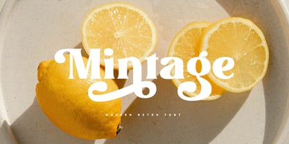 Introducing Mintage: Modern & retro font with a variety of alternative characters to make every word you make more eye-catching. Great for social media post designs, branding, merchandise, posters etc. Features: Uppercase, Lowercase, Numeral, Punctuation, Multilingual, Ligature, Alternates & PUA Encoded.
 - Hay Scary by HandletterYean,
$13.00 This is a Halloween-themed font. Its style will make your creativity stands out in your designs. Feel free to use it on any kind of creative design, and cherish your Halloween with this font to make it more festive.
 - Tattooflash Marie by Otto Maurer,
$14.00 Tattooflash Marie is made for Tattoofans, Tattoostudios and Tattoo artists. Make your own tattoo flash with your Name or the Names of your children. The Font is made for your skin but you can also make Tattooposter, Tattooequipment and more.
 - Geiger by WyldType,
$14.99 Geiger is a geometric typeface inspired by type found in the intros of Commodore 64 games, its attention to the grid and its limited set of building blocks. The design of Geiger respects these criteria to create a sturdy alphabet without diagonals, and loosen its grip on the classic limitations to produce a complete character set worthy of today`s high-resolution displays with a retro touch. The properties of classic computing platforms, like their limited memory and low-resolution displays, required that the designers and programmers of the time devise and use certain techniques to produce interesting visual results. These platforms offered limited sets of default building blocks from which to build more complex graphics and type, and some skilled coders would work around these limitations to produce the unexpected. One of the areas that saw experimental digital type flourish is the Commodore 64 intro scene. The Geiger family includes four styles (regular, oblique, bold and bold oblique), all include common ligatures (fi, ff, ffi, fj, fl, jj, tt, Th, TT) and a few stylistic alternates (K, L). A particular attention was paid to the pattern created by the vertical stem and negative spaces of tightly set text, especially for Geiger Bold. Geiger produces good results at a size of 30pt or more, but we suggest using it at higher display sizes.
 - Queenzia by Skinny Type,
$15.00 Queenzia is a new fresh & modern script with handcrafted calligraphy styles, decorative characters and dancing baselines! So beautiful in invitations like greeting cards, branding materials, business cards, quotes, posters and more !! Queenzia came with 330 glyphs. Alternative characters are divided into several Open Type features such as Swash, Stylistic Sets, Stylistic Alternates, Contextual Alternates. The Open Type feature can be accessed using programs that understand Open Type such as Adobe Illustrator, Adobe InDesign, Adobe Photoshop Corel Draw X version, and Microsoft Word. And this Font has provided PUA unicode (custom coded font). so that all stunt characters can be easily fully accessed by a craftsman or designer. Queenzia: Uppercase & Lowercase International Languages & Symbols Support Punctuation & Numbers Unicode Ranges PUA Standard Alternative Style Alternatives Set Style 1-8 Character Contextual Variants. The files include the following: If you don't have a program that supports OpenType features such as Adobe Illustrator and CorelDraw X Version, you can access all alternative glyphs using Font Book (Mac) or Character Map (Windows). To Access Alternative Characters Click The Link Below: Adobe Illustrator CS https://www.youtube.com/watch?v=geL0Ye02Ryk Adobe Illustrator CC https://www.youtube.com/watch?v=V25yiUh8BcE Ms Word https://www.youtube.com/watch?v=HxkhZiCuwEw Coreldraw X7 https://www.youtube.com/watch?v=UBVsufJjons Adobe Photoshop CC https://www.youtube.com/watch?v=BYKXl58AdNY Indesign CS https://www.youtube.com/watch?v=HgZTCxKG14Q Thank you and happy designing :-) Thank you for purchasing!
 - Sabine by Arabetics,
$45.00 Sabine is an Arabetic type design with a calligraphic flavor. It follows the guidelines of the Mutamathil Taqlidi type style with one glyph for every basic Arabic Unicode character or letter, as defined in Unicode Standards version 5.1, and one additional, final-position, glyph for each Arabic letter that is normally connected with other letters from both sides in traditional cursive Arabic strings. Sabine employs variable x-height values. It includes all required Lam-Alif ligatures and uses ligature substitutions and selected marks positioning but it does not use any other glyph substitutions or forming. Text strings composed using types of this family are non-cursive with stand-alone isolated glyphs. Tatweel (or Kashida) glyph is a zero width space. Keying it before any glyph will display that glyph isolated form. In Sabine Kashidah, Irsal, and Tasmim keying Tatweel (shift J) after certain glyphs will replace it with a long stroke glyph. In Sabine Tasmim, keying it a second time will replace glyph with a final form swash (Irsal) glyph. In Sabine Irsal all final forms are swash glyphs. Keying Tatweel before Alif Lam Lam Ha will display the Allah ligature. Sabine family includes both Arabic and Arabic-Indic numerals; all required diacritic marks, Allah ligature, in addition to standard English keyboard punctuations and major currency symbols. Fonts are available in regular and italic styles.
 - Neo Contact by Linotype,
$40.99Neo Contact is the typeface used on the packaging of Marlboro cigarettes (Marlboro “Reds,” the main line of the brand). The typeface is bold and condensed, designed in the Egyptienne style. Egyptienne types were first designed in the 1800s, as type founders - especially in the westward-expanding United States - began to dream up newer, bolder styles of letters for advertising usage. During the 1800s, it became increasingly important for businesses to set themselves, and their products, apart from competitors. This desire has remained with corporations, as well as with advertisers and designers, into the 21st century. In addition to cigarette packaging, Neo Contact (as part of Marlboro’s branding efforts) can be seen on numerous items, including Ferrari’s F1 racers, and at Formula 1 race tracks. The letters in Neo Contact are filled with personality. Their forms display two distinct weights of line, and the serifs are made up of tiny, strict slabs. Ball terminals round out the design. Neo Contact is a complete font, with a complete western character set. Typefaces in the Egyptienne style preceded the development and distribution of larger, crazier wood typefaces, but also share many similarities with these descendents. More traditional, text faces in the Egyptienne manner are also available from Linotype GmbH (e.g., Adrian Frutiger’s Egyptienne F). On the opposite end of the spectrum, we offer interesting, personality-filled wood display types, like Ponderosa as well. - Volta by Linotype,
$29.99Volta is a robust typeface from the 1950s. A revisit to styles that were en vogue at the turn of the century, Bauer type foundry designers Walter Baum and Konrad Bauer designed this type family in1955. The form of Volta's letters are similar to those in New Transitional Serif typefaces, like Cheltenham and Century. Developed after the Didone (i.e., Bodoni) style types, New Transitional Serifs speak more to the zeitgeist of the late 19th Cntury, and were typographic adaptations to it's newer technologies. Already in the period of mass production, typographers and printers at the dawn of the 20th Century had to cope with larger print runs on cheaper materials. The robust letterforms of New Transitional Serifs were designed to compensate for this, but they were also ingenious little inventions in their own right. Form the beginning, the new, peculiar forms of New Transitional Serif letters were adopted for use by advertisers. Their robustness also allowed them to be used in virtually all sizes. Volta was designed especially with advertising display usage in mind. The x-height of Volta's letters is higher than average for serif faces. It is recommended that Volta be used exclusively for shorter tracks of text, above 12 point. Headlines look dashing set in Volta. Four different font styles are available for the Volta typeface: Regular, Medium, Medium Italic, and Bold."