10,000 search results
(0.023 seconds)
- QuaNauticale_Initials_No1 - Unknown license

- Cabana Club JNL by Jeff Levine,
$29.00Bring back the glory of winters in Miami Beach, exotic summer vacations or Deco-era night spots with Cabana Club JNL - a retro-Deco font, complete with contour outline and solid black characters. - Sharpy by Typadelic,
$19.00As its name implies, sharpy appears as if written with a fine-point marker. As with most Typadelic fonts, sharpy is warm and friendly and works well at small and large text sizes. - Adventure Handwritten by Shape Studio,
$9.00 These hand written letters make for such fun designs! Give you designs that stand out feel with these fun, unique letters! With clean lines for crafting, you can do so much with these!
 - Autumn Leaves by Matthias Luh,
$15.00 These modern, handwritten letters can be used for fancy headings or images. The characters aren't oriented straight or orderly, but a bit random. So they look like they were written by a human.
 - Gritstomper by Hanoded,
$15.00 Gritstomper is a gritty, charcoaly, pencilly font. Quickly written, handcrafted and with sharpened edges. Comes with a full load of diacritics, double letter ligatures for the lower case and a boss-like attitude.
 - Dynamic Schematic by Trustha,
$17.00 Dynamic Schematic is a natural handwritten font, written with fun and relaxed. It comes with 400+ glyphs, which also include multilingual languages. Dynamic Schematic is perfect for headlines, branding, quotes, and many more.
 - Beton by Linotype,
$29.99The Bauer Typefoundry first released the Beton family of types in 1936. Created by the German type designer Heinrich Jost, the present digital version of the Beton family consists of six slab serif typefaces. First developed during the early 1800s, by the 1930s slab serif faces had become one of many stock styles of type developed by foundries all over the world. Because of their distance from pen-drawn forms and their industrial appearance, they were seen as “modern” typefaces. (Their serifs kept them from being too modern.) The first slab serif typefaces were outgrowths of didone style text faces (e.g., Walbaum). As newspapers and advertising grew in importance in the western world (especially in “Wild West” America), type founders and printers began to create bigger, bolder typefaces, which would set large headlines apart from text, and each other. Through display tactics, businesses and industry could begin to visually differentiate their products from one another. This craze eventually led to the development of monster sized wood type, among other things. By the 20th Century, the typographic establishment had begun to tame, categorize, and codify 19th Century type styles. It was in the wake of this environment that Jost developed Beton. The Beton family is a type “family” in a pre-1950s sense of the word. Although six styles of type are available, only four of them fit in logical progression with each other (Beton Light, Beton Demi Bold, Beton Bold, and Beton Extra Bold). The other two members of the family, Beton Bold Condensed and Beton Bold Compressed, are more like distant cousins. They function better as single headlines to text set in Beton Light or Beton Demi Bold, of as companions to totally separate typefaces. - Antique by Storm Type Foundry,
$26.00The concept of the Baroque Roman type face is something which is remote from us. Ungrateful theorists gave Baroque type faces the ill-sounding attribute "Transitional", as if the Baroque Roman type face wilfully diverted from the tradition and at the same time did not manage to mature. This "transition" was originally meant as an intermediate stage between the Aldine/Garamond Roman face of the Renaissance, and its modern counterpart, as represented by Bodoni or Didot. Otherwise there was also a "transition" from a slanted axis of the shadow to a perpendicular one. What a petty detail led to the pejorative designation of Baroque type faces! If a bookseller were to tell his customers that they are about to choose a book which is set in some sort of transitional type face, he would probably go bust. After all, a reader, for his money, would not put up with some typographical experimentation. He wants to read a book without losing his eyesight while doing so. Nevertheless, it was Baroque typography which gave the world the most legible type faces. In those days the craft of punch-cutting was gradually separating itself from that of book-printing, but also from publishing and bookselling. Previously all these activities could be performed by a single person. The punch-cutter, who at that time was already fully occupied with the production of letters, achieved better results than he would have achieved if his creative talents were to be diffused in a printing office or a bookseller's shop. Thus it was possible that for example the printer John Baskerville did not cut a single letter in his entire lifetime, for he used the services of the accomplished punch-cutter John Handy. It became the custom that one type founder supplied type to multiple printing offices, so that the same type faces appeared in various parts of the world. The type face was losing its national character. In the Renaissance period it is still quite easy to distinguish for example a French Roman type face from a Venetian one; in the Baroque period this could be achieved only with great difficulties. Imagination and variety of shapes, which so far have been reserved only to the fine arts, now come into play. Thanks to technological progress, book printers are now able to reproduce hairstrokes and imitate calligraphic type faces. Scripts and elaborate ornaments are no longer the privilege of copper-engravers. Also the appearance of the basic, body design is slowly undergoing a change. The Renaissance canonical stiffness is now replaced with colour and contrast. The page of the book is suddenly darker, its lay-out more varied and its lines more compact. For Baroque type designers made a simple, yet ingenious discovery - they enlarged the x-height and reduced the ascenders to the cap-height. The type face thus became seemingly larger, and hence more legible, but at the same time more economical in composition; the type area was increasing to the detriment of the margins. Paper was expensive, and the aim of all the publishers was, therefore, to sell as many ideas in as small a book block as possible. A narrowed, bold majuscule, designed for use on the title page, appeared for the first time in the Late Baroque period. Also the title page was laid out with the highest possible economy. It comprised as a rule the brief contents of the book and the address of the bookseller, i.e. roughly that which is now placed on the flaps and in the imprint lines. Bold upper-case letters in the first line dramatically give way to the more subtle italics, the third line is highlighted with vermilion; a few words set in lower-case letters are scattered in-between, and then vermilion appears again. Somewhere in the middle there is an ornament, a monogram or an engraving as a kind of climax of the drama, while at the foot of the title-page all this din is quietened by a line with the name of the printer and the year expressed in Roman numerals, set in 8-point body size. Every Baroque title-page could well pass muster as a striking poster. The pride of every book printer was the publication of a type specimen book - a typographical manual. Among these manuals the one published by Fournier stands out - also as regards the selection of the texts for the specimen type matter. It reveals the scope of knowledge and education of the master typographers of that period. The same Fournier established a system of typographical measurement which, revised by Didot, is still used today. Baskerville introduced the smoothing of paper by a hot steel roller, in order that he could print astonishingly sharp letters, etc. ... In other words - Baroque typography deserves anything else but the attribute "transitional". In the first half of the 18th century, besides persons whose names are prominent and well-known up to the present, as was Caslon, there were many type founders who did not manage to publish their manuals or forgot to become famous in some other way. They often imitated the type faces of their more experienced contemporaries, but many of them arrived at a quite strange, even weird originality, which ran completely outside the mainstream of typographical art. The prints from which we have drawn inspiration for these six digital designs come from Paris, Vienna and Prague, from the period around 1750. The transcription of letters in their intact form is our firm principle. Does it mean, therefore, that the task of the digital restorer is to copy meticulously the outline of the letter with all inadequacies of the particular imprint? No. The type face should not to evoke the rustic atmosphere of letterpress after printing, but to analyze the appearance of the punches before they are imprinted. It is also necessary to take account of the size of the type face and to avoid excessive enlargement or reduction. Let us keep in mind that every size requires its own design. The longer we work on the computer where a change in size is child's play, the more we are convinced that the appearance of a letter is tied to its proportions, and therefore, to a fixed size. We are also aware of the fact that the computer is a straightjacket of the type face and that the dictate of mathematical vectors effectively kills any hint of naturalness. That is why we strive to preserve in these six alphabets the numerous anomalies to which later no type designer ever returned due to their obvious eccentricity. Please accept this PostScript study as an attempt (possibly futile, possibly inspirational) to brush up the warm magic of Baroque prints. Hopefully it will give pleasure in today's modern type designer's nihilism. - Caslon #540 by ITC,
$29.00The Englishman William Caslon punchcut many roman, italic, and non-Latin typefaces from 1720 until his death in 1766. At that time most types were being imported to England from Dutch sources, so Caslon was influenced by the characteristics of Dutch types. He did, however, achieve a level of craft that enabled his recognition as the first great English punchcutter. Caslon's roman became so popular that it was known as the script of kings, although on the other side of the political spectrum (and the ocean), the Americans used it for their Declaration of Independence in 1776. The original Caslon specimen sheets and punches have long provided a fertile source for the range of types bearing his name. Identifying characteristics of most Caslons include a cap A with a scooped-out apex; a cap C with two full serifs; and in the italic, a swashed lowercase v and w. Caslon's types have achieved legendary status among printers and typographers, and are considered safe, solid, and dependable. A few of the many interpretations from the early twentieth century were true to the source, as well as strong enough to last into the digital era. These include two from the American Type Founders Company, Caslon 540 and the slightly heavier Caslon #3. Both fonts are relatively wide, and come complete with small caps, Old style Figures, and italics. Caslon Open Face first appeared in 1915 from the Barnhart Bros & Spindler Foundry, and is not anything like the true Caslon types despite the name. It is intended exclusively for titles, headlines and initials, and looks elegant whether used with the more authentic Caslon types or by itself. - DS UstavHand - Unknown license

- Rabbit Boss by Mightyfire,
$15.00 Hi! Rabbit Boss is here. This typeface has a clean, modern and firm looks. This font use capital letters for all letter but has a 'cute' looks. If you want to write a book title, headline or magazine title, we suggest to use this font. We're honored and proud if Rabbit Boss can be the part of your special works. Thankyou.
 - Skinny Chalk by Mvmet,
$16.00 Skinny Chalk is a versatile and playful hand-drawn display font. It works great for creating cool designs that scream for attention. It’s ideal for anything ranging from t-shirts, book designs, restaurant menu, blog writing, greeting cards to stickers, or anything that needs a casual touch. Fall in love with its incredibly cool style, and use it to create lovely designs!
 - PM Showman by Paper Moon Type & Graphic Supply,
$17.00 PM Showman is based on vintage hand-painted sign writing from the 1900s through the 1960s. Seen on everything from office signs to posters, it was a staple of business communication and entertainment advertising in the early 20th century. We meticulously hand-drew each font, modeling the spacing and quirkiness of the original letterforms to give PM Showman an authentic hand-painted look.
 - Moonart by Scratch Design,
$12.00 Introducing “Moonart” It's handwritten with natural and rough character. This font is suitable for designs that emphasize the authenticity of slightly rough writing. Perfect for creating Instagram quote posts, novel or book typefaces, branding, invitations, labels, packaging, stationery, etc. This is a full font, which features all uppercase and lowercase letters, numbers and punctuation, stylish alternates, multilingual, alternates and ligatures. Enjoy this font!
 - Privé by TEKNIKE,
$39.00 Privé is a display handwriting font. The typeface is a distinct uppercased style hand drawn font and designed to be easy to read. Privé name is Old French for “private” or “participating in secret”. Privé is great for display work, invitations, writing, architecture, posters and headings. Privé is designed by Thoma Kikis and is currently available with Latin, Cyrillic and Greek character sets.
 - Hastynga by Golden Wraith Fonts,
$10.00 Golden Wraith Fonts designed the digital typeface Hastynga It began as an effort to find a solution to the digital aesthetic. By distorting digital fonts into a fluid style of writing with a variation in direction between strokes from one letter to the next, Hastynga allows for simulated text imperfection. Its layout creates textual tension, energetic movement, and vibrant vitality.
 - Sansdiego by Sealoung,
$15.00 Introducing our new exploratory Sansdiego, this typeface inspired by European empire-era forms of writing. Sansdiego typeface is perfect for classic Victorian themed designs, beer packaging, whiskey, barbershop, pomade, tattoo studio logos and so on. This font comes with additional effects: Normal - style - double - Shadow, packaged as a layered font. Sansdiego is an all caps font, carefully crafted with a great ornamental taste.
 - Mas dAsil by ParaType,
$25.00 The typeface was designed for ParaType in 2002 by Dmitry Kirsanov. Based on the Mesolithic images on stones were discovered in a prehistoric cave of Mas d’Asil, France. There is a great number of hypotheses explaining the function of the mysterious stones. They have been considered as vessels of souls, computation tools, fortune-telling and magic symbols, relics of prehistoric writing system.
 - Kwash Brush by me55enjah,
$14.00 Introducing Kwash Brush! A handmade brush typeface. Inspired by brush ink stroke character, Kwash Brush makes the messages you write have a more personal touch. This handwritten brush font containing upper & lowercase characters, numerals, and punctuation. Also, support multi-language (Latin simple). This brush font can be applied to any kind of purpose, from handwritten quotes, packaging merchandise, branding projects, etc.
 - Good Monday by BaronWNM,
$14.00 Good Monday is a modern calligraphic style script font with a bold and thin touch like the one you get from writing with a brush. This font is traced from the handwriting so it looks very natural. Good Monday is perfect for use in invitation cards, fashion branding, shirt printing, product advertisements, posters, etc. This font has multilingual support, alternates, and ligatures.
 - Ribjoint by Chank,
$39.95 Created by Chank in 1992, Ribjoint was Chank’s first attempt at creating a Egyptian, cursive font on the computer. Writing cursive with a pencil sure is easy, but getting all the letters to link up correctly in computerized font format is a bit tricky. Not the most graceful script in the world, but it works good enough for a BBQ pit.
 - Bold Yeah by Mvmet,
$16.00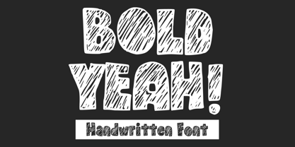 Bold Yeah is a bold and rough hand-drawn display font. It works great for creating cool designs that scream for attention. It’s ideal for anything ranging from t-shirts, book designs, restaurant menu, blog writing, greeting cards to stickers, or anything that needs a casual touch. Fall in love with its incredibly cool style, and use it to create lovely designs!
 - Glovy by RagamKata,
$12.00 Present to you new handwriting font, Glovy! Glovy - Made from my own actual handwriting. It’s not supposed to be neat... because I don’t write neat. It doesn’t align and it’s annoyingly all in caps (but it's kinda charming right?). Glovy - Includes 2 font styles for both regular and bold (A-Z and numerals), as well as standard and accented characters.
 - Calathea Script by FadeLine Studio,
$17.00 Introducing Calathea! This is an elegant calligraphy font that has a casual and luxurious style. This is an upright script font that is made slowly and thorough which aims to convey the character of the writing that is elegant, neat, simple, graceful, firm and still stylish. Available 584 glyphs in it! So, you can get used it freely and follow the current trends.
 - Smoru by Lemonthe,
$12.00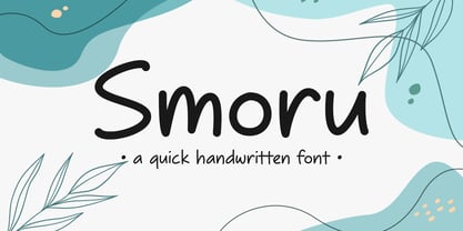 Smoru is a quick handwritten font. It is perfect for those who need to write quickly and efficiently. Its flowing strokes and consistent letterforms capture the natural rhythm and movement of handwriting, making it ideal for anything from taking notes to creating design projects. Suitable for any projects such as logos & branding, quotes, social media posts, product designs, label, and much more!
 - Dino Park by Yoga Letter,
$14.00 "Dino Park" is the most amazing font I've ever made. This font was carefully crafted by incorporating dinosaur into its writing. Very suitable for your projects. This font is also very easy to apply because it has been specially designed. You can create movie titles, book titles, magazine covers, animals, design logos, t-shirt logos, quotes, traveling, research, and more.
 - Exotex by ZetDesign,
$15.00 exotex is a script font created in a bold style at the bottom defined by smooth curves, clean lines, and the finest smooth strokes. Graceful and subtle in its most basic scripted form allows users to elevate their designs to higher levels of aesthetic beauty and elegance. This font is perfect for branding, writing headlines, magazines, and all kinds of your creative work.
 - Sketchino by Mvmet,
$14.00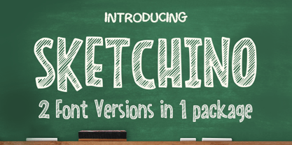 Sketchino is a cool and playful hand drawn font. The font is awesome for creating cool designs that scream for attention. It’s ideal for anything ranging from t-shirts, book designs, restaurant menu, blog writing, greeting cards to stickers, or anything that needs a casual touch. Fall in love with its incredibly cool style, and use it to create lovely designs!
 - Rextions by Java Pep,
$15.00 Rextions is our new font, made in the style of basic hand writing. Every stroke and shape is created with natural handwriting, so that the elegant feel is more pronounced and prominent. Rextions is perfect for your next design project. Thanks for watching, If you have a technical support question, don't hesitate to drop me a message. Have a nice day :)
 - TT Firs Text by TypeType,
$39.00 Specimen | Graphic presentation | Customization options TT Firs Text includes 23 font styles: 11 roman, 11 italic, and 1 variable font. Each font style consists of 898 characters, counting in the characters of the expanded Latin and Cyrillic writing systems. The font has 31 OpenType features, among which are localization features for various languages, circled numerators, and stylistic alternate for the ampersand.
 - Wicked Butter by Toudji Studio,
$19.00 Wicked Butter is a display font inspired by writing styles for young children, such as animated cartoons, comic posters, and so on. This font is bold but sharp and bouncy, which makes it look more playful but still strong. This font also comes with several combined letter variations. but you can still use wicked butter for many print and digital needs.
 - Dear Jane by Letterhend,
$14.00 Dear All, here's comes Dear Jane. This lovely typeface was made from actual hand writing so it has the natural and romantic feel. Perfect to be used especially for signature, wedding invitation, greeting cards, logo, photography, quotes, apparel design, and any design needs. As usual, the font comes with many opentype features such as ligatures, stylistic set alternate, etc and also support multilingual.
 - Qipao by TEKNIKE,
$39.00 Qipao is a display monospace handwriting font. The typeface is a distinct hand drawn font using a felt marker. The Qipao name is derived from the traditional Chinese dress that Manchu women wore in China in the 17th century and became known as the qipao (旗袍), meaning “banner gown”. Qipao is great for display work, invitations, writing, architecture, posters, logos and headings.
 - Nahualli by Ixipcalli,
$30.00 La tipografía Nahualli, esta basada en los escritos castellanos del Códice Méndoza del siglo XVI. Aunque no es un estilo claro, la caligrafía aporta un estilo perfecto para documentos historicos. The Nahualli typography is based on the Castilian writings of the Méndoza Codex of the 16th century. Although it is not a clear style, calligraphy provides a perfect style for historical documents.
 - Rage Italic by ITC,
$40.99 Rage Italic is the work of American designer Ron Zwingelberg. It was one of the first casual brush style scripts with a rough, textured edge. The initial-like capitals complement a lowercase alphabet which links together to create the look of true handwriting. Rage Italic font is ideal for work that should have the spontaneous look of pen writing on parchment.
 - Allograph JNL by Jeff Levine,
$29.00According to the dictionary, the way a letter is formed or shaped within a writing system is an allograph... and Allograph JNL from Jeff Levine takes on unusual shapes. Using characters from Jeff's Printing Set JNL font, they were printed out white-on-black, and the paper was torn into abstract pieces and then scanned in order to create this edgy looking font. - Divina by Sudtipos,
$35.00 Divina is a Latinized digitization of one of German calligraphy master Rudolph Koch's typefaces. The original typeface, Kurrent, was designed in 1927 and cut in 1935. Its shapes are a variant of the German script to be used as a model for writing in schools at the time. This is the first time Koch's rendition of this particular blackletter calligraphy was ever digitized.
 - Dear Diary by Comicraft,
$19.00 Dear diary, what a day it's been. Dear diary, it's been just like a dream. Woke up late. Wasn't where I should have been. For goodness sake what's happening to me? Write lightly, yours truly, dear diary. At last, a font to help you overcome those moody blues… Features: Four fonts (Regular, Underline, Strikethrough & Small caps) with upper and lower case alphabets.
 - Bestina by Cocodesign,
$10.00 INTRODUCING Bestina Modern Calligraphy. This font was designed by handwriting, and it has a modern and unique forms of calligraphy, the writing style is very natural. Bestina has a very unique style of calligraphy, it is very suitable for use in the work of modern design. The Features of this fonts is: * Standart ligatures * Stylistic Alternates * PUA Unicode (Private Use Areas)

