10,000 search results
(0.037 seconds)
- FF Confidential by FontFont,
$59.99 Dutch type designer Just van Rossum created this display FontFont in 1992. The font is ideally suited for advertising and packaging, film and tv, editorial and publishing as well as music and nightlife. FF Confidential provides advanced typographical support with features such as ligatures. It comes with tabular lining figures. As well as Latin-based languages, the typeface family also supports the Greek writing system.
 - ITC Posterboy by ITC,
$29.99If you are looking for a friendly type design that jumps off the page, ITC Posterboy might be for you. Although not quite a script, the font displays strong brush-stroke overtones. The design's inspiration, according to designer Chester Wajda, came from the window-poster lettering in my neighborhood grocery store." The slight top-heavy quality of the design is most noticeable in characters like the 'F,' 'G,' and 's.' ITC Posterboy also has a charming sense of naïveté which is most evident in letters like the cap 'S' and 'J' and lowercase 'f'' and 'g.' ITC Posterboy is a brilliant display design that adds spark and charm to the most mundane display copy. A multifaceted artist, Wajda has been an art director, multimedia and print designer, illustrator, cartoonist, animator, writer, typographer, and infographic designer. ITC Posterboy is his second typeface created for ITC." - HGB Unik by HGB fonts,
$23.00 For many years I had repeatedly written names on certificates or designed texts for certificates of honor with a pen. I later digitized a font written with a broad pen from 1988 to make it easier to use. After the technical possibilities for this had developed, I made a PostScript font out of this document font. The "HGB-Unik" is a humanistic antiqua that arose from this written type. In 2009 Unik was chosen as the text font for a book. However, the book designers wanted to have an italic and a bold style as well. The cursive was developed from written texts that I also wrote for various occasions in the 1980s. The resulting font family was thoroughly revised several times until a usable text font with four weights was created. Although the Unik looks very idiosyncratic in display size, it shows a surprisingly balanced, pleasant typeface in read size.
 - Brush Script by Linotype,
$29.99Brush Script is a lively font with brush-written characteristics, designed by Robert E. Smith in 1942 for American Type Founders. Brush Script continues to be a favorite, despite competition from other similar typefaces of the period and more modern looking scripts digitized in recent years. Perhaps that's because Brush Script is peppy, informal, and unabashedly confident. The letterforms are casual, yet look as if they have been written quickly. Today, Brush Script is used for advertisements and sales materials, especially for luxury and consumer products. - Brush Script by Monotype,
$29.99Brush Script is a lively font with brush-written characteristics, designed by Robert E. Smith in 1942 for American Type Founders. Brush Script continues to be a favorite, despite competition from other similar typefaces of the period and more modern looking scripts digitized in recent years. Perhaps that's because Brush Script is peppy, informal, and unabashedly confident. The letterforms are casual, yet look as if they have been written quickly. Today, Brush Script is used for advertisements and sales materials, especially for luxury and consumer products. - Tombouctou by Hanoded,
$15.00 Tombouctou is the French name for Timbuktu, a city in central Mali. I have been to Timbuktu several times; usually arriving after a three day boat trip up the Niger river. Timbuktu is a smallish city, literally in the middle of nowhere, with a treasure trove of UNESCO listed sights. Tombouctou font is a handmade brush font. It is nice and elegant and will give your designs an ‘oriental’ touch.
 - Richard Starkings by Comicraft,
$39.00 A NEW HOPE! You begged with us..! You pleaded with us..! But we decided to release the official Richard Starkings font anyway! Huh? WHAT? You heard that line before? Where? Hmm... on this very site...? Well, yes, the Hedge Backwards font is all fine and dandy and does resemble the lettering legerdemain of comic book lettering robot, Richard Starkings... but has it been tweaked over the years to better suit the writing stylings of ELEPHANTMEN creator and writer, Richard Starkings? Has it been refurbished and digitally remastered by ELEPHANTMEN designer and Comicraft Secret Weapon, John JG Roshell? Hmm? No? Well then... here it is, retooled, reimagined and reStarkingsed...ah, what the hell, we started from scratch! This ain't no Greedo Shoots First -- you won't have to keep your pasty '70s VHS recordings of previous Richard Starkings Fonts inside a concrete bunker. Because any other font that claimed to be the official Richard Starkings font would have been called The Official Richard Starkings Font, would it not?
 - Swatbats 1 - Unknown license

- Norline by ATK Studio,
$15.00 Norline™ is a new bold sans-serif typeface created to be used for bold titles with 3 shapes into a display fonts way to make it legible for contemporary use. This type features a Latin Pro character set, covering multiple languages written with the Latin script.
 - Sigmund Freud Typeface by Harald Geisler,
$29.00 “For those who regret what keyboards and touch screens have done to their penmanship, typographer Harald Geisler has an answer: Sigmund Freud.” — The Wall Street Journal Sigmund Freud was a neurologist who lived from 1856 to 1939. His research and studies led to the foundation of ‘Psychoanalysis’. When I first saw Freud’s century old letters, I was fascinated by the beauty of these historic manuscripts. It made me smile to imagine a person writing his or her shrink a letter set in Freud’s handwriting. I started to plan creating a font based on his manuscripts. I contacted the Sigmund Freud Museum Vienna and Freud Museum London. To start the creation I selected eight handwritten documents from the archive in Vienna – This selection of specimen was my orientation during the design process. The Samples were created between 1883 to 1938 and are of various character such as handwritten scientific papers, personal letters, notes and a telegram. A successful Kickstarter Campaign "The Sigmund Freud Typeface - A Letter to your Shrink" with over 1400 Backers enabled me to visit the archive in Vienna and study the original manuscripts of Sigmund Freud. After a year of preparation and design work, I finished four alphabets based on Freud’s handwriting. What are the different Versions PRO, Kurrent, #1, #2, #3 and #4 about? “This project gives people the convenience afforded by the computer while maintaining the romantic nostalgia, beauty, and character of letter writing with real handwriting.” — Daniel Vahab, The Huffington Post When you write with your hand, every letter looks a little different. When you write a text on your computer every letter looks exactly the same. In order to make type look like handwriting, I chose four different variations of each letter from Freud’s manuscripts, drew and stored them in the font. The font is then programmed to exchange letters while you are typing. This makes the rendered result on your screen or print look like unique handwriting. PRO While you are typing… the PRO Version actively combines all four alphabets and exchanges them automatically. Through this mechanism never the same two o’s will stand next to each other. With every touch a unique look is generated. This works in certain applications i.e. Word 2010(or newer), Pages, TextEdit, Editor(Pre-installed on Windows 7 or newer), InDesign, Illustrator… →Here you can see an animation of what this effect looks like in action. (Please Note: some applications like LibreOffice, OpenOffice do currently not support this feature. Date: December 2013) #1 #2 #3 and #4 The Sigmund Freud Typeface #1, #2, #3 and #4 each hold one individual lowercase alphabet based on Freud’s handwriting. Kurrent Most of Freud’s correspondence was written in German. Until the 1950′s a different handwriting was taught throughout German speaking countries (Switzerland, Austria, Germany). This style is called Kurrent. The name Kurrent and Cursive derive from the Latin word currere - to run, hurry - both styles were designed to write fast. As you can see in the samples above, Freud practiced both Kurrent and when writing english Cursive (Latin script or Joined-up). Kurrent has three significantly different letters (s,h,e). Use Kurrent to render the authentic look of an historic Sigmund Freud letter in German. Bundle On the Top of this page you can get all six fonts of the Sigmund Freud Typeface Family in a bundle. International Typeface All styles of the Sigmund Freud Typeface feature a wide range of accented letters so you can write to all your friends in Sweden (Bjørn) France (Chloé & Zoë), Ireland (Dáirine), Poland (Łucja), Germany (Jörg) and almost everywhere around the globe (Find a complete list in the tech specs). Usage recommendations I hope that this design will be valuable to you and most of all that you have fun with this typeface! 1. Point Size — To reproduce the size of Sigmund Freud’s handwriting adjust the type size between 18-24 point in your word processor. If you are using an imaging software like Photoshop set the resolution to 300dpi and adjust the point size between 18-24. 2. Line Spacing — Narrow the line hight until swashes of capital letters touch the baseline above. This also happens when you write a letter and gives the document a unique handwritten look. 3. Right Aligned — Freud had the habit to write towards the right edge of the page and start loosely on the left. Set your text alignment to ‘right’ to incorporate this dramatic expression also to your documents. What do other People say about the Sigmund Freud Typeface? “Wouldn’t you love to write a letter to your shrink using the Sigmund Freud typeface?” — Dorothy Tan, Design TAXI ''“JUST DON’T WRITE A LETTER TO YOUR MOTHER WITH IT… …until the reader looks a bit closer, and they see 70+ years of modern science weighing in on turn-of-the-century pop psychology."'' — Mark Willson, Fast Company “Doctor, what does it mean if you dream of creating a font of Freud’s handwriting?” — Ayun Halliday, Open Culture “…geekily romantic, at once artistic and scientific” — Edie Jarolim, Freud’s Butcher “…sympathisch” — Jürgen Siebert, Fontblog !WOW! Thank you for reading the complete font description! You are awesome! If you still have a question please contact me through MyFonts or my website haraldgeisler.com. Credits This project was made possible by the help of 1481 Backers on Kickstarter and the kind support of the Sigmund Freud Museum Vienna and the Freud Museum London. Thank you. All of Freud’s Manuscripts shown are © Sigmund Freud Museum Vienna. Poster Image: IN17 - Sigmund Freud, Germany 1932. © Freud Museum London. Flag Image: IN19 - Sigmund Freud 1930’s. © Freud Museum London.
 - SdrawkcabTOC by Ingrimayne Type,
$9.95 SdrawkcabTOC allows one to create mirror writing, that is, writing which looks correct when viewed in a mirror. To understand why it is named as it is, print out the name “Sdrawkcab” using the typeface and hold it up to a mirror. It is derived from the font TiredOfCourier.
 - SdrawkcabJJ by Ingrimayne Type,
$9.95 SdrawkcabJJ allows one to create mirror writing, that is, writing which looks correct when viewed in a mirror. To understand why it is named as it is, print out the name “Sdrawkcab” using the typeface and hold it up to a mirror. It is derived from the font JetJane.
 - TE Dewani by Tharwat Emara,
$50.00 The Dewani font is a font of original Arabic fonts and is specialized in writing in the offices of the Sultan and the kings of the Arabs. It is also one of the most beautiful Arabic fonts as it has the flexibility to write official graduation certificates, certificates of appreciation, scientific progress and decorations. It is also commonly used in writing posters and sequences for serials, films, medals and decorations on clothes. The Dewani font has its aesthetics derived from its round and interlocking letters.
 - Alfatih by PojolType,
$14.00 This Alfatih font is inspired by calligraphy writing, with modern classic characters. We can use this font for calligraphy book writing, Quran cover writing, film titles, t-shirt designs, magazine titles, web, posters, book titles, logos, country names, brands, billboards. Alfatih font, offers you: 1. Uppercase characters (All uppercase letters, 4 models) 2. Ligature (22 two-letter characters) and Alternate Styles 2. Ligature (8 characters three letters) with alternative styles, we can use it for logos 3. Multilingual Support (Europe Latin West), Numbers and Punctuation
 - Story Lovers by Forberas Club,
$16.00 A font that is purposely made for writing romantic memories or important stories.
 - Deveren by Corien’s Handwritingfonts,
$19.00 Deveren is a font based on goosefeather writings from the late 1600's.
 - KG Change This Heart by Kimberly Geswein,
$5.00 Short, wide thin-stroked writing. Although handwritten, it is a very clean style.
 - Extreme by BA Graphics,
$45.00A wild extreme-looking font that can also be used as chalk writing. - Shmulik Yael MF by Masterfont,
$59.00 Tender and elegant hand writing font, expanded to add air to your text.
 - Estanica by Ixipcalli,
$30.00 Typography inspired by ancient medieval writings from texts and wordings of Spanish scriptures.
 - ITC Simran by ITC,
$29.99ITC Simran was created by the London designer Satwinder Sehmi in 1998. The Indian influence is recognizable at first glance and lends the font an exotic feel - at least to the western eye. Sehmi borrowed forms and feelings from northern Indian writing systems for this typeface. Both the upper and lowercase letters make use of the same lowercase forms, but the upperacse letters have the addition of a horizontal bar running over them at the ascender height. This feature is directly reminiscent of writing systems in northern India, and is ITC Simran's most distinguishing characteristic. But there were other influences as well: Sehmi was also inspired by uncial forms when designing this typeface. ITC Simran exhibits the typical look of writing with a broad-tipped pen, with its strong strokes, as well as characteristic letter forms, for example, the a or h. ITC Simran is a fascinating and harmonious symbiosis of a variety of influences from different cultures. This font is best used for headlines and short texts in point sizes of 12 and larger. - Bulbatail by Letterhend,
$14.00 Introducing, Bulbatail - a cute hand writing with casual looks. This type of font perfectly made to be applied especially in logo, and the other various formal forms such as invitations, labels, logos, magazines, books, greeting / wedding cards, packaging, fashion, make up, stationery, novels, labels or any type of advertising purpose. Features : uppercase & lowercase numbers and punctuation multilingual PUA encoded We highly recommend using a program that supports OpenType features and Glyphs panels like many of Adobe apps and Corel Draw, so you can see and access all Glyph variations.
 - Alessia Harvey by Letterhend,
$19.00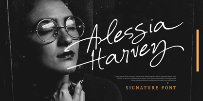 Introducing, Alessia Harvey - an authentic hand writing with natural signature style. This type of font perfectly made to be applied especially in logo, and the other various formal forms such as invitations, labels, logos, magazines, books, greeting / wedding cards, packaging, fashion, make up, stationery, novels, labels or any type of advertising purpose. Features : uppercase & lowercase numbers and punctuation multilingual alternates and ligatures PUA encoded We highly recommend using a program that supports OpenType features and Glyphs panels like many of Adobe apps and Corel Draw, so you can see and access all Glyph variations.
 - Carolyna Pro Black by Emily Lime,
$89.00 Carolyna Pro Black is the bolder sibling of Carolyna Pro. It is an elegant, yet whimsically handwritten calligraphy font that was created with readability in mind. It uses open-type features to assist with letter flow and to give each creation that modern, hand-lettered touch. With over 1000 characters, there are many stylistic alternatives from which choose, tons of foreign characters so you can write in other languages, and fun swashes to give headings a little something extra. Note: This font works best with open-type friendly applications.
 - Mellodate by Letterhend,
$19.00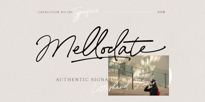 Introducing, Mellodate Script - an authentic hand writing with natural signature style. This type of font perfectly made to be applied especially in logo, and the other various formal forms such as invitations, labels, logos, magazines, books, greeting / wedding cards, packaging, fashion, make up, stationery, novels, labels or any type of advertising purpose. Features : uppercase & lowercase numbers and punctuation multilingual alternates and ligatures swashes PUA encoded We highly recommend using a program that supports OpenType features and Glyphs panels like many of Adobe apps and Corel Draw, so you can see and access all Glyph variations.
 - Ansylia by Letterhend,
$19.00 Introducing, Ansylia Script - an authentic hand writing with natural signature style. This type of font perfectly made to be applied especially in logo, and the other various formal forms such as invitations, labels, logos, magazines, books, greeting / wedding cards, packaging, fashion, make up, stationery, novels, labels or any type of advertising purpose. Features : uppercase & lowercase numbers and punctuation multilingual alternates and ligatures swashes PUA encoded We highly recommend using a program that supports OpenType features and Glyphs panels like many of Adobe apps and Corel Draw, so you can see and access all Glyph variations.
 - Goodfellow by Solotype,
$19.95Our font (circa 1895) of this old wood type was made by Hamilton of Two Rivers, Wisconsin, but we have been told that another identical font was made earlier by W. H. Page, Greeneville, Connecticut. Hamilton became the final home of many of the old wood type patterns as the early companies went out of business. - Aretino by Eurotypo,
$24.00 Pietro Aretino (1492 – 1556) Was an Italian author, playwright, poet, satirist and blackmailer, who wielded influence on contemporary art and politics. The most vigorous and versatile vernacular writer of the 16th century He was a very versatile writer, famous for his Lascivious Sonnets – which caused great scandal at the time – but also for his satirical verses, addressed to all the powerful people in Italy, without forgetting the many plays that he wrote for the theatre. Part of the charm of his letters is that through them you may know the whole of Venetian society from the top to the bottom. The little-known church of San Luca in Venice (in St Mark's district) has been a place of pilgrimage for centuries for people who are decidedly not devout: journalists, writers, free thinkers. In 1556 Pietro Aretino, a unique character of the Italian and Venetian Renaissance period was buried there. Such strong of personality, has contributed to generate the powerful wind of change that emerged from the italian renaissance. We have inspired on that talent searching for a new sight the famous Venetian typefaces. Probably looking for more vigour and contemporary digital style. This typeface is slightly condensed, lighter and has more contrast between the thick and thin letter-strokes, it has concave bracketed serif. Their ascender and descenders strokes are very shorts. Aretino family is completed by four weigh: Regular, SemiBold, Bold and ExtraBold, while Italics has three weighs. These fonts came with a full OpenType features and CE languages.
 - Toucan Tango JNL by Jeff Levine,
$29.00In the days before vinyl sign lettering overran the landscape, talented neighborhood sign painters and show card writers made attractive displays for local merchants. Toucan Tango JNL is Jeff Levine's interpretation of a sign painter's sans serif letter with a distinctive inline. - Spur Handlettered JNL by Jeff Levine,
$29.00The spurred serif style of Roman lettering has long been a favorite of sign painters and show card writers. Spur Handlettered JNL from Jeff Levine gives this classic design an ultra-casual look, complete with all of the nuances of hand-lettering. - Penwrite JNL by Jeff Levine,
$29.00 The same 1935 piece of sheet music ("Along Tobacco Road") that yielded the multi-line lettering design for Deco Triline JNL has also provided lettering examples inspired by the writers' credits for what is now Penwrite JNL, in both regular and oblique versions.
 - Aplin Script by Jeff Marshall,
$42.00 This hand-lettered italic script is another versatile font produced by Jeff Marshall. Named after the late Ron Aplin, who mentored Jeff as an apprentice sign writer early in his career. This font includes 19 unique ligatures and 15 alternate special ending glyphs.
 - Cloister Open Face LT by Linotype,
$29.99Cloister Open Face was designed in 1929 by Morris Fuller Benton as one weight of the Cloister Old Style family. Cloister itself appeared from 1897 with American Type Founders, and later for the typesetting machines of the Linotype, Intertype and Monotype companies. At that time, it was the truest modern industrial revival of the Jensonian Roman. Benton stayed close to the style of his model in both design and spacing. Cloister Open Face has an old-world elegance, and it works well for titling in books and magazines. In 1458, Charles VII sent the Frenchman Nicolas Jenson to learn the craft of movable type in Mainz, the city where Gutenberg was working. Jenson was supposed to return to France with his newly learned skills, but instead he traveled to Italy, as did other itinerant printers of the time. From 1468 on, he was in Venice, where he flourished as a punchcutter, printer and publisher. He was probably the first non-German printer of movable type, and he produced about 150 editions. Though his punches have vanished, his books have not, and those produced from about 1470 until his death in 1480 have served as a source of inspiration for type designers over centuries. His Roman type is often called the first true Roman." Notable in almost all Jensonian Romans is the angled crossbar on the lowercase e, which is known as the "Venetian Oldstyle e."" - Ongunkan Old Turkic Yenisei by Runic World Tamgacı,
$50.00 The Yenisei Inscriptions consist of a total of 158 Turkish inscriptions, kurgans (graves) and rock stones that have been found along the Yenisei River, which passes through the Khakasya, Tuva and Altai Autonomous Republics in Russia. The inscriptions were written with Turkish Stamps, which we know as the Orkhon Alphabet. In addition, there are dozens of versions of the Turkish Runic script, apart from the Yenisei inscriptions and the Orkhon inscriptions. I will present the other versions here as soon as possible.
 - Ecstasy by Talavera,
$60.00 This calligraphic type is based on a free-styled blackletter with an ink-stained spirit. By having several stylistic alternates (on both U&lc.) plus some non standard ligatures, your text may look like it’s written or handmade! You should combine this font with Agony, also available on MyFonts.
 - Potpourri by Linotype,
$29.99 Potpourri was based on an energetic alphabet written by expert calligrapher Gottfried Pott. To create the elegant yet rugged strokes, Pott cut a pen with a unique fringed tip — from a drinking straw! He then produced an huge series of drafts before deciding on the final alphabet for digitization.
 - LDJ Elf Note by Illustration Ink,
$3.00This font will have you feeling elfish! It's great for writing your Christmas invitation! - FG Lova by YOFF,
$14.95FG Lova is a small connected script font that looks like old letter writing. - LeeorPasta MF by Masterfont,
$59.00 This is what happens when you try to write with a bottle of sauce...
 - WL Rasteroids by Writ Large,
$5.00 Rasteroids is a typographic flashback to computing of the mid 1980s, when 9-pin dot-matrix printers were the state of the art, and most home computer displays were TVs hooked up to RF modulators. Rasteroids not only captures the dot-matrix printer look, but recreates the rasterized appearance of text on those lower-resolution monitors. Unlike that dot matrix type of yore, Rasteroids does have some variation in character width, and is legible in small blocks of copy. Still, it is best used sparingly, or as a special effect.
