10,000 search results
(0.03 seconds)
- Hand of Hannah by TypoGraphicDesign,
$19.00 The typeface Hand of Hannah is designed from 2021 for the font foundry Typo Graphic Design by Hannah Englisch & Manuel Viergutz. The character of the handwritten script typeface is rough, ruggend and raw. With state-of-the-art OpenType-Feature (like Contextual Alternates (calt) and Stylistic Alternates (salt)). Each uppercase and each lowercase letter has automatically alternated two variations to bring humanly-random characteristics of handwriting to life. 4 font-styles (Regular, Bold, Heavy & Icons) with 732 glyphs (Latin 3) incl. 100+ decorative extras like icons, arrows, catch words, dingbats, emojis, symbols, geometric shapes (type the word #LOVE for ♥︎ or #SMILE for ☺ as OpenType-Feature dlig) and stylistic alternates. For use in logos, magazines, posters, advertisement plus as webfont for decorative headlines. The font works best for display size. Have fun with this font & use the DEMO-FONT (with reduced glyph-set) FOR FREE! ■ Font Name: Hand of Hannah ■ Font Styles: 4 font-styles (Regular, Bold, Heavy, Icon) + DEMO (with reduced glyph-set) ■ Font Category: Display Script for headline size ■ Font Format:.otf (Mac + Win, for Print) + .woff (for Web) ■ Glyph Set: 732 glyphs (Latin 3 incl. decorative extras like icons) ■ Language Support: 80 languages: Afrikaans Albanian Asu Basque Bemba Bena Breton Catalan Chiga Colognian Cornish Croatian Czech Danish Dutch English Estonian Faroese Filipino Finnish French Friulian Galician German Gusii Hungarian Indonesian Irish Italian Kabuverdianu Kalenjin Kinyarwanda Latvian Lithuanian Lower Sorbian Luo Luxembourgish Luyia Machame Makhuwa-Meetto Makonde Malagasy Manx Morisyen North Ndebele Norwegian Bokmål Norwegian Nynorsk Nyankole Oromo Polish Portuguese Quechua Romanian Romansh Rombo Rundi Rwa Samburu Sango Sangu Scottish Gaelic Sena Serbian Shambala Shona Slovak Soga Somali Spanish Swahili Swedish Swiss German Taita Teso Turkish Upper Sorbian Uzbek (Latin) Volapük Vunjo Zulu ■ Design Date: 2021 ■ Type Designer: Hannah Englisch, Manuel Viergutz
 - Skill by Lián Types,
$49.00 DESCRIPTION With Skill I wanted to create something wild. Something that splashed the letters with life. To do this, I knew I'd have to break the barrier between analog and digital, so I took my best brush and started to play. Throughout the years as a type-designer I've met and become fan of many calligraphers. My belief that only a good calligrapher can make good typography (1) has become even stronger. I'm now absolutely sure that only practice improves the skill, especially in this field. So, with this in mind, I started a font which was a challenge for me because sometimes the gap between paper and screen can be gigantic. Skill is another of my attemps (2) to capture the spirit of the pointed brush, its expressiveness, the passions and fears of the artist. This font is about freedom. Freedom everywhere. Movement, velocity, passion. To achieve this, many alternates and ligatures per glyph were designed. Use it on magazines, posters, book covers, music albums, t-shirts, skates, tattoos. NOTES (1) This is mostly referred to script fonts, though text fonts made by designers with a deep calligraphic background have at least to me, an extra charm. (2) See my fonts Live and Indie. TIPS Thanks to Open-Type, the font gives the user the chance to play and get many wonderful results: In example, using the font with “discretionary ligatures” activated will give more life to the written word. Some letters will jump of the base, while others will ligate or not with the following (typical of gestural calligraphy). Adobe Illustrator is recommended. STYLES Skill is the most complete style. It has all the alternates and ligatures that can be seen in the posters and more! Skill Standard is a variant with no decorative glyphs. It has the basic alphabet and some ligatures for better legibility.
 - PIXEL Pattern by TypoGraphicDesign,
$9.00 The typeface PIXEL pattern is designed from 2021 for the font foundry Typo Graphic Design by Manuel Viergutz. The display typeface is inspired in the past and present. 8 font-styles (Square, Circle, Square Flicker, Circle Cloud, Square Bold, Square Fat, Star, Star Spike) with 830 glyphs (Adobe Latin 3) incl. 100+ decorative extras like icons, arrows, German Capital Sharp S, dingbats, emojis, symbols, geometric shapes, catchwords, decorative ligatures (type the word #LOVE for ♥︎ or #SMILE for ☺ as OpenType-Feature dlig) and stylistic alternates (8 stylistic sets). For use in logos, magazines, posters, advertisement plus as webfont for decorative headlines. The font works best for display size. Have fun with this font & use the DEMO-FONT (with reduced glyph-set) FOR FREE! ■ Font Name: PIXEL pattern ■ Font Styles: 8 font-styles (Square, Circle, Square Flicker, Circle Cloud, Square Bold, Square Fat, Star, Star Spike) + DEMO (with reduced glyph-set) ■ Font Category: Display for headline size ■ Font Format:.ttf (for Print) + .woff (for Web) ■ Glyph Set: 830 glyphs (Latin 3 incl. decorative extras like icons) ■ Language Support: 93 languages: Afrikaans, Albanian, Asu, Basque, Bemba, Bena, Breton, Catalan, Chiga, Colognian, Cornish, Croatian, Czech, Danish, Dutch, Embu, English, Esperanto, Estonian, Faroese, Filipino, Finnish, French, Friulian, Galician, Ganda, German, Gusii, Hungarian, Inari Sami, Indonesian, Irish, Italian, Jola-Fonyi, Kabuverdianu, Kalenjin, Kamba, Kikuyu, Kinyarwanda, Latvian, Lithuanian, Lower Sorbian, Luo, Luxembourgish, Luyia, Machame, Makhuwa-Meetto, Makonde, Malagasy, Maltese, Manx, Meru, Morisyen, Northern Sami, North Ndebele, Norwegian Bokmål, NorwegianNynorsk, Nyankole, Oromo, Polish, Portuguese, Quechua, Romanian, Romansh, Rombo, Rundi, Rwa, Samburu, Sango, Sangu, Scottish Gaelic, Sena, Serbian, Shambala, Shona, Slovak, Soga, Somali, Spanish, Swahili, Swedish, Swiss German, Taita, Teso, Turkish, Upper Sorbian, Uzbek (Latin), Volapük, Vunjo, Walser, Welsh, Western Frisian, Zulu ■ Design Date: 2021 ■ Type Designer: Manuel Viergutz
 - Ebony by TypeTogether,
$35.00 Some typefaces need time to ripen; Burian and Scaglione made the first sketches for Ebony back in 2008, but it took a few years of maturing in a drawer to be developed into a multi-functional type family. While keeping in tune with TypeTogether’s focus on complex typographic structures needed for magazine, newspapers and books —whether printed or digital—, Ebony goes far beyond editorial use and promises great performance in branding and advertising. The range of dark weights with taut and powerful curves can boost any headline, while the lighter styles create an approachable and clean feel in blocks of continuous text. Ebony does not fall short on aiding legibility either; letterforms have a distinct direction of ductus and features like the top serif on ‘l’ help making them clearly distinguishable from each other. It is a type family that cleverly seeks a balance between the openness and legibility of humanist sans serifs and the striking and more regularised character of grotesques. The letter-shapes feature generous counters and open terminals with crisp angles, and daringly grow both in colour and width as the fonts get bolder. Infused with this strength, Ebony also shows a quirky side in some of her shapes; the vertical fractions, the at-symbol, the old-style numbers, … The predominantly slanted style of the italics is broken up in some letterforms, such as ‘a e f l’, that are more in line with a classic cursive appearance. This, together with a forceful italic angle, ensure a change in texture within a block of text, despite sharing the same letter weight and width with the uprights. With 18 styles, tending towards the heavier part of the weight-spectrum, this face has a powerful quality!
 - Rose Garden Deluxe by Fenotype,
$25.00 Rose Garden Deluxe is an elegant type collection including a luscious high contrast serif in three weights and an ethereal pen script also in three weights. Together the fonts form an effective all-around set for sophisticated display purposes. The fonts are best used for imposing headlines, as a logotype, in packaging and posters. Rose Garden Serif has an extra high contrast giving it a sophisticated look, suitable for fashion or luxurious high-end products, magazines and anything such. Rose Garden Pen has no contrast, as if it was written with a steady and precise inking pen. Rose Garden Pen is equipped with plenty of useful OpenType features: it has Contextual Alternates and Standard Ligatures to enliven the flow of “writing” and to keep the connections between letters smooth. In addition it has Stylistic and Swash Alternates for every standard uppercase and lowercase characters, as well as for ampersand and few ligatures. On top of that it has initial and terminal swashes - a feature that is set in Titling Alternates. The feature works following: click it on and write normally. Type a space before a word and after it to get a special swash character in the beginning and in the end of the word. If that isn’t enough seek for even more alternates in the Glyphs Palette. Each weight has over 650 glyphs in total. Rose Garden Ornaments is an extension to Rose Garden Pen. It’s a set of Ornaments with the same weight and handwriting style as the font. The swooshes can be combined with the font for even more ornamental looks and the swashes set in lowercase letters can be used as additional terminal swashes, combined with any lowercase character.
 - Hand Of Evouli by TypoGraphicDesign,
$9.00 The typeface Hand Of Evouli is designed from 2022 for the font foundry Typo Graphic Design by Manuel Viergutz. The display font based on the original Handwriting. Digitized via handwritten template. Thanks to Evouli. 6 font-styles (Light Pen, Bold, xBold, Black Marker, Black Bounce, Mix) + 1 icon-style with 567 glyphs (Adobe Latin 3) incl. 100+ decorative extras like icons, arrows, dingbats, emojis, symbols, geometric shapes (type the word #LOVE for ❤️ or #SMILE for 🙂 as OpenType-Feature dlig) and stylistic alternates (4 stylistic sets). For use in logos, magazines, posters, advertisement plus as webfont for decorative headlines. The font works best for display size. Have fun with this font & use the DEMO-FONT (with reduced glyph-set) FOR FREE! Font Specifications ■ Font Name: Hand Of Evouli ■ Font Styles: 6 font styles (Light Pen, Bold, xBold, Black Marker, Black Bounce, Mix) + DEMO (with reduced glyph-set) ■ Font Category: Display Script for headline size ■ Font Format:.otf (Mac + Win, for Print) + .woff (for Web) ■ Glyph Set: 567 glyphs (Latin 3 incl. decorative extras like icons) ■ Language Support: 87 languages: Afrikaans Albanian Asu Basque Bemba Bena Breton Catalan Chiga Colognian Cornish Croatian Czech Danish Dutch English Estonian Faroese Filipino Finnish French Friulian Galician Ganda German Gusii Hungarian Inari Sami Indonesian Irish Italian Jola-Fonyi Kabuverdianu Kalenjin Kinyarwanda Latvian Lithuanian Lower Sorbian Luo Luxembourgish Luyia Machame Makhuwa-Meetto Makonde Malagasy Maltese Manx Morisyen Northern Sami North Ndebele Norwegian Bokmål Norwegian Nynorsk Nyankole Oromo Polish Portuguese Quechua Romanian Romansh Rombo Rundi Rwa Samburu Sango Sangu Scottish Gaelic Sena Serbian Shambala Shona Slovak Soga Somali Spanish Swahili Swedish Swiss German Taita Teso Turkish Upper Sorbian Uzbek (Latin) Volapük Vunjo Welsh Western Frisian Zulu ■ Design Date: 2022 ■ Type Designer: Evouli & Manuel Viergutz
 - ITC Bodoni Seventytwo by ITC,
$29.99Giambattista Bodoni (1740-1813) was called the King of Printers; he was a prolific type designer, a masterful engraver of punches and the most widely admired printer of his time. His books and typefaces were created during the 45 years he was the director of the fine press and publishing house of the Duke of Parma in Italy. He produced the best of what are known as modern" style types, basing them on the finest writing of his time. Modern types represented the ultimate typographic development of the late eighteenth and early nineteenth centuries. They have characteristics quite different from the types that preceded them; such as extreme vertical stress, fine hairlines contrasted by bold main strokes, and very subtle, almost non-existent bracketing of sharply defined hairline serifs. Bodoni saw this style as beautiful and harmonious-the natural result of writing done with a well-cut pen, and the look was fashionable and admired. Other punchcutters, such as the Didot family (1689-1853) in France, and J. E. Walbaum (1768-1839) in Germany made their own versions of the modern faces. Even though some nineteenth century critics turned up their noses and called such types shattering and chilly, today the Bodoni moderns are seen in much the same light as they were in his own time. When used with care, the Bodoni types are both romantic and elegant, with a presence that adds tasteful sparkle to headlines and advertising. ITC Bodoni™ was designed by a team of four Americans, after studying Bodoni's steel punches at the Museo Bodoniana in Parma, Italy. They also referred to specimens from the "Manuale Tipografico," a monumental collection of Bodoni's work published by his widow in 1818. The designers sought to do a revival that reflected the subtleties of Bodoni's actual work. They produced three size-specific versions; ITC Bodoni Six for captions and footnotes, ITC Bodoni Twelve for text settings, and ITC Bodoni Seventytwo - a display design modeled on Bodoni's 72-point Papale design. ITC Bodoni includes regular, bold, italics, Old style Figures, small caps, and italic swash fonts. Sumner Stone created the ornaments based on those found in the "Manuale Tipografico." These lovely dingbats can be used as Bodoni did, to separate sections of text or simply accent a page layout or graphic design." - ITC Bodoni Twelve by ITC,
$29.99Giambattista Bodoni (1740-1813) was called the King of Printers; he was a prolific type designer, a masterful engraver of punches and the most widely admired printer of his time. His books and typefaces were created during the 45 years he was the director of the fine press and publishing house of the Duke of Parma in Italy. He produced the best of what are known as modern" style types, basing them on the finest writing of his time. Modern types represented the ultimate typographic development of the late eighteenth and early nineteenth centuries. They have characteristics quite different from the types that preceded them; such as extreme vertical stress, fine hairlines contrasted by bold main strokes, and very subtle, almost non-existent bracketing of sharply defined hairline serifs. Bodoni saw this style as beautiful and harmonious-the natural result of writing done with a well-cut pen, and the look was fashionable and admired. Other punchcutters, such as the Didot family (1689-1853) in France, and J. E. Walbaum (1768-1839) in Germany made their own versions of the modern faces. Even though some nineteenth century critics turned up their noses and called such types shattering and chilly, today the Bodoni moderns are seen in much the same light as they were in his own time. When used with care, the Bodoni types are both romantic and elegant, with a presence that adds tasteful sparkle to headlines and advertising. ITC Bodoni™ was designed by a team of four Americans, after studying Bodoni's steel punches at the Museo Bodoniana in Parma, Italy. They also referred to specimens from the "Manuale Tipografico," a monumental collection of Bodoni's work published by his widow in 1818. The designers sought to do a revival that reflected the subtleties of Bodoni's actual work. They produced three size-specific versions; ITC Bodoni Six for captions and footnotes, ITC Bodoni Twelve for text settings, and ITC Bodoni Seventytwo - a display design modeled on Bodoni's 72-point Papale design. ITC Bodoni includes regular, bold, italics, Old style Figures, small caps, and italic swash fonts. Sumner Stone created the ornaments based on those found in the "Manuale Tipografico." These lovely dingbats can be used as Bodoni did, to separate sections of text or simply accent a page layout or graphic design." - ITC Bodoni Ornaments by ITC,
$29.99Giambattista Bodoni (1740-1813) was called the King of Printers; he was a prolific type designer, a masterful engraver of punches and the most widely admired printer of his time. His books and typefaces were created during the 45 years he was the director of the fine press and publishing house of the Duke of Parma in Italy. He produced the best of what are known as modern" style types, basing them on the finest writing of his time. Modern types represented the ultimate typographic development of the late eighteenth and early nineteenth centuries. They have characteristics quite different from the types that preceded them; such as extreme vertical stress, fine hairlines contrasted by bold main strokes, and very subtle, almost non-existent bracketing of sharply defined hairline serifs. Bodoni saw this style as beautiful and harmonious-the natural result of writing done with a well-cut pen, and the look was fashionable and admired. Other punchcutters, such as the Didot family (1689-1853) in France, and J. E. Walbaum (1768-1839) in Germany made their own versions of the modern faces. Even though some nineteenth century critics turned up their noses and called such types shattering and chilly, today the Bodoni moderns are seen in much the same light as they were in his own time. When used with care, the Bodoni types are both romantic and elegant, with a presence that adds tasteful sparkle to headlines and advertising. ITC Bodoni™ was designed by a team of four Americans, after studying Bodoni's steel punches at the Museo Bodoniana in Parma, Italy. They also referred to specimens from the "Manuale Tipografico," a monumental collection of Bodoni's work published by his widow in 1818. The designers sought to do a revival that reflected the subtleties of Bodoni's actual work. They produced three size-specific versions; ITC Bodoni Six for captions and footnotes, ITC Bodoni Twelve for text settings, and ITC Bodoni Seventytwo - a display design modeled on Bodoni's 72-point Papale design. ITC Bodoni includes regular, bold, italics, Old style Figures, small caps, and italic swash fonts. Sumner Stone created the ornaments based on those found in the "Manuale Tipografico." These lovely dingbats can be used as Bodoni did, to separate sections of text or simply accent a page layout or graphic design." - ITC Bodoni Brush by ITC,
$29.99Giambattista Bodoni (1740-1813) was called the King of Printers; he was a prolific type designer, a masterful engraver of punches and the most widely admired printer of his time. His books and typefaces were created during the 45 years he was the director of the fine press and publishing house of the Duke of Parma in Italy. He produced the best of what are known as modern" style types, basing them on the finest writing of his time. Modern types represented the ultimate typographic development of the late eighteenth and early nineteenth centuries. They have characteristics quite different from the types that preceded them; such as extreme vertical stress, fine hairlines contrasted by bold main strokes, and very subtle, almost non-existent bracketing of sharply defined hairline serifs. Bodoni saw this style as beautiful and harmonious-the natural result of writing done with a well-cut pen, and the look was fashionable and admired. Other punchcutters, such as the Didot family (1689-1853) in France, and J. E. Walbaum (1768-1839) in Germany made their own versions of the modern faces. Even though some nineteenth century critics turned up their noses and called such types shattering and chilly, today the Bodoni moderns are seen in much the same light as they were in his own time. When used with care, the Bodoni types are both romantic and elegant, with a presence that adds tasteful sparkle to headlines and advertising. ITC Bodoni™ was designed by a team of four Americans, after studying Bodoni's steel punches at the Museo Bodoniana in Parma, Italy. They also referred to specimens from the "Manuale Tipografico," a monumental collection of Bodoni's work published by his widow in 1818. The designers sought to do a revival that reflected the subtleties of Bodoni's actual work. They produced three size-specific versions; ITC Bodoni Six for captions and footnotes, ITC Bodoni Twelve for text settings, and ITC Bodoni Seventytwo - a display design modeled on Bodoni's 72-point Papale design. ITC Bodoni includes regular, bold, italics, Old style Figures, small caps, and italic swash fonts. Sumner Stone created the ornaments based on those found in the "Manuale Tipografico." These lovely dingbats can be used as Bodoni did, to separate sections of text or simply accent a page layout or graphic design." - ITC Bodoni Six by ITC,
$40.99Giambattista Bodoni (1740-1813) was called the King of Printers; he was a prolific type designer, a masterful engraver of punches and the most widely admired printer of his time. His books and typefaces were created during the 45 years he was the director of the fine press and publishing house of the Duke of Parma in Italy. He produced the best of what are known as modern" style types, basing them on the finest writing of his time. Modern types represented the ultimate typographic development of the late eighteenth and early nineteenth centuries. They have characteristics quite different from the types that preceded them; such as extreme vertical stress, fine hairlines contrasted by bold main strokes, and very subtle, almost non-existent bracketing of sharply defined hairline serifs. Bodoni saw this style as beautiful and harmonious-the natural result of writing done with a well-cut pen, and the look was fashionable and admired. Other punchcutters, such as the Didot family (1689-1853) in France, and J. E. Walbaum (1768-1839) in Germany made their own versions of the modern faces. Even though some nineteenth century critics turned up their noses and called such types shattering and chilly, today the Bodoni moderns are seen in much the same light as they were in his own time. When used with care, the Bodoni types are both romantic and elegant, with a presence that adds tasteful sparkle to headlines and advertising. ITC Bodoni™ was designed by a team of four Americans, after studying Bodoni's steel punches at the Museo Bodoniana in Parma, Italy. They also referred to specimens from the "Manuale Tipografico," a monumental collection of Bodoni's work published by his widow in 1818. The designers sought to do a revival that reflected the subtleties of Bodoni's actual work. They produced three size-specific versions; ITC Bodoni Six for captions and footnotes, ITC Bodoni Twelve for text settings, and ITC Bodoni Seventytwo - a display design modeled on Bodoni's 72-point Papale design. ITC Bodoni includes regular, bold, italics, Old style Figures, small caps, and italic swash fonts. Sumner Stone created the ornaments based on those found in the "Manuale Tipografico." These lovely dingbats can be used as Bodoni did, to separate sections of text or simply accent a page layout or graphic design." - Magical Mystery Tour - Unknown license

- Mandatory - Personal use only

- Monofill - Unknown license

- Dalek - Personal use only

- Susanna - Unknown license

- Otsuki Sama by Julmeme,
$19.00 Otsuki-Sama is a sophisticated mix between a serif and sans serif font design. Its elegant balance between heavy contours and subtle lines gives it a modern yet very rich look. Applicable for any type of graphic design, especially for headlines, posters and magazines.
 - Amarylis Paradise by Timurtype,
$14.00 Introducing by Timur type Proudly Present, Amarylis Paradise Amarylis Paradise A Handwritten Font Amarylis Paradise is perfect for product packaging, branding project, megazine, social media, wedding, or just used to express words above the background. Amarylis Paradise also multilingual support. Enjoy the font.Thank you!
 - TOMO Joseph by TOMO Fonts,
$12.00 Joseph is a slab-serif face designed by TOMO. With a wood type look - letterpress print, this fatty comes in handy when is time to design an informal —yet strong—looking communication piece. Imagine this typeface on a T-shirt, even a mug! Sweet.
 - Brittaney Memories by Timurtype,
$14.00 Introducing by Timur type Proudly Present, Brittaney Memories Brittaney Memories A Handwritten Font Brittaney Memories is perfect for product packaging, branding project, megazine, social media, wedding, or just used to express words above the background. Brittaney Memories also multilingual support. Enjoy the font.Thank you!
 - Arupala Grotesk by Jetsmax Studio,
$15.00 Arupala Grotesk is a Grotesk font this versatile typeface will grab readers’ Attention. This font was inspired by a character named H. Aroepala. This font is suitable for both formal and informal events and is also suitable for various types of print and digital media.
 - Hills Eatery by Timurtype,
$14.00 Introducing by Timur type Proudly Present, Hills Eatery Hills Eatery A Handwritten Font Hills Eatery is perfect for product packaging, branding project, megazine, social media, wedding, or just used to express words above the background. Hills Eatery also multilingual support. Enjoy the font.Thank you!
 - EbuScript by Type-Ø-Tones,
$40.00 EbuScript by José Manuel Urós. OpenType, 1 style The very first font of Type-Ø-Tones, EbuScript, comes from the pen of José Manuel Urós —nicknamed Ebú in those times. Now it is still in our catalogue thanks to a completed and improved version.
 - Post Production JNL by Jeff Levine,
$29.00 A title card listing the supporting cast of the 1950 Humphrey Bogart and Gloria Grahame drama “In a Lonely Place” provided the hand lettered slab serif type design that served as the model for Post Production JNL – available in both regular and oblique versions.
 - Hidden Beauty by Timurtype,
$14.00 Introducing by Timur type Proudly Present, Hidden Beauty Hidden Beauty A Modern Script Font Hidden Beauty is perfect for product packaging, branding project, megazine, social media, wedding, or just used to express words above the background. Hidden Beauty also multilingual support. Enjoy the font.Thank you!
 - Moralist Jameson by Timurtype,
$14.00 Introducing by Timur type Proudly Present, Moralist Jameson Moralist Jameson A Handwritten Font Moralist Jameson is perfect for product packaging, branding project, megazine, social media, wedding, or just used to express words above the background. Moralist Jameson also multilingual support. Enjoy the font.Thank you!
 - P22 Late November by IHOF,
$39.95 P22 Late November is a transitional Antiqua-inspired type design great for text and display uses. The name is derived from the dark, November night in which the design of the font began. The Pro version features fractions, ligatures and full Central European support.
 - La Veronique by My Creative Land,
$10.00 A hand written font family, created with the upcoming spring and sunshine in mind. It is full of alternates, swashes, ligatures and other open type features. You can use it for wedding invitations, thank you cards, quotes - the choice is only limited by your imagination!
 - P22 Nebiornaments by IHOF,
$24.95 P22 Nebiornaments contains over 100 ornaments based on the Italian Nebiolo Type Foundry designs of the 1950s. Many of these ornaments are designed to create complex patterns and continuous borders. The simple geometric shapes allow for endless combinations for a wide variety of uses.
 - Erratic Nouveau JNL by Jeff Levine,
$29.00 The title on the 1925 sheet music for “By the Light of the Stars” was hand lettered in an eccentric Art Nouveau type style with varying character shapes and line widths. This is now available as Erratic Nouveau JNL in both regular and oblique versions.
 - Millrich Moravian NF by Nick's Fonts,
$10.00Originally called Bohemian in the 1918 specimen book of the Miller and Richard Type Foundry of London and Edinburgh, this Jugendstil typeface still retains its freshness and quaint charm. Both versions of this font include the complete Latin 1252 and Central European 1250 character sets. - No Entry JNL by Jeff Levine,
$29.00 The hand lettered titles and credits from the 1958 war film “The Young Lions” command your attention with a bold block slab serif type style. This design has been digitally recreated as No Entry JNL, which is available in both regular and oblique versions.
 - Preferred Shares JNL by Jeff Levine,
$29.00 A bold, condensed slab serif face A July 9, 1935 trade paper ad for Paramount Pictures’ 1st quarter film releases sported hand lettering with chamfered slab serifs. This condensed type design is now available as Preferred Shares JNL in both regular and oblique versions.
 - Ranira by Differentialtype,
$10.00 Ranira is a modern serif typeface. It is suitable for typing on documents and can also be used for display fonts, suitable for logotypes, titles, captions, and more. Ranira comes with 7 weights and 14 styles. Ranira is also equipped with alternates and ligatures.
 - Black Mystique by Timurtype,
$14.00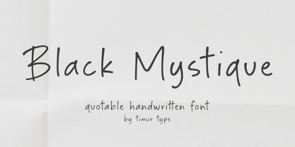 Introducing by Timur type Proudly Present, Black Mystique Black Mystique A Handwritten Font Black Mystique is perfect for product packaging, branding project, megazine, social media, wedding, or just used to express words above the background. Black Mystique also multilingual support. Enjoy the font.Thank you!
 - Kingdrops by Letterhend,
$19.00 Kingdrops is a cool script typeface. This font perfectly made to be applied especially in logo, and the other various formal forms such as invitations, labels, logos, magazines, books, greeting / wedding cards, packaging, fashion, make up, stationery, novels, labels or any type of advertising purpose.
 - Wallflowers by Laura Worthington,
$19.00 Create borders, wallpaper, or repeating patterns using Wallflower’s unique hand drawn wallpaper tiles and accompanying icons. Wallflowers are easy to use for borders or wallpaper: simply type the same letter consecutively (i.e., aaa) and the pattern will emerge. See what’s included! http://bit.ly/2bO0l3b
 - Alyrak by Konstantine Studio,
$16.00 ALYRAK is born from the anxiety of the future dystopia of the human race. The fear of Artificial Intelligence, robots, and technology that potentially invade living things. Represented in a font and visual to emulate the vibe every time you type it from your keyboard.
 - Majestic Jasmine by Timurtype,
$14.00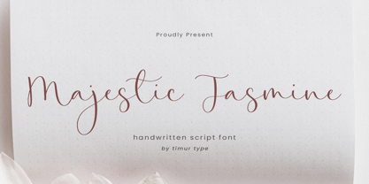 Introducing by Timur type Proudly Present, Majestic Jasmine Majestic Jasmine A Handwritten Font Majestic Jasmine is perfect for product packaging, branding project, megazine, social media, wedding, or just used to express words above the background. Majestic Jasmine also multilingual support. Enjoy the font.Thank you!
 - Stockville JNL by Jeff Levine,
$29.00 Stockville JNL is a total rebuild of the wood type design originally found in Arvada JNL. All angular lines were straightened to give the lettering a more classic look. Bold, brash and block style, this headline typeface is available in both regular and oblique styles.


