10,000 search results
(0.024 seconds)
- Diaria Sans Pro by Mint Type,
$- Diaria Sans Pro is a sans-serif counterpart of Diaria Pro. With its extensive 9 weights and corresponding italics, extensive language support, and various OpenType features it is meant to build visual heirarchies of any detail and complexity in editorial design. This modern sans-serif typeface designed as a universally legible medium for both titles and paragraph text. Its large x-height and static exteriors allow comfortable reading in printed narrow columns as well as in screen graphics. Some of the styles of Diaria Sans Pro can be found in Mint Type Editorial Bundle together with other fonts which make some great pairs. Check it out!
 - BOnuts by BOtype,
$29.00 BOnuts is a modern rounded sans built in 8 styles and crafted for you by BOtype. It's clean and minimal and modern rounded design gives you a wide array of uses such as branding, editorial & print, and also makes it perfect for UI & digital applications. We designed Bonuts to have the most legibility to give you a very versatile font family you use for any use you want. It includes Alternate Characters, Ligatures, Tabular Figures, Fractions, Numerators, Denominators, Superiors and Inferiors. It supports Central and Eastern European languages, basic Cyrillic and Greek. The type family consists of 8 weights (Thin, Light, Normal, Regular, Medium, Bold, Black and Heavy).
 - NorB Architect by NorFonts,
$35.00 NorB Architect fonts will add a beautiful architectural hand-lettering style to all your CAD project drawings. Architects have always wanted their CAD drawings to look more like they were drawn by hand, rather than by a CAD program. These AutoCAD fonts are the first step in bringing back that “artistic hand-drawn” feel to your CAD drawings or any graphic design project that can use true type fonts. NorB Architect is actually my emulation of architectural lettering, it comes with 4 weights: Medium, Regular, Semi Light and Bold along with their Condensed and Extra Condensed version. NOTE: For more variations of "NorB Architect" font please visit click on this link.
 - FF Clan by FontFont,
$68.99 Polish type designer Lukasz Dziedzic created this sans FontFont between 2006 and 2008. The family has 84 weights, ranging from Thin to Ultra in Compressed, Condensed, Narrow, Medium, Wide, and Extended (including italics) and is ideally suited for advertising and packaging, editorial and publishing, logo, branding and creative industries, poster and billboards, small text, wayfinding and signage as well as web and screen design. FF Clan provides advanced typographical support with features such as ligatures, small capitals, case-sensitive forms, fractions, super- and subscript characters, and stylistic alternates. It comes with a complete range of figure set options – oldstyle and lining figures, each in tabular and proportional widths.
 - Cannon by W Type Foundry,
$20.00 The Cannon family is the result of combining the clean aesthetics from a classic sans neo-grotesque with a touch of a geometric design. The result is a simple but dynamic typeface with retro and technological airs. Cannon is ideal for robust advertising, bold brand identities and packaging, also suitable for high impact headlines and short texts. This type family consists of 36 variants and 9 weights (thin, extra light, light, regular, book, medium, bold, extra bold, black), matching italics for all weights and widths, matching small caps for all weights and widths, alternate characters and extended language support. We are proud to introduce: Cannon.
 - Clarina Sans by Asritype,
$24.00 As the name, Clarina Sans is sans serif type family with two weight plus matching italics. Clarina Sans was desinged in 2018/19, influenced by geometrics typeface from handbook and newspapers in 80's during studying that have a good legibility. Clarina sans with medium to high x-heigh and geometric correction and smoothed corner has more elegant visibility, readable, and save space altogether. Its perfect for book, newspaper, web, logos, magazines, posters, and most other design. Equiped with more than 700 glyphs for eachs cut (latin plus, greek, cyrillic), ligatures, kerning, case sensitive for diacritical mark modifier, Clarina Sans has wide range languages coverage.
 - Galpike by Letterhend,
$17.00 Galpike Sans is a neat and clean variable font. The typeface is versatile to blend in your design- with 9 weight, ranging from regular, medium, thin, bold, semibold, extrabold, light, extralight and black & 18 styles + variable type to touch a lot of personality. Perfect anywhere you need a right finas touches for branding, publishing, titles, book, magazine , and use on UI/UX design. Features: Variable Font uppercase & lowercase numbers and punctuation multilingual 9 weight & 18 Style PUA encoded More about variable fonts : https://creativemarket.com/blog/what-is-a-variable-font if you have any questions don't hesitate to send our email at letterhend.com/tutorials/using-opentype-feature-in-any-software/
 - Rimbomba by Muykyta,
$13.00 Rimbomba is a freehand style font with long ascenders and descenders and a steep slant making it elegant yet casual. It is inspired by writing letters by hand, as it was done before, with strokes that in the normal style imitate the tip of a pen and in the medium and bold styles they imitate a round pen stroke. It is a font with strength in its movements and finesse in its curves, which creates a homogeneous set that is easy to read and which produces a certain reading speed. It is complemented with stylistic alternatives for the beginning and the end of the words.
 - Abdo Screen by Abdo Fonts,
$49.50 Abdo Screen is a very simple Naskh font for satellite channels, presentations, videos and advertisements. it comes in sixth weights Thin, Light, Regular, Medium, Bold and Black. This font also contains some of Stylistic Sets and Ligatures.
 - Celestine by Lunas Type,
$19.00 Introducing, Celestine! Celestine is a modern signature style handwritten font. Celestine comes with ending swashes to add charming feel. Just type "-" at the end of the letters to access swashes. Or you can access it via alternates option. Celestine is perfect for many design needs such as merch, T-shirts, logo, titles, wedding, book covers, social media posts, websites, events, and many more. What's you get : - Ending Swashes - Numeral & Punctuation. - Ligature. - Multilingual Support. Enjoy Designing! Thanks! Lunas Type
 - Heritage Signature by Lunas Type,
$19.00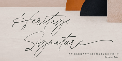 Introducing, Heritage Signature! Heritage Signature is a modern and stylish signature font. This Font have natural flow and unique shape for each letter. Heritage Signature is perfect for many design needs such as merch, T-shirts, signature logo, wedding, book covers, social media posts, websites, events, and many more. What’s you get : – Ending Swashes, beginning swashes, Love connector swashes. – Underline Swashes (just type _1, _2, etc) – Numeral & Punctuation. – ligature. – Multilingual Support. Enjoy Designing! Thanks! Lunas Type
 - Cassandre by Lunas Type,
$19.00 Introducing, Cassandre! Cassandre is a hairline and modern signature handwritten font. Cassandre comes with ending swashes to add charming feel. Just type "-" at the end of the letters to access swashes. Or you can access it via alternates option. Cassandre is perfect for many design needs such as merch, T-shirts, logo, titles, wedding, book covers, social media posts, websites, events, and many more. What's you get : - Ending Swashes - Numeral & Punctuation. - Ligature. - Multilingual Support. Enjoy Designing! Thanks! Lunas Type
 - Quadratish Serif by Gaslight,
$20.00 QuadratishSerif is an interesting ultra black type design with serif, that contains both solid and outlined lettering styles. A third design style can be created when combining the two styles over top of each other.
 - Bloomilife by Timurtype,
$14.00 Introducing by Timur type Proudly Present, Bloomilife Bloomilife A Handwritten Script Font Bloomilife is perfect for product packaging, branding project, megazine, social media, wedding, or just used to express words above the background. Bloomilife also multilingual support. Embelish your designs with our original fonts. Enjoy the font 😉 Thank you!
 - Madista Vintage by IM Studio,
$20.00 Madista Vintage is inspired by retro style combined with hand lettering style. Madista Vintage comes with OpenType features such as style switching, style sets & binders which are great for any type of logo, poster, badge, book cover, t-shirt design, handwritten quote, product packaging, header, poster, merchandise, social media & greeting cards.
 - Letikas Rose by Lumiks Design,
$15.00 Here's a delicate script font with fluid connection and authentic calligraphy, providing a high legibility and elegant design. Letikas rose includes Alternates and Ligatures, making the font more stylized. Perfect for Type-based creations, websites, signature logos, wedding invitations, social media, quotes, greetings and anything that needs a romantic touch.
 - Space Show by David Engelby Foundry,
$25.00 Space Show and tell. This font is the no-nonsense choice in your design of clear and big display typography for many types of media – infographics, websites, menu cards, posters, web banners, logo, signs etc. The font has ligatures, unique alternates, hybrid and oldstyle numerals – and specially designed subscripts and superscripts.
 - Skilaz by Krntype Studio,
$16.00 Skilaz is a modern and charming handbrushed font which has a detailed brush that makes a natural impression. Skilaz also come with underline swash (You can access it by typing 1-9). Skilaz can be placed in many design needs such as, merch, branding, packaging, social media, events, and many more.
 - Golden Estella by Timurtype,
$14.00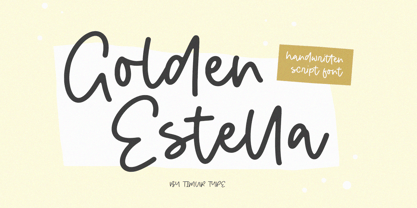 Introducing by Timur type Proudly Present, Golden Estella Golden Estella A Handwritten Script Font Golden Estella is perfect for product packaging, branding project, megazine, social media, wedding, or just used to express words above the background. Golden Estella multilingual support. Embelish your designs with our original fonts.Enjoy the font,Thank you!
 - NorB Sans Expanded by NorFonts,
$32.00 NorB Sans Expanded is my first sans serif font, it's a friendly smooth sans serif font with 3 weights: Regular, Medium and Bold each with italic version. It includes over 1000 glyphs + OpenType features (Access All Alternates, Small Capitals From Capitals, Case-Sensitive Forms, Discretionary Ligatures, Denominators, Fractions, Historical Ligatures, Kerning, Standard Ligatures, Localized Forms, Numerators, Ordinals, Small Capitals and Superscript.) This font would be perfect for both texts and titles, and pairs beautifully with other fonts already in your library, especially handwritten and serif fonts. The resultant texture is lively but not intrusive, and makes for a friendly and readable text. You may use it in everything from logotypes to social media posts, website and magazine layouts to poster designs.
 - ITC Quay Sans by ITC,
$41.99 London-based designer David Quay designed ITC Quay Sans in 1990. One of the precursors to the long run of functionalist European sans serif faces that has been a dominating force in type design since the 1990s, ITC Quay sans is based on the proportions of 19th Century Grotesk faces. Grotesk, the German word for sans serif, defines an entire branch of the sans serif movement, which culminated in the 1950s with the design of Helvetica. ITC Quay Sans is made up of very simple, legible letters. The weights of the strokes throughout the alphabet vary very little. Microscopic flares on the ends of each terminal add a bit of dimension to the design. This helps prevent the onset of the monotony, a danger when one repeats countless near mono-weight stroked letters throughout a large body of text. ITC Quay Sans is a very readable face; it works equally well in all sizes. Six fonts of the ITC Quay Sans typeface are available: Book, Book Italic, Medium, Medium Italic, Black, and Black Italic. ITC Quay Sans is similar to Hans Eduard Meier's Syntax, and Tim Ahrens' Linotype Aroma."
 - Ardentia by Asritype,
$19.00 Ardentia is a serif typeface, supporting a wide range of Latin based languages and Greek (see TechSpecs). Ardentia was created inspired by most serif text font used in book printing. Smooth curves help the flow for long text reading. Ardentia is designed with medium contrast in order to have all parts of the letter’s shape well printable in book size printing, for high or low resolution printers, high or low paper quality. Other than book printing, the medium contrast also gives good visibility in display thanks to its clearness. Thus, Ardentia will work well for both printing and display, webpage or electronic/digital display. Ardentia consist of 4 weights: Light, Regular, Semi-bold and Bold, plus matching italics. The thickness of the lowercases (vertical stem) of the regular font is drawn at about the middle of the thickness of similar kind (serif) and similar size fonts. So Ardentia is the right choice for both textbook and display altogether. Being a normal serif typeface, Ardentia is applicable to a wide range of usage. From book typing, news, magazines notes, cards, sticker texts, banners, to logos and the others design mean. Enjoy using Ardentia for your projects.
 - Sibylle by Hanoded,
$15.00 Sibylle is a handmade script font. I used a medium sized Japanese brush pen and coarse paper to create the ‘eroded’ effect. Sibylle comes with double letter ligatures and stylistic alternates for the o (plus all accented o’s).
 - Alipe Script by TeGeType,
$29.00 Alipe Script is a new script typefaces family. Alipe Script family has light, medium and bold fonts, all with ligatures, alternates and a set of ornaments. It can be used for text as well as for titling applications.
 - Diotima Classic by Linotype,
$29.99Diotima Classic is a total upheaval for the 21st century of Gudrun Zapf von Hesse's mid-20th-century Diotima, one of the most beautiful types ever cast in metal. Its roots lay in a calligraphic sheet written by Gudrun Zapf von Hesse. The text was the Hyperion to Diotima" by Friedrich Hölderlin; Diotima is the name of a Greek priestess in Plato's dialogue about love. In the philosopher's imagination, she should appear slim and beautiful. In 1948, Gudrun Zapf von Hesse finished the typeface's Roman. The Diotima family was released as a metal typeface for hand setting by D. Stempel AG in 1951-53. This original Diotima is a festive design particularly suited to invitations, programs, and poems. The delicate Italic drew attention to text passages that should be emphasized. Linotype's previous digital Diotima only had one weight, which looked great in display sizes, but was too thin for text setting. Diotima Classic has four weights. The new Regular has more robust serifs and thicker hairlines, making it more appropriate for text sizes. The Diotima variation with finer serif remains under the name Light. Gudrun Zapf von Hesse also took the opportunity in 2008 to add an extremely heavy weight to the family. In comparison to the old Diotima, letterforms of the Diotima Classic are more harmonious and balanced. The rhythm of the Italic letters in Diotima Classic is more consistent. The lining figures of the Diotima Classic align with caps, and the letter spacing of the tabular lining figures in Diotima Classic is significantly better. The forms of the figures have been improved as well." - Preto Semi OT Std by DizajnDesign,
$- Preto Semi is an experiment. It is an attempt to create a readable type for text point sizes (other than sans-serif and serif). Preto Semi is not a Sans with added serifs or Serif with serifs removed. The use of the serifs is redefined and used for other purpose(s). The serifs became the extension of the stroke, they help to solve the spacing problem of sans-serif types and they use the primary function of serifs – keeping the eye on the baseline and emphasize the horizontal rhythm of the lines of text. Preto Semi is intended for magazines and editorial design, as other members of Preto family. Preto is an extensive type family, which explores the function of serifs on readability and legibility. Preto consist of three subfamilies: Sans, Semi and Serif. Preto is designed for multilingual typesetting. All of the subfamilies have equal gray value but different texture which can be use to differentiate languages. Preto sub-families have two text weights and two bold styles (Regular -> Bold, Medium -> Black). Every weight has a companion Italic style as well.
 - User Stencil by DSType,
$30.00 User is a monospaced type family with 30 styles, from Hairline to Bold, divided in Regular, Upright and Stencil, with five weights (Hairline, ExtraLight, Light, Medium and Bold) all with Cameo versions. Complexity and versatility are the keywords for this type family. Despite being a monospaced font, which means there's no kerning, all the glyphs were designed in order to sit comfortably in the 600 points width, a hard task because some glyphs are too narrow ('i' and 'l'), while others are too wide ('m' and 'w'), but they must fit the same width. The desire for keeping a comfortable readability in User was one of the key elements, therefore we designed several ligatures that fit both single and double space width, allowing to maintain a certain idea of proportional design. In this digital booklet you will find a detailed vision of the anatomy of the typefaces, the amount of characters available, the styles and weights, along with a series of features, specially designed to make User a very versatile and usable type system.
 - User Upright by DSType,
$30.00 User is a monospaced type family with 30 styles, from Hairline to Bold, divided in Regular, Upright and Stencil, with five weights (Hairline, ExtraLight, Light, Medium and Bold) all with Cameo versions. Complexity and versatility are the keywords for this type family. Despite being a monospaced font, which means there's no kerning, all the glyphs were designed in order to sit comfortably in the 600 points width, a hard task because some glyphs are too narrow ('i' and 'l'), while others are too wide ('m' and 'w'), but they must fit the same width. The desire for keeping a comfortable readability in User was one of the key elements, therefore we designed several ligatures that fit both single and double space width, allowing to maintain a certain idea of proportional design. In this digital booklet you will find a detailed vision of the anatomy of the typefaces, the amount of characters available, the styles and weights, along with a series of features, specially designed to make User a very versatile and usable type system.
 - User by DSType,
$30.00 User is a monospaced type family with 30 styles, from Hairline to Bold, divided in Regular, Upright and Stencil, with five weights (Hairline, ExtraLight, Light, Medium and Bold) all with Cameo versions. Complexity and versatility are the keywords for this type family. Despite being a monospaced font, which means there's no kerning, all the glyphs were designed in order to sit comfortably in the 600 points width, a hard task because some glyphs are too narrow ('i' and 'l'), while others are too wide ('m' and 'w'), but they must fit the same width. The desire for keeping a comfortable readability in User was one of the key elements, therefore we designed several ligatures that fit both single and double space width, allowing to maintain a certain idea of proportional design. In this digital booklet you will find a detailed vision of the anatomy of the typefaces, the amount of characters available, the styles and weights, along with a series of features, specially designed to make User a very versatile and usable type system.
 - Preto Semi by DizajnDesign,
$24.00 Preto Semi is an experiment. It is an attempt to create a readable type for text point sizes (other than sans-serif and serif). Preto Semi is not a Sans with added serifs or Serif with serifs removed. The use of the serifs is redefined and used for other purpose(s). The serifs became the extension of the stroke, they help to solve the spacing problem of sans-serif types and they use the primary function of serifs – keeping the eye on the baseline and emphasize the horizontal rhythm of the lines of text. Preto Semi is intended for magazines and editorial design, as other members of Preto family. Preto is an extensive type family, which explores the function of serifs on readability and legibility. Preto consist of three subfamilies: Sans, Semi and Serif. Preto is designed for multilingual typesetting. All of the subfamilies have equal gray value but different texture which can be use to differentiate languages. Preto sub-families have two text weights and two bold styles (Regular -> Bold, Medium -> Black). Every weight has a companion Italic style as well.
 - Norwich Aldine ML by HiH,
$12.00 Norwich Aldine ML is a all-cap typeface with enlarged serifs, designed and produced in wood by William Hamilton Page of Norwich, Connecticut in 1872. Norwich Aldine ML is a fine example of the strength of decorative wood types: large, simple type forms that provide the visual boldness sought by advertisers of the Victorian period. While our marketing has gotten so very sophisticated, there is always a place for a simple, visually strong typeface. Although about 14 miles inland, Norwich, Connecticut lies at the head of the Thames River. The river is both wide and deep, and therefore was not bridged in the early 20th century. Until then, if you wanted to get from Groton on the west bank to the whaling port of New London on the east bank by land, you had to go by way of Norwich. Because of its size, the Thames is navigable all the way from Norwich to New London. Docks were built in Norwich around 1685 and the city became Connecticut’s 2nd largest port by 1800. With the construction of the Norwich & Worcester Railroad in 1835, Page could easily ship his wood type north by rail or south by coastal schooner. Included with our font, Norwich Aldine ML, are two 19th century printer’s ornaments of sailing ships similar to those that sailed up the Thames to Norwich. Reference: Moon’s Handbooks, Connecticut 2nd Edition (Emeryville CA 2004) The family has expanded from one to four fonts: 1. Norwich Aldine ML: the concept font, computer-sharp corners and smooth curves, as we imagine it was designed. 336 Glyphs including some reduced-width alternatives for better letter spacing. 2. Norwich Aldine Worn ML: the way actual wooden type would look after have been used for a while. 332 Glyphs 3. Norwich Aldine Distressed ML: the way the wooden type would look after it had really been used, perhaps abused. Alternatives to the more popular letters reflect the damage that typically occurs on a well-wormn font, with nicks, cuts and scratches and the overall wear that reduces the overall height and leads to uneven inking due to varying heights in the chase. A couple of bullets look like bullet holes. 345 glyphs. 4. Norwich Aldine Cyrillic: Cyrillic includes alll English and Cyrillic letters for MS Windows Code Page 1251, ISO 8859-5 and MacOS Cyrillic. 235 glyphs. We did Cyrillic because is was fun and we felt the basic design cried out for Cyrillic. While obviously subjective, we hope you will agree.
 - Zauberer by Scriptorium,
$24.00The Scriptorium got its start in the early days of personal computers with a few font designs for the Commodore 64, and the very first font which we did back then in the early 1980s was a gothic calligraphy font. That style of fonts - the medieval, gothic and black letter genre - has always been the backbone of our collection, but with recent releases we've stayed away from them to introduce a bit more variety. Well, with our new Zauberer font the antique, medieval and gothic look is back with a vengeance. Zauberer isn't a true medieval calligraphy style. It's based on early printed type from Germany which combines calligraphic elements with decorative embellishments from the woodcut printing era. The result is decorative and antique looking and rather appealing. The name comes from the German word for a magician or illusionist. - Monterchi by Zetafonts,
$39.00 In 1459, while visiting his dying mother, Italian painter Piero della Francesca spent seven days creating a fresco of a pregnant madonna in a small country church in the hilltown of Monterchi (Italy). Hailed today as one of the masterpieces of Italian Renaissance, the fresco was given a new branding in 2019 by Art Director Riccardo Falcinelli who asked the Zetafonts team to develop a custom font for the project. The resulting typeface system, designed by Cosimo Lorenzo Pancini together with Andrea Tartarelli and Maria Chiara Fantini as a rework of Francesco Canovaro original Beatrix Antiqua, is a 50-weights ode to the beauty of classical roman letterforms, that pairs elegant alternates and quirky ligatures with an array of design options for clear and effective editorial, signage, logo and wayfinding design. The base display family, Monterchi, allows endless design expressions with a range of six weights from the slender thin to the strong extrabold, all with matching italics and an array of over one hundred discretionary ligatures. A fine-tuned companion Monterchi Text has been developed to excel in body use, with a larger x-height and wider spacing - clear and legible even at small sizes. The use range of the family is enriched by Monterchi Serif and Monterchi Sans that feature different contemporary interpretations of the same classical geometric skeleton, allowing for layered editorial design and variation. All the fifty fonts in the Monterchi Type System feature an extended character set of over 1100 glyphs covering over 200 languages using the Latin alphabet, as well as Greek and Russian Cyrillic. Open Type features include small caps, positional figures, alternate letterforms, stylistic sets and discretionary ligatures. With his elegant, historical aesthetic, Monterchi embodies the spirit of early Renaissance and the humanist obsession with constructed and geometric beauty - still managing to function as a workhorse family, ready to help any designer in need of a timeless classic look, or looking for the right ligature to transform a simple word into a striking wordmark.
 - Strima by Nicolas Deslé,
$24.90 Strima is a geometric sans serif typeface that stands for minimalism and legibility. With over 1000 glyphs and extensive language support Strima offers full professional typographic features. The Strima family consists of 4 weights: light, book, medium and bold.
 - Al Embryotic by Aluyeah Studio,
$99.00 Bonjour! Embryotic is a mystical display font. This font was carefully crafted and inspired by world top fashion brand. In general, it creates a luxurious and elegant look in design. Coming to you with 90+ luxury alternate to create a perfectly mystical, beautiful, classy, elegant design. Use this font for your fashion brand, resort, cosmetics, invitations, wedding, branding, packaging, magazines, boutique, social media, restaurant, spa, greeting cards, headers, headline and many more. Features: OpenType support Multilingual support (15 languages) PUA Encoded Super Easy to Use alternates - It's OpenType support but you can easily call alternates character using special combination like A.2 B.4 h.3 etc. so you don't need special software. To get results like the preview just type E.4mb.2ryot.3ic
 - Fifth Reign by Mans Greback,
$59.00 Fifth Reign is a decorative medieval typeface. This wonderful typeface of brings us to the golden times of epic knight sagas. Fifth Reign is the typeface of a Royal House, of vikings, kings and queens. Use it for a Middle Ages game, a fantasy headline, or as a logotype for anything of historical theme. With usage in any modern software, the letters will automatically overlap and embrace in an elegant way. To make heraldic symbols, copy these icons: 🐉 🐎 👑 🗡 🦁 🦅 🦌 + ♖ × ✝ ⚓ * ⚔ † ‡ Alternatively write %A %B %C ... etc to create the heraldry. (Download required.) Dragon, Horse, Crown, Sword, Eagle, Deer, Cross, Anchor are some of the logos. The Fifth Reign family consists of three styles: The weights Thin, Bold and Medium, made to balance against each other and allow for usage in any scale. The font is built with advanced OpenType functionality and has a guaranteed top-notch quality, containing stylistic and contextual alternates, ligatures and more features; all to give you full control and customizability. It has extensive lingual support, covering Greek and Cyrillic, as well as all Latin-based languages, from North Europe to South Africa, from America to South-East Asia. It contains all characters and symbols you'll ever need, including all punctuation and numbers.
 - Blaze Stanley by Ditatype,
$29.00 Blaze Stanley is a casual, fun handwritten font, created by using a brush pen. Clean and a little bit quirky, this font is the perfect fit for all of your logos, branding, social media, and crafty DIY projects. Featured : Accents (Multilingual characters) PUA encoded Numerals and Punctuation (OpenType Standard) Full Support Dita Type
 - Magical Vintage by Gloow Studio,
$19.00 Magical Vintage Font - Retro 70's Script Style. It comes with open type features like style alternatives, style sets, contextual alternatives & binders. This Retro styled font will help you create amazing designs. It offers beautiful typographic harmony for a wide variety of design projects, including logos & branding, social media posts, advertising & product designs.
 - Barriton Paradise by Timurtype,
$24.00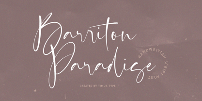 Introducing by Timur type Proudly Present, Barriton Paradise Barriton Paradise A Handwritten Script Font Barriton Paradise is perfect for product packaging, branding project, megazine, social media, wedding, or just used to express words above the background. Barriton Paradise also multilingual support. Embelish your designs with our original fonts.Enjoy the font,Thank you!
 - Electrical Tape by PBinns,
$20.00 Electrical Tape is a mono-case display type. The idea came from generating custom letters using pieces of electrical tape. The over all design was then influenced by the graffiti subgenre as well as a hint of constructivist influence. Recommended applications of the font are for display purposes as well as digital media.