10,000 search results
(0.077 seconds)
- Nindia by Phoenix Group,
$13.00 Nindia font is a font that was created based on the idea of beauty and elegance, with a modern and millimistic form, making Nindia font suitable for use in feminine design types.
 - Sabrosa by JAM Type Design,
$16.00 This display type family was developed with large headlines in mind. While the fonts work will at large size, they are not overbearing and get the point across without being too “shouty”.
 - Rounded Sans Wood JNL by Jeff Levine,
$29.00 Examples of a wood type alphabet for letterpress are the basis for Rounded Sans Wood JNL. Clean and bold, the rounded ends give a softer, more informal look to any display copy.
 - Cattle Drive JNL by Jeff Levine,
$29.00 Cattle Drive JNL is based on some examples of a classic condensed wood type. Lettering of this period lends itself well to themes of Western life, carnivals, circuses or classic broadside posters.
 - Coffee Beans Time by TypoGraphicDesign,
$9.00 The typeface Coffee Beans Time is designed from 2018–2022 for the font foundry Typo Graphic Design by Manuel Viergutz and Annelena Grascht as a graphic design and photography project. The display font based on the original coffee beans and create a dingbat pattern. 3 font-styles (Dingbats, Mix, Coffee Ground) with 304 glyphs (Adobe Latin 2) incl. decorative extras like icons, arrows, dingbats, emojis, symbols, geometric shapes (type the word #LOVE for ♥︎ or #SMILE for ☺ as OpenType-Feature dlig) and stylistic alternates (2 stylistic sets). For use in logos, magazines, posters, advertisement plus as webfont for decorative headlines. The font works best for display size. Have fun with this font & use the DEMO-FONT (with reduced glyph-set) FOR FREE! ■ Font Name: Coffee Beans Time ■ Font Styles: 3 (Dingbats, Mix, Ground) + DEMO (with reduced glyph-set) ■ Font Category: Display for headline size ■ Glyph Set: 304 glyphs (Adobe Latin 2) incl. extras like icons (decorative extras like arrows, dingbats, emojis, symbols) ■ 93 languages: Afrikaans Albanian Asu Basque Bemba Bena Breton Catalan Chiga Cornish Danish Dutch English Estonian Faroese Filipino Finnish French Friulian Galician German Gusii Indonesian Irish Italian Kabuverdianu Kalenjin Kinyarwanda Luo Luxembourgish Luyia Machame Makhuwa-Meetto Makonde Malagasy Manx Morisyen North Ndebele Norwegian Bokmål Norwegian Nynorsk Nyankole Oromo Portuguese Quechua Romansh Rombo Rundi Rwa Samburu Sango Sangu Scottish Gaelic Sena Shambala Shona Soga Somali Spanish Swahili Swedish Swiss German Taita Teso Uzbek (Latin) Volapük Vunjo Welsh Western Frisian Zulu ■ Design Date: 2018–2022 ■ Type Designer: Manuel Viergutz und Annelena Grascht
 - Technical SCRIPTURE by MMC-TypEngine,
$19.00 ‘Technical Scripture’ 2015-2021 A manuscript look, Pixel labyrinthine Display Type System… Plus, an Optical “Layered Game”, Retro Futuristic Sci-Fi Digital interface evolving placeholder… Now with 3D Styles! It was designed as a pair to its brother font ‘Technical Signature’ a Small Caps Font, both inspired by antique Greek, mosaics zig-zag ornaments “ancient times computer” intentionally as a Romanic variation with same metrics... Searching for Technical Solutions, it resulted in many combined styles by matching the primary ones so there’s plenty variations for multi-purpose texting like layered typesetting or simply monochromatic designs… Plus got accurate streaming resolution, therefore some sub-families like Stamp and Texture implicates greater points for minimum size as Regular and Light is appropriated to Small Optical Text reductions. *The New 3’s Upgraded Edition Improvements consisted of Correct ‘Font Info’ (verified data-debugging) rescaled glyphs, quick design review, better style linking with correspondent renamed fonts, addition of automatic OT features encoding, 3D Styles and Italics. Ps. This actual Typeface was quickly re-edited for technical reasons and hasn’t yet reached the intended design, it will soon receive a more tangible redesign upgrade, mainly in lowercases to enhance cursive style. Due to other priorities. Tip: Give preference to THE LYSERGIC UPPERCASES! Multilanguage Support: Western & Eastern European, Baltic, Turkish, Greek, and Cyrillic. This Type is pleasant to Technician Compositions, Such as Briefs layouts manuscript, Old Engineering & Crafts Logos or Support Text, Op-Art Posters, Stamps, Labels, movies and Cartoons Ludic Scripts, sites and of course Video Games! Try ‘Technical Scripture’ & Have some Power to the Pixel! Padang!
 - Arabetics Harfi by Arabetics,
$59.00 Arabetics Harfi is a Latin Serif typeface with a comprehensive support for the Arabetic scripts, including Quranic texts. Careful spacing and kerning was used to enhance resulting text legibility both scripts. Arabetics Harfi fully supports MS 1252 Western and 1256 Arabic code pages, in addition to all transliteration characters required by the ALA-LC Romanization tables. Users can either select an accented character directly or form it by keying the desired combining diacritic mark following an unaccented character. For Arabic, it fully supports Unicode 6.1, and the latest Arabic Supplement and Extended-A Unicode blocks. The Arabic design of this font family follows the Mutamathil Taqlidi type style with connected glyphs, but it emphasizes a horizontal look and feel rather than verticalone, utilizing slightly varying x-heights. The Mutamathil Taqlidi type style uses one glyph per every basic Arabic Unicode character or letter, as defined by the Unicode Standards, and one additional final form glyph, for each freely-connecting letter of the Arabic cursive text. Arabetics Harfi includes the required Lam-Alif ligatures in addition to all vowel diacritic ligatures. Soft-vowel diacritic marks (harakat) are selectively positioned with most of them appearing on similar high and low levels—top left corner—, to clearly distinguish them from the letters. Tatweel is a zero-width glyph. Arabetics Harfi includes both Arabic and Arabic-Indic numerals, in addition to generous number of punctuation and mathematical symbols. It includes two weights, regular and bold, each of which has normal, right slanted Italic, and left-slanted styles.
 - Bex Script by The Ampersand Forest,
$35.00 Bex Script is a riff on traditional French script forms: the Bâtarde, the Ronde, and the Coulée. It has two versions: First, there’s La Belle, a straightforward, lovely interpretation of the script form, suitable for things like invitations, poetry and branding. La Belle’s evil twin is La Bête, a more whimsical (and considerably more hairy) version, great for anything that requires an elegant-but-beastly feel. Bex is surprisingly versatile! With three optional capital forms (Swash, Caps, and Small Caps) all taller than the x-height, Bex has a variety of voices. A full small cap set and a full set of Swash Caps, plus a large complement of alternates, initial forms, terminal forms, and ligatures makes it customizable and… well, FANCY! Additionally, both versions of Bex Script have a set of ten ornament glyphs. La Belle has a combination of fleurons on a culinary theme and symbols of France. La Bête has ten pseudoheraldic beasts that would feel at home at the top center of any whimsical letterhead. NOTE: A few years ago in Paris, I was lucky enough to stop at the Librairie Paul Jammes in St Germain-des-Prés, where I bought a turn-of-the-19th-century signature from a Type Specimen of the printer Joseph Gaspard Gillé. The irregularity of his script types — particularly the ones at smaller sizes, like the Cicéro — was very intriguing. They seemed to blend the Ronde with some elements of the Bâtarde and Coulée. And they, along with the work of French master penman Louis Rossignol, gave Bex Script its initial form.
 - Areplos by Storm Type Foundry,
$53.00To design a text typeface "at the top with, at the bottom without" serifs was an idea which crossed my mind at the end of the sixties. I started from the fact that what one reads in the Latin alphabet is mainly the upper half of the letters, where good distinguishableness of the individual signs, and therefore, also good legibility, is aided by serifs. The first tests of the design, by which I checked up whether the basic principle could be used also for the then current technology of setting - for double-sign matrices -, were carried out in 1970. During the first half of the seventies I created first the basic design, then also the slanted Roman and the medium types. These drawings were not very successful. My greatest concern during this initial phase was the upper case A. I had to design it in such a way that the basic principle should be adhered to and the new alphabet, at the same time, should not look too complicated. The necessary prerequisite for a design of a new alphabet for double-sign matrices, i.e. to draw each letter of all the three fonts to the same width, did not agree with this typeface. What came to the greatest harm were the two styles used for emphasis: the italics even more than the medium type. That is why I fundamentally remodelled the basic design in 1980. In the course of this work I tried to forget about the previous technological limitations and to respect only the requirements then placed on typefaces intended for photosetting. As a matter of fact, this was not very difficult; this typeface was from the very beginning conceived in such a way as to have a large x-height of lower-case letters and upper serifs that could be joined without any problems in condensed setting. I gave much more thought to the proportional relations of the individual letters, the continuity of their outer and inner silhouettes, than to the requirements of their production. The greatest number of problems arose in the colour balancing of the individual signs, as it was necessary to achieve that the upper half of each letter should have a visual counterbalance in its lower, simpler half. Specifically, this meant to find the correct shape and degree of thickening of the lower parts of the letters. These had to counterbalance the upper parts of the letters emphasized by serifs, yet they should not look too romantic or decorative, for otherwise the typeface might lose its sober character. Also the shape, length and thickness of the upper serifs had to be resolved differently than in the previous design. In the seventies and at the beginning of the eighties a typeface conceived in this way, let alone one intended for setting of common texts in magazines and books, was to all intents and purposes an experiment with an uncertain end. At this time, before typographic postmodernism, it was not the custom to abandon in such typefaces the clear-cut formal categories, let alone to attempt to combine the serif and sans serif principles in a single design. I had already designed the basic, starting, alphabets of lower case and upper case letters with the intention to derive further styles from them, differing in colour and proportions. These fonts were not to serve merely for emphasis in the context of the basic design, but were to function, especially the bold versions, also as independent display alphabets. At this stage of my work it was, for a change, the upper case L that presented the greatest problem. Its lower left part had to counterbalance the symmetrical two-sided serif in the upper half of the letter. The ITC Company submitted this design to text tests, which, in their view, were successful. The director of this company Aaron Burns then invited me to add further styles, in order to create an entire, extensive typeface family. At that time, without the possibility to use a computer and given my other considerable workload, this was a task I could not manage. I tried to come back to this, by then already very large project, several times, but every time some other, at the moment very urgent, work diverted me from it. At the beginning of the nineties several alphabets appeared which were based on the same principle. It seemed to me that to continue working on my semi-finished designs was pointless. They were, therefore, abandoned until the spring of 2005, when František Štorm digitalized the basic design. František gave the typeface the working title Areplos and this name stuck. Then he made me add small capitals and the entire bold type, inducing me at the same time to consider what to do with the italics in order that they might be at least a little italic in character, and not merely slanted Roman alphabets, as was my original intention. In the course of the subsequent summer holidays, when the weather was bad, we met in his little cottage in South Bohemia, between two ponds, and resuscitated this more than twenty-five-years-old typeface. It was like this: We were drinking good tea, František worked on the computer, added accents and some remaining signs, inclined and interpolated, while I was looking over his shoulder. There is hardly any typeface that originated in a more harmonious setting. Solpera, summer 2005 I first encountered this typeface at the exhibition of Contemporary Czech Type Design in 1982. It was there, in the Portheim Summer Palace in Prague, that I, at the age of sixteen, decided to become a typographer. Having no knowledge about the technologies, the rules of construction of an alphabet or about cultural connections, I perceived Jan Solpera's typeface as the acme of excellence. Now, many years after, replete with experience of revitalization of typefaces of both living and deceased Czech type designers, I am able to compare their differing approaches. Jan Solpera put up a fight against the digital technology and exerted creative pressure to counteract my rather loose approach. Jan prepared dozens of fresh pencil drawings on thin sketching paper in which he elaborated in detail all the style-creating elements of the alphabet. I can say with full responsibility that I have never worked on anything as meticulous as the design of the Areplos typeface. I did not invent this name; it is the name of Jan Solpera's miniature publishing house, in which he issued for example an enchanting series of memoirs of a certain shopkeeper of Jindrichuv Hradec. The idea that the publishing house and the typeface might have the same name crossed my mind instinctively as a symbol of the original designation of Areplos - to serve for text setting. What you can see here originated in Trebon and in a cottage outside the village of Domanín - I even wanted to rename my firm to The Trebon Type Foundry. When mists enfold the pond and gloom pervades one's soul, the so-called typographic weather sets in - the time to sit, peer at the monitor and click the mouse, as also our students who were present would attest. Areplos is reminiscent of the essential inspirational period of a whole generation of Czech type designers - of the seventies and eighties, which were, however, at the same time the incubation period of my generation. I believe that this typeface will be received favourably, for it represents the better aspect of the eighties. Today, at the time when the infection by ITC typefaces has not been quite cured yet, it does absolutely no harm to remind ourselves of the high quality and timeless typefaces designed then in this country.In technical terms, this family consists of two times four OpenType designs, with five types of figures, ligatures and small capitals as well as an extensive assortment of both eastern and western diacritics. I can see as a basic text typeface of smaller periodicals and informative job-prints, a typeface usable for posters and programmes of various events, but also for corporate identity. Štorm, summer 2005 - Phola Slab by RainBomb Studio,
$16.00 This modern slab serif typeface expands on the phola type family and complements it's siblings with style. Phola is a geometric san-serif display type family. It consists of 64 fonts and includes an extensive character set and multilingual support. Crafted with love this font family offers a numerous styles (Regular, Solid, Square, Diablo, Oblique, Outline, Clean) the family allows for extensive use cases. This OpenType font offer a fantastic options for users to create some unique artwork. Perfect for branding, Logos, displays, posters and other related projects.
 - Maus by Sentinel Type,
$10.00A heavy duty block-shadow font derived from Sentinel Sten Type, Maus' inflexible, near-featureless block-like shapes give the impression of great mass and solidity. Maus is an example of minimalism in type design, using a minimum of sculpting to elicit the essence of familiar Latin forms. Two sets of complimentary letters allow designers to pick and choose combinations for letter fit, for their symmetric values, or to create a particular look or feel to suit the subject. Obviously Maus has great potential for signage, posters and billboards, and screen-printed garments. - Arwidie by Letterhend,
$16.00 Arwidie is a monoline script with a casual and classic theme. This type of font perfectly made to be applied especially in logo, headline, signage and the other various formal forms such as invitations, labels, logos, magazines, books, greeting / wedding cards, packaging, fashion, make up, stationery, novels, labels or any type of advertising purpose. Features : Uppercase & lowercase Numbers and punctuation Alternates & Ligatures Multilingual PUA encoded We highly recommend using a program that supports OpenType features and Glyphs panels like many of Adobe apps and Corel Draw, so you can see and access all Glyph variations.
 - Bulbatail by Letterhend,
$14.00 Introducing, Bulbatail - a cute hand writing with casual looks. This type of font perfectly made to be applied especially in logo, and the other various formal forms such as invitations, labels, logos, magazines, books, greeting / wedding cards, packaging, fashion, make up, stationery, novels, labels or any type of advertising purpose. Features : uppercase & lowercase numbers and punctuation multilingual PUA encoded We highly recommend using a program that supports OpenType features and Glyphs panels like many of Adobe apps and Corel Draw, so you can see and access all Glyph variations.
 - Braleno by Letterhend,
$19.00 Introducing, Braleno - a condensed brush typeface. This type of font perfectly made to be applied especially in headlines which is need a standout font, and the other various formal forms such as invitations, labels, logos, magazines, books, greeting / wedding cards, packaging, fashion, make up, stationery, novels, labels or any type of advertising purpose. Features : numbers and punctuation multilingual PUA encoded We highly recommend using a program that supports OpenType features and Glyphs panels like many of Adobe apps and Corel Draw, so you can see and access all Glyph variations.
 - Sadness by Floodfonts,
$29.00 Sadness is based on some experiments during Felix Braden’s stay at the Trier College of Design: "I played around with Fontographer’s blendfonts-feature (a type design tool to interpolate fonts and to minimize effort and expenditure of large families) with some files from a close designer. Since the basic elements derived from extremely varied fonts without any similarities, the concluding shapes first turned out to be rather fragmentary. From those fragments I chose the most characteristic elements and drew a whole new font." For a detailed type specimen have a look at: http://on.be.net/1CdAZlC
 - MFC Voyeur Monogram by Monogram Fonts Co.,
$24.95 The source of inspiration for Voyeur Monogram is the 1934 "Book of American Types" by American Type Founders. Found in that specimen book was a charmingly sophisticated diagonal monogram alphabet known as “Broadway Monogram Initials”. This wonderful typeface is now digitally recreated, revived, and updated for modern use. Download and view the MFC Voyeur Guidebook if you would like to learn a little more. MFC Voyeur comes complete with Pro format fonts. You will require with programs that can take advantage of OpenType features contained within the Pro fonts.
 - Antique Trove by Letterhend,
$16.00 Antique Trove is a classic display font. This type of font perfectly made which is need a standout font, and the other various formal forms such as invitations, labels, logos, magazines, books, greeting / wedding cards, packaging, fashion, make up, stationery, novels, labels or any type of advertising purpose. Features : Lowercase & uppercase Numbers and punctuation multilingual ligatures PUA encoded We highly recommend using a program that supports OpenType features and Glyphs panels like many of Adobe apps and Corel Draw, so you can see and access all Glyph variations.
 - Bluebell by Fenotype,
$35.00 Bluebell is a modern script type family in the style of copperplate calligraphy. It comes with six weights from extra light to extra bold, all of them maintaining the distinct high contrast. Rich with Open Type features, Bluebell includes Swash & Stylistic alternates, automatic ligatures, old style figures and small caps that work as stand-alone font as well. Each font also comes with a set of ornaments that are found in the glyph palette. Bluebell makes for an elegant, iconic display letter for packaging, books, posters and the like.
 - Blooming Bluster by Letterhend,
$19.00 Blooming Bluster is a textured Sans Serif typeface. This type of font perfectly made to be applied especially in headlines which is need a standout font, and the other various formal forms such as invitations, labels, logos, magazines, books, greeting / wedding cards, packaging, fashion, make up, stationery, novels, labels or any type of advertising purpose. Features : Solid version numbers and punctuation multilingual ligatures PUA encoded We highly recommend using a program that supports OpenType features and Glyphs panels like many of Adobe apps and Corel Draw, so you can see and access all Glyph variations.
 - Stacylia by Letterhend,
$19.00 Introducing, Stacylia - a bold handwritten script typeface. This type of font perfectly made to be applied especially in logo, and the other various formal forms such as invitations, labels, logos, magazines, books, greeting / wedding cards, packaging, fashion, make up, stationery, novels, labels or any type of advertising purpose. Features : uppercase & lowercase numbers and punctuation multilingual alternates and ligatures PUA encoded We highly recommend using a program that supports OpenType features and Glyphs panels like many of Adobe apps and Corel Draw, so you can see and access all Glyph variations.
 - Vottela by IKIIKOWRK,
$17.00 Introducing Vottela - Feminine Type, created by ikiiko. Vottela is a traditional serif typeface with many unique decorative features. You can choose the type of decoration that suits what you need. Vottela also have bold font characters with elegant and feminine shapes. This typeface is perfect for an elegant logo, branding, wedding, invitation, layout magazine, home & decor layout, beauty product, packaging product, quotes, or simply as a stylish text overlay to any background image. What's included? Uppercase & Lowercase Number & Punctuation Swashes & Ligature Multilingual Support Format File : TTF & OTF Works on PC & Mac Enjoy our font, Cheers!
 - Martinelli by Mazkicibe,
$12.00 Luis Martinelli Serif and Script Font is Beautyful Serif and Script modern font combined with a sweet touch and beautifully curved each letter. Equipped with stunning character alternatives to make your design more strikin. using a touch of soft curves so that it is pleasing to the eye. Luis Martinelli Font is great for: Wedding invitations, fashion, magazines, logos, signatures, and suitable for watermark. photography, branding, merchandise and so on. Type and type now to pour your creative ideas.... Features: Uppercase, Lowercase, Numeral, Punctuation, Multilingual, Alternates, Ligatures & PUA Encoded. Obtained file format: Otf, Ttf
 - Blue Jones by Letterhend,
$19.00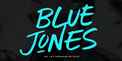 Introducing, Blue Jones - a display brush typeface. This type of font perfectly made to be applied especially in headlines which is need a standout font, and the other various formal forms such as invitations, labels, logos, magazines, books, greeting / wedding cards, packaging, fashion, make up, stationery, novels, labels or any type of advertising purpose. Features : numbers and punctuation multilingual ligatures PUA encoded We highly recommend using a program that supports OpenType features and Glyphs panels like many of Adobe apps and Corel Draw, so you can see and access all Glyph variations.
 - ITC Mudville by ITC,
$29.99ITC Mudville was Christopher Wolff's entry in the 1998 U&lc Type Design Competition, for which he won an Honorable Mention (Display). Mudville evolved from variations on hand-lettering that Wolff had done on a variety of projects over the years. The underlying shapes of the letters are formal roman letterforms, but the actual strokes retain the look of letters sketched casually on a layout. Mudville straddles the line between inline and outline type designs. It recalls some of the styles of popular lettering used in display advertising in the '20s. - Greybridge by Letterhend,
$19.00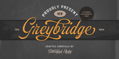 Introducing, Greybridge - Classic Calligraphy Typefce. This type of font perfectly made to be applied especially in logo, and the other various formal forms such as invitations, labels, logos, magazines, books, greeting / wedding cards, packaging, fashion, make up, stationery, novels, labels or any type of advertising purpose. Features : uppercase & lowercase numbers and punctuation multilingual alternates and swashes PUA encoded We highly recommend using a program that supports OpenType features and Glyphs panels like many of Adobe apps and Corel Draw, so you can see and access all Glyph variations.
 - Emporia JNL by Jeff Levine,
$29.00 Emporia JNL is a wonderfully decorative and vintage wood type named for a city in Kansas, and modeled from just a dozen images of individual type blocks spotted for auction online. The release of this typeface is also a milestone for Jeff Levine Fonts. The foundry started in January, 2006 with only ten releases, and has now grown to be an impressive library of unique lettering designs from the past. The collection also contains numerous original and novelty creations. Emporia JNL is proudly released as the 500th font design to join this extensive library.
 - Zosimo Pro by Delicious Type,
$49.00 Zosimo is a neo-grotesque typeface created by designer Ron Gilad (Delicious Type) in cooperation with renowned typographer Oded Ezer based on his ubiquitous Alchemist typeface. Carefully drawn curves, robust shapes and a range of OpenType features make Zosimo a great choice for designing logotypes, signage, titling, texts and more. Zosimo now comes in three families: Standard (full Latin support), Cyrillic (basic Latin and Cyrillic) and Pro (all included). Totalling in 9 weights, roman and italic, Zosimo can accommodate all your type-related design needs in one big happy family.
 - Ryman Gothic by W Type Foundry,
$25.00 Ryman Gothic is inspired by American Wood Types and Gothic Typefaces, mainly in the work of Edwin Allen and Morris Fuller Benton. The result is a hybrid combining gothic proportions with the contrast of wood types. While drawing consonants guided by gothic proportions, vowels were designed slightly wider, making them not only more legible when it comes to long text designs, but also more attractive. Ryman Gothic comes in 8 weights plus its matching italics, ranging from Thin to Heavy. Each weight includes extended language support (Latin + Cyrillic + Greek), ligatures, arrows and more.
 - String Theory by Ampersand Type Foundry,
$20.00 String Theory has been a 10+ year project in the making which originated from a type workshop in Graduate School at Otis College of Art & Design. The workshop was hosted by Dutch designer Hansje Van Halem, and we were tasked to play with string to create letterforms. Thus String Theory was born, and slowly migrated from yarn, to an illustrator file, to what it is today as a type family. Each glyph has it’s own custom string set up, along with each weight. Experimental in nature, edgy, with subliminal angst and grittiness.
 - Breakshot by Letterhend,
$14.00 Break Shot is a bold display sans font. This type of font perfectly made which is need a standout font, and the other various formal forms such as invitations, labels, logos, magazines, books, greeting / wedding cards, packaging, fashion, make up, stationery, novels, labels or any type of advertising purpose. Features : regular & stamp numbers and punctuation multilingual ligatures PUA encoded We highly recommend using a program that supports OpenType features and Glyphs panels like many of Adobe apps and Corel Draw, so you can see and access all Glyph variations.
 - Stubby by Tipos Pereira,
$12.00 Stubby is a display type family with 11 styles, was made for titles, headlines and also packages, posters and everything that provide space for a rude, fat and widish type. You should try Stubby in your text blocks if you're looking for an informal shape with some handwriting taste, there are eleven styles mixing from a narrowed thin to a sloppy ultrabold. Stubby has a tight spacing made to fit in squeeze places, not so elegant or clean but definitely an original choice for your real life project.
 - Linotype Compendio by Linotype,
$40.99Linotype Compendio is a part of the Take Type Library, chosen from the contestants of the International Digital Type Design Contests from 1994 and 1997. Christian Bauer designed this font based on the basic forms of Transitional faces of the 17th century. The outer contours of the letters are purposely raw and irregular, much like alphabets printed on low-quality paper. The legibility of the font is thus reduced, making it necessary to use this font only for shorter texts or headlines, but it is exactly this characteristic which lends Linotype Compendio its distinctiveness. - AggressIan by Hackberry Font Foundry,
$13.95 AggressIan is the release of the first font I ever drew. It was done by hand with triangle and parallel rule back in the mid-1980s. I originally called it Aggressor, but I never liked it. My local type designer friend, Ian Roberts, really likes this type of drawing and told me I had to release it. So I named it after him. The small caps should work well if you need a bolder version. It has oldstyle and lining figures, plus the small cap figures. I hope you like it.
 - Orleen Arabic by Zaza type,
$24.00 Orleen is an Arabic typeface from Lina type family, with an elegant and modern feeling. It's luxurious, strong, legible, Clear, Simple, and contemporary. With a handful set of OpenType features and alternatives. The design is inspired by the Kufic calligraphic style and influenced by the Naskh style. Lina type family consists of Lina soft, Lina sans, Lina round. and Orleen. Orleen has a wide range of use possibilities headlines, logotypes, branding, books, magazines, motion graphics, and use on the web and Tv. Orleen consists of 7-weight versions from thin to bold.
 - Romany by Ascender,
$50.99 The Romany™ typeface family is a delightful typographic confectionary that will bring affability and charm to both print and interactive design projects. Be it an online game, digital app, hardcopy packaging, or larger than life poster, Romany will deliver. When first designed by A.R. Bosco for American Type Founders in 1934, Romany was a single weight design. Relatively popular as hand-set type, Romany was not made into digital fonts – until now. The septuagenarian design was updated, reimagined and enlarged into a small family by Terrance Weinzierl.
 - Birthday Wish PB by Pink Broccoli,
$16.00 Birthday Wish is a totally off-kilter sans-serif font inspired by a late 70's birthday greeting card. Much like a typographic drunken stumble, this font wonderfully and awkwardly fumbles across designs, surprising with each letter typed. With a pseudo unicase character set, and offbeat letter weighting, Birthday Wish is fun to typeset with, with a cluster of ligature combinations that add to the quirky playfulness. You’ll find this Birthday Wish is a typesetting ride of a font. Try typing standard, all caps, or all lowercase for even more visual variety.
 - Linotype Clascon by Linotype,
$29.99Linotype Clascon is part of the Take Type Library, which features winners of Linotype’s International Digital Type Design Contest. Designed by the British artist Rachel Godfrey, the constructed forms of the capitals are reminiscent of sketches of many famous 16th century artists, Albrecht Dürer and Nicolas Jaugeon among them. This style emphasizes the mathematic construction of the letters, based on the circle, rectangle and triangle, but Clascon’s historical roots lie in Transitional and Modern Face styles. This font is particularly suited to very short texts, headlines and initials. - MVB Peccadillo by MVB,
$39.00MVB Peccadillo is an interpreted revival of a metal typeface popular in the 19th Century, then known as Skeleton Antique. Highly condensed with extra short descenders, the face makes a big impact in a narrow space. Holly Goldsmith worked from letterpress-printed specimens of 96-point, antique metal type, deliberately retaining subtle distortions due to type wear and letterpress impression. Alan Dague-Greene, referring to printed samples of Skeleton Antique, adapted the design to create two additional optical sizes: “Eight” for smaller text and “Twenty-four” for subheads. - Movie Usher JNL by Jeff Levine,
$29.00 Decorative, Display, Headline, Serif, 1920s, Hand Lettered, Engraved, Incised, Bold, Extra Bold, Retro, Vintage, Nostalgic An ad in the July 27, 1928 issue of The Film Daily for FBO Pictures was an encouragement to all theaters to accept the emergence of 'talking pictures' and "Don't be Panicked by Sound". The headline text was hand lettered in an extra bold serif type face with engraved [incised] lines. The lettering has been redrawn as the digital type face Movie Usher JNL, and is available in both regular and oblique versions.
 - Favela by Borutta Group,
$29.00 Favela is an experimental, geometric and sans serif type family. It is characterised by scalable construction of glyphs – hairline version is at the same time condensed, regular is normal, and black is super extended, with short ascenders. Favela was made mainly for branding and display purposes but middle weights are prefect for short texts. Thanks to characteristic features compilation of extreme styles will work on layouts, websites and prints. Favela type Family consist 18 styles with scalable x-height and width.. All styles include over 500 glyphs with set of small caps.