10,000 search results
(0.097 seconds)
- Byte 305 by Talbot Type,
$15.00 Byte 305 is a modular font, resulting from experiments in creating a practical, legible font from a minimum set of geometric components on a uniform grid. It has full upper and lower case character sets and includes all accented characters for Western and Central European languages. It's available in three styles – 105, 205 and 305. Each style has different corners, 105 is square, 205 is bevelled and 305 is round. Each style is available in three weights, Light, Medium and Bold.
 - Hawkes by Kimmy Design,
$15.00 Hawkes is an extensive handmade typeface family that comes with a bundle of weights, widths and styles, all designed to work cohesively. Here is a breakdown of the Hawkes family. Hawkes Sans: The primary subfamily is a sans-serif typeface that includes nine fonts: three weights (light, medium and bold) and three widths (narrow, regular and wide). Within this set are an array of stylistic features; including small capitals, character style alternatives, discretionary ligatures and contextual alternatives. See details below for more information on OpenType Features. Hawkes Variable Width Sans: The secondary subfamily is the same base sans-serif fonts but combined in variating widths. Essentially, it takes all three widths of each weight and randomly mixes them together. This creates a funky and creative alternative to the more traditional sans-serif set. The variations are for the uppercase, lowercase, small capitals, ligatures and numbers. Hawkes Script: The last subfamily is the script typeface. It’s a quirky script with variations of its own, including ligatures, swashes and contextual alternatives (again, see below for further details.) The script font works great as a complimentary style to the sans-serif, or on it’s own. FEATURES Alright, let’s get into all the extra goodies this typeface has to offer. Small Capitals: Small caps are short capital letters designed to blend with lowercase text. These aren’t just capital letters just scaled down but designed to fit with the weight of both the lowercase and capitals. With Hawkes, small caps can either sit on the baseline (in line with the base of the capital and lowercase) or to be lifted to match the height of the capital letters by applying the discretionary ligature setting in the OpenType panel. These small capitals have a dot underlining them that sit along the baseline. The feature offers a unique display affect that is great for logos, titles and other headline needs. Discretionary Ligatures: A discretionary ligature is more decorative and unique combination than a standard ligature and can be applied at the users discretion (as the name indicates.) The specific styling for these ligatures varies for different fonts. With Hawkes, they are used as an all capital styling feature, or to lift the small capitals to align with the height of the capitals. In the former setting, both lowercase and uppercase letters are first changed to all capitals, then a specialized set of letter combinations are transitioned so small characters are positioned within a main capital letter. These combinations only happen with main characters that include an applicable stem, such as C F K L R T Y. Some of these combinations include two or three characters. When Small Caps is turned ‘on’, this feature will lift the small caps to the height of the capital letter. For more information, please check out the user guide! Stylistic Alternatives: Stylistic alternates are a secondary form of a character, often used to enhance the look or style of a font. For Hawkes, these alternatives provide a slightly more handmade feel. A - the capital and small capital A will lose its pointed apex and become rounded. Think of it more as an upside-down U than an up-side-down V ;-) Oo, G, Ss, Cc- these characters’ topmost terminal becomes a loop. The O is applied automatically, the G S and C need to be turn on individually. Titling Alternatives: This feature does sort of the opposite of what it intends. Instead of being used for titling purposes, this feature makes the text look better in paragraph text settings. Kk Rr h n m - curved terminals on the are straightened e - the counter stroke also gets straightened from a more looping motion y - the shape of y is changed from a rounded character to a sharper apex (think more like a ‘v’ than ‘u’) Contextual Alternatives: Contextual alternates are glyphs designed to work within context of other adjacent glyphs. With Hawkes Sans, there are three slightly different variations per character. The feature rotates the application of each variation. This helps with organic authenticity, so if you have two e’s next to each other, they won’t look identical (reflecting the natural variations in handwriting and lettering.) With Hawkes Variable width fonts, I have created a contextual pattern that randomizes the widths of each character. So, when the feature is turned ‘on’ in the OpenType panel, the widths would alternate in a pattern such as: Narrow, Wide, Regular, Narrow, Regular Wide, Narrow, etc. It happens automatically so the user doesn’t have to think or worry about getting a random seed. With Hawkes Script, contextual alternates allow strokes to connect properly from one character to the next while maintaining a believable, natural flow. Connecting strokes are present for two letters next to each other but are replaced by a shorter stroke when located at the end of a word or sentence. Some characters have in-strokes when located at the start of a word. When a character is preceded by a capital letter that doesn’t connect, it too needs an in-stroke or altered spacing. This feature is complicated and messy, but luckily you don’t really have to think about it! I’ve done all the coding so all you have to do is turn ‘on’ the feature in the OpenType panel and you are off to the races! I’m just letting you know what’s happening behind the scenes. Swashes: These are just for Hawkes Script and provide tail swashes to the start and ends of letters. There are three different options. You can pick the basic option by turning ‘on’ the swash feature in the OpenType panel, or you can pick using the Glyph panel. Stylistic Sets: This feature work in new versions of Illustrator CC and InDesign CC. You can pick specific styling sets instead of turning on an entire feature. For example, let’s say you want to have a loopy S, but not a loopy C or O, you can just turn on the S in the Style Set. It also helps create the little drop box that pops up when you hover over a character, showing you the alternates associated with that character. This makes it easy to pick and choose specific styles you want in a word or headline. ---------- And there it is folks! That’s all the basic info on Hawkes, I know it’s been a lot and I appreciate you hanging on. If you are like me and need more of a visual reference to accessing all these goodies, I’ve made a user guide to help navigate Hawkes and everything it has to offer. Altogether this extensive family boasts 14 total fonts in a wide array of styles, weights and widths, making it a great addition to any handmade type collection. Enjoy!
 - Bague by Eurotypo,
$22.00 Bague is a classical roman typeface, which was inspired in Old Dutch style, especially in the work of Jan Van Krimpen. Bague family comes with two different lengths of stem (ascenders-descenders), with three weights in each style: Text and Caption OpenType features: Discretional and standard ligatures; Swash, Contextual and stylistic alternates; Case sensitive forms, tabular figures, numerals, denominator, numerator, Small-Caps and Old Style figures.
 - Boucle by TipografiaRamis,
$29.00 Bouclé is a monoline decorative typeface family of three subfamilies—Plain, Round and Loopy. Plain and Round come in two weights—regular and bold. Bouclé Plain, as its name states, has minimal decorative features in comparison with Bouclé Round, and especially Bouclé Loopy. Thus, Bouclé Plain fonts could be better used for display text purposes. Round and Loopy fonts are reserved for highly decorative cases.
 - Altemus Rules by Altemus Creative,
$11.00 Rules is a collection of 174 geometric and shape rule designs including all flips and flops. Rules Two is a collection of 174 underlined geometric and shape rule designs including all flips and flops. Rules Three is a collection of 174 loop rule designs including all flips and flops. Rules Four is a collection of 174 classic and scotch rule designs including all flips and flops.
 - Lindisfarne Nova BT by Bitstream,
$50.99 Lindisfarne Nova is an uncial-like design based on the script found in the Lindisfarne Gospels. Created by Harry Pears and Margaret Layson, it is available in two weights, regular and bold. Lindisfarne Nova is Harry’s first completed font. There are also two companion styles, Lindisfarne Nova Incised and Lindisfarne Runes.
 - HaruNami by PSY/OPS,
$32.00 HaruNami (“spring wave”) fuses Japanese ornamentation with the Roman alphabet. All the motifs in the typeface are based on traditional Japanese wave ornamentation. HaruNami has a unique stylistic system that ranges from Simple to Ornate. The Simple font is a purely functional sanserif that is ready to use as text type. The three other styles, Decorative, Embellished and Ornate, progressively apply the wave ornamentation to the capital letters. HaruNami Complete ships as a unified OpenType font, and as a set of individual fonts. If you're using an application that supports OpenType features, we recommend using the Unified font. The three decorated styles will be accessible as feature sets. Otherwise, you can install the individual fonts and use them in any application. (It is also all right to install the Unified and individual fonts simultaneously.)
 - Savage Sword by Comicraft,
$29.00 Mother of Mitra, Crom’s Devils and other Savage WORDS! The only thing better than one dead Pict is TWO! Or THREE! Or FOUR! And what better than this SAVAGE font to sound the sword strokes of a BARBARIAN BORN?! Hack! Slice! Cut your fiendish foes into pieces with Comicraft’s SAVAGE SWORD and tell your SAVAGE TALES to all and sundry and even those you’ve sundered! BE AWARE! Handle with care and keep some neosporin or other antibacterial cream at hand -- being Savage and filled with Berserker Rage may result in unintended wounds to yourself and your kinsmen. Savage Sword features two sets of automatically alternating uppercase characters, plus support for Western & Central Europe and Vietnamese.
 - P22 Stanyan by P22 Type Foundry,
$24.95 P22 Stanyan Autumn is a set of three fonts based upon a casual hand lettering text created for the deluxe 1969 edition of "...and autumn came" by Rod McKuen.
 - Mingray Mono by Rekord,
$39.00 Mingray Mono is a stylish Monospaced family in three weights. It contains old-style figures, small caps, fractions, ligatures, pictograms and arrows. Mingray Mono supports 85 Latin-based languages.
 - Mothem by Gerobuck,
$23.00 MOTHEM font family with three modes, Black, ItalicBlack, and ThinOutline and supported by multiligual features. The shape has a sporty, strong, and futuristic impression, very perfect for classy designs.
 - Monogramma by Wiescher Design,
$10.40 Monogramma is a set of 676 beautiful and unique Monograms plus some doubles. There is one monogram for each possible letter-combination! For easy use I packed the monograms in 13 packets. One for two starting letter each. So if for example you look for the monogram "GW", you must choose the packet "Monogramma-GH" -- the G-combinations under the uppercase letters. You now have to type a capital "W" and Bingo you have the combination GW! Some letter-combinations have doubles, just check the numbers 0 to 9 if there is anything to be found. If you buy the whole set of monograms you get the basic font free of charge! Your long-distance (this was a lot of work) font-designer Gert Wiescher
 - Buchfraktur by RMU,
$25.00 The late-19th and early-20th century standard blackletter family in Germany, in three weights. To get access to all ligatures, it is recommended to activate both Standard and Discretionary Ligatures. You find the round s on the # key, and by typing the combination N-o-period and activating the OT feature Ordinals you get the numero sign.
 - Urban Vibe by DainType,
$15.00 We tried to implement graffiti that is common in our city. Everyone wants to express themselves. Whether in writing, painting on canvas or on the street, everything must be respected as art. It can be useful when you want to express graffiti art, but also consider readability. You can also work easily with three color fonts.
 - Pansy Bo by Dharma Type,
$19.99 Based on some script in the 19th century. Inky texture gives realistic handwriting appearance. Smooth writing feeling creates antiqued and nostalgic atmosphere. There are two other script designed by in the same concept. -Daisy Lau -Lily Wang -Pansy Bo
 - Gallard by Type-Ø-Tones,
$40.00 Gallard is a two weights family that contains the display type of the great cartoonist and illustrator Miguel Gallardo. In addition, as we usually do for this kind of author fonts, there is a collection of drawings called Victims.
 - Varese Outlined by Tarallo Design,
$14.99 Varese Outlined is the perfect font for giving content a retro, dimensional, and playful feel. Use it for headlines or short body text for an optimistic or nostalgic tone. It comes in two variations, outlined and shadow. It has standard uncolored and colored options. Please see the slides to know what each color font is named. This geometric and modular typeface was inspired by Italian posters of the 1920s and 1930s. Its design playfully explores the boundaries between unity and variety. The blocky characteristics lend it well to tightly composed text either horizontally or vertically. The lowercase is similar in form to the uppercase, yet many of the lowercase letters have interior spaces (counterforms). It comes with standard ligatures; ff, fi, fl, ffl and three alternate glyphs for number 1. The color fonts in Varese Outlined are vector-based and in the fully scalable SVG OpenType format. Color fonts are supported by Photoshop 2017, Illustrator and InDesign 2018, and QuarkXPress 2018 (and later versions). Those who do not want a color font should purchase the files simply named “Regular” and “Outlined”. These will not have any color words in the names. Varese Outlined has two siblings; Varese and Varese Soft. The designer suggests pairing Varese Outlined with his ornamental fonts FormPattern or FormPattern Color Two, Three, or Six.
 - Golovolomka by Alexandr Galuzin,
$30.00 This font is reminiscent of the Middle Ages texture fonts. But geometric shapes make it more modern. It will work well in large and short inscriptions. The large array of text readability is reduced due to the characteristic rhythm of the font. It has the standard ligatures and ligature to failed pairs. There are two sets of numbers: the proportional and the Old style.
 - JetJaneButton by Ingrimayne Type,
$15.00 JetJaneButton has letters on a design that looks like a computer button. Its letters are from JetJane Mono, a sans-serif monospaced font. The typeface contains characters that can add color to letters. There are two ways to do this. One uses layers and the other a combination of characters, some with zero width. This pdf file explains the how this can be done.
 - Psyleidoscope by Designpiraten,
$19.00 Imagine a font that reveals more and more details the closer you get. Clearly readable in small sizes and illustrative when blown up to large scales. A psychedelic trip, a kaleidoscope of discoveries – that is Psyleidoscope. Use it in extreme sizes – large and small – to get all the fun out of it. There are two styles, Regular and Bold, with glyphs that support 207 different languages.
 - Coffinated by Ingrimayne Type,
$9.00 Coffinated features letters on coffin shapes. This caps-only family has two sets of characters, with one on coffins that are flipped from those in the other set. The OpenType feature contextual alternatives (calt) prevents two characters from the same set being adjacent. The two styles, bold and regular, can be used in layers to add color. There are not a lot of uses for macabre lettering (horror? Halloween?) but Coffinated is available for those who do find a use.
 - Aequitas by Fenotype,
$25.00 Aequitas is an expressive Roman Display typeface with three weights. Aequitas is great for fashion, branding, packaging or editorial use. Each weight of Aequitas is equipped with Swash & Titling Alternates.
 - JH Hadi by JH Fonts,
$70.00 JH Hadi is an Arabic Naskh typeface, including three weights; it is typical for long running text, headlines, branding & signage... The diacritic positioning is fine tuned per the publishers requirements.
 - Outlast by BoxTube Labs,
$24.00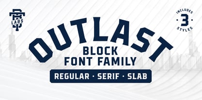 Introducing Outlast - A competitive sports font with three distinct and unique styles. Outlast was designed for creating powerful logotypes, sports branding, posters, apparel design, magazines headlines, labels and much more.
 - Chervonec Uzkj BT by Bitstream,
$50.99Possessing a distinctive Russian appearance, Chervonec Uzkj, or Chervonec Condensed, is a hybrid semi-serif designed by Russian designer Oleg Karpinsky. The typeface family includes three weights with drawn italics. - Cambridge Round by AVP,
$29.00 Cambridge Round provides a rounded version of Cambridge, useful for headings and more informal texts. The family contains four weights in three widths with matching italic forms for all variants.
 - Handwritten Note JNL by Jeff Levine,
$29.00 The movie poster promoting the 1962 James Cagney comedy "One, Two Three" had it's text done in free-style hand lettering. Starting with an auto-trace in order to have an isolated version of the black letters separated from the red poster background, the tracing kept the basic forms intact, but with limited accuracy. Cleaning up and digitally reshaping the letters manually to form a more correct version [closer to the original movie poster], additional figures, foreign characters, accents and punctuation were drawn from scratch. This is now available as Handwritten Note JNL in both regular and oblique versions.
 - Hodgepodge by Outside the Line,
$19.00 Hodgepodge is a confused mixture of letters that somehow work together. While I know this has been done before I create fonts that I need. And I occasionally have found a need for this. And it was not there, so now it is. There is a mixture of light and dark, bold and regular, caps and lower case but not where you would expect them to be. Since this is a headline font you can set the headline and then easily go back and change a letter here or there to get the best-looking combination. Hodgepodge was in the 2011 Typodarium Page-A-Day Calendar on 7-17-2011.
 - Bihext by Ingrimayne Type,
$10.00 The letters of Bihext fit into the trapezoids formed by bisecting hexagons from the top corner to the bottom corner. Because these trapezoids have two orientations, there are two sets of characters and the typeface was designed assuming that the user would want to alternate these two character sets. The alternating of characters is done automatically with the OpenType feature of contextual alternatives (calt) in applications that support it. The typeface is monospaced with very tightly letter spacing. If the letter spacing seems too tight, consider alternating colors to make the individual letters stand out as an alternative to loosening the letter spacing. Almost certainly the user will need to adjust line spacing if more than one line of text is used. The family includes an outline style that can be used in a layer above the filled style. A decorative, display face, Bihext is too difficult to read to be used for long text.
 - RL Bouba by Rebecca Larson,
$15.00 RL Bouba is an experimental display typeface that includes three weights. RL Bouba can be used on but is not limited to, posters, billboards, T-shirts, album covers, basically any design that needs a big eye-catcher font! Bouba offers Basic and Western European Latin letters, numbers, and punctuation.
 - Gendis by Surotype,
$20.00 Gendis is a complete fonts pack for build brands, comes in three different styles and extras. This complete package is perfectly for all your creative work such as branding projects, packaging design, ads and more. To enable the opentype stylistic alternates, you need a program that supports opentype features.
 - Patagon by Latinotype,
$19.00 Patagon is a contemporary Woodtype Sans typeface especially designed for fresh, high impact sentences with a mix of flavoured features. Its upper-case Opentype ornamental alternate glyphs provide great elegant textures adding versatility to the three weight family: condensed, regular & extended. Mix them up for a really cool design!
 - Landepz by Zamjump,
$9.00 Landepz Typefamily includes three normal styles, grunge texture and glitch, Landepz is a family of bold hand-printed types, celebrating the style of the original printing press and all its beautiful imperfections. Its solid, robust shape lends itself to a robust design, while its texture provides an authentic sound.
 - Wendy LP by LetterPerfect,
$39.00 The Wendy family is a cursive script provided in three weights -- Light, Medium and Bold. The design is an upright, casual handwriting style, with natural joins and connecting strokes. Wendy, in her various modes, projects a friendly persona, adding an approachable quality to headlines and short runs of text.
 - Ames' Shaded by Greater Albion Typefounders,
$16.00 Ames’ Shaded is one of three display typefaces designed to complement the Ames’ Roman and Ames’ Text typeface families. Ames’ Shaded has that semi-industrial feel that somehow is evoked by diagonal cross-hatching. Delightful for use on its own of with the families mentioned. A delightful introduction to the Ames’ ‘Super’ typeface family.
 - RMU Siegfried Pro by RMU,
$35.00 RMU Siegfried Pro is another breathtaking Art Nouveau font from the fin-de-siècle period which underlines your stylish projects in a remarkable way. The font was carefully redesigned, some oddieties abolished, and the font was extended to make it usable for Central European languages too. Three embedded graphic elements let you make a fitting frame. The letter k has an alternative form, so look for all OT features in this font.
 - Movella by Greater Albion Typefounders,
$8.00 Remember those 1970s science fiction dramas which had such charming futuristic sets and backdrops? Remember the intriguing future lettering and signage the set designers would devise-often coupled with interesting futuristic spellings? Movella is a family of three typefaces inspired by that design ethos. The three faces- regular, italic and the 3D solid form are all capitals faces which combine a feeling of retro-futuristic design with easy legibility. Take your next project into the age of the Apollo Launches, sci-fi action drama and fun!
 - NL Seasalt by Nicky Laatz,
$25.00 A breath of fresh air! Seasalt typeface was designed to emulate natural-looking handwritten notes. Opentype ligatures are included to make the typeface appear more realistic and last but not least, it includes a doodles font - arrows, scribbles and scrawls to help your designs pop! The typeface comes in three different variants to suit the look you are after : Upright, Regular and Slanted.
 - Bouncer by Fenotype,
$9.95 Bouncer is an all-caps font family with automatic interlocks. With soft and rounded look and over 150 automatic ligatures and three weights Bouncer is a flexible and easy to use font. It's very suitable for anything from a Jazz poster to a restaurant menu. To access the ligatures you only need to write in CAPS in any OpenType-supporting application.
 - New Millennium by Three Islands Press,
$24.00New Millennium is one of three font families that share a common name, a common design philosophy, a common x-height, and basic character shapes. (The others are New Millennium Sans and New Millennium Linear; all three work well together.) New Millennium is a serif face of what some might describe as a "modern style." But although it has flat serifs, it differs markedly from, say, Bodoni or Didot -- especially in the italic, which is a radical departure from tradition. (The bold styles are in fact sans-serif, identical to those of New Millennium Sans.) There's also a nice, dark Headline style for display text. New Millennium is a distinctive, legible, accessible text face that might be well suited to, say, scientific documentation.