10,000 search results
(0.025 seconds)
- Hoyle by Mans Greback,
$49.00 Hoyle is a dynamic high-quality serif typeface. Drawn and created by Måns Grebäck between 2019 and 2020, this classic design makes use of the fact that timelessness is the best manner to achieve modernity; the letters are of such composition that they will always be simultaneously contemporary and traditional. Hoyle is a family containing five weights: Thin, Light, Medium, Bold and Black. Each weight is also provided as Italic, resulting in 10 unique styles. The weights are harmonic and created to balance perfectly agaist each other. Try the included Variable Font! A format where you can set any weight manually, and any slant, resulting in more than 5000 variations. More info: https://www.mansgreback.com/variable-fonts This slab serif typeface is also filled with OpenType features such as ligatures, alternates, oldstyle, superscript, subscript, fractional and alternate numbers. It has a very extensive lingual support, covering European Latin, Vietnamese, Zulu and many more scripts. The font contains all characters you'll ever need, including all punctuation and numbers.
 - Eurostile Next by Linotype,
$50.99 Eurostile Next is Linotype's redrawn and expanded version of Aldo Novarese's 1962 design. This new version refers back to the original metal types and to its mid-century modern aesthetic of squarish characters and subtle curves. Eurostile Next brings back the gentle curves, which were lost in other digital versions, therefore regaining the spirit of the original design and its somewhat softer demeanor. The family has been greatly expanded, now consisting of five different weights: ultra light, light, regular, semibold, and bold. Along with the regular width, all weights also have extended and condensed versions. Stylistically, Eurostile Next is well suited for designs in the fashion of the 50's and 60's, yet it still has a remarkably new and contemporary feeling. Its numerous variations and typographic features are invaluable for projects ranging from extensive corporate branding to one-off posters and from large signage to small print text.
 - Ryo Gothic PlusN by Adobe,
$79.00Ryo Gothic is a new Japanese sans serif (or gothic) kana typeface design. Created by Adobe type designer Ryoko Nishizuka , the typeface has a bright and speedy calligraphic touch and can be used to compose readable body text, as it gives a calm and well-controlled color to the typeset page. Supplied in OpenType format, each Ryo Gothic font includes hiragana, katakana and some punctuation marks and should be combined with the kanji and other glyphs in existing Japanese gothic typefaces that contain full character sets. This typeface family is available in seven weights--extra light, light, regular, medium, bold, heavy, and ultra heavy--which allow end users to select the best-matching weight for their favorite full-set Japanese gothic typeface. Creative professionals using the Japanese version of Adobe InDesign may use that program's Composite Font tool to easily combine Ryo Gothic with other typefaces. - Eurostile Next Paneuropean by Linotype,
$50.99Eurostile Next is Linotype's redrawn and expanded version of Aldo Novarese's 1962 design. This new version refers back to the original metal types and to its mid-century modern aesthetic of squarish characters and subtle curves. Eurostile Next brings back the gentle curves, which were lost in other digital versions, therefore regaining the spirit of the original design and its somewhat softer demeanor. The family has been greatly expanded, now consisting of five different weights: ultra light, light, regular, semibold, and bold. Along with the regular width, all weights also have extended and condensed versions. Stylistically, Eurostile Next is well suited for designs in the fashion of the 50's and 60's, yet it still has a remarkably new and contemporary feeling. Its numerous variations and typographic features are invaluable for projects ranging from extensive corporate branding to one-off posters and from large signage to small print text. - Alaturka by Bülent Yüksel,
$19.00 ABOUT FAMILY: What makes "Alaturka" elegant, friendly and contemporary is its very rounded curves with very open terminals. "Alaturka" has been designed with a higher "x-height" than other fonts in its class to make tiny readability more obvious in any use situation. It will be ideal for use in small sizes such as business cards or mobile applications. This typeface is also equipped with powerful OpenType features to satisfy the most demanding professionals. It has solid features like case sensitivity, small, true capitals, full ligatures, tabular figures for tables, old-style figures to elegantly insert numbers into your sentences, and more alternative characters to give personality to your projects. FEATURE SUMMARY: - 2 style: 1From 1923 To 2023 - 8 weights: Thin, Extra Light, Light, Regular, Medium, Bold, Extra Bold, and Black. - 3widths: Normal, Narrow, and Condensed. - Matching italics (12º) for all weights and widths. - Matching small caps for all weights and widths. - Lining and old-style figures (proportional and tabular). - Some alternate characters - Unlimited fractions. - Automatic ordinals (1st, 2nd, 3rd, etc.). - Extended language support: Most Latin-based scripts - Extended currency support. You can enjoy using it.
 - Elicit Script by Monotype,
$40.99 Elicit Script is a hybrid script family, that can be as casual or formal as the occasion demands. Created by Laura Worthington and Jim Wasco, the design is based on pointed pen Spencerian Script handwriting. “It’s like one of those German italics from the early 20th century, that have beautiful shapes that hold their own,” says Wasco. Elicit Script spans five weights, from Extra Light to Bold, and three styles – Formal, Normal and Casual. This makes it an incredibly versatile script design, easily paired with other typefaces and able to be dressed up or down, depending on what it’s used for. The monoline Casual style offers a more relaxed tone of voice, while Formal sits at the more decorative end of the spectrum. Designers can keep things straightforward, tidy and practical with the typeface’s simple caps, or add in swash caps if they need more exuberance and expression. Generous spacing means Elicit Script works well at smaller sizes as well. Elicit Script Variable Set is a single font file that features two axes: Weight and Contrast. The Weight axis has instances from Extra Light to Bold. The Contrast axis has instances from Casual (low contrast) to Formal (high contrast).
 - Vellvé by ITC,
$29.99For over 30 years, Tomás Vellvé created beautiful graphics and distinctive typefaces in his native homeland of Spain. First drawn as a phototype display design in 1971, Vellvé’s only typeface in digital form is an uncommon solution to the problem of creating a new sans serif design. The end result, which bears his name, is a design that stands out from the crowd of other sans serif typefaces. The phototype version was only available in a single, light weight. With the release of the digital fonts, however, three additional weights as well as a companion italic for the light weight were created.The typeface designs were originally drawn for Agfa Monotype (now Monotype Imaging) in 1996 as part of the company’s “Creative Alliance” initiative. Through an exclusive licensing arrangement, the Vellvé™ family has now been added to the ITC Typeface Library.ITC Vellvé is a wide design with strong calligraphic overtones. This is no “anonymous” design like so many modern sans. Letters like the `R, `e and `s clearly show the hand of Tomás Vellvé in the design process. Vellvé provides a fresh choice between geometric sans serifs such as Helvetica® and industrial sans serifs like Futura®. - TT Nooks by TypeType,
$39.00 TT Nooks useful links: Specimen | Graphic presentation | Customization options TT Nooks is an experimental font family that includes a high contrast serif, TT Nooks, and an upright italic, TT Nooks Script. Despite the difference in style, both subfamilies get along well, which is partially thanks to their similar proportions. Each of the subfamilies includes 4 weights: Light, Regular, Bold and Black. The main subfamily is TT Nooks—a stylish high-contrast serif with a light touch of self-centeredness. If TT Nooks were a person, it would be an elegant lady with an independent and firm personality. In the original sketches of TT Nooks there were traces of a broad pen, but in the course of further evolution the typeface moved away from this style, retaining only the high contrast of strokes. In addition, in the process of design searches TT Nooks has obtained a touch of geometricity. The serifs in TT Nooks stand out especially visibly thanks to their geometric shape that resembles slippers. In addition to their peculiarity, such serifs add stability to the font and allow better compensation of the black and white ratio within the letters. TT Nooks has small capitals for Latin and Cyrillic alphabets, as well as a set of stylistic alternates (including some figures) that makes the typeface a bit more geometric. In addition, we have drawn more than 25 ligatures, including ligatures for capital letters, slashed zero and many other useful OpenType features. TT Nooks Script is a complementary family designed to harmoniously extend the main family and expand its scope. The forms of the characters in bold and light fonts of TT Nooks Script are quite different. For example, Black & Bold have high contrast strokes and an open aperture, and in Regular & Light the aperture of the characters is closed. TT Nooks also has small capitals for Latin and Cyrillic alphabets, ligatures, oldstyle figures and other OpenType features. In light faces, TT Nooks Script is more humanist and has artifacts inherent to the continuous movement of a flat pen. In bold faces, TT Nooks Script has a very dense and dynamic typing rhythm, and the shape of the letters begins to geometrize. We had had the difficult task of preserving the continuity of forms between bold and light faces, and we have managed to solve it thanks to the found rhythm, which united different fonts, and proximate stylistic solutions.
 - Mythring by Ditatype,
$29.00 Myhtring is a spine-chilling display font that will cast a spell of fear on your designs. Designed in uppercase and with a bold weight, this typeface demands attention and exudes an aura of darkness and mystery. Each letter is meticulously crafted with details resembling menacing plant roots with sharp edges, adding an eerie and sinister touch to the font. With its bold weight and uppercase design, this font creates a powerful and impactful presence. The root-like details in each letter of Myhtring give the font an organic and unsettling appearance, as if the letters are entangled with malevolent and ancient roots. These haunting details add a sense of otherworldly energy and create an atmosphere of foreboding and suspense. The combination of bold weight and sharp-edged root details gives this font a sinister and enigmatic look, evoking images of dark and sinister forces lurking in the shadows. The letters seem to possess an aura of malevolence, making it an ideal choice for projects that delve into the horror and the supernatural. For the best legibility you can use this font in the bigger text sizes. Enjoy the available features here. Features: Alternates Multilingual Supports PUA Encoded Numerals and Punctuations Mythring fits in headlines, logos, movie posters, flyers, invitations, branding materials, print media, editorial layouts, headers, and any horror-themed project. Find out more ways to use this font by taking a look at the font preview. Thanks for purchasing our fonts. Hopefully, you have a great time using our font. Feel free to contact us anytime for further information or when you have trouble with the font. Thanks a lot and happy designing.
 - P22 FLW Exhibition by P22 Type Foundry,
$29.95 This font set is the second in a series from P22 Type Foundry based on the lettering styles of Frank Lloyd Wright. Created in 1931, the Exhibition lettering was intended primarily to accompany Frank Lloyd Wright's exhibition drawings and models. Many of the 72 Extras were designed to form continuous linking borders. Combinations of these geometric forms can provide endless variations of decorative elements in the style of Frank Lloyd Wright. Many of these images were based on Mr Wright's "Saguaro Forms and Cactus Flowers" illustration for an unused Liberty magazine cover of 1926. Other imagery in this set was derived from assorted geometric designs by Wright. Exhibition Regular, Light, and Bold have been remastered and now contain almost 400 characters including support for Western and Central European languages.
 - KAPITAL by Superfried,
$32.00 KAPITAL is an elegant, geometric uppercase sans. It is available in standard and stencil style across four weights – light | regular | medium | demi – covering 346 glyphs. It is based on the capital character set from a previous release – Basik. Continuing the clean, geometric aesthetics, KAPITAL was refined further to create a more minimal style. This enabled the characters to discreetly perform their role – to simply convey the message of the writer without distraction. To achieve this, special attention was applied to the form consistency of the glyphs across the weights and negative space throughout. In many typefaces as the weight is increased the form and style can deviate significantly from the original design. With regards to negative space – although inevitable – wherever possible key letterforms were adjusted to alleviate this.
 - Logika Nova by Designova,
$35.00 Logika Nova is a simple, clean typeface with a modern design and remarkable appearance. This is a perfect choice for creating logotypes, branding, headlines, corporate identities, and marketing materials for web, digital & print alike. The typeface will be a great option for branding, logo/logotype design projects, marketing graphics, banners, posters, signage, corporate identities, and editorial design. Adding extra letter spacing will make this font the perfect choice for minimal headlines and logotypes, as shown in the promo designs attached. Handcrafted and designed with powerful OpenType features in mind, each weight includes extended language support with Western European, Central European, and South Eastern European sets. A total of 280 glyphs are available. Logika Nova typeface includes 12 fonts, with six upright weights (Thin / Light / Book / Regular / Bold / Heavy) and Italic equivalents of all six weights.
 - Colagent by Great Studio,
$25.00 Colagent is a high-contrast typography inspired by transitional and contemporary typography. The font expands its usability by providing weights ranging from Light to black. Natural curves, swelling and slanting stems grow in characters as the font gets heavier. While the thinner weights have reduced contrast and optical corrections to create a warm and soft appearance. Featuring charming italic letters, exceptional bold weights, and full character support for over 200 Latin-based languages. Colagent excels in display settings such as editorial design, titles, branding projects, logo design, packaging, magazine headings, advertising, short or long text. Colagent also comes with four Variable font versions: Regular, Italic, Condensed, and Condensed Italic to make it easier for designers to explore and perfect beautiful designs, uncovering many visual tones and hidden secrets.
 - Rhodes by Eurotypo,
$19.00 Rhodes is a modern geometric sans serif consisting of 5 weights ranging from Extra Light to Bold with matching true italics. Its variety of weights provide a range of choices that will help you find the best typographic color for your project. Lighter weights are well-suited for body text while heavier ones are ideal for high impact headlines. Rhodes has been designed purposely to enable brands to appeal more emotionally to modern consumers. The balanced characteristic of Rhodes with unique details, such as the geometric form and the prominent x-height makes it perfect for strong headlines and outstanding logos, but also suitable for long text. Rhodes includes a set of ornaments in regular and italic to be able to combine it with the glyphs and thus, to give your designs more exclusivity.
 - Swonderful by The Ampersand Forest,
$19.00 Everyone loves an Art Deco typeface. And there are hundreds of similarly-designed deco faces out there! But not one of them seems to have every form of every character that you want or need at any given moment. That’s why Swonderful was created! It has more letterform variations than you can shake a stick at (if you're inclined to shake sticks at things). With four variations of every uppercase form, two variations of every lowercase form (plus diacritical characters for the standard set), you’re bound to find the character you need for any given project, whether the style is French Art Deco, American Streamline Moderne, or Jazzy Midcentury Gaspipe. Just switch between stylistic sets! And you’ll find all those characters in three standard weights: Light, Regular, and Bold. They’re designed as a unicase, so they’re all height-compatible, and every set works with every other set, so you can mix and match to your heart’s delight!
 - Yue Han by Phoenix Group,
$13.00 Yue Han is a font created as a form of gratitude for all the feelings and love that has been given, this font symbolizes the willingness to let go of someone we love and move on to a better place.
 - Nervatica by Tour De Force,
$25.00 Language is a must, please clean your book’s dust. If you move like a snail, you'll never end up on Yale. Teach your mind to rewind, never leave knowledge behind, what should be defined, is what you'll get as assigned.
 - Magisk Time by Bogstav,
$11.00 This is my roughly handprinted typewrite-ish font. It has all the cool and classic moves of the traditional typewriter look, but with a more rough attitude due to the contextual alternates (which offer 6 different versions of each letter!)
 - Circle Two Letter by Fauzistudio,
$12.00 Cilcle TwoLetter Monogram Logo Font Family with OpenType magic that can adjust to front and back letters, there are 10 frame variations that you can access at numbers 0-9 how to activate it simply by adding a number in front of your initials, typing something (0AB - 9AB) it will automatically compose . you can use it on any Logo project it is perfect to add to your collection. Cilcle TwoLetter font FAMILY – includes 9 weights (Thin, Extra light, Light, Regular, Medium, Semi Bold, Bold, Extra Bold, Black) : Cilcle TwoLetter Thin Cilcle TwoLetter Extralight Cilcle TwoLetter Light Cilcle TwoLetter Regular Cilcle TwoLetter Medium Cilcle TwoLetter Semibold Cilcle TwoLetter Bold Cilcle TwoLetter Extra Bold Cilcle TwoLetter Black Hope you enjoy. Intuisi Creative
 - Pentagram Two Letter by Fauzistudio,
$9.00 Pentagram TwoLetter Monogram Logo Font Family with OpenType magic that can adjust to front and back letters, there are 10 frame variations that you can access at numbers 0-9 how to activate it simply by adding a number in front of your initials, typing something (0AB - 9AB) it will automatically compose . you can use it on any Logo project it is perfect to add to your collection. Pentagram TwoLetter font FAMILY – includes 9 weights (Thin, Extra light, Light, Regular, Medium, Semi Bold, Bold, Extra Bold, Black) : Pentagram TwoLetter Thin Pentagram TwoLetter Extralight Pentagram TwoLetter Light Pentagram TwoLetter Regular Pentagram TwoLetter Medium Pentagram TwoLetter Semibold Pentagram TwoLetter Bold Pentagram TwoLetter Extra Bold Pentagram TwoLetter Black Hope you enjoy. Intuisi Creative
 - Paradise Point by Swell Type,
$20.00 Surf's up! Take an unforgettable adventure to the sparkling shores of Paradise Point. Ride our 25 majestic weights, from tranquil tall & thin to thunderous wide & heavy. Expand your horizons with the versatile Variable font to select any spot between. One-of-a-kind activities: Drop in a thrilling Inline weight for stylistic flair. Overlay with the matching Heavy for striking color effects. Discover hidden wonders! Stylistic Alternates will take you to the scenic heights of uppercase in a friendly lowercase style. Or immerse your text in interlocking Discretionary Ligatures for an authentic Tiki Type island experience. Enchanting views: Two versions of each letter and number automatically rotate for a natural, hand-drawn appearance. The Light weights have round ends to simulate a single pen stroke, which matches the center of the Inline weights for a perfect pairing. Explore! If you venture into unknown territory, each weight of Paradise Point contains 775 glyphs for stress-free support of over 200 languages. An all-inclusive getaway: Each weight of Paradise Point includes the features above, and can set readable body text as well as create striking logos and headlines. Use it for restaurant menus, surf and skate brands, or any design project where you want to convey lively, friendly, stress-free fun.
 - Fairplex by Emigre,
$49.00 Zuzana Licko's goal for Fairplex was to create a text face which would achieve legibility by avoiding contrast, especially in the Book weight. As a result of its low contrast, the Fairplex Book weight is somewhat reminiscent of a sans serif, yet the slight serifs preserve the recognition of serif letterforms. When creating the accompanying weights, the challenge was to balance the contrast and stem weight with the serifs. To provide a comprehensive family, Licko wanted the boldest weight to be quite heavy. This meant that the "Black" weight would need more contrast than the Book weight in order to avoid clogging up. But harmonizing the serifs proved difficult. The initial serif treatments she tried didn't stand up to the robust character of the Black weight. Several months passed without much progress, and then one evening she attended a talk by Alastair Johnston on his book "Alphabets to Order," a survey of nineteenth century type specimens. Johnston pointed out that slab serifs (also known as "Egyptians") are really more of a variation on sans serifs than on serif designs. In other words, slab serif type is more akin to sans-serif type with serifs added on than it is to a version of serif type. This sparked the idea that the solution to her serif problem for Fairplex Black might be a slab serif treatment. After all, the Book weight already shared features of sans-serif types. Shortly after this came the idea to angle the serifs. This was suggested by her husband, and was probably conjured up from his years of subconscious assimilation of the S. F. Giants logo while watching baseball, and reinforced by a similar serif treatment in John Downer's recent Council typeface design. The angled serifs added visual interest to the otherwise austere slab serifs. The intermediate weights were then derived by interpolating the Book and Black, with the exception of several characters, such as the "n," which required specially designed features to avoid collisions of serifs, and to yield a pleasing weight balance. A range of weights was interpolated before deciding on the Medium and Bold weights.
 - Sherbrooke by Eyad Al-Samman,
$- Sherbrooke is a simple and sans serif font. I have chosen the name of this typeface after the "Sherbrooke" Street in Montreal, Canada, that I daily walked in for several months in the late 2005 while I was studying in Montreal, Quebec, Canada. I do adore this street and also I adore the whole city of Montreal. This font comes in two different weights. "Sherbrooke" can be used in wide fields of publications such as the titles of novels, literary texts, short stories, dictionaries, books, newspapers, websites, and magazines. It is suitable for T-shirts, mugs, advertisement light boards in malls, subtitles of movies, logos, cans of foods, and medicines' names. The font is more attractive when it is printed in calendars and for displaying the contents and paragraphs of electronic encyclopedias and different online websites. "Sherbrooke" is specifically designed for educational, journalistic, literary, and social purposes. The main characteristics of "Sherbrooke" Typeface are in its sans serif new designed letters and also in its lowercase special numerals. I think that these characteristics have made "Sherbrooke" exceptionally unique with its alphanumeric combinations. You can enjoy this typeface and use it anywhere at any product or service. It is simply gratuitous for all. The word "Sherbrooke" is a person's name. Sherbrooke Street - officially Rue Sherbrooke - is a major east-west artery at 31.3 kilometers in length and it is the second longest street on the Island of Montreal in Canada. The street is named for John Coape Sherbrooke, the Governor General of British North America from 1816 to 1818.
 - Gleeful Bubble by Insan Perkasya,
$12.00 Gleeeful Bubble, a delightful font that bubbles with joy, featuring a hint of sparkling bubbles in each character. This playful typeface adds a touch of whimsy to your designs, infusing them with a sense of light-hearted cheer. Let Gleeeful Bubble be the choice that brings a burst of happiness and a sprinkle of effervescent charm to your creative projects. If you have any question, please contact us
 - Linotype Rowena by Linotype,
$29.99Linotype Rowena is part of the Take Type Library, selected from the contestants of Linotype’s International Digital Type Design Contests of 1994 and 1997. This text font was designed by the Latvian artist Gustavs A. Grinbergs and is available in six weights, from light to black. The font has a light stroke contrast and its basic forms are the circle, rectangle and triangle, making it a constructed face. The impression of the font on the reader is elegant and cool, very like poster fonts of the 1930s. Linotype Rowena is suitable for headlines and shorter texts with point sizes 12 and larger. - Linotype Brewery by Linotype,
$29.99Linotype Brewery is part of the Take Type Library, chosen from the contestants in the International Digital Type Design Contests of 1994 and 1997. This text font is available in six weights from light to black and was designed by Gustav A. Grinberg. An outstanding characteristic of the font is its light stroke contrast and its constructed forms. Its tiny, triangular serifs first become noticeable in very large typesizes, much like the Dutch fonts of the 17th century, Copperplate, for example. Linotype Brewery is cool and elegant and well-suited to middle-length texts and headlines. - Altruiste by ParaType,
$30.00 Altruiste is a decorative slab serif typeface with distinctive sharp features. It was inspired by the idea of duplicating elements, conveying typeface a unique look. It is austere, sophisticated typography marked by light shapes, yet of a strong nature. Altruiste is the perfect choice for a wide range of tasks such as creating logos, signboards, posters, invitation cards and more. The typeface is available in 5 weights, from hairline to regular with italics. Each style contains 600 extended Latin and Cyrillic characters. Altruiste was designed by Alexey Chekulaev in 2021, based on the light styles of the Postulat typeface.
 - Luks Deco by Nasir Udin,
$24.00 Luks Deco took inspiration from the glory of Roaring 20’s when the Art Deco style rose to its heyday. The strong geometric shape emphasizes the touch of retro yet modern style. Luks Deco is a good choice who wants to give Art Deco vibes to their designs. Luks Deco’s weight range from light to black, suitable to cater of all you need. The O,C,G and Q letters (and all glyphs that have circle form) have a bit different shape from light to black which will give unique display look for overall design. - Uppercase
 - Montix by Linotype,
$49.00Montix is a narrow, constructed type family that developed by the German designer Diana Fischer in 2003. With five weights (light, light italic, regular, regular italic, and bold), Montix is a particularly effective small family, especially when used for headline or display purposes. Montix's letterforms have relatively long ascenders and descenders, which compared with its horizontally compact body gives it its unique style. Words or lines of text set in Montix would look best when some amount of white space is left around them. Because of this, the faces are well suited for logos and corporate identity uses. - Marvello by Keristyper Studio,
$14.00 Marvello a classy elegant stencil serif font is perfect for any project. This font is good for logo design, Social media, Movie Titles, Books Titles, short text even long text letters, and good for your secondary text font with sans or serif. **Featured:** * Standard Uppercase & Lowercase * Numeral & Punctuation * Multilingual : ä ö ü Ä Ö Ü ß ¿ ¡ * Alternate & Ligature * PUA encoded We recommend programs that support the OpenType feature and the Glyphs panel such as Adobe applications or Corel Draw. so you can use all the variations of the glyphs. Hope you enjoy our fonts!
 - Heartline by Keristyper Studio,
$14.00 Introducing Heartline a magical script font carefully created with a touch of elegance. This font is good for logo design, Social media, Movie Titles, Books Titles, short text even long text letters, and good for your secondary text font with sans or serif. **Featured:** * Standard Uppercase & Lowercase * Numeral & Punctuation * Multilingual : ä ö ü Ä Ö Ü ß ¿ ¡ * Alternate & Ligature * PUA encoded We recommend programs that support the OpenType feature and the Glyphs panel such as Adobe applications or Corel Draw. so you can use all the variations of the glyphs. Hope you enjoy our fonts!
 - Blackrocky by Letterara,
$18.00 Blackrocky is a natural dry brush font. a tough-looking font with natural strong brush touch ready to rock every design you make. this font has a striking look and a good flow font that can add a stylish to your designs. It’s perfect for logos, quotes, posters, packaging, movie title, youtube banner, clothing, and every other design which needs a strong touch. It is PUA encoded which means you can access all of the glyphs with ease! Add it confidently to your projects, and you will love the results.
 - Wakolltu by Keristyper Studio,
$14.00 Wakolltu is ethnic culture font. it has a fun character and display typeface. This font is good for logo design, Social media, Movie Titles, Books Titles, short text even long text letters, and good for your secondary text font with sans or serif. **Featured:** * Standard Uppercase & Lowercasea * Numeral & Punctuation * Multilingual : ä ö ü Ä Ö Ü ß ¿ ¡ * Alternate & Ligature * PUA encoded We recommend programs that support the OpenType feature and the Glyphs panel such as Adobe applications or Corel Draw. so you can use all the variations of the glyphs. Hope you enjoy our fonts!
 - Thunder Shutter by Aminmario Studio,
$20.00 Thunder Shutter font is modern and elegant signature with a great flow effect. This font is great for your creative projects such as watermark on photography, and perfect for logos & branding, photography, invitation, watermark, advertisements, product designs, stationery, wedding designs,label, product packaging, social media, movie titles, books titles, a short text even a long text letter and good for your secondary text font with sans or serif. And also for special events or anything that need handwritting taste. Thanks for checking out this font. I hope you enjoy it!
 - Jufertie by Keristyper Studio,
$14.00 Jufertie is a handwritten font with a unique character. This font is good for logo design, Social media, Movie Titles, Books Titles, short text even long text letters, and good for your secondary text font with sans or serif. **Featured:** * Standard Uppercase & Lowercase * Numeral & Punctuation * Multilingual : ä ö ü Ä Ö Ü ß ¿ ¡ * Alternate & Ligature * PUA encoded We recommend programs that support the OpenType feature and the Glyphs panel such as Adobe applications or Corel Draw. so you can use all the variations of the glyphs. Hope you enjoy our fonts!
 - King Trufle by Keristyper Studio,
$14.00 King Trufle is display fun font with a bold and rough style. This font is good for logo design, Social media, Movie Titles, Books Titles, short text even long text letters, and good for your secondary text font with sans or serif. Featured: OTF Standard Uppercase & Lowercase Numeral & Punctuation Multilingual : ä ö ü Ä Ö Ü ß ¿ ¡ Alternate & Ligature PUA encoded We recommend programs that support the OpenType feature and the Glyphs panel such as Adobe applications or Corel Draw. so you can use all the variations of the glyphs. Hope you enjoy our fonts!
 - Hensoca by Keristyper Studio,
$12.00 Hensoca is a typeface that is inspired by vintage victorian signs and letterhead. This font is good for logo design, Social media, Movie Titles, Books Titles, short text even long text letters, and good for your secondary text font with sans or serif. **Featured:** * Standard Uppercase & Lowercase * Numeral & Punctuation * Multilingual : ä ö ü Ä Ö Ü ß ¿ ¡ * Alternate & Ligature * PUA encoded We recommend programs that support the OpenType feature and the Glyphs panel such as Adobe applications or Corel Draw. so you can use all the variations of the glyphs. Hope you enjoy our fonts!
 - Lyonette NB by No Bodoni,
$39.00 These four typefaces, Berlinette NB, Lyonette NB, Marseillette NB and Parisette NB, were designed from the same basic shape, a geometric form that avoids strict horizontals and uses more offbeat triangular shapes. Lyonette is a fanciful type, gentle and precocious. It seems aloof at times but isn�t really. The frivolity and quirkiness of the narrow width is offset by the fey, finger-like horizontals, vaguely reminiscent of strange encounters and dark closets. It�s great for fashion advertising with literary pretensions. Or maybe a kinder, gentler sci-fi movie.
 - Stelashild by Skinny Type,
$16.00 Stelashild Duo is a majestic, luxurious and impactful handwritten script font, serif font with clean ligatures and alternates making for a harmonious pair. Handwritten scripts come with a large number of ligatures giving you several options for your designs. Stelashild Duo supports western, southern, southern, and southeastern America. Stelashild Duo is perfect for branding, web titles, logos, quotes, movie titles and more... Promote your next project today with this powerful duo and differentiate your message from the rest. I'm so excited and excited to see what you can do with the Stelashild Duo!
 - Karliga by Keristyper Studio,
$14.00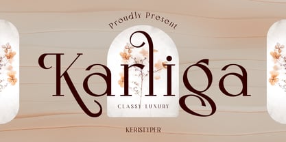 Karliga is a modern vintage serif typeface. This font is good for logo design, Social media, Movie Titles, Books Titles, short text even long text letters, and good for your secondary text font with sans or serif. **Featured:** * Standard Uppercase & Lowercase * Numeral & Punctuation * Multilingual : ä ö ü Ä Ö Ü ß ¿ ¡ * Alternate & Ligature * PUA encoded We recommend programs that support the OpenType feature and the Glyphs panel such as Adobe applications or Corel Draw. so you can use all the variations of the glyphs. Hope you enjoy our fonts!