10,000 search results
(0.278 seconds)
- Hayen by Twinletter,
$15.00 Looking for a way to make your brand look dark, mysterious, and even gothic? look no further, HAYEN Blackletter! This font is perfect for creating labels, retro designs, stamping, badges, and packaging. Use it for your next retro Oktoberfest poster or for your next tattoo. It’s also a great choice for a barber shop or whiskey brand. Plus, it’s available in a variety of different styles and weights, so you can find the perfect one for your needs. So why wait? Add this Blackletter font to your next project today!
 - PAG Revolucion by Prop-a-ganda,
$19.99Prop-a-ganda offers retro-flavored fonts inspired by lettering on retro propaganda posters, retro advertising posters, retro packages all the world over. This is perfect font for your retrospective project. PAG Revolucion has a boyish mood compared to other fonts of Prop-a-ganda series. It has short legs and large head, but because of its simplicity, it is legible font. Perfect for all of display. In 2012, Extended and optimized for multipurpose font family named Revolution Gothic which has lowercase, multi-language accents, five weights and italics can be available from Dharma Type. - Barnic Slab by Peninsula Studioz,
$9.00 Barnic Slab is a modern geometric slab typeface tailored to elevate all your design projects, from UI and app design to web design, branding, posters, magazines, infographics, packaging, and beyond. With its sharp slab edges, Barnic Slab effortlessly radiates professionalism and trustworthiness. Boasting 12 font weight variations, Barnic Slab excels in delivering a multi-level content hierarchy in your design, ensuring your value is communicated clearly and easily. Key features: Extended language support Mathematical symbols Currency symbols Alternate stylish letters Directional arrows Fraction support Special ligatures Numerator and Denominator support
 - Corso by Dominik Krotscheck,
$7.99 Corso is a clean condensed sans serif font family. It comes in upright, slanted and italic, in six weights each. It includes useful typographic features such as fractions, ligatures and case sensitive forms. Also included are double- or single-storey versions of a and g, you can switch via stylistic OpenType sets. Other letters with alternative forms accessible the same way are ß and ampersand. Corso works especially great for larger size uses such as signage, headlines or posters. But that doesn’t mean that it isn’t also useable for short texts.
 - Lorenza by Almarkha Type,
$25.00 LORENZA Elegant Sans Family Our latest product inspired by the famous logo is simple but classy, made with precision and measured. very good for combining your design work with a clear line and a circle with several different weights that are very comfortable in the design area you are easy to read and as a title on a blog or magazine page LORENZA Elegant Sans Family has symbols and punctuation and unique alternative letters perfect for logos & branding, photography, invitation, watermark, advertisements,product designs, stationery, wedding designs,label , and product packaging.
 - Bandera Text Cyrillic by AndrijType,
$21.00 This serif typeface is a real workhorse. It is a modern tool for text design: extremely legible and well shaped. Bandera Text Cyrillic has six weights with original italics. It catches attention in headlines of posters and magazines or makes reading comfortable in plain texts. Don't forget try Medium and Medium Italic faces for free. Bandera Text Cyrillic works well with Bandera Cyrillic (slab serif), Osnova Cyrillic (sans serif) and Bandera Display Cyrillic (contrast serif) fonts. Bandera is Spanish for ‘flag’. And Bandera is a symbol of Ukrainian fighting for freedom for many years.
 - Reed by ParaType,
$30.00 Reed is a refined calligraphic font based on humanist italic. It contains two weights and a high-contrast Display style for extra large point sizes. Two unusual stencil styles add zest to the type family. The character set includes lots of swashes and contextual alternates. This makes text set in Reed look very close to live calligraphy. Reed works perfectly in labels and packaging of confectionery, cosmetics, perfumery and sparkling wines, as well as greeting cards and event design. Reed was designed by Isabella Chaeva and released by Paratype in 2020.
 - Prapen by TypeClassHeroes,
$29.00 Prapen and Prapen Neu is a Monospaced sans serif family. Design with various width and weight that you can explore and combine creating rhythm and texture for comfortable reading. This font supports more than 100 Latin-based languages and has extensive Cyrillic and Greek support for languages like Russian, Bulgarian, Ukrainian, and many more.In variable version, it allows multiple options when designing, adapting to different composition solutions. Feature Uppercase & Lowercase Number & Symbol International Glyphs (Cyrillic & Greek) Multilingual support Ligature Feel free to drop us a message any time and follow my shop for upcoming updates
 - Pork Chop by Font Kitchen,
$9.99 Order a platter of sizzling Pork Chop, a sans serif from Font Kitchen. Rounded squared contours and horizontal terminals give this serif typeface a futuristic feel, while still remaining readable at smaller sizes. 10 weights are available with obliques, weighing in at 20 styles, each fresh cut and farm-raised. This font family is served with sides of expansive ligatures, kerning pairs, stylistic alternates, proportional and tabular figures, and versatile fractions. Pork Chop is a great way to add a calculated, futuristic, yet still approachable feel to your next project.
 - Mirador by René Bieder,
$30.00 Mirador is a powerful neoclassical font family designed for various usages — ranging from editorial and corporate design to web, interaction and product design. It is a contemporary take on high contrast typefaces that have never gone out of style — defined by elegance, tradition and timelessness. Although Mirador seems to be a display font at first glance, its proportions and design reveal a powerful and characteristic workhorse when set in smaller sizes. Mirador comes in 10 weights with matching italics. It is equipped with ligatures, a large set of alternative glyphs and many more opentype features.
 - Hadsai by Jipatype,
$25.00 ฟอนต์ หาดทราย ลักษณะกลมมน เส้น Stem มีความหนาแตกต่างกันสองขนาด หนา-บาง ไม่เท่ากัน การเดินเส้นเลียนแบบลายมือ มาพร้อมกับฟีเจอร์ dlig ที่เปิดใช้งานแล้วจะยกตัวอักษรลำดับที่สองให้สูงขึ้นเล็กน้อยสลับกันเป็นฟันปลา เหมือนคลื่นเล็ก ๆ บนผิวน้ำ ให้ความรู้สึกเป็นมิตร น่ารักใสๆ มีไดนามิค สนุกสนาน ไม่เป็นทางการ เหมาะสำหรับการผาดหัว โปรยประโยคข้อความสั่น ๆ มีให้เลือกใช้ 9 น้ำหนัก ทั้งตัวตรงและตัวเอียงรวมเป็น 18 สไตล์ - Hadsai, rounded shape, stem lines are of two different thicknesses, look like handwriting. It comes with a dlig feature that is enabled to raise the letter to zigzag. Like a wave on the surface of the sea water, it feels friendly, cute, clear, dynamic, fun, casual. Suitable for headline and sub-headline. Available in 9 weights, both upright and italic, total of 18 styles.
 - Baskerville Display PT by ParaType,
$30.00 Baskerville Display PT is a type family intended for large and extra large point sizes. It was inspired by the faces of John Baskerville and designed for expressive display typography. Two weights of Baskerville Display with matching italics are much lighter than the existing text versions of Baskerville. Each of them is an ideal partner for ITC New Baskerville. A good addition to the family is Baskerville Poster which will look great in very large sizes. The font was designed by Arina Alaferdova under the supervision of Dmitry Kirsanov and released by ParaType in 2016.
 - Quincy CF by Connary Fagen,
$35.00 Quincy® CF's warm letterforms and medium contrast give any text a smooth, calming motion. Small variations and human touches add charm, with Quincy's boldest weights especially eloquent as large and medium display type. Quincy® CF pairs well with clean, text-friendly sans-serifs, such as Greycliff CF and Work Sans, or for even more contrast, try monospaced typefaces like Ellograph CF and Cartograph CF. All typefaces from Connary Fagen include free updates, including new features, and free technical support. Check out Greycliff® CF which pairs nicely with Quincy® CF.
 - Zosimo Cyrillic by Delicious Type,
$39.00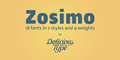 Zosimo is a neo-grotesque typeface created by designer Ron Gilad (Delicious Type) in cooperation with renowned typographer Oded Ezer based on his ubiquitous Alchemist typeface. Carefully drawn curves, robust shapes and a range of OpenType features make Zosimo a great choice for designing logotypes, signage, titling, texts and more. Zosimo now comes in three families: Standard (full Latin support), Cyrillic (basic Latin and Cyrillic) and Pro (all included). Totalling in 9 weights, roman and italic, Zosimo can accommodate all your type-related design needs in one big happy family.
 - Architectuur NF by Nick's Fonts,
$10.00Letterpress type, crafted by H. Th. Wijdeveld, founding editor and chief designer of the legendary Dutch art and architecture magazine Wendingen, provided the inspiration for this typeface. The original design graced a 1925 issue examining the work of Frank Lloyd Wright, and Wijdeveld created his typeface by assembling bits of standard brass rules. This version features several of the meanders typical of Wijdeveld’s graphic design in the dagger, double dagger, ASCII tilde and ASCII circumflex positions. Both versions of the font include 1252 Latin, 1250 CE (with localization for Romanian and Moldovan). - Typold by The Northern Block,
$29.55Typold originated out of the desire to improve geometric forms and push beyond previous achievements through collaborative working methods and knowledge sharing. The result is a finely balanced modern sans serif constructed from mathematical inputs, typographers needs, and the natural hand and eye of an artisan. Details include nine weights and matching italics, three separate widths, 1000 characters with an alternative lowercase a and y, small caps, 12 variations of numerals, Opentype features inferiors, superiors, fractions, case sensitive punctuation, extended symbols including emoji's and language support covering Western, South and Central Europe. - Lerum by Larin Type Co,
$15.00 Lerum this is elegant stencil font. Classic serif, bold weight, stencil style, it all carries this font and with it in highlight the main thing, make a title or logo and much more. It can also be more expressive and playful, thanks to the many alternates that are harmoniously combined in this font and make it more attractive and expressive. Try to change the alternatives, ligatures and you will get a lot of options for your project that will make it unique. This font is easy to use and has OpenType features.
 - Rondell by Scrowleyfonts,
$12.00 Rondell was originally designed in 2011 as a reasonably priced variable width and weight font. There were a couple of things about it that I didn't like and so I withdrew it from sale. Since then I have found myself using it for many different projects and have realised how useful and versatile it is. Therefore I have fixed the things I didn't like about it and it is now available again. Rondell is a simple, smart, sans serif font. Rounded corners make it slightly informal and friendly.
 - Cubenzis by Illuminaut Designs,
$12.00 Attempting to marry the warm friendliness of the Cubano typeface with the versatility, functionality, and geometry of Eurostile has resulted in Cubenzis. After finishing the regular weight, I realized that it reminded me of old Soviet military hardware, something you might see on the outside of a tank or rocket, so i made the decision to include a full Cyrillic alphabet as well. It feels very sci-fi to me and i can imagine it being used as signage on a ship or as a warning label on machinery.
 - Tiza by Sudtipos,
$39.00 Tiza is a rough take on informal faces and handwriting, brought on by the recent demand for scripts and brush lettering. Its flow leaves traces simulating runny pen ink, which makes it very suitable for handwriting-like paragraphs as well as casual greeting card and invitation setting. The bold weight, Tiza Negra, fits very nicely on book covers as well as large signs. Tiza is the proverbial reminder that typefaces can sometimes be more human than they are normally perceived. Designed by lettering great Angel Koziupa, and digitized and completed for Sudtipos by Alejandro Paul.
 - Journal Sans Old School by ParaType,
$30.00 Journal Sans Old School is a new, modernized digital version of the widely popular Journal Sans. The new typeface preserves the character of the geometric sans from the famous “Science and Life” magazine of the 1960s. The weight of the basic styles corresponds to the Journal Sans regular and bold from the Soviet linotype catalogs. Also, the original vertical proportions and character forms match the original. Cyrillic Alternates, Greek language support expand the range of font’s usage. Journal Sans Old School was designed by Natalia Vasilyeva and released by Paratype in 2019.
 - Distill by MADType,
$19.00 Distill draws its inspiration mainly from Theo van Doesburg's De Stijl era lettering. The type he designed for the Aubette Café, De Stijl Magazine, etc was used as a starting point and then expanded upon. While this typeface was inspired by historical references, it also has the ability to invoke a contemporary feel under the right conditions. Distill will work hard whether you are designing a neo-constructivist poster or a futuristic website. Distill is a family of 12 fonts: 4 weights, each containing condensed, regular, and expanded widths. It also features several alternate characters.
 - Ponder by TypeUnion,
$20.00 This is Ponder. A modern sans carefully crafted to be a versatile typeface for the modern world. Featuring over 650 glyphs, Ponder includes stylistic alternates for the a, l, y and & characters to provide two uniquely styled design approaches. From contrasting strokes on the heavier weights to the angled bars on the P & R, Ponder has a unique feel that will give your brand or project that stand out quality. Ponder features extensive language support for Latin & Cyrillic as well as many opentype features such as stylistic alternates, ligatures and numbers (Tabular, Oldstyle & Circled).
 - Floukista by Qaratype,
$15.00 Floukista is a Minimalist Modern Elegant sans serif font with beautiful ligatures, tons of special alternative glyphs, ornament and multilingual support. It’s a very versatile font that works great in large and small sizes. Floukista is perfect for branding projects, Logo design, Clothing Branding, product packaging, magazine headers, or simply as a stylish text overlay to any background image… Main Features: 3 Weights font with Italic Uppercase & Lowercase letters Punctuation and special characters Multilingual support Ligatures & Alternate glyphs Thank you for visiting our item. Hope you like it!
 - Quiverleaf Arabic CF by Connary Fagen,
$35.00 Quiverleaf Arabic CF brings the flowing movement of the original Quiverleaf CF typeface to the Arabic script. Five weights, from a delicate thin to a hearty extra bold, across both Latin and Arabic scripts in a visually unified and gorgeous font family. Quiverleaf Arabic CF works as a complete, self-contained type system, with both Arabic and Latin scripts included. It also pairs well with clean, simple sans serifs, like Greycliff Arabic CF. All typefaces from Connary Fagen include free updates, including new features, and free technical support.
 - FF Zine Sans Display by FontFont,
$65.99 German type designer Ole Schäfer created this sans FontFont in 2001. The family has 10 weights, ranging from Regular to Black (including italics) and is ideally suited for editorial and publishing and sports. FF Zine Sans Display provides advanced typographical support with features such as ligatures, alternate characters, case-sensitive forms, super- and subscript characters, and stylistic alternates. It comes with proportional lining and tabular lining figures. This FontFont is a member of the FF Zine super family, which also includes FF Zine Serif Display and FF Zine Slab Display.
 - Fugues by TEKNIKE,
$39.00 Fugues is a modern monospace display font. The typeface is made from a basic line, circle and square geometry. Fugues Regular and Italic are inspired by straight geometric shapes and Fugues Rounded and Rounded Italic are inspired by organic geometry similar to works by Antoni Gaudí and Alphonse Mucha. The name is derived from the Latin “Fuga” meaning flight and its current meaning “compositions of many parts on a short theme and using counterpoint.” Fugues is great for display work, logos, film titles, sports, monograms, headings and posters.
 - Kyhota by Ingrimayne Type,
$14.95 The six typefaces of the Kyhota group all have an “Old West” look to them. KyhotaOne has very thick slab serifs compared to KyhotaTwo. KyhotaBarbed is more condensed than either and has little barbs on the verticals, something that was a feature of a number of nineteenth century typefaces in this style. KyhotaFezdaz is condensed, without barbs, and with the slab serifs replaced with a flare serif. KyhotaBigBottom and KyhotaBigTop play with the weighting of the serifs, with one (either top or bottom) very thin and the other very thick.
 - Legitima by César Puertas,
$29.99 Legitima is a text font family inspired by the types found in the 3rd edition of the Italian book La Cicceide Legitima, printed in 1695. Its weight and x-height, optimized for 10 point-size, make it an ideal choice for book design and anything with running text. Like most typefaces from the 16th century, the strokes that constitute Legitima seem to depart from the traditional broad-nib pen model of handwriting and dare to explore the shapes produced by the techniques in use by punch-cutters of the time.
 - Arquitecta Office by Latinotype,
$16.00 We have adapted the version of our Arquitecta font for use in Microsoft Office™. It only has 4 variants: regular, italic, bold and bold italic. Font weights have been named in a way that can be clearly shown up in the font list in Office™ programs for the sake of a good hierarchy (the bold variant is quite bold and does not look the same as the original font). Arquitecta Office update: Improvements of proportions and drawing. The set was extended to the current one of Latinotype.
 - School Project JNL by Jeff Levine,
$29.00 A set of self-adhesive poster board letters once made by the E-Z Letter Stencil Company and sold under the name "Quik Stik" was the model for School Project JNL. Ironically, the line was discontinued because they did not stick very well - the weight of the cardboard caused the letters (which used a rubber cement type of glue) to pull away from the surface they were mounted to. Unlike vinyl self-adhesive letters (which were formulated for indoor or outdoor use) these cardboard sets were relegated to indoors only; further restricting their usability.
 - Milk Water by Yumna Type,
$12.00 Be a the ultimate you with gorgeous style font. The awesome Milk Water. It is a beautiful font duo that reflects youth, power, yet cuteness. The weight of the display font brings strength to any title or header you apply to it. On the other hand, the curve of the script font also convey a sense of cuteness. Features: Stylistic Sets Ligatures Multilingual Supports Numerals and Punctuations Thank you for purchasing premium fonts from our studio. If you have any further questions, don't hesitate to contact us. Happy Designing.
 - Gerbera by Brownfox,
$44.99 Gerbera is a new sans-serif with a distinct personality that fuses geometric and organic elements. It is at once hip and quaint, clear yet idiosyncratic, restrained but sensual. Its deliberately varied classical capital proportions and geometric structure are balanced by slightly reversed stress and pinched terminals on curved strokes. This versatile font comes in five weights with their italics and offers a variety of Open Type features, including small caps, alternate characters and punctuation, five sets of figures, and CE, Baltic, and Cyrillic support. Designed by Gayaneh Bagdasaryan & Vyacheslav Kirilenko, 2014-2022.
 - Nvma Titling by Stone Type Foundry,
$49.00 Nvma is based on Roman letterforms which appeared during the period from the earliest extant examples in the sixth or seventh century BC until the end of the third century BC. For Nvma the J, U and W had to be fantasies as they did not exist until much later, similar to the G, numerals and other non-alphabetic signs in the font. Thus not all of the archaic forms are represented in Nvma. Nvma was designed to work with Magma, as it matches the weights and heights for Magma Thin and Magma Titling Thin.
 - Recording Artist JNL by Jeff Levine,
$29.00 When 45 RPM records were the norm for a teenager’s music collection in the 1950s and 1960s, many discs had their labels printed by letterpress. Some record companies utilized a bold, condensed typeface set in all caps for the song’s title and other pertinent information. The digital version of this font is called Recording Artist JNL, and is available in both regular and oblique versions. A companion font loosely based on this type design [but with more original characters and a slightly lighter weight] is Promotional Copy JNL.
 - Lyster by Mans Greback,
$58.00 Lyster is a hand-painted script typeface, built and created by Måns Grebäck in 2020. Its brush strokes makes the typeface the ultimate blend between modern and classic. The balanced weight and tilt result in velocity, flow and a friendly but energetic vibe. Lyster comes as Lyster Regular and Lyster Bold, and each style contains a full OpenType compatible alternate alphabet and ligatures. The font contains all characters you'll ever need, including all punctuation and numbers. It has an extensive lingual support, covering all Latin-based, European languages.
 - Povetarac Display by Tour De Force,
$25.00 Povetarac Display font family is part of Povetarac Superfamily together with Povetarac Sans and Povetarac Didone. Available in 6 weights and one variable font file, Povetarac Display relays on lively uppercase proportions that took inspiration from vintage typefaces. It is well balanced, elegant and fully recognizable high contrasted sans serif family. One of its characteristics are straight and wide terminals. With sharp overhang, Povetarac Display works pretty well in all situations – from editorial use to branding, websites or just titles. Comes with 3 Stylistic Sets, SmallCaps and Fractions and extended Latin character map.
 - Titular by Latinotype,
$26.00 Titular is a condensed Sans Serif typeface that works well with headings, subheadings, newspapers, magazines as well as with logotypes, brands and posters. This typeface revives the spirit of old Woodtypes, but adding a contemporary flavour and Latin American seasoning. The family comes with 2 subfamilies: one regular and one alternative. Just like many of our faces, every subfamily includes 7 weights plus italics. Titular is a Latinotype’s typeface designed by Bruno Jara, and produced and supervised by Latinotype Team. Latinotype Team comprises: Luciano Vergara, Daniel Hernández, Bruno Jara, César Araya and Rodrigo Fuenzalida.
 - Royale Milano by Krismagraph,
$15.00 Royale Milano is an elegant and modern serif font family. It's serif in 8 weights from Thin to ExtraBold, with regular and italic versions. 16 fonts in total, Font Royale Milano is the perfect multipurpose font for any project, with high contrast glyphs, giving it a feminine and masculine quality, modern, and easy to read. Great in layout design for quotes or body copy, best used as a display for headings, logos, branding, magazines, product packaging, invitations, and more. This font is easy to use and has OpenType features.
 - CA Slalom Compressed by Cape Arcona Type Foundry,
$40.00 The starting point for CA Slalom was the aspiration to create a contemporary interpretation of classics like Gill and Antique Olive in terms of aesthetics, flexibility and usefulness. The outstanding S soon became the visual hook and starting from the extra bold extended weight, CA Slalom evolved into a huge family with four widths. It’s rather round instead of squarely with stroke-ends pulled deep and a relatively low x-height. This gives CA Slalom a taste of its own, and although it is clearly contemporary, it has the potential to become a classic.