10,000 search results
(0.028 seconds)
- Grand Junction by Bluestudio,
$15.00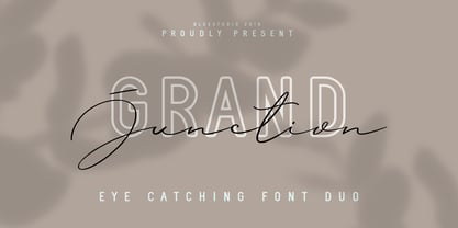 Grand Junction is a modern, elegant and stylish font duo. Grand Junction is the perfect collection of fonts for any design project that requires a light and charming feel. Use it to turn any design project into a true standout! What's include : Grand Junction Script Grand Junction Regular Grand Junction Outline Multilingual support - spread your message globally AÀÁÂÃÄÅCÇDÐEÈÉÌÍÎÏIÌÍÎÏNÑOØÒÓÔÕÖUÙÜÚÛWYÝŸÆßÞþ Encoded PUA Characters Fonts are fully accessible without additional design software. Happy designing!
 - Tilda by Etewut,
$30.00 Tilda is a sans serif typeface with big potential. It’s gonna be your daily font, because it perfectly fits to different tasks. Tilda is good as long text but also cool as eye-catch title. This font can be like human ages: childhood, adolescence, youth, adulthood and maturity: stylish THIN, fancy LIGHT, great REGULAR, golden BOLD, brilliant HEAVY And beautiful Isabella Bersellini created illustrations, say her hello! http://www.isabellabersellini.com
 - First love FD by Letterara,
$14.00 First Love Font Duo is the perfect calligraphy font: Elegant, Sweet, innocent, light, and charming, this one-of-a-kind typeface will add a unique charm to any design project! The connected heart feature makes this font even more charming. This font is PUA encoded which means you can access all of the glyphs Alternate, Titling and Swashes with ease! It features a varying baseline, gorgeous glyphs, and stunning alternates.
 - Colgent by Great Studio,
$15.00 Colgent is a modern serif font with a unique style, a light and high contrast font perfect for feminine logo signs, fashion heads & editorial designs. Colgent is perfect for branding projects, Logo design, Clothing Branding, packaging, magazine headings, advertising, T-shirts, postcards and much more. Colgent is also included full set of: Uppercase and lowercase letters multilingual characters numerals punctuation If you have any questions, don't hesitate to contact me.
 - Klick by Grontype,
$10.00 Klick is a Slab Serif Font family. The style are light, outline and Blurred. This font is elegant and it based on the combining a variety of styles. Suitable for Logo, greeting cards, quotes, posters, branding, name card, stationary, design title, blog header, art quote, typography Features : Uppercase and lowercase Numeral and Punctuation Please contact us if you have any questions. Enjoy the font and thanks for supporting us. Regards, Grontype.
 - Annexia by Koshemare Studio,
$10.00 Annexia is a serif font with a several styles from Light to Bold. Serifs and stretched letters connect two times the past and the future, creating a perfect present. This font doesn't have a specific mood. Depending on the tasks, it can show itself in different ways. The font is perfect for both text, headlines, and branding. The font was designed by Pavel Bruev and released by Koshemare studio in 2021
 - TT Prosto Sans by TypeType,
$29.00 Prosto Sans - this font family for any occasion. You can use these fonts almost everywhere. The modern open grotesque forms and classic font family formula: Thin, Light, Regular, Bold, Black and Italics. Prosto Sans is the assistant to work for any projects. Optimized for the websites, mobile applications, and printing materials. We offer you to have a look at this font’s narrow version, which is called TT Prosto Sans Condensed.
 - Bertie by ITC,
$29.99Bertie was designed by Alan Meeks in 1986, an ornamented typeface with a light and elegant look. Such typefaces were at their peak in the middle of the 19th century, when they were created for the advertisements of booming industries. The sophisticated Bertie is based on forms of the transitional period and is best used in headlines with point sizes of 18 or larger to highlight its unique details. - Necia Stencil by Graviton,
$20.00 Necia Stencil font family is the stencil version of Necia font family, it has been designed for Graviton Font Foundry by Pablo Balcells in 2014. Necia Stencil consists of 16 styles. The 8 “Stencil 1” styles contain a narrow stem for big sizes type and/or rigid materials printing, and the 8 “Stencil 2” styles contain a wide stem for small sizes type and/or light materials printing.
 - Elsewhere by Comicraft,
$29.00 Someday, a long time from now, in a galaxy not so very far away, you'll find yourself Suddenly transported to the nether-realms of Elsewhere, bathed in the light of the mystic moons of Meanwhile... While you're waiting for that day, check out this font by John "JG" Roshell. It may not provide you with the same transcendental experience, but JG assures us that it really is the next best thing.
 - Aguda Stencil by Graviton,
$20.00 Aguda Stencil font family is the stencil version of the Aguda font family and has been designed for Graviton Font Foundry by Pablo Balcells in 2014. Aguda Stencil consists of 16 styles. The 8 “Stencil 1” styles contain a narrow stem for big sizes type and/or rigid materials printing, and the 8 “Stencil 2” styles contain a wide stem for small sizes type and/or light materials printing.
 - Winterante by Aldedesign,
$25.00 Winterante is a beautiful and light handwritten font with a unique feel and a stunning impact. It will add a luxury spark to any design project that you wish to create! This font is PUA encoded which means you can access all of the amazing glyphs and ligatures with ease! Each Font Has: Stylish modern handwritten script Beautiful Swash (Ending tail) Beautiful Titling (Beginning tail) Special Ligatures Multilingual Support
 - Luckiest Guy Pro by Stiggy & Sands,
$29.00 Our Luckiest Guy Pro was inspired by hand-lettering by vintage 1950’s advertisements. The uber-bold unicase letterforms exude charm and light-heartedness, while the SmallCaps and extensive figure sets expand the range of usability and appeal. Opentype features include: - SmallCaps. - Full set of Inferiors and Superiors for limitless fractions. - Tabular, Proportional, and Oldstyle figure sets (along with SmallCaps versions of the figures). - Stylistic Alternates for Caps to SmallCaps conversion.
 - Helena Handbasket NF by Nick's Fonts,
$10.00The 1888 edtion of James Conner's Sons United States Type Foundry specimen book listed this little gem simply as "Antique Light". Its original, rather anemic outlines have been beefed up and its serifs have been rounded, with the result that this face will get noticed wherever it goes. Both versions of this font include the complete Latin 1252 and CE 1250 character sets, with localization for Romanian and Moldovan. - Odell by The Organic Type,
$29.99 Odell is a fun, whimsical, yet elegant handwritten font that was created in a light-hearted manner for use in things like menus, invitations, bed and breakfast collateral and whatever else you can dream up. Odell features extra thin letters and it is designed to be creative, a little fancy, and very legible. There are tons of foreign characters to choose from so you can write in other languages as well.
 - Scriptys by Atom,
$14.00 Scriptys is a beautiful and light handwritten font with a romantic twist. Use it to add an authentic spark to any design project. It includes 1-10 amazing alternates, which gives you the opportunity to create multiple unique designs with just this one download. It is suitable for logos, web, stationary kits, banners, greeting cards, quotes and every other design which needs an elegant touch. Have a great day! Thanks :)
 - Valve by Typodermic,
$11.95 Introducing Valve—the ultimate industrial typeface for the modern age. With its superelliptical letterforms and pragmatic stroke logic, Valve is the perfect choice for anyone looking to evoke the cold, hard world of plastics, pharmaceuticals, electronics, and alternative energy. But don’t be fooled by Valve’s emotionless, android-like forms. This is a typeface that packs a punch, with soft stroke ends that lend it a touch of elegance and sophistication. Whether you’re designing a cutting-edge tech brochure or a sleek new website, Valve is the perfect choice for anyone who wants to convey a sense of modernity and precision. And unlike other ultramodern typefaces that rely on tongue-in-cheek references to retro futurism, Valve is purely synthetic. Built solely from artificial elements with no specific structural source, this is a typeface that’s as forward-thinking as they come. So why settle for a typeface that’s stuck in the past when you can choose Valve and embrace the future? And with OpenType fractions, numeric ordinals, and a wide range of currency symbols included, Valve is more versatile than ever. Available in five weights—Extra-Light, Light, Regular, Bold, and Heavy—as well as a set of sleek obliques, Valve is the perfect choice for anyone looking to take their design game to the next level. So what are you waiting for? Choose Valve today and see the difference that a truly ultramodern typeface can make. Most Latin-based European writing systems are supported, including the following languages. Afaan Oromo, Afar, Afrikaans, Albanian, Alsatian, Aromanian, Aymara, Bashkir (Latin), Basque, Belarusian (Latin), Bemba, Bikol, Bosnian, Breton, Cape Verdean, Creole, Catalan, Cebuano, Chamorro, Chavacano, Chichewa, Crimean Tatar (Latin), Croatian, Czech, Danish, Dawan, Dholuo, Dutch, English, Estonian, Faroese, Fijian, Filipino, Finnish, French, Frisian, Friulian, Gagauz (Latin), Galician, Ganda, Genoese, German, Greenlandic, Guadeloupean Creole, Haitian Creole, Hawaiian, Hiligaynon, Hungarian, Icelandic, Ilocano, Indonesian, Irish, Italian, Jamaican, Kaqchikel, Karakalpak (Latin), Kashubian, Kikongo, Kinyarwanda, Kirundi, Kurdish (Latin), Latvian, Lithuanian, Lombard, Low Saxon, Luxembourgish, Maasai, Makhuwa, Malay, Maltese, Māori, Moldovan, Montenegrin, Ndebele, Neapolitan, Norwegian, Novial, Occitan, Ossetian (Latin), Papiamento, Piedmontese, Polish, Portuguese, Quechua, Rarotongan, Romanian, Romansh, Sami, Sango, Saramaccan, Sardinian, Scottish Gaelic, Serbian (Latin), Shona, Sicilian, Silesian, Slovak, Slovenian, Somali, Sorbian, Sotho, Spanish, Swahili, Swazi, Swedish, Tagalog, Tahitian, Tetum, Tongan, Tshiluba, Tsonga, Tswana, Tumbuka, Turkish, Turkmen (Latin), Tuvaluan, Uzbek (Latin), Venetian, Vepsian, Võro, Walloon, Waray-Waray, Wayuu, Welsh, Wolof, Xhosa, Yapese, Zapotec Zulu and Zuni.
 - TT Travels by TypeType,
$35.00 TT Travels useful links: Specimen | Graphic presentation | Customization options About TT Travels: TT Travels is a geometric grotesque with wide proportions and peculiar shapes of circles and brackets. TT Travels incorporates two stylistic sets which add completely different characters to the type family. The first set ss01 (aka salt) makes the font more humanistic, thanks to the ductal and smooth design of the characters defining the style. And if you want to work with the futuristic version of TT Travels, we recommend that you enable the second set (ss02). In this set, most of the characters defining the style change to characters possessing experimental forms of graphemes. For the convenience of the TT Travels font family use and for working within a complex text hierarchy, we've created 9 weights (Thin, X-Light, Light, Regular, Medium, DemiBold, Bold, X-Bold, Black) and added 9 true Italics. TT Travels also implements standard and discretionary ligatures, oldstyle figures, slashed zero, and much more. The full list of OpenType features used in TT Travels is: ordn, sups, sinf, numr, dnom, onum, tnum, pnum, liga, dlig, salt, ss01, ss02, case, frac, zero. TT Travels language support: Acehnese, Afar, Albanian, Alsatian, Aragonese, Arumanian, Asu, Aymara, Banjar, Basque, Belarusian (cyr), Bemba, Bena, Betawi, Bislama, Boholano, Bosnian (cyr), Bosnian (lat), Breton, Bulgarian (cyr), Cebuano, Chamorro, Chiga, Colognian, Cornish, Corsican, Cree, Croatian, Czech, Danish, Embu, English, Erzya, Estonian, Faroese, Fijian, Filipino, Finnish, French, Friulian, Gaelic, Gagauz (lat), Galician, German, Gusii, Haitian Creole, Hawaiian, Hiri Motu, Hungarian, Icelandic, Ilocano, Indonesian, Innu-aimun, Interlingua, Irish, Italian, Javanese, Judaeo-Spanish, Judaeo-Spanish, Kalenjin, Karachay-Balkar (lat), Karaim (lat), Karakalpak (lat), Kashubian, Khasi, Khvarshi, Kinyarwanda, Kirundi, Kongo, Kumyk, Kurdish (lat), Ladin, Latvian, Laz, Leonese, Lithuanian, Luganda, Luo, Luxembourgish, Luyia, Macedonian, Machame, Makhuwa-Meetto, Makonde, Malay, Manx, Maori, Mauritian Creole, Minangkabau, Moldavian (lat), Montenegrin (lat), Mordvin-moksha, Morisyen, Nahuatl, Nauruan, Ndebele, Nias, Nogai, Norwegian, Nyankole, Occitan, Oromo, Palauan, Polish, Portuguese, Quechua, Rheto-Romance, Rohingya, Romanian, Romansh, Rombo, Rundi, Russian, Rusyn, Rwa, Salar, Samburu, Samoan, Sango, Sangu, Scots, Sena, Serbian (cyr), Serbian (lat), Seychellois Creole, Shambala, Shona, Slovak, Slovenian, Soga, Somali, Sorbian, Sotho, Spanish, Sundanese, Swahili, Swazi, Swedish, Swiss German, Swiss German, Tagalog, Tahitian, Taita, Tatar, Tetum, Tok Pisin, Tongan, Tsonga, Tswana, Turkish, Turkmen (lat), Ukrainian, Uyghur, Vepsian, Volapük, Võro, Vunjo, Xhosa, Zaza, Zulu.
 - Polarized by Typodermic,
$11.95 Introducing Polarized—the innovative and ultramodern typeface that redefines the concept of digital display type. Inspired by the iconic seven-segment liquid crystal numeric displays, Polarized encapsulates the essence of technological advancement through its angular and geometric design. With its unique corner logic, Polarized provides a distinctive and futuristic look that sets it apart from other typefaces. Whether you’re creating a digital interface or a sci-fi themed project, Polarized’s sharp and sleek design will add a touch of technical elegance. But that’s not all—Polarized’s versatility doesn’t stop at its design. It features a range of currency symbols, numeric ordinals, primes, and OpenType fractions, providing the flexibility and functionality that you need for your project. Available in Extra-Light, Light, Regular, Semi-Bold, and Bold, with obliques, Polarized offers a range of weights and styles to suit your specific design requirements. Whether you need a subtle accent or a bold statement, Polarized has got you covered. Incorporate Polarized into your project and experience the power of a typeface that blends cutting-edge technology with contemporary design. Get ready to bring your work to the next level with Polarized. Most Latin-based European, Vietnamese, Greek, and most Cyrillic-based writing systems are supported, including the following languages. Afaan Oromo, Afar, Afrikaans, Albanian, Alsatian, Aromanian, Aymara, Azerbaijani, Bashkir, Bashkir (Latin), Basque, Belarusian, Belarusian (Latin), Bemba, Bikol, Bosnian, Breton, Bulgarian, Buryat, Cape Verdean, Creole, Catalan, Cebuano, Chamorro, Chavacano, Chichewa, Crimean Tatar (Latin), Croatian, Czech, Danish, Dawan, Dholuo, Dungan, Dutch, English, Estonian, Faroese, Fijian, Filipino, Finnish, French, Frisian, Friulian, Gagauz (Latin), Galician, Ganda, Genoese, German, Gikuyu, Greenlandic, Guadeloupean Creole, Haitian Creole, Hawaiian, Hiligaynon, Hungarian, Icelandic, Igbo, Ilocano, Indonesian, Irish, Italian, Jamaican, Kaingang, Khalkha, Kalmyk, Kanuri, Kaqchikel, Karakalpak (Latin), Kashubian, Kazakh, Kikongo, Kinyarwanda, Kirundi, Komi-Permyak, Kurdish, Kurdish (Latin), Kyrgyz, Latvian, Lithuanian, Lombard, Low Saxon, Luxembourgish, Maasai, Macedonian, Makhuwa, Malay, Maltese, Māori, Moldovan, Montenegrin, Nahuatl, Ndebele, Neapolitan, Norwegian, Novial, Occitan, Ossetian, Ossetian (Latin), Papiamento, Piedmontese, Polish, Portuguese, Quechua, Rarotongan, Romanian, Romansh, Russian, Rusyn, Sami, Sango, Saramaccan, Sardinian, Scottish Gaelic, Serbian, Serbian (Latin), Shona, Sicilian, Silesian, Slovak, Slovenian, Somali, Sorbian, Sotho, Spanish, Swahili, Swazi, Swedish, Tagalog, Tahitian, Tajik, Tatar, Tetum, Tongan, Tshiluba, Tsonga, Tswana, Tumbuka, Turkish, Turkmen (Latin), Tuvaluan, Ukrainian, Uzbek, Uzbek (Latin), Venda, Venetian, Vepsian, Vietnamese, Võro, Walloon, Waray-Waray, Wayuu, Welsh, Wolof, Xavante, Xhosa, Yapese, Zapotec, Zarma, Zazaki, Zulu and Zuni.
 - Bunken Tech Sans Wide by Buntype,
$49.00 The Bunken Tech Sans superfamily: A reminiscence of constructed fonts of the modern age designed with considerably cleaner forms. •See other members of the Superfamily: Bunken Tech Sans •For further details, view the Specimen PDF. Bunken Tech Sans Wide follows in the best tradition of the straight-lined and somewhat angular structures of its predecessors while offering a much more open and mild design. The shapes of the letters are therefore reduced to the most essential elements: The spurs on a, b, n and other lower case letters occur just as little as decorative or style details, the lightly rounded inside edges are more pleasing to the eye than certain historic role models and make for a harmonic, flowing style. Use In particular Bunken Tech Sans Wide stands out as an easy, distinctive headline font with its straight-lined, technical design. Open counters and large x-height make it equally suited for use in shorter texts. It is also perfectly complemented by Bunken Sans or Bunken Slab in longer texts (available soon). Features Available in 16 styles with widths ranging from Light to Heavy with associated Italics. All of the styles are very extensive: Support for at least 58 languages, Small Capitals, 9 number sets (e.g. Lining, Oldstyle, Tabular and Small Cap Figures), ligatures, alternate characters, numerous Opentype functions, and lots of other small features that make it more pleasant to work with the font on a daily basis as well as fulfilling typographic desires. Each style contains more than 870 characters! Each style is available in a professional (Pro) standard (Std) and Small Caps (SC) edition with a different range of functions. (Language support, OpenType features and number of glyphs). Details can be found on the respective pages. Bunken Tech Sans Wide is part of the Bunken Tech superfamily and is available in Condensed, Normal and Wide. Also of interest: The slab serif variation Bunken Tech Slab Features in Detail: 16 Weights: -Light -Book -Medium -SemiBold -Bold -ExtraBold -UltraBold -Heavy and corresponding Italics 3 Widths: -Condensed -Normal -Wide Alternate Characters: A, E, F, L, S, e, f, t, s, y, etc. Small Capitals 5 Sets of Figures: -Lining Figures -Old Style Figures -Tabfigures -Old Style Tabfigures -Small Cap Figures Automatic Ordinals Automatic Fractions Extended Language Support and more...
 - Basilio by Canada Type,
$29.95 In the late 1930s, old Egyptiennes (or Italiennes) returned to the collective consciousness of European printers and type houses — perhaps because political news were front a centre, especially in France where Le Figaro newspaper was seeing record circulation numbers. In 1939 both Monotype and Lettergieterij Amsterdam thought of the same idea: Make a new typeface similar to the reverse stress slab shapes that make up the titles of newspapers like Le Figaro and Le Frondeur. Both foundries intended to call their new type Figaro. Monotype finished theirs first, so they ended up with the name, and their type was already published when Stefan Schlesinger finished his take for the Amsterdam foundry. Schlesinger’s type was renamed Hidalgo (Spanish for a lower nobleman, ‘son of something’) and published in 1940 as ‘a very happy variation on an old motif’. Although it wasn’t a commercial success at the time, it was well received and considered subtler and more refined than the similar types available, Figaro and Playbill. In the Second World War, the Germans banned the use of the type, and Hidalgo never really recovered. Upon closer inspection, Schlesinger’s work on Hidalgo was much more Euro-sophisticated and ahead of its time than the too-wooden cut of Figaro and the thick tightness of Playbill. It has a modern high contrast, a squarer skeleton, contour cuts that work similarly outside and inside, and airy and minimal solutions to the more complicated shapes like G, K, M, N, Q and W. It is also much more aware of, and more accommodating to, the picket-fence effect the thick top slabs create in setting. Basilio (named after the signing teacher in Mozart’s Figaro) is the digital revival and major expansion of Hidalgo. With nearly 600 glyphs, it boasts Pan-European language support (most Latin languages, as well as Cyrillic and Greek), and a few OpenType tricks that gel it all together to make a very useful design tool. Stefan Schlesigner was born in Vienna in 1896. He moved to the Netherlands in 1925, where he worked for Van Houten’s chocolate, Metz department store, printing firm Trio and many other clients. He died in the gas chambers of Auschwitz in 1944. Digital revivals and expansions of two of his other designs, Minuet and Serena, have also been published by Canada Type.
 - Ulga Grid by ULGA Type,
$19.00 Update November 2022: ULGA Grid now features an oblique variant. It’s also been expanded into a family of different but related designs with the addition of ULGA Grid Solid and ULGA Grid Rounded typeface families. All variants and new designs are monospaced, sharing the same width as the original ULGA Grid font and matching character sets. The character set has also been enlarged and now supports Western Europe, Vietnamese, Central/Eastern Europe, Baltic, Turkish and Romanian. ULGA Grid is a modular, monospaced typeface reminiscent of the old Letraset LCD & Quartz typefaces from the 1970/80s with lots of alternative characters and ornaments to bring a fresh twist to the genre. The idea’s seed germinated while I was going through a phase of binge watching my favourite 1980/90s sci-fi movies (classics such as Terminator, Total Recall and RoboCop). However, perception and reality don’t always align. Thirty years later, when compared to today’s technology, some visual elements look kind of outdated, almost Retro Futuristic. The initial design process started out in Adobe Illustrator when I constructed letters from a few geometric shapes within a square block. Just playing around with different shapes was so engrossing that it wasn’t long before there were enough characters for a basic typeface. The project grew again as I experimented with designs within the shapes and set paragraphs of text in patterns, resulting in over a hundred alternative characters and ornaments, some of which double up as border designs. This typeface may be square but it’s anything but boring. What it lacks in legibility ULGA Grid makes up for in style and the end result is a surprisingly versatile typeface that you'll have fun using for a wide range of display purposes including CD covers, posters, packaging, advertising, brochures and film titles. Ironically, the fixed grid structure frees the characters to create patterns of text not possible with variable widths.
 - Antypica by Anfound Type,
$33.00 Antypica is a soft and friendly slab-serif font that draws inspiration from typewriter styles. This font is designed to be easily legible in both small and large sizes, making it a great option for various applications. Its simple yet timeless design with a modern twist makes it perfect for use in a wide range of design projects. This includes package design, ad campaigns, brand identities, movie titles, poster art, booklets, and even classified documents. With an impressive 790 glyph count, Antypica supports Basic Latin and Latin Extended-A. OpenType features further enhance typography by providing Small Caps and Small Numbers, Lining Figures, Oldstyle Figures, Superscripts, and Subscripts, Fractions, Tabular Lining Figures, Tabular Oldstyle Figures, Ligatures, and Contextual Alternates to prevent some unwanted letter pair collisions. Additionally, Stylistic Sets offer Stylistic Alternate Lowercase a, Alternate Cap T, Alternate Dollar Sign, and Slanted Hyphen to add calligraphic quality to text blocks, while the Special Set offers unique glyphs like Bitcoin and Interrobang. Antypica is highly versatile and can be used in many design applications. Small Caps and Small Numbers can be used creatively to create more visually engaging typography, and the optimized underline effect can be used to enhance the design. To access the Special Set in OpenType features, select it from the OpenType menu. To add special additional marks, type following in your text field. • For the Exclam-Comma mark, type ” ,! ” (comma+exclam) • For the Question-Comma mark, type ” ,? ” (comma+question) • For the Bitcoin mark, simply type " bitcoin " (not case sensitive). • For the alternate (Cap Height) Registered mark, type " registered " (not case sensitive). • For the Published mark, type " published " (not case sensitive). The font also has a small caps version of the Published Mark. • For the Numero mark, type " N° " (N + degree) (case sensitive). • For the Interrobang, type " bang " (not case sensitive). • For Price marking, type ” ,– ” (comma + one of these: hyphen, en dash, em dash). • For Dot(s) Pattern glyph, type " dots " (not case sensitive). • For Line(s) Pattern glyph, type " lines " (not case sensitive).
 - WEAR FAT SHIRT by TypoGraphicDesign,
$15.00 CONCEPT/ CHARACTERISTICS A display font that allows you to »Kleckern und Klotzen« (modified German proverb »to not take half-measures«) The fat and square character to the font, a bold and loud statement. The motto is square, practical, fat. The font styles ranging from high-contrast line difference "beanpole" over mediocrity "slim" to the fattest and blackest "okay" style. A font with humor ^^ APPLICATION AREA The modern, square lightweight »Fat Wear Shirt« would be happy as a display typeface in headline size on the following areas and would find this very real bold: Editorial Design (Magazine or Fanzine) or Webdesign (Headline Webfont for your website), party flyer, movie poster, music poster, clothing, fashion, t-shirts, music covers or webbanner. And and and… TECHNICAL SPECIFICATIONS Headline Font | Display Font | Fat Techno Font »Wear Fat Shirt« OpenType Font (Mac + Win) with 3 styles (okay, slim, beanpole) & 268 glyphs. Alternative letters and ligatures (with accents & €) Desktop Font (.otf) + Web Font (.svg, .eot, .woff) KONZEPT/BESONDERHEITEN Eine Display-Schrift bei der Kleckern und Klotzen erlaubt ist! (Verändertes deutsches Sprichwort »nicht kleckern sondern klotzen«) Der fette und eckige Charakter verleihen der Schrift eine plakative und laute Aussage. Das Motto lautet quadratisch, praktisch, fett. Die Schriftschnitte reichen von kontrastreichen Linienunterschied »beanpole«, über mittelmaß »slim« bis zum fettesten und schwärzesten »okay« Style. Eine Schrift mit Humor ^^ EINSATZGEBIETE Das moderne, quadratische Leichtgewicht »Wear Fat Shirt«, würde sich als Auszeichnungsschrift in Headlinegröße über folgende Einsatzgebiete sehr freuen und fände dies echt fett: Logos/Wortmarken aller Art, Flyer für fast jede Party, Platten Cover, CD-Cover und Icon Design, Plakat Design, Kleidung, T-Shirts, Comics und Graphicnovels, Game– und Videospiel Design aller Genres, als Headlineschrift für print und digitale Magazine, Bücher und Webseiten u.v.m. TECHNISCHE INFORMATIONEN Headline Font | Display Font | Fat Techno Font »Wear Fat Shirt« OpenType Font (Mac + Win) mit 3 Schriftschnitten (okay, slim, beanpole) & 268 Glyphen. Inkl. diakritisches Zeichen, alternative Buchstaben, Ligaturen & €. Desktop Font (.otf) + Web Font (.svg, .eot, .woff)
 - Hollywood Stars (Volume 1) by Celebrity Fontz,
$24.99Hollywood Stars (Volume 1) is a unique collection of signatures of 92 famous Hollywood stars in a high-quality font. A must-have for autograph collectors, desktop publishers, lovers of the arts, history, movie buffs, fans, or anyone who has ever dreamed of sending a letter, card, or e-mail "signed" as if by one of these famous Hollywood celebrities. This font includes signatures from the following Hollywood personalities: Michael Jackson, Farrah Fawcett, Elvis Presley, Marilyn Monroe, Ben Stiller, Kate Beckinsale, Steve Buscemi, Mel Gibson, Helen Hunt, Paul Reiser, Angelina Jolie, George Kennedy, Larry King, Edward Norton, Mira Sorvino, Steven Spielberg, Kate Winslet, Daniel Day Lewis, Laura San Giacomo, Holly Hunter, Jane Fonda, Alan Alda, Robbin, Williams, Alan Rickman, Al Pacino, Drew Barrymore, Bob Newhart, Brooke Shields, Burt Reynolds, Keira Knightley, Cheryl Ladd, Basil Rathbone, Minnie Driver, Debra Messing, David Schwimmer, Clint Eastwood, David Hyde Pierce, Burgess Meredith, Donald Trump, Linda Evans, Tony Danza, Gene Wilder, Cameron Diaz, Judi Dench, George Clooney, Nicolas Cage, Timothy Hutton, Jennifer Garner, Jay Leno, Tony Curtis, Suzanne Somers, Connie Selleca, Donald Sutherland, Jack Klugman, Tony Randall, Matthew Perry, Jenna Elfman, Morgan Fairchild, Jack Nicholson, Chazz Palminteri, Dustin Hoffman, Anthony Hopkins, Walter Matthau, Larry Hagman, Lisa Kudrow, Bill Cosby, John Mahoney, Ray Liotta, Jon Voight, Christian Slater, Chris Cooper, Dwayne "The Rock" Johnson, Drew Carey, Eli Wallach, Douglas Fairbanks Jr., Amanda Seyfried, Danny DeVito, Gary Sinise, Mary Tyler Moore, Edward Asner, Will Rogers, Cuba Gooding Jr., Bela Lugosi, Charles Grodin, Victoria Principal, Winona Ryder, Tea Leoni, Matt Damon, Loni Anderson, Emma Thompson, Ed O'Neill, Karl Malden. This font behaves exactly like any other font. Each signature is mapped to a regular character on your keyboard. Open any Windows application, select the installed font, and type a letter, and the signature will appear at that point on the page. Painstaking craftsmanship and an incredible collection of hard-to-find signatures go into this one-of-a-kind font. Comes with a character map. - Brass by HiH,
$8.00 The Brass Family has a lineage that extends into English history. About five hundred years ago a devout, but anonymous Englishman gave glory to the God he worshipped by designing the capital letters and decorations of these two fonts. Originally recorded in The History Of Mediaeval Alphabets And Devices by Henry Shaw (London 1853), they are described by Alexander Nesbitt in his Decorative Alphabets And Initials (Mineola, NY 1959) as “Initials and stop ornaments from brasses in Westminster Abbey.” I wish I could say I remember seeing them when I was there, but that was forty-two years ago and all I remember was seeing the tomb of Edward the Confessor. One definition of “stop” as a noun is a point of punctuation. I have heard people from the British Isles speak of a “full stop” when referring to a period. Some may remember a 19th century form of communication called a telegram being read aloud in an old movie, with the use of the word “stop” to indicate the end of a sentence or fragment. A full dozen of these stop ornaments are provided. They occupy positions 060, 062, 094, 123, 125, 126, 135, 137, 167, 172, 177 & 190. The Brass Family consists of two fonts: Brass and Brass Too. Both fonts have an identical upper case and ornaments, but paired with different lower cases. Although the typefaces from which the lower cases were drawn are both of modern design, both are interpretations of the textura style of blackletter in use in England when the upper case and ornaments were fashioned for the Abbey. Brass is paired with Morris Gothic, which matches the color of the upper case quite well. Brass Too is paired with Wedding Regular, which is distinctly lighter than the upper case. I find it very interesting how each connects differently. The resulting fonts are unusual and most useful for evoking an historic atmosphere.
 - Computechnodigitronic by Typodermic,
$11.95 Attention all tech enthusiasts! Introducing Computechnodigitronic—the futuristic typeface you never knew you needed. This segmented LED/LCD display font is the epitome of 1980s sci-fi style, and it’s here to take your designs to the next level. With its sleek, modern design and perfectly spaced letters, Computechnodigitronic prioritizes legibility while still conveying the concept of a digital readout. And, for those of you who need to create vertical numeric columns, we’ve got you covered. Our monospaced numerals make it easy to create stunning displays that look straight out of a sci-fi movie. Imagine your designs, lit up like a spaceship dashboard, communicating important information to your audience with ease. Whether you’re working on a website, an app, or a print design, Computechnodigitronic will help you stand out from the crowd. So, what are you waiting for? Upgrade your designs today with Computechnodigitronic—the perfect blend of style and function. Most Latin-based European writing systems are supported, including the following languages. Afaan Oromo, Afar, Afrikaans, Albanian, Alsatian, Aromanian, Aymara, Bashkir (Latin), Basque, Belarusian (Latin), Bemba, Bikol, Bosnian, Breton, Cape Verdean, Creole, Catalan, Cebuano, Chamorro, Chavacano, Chichewa, Crimean Tatar (Latin), Croatian, Czech, Danish, Dawan, Dholuo, Dutch, English, Estonian, Faroese, Fijian, Filipino, Finnish, French, Frisian, Friulian, Gagauz (Latin), Galician, Ganda, Genoese, German, Greenlandic, Guadeloupean Creole, Haitian Creole, Hawaiian, Hiligaynon, Hungarian, Icelandic, Ilocano, Indonesian, Irish, Italian, Jamaican, Kaqchikel, Karakalpak (Latin), Kashubian, Kikongo, Kinyarwanda, Kirundi, Kurdish (Latin), Latvian, Lithuanian, Lombard, Low Saxon, Luxembourgish, Maasai, Makhuwa, Malay, Maltese, Māori, Moldovan, Montenegrin, Ndebele, Neapolitan, Norwegian, Novial, Occitan, Ossetian (Latin), Papiamento, Piedmontese, Polish, Portuguese, Quechua, Rarotongan, Romanian, Romansh, Sami, Sango, Saramaccan, Sardinian, Scottish Gaelic, Serbian (Latin), Shona, Sicilian, Silesian, Slovak, Slovenian, Somali, Sorbian, Sotho, Spanish, Swahili, Swazi, Swedish, Tagalog, Tahitian, Tetum, Tongan, Tshiluba, Tsonga, Tswana, Tumbuka, Turkish, Turkmen (Latin), Tuvaluan, Uzbek (Latin), Venetian, Vepsian, Võro, Walloon, Waray-Waray, Wayuu, Welsh, Wolof, Xhosa, Yapese, Zapotec Zulu and Zuni.
 - Cinema Macabre by Wing's Art Studio,
$10.00 Cinema Macabre: Horror Fonts Torn from the Pages of Giallo A Hand-drawn Display Font for Creating the Most Diabolical Horror Titles This loose and inky brush font takes its inspiration from the classic Giallo film posters of the 1960s to 1980s - a cult cinematic subgenre beloved for its stylish visuals, haunting soundtracks and exploitation led marketing. It's a devilishly drawn design that aims to capture the feeling of vintage horror, preserving analogue details of old print while remaining versatile enough to work across a variety of digital designs. The Cinema Macabre font family boasts six fonts, each containing a unique set of uppercase and lowercase characters, as well as numerals, punctuation and language support. Add to this a host of custom ligatures, underlines and graphic elements and you have an essential toolbox for creating truly hand-made looking title designs. Cinema Macabre if a font that rewards experimentation by mixing all the various upper and lowercase alternatives, with interesting combinations waiting to be found and inspire terror across your own movie posters, book covers, albums and editorials. Few other fonts offer the versatility to create such diabolical designs! A Brief Introduction to Giallo: In popular cinema, Giallo is a genre of mystery fiction and thrillers often containing slasher, psychological horror, exploitation, supernatural and erotic elements. The term giallo (meaning yellow) derives from a series of pulp novels published by Mondadori from 1929 taking the name from its trademark yellow covers. The series consisted of Italian translations of mystery novels by well-known authors such as Agatha Christie, Edgar Allan Poe and Raymond Chandler. The popularity of these cheap paperbacks eventually established the word Giallo as a synonym in Italian for a mystery novel. The cinematic Giallo subgenre developed during the 1960-80s and are noted for their vivid cinematography, memorable soundtracks and inventive gore-filled scenarios. Key examples include Dario Argento's Suspiria, Tenebrae and Deep Red - stylish films that at once influenced the American slasher (see Black Christmas and Friday 13th) up to todays horror in Censor and Last Night In Soho.
 - Croteau by Typodermic,
$11.95 Welcome to the world of horror! Meet Croteau, the scariest typeface you’ll ever lay your eyes on. This font is inspired by the 1960s horror movies, so you know it’s going to be good. Use it to enhance the horribleness of your message and terrify your audience. With 250 spooky bespoke ligatures, Croteau can produce an intriguing interlocking letter effect that will give your design an eerie look. The letter pair ligatures help break up the monotony of plainly repeating characters, adding an extra layer of horror to your design. Use this OpenType-savvy app to create an unforgettable experience for your audience. But beware, turning off the “standard ligatures” functionality in your app may eliminate this effect. So keep it on and let the horror unfold. Step into the world of horror with Croteau, and give your designs a spine-chilling twist. Get ready to be scared out of your mind! Most Latin-based European writing systems are supported, including the following languages. Afaan Oromo, Afar, Afrikaans, Albanian, Alsatian, Aromanian, Aymara, Bashkir (Latin), Basque, Belarusian (Latin), Bemba, Bikol, Bosnian, Breton, Cape Verdean, Creole, Catalan, Cebuano, Chamorro, Chavacano, Chichewa, Crimean Tatar (Latin), Croatian, Czech, Danish, Dawan, Dholuo, Dutch, English, Estonian, Faroese, Fijian, Filipino, Finnish, French, Frisian, Friulian, Gagauz (Latin), Galician, Ganda, Genoese, German, Greenlandic, Guadeloupean Creole, Haitian Creole, Hawaiian, Hiligaynon, Hungarian, Icelandic, Ilocano, Indonesian, Irish, Italian, Jamaican, Kaqchikel, Karakalpak (Latin), Kashubian, Kikongo, Kinyarwanda, Kirundi, Kurdish (Latin), Latvian, Lithuanian, Lombard, Low Saxon, Luxembourgish, Maasai, Makhuwa, Malay, Maltese, Māori, Moldovan, Montenegrin, Ndebele, Neapolitan, Norwegian, Novial, Occitan, Ossetian (Latin), Papiamento, Piedmontese, Polish, Portuguese, Quechua, Rarotongan, Romanian, Romansh, Sami, Sango, Saramaccan, Sardinian, Scottish Gaelic, Serbian (Latin), Shona, Sicilian, Silesian, Slovak, Slovenian, Somali, Sorbian, Sotho, Spanish, Swahili, Swazi, Swedish, Tagalog, Tahitian, Tetum, Tongan, Tshiluba, Tsonga, Tswana, Tumbuka, Turkish, Turkmen (Latin), Tuvaluan, Uzbek (Latin), Venetian, Vepsian, Võro, Walloon, Waray-Waray, Wayuu, Welsh, Wolof, Xhosa, Yapese, Zapotec Zulu and Zuni.
 - Rukyltronic by Typodermic,
$11.95 Welcome to Rukyltronic—a synthetic bitmap font that brings a unique and intriguing twist to your designs. Inspired by the eccentric computer fonts from the 1980s science fiction computer games, Rukyltronic boasts an array of interesting effects that will add a touch of nostalgia to your creations. With its variable gaps, Rukyltronic is the perfect choice for anyone looking to create an authentic pixel font look. The kerning is limited to full pixel increments, allowing you to achieve an authentic low resolution look and feel in your designs. Whether you’re working on a retro video game, a sci-fi movie poster, or a digital art piece, Rukyltronic is the font you need to bring that vintage 80s computer feel to life. Its unique style and limited kerning create a humble yet striking appearance that is sure to catch the eye of your audience. So what are you waiting for? Give Rukyltronic a try today and let your designs stand out! Most Latin-based European writing systems are supported, including the following languages. Afaan Oromo, Afar, Afrikaans, Albanian, Alsatian, Aromanian, Aymara, Bashkir (Latin), Basque, Belarusian (Latin), Bemba, Bikol, Bosnian, Breton, Cape Verdean, Creole, Catalan, Cebuano, Chamorro, Chavacano, Chichewa, Crimean Tatar (Latin), Croatian, Czech, Danish, Dawan, Dholuo, Dutch, English, Estonian, Faroese, Fijian, Filipino, Finnish, French, Frisian, Friulian, Gagauz (Latin), Galician, Ganda, Genoese, German, Greenlandic, Guadeloupean Creole, Haitian Creole, Hawaiian, Hiligaynon, Hungarian, Icelandic, Ilocano, Indonesian, Irish, Italian, Jamaican, Kaqchikel, Karakalpak (Latin), Kashubian, Kikongo, Kinyarwanda, Kirundi, Kurdish (Latin), Latvian, Lithuanian, Lombard, Low Saxon, Luxembourgish, Maasai, Makhuwa, Malay, Maltese, Māori, Moldovan, Montenegrin, Ndebele, Neapolitan, Norwegian, Novial, Occitan, Ossetian (Latin), Papiamento, Piedmontese, Polish, Portuguese, Quechua, Rarotongan, Romanian, Romansh, Sami, Sango, Saramaccan, Sardinian, Scottish Gaelic, Serbian (Latin), Shona, Sicilian, Silesian, Slovak, Slovenian, Somali, Sorbian, Sotho, Spanish, Swahili, Swazi, Swedish, Tagalog, Tahitian, Tetum, Tongan, Tshiluba, Tsonga, Tswana, Tumbuka, Turkish, Turkmen (Latin), Tuvaluan, Uzbek (Latin), Venetian, Vepsian, Võro, Walloon, Waray-Waray, Wayuu, Welsh, Wolof, Xhosa, Yapese, Zapotec Zulu and Zuni.
 - Milligram by Zetafonts,
$35.00 Grotesque sans typefaces: you know you won’t ever get tired of those. And any moment you decide that Vignelli was right and one Swiss font is enough, here comes a new specimen from the past inviting you to try new takes on the modernist letterforms. It's a tight and crowded design space, so design decisions are subtle and almost unnoticeable. Whoever you decide to be in the details - either God or the Devil - you surely need a taste for the infinitesimal to work with these shapes. Time design borders sandstoning shapes, in a delicate equilibrium between modernist precise ideals and the fascinating energy of old lead grotesques. The resulting typeface develops around an idiosyncratic relationship with negative space, inspired by the tight metrics modernist designers imposed on their layouts. Leaving a text optimised spacing to the text subfamily, Milligram plays with a feeling of attraction behind shapes, something brought to the extremes in the logo-oriented Milligram Macro Variant. Designed by Cosimo Lorenzo Pancini with Andrea Tartarelli, Milligram is a fine but bold homage to the Akzidenz Grotesk that never was. • Suggested uses: Milligram is a versatile type family: perfect for modern branding and logo design (Milligram Macro), for text and editorial design (Milligram Text), web design, packaging and countless other projects; • 36 styles: 7 weights + 7 italics x 3 different styles + 2 variable fonts; • 759 glyphs in each weight; • Useful OpenType features: Access All Alternates, Case-Sensitive Forms, Glyph Composition / Decomposition, Denominators, Fractions, Kerning, Lining Figures, Localized Forms, Mark Positioning, Mark to Mark Positioning, Alternate Annotation Forms, Numerators, Oldstyle Figures, Ordinals, Proportional Figures, Scientific Inferiors, 5 Stylistic Sets, Subscript, Superscript, Tabular Figures, Slashed Zero; • 207 languages supported (extended Latin and Cyrillic alphabets): English, Spanish, Portuguese, French, Russian, German, Javanese (Latin), Turkish, Italian, Polish, Afaan Oromo, Tagalog, Sundanese (Latin), Filipino, Moldovan, Romanian, Indonesian, Dutch, Cebuano, Malay, Uzbek (Latin), Kurdish (Latin), Swahili, Hungarian, Czech, Haitian Creole, Hiligaynon, Afrikaans, Somali, Zulu, Serbian, Swedish, Bulgarian, Shona, Quechua, Albanian, Catalan, Chichewa, Ilocano, Kikongo, Kinyarwanda, Neapolitan, Xhosa, Tshiluba, Slovak, Danish, Gikuyu, Finnish, Norwegian, Sicilian, Sotho (Southern), Kirundi, Tswana, Sotho (Northern), Belarusian (Latin), Turkmen (Latin), Bemba, Lombard, Lithuanian, Tsonga, Wolof, Jamaican, Dholuo, Galician, Ganda, Low Saxon, Waray-Waray, Makhuwa, Bikol, Kapampangan (Latin), Aymara, Ndebele, Slovenian, Tumbuka, Venetian, Genoese, Piedmontese, Swazi, Latvian, Silesian, Bashkir (Latin), Sardinian, Estonian, Afar, Cape Verdean Creole, Maasai, Occitan, Tetum, Oshiwambo, Basque, Welsh, Chavacano, Dawan, Montenegrin, Walloon, Asturian, Kaqchikel, Ossetian (Latin), Zapotec, Frisian, Guadeloupean Creole, Q’eqchi’, Karakalpak (Latin), Crimean Tatar (Latin), Sango, Luxembourgish, Samoan, Maltese, Tzotzil, Fijian, Friulian, Icelandic, Sranan, Wayuu, Papiamento, Aromanian, Corsican, Breton, Amis, Gagauz (Latin), M?ori, Tok Pisin, Tongan, Alsatian, Atayal, Kiribati, Seychellois Creole, Võro, Tahitian, Scottish Gaelic, Chamorro, Greenlandic (Kalaallisut), Kashubian, Faroese, Rarotongan, Sorbian (Upper Sorbian), Karelian (Latin), Romansh, Chickasaw, Arvanitic (Latin), Nagamese Creole, Saramaccan, Ladin, Palauan, Sami (Northern Sami), Sorbian (Lower Sorbian), Drehu, Wallisian, Aragonese, Mirandese, Tuvaluan, Xavante, Zuni, Montagnais, Hawaiian, Marquesan, Niuean, Yapese, Vepsian, Bislama, Hopi, Megleno-Romanian, Creek, Aranese, Rotokas, Tokelauan, Mohawk, Warlpiri, Cimbrian, Sami (Lule Sami), Jèrriais, Arrernte, Murrinh-Patha, Kala Lagaw Ya, Cofán, Gwich’in, Seri, Sami (Southern Sami), Istro-Romanian, Wik-Mungkan, Anuta, Sami (Inari Sami), Yindjibarndi, Noongar, Hotc?k (Latin), Meriam Mir, Manx, Shawnee, Gooniyandi, Ido, Wiradjuri, Hän, Ngiyambaa, Delaware, Potawatomi, Abenaki, Esperanto, Folkspraak, Interglossa, Interlingua, Latin, Latino sine Flexione, Lojban, Novial, Occidental, Slovio (Latin), Volapük.
 - Margarine Pro by Stiggy & Sands,
$29.00 Our Margarine Pro draws its roots loosely from numerous inspirations, but its unique thick marker weight and deliberate carrying of rounds into regularly straightened letterforms allows this typeface to stand on its own. The lively letterforms are legible yet slightly offbeat, while the SmallCaps and extensive figure sets expand the range of usability and appeal. Opentype features include: - SmallCaps. - Full set of Inferiors and Superiors for limitless fractions. - Tabular, Proportional, and Oldstyle figure sets (along with SmallCaps versions of the figures). - Stylistic Alternates for Caps to SmallCaps conversion.
 - Namaskarn by Jipatype,
$25.00 ฟอนต์ นมัสการ แบบอักษรได้แรงบันดาลใจจากเขียนตัวอักษรวิจิตรด้วยปากกาหัวตัด ที่มีองศาในการเดินเส้นที่ 45 องศา เลยเอาตัวเลข 45 องศามาใข้ในการออกแบบ สังเกตได้จากการจบเส้น เช่น "r" ปลายตัดที่ 45 องศา แบบอักษรมีความเปรียบต่างสูง เหมาะกับการใช้เป็นผาดหัว ข้อความสั่นๆ หรือ Quote มี 9 น้ำหนัก ทั้งตัวตรงและตัวเอียงรวมเป็น 18 สไตล์ -- Namaskarn Font inspired by flat calligraphy pen, with at 45 degrees when holding the pen, so the number 45 degrees was used in the design for example "r" at the terminal cut at 45 degrees. The font has a high contrast. Suitable for use as a headline, sub-headline or quote, comes in 9 weights, upright and italic for a total of 18 styles.
 - Motorix by Ampersand Type Foundry,
$24.00 Motorix is a typeface of alternatives. A versatile and highly flavorful constructivist design in three weights with corresponding italics, and hundreds of variant forms. Motorix’ interchangeable letterforms yield a multitude of combinations that elicit electronic rhythms and at times take on humanistic forms. The name Motorix is a pseudo-feminized variant (the ‘-ix’ suffix being derived from ‘-trix’) of the German word ‘motorik’, which refers to both electronic music and human motor skills. The typeface lives up to its energetic name, synthesizing precise rhythms and alphabetic waveforms into a uniquely upbeat and spunky typeface.
 - Skapa by Fontoura,
$24.00 Skapa is all about creation (translation from Old Norse: "to create"). It's simply the font I always needed and wanted. A well balanced, modern with delicate round corners sans serif, comprised of 5 weights with matching italics. Great for varied graphic design projects and perfect for logos and headlines, print art, billboards etc. Extended support for Central, Eastern and Western European languages. OpenType layout features: Fractions, oldstyle figures, ligatures, slashed zero, superscript, subscript, numerator, denominator and combining diacriticals (Mark Positioning) plus tabular figures for standard figures ,oldstyle figures & currency symbols. Think. Design. Create.
 - Mak by Tkachenko design,
$21.00 Mak is a display font with a Ukrainian feeling inspired by Ukrainian music. This is a big update of the first free two styles of Mak (SemiBold High & Black High) that were created in 2019 and become widespread among free display fonts. The big update wasn't been only adding more weights and contrasts but also changing a lot of glyphs and adding new ones. Now Mak supports all Latin-based languages and European Cyrillic. Experiments with historical forms, contrasts, and daring shapes to create a new image of Ukrainian Cyrillic and Latin based on it.
 - Olis by Roman Polishchuk,
$34.00 Olis is a stylish, fresh new handwritten script. Olis comes with two weights, numerals, punctuations, and some variations on character including OpenType alternates, and common ligatures. It helps set your designs apart by adding a custom-lettered look. You will also find that its initial and terminal letters can enhance your designs in new and creative ways. Hand-drawn leaves, plants, flowers, as well as large and small snowflakes add original detail while complementing the font perfectly. If you like this font you might also like an aesthetic text generator by the same author.
 - Chroman by Larin Type Co,
$16.00 Chroma this is a modern and elegant typeface. It carries a bold weight and with it in highlight the main thing, make a title or logo and much more. It can also be more expressive and playful, thanks to the many alternates that are harmoniously combined in this font and make it more attractive and expressive. Try to change the alternatives, ligatures and you will get a lot of options for your project that will make it unique. This font is easy to use and has OpenType features.
 - Hermit by Davide Romito,
$106.00 Hermit was born like a modern and personal reinterpretation of Gothic-style alphabets, where improvisation and personal taste have led the design towards a new aesthetic mix between gothic and modern typefaces, creating new glyphs with tweaked strokes to achieve a good level of legibility. Hermit is a modern gothic font designed for brave designers and for epic designs, available in three weights and variable fonts. It is good to use for Branding and Editorial projects with texts not too small, Advertising, Packaging, Labeling, and Book or Magazine titles.
 - Dupont Gothic by Hexagon Foundry,
$19.00 Dupont Gothic is a sleek and contemporary sans-serif font that embodies elegance, clarity, and modernity. With its clean lines, balanced proportions, and distinctive character, Dupont Gothic is a versatile typeface that can be used in many ways. The simplicity of Dupont Gothic lends itself to a wide range of applications. Whether used for headlines, body text, or branding, this font possesses a quality to effortlessly adapt to different design contexts. The font comes in 10 weights with matching oblique characters, 2 widths, and 2 style sets that ensure the endless combinations and possibilities.