10,000 search results
(0.052 seconds)
- Alcapone by Adam Fathony,
$17.00 Alcapone, a name based from legendary donuts on some brand, It's crunchy and melty. So, I've created this fonts while eating this meal. The Concept is Groovy, Retro & Psychedelic look. Created with a base on standard Serif fonts, playing with melted on the serif itself giving more weight to represent the grooviness and retro-ish look. Alcapone are good for Display, Header, Headline, Poster, Logos, or etc on a big typography.
 - Crazy Party by Sarid Ezra,
$15.00 Crazy Party is a quirky handmade font that will make all your project more unique and handy. This font also including a unique lowercase and uppercase with very different weight. Combining the uppercase and lowercase in one word will make your project even more stunning. You can use this font for quotes, your cover book or playing with words in your instagram post. This font also support multilingual!
 - Blauth by Latinotype,
$29.00 Blauth—a versatile and contemporary sans serif typeface—comes in 8 weights, ranging from Thin to Black, with matching italics and contains a set of alternate characters. Its small x-height gives it an elegant feel that reminds us of classic typefaces. Blauth is well-suited to continuous text and its uppercase set is ideal for high-impact headlines while its softened corners give your designs a warm and contemporary look.
 - Tinman Pro by No Bodoni,
$35.00 TinmanPro is a mildly stressed humanist sans serif type based on the University of California Oldstyle type designed by Frederick Goudy. The design captures the warmth and friendly character of Goudy�s original in a monotone sans. Broad Latin support along with small caps, fraction support and other typographic niceties are included in the ten font family. Weight range includes Regular, Medium, DemiBold, Bold and ExtraBold with matching italics for each.
 - Superpop by Resistenza,
$39.00 Superpop is sweet and gentle, a rounded geometric sans with a brushy script twist. Soft and refreshing like a soda, this font gets fizzy when geometric letterforms get mixed with script shapes you wouldn’t expect in a Sans Serif. A display family with two styles ( regular and italic ), 5 weights and an outline version for each style. Opentype Features: https://www.rsztype.com/article/how-to-use-opentype-features-adobe-microsoft-pages
 - Chilidog PB by Pink Broccoli,
$16.00 Looking for a real fun whack-a-doodle typestyle? You may have just found your match with the Chilidog PB typeface. Chilidog PB began as a digitization of the film typeface called Nectar by LetterGraphics. This font is filled with irregular shapes, shifting weights, and a collection of ligatures that give it real personality. It's a real eyecatcher, but don't take my word for it, give it a spin for yourself.
 - Deleplace by Typogama,
$29.00 Deleplace is a modern, delicate and refined typeface that is both contemporary and hints at a classical past. Featured in 3 weights, this family includes an extended language support that covers extended latin and cyrillic scripts. It equally includes a series of Opentype features, from ligatures, alternates, different number options and swash letters. Suited for bot text and large display, this versatile family will be a refined addition to your catalogue.
 - Breakfast Script by Fenotype,
$35.00 Breakfast Script is an elegant connected script family of three weights. Breakfast Script is equipped with Contextual Alternates that helps to keep connections smooth. Every standard character also has Swash Alternate for more funky letters. In addition there’s 26 ending swooshes placed in a-z that you can access from Stylistic Alternates. Breakfast Script is a great display type that works as a logotype or fancy headline type.
 - Domosed Slab Serif by Etewut,
$29.00 Domosed Slab Serif typeface was build during lockdown. As a result of home sitting it appears in two weights. It refers to Italian futurism when all generation understand global changes of industrial revolution. The forth industrial revolution appears with new rules but the main idea is the same – simplifying the processes. Causing the vibe of a bright phenomenon I want you to use my font to match to zeitgeist.
 - MBF Ligione by Moonbandit,
$15.00 Ligione is a multi function font family, consist of uppercase and lowercase with 4 weight and 4 width option making it a big 8 styles in total. This typeface is a modern display sans serif packed with a geometric modular assembly in mind, combine the regular and expanded style for a unique touch on your design. This font is perfect for a big size display, title, body text and even logo.
 - Santanelli by Pisto Casero,
$19.00 Santanelli is a rounded all caps display typeface. It is intended to be used in posters, editorial headlines and logotypes. It comes in three weights: Thin, Medium and Bold. Each letter has been designed with two different styles or flavors: decorative and clean. You can access each of them by typing uppercase and lowercase respectively. These two styles fit perfectly when combined within the same word or message.
 - Metroland by takoliko,
$15.00 Metroland inspired by urban and modern life on a metropolis city. Metroland have a Subway vibe and a transportation theme that relate to our routine. Metroland is simple and modern sans serif display family font. it has a monoline geometric, and simple atmosphere. Metroland came with 9 weight and 9 italic fonts. It can easily be matched to an incredibly large set of projects, and good for communicating your brands.
 - Ziletti Pop by RM&WD,
$20.00 ZILETTI POP is a font used by Girolamo Ziletti in Venice in mid/late 1500. A typographic caracter characterized by a Venetian style cage with slight geometrical imperfections but with a great perceptual level. This is a multilayered variant with a wide range of possibility in variations in terms of end results. With the use of the color your artworks will have news optical effects. Ideal for Covers, Posters, Logos…
 - Big Cat by FontMesa,
$25.00 Released in 2006 under the name Flatrock this new 2020 version takes back the original name of Big Cat. Also new for 2020 are two solid black weights and Big Cat now has additional accented glyphs for eastern European countries. If you're looking to make an authentic 1800's broadside poster then Big Cat is perfect for the job, combine it with other woodtype fonts from our collection.
 - Waveruder by UICreative,
$23.00 Introducing our new product the name Waveruder Retro Display Font comes with 3 different weights. Modern Serif font that beautiful classy, elegant, and modern. This font is perfectly suited for a wide variety of projects, such as signature, stationery, logo, wedding, typography quotes, magazine or book covers, website headers, clothing, branding, packaging design, and more. Also for fashion-related branding or editorial design and displays both masculine and feminine qualities.
 - Krellon by Nathatype,
$29.00 Krellon invites you to step back in time and embrace the elegance of the past with its vintage style. Rounded shapes define each character, creating a sense of approachability and friendliness. What makes Krellon so special is its subtle, textured appearance. The font carries a delightful roughness that adds authenticity to your text, as if each letter has endured the test of time. Beautiful ornaments are included as a bonus. Krellon fits in headlines, logos, branding materials, and many more.
 - Kattys by Flawlessandco,
$9.00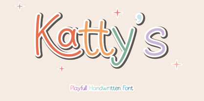 Introducing "Kattys" - a delightful and playful handwritten font that adds a touch of whimsy to any project. An Original typeface that suitable for any graphic designs such as branding materials, t-shirt, print, business cards, logo, poster, t-shirt, photography, quotes .etc This font support for some multilingual. Modern Sweet Retro that contains uppercase A-Z and lowercase a-z, alternate character, numbers 0-9, and some punctuation. If you need help, just write me! Thanks so much for checking out my shop!
 - Saturday Lunchtime by Rillatype,
$17.00 Saturday Lunchtime Font is a delightful combination of handwritten sans serif in uppercase and charming script in lowercase. Crafted with a cute and playful vibe, this font is perfect for creating logos for children's brands or adding a touch of whimsy to quotes. Its versatility allows you to use either the uppercase or lowercase alone, and you can activate swashes by typing underscore followed by numbers 1-3. Elevate your designs with the joyful and dynamic aesthetic of Saturday Lunchtime Font!
 - Toony Line by Mans Greback,
$59.00 Toony Line is a comic font that feels like a delightful throwback to the golden age of cartoons. Funny and loony, the font channels playful tunes while its sharp, sans-serif characters dance on the page with a joy reminiscent of our favorite animated classics. There's a hint of Mickey's magic, a dash of Disney dreaminess, and the unapologetic boldness of comic strips and street art. But what sets Toony Line apart is its intricate overlapping effect, made possible by sophisticated OpenType.
 - Make Wish by Flawlessandco,
$9.00 Make Wish is a Handwritten Funny Font. Unleash a burst of laughter and lightheartedness with "Make Wish," a delightful handwritten font that adds a touch of humor and playfulness to your designs. There's some connected letters and some alternates that suitable for any graphic designs. This font support for some multilingual. Also contains uppercase A-Z and lowercase a-z, alternate character, numbers 0-9, and some punctuation. If you need help, just write me! Thanks so much for checking out my shop!
 - Flower Island by Flawlessandco,
$9.00 Flower Island - A Playful Bubble Display Font. Immerse yourself in the whimsical world of Flower Island, a delightful bubble display font that adds a touch of fun and playfulness to your designs. There's some connected letters and some alternates that suitable for any graphic designs. This font support for some multilingual. Also contains uppercase A-Z and lowercase a-z, alternate character, numbers 0-9, and some punctuation. If you need help, just write me! Thanks so much for checking out my shop!
 - Grandeux Serif by Mans Greback,
$59.00 Grandeux Serif is a classic Victorian-inspired font that exudes vintage elegance and sophistication. Its distinct vintage style makes it perfect for adverts, restaurant branding, and other high-end design projects that require a touch of luxury and refinement. The font's heavy strokes and high-quality craftsmanship give it a strong presence, while its intricate details and stylistic alternates allow for a truly customized and unique typographical experience. The Grandeux Serif font family includes six high-quality styles to suit various design needs: Light: Delicate and sophisticated for a subtle, elegant presence Light Italic: Adds a touch of dynamic flair to the light style Regular: A well-balanced, classic look for versatile use Regular Italic: Combines the versatility of regular with a touch of expressiveness Bold: A strong, assertive style for impactful designs Bold Italic: Merges the boldness of the bold style with the energy of italic The font is built with advanced OpenType functionality and has a guaranteed top-notch quality, containing stylistic and contextual alternates, ligatures and more features; all to give you full control and customizability. It has extensive lingual support, covering all Latin-based languages, from Northern Europe to South Africa, from America to South-East Asia. It contains all characters and symbols you'll ever need, including all punctuation and numbers.
 - Quarpa by Pasternak,
$9.00 Name: Quarpa Styles: 6 styles Glyphs: 394 Year: 2021 This lofty font features a compact structure as well as a unique combination of rounded corners and square contours. The collection includes six styles: Extra Light, Light, and Semi Light that will ensure elegance; Regular, Medium, Semi Bold and Bold suitable for a solid design. Each of them also has Italic variation. It’s an ideal option for outstanding corporate images, logos, promos, or video presentations. Quarpa has proper kerning, multi-lingual support, and ligatures. Languages: Afrikaans, Albanian, Asu, Basque, Bemba, Bena, Bosnian, Catalan, Cebuano, Chiga, Colognian, Cornish, Corsican, Croatian, Czech, Danish, Embu, English, Esperanto, Estonian, Faroese, Filipino, Finnish, French, Friulian, Galician, German, Gusii, Hungarian, Icelandic, Ido, Indonesian, Interlingua, Irish, Italian, Javanese, Jju, Kabuverdianu, Kalaallisut, Kalenjin, Kamba, Kikuyu, Kinyarwanda, Kurdish, Latvian, Lithuanian, Lojban, Low German, Lower Sorbian, Luo, Luxembourgish, Luyia, Machame, Makhuwa-Meetto, Makonde, Malagasy, Malay, Maltese, Manx, Maori, Meru, Morisyen, North Ndebele, Northern Sotho, Norwegian Bokmål, Norwegian Nynorsk, Nyanja, Nyankole, Occitan, Oromo, Polish, Portuguese, Romanian, Romansh, Rombo, Rundi, Rwa, Samburu, Sango, Sangu, Sardinian, Scottish Gaelic, Sena, Shambala, Shona, Slovak, Slovenian, Soga, Somali, South Ndebele, Southern Sotho, Spanish, Swahili, Swati, Swedish, Swiss German, Taita, Taroko, Teso, Tsonga, Tswana, Turkmen, Upper Sorbian, Vunjo, Walloon, Walser, Xhosa, Zulu
 - Namile by Craft Supply Co,
$20.00 Introducing Namile – Playful Sans Serif A Playful Twist on Sans Serif Namile, our Playful Sans Serif font, is a delightful departure from the ordinary. Its quirkiness and fun factor set it apart from the crowd. Eccentric Display Font Crafted especially for eccentric displays, Namile injects a delightful dash of whimsy and vibrancy into your creative projects. Versatile for a Range of Designs Namile’s versatility truly shines in various design contexts. This makes it an ideal choice for a broad spectrum of creative endeavors, from branding to posters. A Playful and Memorable Experience Namile ensures that your content is not only playful but also memorable. It captivates your audience, leaving a lasting and cheerful impression. In Conclusion In summary, Namile – Playful Sans Serif is the font that brings a playful and quirky twist to the world of sans serif fonts. Its versatility allows it to shine in various creative projects, ensuring they stand out with a sense of fun and vibrancy. Whether it’s for branding, posters, or any other design endeavor, Namile captivates your audience, leaving a memorable and cheerful mark, making it accessible to a diverse readership.
 - Helvetica Hebrew by Linotype,
$65.00Helvetica is one of the most famous and popular typefaces in the world. It lends an air of lucid efficiency to any typographic message with its clean, no-nonsense shapes. The original typeface was called Neue Haas Grotesk, and was designed in 1957 by Max Miedinger for the Haas'sche Schriftgiesserei (Haas Type Foundry) in Switzerland. In 1960 the name was changed to Helvetica (an adaptation of Helvetia", the Latin name for Switzerland). Over the years, the Helvetica family was expanded to include many different weights, but these were not as well coordinated with each other as they might have been. In 1983, D. Stempel AG and Linotype re-designed and digitized Neue Helvetica and updated it into a cohesive font family. At the beginning of the 21st Century, Linotype again released an updated design of Helvetica, the Helvetica World typeface family. This family is much smaller in terms of its number of fonts, but each font makes up for this in terms of language support. Helvetica World supports a number of languages and writing systems from all over the globe. Today, the original Helvetica family consists of 34 different font weights. 20 weights are available in Central European versions, supporting the languages of Central and Eastern Europe. 20 weights are also available in Cyrillic versions, and four are available in Greek versions. Many customers ask us what good non-Latin typefaces can be mixed with Helvetica. Fortunately, Helvetica already has Greek and Cyrillic versions, and Helvetica World includes a specially-designed Hebrew Helvetica in its OpenType character set. Helvetica has also been extende to Georgian and a special "eText" version has been designed with larger xheight and opened counters for the use in small point sizes and on E-reader devices. But Linotype also offers a number of CJK fonts that can be matched with Helvetica. Chinese fonts that pair well with Helvetica: DF Hei (Simplified Chinese) DF Hei (Traditional Chinese) DF Li Hei (Traditional Chinese) DFP Hei (Simplified Chinese) Japanese fonts that pair well with Helvetica: DF Gothic DF Gothic P DFHS Gothic Korean fonts that pair well with Helvetica: DFK Gothic" - Karela by Blancoletters,
$39.00 English description Karela is a humanist slab serif family. Karela is also the Basque word for gunwale, this is, the widened edge at the top of the side of a boat, where the edge is reinforced with wood or other material and to which the thwarts are attached. Gunwales resemble the way slab serifs reinforce vertical stems giving a more robust appearance to the letters. The sturdy, solid and often mechanical structure that is customary in slab serif or mechanistic typefaces is softened in Karela applying subtle tweaks as: humanist proportions, slightly curved endings in ascenders, and curved edges in serifs. The influence of calligraphy is noticeable all over the character set, especially in counters and letters with instrokes like “m”, “n” and “r”, and it becomes explicit in the italics. On the other hand, its low contrast, generous x-height and the constant width of characters across weights makes it very convenient for editorial uses when low resolution is a concern. Karela pursues to give a human touch to a strong and highly functional structure. It seeks for the ideal combination of strength, precision and warmth of the wooden parts painstackingly handcrafted by ancient boat builders. Besides its 12 standard styles, Karela offers also four additional fonts called "grades". Grades are subtle changes in stroke weight in order to compensate for differences in printing media or display conditions of text layouts. To minimize these subtle changes without a reflow of the text they have to be designed with the same character width of the base style. Karela offers 4 grades for its Regular weight: Grade Minus 5, Grade Minus 5 Italic, Grade Plus 5 and Grade Plus 5 Italic. This makes possible to counteract the effect of changes in paper, temperature, paper, background color… In addition, Karela takes this no‑reflowing idea from grades and extends it to the whole range of styles, allowing to play with any of its weights without undesirable text reflows. Enjoy the layout stability while you experiment and play with variations! Karela presents also a wide range of Opentype features for a professional text layout.
 - Helvetica Thai by Linotype,
$149.00Helvetica is one of the most famous and popular typefaces in the world. It lends an air of lucid efficiency to any typographic message with its clean, no-nonsense shapes. The original typeface was called Neue Haas Grotesk, and was designed in 1957 by Max Miedinger for the Haas'sche Schriftgiesserei (Haas Type Foundry) in Switzerland. In 1960 the name was changed to Helvetica (an adaptation of Helvetia", the Latin name for Switzerland). Over the years, the Helvetica family was expanded to include many different weights, but these were not as well coordinated with each other as they might have been. In 1983, D. Stempel AG and Linotype re-designed and digitized Neue Helvetica and updated it into a cohesive font family. At the beginning of the 21st Century, Linotype again released an updated design of Helvetica, the Helvetica World typeface family. This family is much smaller in terms of its number of fonts, but each font makes up for this in terms of language support. Helvetica World supports a number of languages and writing systems from all over the globe. Today, the original Helvetica family consists of 34 different font weights. 20 weights are available in Central European versions, supporting the languages of Central and Eastern Europe. 20 weights are also available in Cyrillic versions, and four are available in Greek versions. Many customers ask us what good non-Latin typefaces can be mixed with Helvetica. Fortunately, Helvetica already has Greek and Cyrillic versions, and Helvetica World includes a specially-designed Hebrew Helvetica in its OpenType character set. Helvetica has also been extende to Georgian and a special "eText" version has been designed with larger xheight and opened counters for the use in small point sizes and on E-reader devices. But Linotype also offers a number of CJK fonts that can be matched with Helvetica. Chinese fonts that pair well with Helvetica: DF Hei (Simplified Chinese) DF Hei (Traditional Chinese) DF Li Hei (Traditional Chinese) DFP Hei (Simplified Chinese) Japanese fonts that pair well with Helvetica: DF Gothic DF Gothic P DFHS Gothic Korean fonts that pair well with Helvetica: DFK Gothic" - Lisbeth by TypeTogether,
$39.00 Louisa Fröhlich’s Lisbeth is the charming all-italic trailblazer that handles branding and text with internal vividness. With no roman style, it’s an italic-only family whose creation was guided by imagination instead of restrictive writing tools. Some type families aren’t sure what they want. Lisbeth proceeds with the utmost confidence on its own terms — it’s a feisty three-dimensional thespian amidst the cast of strait-laced characters you’re used to. With branding and magazine usage in mind, Lisbeth addresses the distinct challenges of text and display in a characterful way. The curves of the text weights show a soft angularity, emphasising the handwritten quality and the subtle twist inside the letters. The stroke’s carefully balanced contrast is more pronounced in the vibrant heavier weights but almost absent in the graceful structure of the thin weight. The angle of the letters is almost upright and the x-height is relatively large, so longer texts can be read comfortably and without effort. Lisbeth is slightly condensed and so uses a smaller area to efficiently impart much information. So if a type design can be thought of as the clothing letters wear, then Lisbeth is an energetic, freely flowing stroke wrapped around practical and efficient letter proportions. Another highlight of the family is the quirky high-contrast display style, easily catching every eye. The design concept of the twisted stroke shows at the extreme here and makes the letters dance a little on the page. Even though the shapes behave wildly, every letter is carefully balanced in itself so that the rhythmic repetition of the lettershapes results in an even and harmonic total picture. Lisbeth’s five text weights (from thin to bold) perform excellently in text settings, and its funky display style amps up the internal shimmer within each glyph. It supports numerous languages (Latin-A extended) and comes with ligatures and contextual alternates to produce beautiful typography. The character set contains proportional lining and oldstyle figures, tabular figures, subscripts, superscripts, and fractions. The complete Lisbeth family, along with our entire catalogue, has been optimised for today’s varied screen uses.
 - Helvetica Monospaced Paneuropean by Linotype,
$89.00Helvetica is one of the most famous and popular typefaces in the world. It lends an air of lucid efficiency to any typographic message with its clean, no-nonsense shapes. The original typeface was called Neue Haas Grotesk, and was designed in 1957 by Max Miedinger for the Haas'sche Schriftgiesserei (Haas Type Foundry) in Switzerland. In 1960 the name was changed to Helvetica (an adaptation of Helvetia", the Latin name for Switzerland). Over the years, the Helvetica family was expanded to include many different weights, but these were not as well coordinated with each other as they might have been. In 1983, D. Stempel AG and Linotype re-designed and digitized Neue Helvetica and updated it into a cohesive font family. At the beginning of the 21st Century, Linotype again released an updated design of Helvetica, the Helvetica World typeface family. This family is much smaller in terms of its number of fonts, but each font makes up for this in terms of language support. Helvetica World supports a number of languages and writing systems from all over the globe. Today, the original Helvetica family consists of 34 different font weights. 20 weights are available in Central European versions, supporting the languages of Central and Eastern Europe. 20 weights are also available in Cyrillic versions, and four are available in Greek versions. Many customers ask us what good non-Latin typefaces can be mixed with Helvetica. Fortunately, Helvetica already has Greek and Cyrillic versions, and Helvetica World includes a specially-designed Hebrew Helvetica in its OpenType character set. Helvetica has also been extende to Georgian and a special "eText" version has been designed with larger xheight and opened counters for the use in small point sizes and on E-reader devices. But Linotype also offers a number of CJK fonts that can be matched with Helvetica. Chinese fonts that pair well with Helvetica: DF Hei (Simplified Chinese) DF Hei (Traditional Chinese) DF Li Hei (Traditional Chinese) DFP Hei (Simplified Chinese) Japanese fonts that pair well with Helvetica: DF Gothic DF Gothic P DFHS Gothic Korean fonts that pair well with Helvetica: DFK Gothic" - Helvetica Now Variable by Monotype,
$328.99 Helvetica Now Variable Helvetica Now 2.0 builds on the groundbreaking work of 2019’s Helvetica Now release—all of the clarity, simplicity, and neutrality of classic Helvetica with everything 21st-century designers need. In this 2021 release, we introduce Helvetica Now Variable and add condensed weights to the Helvetica Now static fonts. Helvetica Now 2.0 includes 96 fonts in three distinct optical sizes (Micro, Text, and Display), now with 48 new condensed weights. The Helvetica Now Variable fonts include even more: 144 instances—48 normal, 48 condensed, and 48 compressed. Helvetica Now Variable gives you over a million new Helvetica styles in one state-of-the-art font file (over two-and-a-half million with italics!). Use it as an extension of the Helvetica Now family or make custom-blends from its weights (Hairline to ExtraBlack), optical sizes (four point to infinity), and new Compressed and Condensed widths. Create infinite shades of expression, incredible typographic animations, and ultra-refined typography. Its single font file makes it easier to use and wickedly fast. Load one file and access a million fonts—in a fraction of the size of a traditional font family. More freedom. More expression. More power. More. Helvetica. Now. Each one of the Helvetica Now static fonts has been carefully tailored to the demands of its size. The larger Display versions are drawn to show off the subtlety of Helvetica and spaced with headlines in mind, while the Text sizes focus on legibility, using robust strokes and comfortably loose spaces. Helvetica Now's Micro designs are simplified and exaggerated to maintain the impression of Helvetica in tiny type. There's also an extensive set of alternates, which allow designers the opportunity to experiment with and adapt Helvetica's tone of voice. The new Condensed weights put more type into smaller spaces—for intense emphasis, sophisticated contrast, or just everyday space-fitting. Helvetica Now 2.0 is, quite simply, more: more versatility; more power; and more creative possibilities. “For more than six decades, Helvetica has been the essential typeface,” says Monotype Type Director Charles Nix. “The release of Helvetica Now insures that it will be a typographic force for decades to come.”
 - Univers by Linotype,
$42.99 The font family Univers? is one of the greatest typographic achievements of the second half of the 20th century. The family has the advantage of having a variety of weights and styles, which, even when combined, give an impression of steadiness and homogeneity. The clear, objective forms of Univers make this a legible font suitable for almost any typographic need. In 1954 the French type foundry Deberny & Peignot wanted to add a linear sans serif type in several weights to the range of the Lumitype fonts. Adrian Frutiger, the foundry's art director, suggested refraining from adapting an existing alphabet. He wanted to instead make a new font that would, above all, be suitable for the typesetting of longer texts - quite an exciting challenge for a sans-serif font at that time. Starting with his old sketches from his student days at the School for the Applied Arts in Zurich, he created the Univers type family. In 1957, the family was released by Deberny & Piegnot, and afterwards, it was produced by Linotype. The Deberny & Peignot type library was acquired in 1972 by Haas, and the Haas'sche Schriftgiesserei (Haas Type Foundry) was folded into the D. Stempel AG/Linotype collection in 1985/1989. Adrian Frutiger continues to do design work with Linotype right up to the present day. In 1997, Frutiger and the design staff at Linotype completed a large joint project of completely re-designing and updating the Univers family. The result: Univers Next - available with 59 weights and 4 Linotype Univers Typewriter weights. With its sturdy, clean forms Univers can facilitate an expression of cool elegance and rational competence. Univers has the uncanny ability to combine well with fonts of many different styles and origins: Old style fonts such as: Janson Text, Meridien, Sabon, Wilke. Modern-stressed fonts such as: Linotype Centennial, Walbaum. Slab serif fonts such as Egyptienne F, Serifa. Script and brush fonts such as: Brush Script, Mistral, Ruling Script. Blackletter fonts such as: Duc De Berry, Grace, San Marco. Even fun fonts such as F2F OCRAlexczyk, Linotype Red Babe, Linotype Seven."
 - 2011 Slimtype by GLC,
$42.00 This light manual font, with two styles, is a looking like slab serif or typewriter pattern. It is containing Western and Northern European, Icelandic, Baltic, Eastern, Central European and Turquish specific characters, plus old style numerals, ct, st and f standard ligatures. The two styles are both legible from 10-11 pts.
 - Devilish by Celebrity Fontz,
$24.99 Devilish is a digital revival of 2 decorative lettering sets. The uppercase letters are based on characters from the end of the 18th century, and the lowercase letters are based on characters from the 19th century. The letters are made up of light-hearted devilish figures engaged in playful and mischievous activities.
 - Shake Your Head by PizzaDude.dk,
$20.00Shake Your Head is a grafitti font which involves both smooth curves and ragged edges. Somewhat a mixture between the grungy lines of TagBoyHardcore and the more elegant swings of TagStarHardcore. Furthermore Shake Your Head is spaced very tight and kerned even tighter in order to keep my way of writing tagfonts! - Janagrace by Jonahfonts,
$40.00 Janagrace is designed for birthday, holiday cards and can be used effectively in other applications for that calligraphy appearance. Regular: Contain ONLY Regular-Caps. Swash: Swash-Caps with NO Regular Caps. OT Swash: Contain BOTH Regular and Swash-Caps. Swash LIGHT: Swash-Caps with NO Regular Caps. Janagrace, Agile, Charming and Lovely.
 - Tidy Hand by Sean Johnson,
$- Tidy Hand is a clean and simple hand-written font, reminiscent of classic Swiss type. Perfectly suited to annotating sketches, UX / UI wireframes and architects drawings, where a slightly more formal, but still hand-drawn aesthetic is needed. Available in light, regular and bold; with Greek, Cyrillic and full extended Latin character sets.
 - Grand Rapids NF by Nick's Fonts,
$10.00This disarming beauty is based on a typeface named "Archer" from the 1905 specimen book from Barnhart Brothers & Spindler. The original was a rather light face; this beefed-up version highlights the face’s charming quirks quite nicely. Both versions of the font include 1252 Latin, 1250 CE (with localization for Romanian and Moldovan). - Undeka by WildOnes,
$24.95 Undeka™ is a modern contemporary sans serif typeface that embodies simple geometric shapes combined with strong typographical foundations. Inspired be the grotesk typefaces made in the early 20th century. It was made by Krisjanis Mezulis at the WildType Foundry. Undeka is available in 6 different versions - Regular/Italic, Light/Italic, Bold/Italic.
 - Houndcats PB by Pink Broccoli,
$14.00 A light hearted comic sans-serif typeface inspired by a 1972 cartoon of the same name, Houndcats works with all it’s got to convey a funky, friendly, fantastic persona. A little bit off the chain, yet still easily legible, this typographic nutcase is ready and waiting for you to go wild with it!
 - Dopetta by Creaditive Design,
$12.00 Dopetta is a beautiful light handwritten font with a unique feel and a stunning impact. It will add a luxury spark to web design, invitaition, quotes and branding project that you wish to create! This font is PUA encoded which means you can access all of the amazing glyphs and ligatures with ease!