10,000 search results
(0.043 seconds)
- Nightales by Trim Studio,
$15.00 Introducing Nightales a simple, bold and light font style perfect for kids' books! With a playful and rounded design, this font is both whimsical and fun, making it perfect for capturing the imagination of young readers. The brush pressure adds a touch of creativity and charm, while still being easy to read and understand. The bold and light variations provide versatility for different design elements, and the rounded edges make it safe and friendly for kids. Let Nightales bring joy and excitement to your next kids' book project! even so contains All Standard glyphs and punctuations Thank you for let us be your design partner, If you have any questions please don't hesitate to drop me a message
 - Gradia by Attract Studio,
$20.00 Gradia is a serif font in the form of a unique & elegant typographic design. very suitable for making your choice of design work from invitation cards to magazines, logos, branding, signage and many other creative projects. Gradia features OpenType 765+ glyphs, also has 270 character Alternates, 116 Ligatures that are perfect for various uses, and is also equipped with multiple language support. What is included: Gradia Regular Gradia Regular Italic Gradia Light Gradia Light Italic Gradia Bold Gradia Bold Italic To access these OpenType features, you will need Opentype-enabled software such as: Adobe Illustrator, Word, CorelDraw, Photoshop, Indesign and many more. Check out Bagoni Type which is a great pair for Gradia.
 - Kropotkin Std by sugargliderz,
$30.00 This typeface design was influenced by the British Rail corporate type introduced in an old lettering instruction book published in Japan. Of course, the only clue to this typeface is the lettering instruction book at hand. Therefore, this typeface is based on the British Rail corporate type introduced in an old lettering instruction book published in Japan, and I have expanded the design variations. I started with the Bold design first. Then I designed Light, Regular, and Black in that order. Light and Regular are intended to be used as the text type, while Bold and Black are intended to be used as the base for logotypes, headlines, and other eye-catchers.
 - Ctoxina by FSdesign-Salmina,
$39.00 The Ctoxina family is growing. Due to the success the author decided to add an outline version of the font. The typeface is now available in 6 different styles: light, light italic, regular, italic, bold and bold italic. The Atoxina family is designed especially for the burgeoning market of starships and other space cruisers. The fonts are ideal for internal and external use (including zero-g and occasional bursts of cosmic rays), and with their simplified forms are expected to survive well in non-linear galaxies. With their unusual diagonal half-pixels the fonts are striking as abstract designs at astronomical sizes, where small text may be placed within the black holes formed inside the letters.
 - Florida Rose by Yahya Type,
$16.00 Florida Rose is a Sharped version of "Peroba Rosa" Font. It is a modern sans serif type family featuring a blend of modern, classical, and playful characteristics. The simple, clean forms and classically inspired proportions give it a timeless quality and interesting visual rhythm. Florida Rosa is perfect for logo design, magazine headers, product packaging, branding projects, clothing or simply as a stylish text overlay to any images or websites. WHAT’S INCLUDED? • Comes with regular, thin, light, italic, bold, thin italic, light italic, bold italic and bold italic font styles. • Uppercase & lowercase letters, numbers, punctuation Ligature & Huge Stylistic alternate, Multilingual support. Still got a question? Send me a message and I’ll be happy to answer! qura.yahya@gmail.com
 - Clauques by Eurotypo,
$24.00 Clauques Family includes four fonts and, in addition, a very useful extra elements. Clauques Script and Clauques Script Light are elegant and youthful fonts with many stylistic variations, swashes and ligatures. Clauques Sans and Clauques Sans Light add a little seriousness. Both are designed to be combined but they also work great on their own. Clauques Ornaments has a lot of beautiful ornaments that work very well with the two styles of fonts. With all this, Clauques Family Font will allow you to create elegant works. This family font is the great choice for any project from logos, magazines and book covers, children’s material, fashion, headlines, cards, posters, websites, packaging and, basically, anywhere you want.
 - Dreams Note PS by pentagonistudio,
$14.00 Dreams Note Is A Modern Family Font Serif Including 8 Font Style. Font Features : Dreams Note Thin Dreams Note Extra Light Dreams Note Light Dreams Note Regular Dreams Note Medium Dreams Note Semi Bold Dreams Note Bold Dreams Note Black SOFTWARE REQUIREMENTS : Fonts and alternate: No special software is required they may be used in any basic program /website app that allows standard fonts That's it, folks! You can go ahead and get cracking :) Follow My Shop For Upcoming Updates Including Additional Glyphs And Language Support. And Please Message Me If You Want Your Language Included or If There Are Any Features or Glyph Requests, Feel Free to Send me A Message. Have a Good Day!
 - Lightron by Sensatype Studio,
$15.00 Newon is an Unique Neon Light Font with Floating shape make your design look unique and modern A new Display Font that we created special for Headline, Title and more stand out typography needs, with extra ligature that will add your variations. It's so perfect to add your style and headline overview. And specially for this font, we crafted for unique style and modern feels so enjoy to create any project that will show your main idea out. Newon Neon Light Font ready with: Any options to get creative variations (combination of Ligature Characters) Preview as a inspirations that you can do with this font Ready with Uppercase & Lowercase characters Wish you enjoy our font. :)
 - Atelier Femme by PeachCreme,
$14.00 Introducing our new font trio "Atelier Femme"! Featuring an elegant upright serif, light and clean italic, and a casual handwritten script, this trio brings a splendid, clean visage to websites, logos, brand identities, quotes, and anything else you can think of! Atelier Femme Serif - being something between light and regular, Atelier Femme Serif is a versatile font that gives your projects a modern and minimalist look. Atelier Femme Italic - is a classy and supremely legible font that stands out in both large and small designs be it a display or body text. Atelier Femme Script comes with adorable lowercase beginning and ending swashes and 68 quirky ligatures for a custom handwritten look.
 - Morning Fog Cyrillic by Ira Dvilyuk,
$18.00 Morning Fog Modern Cyrillic Font is a classy all-caps sans-serif typeface with decorative lowercase, clear uppercase letters, and an alternative light decorative set. Perfect for gorgeous logos and titles, Morning Fog Cyrillic Font will pair beautifully with many fonts and work well with whatever project you're working on. You can choose to use decorative, light decorative, or clear glyphs to make your typography more varied. Multilingual Support for 32 languages: Latin glyphs for Afrikaans, Albanian, Basque, Bosnian, Catalan, Danish, Dutch, English, Estonian, Faroese, Filipino, Finnish, French, Galician, Indonesian, Irish, Italian, Malay, Norwegian Bokmål, Portuguese, Slovenian, Spanish, Swahili, Swedish, Turkish, Welsh, Zulu. And Cyrillic glyphs support Russian, Belorussian, Bulgarian, Ukrainian, and Kazakh languages.
 - ED Muskrat by Emyself Design,
$9.00 ED Muskrat is a display font family that looks elegant classic and modern, this font is designed from a combination of serif and semi blackletter fonts that add a unique feel to the font. ED Muskrat has 9 styles: Thin, ExtraLight, Light, Regular, Medium, SemiBold, Bold, ExtraBold, and Black. ED Muskrat is equipped with ligatures, alternative characters, and supports multiple languages. and also this font is perfect for your design needs such as branding, poster design, books, fashion, social media design, logos, etc. Features: Stylistic alternates ( C, E, F, I, J, N, Q, S, Z ) Ligatures ( fi , fj , tt ) 9 Styles ( Thin, ExtraLight, Light, Regular, Medium, SemiBold, Bold, ExtraBold, and Black ) Multi Language Support 373 Glyphs
 - Tiddly Winks NF by Nick's Fonts,
$10.00This dotty delight, with its exceptional x-height, is based on handlettering presented in one of Hal Martin’s many Idea Books for Signmen, Artists and Displaymen, published in the 1930s. The ball terminals on several letters in the original alphabet have been enlarged to punctuate the page with dancing dots, suggesting the game which gives this typeface its name. Both versions of the font include 1252 Latin, 1250 CE (with localization for Romanian and Moldovan). - Star Crystals by Deniart Systems,
$20.00 Star bright tonight! Deniart’s StarCrystals typeface is an original design featuring 62 unique snowflake symbols. These geometric starburst snow crystals are sure to add elegance to all your winter designs. This font comes with a PDF guide to put all these special characters right to your fingertips! TIP: pair this one up with our SnowChrystals typeface for an even greater winter snow experience - a virtual snow storm of crystals for all your decorative needs.
 - Hamburger Font BF by Bomparte's Fonts,
$40.00 Hamburger Font BF is an endearing tribute to the lettering style of a logo, long retired, from a certain chain of fast food restaurants. It joins that fraternity of heavy, fat, round, and pleasingly-plump faces such as Cooper Black and Frankfurter; and it serves as a delightful alternative to such. It's suitable for a wide variety of uses from children’s media projects, to headlines where a cool, informal appearance is desired.
 - Michael Sheikh by Silverdav,
$18.00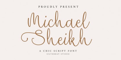 Introducing the “Michael Sheikh” font, a playful and unique handwriting typeface designed to infuse your projects with a touch of whimsy and character. This font offers a delightful collection of alternate characters, providing you with endless creative possibilities. With “Michael Sheikh,” you can effortlessly add and charming touch to your designs. Its handcrafted style lends authenticity and warmth, making it perfect for a wide range of applications, from invitations to branding and beyond.
 - Yellow Cute by Sakha Design,
$10.00 Yellow Cute is a lovely and modern script font that exudes elegance and sophistication. Each letter is delicately crafted with fluid and graceful strokes, creating a timeless look that’s perfect for everything from wedding invitations to branding projects. Its sleek and chic style will add a touch of class to any design. Keep in mind that the font is PUA encoded, meaning that you can access all delightful glyphs and swashes effortlessly.
 - Baby Cakes NF by Nick's Fonts,
$10.00This robust, roly-poly typeface is patterned after a 1974 release from the Ludwig & Mayer foundry of Frankfurt am Main named Big Band, and designed by Karlgeorg Hoefer. The type color is even darker than the original, and the result is a delightful face that will definitely attract attention. The PC Postscript, Truetype and Opentype versions contain the complete Latin language character set (Unicode 1252) plus Central European (Unicode 1250) languages as well. - Yum Yum NF by Nick's Fonts,
$10.00The Cleveland Type Foundry strikes again, with this delightful little number from their 1893 specimen book, originally named "Mikado". This version takes its name from one of the characters in the Gilbert and Sullivan operetta of the same name, and the name aptly describes the tasty nature of this frolicking face. Both versions of this font include the complete Latin 1252 and CE 1250 character sets, with localization for Romanian and Moldovan. - Cloud Dancer by Reyrey Blue Std,
$16.00 Say Hi to Cloud Dancer. It is bold and high-contrast display serif typeface with delightful nostalgic feeling. Cloud Dancer contain several stylistic alternates that can make it unique and different. This typeface is perfect for corporate identities, websites, publications, titles, books, magazines, business cards, logos, product labels, packaging, or any kind of advertising purpose. Features : · All Uppercase and Lowercase · Number & Symbol · Supported Languages · Alternates and Ligatures · PUA Encoded Hope you enjoy with our font!
 - Taguro by Twinletter,
$18.00 Taguro Groovy is a geometric font and the curved lines in each anatomy with high contrast and bold characters make this a powerful font for your projects. This font has an elegant and distinct style that makes it visually different from many other fonts. It makes your design stand out from the rest. This delightful font has precisely defined Curves and the subtle strokes of the typeface make this font very pleasing to the eye.
 - Alright, let’s dive into the world of typography and talk about a font named "Star_Font." Imagine it as the star-studded night sky of the font universe—a typeface designed not just to communicate but...
- Bionic Type Cond Italic by Iconian Fonts is a futuristic, dynamic font that encapsulates movement and energy within its design. This typeface, created by the prolific font foundry Iconian Fonts, know...
- Carouge Pro by André Simard,
$14.00 Carouge Pro is a contemporary typeface with a classical twist. This duality gives Carouge an energetic and vivid sensibility. Its subtle shapes are highly suitable for all types of documents, including corporate collateral and publicity literature. The fineness of the types provides a pure and elegant style that is highly valued in the fashion and design industry. While extremely legible in small body sizes, its personality comes into full bloom when used in large type sizes. Carouge comprises a wide range of bold fonts, from Ultra Thin to Ultra. The italic companion of the roman type has a split-line allure with a rounded personality. Carouge Pro is available in eight weights from the UltraThin to an Ultra Black. Each weight is also supported by a strong personality cursive italic. “When I designed Carouge, I wanted to create a typeface with a sober appearance and a dash of audacity. Carouge provides a fine balance between two different worlds.” — André Simard Carouge Pro is a contemporary typeface with a classical twist. This duality gives Carouge an energetic and vivid sensibility. Its subtle shapes are highly suitable for all types of documents, including corporate collateral and publicity literature. The fineness of the types provides a pure and elegant style that is highly valued in the fashion and design industry. While extremely legible in small body sizes, its personality comes into full bloom when used in large type sizes. Carouge comprises a wide range of bold fonts, from Ultra Thin to Ultra. The italic companion of the roman type has a split-line allure with a rounded personality. Carouge Pro is available in eight weights from the UltraThin to an Ultra Black. Each weight is also supported by a strong personality cursive italic. “When I designed Carouge, I wanted to create a typeface with a sober appearance and a dash of audacity. Carouge provides a fine balance between two different worlds.” — André Simard
 - Gill Sans Nova by Monotype,
$61.99 The Gill Sans® Nova typeface, by Monotype Studio designer George Ryan, expands the much-loved Gill Sans family from 18 to 43 fonts and features a coordinated range of roman and condensed designs. Several new display fonts are available, including a suite of six inline weights, shadowed outline fonts that were never digitized and Gill Sans Nova Deco that was previously withdrawn from the Monotype library. A variety of OpenType® features are supported that make it possible to include experimental characters from different points in Gill Sans’s long history, including pointed diagonals on ‘A’, ‘V’ and ‘W’ and alternatives for ‘b’, ‘d’, ‘p’ and ‘q.’ Proportional figures are also available as an alternative to the tabular designs. The Gill Sans Nova family has a large character set that supports Latin, Greek and Cyrillic languages. The display weights support Latin only. “Gill Sans was fast to strike a chord with people after its initial 1928 release and quickly became popular,” explains Ryan. “It’s been adapted for every publishing technology, from mechanical typesetting to digital imaging – always receiving the best treatment from Monotype in each iteration. This is especially true with all that we’ve added to the new series, while still retaining the familiarity of Gill Sans. My goal was to ensure clarity across digital environments, add missing weights, and bring more personality to the family with new display fonts, as well as Gill-inspired alternate characters.” The Gill Sans Nova typeface family is part of the new Eric Gill Series, drawing on Monotype's heritage to remaster and expand and revitalize Eric Gill’s body of work, with more weights, more characters and more languages to meet a wide range of design requirements. The Series also brings to life new elements inspired by some of Gill’s unreleased work, recently discovered in Monotype’s archive of original typeface drawings, designer correspondence and documents from the last century.
 - Stinger by Zetafonts,
$39.00 Since their first appearance as Italians on the pages of the 1821 William Caslon type specimens, reverse contrast typefaces have been typography's best loved quirky outcasts. Subverting the traditional relationship between thick verticals and thin horizontals made them perfect for eye-catching advertisements. The unexpected contrasts and the thick slabs produced by reverse-contrast serifs became ubiquitous in period posters, and synonymous with wild west and circus iconography. In designing Stinger, the Zetafonts design team composed by Maria Chiara Fantini, Andrea Tartarelli and Francesco Canovaro and orchestrated by Cosimo Lorenzo Pancini decided to marry this subversive tradition with the workhorse approach of modernist sans serif typefaces like Univers, developing a super-family with four widths, each in five different weights, from thin to heavy. This gives the designer a full range of options for type setting, with the Normal and Fit widths providing two different text-sized alternatives, the wide width adding display and titling options and the Slim ready to deal with the space-saving necessities of extremely long texts. True italics have been added developed for all weights and variants, bringing the Stinger family to a total of 40 fonts, with a latin extended + Russian Cyrillic character set covering over 200 languages, and open type features including positional numbers, stylistic sets and alternate forms. In the crowded panorama of contemporary grotesque typefaces, all aiming to stark geometric perfection, Stinger stands out with its bold choices and strong personality. From the calligraphy-inspired terminals in the thin weights to the logo-ready sculptural approach in the heavy weights, each variant manages to look striking without forgetting the readability and flexibility lessons of modern reverse-contrast classics like those designed by Excoffon or Novarese. A variable version is included with the full family, allowing maximum flexibility and control for the designer over the wide range of expression capabilities of the Stinger super family.
 - Barbou by Besnowed,
$19.99 Barbou was originally cut in 1925 by Monotype as a counterpart to Fournier, siblings that were different in design but both based on the work of Pierre-Simon Fournier. Whether by choice, accident or oversight, Fournier was preserved digitally, and Barbou was lost to history. Barbou was notably used by Stanley Morrison, in particular as the face of The Fleuron. I fell in love with Barbou when I saw it, and knew that I wanted to bring it to a new generation of designers and readers. This is a revival of Barbou, a faithful recutting with new weights, characters and many of the best features that modern font technology brings. Particular attention was paid to the original Monotype Barbou 178 specimen sheet. Originally only available in a single weight, Barbou has been recut with a variable weight, providing a large degree of flexibility between Regular and Bold. Barbou excels as a comfortable reading face for books, and the variable weight allows you to fine tune the darkness and texture of the page in a way never before possible. Barbou has a distinctive softness, and this revival of Barbou preserves much of the effect the medium of metal type had on the letterforms. This results in a subtly rounded yet defined type, elegant not worn, with the utmost attention and respect to the smallest of details. Barbou was originally cut with disparate x-heights for roman and italic, and this revival of Barbou features both the original italic, as well as a new italic redesigned at the same height as the roman. In Fournier’s time, roman and italic would not be mixed on the same line, but the type must change to meet the needs of a new generation. Barbou also features unique ligatures and alternates, old style numbers, small caps and a full Greek alphabet. Barbou is perfect for books and anywhere a comfortable reading face is required, and excels in flexibility.
 - FS Industrie Variable by Fontsmith,
$279.99Changing nature of work FS Industrie is an extraordinarily versatile new type system, with 70 variants built around five different widths and seven different weights. Type in the future will be increasingly variable, and FS Industrie is specifically designed to address the changing needs of brands. As more of the things we make exist primarily in a digital space, so our need to create type that can adapt within that space grows. It is the spirit of variable design, adaptation and flexibility that drove us to create FS Industrie. A typeface for future work in a future world. FS Industrie is a response to the changing nature of type, for brands that are responding to the changing nature of work. Industrial style Stylistically, FS Industrie feels direct and simple without sacrificing its humanity. It takes inspiration from German fonts of the 1930s, with their roots in manufacturing and signage. A classic sense of functional utility combined with a progressive view of where type is heading. Expressions in width A fundamental challenge with variable type is to ensure that craft and precision is preserved at every interval. Each width and weight is drawn by hand, with subtle variations in terminals and angles as you progress through the system. This ensures each variant can play to its unique strengths, while also pairing perfectly with its siblings. From the closed terminals of the Condensed and the open terminals of the Extended. FS Industrie is a design system that maintains a practical, grounded and robust tone throughout every variable style. Variable nature The 70 styles offer a range of expression. Each width contrasts with the next to clearly define typographic roles in graphic layouts. Every glyph is crafted with adaptability and scalability in mind, creating a pliable design space for the user. The proportions of each letterform flex as weight scales up, stem weights increase as letter width broadens. These subtle design changes create an optically consistent visual impression. - Jukebox Hero by Grype,
$19.00 As one of the most popular rock bands of the world, Foreigner has rocked the charts with 10 multi-platinum albums and sixteen top 30 hits in the last 40 years. But one might ask what a band this successful has been missing all these years? No head games here...a consistent typeface based on their logo is the answer. As fans of Foreigner, we've taken the essence of their iconic logotype and expanded it out into a full typeface in regular and bold weights to celebrate their 40th anniversary tour. The Jukebox Hero Family celebrates the typographic stylings of Foreigner, with the soft rounded terminals and an open geometric feel, including the unique stencil flavor of the original logo. It inherited the friendly stylings of the all Capitals logo that inspired it, and goes on to include a full standard character set with expansive international support of latin based languages, and two weights jumping from regular to a beefy bold. This family is ready to rock the charts for your designs towards that of a modern, comfortable appeal. Here's what's included with Jukebox Hero Family bundle: 413 glyphs - including Capitals, Lowercase, Numerals, Punctuation and an extensive character set that covers multilingual support of latin based languages. (see the 3rd graphic for a preview of the characters included) 2 weights: Regular & Bold. Fonts are provided in TTF & OTF formats. The TTF format is the standard go to for most users, although the OTF and TTF function exactly the same. Here's why Jukebox Hero Family bundle is for you: You're a die-hard Foreigner fan, and have a case of "Double Vision" and need both font weights. You're looking for a stylish and sophisticated soft sans-serif stencil typeface family. You've been waiting for fonts like these. You're looking for a Sci-fi vibe typeface that has a look that feels familiar. You just like to collect quality fonts to add to your design arsenal
 - Roc Grotesk by Kostic,
$40.00 Roc is a sans serif grotesk inspired by American wood types from the end of the 19th century. With nine weights in five widths, this family contains 45 fonts in total. The character set supports Western and Central European languages, as well as Turkish. Roc Grotesk comes in a range of five widths: Compressed, Condensed, Normal, Wide and ExtraWide, in order to cover a wide scope of applications. Although the styles at both ends of each range are made in their most pronounced form in terms of width and weight, they are not taken to such extremes as to become absurd, and are quite usable in display settings. The Normal width keeps all its nine styles in proportionally similar widths. The Compressed width, however, is deliberately made to be disproportionate, so that every style takes the least possible horizontal space. That is why the contrast between Compressed Thin and Compressed Heavy style is substantial. As the weights progress from Thin to Heavy, the stroke contrast becomes more prominent. It is intentionally exaggerated in heavier weights, which is particularly apparent in the uppercase E and R of the Black and Heavy style. Roc has a large x-height and relatively short descenders and ascenders. No uppercase letter descends below the baseline, so the lines of an all-caps text can be packed tightly on a poster or a headline. The Regular style is somewhat generously spaced, as it is most likely to be used for setting longer passages of text. Its Bold counterpart is spaced in such a way that the width of the text column will be similar to the text set in Regular. Tabular figures in these two styles have exact matching widths, so for example, you could emphasize one row of numbers in a data column without visually disrupting the vertical order of the table. The lowercase g and r have alternatives to accommodate what most designers expect from a typical Grotesk typeface. The single-story g and the cut-off r are accessible via the OpenType feature.
 - FS Joey Paneuropean by Fontsmith,
$90.00Kangaroo FS Joey was the offspring of a project with Rudd Studio to develop a logotype for an online streaming TV service, in 2008. While under wraps, the secret project was code-named Kangaroo. The logotype led to a second project, to design a corporate typeface for the service. It was the first big project Fernando Mello had worked on with Jason Smith. “Like any designer who just joined a team, I was very excited about it, drawing and sketching lots of ideas. I remember Jason and I experimenting with lots of possibilities, for both the logo and the typeface.” Online As the font for a Spotify-style, internet-based service, FS Joey needed to be highly legible on-screen, including at very small sizes. There had to be a range of weights, and they’d have to work well in print, too. It was also important that it felt corporate, not too quirky, while still having a strong character of its own. Quirkiest “We designed three weights specifically for use on the Web,” says Jason Smith. “There was the usual fight between me and my team. I wanted at least one identifiable letter that was a quirk. As always I went straight for the lowercase ‘g’, and it was drawn numerous times with lots of variation. I got the quirkiest one accepted by the client.” But, later in 2009, the Competition Commission blocked Project Kangaroo, and Fontsmith were left with a couple of weights of an as yet unused font. From Kangaroo, Joey was born. A favourite “Straight away, people started to notice the typeface,” says Jason. “I can take the credit for pushing the art direction and standing up for the quirks. But it was Fernando who was the key to pulling it all together and adding his own distinct flavour. Now it’s one of my favourite designs in our library.” Fresh and friendly, geometric and energetic, Joey is available in five weights, all with italics, all finely-tuned for both screen and print. - FS Joey by Fontsmith,
$80.00 Kangaroo FS Joey was the offspring of a project with Rudd Studio to develop a logotype for an online streaming TV service, in 2008. While under wraps, the secret project was code-named Kangaroo. The logotype led to a second project, to design a corporate typeface for the service. It was the first big project Fernando Mello had worked on with Jason Smith. “Like any designer who just joined a team, I was very excited about it, drawing and sketching lots of ideas. I remember Jason and I experimenting with lots of possibilities, for both the logo and the typeface.” Online As the font for a Spotify-style, internet-based service, FS Joey needed to be highly legible on-screen, including at very small sizes. There had to be a range of weights, and they’d have to work well in print, too. It was also important that it felt corporate, not too quirky, while still having a strong character of its own. Quirkiest “We designed three weights specifically for use on the Web,” says Jason Smith. “There was the usual fight between me and my team. I wanted at least one identifiable letter that was a quirk. As always I went straight for the lowercase ‘g’, and it was drawn numerous times with lots of variation. I got the quirkiest one accepted by the client.” But, later in 2009, the Competition Commission blocked Project Kangaroo, and Fontsmith were left with a couple of weights of an as yet unused font. From Kangaroo, Joey was born. A favourite “Straight away, people started to notice the typeface,” says Jason. “I can take the credit for pushing the art direction and standing up for the quirks. But it was Fernando who was the key to pulling it all together and adding his own distinct flavour. Now it’s one of my favourite designs in our library.” Fresh and friendly, geometric and energetic, Joey is available in five weights, all with italics, all finely-tuned for both screen and print.
 - FS Industrie by Fontsmith,
$50.00 Changing nature of work FS Industrie is an extraordinarily versatile new type system, with 70 variants built around five different widths and seven different weights. Type in the future will be increasingly variable, and FS Industrie is specifically designed to address the changing needs of brands. As more of the things we make exist primarily in a digital space, so our need to create type that can adapt within that space grows. It is the spirit of variable design, adaptation and flexibility that drove us to create FS Industrie. A typeface for future work in a future world. FS Industrie is a response to the changing nature of type, for brands that are responding to the changing nature of work. Industrial style Stylistically, FS Industrie feels direct and simple without sacrificing its humanity. It takes inspiration from German fonts of the 1930s, with their roots in manufacturing and signage. A classic sense of functional utility combined with a progressive view of where type is heading. Expressions in width A fundamental challenge with variable type is to ensure that craft and precision is preserved at every interval. Each width and weight is drawn by hand, with subtle variations in terminals and angles as you progress through the system. This ensures each variant can play to its unique strengths, while also pairing perfectly with its siblings. From the closed terminals of the Condensed and the open terminals of the Extended. FS Industrie is a design system that maintains a practical, grounded and robust tone throughout every variable style. Variable nature The 70 styles offer a range of expression. Each width contrasts with the next to clearly define typographic roles in graphic layouts. Every glyph is crafted with adaptability and scalability in mind, creating a pliable design space for the user. The proportions of each letterform flex as weight scales up, stem weights increase as letter width broadens. These subtle design changes create an optically consistent visual impression.
 - Mundo Serif by Monotype,
$50.99 With designs drawn specifically for comfortable reading in everything from on-screen digital content to print in periodicals and books, Mundo Serif is ready to take on just about any project. Carl Crossgrove drew the suite of typefaces to complement his Mundo Sans family’s classic humanistic design traits – and added a subtle modern influence. Restrained stroke modulation, generous counters, commanding x-height and tall ascenders ensure that content set in Mundo Serif is both legible and easy on the eyes. While primarily designed for text copy in print and on screen, Mundo Serif becomes a powerful display type tool in the lightest and boldest weights. Headlines, navigational links and banners are naturals for this versatile collection of typefaces. Mundo Serif is a large family. Nine weights, each with an italic companion, enable precise typographic tuning. Captions, subheads, pull quotes and long-form copy can be melded to create a welcoming page of modulated text. For best results in digital environments, skipping a weight – or even two – ensures hierarchical clarity. Crossgrove did extensive testing of Mundo Serif to ensure the best possible on-screen readability. To further guarantee optimal digital imaging of the family, he gave the design generous inter-character spacing and slightly expanded intricate characters like the lowercase a and g. If the goal is diversified or multi-platform branding, look no further than Mundo Sans. The two designs harmonize with each other perfectly in weight, typographic color and proportion. Both designs benefit from large international character set that includes support for most Central European and many Eastern European languages. For a stronger contrast, pair Mundo Serif with virtually any sans serif grotesque design. Crossgrove has designed a variety of typefaces ranging from the futuristic and organic Biome™ to the warm, clean lines of the Mundo Sans. His work for Monotype also often takes Crossgrove into the realm of custom fronts for branding and non-Latin scripts.
 - FS Lucas by Fontsmith,
$80.00 Pure and not-so-simple Maybe it’s the air of purity, openness and transparency that they transmit, but geometric typefaces are more popular than ever among leading brands. Based on near-perfect circles, triangles and squares, geometric letterforms look uncomplicated, even though making them readable is anything but – something the designers of the first wave of geometric fonts discovered nearly a century ago. Many of the world’s most recognisable brands in technology, retail, travel, food, manufacturing and other industries continue to be drawn to the straightforward, honest character that geometric fonts convey. Fontsmith set out in 2015 to develop a typeface in the same tradition, but optimised for the demands of modern brands – online and offline usage, readability and accessibility. And, of course, with the all-important Fontsmith x-factor built in. FS Lucas is the bold and deceptively simple result. Handle with care The letterforms of FS Lucas are round and generous, along the lines of Trajan Column lettering stripped of its serifs. But beware their thorns. Their designer, Stuart de Rozario, who also crafted the award-winning FS Millbank, wanted a contrast between spiky and soft, giving sharp apexes to the more angular letterforms, such as A, M, N, v, w and z. Among his inspirations were the colourful, geometric compositions of Frank Stella, the 1920s art deco poster designs of AM Cassandre, and the triangular cosmic element symbol, which led him to tackle the capital A first, instead of the usual H. The proportions and angles of the triangular form would set the template for many of the other characters. It was this form, and the light-scattering effects of triangular prisms, that lit the path to a name for the typeface: Lucas is derived from lux, the Latin word for light. Recommended reading Early geometric typefaces were accused of putting mathematical integrity before readability. FS Lucas achieves the trick of appearing geometric, while taking the edge off elements that make reading difficult. Perfectly circlular shapes don’t read well. The way around that is to slightly thicken the vertical strokes, and pull out the curves at the corners to compensate; the O and o of FS Lucas are optical illusions. Pointed apexes aren’t as sharp as they look; the flattened tips are an essential design feature. And distinctive details such as the open terminals of the c, e, f, g, j, r and s, and the x-height bar on the i and j, aid legibility, especially on-screen. These and many other features, the product of sketching the letterforms in the first instance by hand rather than mapping them out mechanically by computer, give FS Lucas the built-in humanity and character that make it a better, easier read all-round. Marks of distinction Unlike some of its more buttoned-up geometric bedfellows, FS Lucas can’t contain its natural personality and quirks: the flick of the foot of the l, for example, and the flattish tail on the g and j. The unusual bar on the J improves character recognition, and the G is circular, without a straight stem. There’s a touch of Fontsmith about the t, too, with the curve across the left cross section in the lighter weights, and the ampersand is one of a kind. There’s a lot to like about Lucas. With its 9 weights, perfect proportions and soft but spiky take on the classic geometric font, it’s a typeface that could light up any brand.
 - FS Lucas Paneureopean by Fontsmith,
$90.00Pure and not-so-simple Maybe it’s the air of purity, openness and transparency that they transmit, but geometric typefaces are more popular than ever among leading brands. Based on near-perfect circles, triangles and squares, geometric letterforms look uncomplicated, even though making them readable is anything but – something the designers of the first wave of geometric fonts discovered nearly a century ago. Many of the world’s most recognisable brands in technology, retail, travel, food, manufacturing and other industries continue to be drawn to the straightforward, honest character that geometric fonts convey. Fontsmith set out in 2015 to develop a typeface in the same tradition, but optimised for the demands of modern brands – online and offline usage, readability and accessibility. And, of course, with the all-important Fontsmith x-factor built in. FS Lucas is the bold and deceptively simple result. Handle with care The letterforms of FS Lucas are round and generous, along the lines of Trajan Column lettering stripped of its serifs. But beware their thorns. Their designer, Stuart de Rozario, who also crafted the award-winning FS Millbank, wanted a contrast between spiky and soft, giving sharp apexes to the more angular letterforms, such as A, M, N, v, w and z. Among his inspirations were the colourful, geometric compositions of Frank Stella, the 1920s art deco poster designs of AM Cassandre, and the triangular cosmic element symbol, which led him to tackle the capital A first, instead of the usual H. The proportions and angles of the triangular form would set the template for many of the other characters. It was this form, and the light-scattering effects of triangular prisms, that lit the path to a name for the typeface: Lucas is derived from lux, the Latin word for light. Recommended reading Early geometric typefaces were accused of putting mathematical integrity before readability. FS Lucas achieves the trick of appearing geometric, while taking the edge off elements that make reading difficult. Perfectly circlular shapes don’t read well. The way around that is to slightly thicken the vertical strokes, and pull out the curves at the corners to compensate; the O and o of FS Lucas are optical illusions. Pointed apexes aren’t as sharp as they look; the flattened tips are an essential design feature. And distinctive details such as the open terminals of the c, e, f, g, j, r and s, and the x-height bar on the i and j, aid legibility, especially on-screen. These and many other features, the product of sketching the letterforms in the first instance by hand rather than mapping them out mechanically by computer, give FS Lucas the built-in humanity and character that make it a better, easier read all-round. Marks of distinction Unlike some of its more buttoned-up geometric bedfellows, FS Lucas can’t contain its natural personality and quirks: the flick of the foot of the l, for example, and the flattish tail on the g and j. The unusual bar on the J improves character recognition, and the G is circular, without a straight stem. There’s a touch of Fontsmith about the t, too, with the curve across the left cross section in the lighter weights, and the ampersand is one of a kind. There’s a lot to like about Lucas. With its 9 weights, perfect proportions and soft but spiky take on the classic geometric font, it’s a typeface that could light up any brand. - Broceta by IbraCreative,
$17.00 Broceta- A Playful Monoline Kids Font Broceta, a Playful Monoline kids font, exudes a whimsical charm that captivates the essence of youthful creativity. With its seamless monoline strokes, this font radiates a sense of simplicity and innocence, making it a perfect choice for projects targeting a younger audience. Broceta’s characters boast a delightful playfulness, each letter dancing with a unique flair that evokes the carefree spirit of childhood. The monoline design ensures a consistent and smooth visual flow, enhancing readability while maintaining an air of lightheartedness. Whether used in storybooks, playful branding, or educational materials, Broceta adds a touch of joy and imagination to any project, making it an enchanting font for those who seek to infuse their designs with a delightful sense of wonder. Broceta is perfect for branding projects, logo, wedding designs, social media posts, advertisements, product packaging, product designs, label, photography, watermark, invitation, stationery, game, fashion and any projects. Fonts include multilingual support for; Afrikaans, Albanian, Czech, Danish, Dutch, English, Estonian, Finnish, French, German, Hungarian, Italian, Latvian, Lithuanian, Norwegian, Polish, Portuguese, Slovak, Slovenian, Spanish, Swedish.
 - Dal Baati by Gunjan,
$69.00 "Indulge in the Delectable Delight of 'Dal Baati' Brushy Typeface - A Feast for the Eyes! Discover the artistry of 'Dal Baati,' an exquisite brushy typeface that serves up a delightful blend of elegance and rustic charm. Inspired by the flavors of Rajasthan, this typeface brings a touch of authenticity to your designs, evoking the rich cultural heritage of the region. With every stroke, 'Dal Baati' exudes a handcrafted allure, making it perfect for logos, branding, posters, packaging, and so much more. Its unique character and versatile nature add a pinch of spice to your projects, leaving a lasting impression on your audience. Captivate your viewers' senses with the flavorful aesthetics of 'Dal Baati.' Whether you're designing for a restaurant, food-related business, or any creative endeavor, this typeface elevates your work to new culinary heights. Embrace the distinct personality and mouthwatering appeal of 'Dal Baati' in your designs. Enhance your visual storytelling and give your projects the delectable touch they deserve. Take your creations on a flavourful journey today with 'Dal Baati' brushy typeface!"
 - Lilium Star by Krafted,
$10.00 “The modest Rose puts forth a Thorn. The humble Sheep a threat’ning Horn. While Lily white shall in love delight. Nor a Thorn nor a threat stain her beauty bright.” ― William Blake Are you looking for a way to enhance your copy? Introducing Lilium Star - A Modern Handwritten Font. With every hand-drawn stroke and curve, Lilium Star will delight and add brightness, modernity and elegance to wherever it is placed. Impress your wedding guests with gorgeous invitations using Lilium Star. Why not create more engaging content and inspire your audience and clients? This Modern Handwritten font is also perfect for headings, logos, business cards, printed quotes, cards, packaging, and your website or social media branding. What you’ll get: Multilingual & Ligature Support Full sets of Punctuation and Numerals Compatible with: Adobe Suite Microsoft Office KeyNote Pages Software Requirements: The fonts that you’ll receive in the pack are widely supported by most software. In order to get the full functionality of the selection of standard ligatures (custom created letters) in the script font, any software that can read OpenType fonts will work.
 - Kitsch by Zetafonts,
$39.00 Designed by Francesco Canovaro with help from Andrea Tartarelli and Maria Chiara Fantini, Kitsch is a typeface happily living at the crossroads between classical latin and medieval gothic letterforms. But, rather than referencing historical models like the italian Rotunda or the french Bastarda scripts, Kitsch tries to renew both its inspirations, finding a contemporary vibe in the dynamic texture of the calligraphic broad-nib pen applied to the proportions of the classical roman skeleton. The resulting high contrast and spiky details make Kitsch excel in display uses, while a fine-tuned text version manages to keep at small sizes the dynamic expressivity of the design without sacrificing legibility. Both variants are designed in a wide range of weights (from the almost monolinear thin to the dense black), and are fully equipped with a extended character sets covering over two hundred languages that use latin, cyrillic and greek alphabets. Special care has been put in designing Kitsch italic letterforms, with the broad-nib movements referencing classical italian letterforms to add even more shades to your typographic palette. The resulting alternate letter shapes have also been included in the roman weights as Stylistic Alternates - part to the wide range of Open Type features (Standard and Discretionary Ligatures, Positional Numerals, Small Caps and Case Sensitive Forms) provided with all the 32 weights of Kitsch. Born for editorial and branding use, Kitsch is fashionable but solid, self-confident enough to look classic while ironic enough to be contemporary.
 - Neufile Grotesk by Halbfett,
$30.00 Neufile Grotesk has its roots in some of the earliest commercially available sans-serif typefaces. This highly legible sans-serif design is well-suited for many display and text-based typographic uses. Users can apply the fonts effortlessly to a large number of messages and media, from advertising to book design. The typeface family ships in two different formats. Depending on your preference, you can install the typeface as a single Variable Font or use the family’s eight static OpenType font files instead. Those weights run from Extralight through Black. While the static-format fonts offer a good intermediary-step selection, users who install the Variable Font have vastly greater control over their text’s stroke width. The Neufile Grotesk Variable Font’s weight axis allows users to differentiate between almost 1,000 possible font weights. That enables you to fine-tune your text’s exact appearance on-screen or in print. But even the eight static fonts satisfy the need for flexibility, creating harmonious variations of texture and emphasis. Whichever format you choose, the Neufile Grotesk fonts include several sophisticated OpenType features. In addition to standard ligatures, there are a few discretionary ligatures and a stylistic set replacing “a”, “g”, and “R” with geometric-sans-style forms. Other features include numeral variants – there are proportional and tabular versions of lining figures and oldstyle figures – as well as fractions and numbers in circles. The fonts have arrows and a feature for setting case-sensitive forms, too.