10,000 search results
(0.044 seconds)
- Publica Sans Round by FaceType,
$22.00 Publica Sans Rounded is the rounded version of Publica Sans. A clean geometric typeface, equipped with a variety of OpenType features to give you all you need for great typography: Alternates, arrows, rare currency symbols, case sensitive forms, various sets of figures and discretionary ligatures. Publica Sans Rounded has two other sisters: Publica Play and Publica Slab Take a close look at our gallery (especially ‘OpenType Features 1–6’) to discover the versatility of Publica Sans. Alternates Give your typography a certain spin with the variety of alternate letters provided. Currency You need to set prices in exotic countries? No problem: Publica Sans gives you loads of rare currency symbols. Case Sensitive Forms Sometimes you write in all caps and there are some symbols (e.g. brackets) that need some extra treatment to make it look perfect – that’s what case sensitive forms are for. Figures Publica Sans provides 6 sets of figures, like lining, tabular, oldstyle, numerators ... Discretionary Ligatures Ligatures can make your logo or headline look spicy. So there are plenty of them.
 - Sincerely Yourz by Outside the Line,
$19.00 Sincerely Yourz is another font in the Love Letters series from Outside the Line. It is a hand-printed font with extra letter spacing. All the letters have about the same height. All vowels are lower case whether they are caps or not. This font has a fresh contemporary hand-lettered look. While it can be used as a headline font it is really designed for body copy.
 - Avancar Condensed by Brenners Template,
$19.00 Avancar Condensed Font Family showcases the exquisite pairing of modern grotesque style and soft sans-serif design. These conjunctions provide the effect of owning two subfamily typefaces and are an amazing solution for designers. The main feature of this font family is a semi-condensed design with a slightly higher x-height. And, while having the same skeleton design and stem width, they provide a completely different look and feel.
 - Jackpot by Funk King,
$5.00 Jackpot is a font-bat of a slot machine for all your gaming needs.
 - Kanibal by Milos Zlatanovic,
$80.00 Kanibal is typeface that creates a game of different shapes and styles. Have fun!
 - Sentic Display by HeadFirst,
$19.90 Designed by Morice Kastoun Sentic Display, s a san-serif font based on geometric patterns with humanist elements. Sentic Display incorporates rounded intersecting forms. The font exploits the common affective patterns associated with natural language, and the patterns associated with text and speech. The name sentic was instigated and named by Austrian neuroscientist Manfred Clynes. Which is the study of waveforms of touch, emotion, and music.
 - FF Stamp Gothic by FontFont,
$62.99 Dutch type designer Just van Rossum created this display FontFont in 1992. The font is ideally suited for advertising and packaging, film and tv, editorial and publishing, music and nightlife as well as software and gaming. FF Stamp Gothic provides advanced typographical support with features such as ligatures, alternate characters, case-sensitive forms, and stylistic alternates. It comes with proportional lining figures. As well as Latin-based languages, the typeface family also supports the Greek writing system.
 - Fido Pro by Canada Type,
$29.95Fido Pro is the official font of dog owners everywhere. Woof! When the original Fido font was published in 2009, it became an instant hit with cartoon channels, comic book artists, toy makers, cereal packagers and game developers. Now, more than a decade later, we decided to pick it up and give it the Pro treatment. This new version boasts more than 800 glyphs, including 117 interlocking ligatures, plenty of alternate glyphs, and and Pan-European language support. - Speedblur by Greater Albion Typefounders,
$12.00 Speedblur - the name says it all really! Want a display typeface that suggests speed and motion? Well this is it. Ideal for all those retro-future designs, anything streamlined or the boy (or girl) racer in all of us!
 - MBF Raveny by Moonbandit,
$19.00 Raveny is a high contrast modern display font by moonbandit, This typeface is a unicase font, meaning that the uppercase and lowercase has the same height. Raveny also comes with multilingual support and several alternates for you to explore.
 - Rough Tongue by Comicraft,
$19.00 Here's The Thing -- it can be loosened, twisted, tied, tripped over, wagged, bitten, forked, stuck out or kept in your cheek. You need your tongue to talk, taste, chew, swallow and sing. You can keep a civil tongue in your head or you can give someone the rough side of your tongue...
 - Sundae by SparkyType,
$25.00Sundae is a brush script drawn with a naïve hand-made twist. The flow of curves, contrast in stroke and variations in letter heights add a human touch while the consistency in design allows for semi-extended setting. Sundae is best suited for large, confident headings where a personal impact is desired. - Gentium - 100% free

- Orgon Plan by Hoftype,
$49.00 Orgon Plan is the square-cut sister of the Orgon. It represents the crispy counterpart to the sucsessfull Orgon family and was published in 2020. Orgon Plan consists of 20 styles and is well equipped for advanced typography. It comes in OpenType format with extended language support. All weights contain small caps, ligatures, superior characters, proportional lining figures, tabular lining figures, proportional old style figures, lining old style figures, matching currency symbols, fraction- and scientific numerals and matching arrows.
 - Montera by Liartgraphic,
$20.00 Hello gaes! How are you guys doing ? i’m sure that’s nice! Meet our newest product, we call this product Montera font. Montera font are cute typeface font Whit a uniqe touch and assertive Monteras font is very nice to use on: fashion magazine,logos, ,and photography,landing page,fliyer, What’s includes - Montera (TTF/otf) - mutilngual support - alternate - ligature Thank you,salutations Ali Sifak Muftari
 - Cervo by Typoforge Studio,
$25.00 Font Cervo is the younger sister of Kapra. It is characterized by eight different varieties – lower and uppercase characters and in contrast to Kapra is “slimmed” version (from Medium to Thin). It is inspired by a You And Me Monthly published by National Magazines Publisher RSW „Prasa” that appeared from May 1960 till December 1973 in Poland.
 - Klapt Arabic by SevenType,
$29.99 Klapt Arabic is a geometric sans serif family that is soft on the outside and sharp on the inside. It is based in the Arabic Kufic style. Klapt Arabic can be bold or very elegant and is well suited for designs ranging from branding and corporate identity to editorial design or web design. It has a timeless style and is great for display purposes, especially for headlines, posters, magazines, book covers, logos... you name it! This font family of four weights includes an extended character set supporting most Latin languages and extended Arabic, including Persian and Urdu. Feel free to share your designs using Klapt Arabic or just get in touch via email to hi@seventype.com. Klapt Arabic is the extension of Klapt https://www.myfonts.com/fonts/seventype/klapt/.
 - Mellony by Alit Design,
$12.00 Introducing Mellony brush script font which has a elegant hand lettering brush style. So it looks naturally handmade, the Mellony family is unique because it has more choice of characters, like a swash, end characters and many more. This font is best used for your design project that has the concept of fun, girly, romantic and elegant. Can also be applied to the design of a logotype, header website, wedding logo, romantic design, make some lettering a quote, t-shirt design etc. Mellony family font has two font styles that are similar but a different character, namely Mellony regular and Mellony dry brush. The Mellony family deserve to be one of your fonts collections, because it is unique, elegant and has many options of alternative glyphs for your fresh designs. Thank you and enjoy :)
 - ITC Aram by ITC,
$29.99Jana Nikolic was finishing her degree program at the Faculty of Applied Arts, in Belgrade, with a final project that would combine her two majors: type and book design. Three stories from William Saroyan's My Name Is Aram would provide the text for the book, to be set in a typeface that Nikolic would design. Nikolic knew something special was happening the moment she put pen to paper. The letters just emerged," she recalls. "I started to explore a few new pens and found one I loved. I was able to make its tip bend with pressure." Like the family Saroyan writes about, the design flowing from Nikolic's pen would be simple but a little quirky. "When there were a whole bunch of little black letters around me," continues Nikolic, "I saw that this was going to be a very interesting typeface family." Nikolic drew Latin and Cyrillic letters, lowercase and capital letters, wide letters and narrow letters. She was surprised at how quickly and easily the design came. "There were no badly written letters," she says. "I hardly had to rework them and they fit together remarkably well." ITC Aram's standard character complement consists of one set of lowercase letters and two sets of capitals: one narrow and the other wide. The wide caps can be used with the standard lowercase, or mixed with the narrow caps for a variation on "cap and small cap" copy. The ITC Aram create the opportunity to mix and combine the letters into playful typographic expressions. Words and sentences that twinkle; text that seems light and alive - one runs the risk of creating work that is both delightful and charming when setting copy in ITC Aram." - Wahed by Khalid Jassim,
$27.00 I used Arabic letters to give the same sound of each letter in the English Alphabet (a, b,c,….)
 - Bang by ITC,
$29.00Bang was designed by David Sagorski in 1993 as a playful font of spirals. It consists of two capital alphabets which can be combined like the usual capitals and small caps, although both have the same height. They differ from one another only in the decorative forms which adorn them and the highly decorated characters of one set are complemented by the slightly more reserved characters of the second. Serious this font is not, rather, with its circles and spirals, Bang is best in point sizes 12 and larger and is meant for short texts and headlines. - Okey Dokey NF by Nick's Fonts,
$10.00The 1912 American Type Founders specimen catalog carried the pattern for this typeface, under the rather unimaginative name of "Pen Print". Its irrepressible insouciance makes it equally suitable for downtown or down home applications. Both versions of this font include the complete Latin 1252 and CE 1250 character sets, with localization for Romanian and Moldovan. - ITC Handel Gothic by ITC,
$40.99 The Handel Gothic? typeface has been a mainstay of graphic communication for over 40 years - all the while looking as current as tomorrow. Designed by Don Handel in the mid-1960s, and used in the 1973 United Airlines logo developed by Saul Bass, Handel Gothic was an instant success when released to the graphic design community. Its generous lowercase x-height, full-bodied counters and square proportions make the design highly readable at a wide range of sizes. Handel Gothic's slightly idiosyncratic character shapes gave the face a futuristic look 40 years ago that retains its power today. In addition, its Uncial-like lowercase is instantly identifiable - and unique among sans serif typestyles. Award-winning type designer Rod McDonald was attracted to the simple, decisive forms of the original, but he felt the design needed to be refined and updated. ?One of my goals was to bring a modern typographic discipline to what was really an old phototypesetting font.? To achieve his goal, McDonald re-proportioned every character and balanced the delicate relationship between the curves and the straight strokes. He also added a number of alternate characters to extend the range of the design. ?I wanted to give designers a large enough character set so they wouldn't feel constrained in what they could do. I want them to be able to play with the fonts, not just set words.? McDonald enlarged the family from the single-weight original to five weights, each with a full suite of alternate characters.In 2015 Nadine Chahine designed matching arabic weights to this family.
 - Pastiche Brush by Eclectotype,
$40.00 This handmade looking brush font is inspired by the titles of the 1959 movie, Imitation of Life, by prolific film titles artist, Wayne Fitzgerald. The 'pastiche' of the font's name derives from the 'imitation' of the film's title, and from the imitation of the brush. OpenType enabled software can make Pastiche Brush feel even more handmade. There are alternates for every letter and number, and most punctation marks and symbols. Every letter has at least one alternate glyph, and more commonly used (in English at least) letters have up to three, so when contextual alternates are enabled, the font automatically cycles through glyphs in a pseudo-random manner. This means no double letter combination will ever contain two identical glyphs. Not only this, but it's highly likely the same word will look different elsewhere in the sentence. The contextual alternates feature also takes care of start and end forms of letters, for an even more handmade feel. This is a great font for headlines in fashion glossies, food packaging where an organic look is desirable, posters, perfume bottles, wine bottles... the list goes on. And with extensive language support, it's going to be a very usable addition to your display font repertoire.
 - Night Train by FontMesa,
$19.95 Night Train is a new font built from the ground up; while Night Train may resemble an old classic wood type there are a few lines that make this font a little more modern setting it apart from other wood type revivals. If you're a railroad enthusiast you're sure to enjoy the steam locomotive graphic located on the less than and greater than keys on all versions of this font, due to the fine detail of this train illustration the best printing results will be at 600dpi or higher on a laser printer. An alternate K and R are within the Night Train fonts, for Win Type1 these alternates are on the left and right bracket keys, for Truetype and OpenType you may access the alternates by using the Character Map in Windows or Adobe Illustrator, for OpenType you may also find them on the stylistic alternates page of the glyph map in Illustrator. There's something new with Night Train that the sign making people will love, for the first time FontMesa is pleased to offer a block shadowed version in four directions. One fill font is all that is needed for all four open faced fonts, you'll need an application that works in layers in order to use the fill font with the open faced fonts, simply place the fill font in its own layer then move it behind one of the open faced fonts of Night Train. The Night Train name has been on my list to use as a font name for a few years, a friend from years ago used to sail his boat in the Mackinac race from Chicago to Mackinac Island, the name of that boat was the Night Train. Watching the 2010 Olympic four man U.S. bobsled team win gold with their sled also called Night Train has inspired me to complete this font.
 - Ainslie Sans by insigne,
$- Say g'day to Ainslie Sans, insigne Design’s new typeface. Like its big brother, the new face incorporates a mix of influences from Oz, although Sans is pared down from the original semi-serif. The original Ainslie was inspired by Mt. Ainslie and the city of Canberra’s inner suburb of the same name. Canberra is Australia’s capital--a planned city designed by American architect Walter Burley Griffin. Griffin’s style and geometric design for the city, which include Mt. Ainslie, are now also the same structure that make up the foundation of Ainslie Sans. Unlike the original Ainslie family member, though, Ainslie Sans does away with much of the aboriginal-inspired touches by eliminating the semi-serifs, forcing the font to borrow more heavily than its predecessor from Canberra’s distinct, geometric design and style. The result’s a spiffy Australian font that’s usable within a wide array of applications. The trendy typeface incorporates a multitude of alternates. You can access these in any OpenType-enabled application. Alternates, swashes and alternate titling caps allow you to customize the look and feel. Also incorporated are capital swash alternates, old style figures, and compact caps. Check out the PDF brochure to view these options in action. OpenType enabled applications can take complete benefit of your automatic replacing ligatures and alternates. This font also presents the glyphs to help a wide array of languages. Try it for copy. Try it for a headline. Try it alongside the original Ainslie. Whichever way suits you best, give it a burl. You won't be sad you did.
 - Barollo by Greater Albion Typefounders,
$16.00 Barollo is a boisterous, lively, display family of two typefaces, offered in regular and shaded form. It’s ideal for eye-catching banners and posters that call for clear and forceful type, with a sense of fun and life.
 - FF Friday, Saturday, Sunday by FontFont,
$30.99 German type designer Jan Jedding created this script FontFont in 1994. The family contains 3 weights: Regular, Semi Bold, and Bold and is ideally suited for advertising and packaging, festive occasions as well as software and gaming. FF Friday Saturday Sunday provides advanced typographical support with features such as ligatures and case-sensitive forms. It comes with proportional oldstyle figures.
 - FF Eboy by FontFont,
$41.99 German type designer Kai Vermehr created this display FontFont between 1998 and 1999. The family has 12 weights and is ideally suited for advertising and packaging, film and tv, poster and billboards as well as software and gaming. FF Eboy provides advanced typographical support with features such as ligatures, case-sensitive forms, and super- and subscript characters. It comes with proportional lining figures.
 - FF Instanter by FontFont,
$30.99 German type designer Frank Heine created this display FontFont in 1994. The family contains 2 weights: Light and Bold and is ideally suited for festive occasions, editorial and publishing, poster and billboards as well as software and gaming. FF Instanter provides advanced typographical support with features such as ligatures and case-sensitive forms. It comes with proportional lining and proportional oldstyle figures.
 - Recumba by Pixesia Studio,
$23.00 Introducing Recumba - Modern Display Font Recumba is modern display font with bold characters. Recumba is perfectly suited for branding projects, headlines, poster, movie titles, games, logos, social media posts, advertisements, product packaging, labels, photography, watermarks, stationery, and any creative project seeking a touch of modern bold elegance. FEATURES - Stylistic Alternates - Ligatures - PUA Encoded - All Caps - Numbering and Punctuations - Multilingual Support - Works on PC or Mac - Simple Installation - Support Adobe Illustrator, Adobe Photoshop, Adobe InDesign, also works on Microsoft Word Hope you Like it. Thanks.
 - Spooky Hill by Attype Studio,
$10.00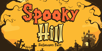 Hello! Spooky Hill is an incredibly unique and playful display font. Fall in love with its authentic feel and use it to create spectacular Halloween designs! Spooky Hill is perfect for branding, logo, invitation, stationery, social media post, product packaging, merchandise, blog design, game titles, cute style design, Book/Cover Title and more. What's Included : - Spooky Hill.otf - Spooky Hill Inline.otf - Multilingual Support (Afrikaans, Albanian, Catalan, Danish, Dutch, English, Estonian, Finnish, French, German, Icelandic, Italian, Norwegian, Portugese, Spanisch, Swedish, Zulu) --- Hope you enjoy with our font! Attype Studio
 - Dimentia by The Type Fetish,
$10.00 Dimentia is a twisted, hand drawn, dimensional, layered sans serif typeface. What more do you need?
 - Gaia by Outras Fontes,
$21.95 Gaia is the first dingbat series made by Ricardo Esteves Gomes. Each glyph in this font was designed to be used as single forms or as graphic pattens. When repeated several times, they create some interesting optical effects. Their organic shapes gives a nice feeling of nature. I hope this can be useful for your artworks.
 - ITC New Rennie Mackintosh by ITC,
$50.99 Looking to add a little Arts & Crafts flavor to your next project? Perhaps you just need a distinctive, new sans serif design? And one with a large international character set. In either case, ITC New Rennie Mackintosh™ may be the typeface for you. Its narrow proportions saves space, and the design shines at large sizes. While it can be an excellent typeface for Art Nouveau flavored labels, name tags and chapter call-outs, this is a suite of fonts that you can also turn to for a bevy of print and on screen uses. Games and apps, as well as print headlines and menus all benefit from ITC New Rennie Mackintosh’s vintage vibe. Based on Phill Grimshaw’s original 1996 design, Monotype Studio designers reimagined the iconic family, added lowercase characters, a new weight structure of light, regular and a more robust bold design; each with an italic counterpart. In addition, a large international character set that include support for many Western and Eastern European languages – including Cyrillic and Greek – give the family a deep typographic bench. An added benefit: the new designs can also be combined with Grimshaw’s original ornament and initial character fonts.
 - Bandica by IbraCreative,
$17.00 Bandica – A Bold Sans-serif Display Font Bandica is a striking sans-serif display font that boldly commands attention with its modern and assertive aesthetic. Characterized by clean lines and a lack of serifs, this typeface exudes confidence and contemporary style. The bold weight of Bandica amplifies its impact, making it ideal for headlines, banners, and other prominent design elements. The letterforms are meticulously crafted, ensuring a balance between readability and visual flair. With its distinctive personality and strong presence, Bandica stands out as a versatile choice for graphic designers seeking a bold and impactful typographic solution. Bandica is perfect for branding projects, logo, wedding designs, social media posts, advertisements, product packaging, product designs, label, photography, watermark, invitation, stationery, game, fashion and any projects. Fonts include multilingual support for; Afrikaans, Albanian, Czech, Danish, Dutch, English, Estonian, Finnish, French, German, Hungarian, Italian, Latvian, Lithuanian, Norwegian, Polish, Portuguese, Slovak, Slovenian, Spanish, Swedish.
 - Waylom by Eurotypo,
$26.00 Waylom is based on 19th century letters written in calligraphy. These writings had some glyphs of a height higher than the others, which together with the flowing lines, the elegant curves and the flourishes, gave it a very interesting rhythm and a lot of personality. Using this font you will achieve a very elegant, and warm style. This font is slim, feminine, friendly and sexy. Waylom includes a wide range of latin languages, 720 glyphs with many stylistic variations, initial forms, swashes and ligatures, which you can mix and match to achieve a more interesting effect. I separated the highest glyphs to create Waylom Pro, to which I added some very useful ornaments to improve its possibilities, with a total of 823 glyphs. Waylom is very versatile and is ideal for high-end logos, magazines and book covers, fashion, headlines, cards, posters, websites, and packaging.
 - Ribfest by FontMesa,
$25.00 Ribfest is a new font based on lettering found on old United States currency from the 1800’s. Named after the Ribfest held in Naperville IL over 4th of July weekend each year, this font will be perfect for your next summer barbecue party. Ribfest offers three Fill fonts that can be layered behind the main open faced fonts, the regular Fill font covers the complete opening on the main fonts while the Fill T for top and Fill B for bottom gives you the option to fill with two different colors for top and bottom. The Fill fonts for Ribfest may also be used as stand alone fonts, the Fill T and Fill B fonts when layered together creates a unique look on its own. Expand your summertime fun with Ribfest and save me some of those rib’s, with extra barbecue sauce please. Special Note: When using the Opentype format of Ribfest, if you experience some letters appearing too bold at point sizes of 36 or above please install the truetype version that came with your purchase. Due to the extra detail in this font some graphics drivers may increase the boldness of the Opentype version of this font, the solution is to uninstall the Opentype and install the Truetype version.
 - Liminoru by IbraCreative,
$17.00 Liminoru – An Organic Liquid Typface Liminoru is an organic liquid typeface that flows seamlessly between characters, embodying a fluidity reminiscent of cascading water or molten metal. The letters dance with a graceful, serpentine rhythm, each stroke resembling the sinuous movement of organic forms. The typeface’s design evokes a sense of natural beauty and dynamic growth, as if the letters are evolving and adapting to their environment. Liminoru’s unique curves and undulating lines create a harmonious balance between sophistication and an elemental, earthy quality. The liquid nature of the font imparts a tactile, almost sensory experience, making it a visually captivating choice for projects that seek to blend elegance with the organic essence of nature. Liminoru is perfect for branding projects, logo, wedding designs, social media posts, advertisements, product packaging, product designs, label, photography, watermark, invitation, stationery, game, fashion and any projects. Fonts include multilingual support for; Afrikaans, Albanian, Czech, Danish, Dutch, English, Estonian, Finnish, French, German, Hungarian, Italian, Latvian, Lithuanian, Norwegian, Polish, Portuguese, Slovak, Slovenian, Spanish, Swedish.
 - Clarendon Jordan by Wooden Type Fonts,
$25.00 Clarendon is the name of a slab-serif typeface that was released in 1845 by Thorowgood and Co. (or Thorowgood and Besley) of London, a letter foundry often known as the Fann Street Foundry. This current design is a somewhat condensed version of the font.
