10,000 search results
(0.045 seconds)
- Mekanik by ITC,
$29.99Mekanik font is the work of British artist David Quay and as the name suggests, this geometric typeface reflects the simplicity of mechanical sans serif type design. It is an echo of the type styles developed by the Soviet Constructivists in the early 1920s. Mekanik font is excellent for use where a feeling of precision and strength is desired. - Folsom JNL by Jeff Levine,
$29.00Folsom JNL is one of the many stencil fonts Jeff Levine has recreated from original sources. This particular design was modeled from a kit made by the Meyercord Company of Chicago. In the original, some of the letters were solid rather than stencil forms, but Jeff gave all of the letters the traditional treatment for continuity. - AT Move Tremelo by André Toet Design,
$39.95 TREMELO a typeface based on a logotype (Microtel). We designed it as a complete capital alphabet. The original idea for the logotype font came from the products the firm produced. They provided the parts that go into hearing-aids. We thought the type should have some visual tremor in it. Concept/Art Direction/Design: André Toet © 2017
 - Chimpsdale by Maculinc,
$15.00 Chimpsdale name was inspired by the Fairly Odd Parents cartoon series, which tells about the parody world of Planet Of The Apes. Chimpsdale is an alternate version of Dimsdale from the ape-dominated world created by Bippy the Monkey’s wish, after he bit into a magic muffin that allowed him one rule-free wish in Abra-Catastrophe. Chimpsdale is a font that is inspired by the theme of past kingdoms, we wrap it in such a way to make it look suitable for many jobs Especially.You can use it as a logo, badge, insignia, packaging, headline, poster, t-shirt/apparel, greeting card, business card, and wedding invitation and more. The flowing characters are ideal to make an attractive messages to your taste. mix and match with a bunch of alternative characters to fit your project.It will be more interesting if you add swash / alternative swash. The alternative characters in this font were divided into several OpenType features such as Stylistic Alternates, Ligature and Ligature Alternates. Mail support : maculinc@gmail.com Thank you! Maculinc
 - Danki by Twinletter,
$15.00 Danki, our newest font, is a display typeface created with natural hand strokes and a joyful and playful background. This typeface has two alternates for each character, making it simple to select the appropriate character for each of your unique projects. This font is ideal for usage in a variety of unusual graphic projects, including games, book titles, outdoor activities, posters, banners, quotes, branding, and other unique projects. So, what are you waiting for? Get this font now!
 - Lychee Farmland by Putracetol,
$25.00 Lychee Farmland - Playful Sans Serif Font. This font is a playful quirky font with a lot of character ligatures, as many as 90 ligatures. With a soft and warm appearance, it is suitable for all ages from children, teenagers and the elderly. This font is perfect for logos, greeting cards, quotes, svg, clothes, posters, logos and more. This font can be installed on MAC OS and Windows OS, it can also be installed in the procreate and cricut applications. Come with lot of ligatures character, its help you to make great lettering, quote, logos and. This font is also support multi language.
 - Double Pineapple by Putracetol,
$25.00 DoublePineapple - Playful Quirky Font. This font is a playful quirky font with a lot of character ligatures, as many as 85 ligatures. With a soft and warm appearance, it is suitable for all ages from children, teenagers and the elderly. This font is perfect for logos, greeting cards, quotes, svg, clothes, posters, logos and more. This font can be installed on MAC OS and Windows OS, it can also be installed in the procreate and cricut applications. Come with lot of ligatures character, its help you to make great lettering, quote, logos and. This font is also support multi language.
 - Electrical Tape by PBinns,
$20.00 Electrical Tape is a mono-case display type. The idea came from generating custom letters using pieces of electrical tape. The over all design was then influenced by the graffiti subgenre as well as a hint of constructivist influence. Recommended applications of the font are for display purposes as well as digital media.
 - Helvetica by Linotype,
$42.99 With the name Helvetica (Latin for Swiss), this font has the objective and functional style which was associated with Swiss typography in the 1950s and 1960s. It is perfect for international correspondence: no ornament, no emotion, just clear presentation of information. Helvetica is still one of the best selling sans-serif fonts.
 - Film Critic JNL by Jeff Levine,
$29.00 An ongoing movie review column known as the "Critic's Forum" (such as was found in the May 23, 1936 issue of The Film Daily) had a simple Art Deco monoline hand lettering of the column's name. Redrawn digitally as Film Critic JNL, this typeface is now available in both regular and oblique versions.
 - Mencken Std by Typofonderie,
$59.00 An American Scotch remixed in 27 fonts Mencken has twenty seven styles, divided into three widths, three optical sizes, romans and italics. Generally, optical size typeface families belong to a same common construction. It falls into the same category of type classification, while presenting different x-heights or contrasts. Mencken is unique because it is designed according to different axis and optical sizes. Firstly, Mencken Text is a low-contrast transitional typeface, designed on an oblique axis, asserting horizontal with featuring open counters. Its capitals follow Didots to better harmonize the rest of the family. On the other side of the spectrum, Mencken Head (and narrow variations) is designed on a vertical axis, high contrast, in a contemporary Didot style. The Mencken is therefore a typeface answering to different sorts of uses, whose design is different according to its uses: from oblique axis in small size to vertical axis in large sizes. Vertical proportions (x-height, capitals height, etc.) were calibrated to be compatible with many Typofonderie typeface families. Lucie Lacava and I followed the idea launched by Matthew Carter few years ago for some of his typefaces intended for publications. From Baltimore Sun’s project to Typofonderie’s Mencken It is a bespoke typeface for American newspaper The Baltimore Sun started at the end of 2004 which marks the beginning of this project. The story started with a simple email exchange with Lucie Lacava then in charge of redesigning the American East Coast newspaper. As usual, she was looking for new typeface options in order to distinguish the redesign that she had started. At the time of its implementation, a survey of the newspaper’s readers has revealed that its previous typeface, drawn in the mid-1990s, was unsatisfactory. The Mencken was well received, some reader responses was particularly enjoyable: “It’s easier to read with the new type even though the type is designed by a French.” Why it is called Mencken? The name Mencken is a tribute to H. L. Mencken’s journalistic contributions to The Sun. According to the London Daily Mail, Mencken ventured beyond the typewriter into the world of typography. Because he felt Americans did not recognize irony when they read it, he proposed the creation of a special typeface to be called Ironics, with the text slanting in the opposite direction from italic types, to indicate the author’s humour. Affirming his irreverence, the Mencken typeface does not offer these typographic gadgets. Henry Louis Mencken (1880 — 1956) was an American journalist, satirist, cultural critic and scholar of American English. Known as the “Sage of Baltimore”, he is regarded as one of the most influential American writers and prose stylists of the first half of the twentieth century. He commented widely on the social scene, literature, music, prominent politicians and contemporary movements. Creative Review Type Annual 2006 Tokyo TDC 2018
 - Quinceanera NF by Nick's Fonts,
$10.00Here's a new take on an old dry-transfer standard from the 70s named Barrio. This unicase version features several handy ligatures not found in the original typeface, which will substitute in OpenType-savvy applications when the lowercase combos are typed. This font contains the complete Latin language character set (Unicode 1252) plus support for Central European (Unicode 1250) languages as well. - Kirschwasser NF by Nick's Fonts,
$10.00An unannotated photocopy tucked inside the leaves of an old lettering book yielded this unusual and exuberant Art Deco face. The caps feature a simple “bubbly” pattern that makes this offering pack a punch, not unlike the German cherry brandy for which it is named. Both versions of the font include 1252 Latin, 1250 CE (with localization for Romanian and Moldovan). - ITC Zapf Chancery by ITC,
$29.99 Zapf Chancery font is a work of German designer Hermann Zapf. It was named after a typeface used in Anglo-Saxon lands during the Renaissance as well as inspired by such scripts. This font makes it possible to give printed items an individual character. The handwriting of the designer can be seen in the forms of this classic, elegant font.
 - Omaha Bazoo NF by Nick's Fonts,
$10.00Based on a typeface named "Viola Flare", issued by Franklin Photolettering in the 1970s, this version has been kerned for every possible letter combination, so you can mix the swash uppercase letters with the lowercase as you please, creating distinctive and delightful headlines. Both versions of this font include the complete Unicode Latin 1252 and Central European 1250 character sets. - Glissando NF by Nick's Fonts,
$10.00A whimsical semi-script typeface named Belcanto, designed by Edwin Sisty for Photolettering in the 1970s, provided the pattern for this typeface. Elegant and engaging, this face is sure to put a smile on yours. The PC PostScript, TrueType and OpenType versions contain the complete Latin language character set (Unicode 1252) plus support for Central European (Unicode 1250) languages as well. - Sophima by insigne,
$10.00 What's Included : • Ligatures • Works for PC and Mac • Simple installation • 7 styles: 1 undistressed, 6 distressed • 500+ glyphs in each type • More than 75 languages are supported, including extended Latin. • Each style includes 12 OpenType features, including stylistic alternatives, ligatures, old-fashioned figures, and other helpful elements. • Two different swash ending varieties. • Non connected forms • All connected forms, including caps • Randomly selected character forms for organic looking textures. Sophima exudes languorous luxury. The writing glides around, changing elevation above and below the standard x-height, giving it a lively and raucous vibe. Sophima is designed for 3D printing. I required a contemporary script with technical elements that could be printed using a 3D printer. This necessitates the use of quite thick linking characters. Another result of this technology was the need that all letters, including caps, be linked. Such letters are included in optional Opentype style sets. The unusual technological limitation gave the design a new and distinct vibe. Sophima may be used for a variety of purposes, including headlines, weddings, social media, logos, posters, packaging, T-shirts, coffee shops, restaurants, magazine headers, signage, gift/post cards, cafés, and weddings. Designers have a plethora of alternatives from which to pick, giving them greater variety, power, and creative flexibility. Automatic ligatures for best character connections are supplied, as are alternate ending characters that appear at the end of words that lack connectors or have lengthy swash endings. Sophima is made up of five fonts: one standard and five texture variants that change the tone of the typeface. Each design has 500 characters and is available in more than 75 languages. The typeface has 15 OpenType features, such as stylistic alternates that change the look of characters, ligatures, and more. Constraints and a desire to solve challenges breed the finest creativity. And there's no question that Sophima came up with a solution to the situation. Now use Sophima to create your own designs.
 - Malovely Script by FadeLine Studio,
$10.00 Introduce Malovely Font! This is a beautiful script font made with love. This font comes in a bold, upright style. With this style you can create an attractive, cute, sweet and firm design. So that it will make your work even more fun! With a style like this, this font will be suitable in use for logo's, branding projects, homeware designs, product packaging, mugs, quotes, posters, shopping bags, logo's, t-shirts, book covers, name card, invitation cards, greeting cards, and all your other lovely projects. You can use this font for your job very easily. Because there are many features in it. Contains the complete set of lower and uppercase letters, punctuation, numbers, web fonts, and multilingual support. This font also includes several ligatures and alternative style Stylistic Set For those of you who have software that is capable of working OpenType (Corel Draw / Photoshop / Illustrator / InDesign).
 - Carimbo by Misprinted Type,
$15.00 Carimbo is probably one of the most handy dirty fonts around. It works well with most projects, creating that stamp-like effect, without being too much distressed. It has 2 uppercase variations, so you can combine letters without repeating them in the same word.
 - African Elephant Trunk by Dharma Type,
$14.99 Based on retro vinyl records in the early and middle of 20th century. This font includes small caps for advanced typography. There are three other fonts designed by in the same concept. -Moon Star Soul -Rebel Train Goes -Word From Radio -African Elephant Trunk
 - Andrea Handwriting by StuArt,
$9.00 Born out of an insatiable addiction to handwriting fonts, Andrea's Handwriting fonts are simple, readable and easy on the eyes. Each font is cool, casual and fun all at the same time. Perfect for printing your personal thoughts be they silly, pensive or absolutely nonsense!
 - Palace Script by Monotype,
$29.99 Palace Script is a formal English script from the 1920s. This typeface, inspired by centuries-old copperplate engravings, could add the perfect touch to any number of holiday cards. You could also make cute little names tags for all of your presents with Palace Script.
 - Quake Cyr - Unknown license

- Cinestory by Goodigital13,
$20.00 This type of font perfectly made to be applied especially in logo, and the other various formal forms such as invitations, labels, logos, magazines, books, greeting / wedding cards, packaging, fashion, make up, stationery, novels, labels or any type of advertising purpose.
 - Hantaran by Goodigital13,
$20.00 This type of font perfectly made to be applied especially in logo, and the other various formal forms such as invitations, labels, logos, magazines, books, greeting / wedding cards, packaging, fashion, make up, stationery, novels, labels or any type of advertising purpose.
 - Mr. Mamoulian by Comicraft,
$19.00 “In some way I was Mr Mamoulian, and someone else was writing and drawing this stuff. He kept sending me these pages. I had to sign my name and pass them off as my own. I had no choice. He was holding my aged mother hostage, you see. I told him when the pages were due and he somehow got them to me. Sometimes he left them in secret locations. I don't remember them at all.” -- Brian Bolland Mr. Mamoulian has four weights with automatic alternating uppercase letters, Crossbar I Technology, and European, Vietnamese & Cyrillic language support.
 - Sangli by insigne,
$- It started in 2007 with Chennai, the first of a three-part series of sans that I envisioned with slab serif counterparts. Each font would differ from the others in how the stem terminals were expressed. The initial font was extremely well received, and a revitalized and remastered Chennai made its appearance two years later, complete with new weights and new, novel OpenType features. Then came Madurai, a variation of Chennai based on the same core, only without the rounded stems. Chennai’s rounded stems made it distinctive and great for headlines but left it lacking appeal as copy--a problem that Madurai easily solved. And now comes Sangli, the final iteration of my original 2007 vision. Sangli is a happy medium. Like Chennai, it’s great for headlines--but not too distinct for copy. Sangli keeps the same core structure as the other two, but new less sharp forms give this latest font a friendlier look that’s more versatile than the original Chennai and less formal than Madurai. The font includes a whole range of six weights from light to black, along with condensed and extended options as well for a total of 54 fonts. There are plenty of OpenType features, including small caps. Alternates include normalized capitals and lowercase letters that include stems for when you want a more traditional look or when you’re writing copy. Sangli also supports over 70 languages that use the extended Latin script. Use Chennai, Madurai, and their slab serif variants interchangeably with Sangli, too, for even more options in your work. All three complement one another well. So when you need a balanced font that stands boldly on the page and commands your reader’s attention, look within and find your Sangli.
 - Agatized Formal by ULGA Type,
$25.00 Agatized Formal is a chunky stencil typeface with slightly condensed letterforms and tight spacing. Designed primarily for display use, it’s ideal for posters, logos, advertising, book cover designs or small chunks of text such as pull-out quotes. It exudes authority without taking itself seriously, like a plump jolly uncle in charge of a brass band. Agatized Formal is a big, bold typeface with a charismatic presence that commands attention – in a friendly way, of course. But what really makes this typeface come alive is its arsenal of alternative characters and ligatures. There is a saying: Use sparingly. Whoa! Not here, no, no, no. Make your Glyphs palette earn its money. Flex your OpenType muscles: get stylized, contextualized, indulge in some ligaddiction. This typeface is a peacock that likes to put on a show, spread its plumage and strut around in all its blazing glory. Agatized, according to Wiktionary, means: A living thing converted into the form of agate; fossilized. I felt the name suited the solid, almost rock-like letterforms, but most of all I just wanted a typeface name that began with the letter A. Although Agatized Formal is a single-weight typeface it has a sibling, Agatized Informal, an older, more casual brother, rougher round the edges with craggy good looks and an altogether more jaunty style.
 - Eutaw Stencil JNL by Jeff Levine,
$29.00 A hand lettered emulation of a Roman stencil type face on the cover of the folio for the Stenso School Set was the basis for Eutaw Stencil JNL, which is available in both regular and oblique versions. The Stenso School Set (circa 1940-41) was comprised of three stencils – two lettering guides and a map of the [then] 48 United States. Developed and patented by Baltimore school teacher Ruth Libauer Hormats, her stencils were the first to offer a system for accurate letter spacing and ease of use. “Eutaw” (as part of the font’s name) is taken from Eutaw Place, the street where Ruth and her husband lived at the time of Stenso’s inception. To the Cherokee, the name means “Creek Indian”.
 - Old Softy NF by Nick's Fonts,
$10.00The pattern for this friendly face was found within the Keystone Type Foundry's 1884 specimen book, under the rather prosaic name of Round Gothic. This version retains all of the original's warmth and charm, while updating it to twenty-first century standards. Both versions of this font include the complete Latin 1252, Central European 1250 and Turkish 1254 character sets, along with localization for Lithuanian, Moldovan, Romanian and Turkish. - Calamity Jane NF by Nick's Fonts,
$10.00This typeface is an amalgam of Edwardian and Art Deco letterforms: the lowercase letters come from a turn-of-the-twentieth-century typeface named Amsterdam, and the uppercase letterforms come from a 1930s logotype for the Théâtre Moderne in Paris. Like its namesake, this typeface is not easily overlooked. This font contains the complete Latin language character set (Unicode 1252) plus support for Central European (Unicode 1250) languages as well. - Fireside Chat NF by Nick's Fonts,
$10.00This unusual display face is another in a series of works based on the work of lettering artist Samuel Welo. The sinewy curves and radiant inline decoration give this typeface a cozy, warm and inviting charm. Named after the informal radio addresses popularized by Franklin Delano Roosevelt in the 1930s. Both versions of this font include the complete Latin 1252 and CE 1250 character sets, with localization for Romanian and Moldovan. - Marian Churchland by Comicraft,
$39.00 Tall, thin and elegant, Marian Churchland’s fonts are very much like her.. and now available from those awfully nice chaps at Comicraft to allow you to pretend that you are too! Marian Churchland was born in Canada in 1982, and was raised on a strict diet of fine literature and epic fantasy video games. She has a BA in Interdisciplinary Studies (English Literature and Visual Arts) from the University of British Columbia, and has been doing professional illustration work, including book covers and magazine articles, since she was 17. Last year, she became the first woman to solo-illustrate a CONAN story, and this year she’s illustrating three issues of ELEPHANTMEN for Image Comics. See the families related to Marian Churchland: Marian Churchland Journal.
 - Lepraqun by IbraCreative,
$17.00 Lepraqun – A Minimalist Narrow Sans Serif Font Lepraqun, a minimalist narrow sans-serif font, epitomizes simplicity and modern sophistication. With its slender letterforms and clean lines, Lepraqun embodies a sleek aesthetic that is both contemporary and timeless. This typeface offers a refined and space-efficient design, making it an ideal choice for projects that demand a sleek, minimalist appearance without sacrificing readability. The precise and balanced proportions of Lepraqun contribute to its versatility, allowing it to seamlessly integrate into various design contexts, from branding to editorial layouts. Lepraqun stands as a testament to the power of minimalism in typography, providing a stylish and efficient solution for those seeking a clean and sophisticated visual identity. Lepraqun is perfect for branding projects, logo, wedding designs, social media posts, advertisements, product packaging, product designs, label, photography, watermark, invitation, stationery, game, fashion and any projects. Fonts include multilingual support for; Afrikaans, Albanian, Czech, Danish, Dutch, English, Estonian, Finnish, French, German, Hungarian, Italian, Latvian, Lithuanian, Norwegian, Polish, Portuguese, Slovak, Slovenian, Spanish, Swedish.
 - Rachmanty by Goodigital13,
$20.00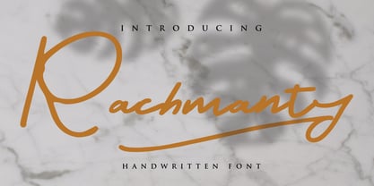 minimal fashion fonts designs. projects to the highest level, be it branding, headings, wedding, digital, movie, invitations, signatures, logos, labels, and much more! This font is readable, catchy, and easy to use. This font is suitable for quotes, logo designs, magazines, business cards, and many other design projects.
 - Punkinhead - Unknown license

- Cheq by Adobe,
$35.00A set of chessmen and related symbols. Another version from Linotype can be found at Linotype Game Pi. " - Schein by Almarkha Type,
$29.00 Schein – Sans & Slab inspired by the famous minimalist logo and perfect for the purposes of designing templates, brochures, videos, advertising branding, logos and more.
 - Tangram by Présence Typo,
$51.00 Tangram is the famous Chinese puzzle, perhaps one of the oldest games in the world. It consists of seven pieces called Tans obtained from a square cut up in a certain way. These seven Tans (5 different-sized triangles, a square and a parallelogram) have to be used to form the figures. The Tangram collection represents 1772 different shapes spread in 15 fonts. Each font exists in 2 styles: plain & inline.
 - Soldier Slab Stencil Dstrssd by Alphabet Agency,
$15.00 Soldier Slab Stencil Dstrssd. is a grungy military stencil font. The bold slab characters provide a great base to present the distressed effect. The font has been developed from a war related computer game project. The font contains 26 letters of the English alphabet in capitals and alternative capitals are represented when typing in lowercase letters. Each font also contains numbers, punctuation and a range of Latin characters as displayed.

