10,000 search results
(0.019 seconds)
- Sunstar by Daily Studio,
$14.00 Sunstar is a multi-purpose font designed by Daily Studio. This font has its unique style in every letter. Making your works look spectacular. Perfect for headlines, logos, posters, and branding. Contain full uppercase, lowercase, punctuation, and multilingual lettes.
 - Delluza by Almarkha Type,
$29.00 Introducing Delluza - Authentic Condensed Sans with strong and challenging nuances. very suitable for the title, typography, magazines, brochures, packaging and much more for your design needs, making your designs more modern and professional, You can activate Ligature OpenType panel.
 - Ausion by Andfonts,
$14.00 Ausion is a minimal and neat sans serif font. It can easily be matched to an incredibly large set of projects, so add it to your creative ideas and notice how it makes them stand out! Caps only fonts.
 - Synthetic by Gassstype,
$27.00 Hello Everyone, Introduce our new collection Syhthetic - Playful Typeface Font Fun All Caps Font and display for posters, packaging, branding, logotype and more, for your design needs, making your designs more modern and professional for kids,unique and sweety.
 - Slimpick by IbeyDesign,
$15.00 Slimpick Brush Stroke Font results out of a stunning pairing of a brush pen and pencil that makes it look incredibly endearing and authentic. Use this gorgeous and unique this handwritten font to bring any DIY project to life!
 - Bunnyheart by Letterafandi Studio,
$16.00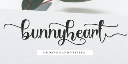 Bunnyheart is a modern handwritten font. Whether you’re using it for crafting, digital designing, presentations, or greeting card making, it’s perfect! This font is PUA encoded which means you can access all of the glyphs and swashes with ease!
 - Roundhead by Solotype,
$19.95A surprisingly modern looking condensed sans serif issued by Mackellar, Smiths & Jordan foundry in 1887. Its narrow width makes it useful for long copy headlines. Designed by the freelance type cutter Charles Beeler who did many fonts for Mackellar. - Vingiloth by Mr. Typeman,
$12.00 Vingiloth is a delicate script which simulates natural handwriting. Vingiloth includes Vingiloth Regular and Vingiloth Caps, designed to contrast and compliment each other with elegant beauty and contemporary style, making it an excellent fit for projects of all types.
 - Sweet Love Land by Persik Flor,
$10.00 Sweet Love Land is a decorative font family with heart-shaped forms, perfect for various uses like weddings, greeting cards, and more. It supports multiple languages, including German and Dutch (ẞ, IJ, ij), making it versatile for creative projects.
 - Scripio A by AType,
$24.95Scripio A was the first font which I submitted to MyFonts.com. It is a decorative font. Little bit technical. I wanted to make a font which would be interesting to all. To some extent it has justified my hopes. - Fairy Heart by Namara Creative Studio,
$9.00 Cute and lovely display font that comes with a unique style to make it suitable for any purpose, such as handicrafts, product packaging, quotes, product design, craftsmen, labels or any other projects which need a playful and lovely touch.
 - Fiendstar by AVP,
$29.00Initially created as a less quirky alternative to GillSans Schoolbook, Fiendstar has been developed into a family of widths, weights and styles. High legibility makes it suitable for signs and school books, especially for readers with poor reading ability. - Finabilla by Gassstype,
$23.00 Hello Everyone, introduce our new product Finabilla It Is Handwritten Script Font with a natural feel. This handmade font will make your design has a beautiful natural touch for each details. You can activate 15 Ligature glyphs OpenType panel.
 - Rajomon by Etewut,
$20.00 Introducing Rajomon the hand drawn script made with dry brush. All European languages are in. More of all there are initial, final and alternative letters for making your lettering on a high level as a peak of the rock!
 - Congratulatory New Year And Christmas by Dmitriy Shchetinskiy,
$19.00 Congratulatory New Year and Christmas font consist of 36 calligraphic greetings letterings. Letterings are original and handwritten. This font makes it possible to use high quality calligraphy in your projects - greeting cards, certificates, invitation cards, letters of commendation etc.
 - December Holidays by Good Java Studio,
$19.00 Introducing December Holidays December Holidays a playfully display font make from handdrawn ideas in typeface. This font includes full of Alphabetical glyphs, Numerals, and punctuation. This is so perfect for invitations, monograms, wedding, fashion, branding, label, handdrawn or logotype.
 - Narcis by VP Creative Shop,
$15.00 Introducing Narcis, the delightful retro bold script font that's bound to add a touch of nostalgia and flair to any project! This charming typeface boasts a unique blend of boldness and elegance, making it perfect for various design purposes. With its alternate and ligature glyphs, Narcis offers a wonderful range of creative possibilities. These additional characters add extra variety to your text, giving it a truly personalized and artistic feel. Whether you're designing a logo, poster, invitation, or any other project, Narcis' alternates and ligatures will help you achieve a distinct and eye-catching look. But that's not all! Narcis is also impressively versatile when it comes to language support, accommodating up to 87 languages. This means you can confidently express yourself in multiple languages without compromising on the font's aesthetics or legibility. Narcis comes in both regular and italic styles, allowing you to emphasize specific parts of your text or create a dynamic interplay between the two styles. The regular style offers a bold and confident appearance, while the italic style adds a touch of sophistication and movement to your design. Whether you're a seasoned designer or just starting on your creative journey, Narcis is sure to become your go-to font for adding that retro touch with a modern twist. Its warm and friendly demeanor will instantly win you over, making every project a joyful and visually captivating experience. So go ahead and give Narcis a try – you won't be disappointed! Language Support : Afrikaans, Albanian, Asu, Basque, Bemba, Bena, Breton, Chiga, Colognian, Cornish, Czech, Danish, Dutch, Embu, English, Estonian, Faroese, Filipino, Finnish, French, Friulian, Galician, Ganda, German, Gusi,i Hungarian, Indonesian, Irish, Italian, Jola-Fonyi, Kabuverdianu, Kalenjin, Kamba, Kikuyu, Kinyarwanda, Latvian, Lithuanian, Lower Sorbian, Luo, Luxembourgish, Luyia, Machame, Makhuwa-Meetto, Makonde, Malagasy, Maltese, Manx, Meru, Morisyen, North Ndebele, Norwegian, Bokmål, Norwegian, Nynorsk, Nyankole, Oromo, Polish, Portuguese, Quechua, Romanian, Romansh, Rombo, Rundi, Rwa, Samburu, Sango, Sangu, Scottish, Gaelic, Sena, Shambala, Shona, Slovak, Soga, Somali, Spanish, Swahili, Swedish, Swiss, German, Taita, Teso, Turkish, Upper, Sorbian, Uzbek (Latin), Volapük, Vunjo, Walser, Welsh, Western Frisian, Zulu How to access alternate glyphs? To access alternate glyphs in Adobe InDesign or Illustrator, choose Window Type & Tables Glyphs In Photoshop, choose Window Glyphs. In the panel that opens, click the Show menu and choose Alternates for Selection. Double-click an alternate's thumbnail to swap them out. Mock ups and backgrounds used are not included. Thank you! Enjoy!
 - ALS Direct by Art. Lebedev Studio,
$63.00 ALS Direct is an open and dynamic typeface with clear-cut letterforms that make it instantly readable. It lends text a neutral, yet agreeable and modern feel. Direct has nine font styles convenient for the purposes of navigation signage. Regular-style letterforms are rather wide, because direction signs are likely to appear before readers at an angle, so the type needs to withstand perspective distortions. And as signs and boards may vary in size, Direct was developed to include several width variations. Condensed fonts can be used where horizontal space is limited, allowing you to keep proper height and readability of the characters. A signage typeface must be easily readable from some distance away and have simple letterfoms with clear-cut features to quickly identify characters. Designing a type for a potentially wide range of purposes calls for a universal approach. If not destined to be used for navigation in a particular building, it shouldn’t incorporate any peculiar elements to agree with certain design or architecture. All of the above determined our choice of a sans serif with large apertures and definite features allowing readers to instantly recognize letters. Descenders are made compact not to interfere with the line below. And the low contrast between thick and thin strokes renders all elements equally perceptible. The x-height is significant, close to the cap height, which inhances readability of the lowercase type. There are two reasons why directions must not be set in all caps. Firstly, lowercase letters are more diverse and include ascenders and descenders identifying some of the letters in the line. And secondly, having learned to read, people recognize word shapes rather than individual letters, which makes lowercase text more readable. With Direct being a signage typeface, first to be developed were its width variations, and different weight styles and italics were added later. Another thing to be kept in mind was that signs often use dark background colors, and black type on a white background appears smaller than white type on a black background. Direct is the first Cyrillic typeface created for navigation purposes. Before that, designers could use the Cyrillic version of Frutiger (Freeset) developed by Adrian Frutiger for the Paris Charles de Gaulle International Airport, and a number of other, mostly body copy, neutral sans serif types. However, signs and boards were dominated by Arial, which Direct would be glad to replace offering elegance and lucidity of form instead of type bluntess. Direct was designed as a signage typeface, but its neutral style and clear-cut letterforms suggest various other ways of application.
 - Bodoni Z37 by Typodermic,
$9.95 Indulge in the timeless elegance of Bodoni Z37—a typeface that captures the essence of European sophistication. Designed with the mid-21st century in mind, this Didone font offers a dynamic range of weights and widths, allowing you to create captivating typography that is truly one-of-a-kind. Bodoni Z37’s Deco design with flat edges and geometric lines sets it apart from other fonts in its genre. It’s an exceptional choice for creating headlines, posters, and invitations. The razor-thin lines are enticing at larger sizes but can be challenging to handle when you need to go extremely small. Thankfully, the font is available in three optical sizes—large, medium, and small, making it versatile enough to use in any design scenario. The Bodoni Z37 family includes four weights, four widths, and italics, giving you a staggering 96 font options to choose from. The cute, curly italics are perfect for adding emphasis and flair to your text, while the lining numerals are kerned and proportionally spaced for effortless readability. With open-type fractions, numeric ordinals, and old-style numerals, Bodoni Z37 is a complete package that allows you to experiment with typography to your heart’s content. Whether you’re designing a book cover or a branding package, Bodoni Z37’s exceptional versatility and elegant design are sure to make your work stand out. Most Latin-based European, Vietnamese, Greek, and most Cyrillic-based writing systems are supported, including the following languages. Afaan Oromo, Afar, Afrikaans, Albanian, Alsatian, Aromanian, Aymara, Azerbaijani, Bashkir, Bashkir (Latin), Basque, Belarusian, Belarusian (Latin), Bemba, Bikol, Bosnian, Breton, Bulgarian, Buryat, Cape Verdean, Creole, Catalan, Cebuano, Chamorro, Chavacano, Chichewa, Crimean Tatar (Latin), Croatian, Czech, Danish, Dawan, Dholuo, Dungan, Dutch, English, Estonian, Faroese, Fijian, Filipino, Finnish, French, Frisian, Friulian, Gagauz (Latin), Galician, Ganda, Genoese, German, Gikuyu, Greenlandic, Guadeloupean Creole, Haitian Creole, Hawaiian, Hiligaynon, Hungarian, Icelandic, Igbo, Ilocano, Indonesian, Irish, Italian, Jamaican, Kaingang, Khalkha, Kalmyk, Kanuri, Kaqchikel, Karakalpak (Latin), Kashubian, Kazakh, Kikongo, Kinyarwanda, Kirundi, Komi-Permyak, Kurdish, Kurdish (Latin), Kyrgyz, Latvian, Lithuanian, Lombard, Low Saxon, Luxembourgish, Maasai, Macedonian, Makhuwa, Malay, Maltese, Māori, Moldovan, Montenegrin, Nahuatl, Ndebele, Neapolitan, Norwegian, Novial, Occitan, Ossetian, Ossetian (Latin), Papiamento, Piedmontese, Polish, Portuguese, Quechua, Rarotongan, Romanian, Romansh, Russian, Rusyn, Sami, Sango, Saramaccan, Sardinian, Scottish Gaelic, Serbian, Serbian (Latin), Shona, Sicilian, Silesian, Slovak, Slovenian, Somali, Sorbian, Sotho, Spanish, Swahili, Swazi, Swedish, Tagalog, Tahitian, Tajik, Tatar, Tetum, Tongan, Tshiluba, Tsonga, Tswana, Tumbuka, Turkish, Turkmen (Latin), Tuvaluan, Ukrainian, Uzbek, Uzbek (Latin), Venda, Venetian, Vepsian, Vietnamese, Võro, Walloon, Waray-Waray, Wayuu, Welsh, Wolof, Xavante, Xhosa, Yapese, Zapotec, Zarma, Zazaki, Zulu and Zuni.
 - Martian Grotesk by Martian Fonts,
$35.00 Martian Grotesk is a large typeface family originally designed for the screen which consists of a variable font with 2 axes of variation and 63 styles: Condensed to Ultra Wide, Thin to Ultra Black. Aesthetics The font style is characterized by some brutality and assertiveness. Overhanging terminals, a closed aperture, and an almost complete lack of contrast lead to this effect. Additionally, some elements of the letters are especially enlarged. This font gives any text the impression of being a “signature” style. Nevertheless, we still maintain the golden mean between its rebellious nature and readability. Perfect for web development We created Martian Grotesk for the web and digital project world. When laying out web pages, frontend developers are constantly faced with the fact that uneven metrics do not allow text to be evenly placed on some design element, for example, on a button. Instead, they have to compensate in some way, like making the top padding smaller and the bottom padding larger in CSS. This little deal really hurts. Also, if your project adheres to design system principles, you might be unable to stand a lack of systematic approach when working with fonts. We researched and calculated vertical metrics and set them up in a way that guarantees equal space above the cap height and under the baseline. This enables the text labels to be evenly placed on buttons, inputs, lists, and forms. In addition, we found a proper ratio of the letter heights, so, with commonly used font sizes—10, 15, and 20 pixels—the glyph heights stick to the pixel grid. As a result, the letter shapes become sharper, which reduces the load on the reader's eyes and simply looks much better. The typeface also comes equipped with OpenType and TrueType hinting, and Martian Grotesk appears legible on most platforms, even when being rendered in small sizes. When coupled together, all the above features make Martian Grotesk a reasonable choice for any user interface design. Roadmap Martian Grotesk right now is a work-in-progress product. The font is completely ready for professional use, however, many great features are still ahead! For example, support for Extended Cyrillic characters, and italics. Pricing Purchasing an early version of the font presents the opportunity to get it at a very attractive price! That’s because with every new version, costs will go up to reflect the additional value that comes with every release. But after purchasing Martian Grotesk, all its future updates are included for free!
 - PF Das Grotesk Pro by Parachute,
$79.00 Das Grotesk was inspired by earlier nineteenth-century grotesques, but it is much more related to American gothic designs such as those by M.F. Benton. Due to their pure geometric structure, most grotesque typefaces tend to have a rather monotonous and lifeless appearance, thus failing to express the ideals of the modern creed. Das Grotesk on the other hand is a lively design with several distinguishable characteristics which attract attention when set at large sizes, whilst they become subtle and blend evenly at small sizes, fostering a neutral identity. This is a very legible and space-saving typeface with a narrow structure. It was designed with slanted curved ends and sheared terminals applied on several straight strokes. It has two-storey ‘a’ and ‘g’ but includes single-storey alternates. The family consists of 14 weights ranging from Extra Thin to Black (including true-italics). It provides simultaneous support for Latin, Cyrillic and Greek and is loaded with several advanced typographic features such as small caps. Download its complehensive PDF Specimen Manual for further details.
 - Baltra by Galapagos,
$39.00After researching the type styles contemporary graphic designers have been using over the past few years, I noticed a consistent use of Copperplate Gothic, and its derivative designs, for various corporate advertising campaigns. That level of usage gave me the inspiration to design a display font possessing subtle characteristics of Copperplate Gothic, and various Latin Condensed designs. The font I ended up designing was semi-condensed, with more contrast between thicks and thins than in Copperplate. Baltra also has a subtle flair in its otherwise traditional lowercase, while possessing a larger than average lowercase x-height. Copperplate Gothic, on the other hand, has minimal contrast and uses small capitals for its lowercase. After examining extensive type specimens from wood type, metal type, phototype and digital type, I was not able to find a single design possessing a majority of Baltra's characteristics. Consequently, I consider Baltra to be a truly unique design, sharing with Copperplate Gothic only its flairs on stems, and having only subtle characteristics in common with traditional Latin designs. - Syncopate Pro by Stiggy & Sands,
$29.00 The Syncopate Pro Family is a unicase design where the traditional lowercase x-height has been abandoned and a single uppercase height rules the design of all of the alpha and numeric glyphs. Some uppercase glyphs are copied to their lowercase slots, where other lowercase glyphs such as the a, e, and r, are scaled up to uppercase heights. This motif allows for a vast array of typesetting possibilities. A modern and stylish sans inspired by the many trendy sans serif typefaces that are prevalent today, the Syncopate Pro Family, primarily intended for display and headline use, also works well for limited text runs. The thin and regular weights and wide body impart a certain level of elegance, while the unicase approach keeps the look lively and fresh. The bold weight imparts a powerful substantiality, lending a strong corporate presence to any design. Opentype features include: - Stylistic Alternates for a collection of alternate Small Caps - Full set of Inferiors and Superiors for limitless fractions - Lining and Proportional figure sets
 - Varietta by Sudtipos,
$39.00 Varietta is the result of my fascination with photographing the type designs of some marquees in Spanish markets. In them you can see many letter designs with reversed contrast and in different widths, probably based on the possibilities of photocomposition. At the same time I was working on the expansion of the Hastile typeface designed by Alessandro Butti for the Nebiolo foundry in Italy in the late 1930s, of which I had not seen any digitization. As I am not a fan of perfect revivals, I thought it could be interesting to connect Spain and Italy in a single typeface. The first step was to expand Butti's design to 27 styles, ranging from thin condensed to black expanded. To look for the Spanish connection and its characteristic inverse contrast I took advantage of the current technology that allows variable typefaces with many axes. From this, three scenarios of horizontal contrast were incorporated (top, bottom and mixed) which allows infinite possibilities of use. The final result is a collection of 108 static typefaces or a single variable file.
 - PB Roman Uncial Vc by Paweł Burgiel,
$32.00 PB Roman Uncial Vc is a font face designed for imitate Roman uncial writing style found in manuscripts from 4th to 5th century. All characters are handwritten by use ink and reed pen (calamus), scanned, digitized and optimized for best quality without lost its handwritten visual appearance. Character set support codepages: 1250 Central (Eastern) European, 1252 Western (ANSI), 1254 Turkish, 1257 Baltic. Include also additional characters for Cornish, Danish, Dutch and Welsh language, spaces (M/1, M/2, M/3, M/4, M/6, thin, hair, zero width space etc.), historical characters (overlined Roman numerals, abbreviations, I-longa, historical ligatures for "nomina sacra" and "notae communes") and wide range of ancient punctuation. OpenType TrueType TTF (.ttf) font file include installed OpenType features: Access All Alternates, Localized Forms, Fractions, Alternative Fractions, Ordinals, Superscript, Tabular Figures, Proportional Figures, Stylistic Alternates, Stylistic Set 1, Historical Forms, Historical Ligatures. Include also kerning as single 'kern' table for maximum possible backwards compatibility with older software. Historical ligatures for "nomina sacra" and "notae communes" are mapped to Private Use Area codepoints.
 - Core Sans N by S-Core,
$15.00 The Core Sans N Family is a part of the Core Sans Series (Core Sans N SC, Core Sans N Rounded, Core Sans M, and Core Sans G). Letters in the Core Sans N Family are designed with genuine neo-grotesque and neutral shapes without any decorative distractions. The spaces between individual letter forms are precisely adjusted to create the perfect typesetting. The Core Sans N Family consists of 3 widths (Condensed, Normal, Extended), 9 weights (Thin, ExtraLight, Light, Regular, Medium, Bold, ExtraBold, Heavy, Black), and Italics for each format. It also supports WGL4, which provides a wide range of character sets (CE, Greek, Cyrillic and Eastern European characters). Each font includes support for Tabular numbers, Arrows, Box drawings, Geometric shapes, Block elements, Mathematical operators, Miscellaneous symbols and Opentype Features such as Proportional Figures, Numerators, Denominators, Superscript, Scientific Inferiors, Subscript, Fractions and Standard Ligatures. The Core Sans N Family provides both OpenType (.OTF) and TrueType (.TTF) versions in the same package. We highly recommend it for use in books, web pages, screen displays, and so on.
 - White Dream by Mans Greback,
$59.00 White Dream is a clean, swashy and beautiful script typeface. It brings your thoughts to the magic setting in a wonderful story or a fantasy movie. This decorative logotype font is the ultimate Disney princess typeface; a font that reminds you of everything from Cinderella and Snow White to Anna & Elsa of Frozen. With the highest quality and perfection, this is a four-style calligraphic family consisting of Regular, Thin and Swash versions. These style, and the wide selection of alternates, together guarantees that you can always use it to design a logo or headline that will satisfy its purpose. White Dream is built with advanced OpenType functionality and has a guaranteed top-notch quality, containing stylistic and contextual alternates, ligatures and more features; all to give you full control and customizability. It has extensive lingual support, covering all Latin-based languages, from North Europe to South Africa, from America to South-East Asia. It contains all characters and symbols you'll ever need, including all punctuation and numbers.
 - TA Fabricans by Tural Alisoy,
$25.00 TA Fabricans graphic presentation at Behance TA Fabricans font is based on Film Fiction Semi Expanded font. The font also supports the Hebrew alphabet. The Display version comes only in the Latin alphabet. I tried to prepare the font carefully. I specifically searched for the Hebrew alphabet. I benefited from my Israeli colleagues. I believe that my font will be successful. Please check and if you have any additional requests or complaints, please write to me. t@taft.work TA Fabricans works great for branding, magazines, headers, logos, TV, UI, web, badge, packaging, headlines, posters, t-shirt/apparel etc. TA Fabricans offers you options to explore a whole host of applications and gives a real modern feel to any project. Family overview: 36 fonts, 9 weights (from Thin to ExtraBlack) + Condensed, Expanded, Display Latin, Hebrew Display font without Hebrew Multilingual 4 free font Localized Forms with NLD, PLK OpenType Features: Localized Forms Contextual Alternates Tabular Figures Subscript Scientific inferiors Superscript (Superiors) Numerators Case Sensitive Forms Standard and Discretionary Ligatures Stylistic Alternates Kern Ordinals
 - FF DIN by FontFont,
$104.99 Dutch type designer Albert-Jan Pool created this sans FontFont between 1995 and 2009. The family has 20 weights, ranging from Light to Black in normal and condensed styles (including italics). It is ideally suited for advertising and packaging, editorial and publishing, logo, branding and creative industries, poster and billboards, small text, wayfinding and signage as well as web and screen design. Looking for the new Thin and Extra Light weights? They are available through fontshop.com, linotype.com and fonts.com. FF DIN provides advanced typographical support with features such as case-sensitive forms, fractions, super- and subscript characters, and stylistic alternates. It comes with a complete range of figure set options – oldstyle and lining figures, each in tabular and proportional widths. As well as Latin-based languages, the typeface family also partly supports the Cyrillic and Greek writing systems. In 2011, FF DIN was added to the MoMA Architecture and Design Collection in New York. This FontFont is a member of the FF DIN super family, which also includes FF DIN Round.
 - Fenomen Sans by Signature Type Foundry,
$38.00 Geometrical drawing of Fenomen Sans typeface goes back to the roots of the Bauhaus aesthetics and the entire architectural and design avant-garde of the 20th century. It is still a symbol of functional rationality, clean aesthetics in relation to shape, and of progressive thinking. Its popularity is timeless and permanent. The set contains eight basic alphabets of a square pattern, eight semicondensed, eight condensed and eight extremely condensed alphabets, all in Latin and Cyrillic alphabets. Every font of the family has four types of numerals, small caps and variant letters. The typesetting can fluently use all fonts simultaneously. The typeface originated between the years 2011–2014 and was subjected to a series of tests for the fluent legibility of narrow fonts even in extreme conditions. Narrow fonts provide this set with the maximum use also for newspaper typesetting. The typeface has an elegant, delicate design in thin fonts and sufficient legibility in bold. Mutual contrast produces creative tension. Font name acronyms described: SCN = SemiCondensed CN = Condensed XCN = ExtraCondensed
 - Antipol VF by phospho,
$75.00 With Antipol Variable, the reversed stress font was supplemented with Wide and Extended cuts in the Hairline weight. The ability to stretch single letters extremely wide is an exclusive goodie of the Variable version. Antipol is a Sans Serif design that reverses the conventions of a regular Latin Sans Serif. With a weight emphasis on the horizontals and its vertical terminals Antipol radiates a 1970s charisma known from the like of Antique Olive. Its modern and avantgardistic attributes are most pronounced in the Hairline weight, where ultra thin lines meet distinctive arrowhead-corners. This particular weight is meant for display settings, think full-page magazine titles or posters. Antipol Wide and Antipol Extended are a generous statement for graphic design with enough space to let the type breathe: art catalogs, lead texts, invitations, letterheads or brand identity. Any style comes with a wide range of OpenType features that goes beyond a standard display font: Small Caps, Proportional and Tabular Oldstyle Figures and Lining Figures, Fractions, and much more.
 - Stempel by Linotype,
$29.99The Stempel family consists of two fonts; each made to look like a set of block stamps. Each letter appears inside its own roughly drawn square. Stempel One's letters are very simple form/counterform objects. Stempel Two's forms are more ornate: each square stamp has a thin border inside of it, and then the individual letterforms have been knocked-out, so that the colored area depicts the counters around the letters rather than the letters themselves. As a line of text is typed, a box appears for each letter entered, and all of the boxes slightly nudge against each other to form the line. The Stempel fonts have the appearance of a hand-made quality to them. Their forms appear too random, too delicate, and too thought out to have been made on a machine. Using these fonts will add a nice warm, linoleum-cut touch to your work. Both Stempel One and Stempel Two were designed by German designer Martina Balke in 2002, and are part of the Take Type 5 collection from Linotype GmbH." - PB Beneventan XIc by Paweł Burgiel,
$32.00 PB Beneventan XIc is a font face designed for imitate Beneventan minuscule (also called Lombardic, Casinense, Langobarda, littera Longobarda, Longobardisca) from southern Italy found in 11th century manuscripts. All characters are handwritten by use ink and pen, scanned, digitized and optimized for best quality without lost its handwritten visual appearance. Character set support codepages: 1250 Central (Eastern) European, 1252 Western (ANSI), 1254 Turkish, 1257 Baltic. Include also additional characters for Cornish, Danish, Dutch and Welsh language, spaces (M/1, M/2, M/3, M/4, M/6, thin, hair, zero width space etc.) and historical characters (mediaeval abbreviations, ligatures, ancient punctuation). OpenType TrueType TTF (.ttf) font file include installed OpenType features: Access All Alternates, Localized Forms, Fractions, Alternative Fractions, Ordinals, Superscript, Tabular Figures, Proportional Figures, Case-Sensitive Forms, Stylistic Alternates, Contextual Alternates, Stylistic Set 1-14, Contextual Ligatures, Historical Ligatures, Standard Ligatures. Include also kerning as single 'kern' table for maximum possible backwards compatibility with older software. Additional glyphs are mapped to Private Use Area codepoints. OpenType features automatically exchange some default glyphs by stylistic alternates and create ligatures for better historical appearance.
 - PB Roman Uncial IIc by Paweł Burgiel,
$32.00 PB Roman Uncial IIc is a font face designed for imitate Roman uncial writing style found in manuscripts from 1st to 2nd century. All characters are handwritten by use ink and reed pen (calamus), scanned, digitized and optimized for best quality without lost its handwritten visual appearance. Character set support codepages: 1250 Central (Eastern) European, 1252 Western (ANSI), 1254 Turkish, 1257 Baltic. Include also additional characters for Cornish, Danish, Dutch and Welsh language, spaces (M/1, M/2, M/3, M/4, M/6, thin, hair, zero width space etc.), historical characters (overlined Roman numerals, I-longa, historical ligatures for "nomina sacra" and "notae communes") and wide range of ancient punctuation. OpenType TrueType TTF (.ttf) font file include installed OpenType features: Access All Alternates, Localized Forms, Fractions, Alternative Fractions, Ordinals, Superscript, Tabular Figures, Proportional Figures, Stylistic Alternates, Stylistic Set 1, Historical Forms, Historical Ligatures. Include also kerning as single 'kern' table for maximum possible backwards compatibility with older software. Historical ligatures for "nomina sacra" and "notae communes" are mapped to Private Use Area codepoints.
 - De Fonte Plus by Ingo,
$39.00 A variation of ”Helvetica according to the blur principle.“ The underlying typeface is ”Helvetica“, the only true ”run-of-the-mill“ typeface of the twentieth century. The distortion principle used simulates the photographic effect of halation and/or overexposure. The light weight, »DeFonte Léger«, nearly breaks on the thin points, whereas on those points where the lines meet or cross, dark spots remain. The characters are ”nibbled at“ from the inner and outer brightness. On the normal and semibold typestyles, »DeFonte Normale« and »DeFonte Demi Gras«, the effect is limited almost exclusively to the end strokes and corners, which appears to be strongly rounded off. The bold version »DeFonte Gros« is especially attractive. As a result of ”overexposure“, counters (internal spaces) are closed in, while characters become blurred and turn into spots; new characteristic forms are created which are astoundingly legible. The fat version »DeFonte Gros« is particularly appealing. “Overexposure” leads to drifted counters, letters blur into spots; new characteristic forms emerge, which are surprisingly easy to read.
 - Brokve by MKGD,
$13.00 Brokve is a Croatian word used along the Dalmatian coast. It means “nails", as in the; hammer and nails, variety. It’s tall thin strokes and jutting points give it a very spike-like appearance; suitable for any uses that are intense, jarring or just plain edgy. There is no lower case for Brokve as it is a display font. The upper case serves as both the upper and lower case letters. Brokve has a glyph count of 392 and supports the following languages; Afrikaans, Albanian, Asu, Basque, Bemba, Bena, Bosnian, Catalan, Chiga, Colognian, Cornish, Croatian, Czech, Danish, Embu, English, Esperanto, Estonian, Faroese, Filipino, Finnish, French, Friulian, Galician, German, Gusii, Hungarian, Icelandic, Indonesian, Irish, Italian, Kabuverdianu, Kalaallisut, Kalenjin, Kamba, Kikuyu, Kinyarwanda, Latvian, Lithuanian, Low German, Lower Sorbian, Luo, Luxembourgish, Luyia, Machame, Makhuwa-Meetto, Makonde, Malagasy, Malay, Maltese, Manx, Meru, Morisyen, North Ndebele, Norwegian Bokmål, Norwegian Nynorsk, Nyankole, Oromo, Polish, Portuguese, Romanian, Romansh, Rombo, Rundi, Rwa, Samburu, Sango, Sangu, Scottish Gaelic, Sena, Shambala, Shona, Slovak, Slovenian, Soga, Somali, Spanish, Swahili, Swedish, Swiss German, Taita, Teso, Turkmen, Upper Sorbian, Vunjo, Walser, and Zulu.
 - Goodnight London by Ronny Studio,
$20.00 Goodnight London is a Duo Font with a blend of 2 fonts, namely the Sans & Script font. A luxurious font, with thick and thin sizes with a combination of handwritten script fonts, so that it adds an elegant, luxurious and classy impression. This typeface is perfect for logos, branding, travel promotions, social media posts, magazine layouts, product packaging, quotes, or simply as a stylish text overlay onto any background image. 5 Style Font : Regular Sans Italic Sans Bold Sans Bold Italic Sans Regular Script Goodnight London Features : Uppercase Lowercase Numbers & Punctuation Alternates Ligatures Multilingual Support Simple installation All of features and special characters of this font are included in one file. So it is easy to accessed by using program or software that support the opentype like Adobe Illustrator, Adobe Photosop, and Adobe Indesign). This font also very easy to use because compatible for all software even for non-opentype supported. Please comment us if you have any questions Thank you and have a nice day. thank you
 - Resgak by Kulokale,
$30.00 Resgak is a contemporary serif font with 20 fonts, ranging from thin to extra black with its matching italics, Resgak offers many possibilities to be applied in many graphic or editorial projects. Lighter weights are suitable for body text, and the heavier weights are perfect for striking headlines. Resgak is perfect for many different projects such as logos and branding, invitations, stationery, social media posts, advertisements, printed quotes, product packaging, product designs, labels, photography, watermark, special events and many more. This font is encoded with Unicode PUA, which allows full access to all additional characters without having special design software. Mac users can use Font Book, and Windows users can use Character Map to view and copy one of the extra characters to paste into your favorite text editor / application. I highly recommend using a program that supports OpenType features and Glyphs panels such as Adobe Illustrator, Adobe Photoshop CC, Adobe InDesign, or CorelDraw, so you can see and access all Glyph variations. We hope you enjoy the font and have fun! Thank You.
 - Kardinal by Ani Dimitrova,
$30.00 Kardinal is a sans serif humanistic type family. The family has 16 weights, ranging from Thin to Black with extra drawn italics and small caps versions. The Kardinal type family is ideally suites for small text, books and magazines, branding, posters, as well as web and screen design, headlines and more. Kardinal comes in 16 styles with extended language support. All weights contain standard ligatures, proportional figures, tabular figures, old style figure, numerals and arrows, matching currency symbols and fraction. The construction of characters combines clean grotesque style and calligraphic features with humanist fragrance. Out standing for the designs are the small serifs. They are giving the letters movement and freshness, as well as contribute to a better readability in different volume texts and including lots of details that give it a unique personality. The Regular and Medium weights are perfect for body text while the italic give an interesting texture to the text. The range of styles give a good flexibility to this family. The fonts are carefully hinted and perfect for digital use.
 - Radiata by Untype,
$30.00 Type designer Sergio Leiva delivers another highly inspired text typeface that honours both, nature and type tradition. Radiata looks strong on its structure yet delicate on its terminals and serifs, and bring a sense of modern rationality to the composition because its proportions and vertical stress at the time thata flourishes organically and full of details on display settings. The family has 10 weights, ranging from Thin to Heavy (plus matching italics) including 3 weights especially optimised for long text settings. Ideally suited for book text, editorial and publishing, advertising and packaging, logo, branding and creative industries, small text as well as web and screen design. Radiata provides advanced typographical support with features such as ligatures, small capitals, alternate characters, swashs, case-sensitive forms, fractions, and super- and subscript characters. It also comes with a complete range of figure set options – oldstyle and lining figures, each in tabular and proportional widths. Considering all this Radiata is a must have for every designer or type user looking for a versatile and reliable workhorse.