10,000 search results
(0.033 seconds)
- Amoba by Linecreative,
$16.00 Amoba is a very thick slab-serif font type. This font has supported supporting languages: Latin Western Europe and also comes with uppercase, lowercase, and ligature, So it gives design without limits
 - Print Promoters JNL by Jeff Levine,
$29.00 Print Promoters JNL is another batch of classic dingbats re-drawn from vintage source material. This collection features stock words and phrases with a few decorative embellishments thrown in for good measure.
 - Cutie Biscuit by Balpirick,
$15.00 Cutie Biscuit is perfect for product packaging, branding project, magazine, social media, wedding, or just used to express words above the background. This font includes TTF, Cutie Biscuit also has multilingual support.
 - Beatlove by Sakha Design,
$14.00 Beatlove is a sweet and delicate handwritten font. Dainty and joyful, this font will be ideal for writing wedding invitations, cards or any other design that may need a romantic, personalized touch!
 - Solfont by Enrich Design,
$24.95A new Enrich Design font based on the handwriting of Jeff Solak. It was designed to stay as true to the original style as possible. This font features an extended character set. - Mykonos by Deniart Systems,
$20.00 A geometrical, modern, angular design inspired by the Greek Key. It's complex yet simple, creating smooth, continuously flowing print. This font is well suited for headlines, posters, greeting cards, and much more.
 - Nathaly by Aestherica Studio,
$12.00 Nathaly is a sweet and delicate handwritten font. Dainty and joyful, this font will be ideal for writing wedding invitations, cards, or any other design that may need a romantic, personalized touch!
 - Condensed Stencil JNL by Jeff Levine,
$29.00 Browsing online auctions is a wonderful way to pick up ideas for font designs. Take Condensed Stencil JNL for example. This font was modeled from a set of vintage brass interlocking stencils.
 - TXT Groovy Smooth by Illustration Ink,
$3.00Add some retro personality to scrapbooks, greeting cards, invitations, announcements, signs, and more. The round, thick lines of Groovy Smooth lend a playful 70s feel to the letters of this cool font. - Carlingtown by Red Rooster Collection,
$60.00 This old victorian typeface was originally called Constantia. Since that name was already in use, we decided on a the new name of Carlingtown. Digitally engineered by Steve Jackaman and Ashley Muir.
 - Hannover Modern by Type-Ø-Tones,
$40.00 Hannover Modern belongs to a series of typefaces used at the Estudio Mariscal in Barcelona. José Manuel Urós developed this weight, a vigorous egyptian-style, the embodiment of the Javier Mariscal style.
 - Maya Month Glyphs by Deniart Systems,
$15.00 Contains the 19 months of the Maya solar year (in outline and silhouette mode) as well as the 19 Maya numerals. NOTE: this font comes with an interpretation guide in pdf format.
 - AZ Clouds by Artist of Design,
$20.00 AZ Clouds was inspired from a need to develop a sans serif typeface with center accents for a t-shirt design. This font was designed for use as a fun bold headline.
 - Gold&Song by Letterena Studios,
$17.00 Gold&Song is a modern and classic serif font that has its own unique style. This typeface is perfect for luxury logos, books, fashion brands, magazines, apparel, quotes, and so much more.
 - Serifa by Linotype,
$29.99 This slab serif font of Adrian Frutiger is extremely legible and robust, making it suitable for most any use. Based on the forms of Univers, Serifa makes a harmonious and timeless impression.
 - Sabrosa by JAM Type Design,
$16.00 This display type family was developed with large headlines in mind. While the fonts work will at large size, they are not overbearing and get the point across without being too “shouty”.
 - Olimate by ARToni,
$14.00 Olimate is a cool, summer inspired decorative font, featuring characters made entirely out of tiny splashes. Add this font to your most creative ideas, and notice how it makes them stand out!
 - Tropical Nature by Skinny Type,
$15.00 Tropical Nature is a smoothie handwritten font perfect for your boho and farmhouse designs! This font is perfect for signs, shirts, wedding, home decor, branding, blogs, logos, invitations and more! Thank you!
 - Cattle Drive JNL by Jeff Levine,
$29.00 Cattle Drive JNL is based on some examples of a classic condensed wood type. Lettering of this period lends itself well to themes of Western life, carnivals, circuses or classic broadside posters.
 - Stillhouse by Surplus Type Co,
$16.00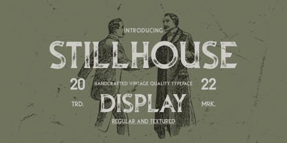 Stillhouse is a vintage serif font that features 2 styles - Textured & Solid. This typeface is great for achieving that rustic aesthetic which is popular in restaurant branding, apparel designs and product packaging.
 - Shining Monday by Subectype,
$16.00 Shining Monday is a fun and whimsical paint brushed display font. This font is perfect for children themed designs, especially when combined with bright colors. What's Include: Hello Angel Thank You, Subectype
 - Orange Leaves by Crumphand,
$9.50 Orange Leaves Fresh Fonts. This font is very unique shape. Comes with some ligature make your graphic looks fresh. Perfect Contour, Easy to read. What's Included ? Uppercase Lowercase Symbols Numerals Multilingual Support
 - Usefully by Beary,
$15.00 Usefully is a quirky and laid-back handwritten font. Whatever the topic, this font will be a wonderful asset to your font library, as it has the potential to enhance any creation.
 - JH Haroun by JH Fonts,
$120.00 JH Haroun is based on the calligraphic Thuluth script; It includes over two thousand glyphs and smart Kashidas to simulate the actual calligraphy. It is ideal for titles, book covers, greeting cards .........
 - Boldscope by ahweproject,
$9.00 Boldscope is a fun, retro-psychedelic display font. No matter the topic, this font will be an incredible asset to your fonts’ library, as it has the potential to elevate any creation.
 - Baby Boss by Nirmalagraphics,
$14.00 Baby Boss was inspired by the writing style of my brother who focused on learning to write and read. This font works well for children themed uses and has multi-lingual support.
 - Javagos by IbeyDesign,
$18.00 Javagos Handwritten Script Font is a cool, friendly, and trendy handwritten font. Not too thin and not too thick, balanced and varied, this was designed to enhance the beauty of your projects.
 - Solpera by Storm Type Foundry,
$32.00This type face fills one of the gaps between the world of Roman alphabets and that of linear alphabets. The first to be designed was the set of upper-case letters. The expression of these characters cannot conceal that they were originally intended only for the sculptor's use, as a type face for three-dimensional inscriptions. Their width proportions reflect a dialogue between the contemporary feeling and the legacy of classical Roman inscriptions. The type face was later complemented with a set of lower-case letters and elaborated into further designs. Its clear, concise letter forms end with small serifs which not only make the type face more refined, but above all anchor the individual letter signs visually to the horizontal of the text line. The austere construction of the majority of the letters is balanced by the more exuberant, humanizing forms of the most frequently used letters "a"; "e". (The three variants of the lower-case "e" enable to create rhythmically differentiated texts.) The letters in which a straight stroke is connected with an arch are designed in two ways. That means that the letters "n", "h","m" and the group of letters "b","d","p","q" are conceived in a different way. Thus an interesting tension is created in the structure of the text, which, however, does not endanger legibility. The economizing, slightly narrowed design of this type face predetermines its use for the setting of usual texts. In larger sizes, however, it produces a rather serious, even solemn, impression. - Chubs by Type.p,
$24.00 "Chubs," a typeface specifically designed for large display sizes, perfect for making a bold statement. Each letter in Chubs has been meticulously crafted to possess a thick and prominent appearance, ensuring that your designs leave a lasting impact on viewers. Chubs's distinctive weight and blackness make it an ideal choice for a wide range of applications, including posters, packaging, and logos. Whether you want to create eye-catching promotional materials or design a powerful brand identity, Chubs has got you covered. Within the Chubs typeface family, you'll find two distinct styles, each with its own personality and visual appeal. The first style, "Chubs Black," features letters with a captivating slit, reminiscent of a belly that overlaps. This distinctive groove adds an extra layer of visual interest and uniqueness to your designs. On the other hand, "Chubs Filled" offers a solid and plump appearance, without the characteristic slit. This style amplifies the chubby nature of the letters, resulting in a bold and impactful display. To further enhance your creative options, both styles within the Chubs family include an alternate character set featuring a wink shadow in every letter. These additional characters provide a touch of fanciness and playfulness, allowing you to experiment and add unique elements to your designs. Choose "Chubs" for your next big project, and witness the boldness and charm that sets your designs apart from the rest. Let Chubs bring your ideas to life and make a powerful visual statement that captures attention and leaves a lasting impression.
 - Smart Sans by Monotype,
$29.99 Smart Sans is a personal tribute to Leslie (Sam) Smart, the first type director to be hired by a major typesetting house in Canada. Smart was a twentieth century design pioneer who raised the standards of Canadian typography. Together with three of his peers, he established the first Type Directors Club in Toronto. After Smart's death in 1998, type designer Rod McDonald decided that something should be done to commemorate Smart's life and achievements. I had first thought of establishing a scholarship in Sam's name, but a typeface design soon replaced this idea," says McDonald. "Once I decided to design a typeface, however, it became a foregone conclusion that it would be a sans serif - for no other reason than that I loved the name Smart Sans." Two typefaces served as inspiration for McDonald's work. "Like thousands of designers, I'm keen on Matthew Carter's Helvetica Compressed series. And, when I was younger, I also loved Fred Lambert's Compacta," says McDonald. "I thought there might be a place for a small range that could take over from these 'old workhorses' and, in the process, bring a fresher look to the genre." McDonald drew three weights for the Smart Sans family, all ideally suited for setting attention-getting headlines and powerful display copy. The two-storied 'g' contributes to the design's lively personality, and the short 'r' helps maintain tight, even spacing. Smart Sans is the perfect homage to a great typographer, because it raises the bar on what to expect from condensed sans serif typefaces. Sam Smart would be pleased."
 - Gallos by W Type Foundry,
$25.00 What comes to your mind if I say Architype, Geometric, Gaelic, and Uncial? An impossible combination of features? An unrealistic setup of tastes as weird as your music list? Or some part of a joke told by your favourite comedian? Just chill and stick to the idea that is possible. Gallos combines the conceptual historical elegance of the Uncials with the practical rationalism of the Geometric style. Moreover, this typeface is composed by two sub families: Gallos Uncial and Gallos Architype. The letters “M”, “N”, “W”, “a”, “m”, “n”, “r”, and “w” differ between these two models. The first one is related to both: The Uncial script aspect displaying the leaned “a” with a closed bowl, and the classical geometric style depicting more conventional uppercase and lowercase letters “m” and “n”. The Architype one is inspired by Paul Renner’s Architype model, thus the leaned “a” has an open counter, the “r” is composed by a stem and a dot, and the rest of the mentioned letters were built using square rational features. Both models are connected by classical Uncial features such as the curved stroke “e” and curved shaft “t”, and with Gaelic vibes which can be seen in uppercase and lowercase letters “K” and “X”. Also, the curved descender “g” and “y”, alongside the curved stem “z” connect really well with the rest of the system and provide more uniqueness to the Gallos type family. Without further ado, we say to you: let’s make Uncials popular again!
 - Typist Slab Mono by VanderKeur,
$25.00 The typeface Typist originated during an extensive research on the origin and development of typewriter typestyles. The first commercially manufactured typewriter came on the market in 1878 by Remington. The typestyles on these machines were only possible in capitals, the combination of capitals and lowercase came available around the end of the nineteenth century. Apart from a few exceptions, most typestyles had a fixed letter width and a more or less unambiguous design that resembled a thread-like structure. A lot of this mechanical structure was due to the method the typestyles were produced. Looking at type-specimens for print before the first typewriters were good enough to came on the market we can see that in 1853 and in 1882 Bruce’s Type Foundry already had printing type that had a structure of the typewriter typestyles. Of course printing types were proportional designed as typewriter typestyles had a fixed width. So it is possible that except from the method of production for typewriter typestyles, the design of printing types were copied. In the design of the Typist, the purpose was – next to the monospace feature – to include some of the features of the early typewriter typestyles. Features such as the ball terminals and the remarkable design of the letter Q. This new typeface lacks the mechanical and cold look of the early typewriter typestyles. The Typist comes in six weights with matching italics in two versions. One that resembled the early typewriter typestyles (Typist Slab) and a version designed with coding programmers in mind (Typist Code).
 - Frutiger Stones by Linotype,
$29.00In Adrian Frutiger, the discipline of a mathematically exact mind is joined with an unmistakable artistic sense. His independent work possesses the controllable language of letterforms. Personal and intensive, this work is the manifestation of his expressive will. Frutiger's precise sense of outline reveals itself two- or three-dimensionally in wood, stone, or bronze, on printing plates and in the form of reliefs. However, even his independent work can be understood as objectivized signs; in their symbolism, they are embedded in the fundamental questions of human existance. They might have developed in the spirit of playfulness, but their nature is always conceptual, directed towards a complex, yet harmonic, whole. Following function, form also necessarily follows the content of the language. The entire spiritual world becomes readable through letters. Essentially, Adrian Frutiger attempts to fathom the basic, central truth which defines our lives: change, growth, division - beginning and end. In a virtual synthesis, he seems to close the circle in which the world reflects itself in symbolic forms. Frutiger Stones is for Adrian Frutiger the example of his formal artistic sensibility par excellence. Searching for the fundamental elements in nature, he has discovered the pebble, rounded and polished over innumerable years by gently flowing water. And out of this, he has created his complete system, a ruralistic typeface of letters and symbols. It depicts animals and plants, as well as astrological and mythical signs. Because of its unique aura, Frutiger Stones is particularly well-suited to different purposes - in headlines and prominent pictograms, as symbol faces, illustrations, and more. - Grafical by Halbfett,
$30.00 Grafical is a contemporary take on 19th-century sans serifs. In this family, the amount of geometry inherent within the letterforms has been amped up. Many shapes have received further streamlining, too. All the geometric forms you see have been optically corrected, ensuring their delivery of better legibility. Grafical ships in two different formats: depending on your preference, you can install the typeface as two Variable Fonts or use the family’s 16 static OpenType font files instead. The static fonts offer eight weights, running from Extralight through Black. Each weight has an upright and an italic font available. While the static-format fonts offer a good intermediary-step selection, users who install the Variable Fonts have vastly greater control over their text’s stroke width. The Grafical Variable and Grafical Variable Italic font’s weight axes allow users to differentiate between almost 1,000 possible font weights. That enables you to fine-tune your text’s exact appearance on-screen or in print. Grafical is the perfect tool for a range of design uses, including text on the web, text in print, and text in motion graphics. Its fonts are typographic workhorses – not just from their legibility perspective but also because of the amount of OpenType features they include. There are ligatures, for instance, as well as proportional and tabular lining and oldstyle figures, fractions, numbers placed inside circles, and even Roman numerals. Users can also substitute alternate versions of the “a”, “g”, “i”, “j”, “y”, “G”, and “Q” into their work.
 - Agilita by Linotype,
$29.99 Created by German designer Jürgen Weltin, Linotype’s Agilita is a contemporary humanist sans serif family with a wide variety of weights, including both ultra thin hairline options and heavier, dark type. Agilita has rather classical proportions; its clear ascenders and descenders lend more distinct word shapes. Weltin’s design has a dynamic, yet strong and very functional appearance with a fine but clear emphasis on the horizontals. This traditional approach makes it a versatile typeface for large-scale text setting, but it can also be used in complex information design projects, and orientation systems, for example. Hence it was developed carefully into a wide range type family system consisting of 32 styles. This even covers the requirements for display and headline setting. Corresponding condensed weights are suitable where horizontal space is scarce, as in narrow columns and tables, for example. The Agilta Hairline and Agilta Ultra Thin styles were especially made for display use. These fonts should be set at a minimum size of 20 pt for printed project, and about 40 pt on output to laser printers, depending on the paper used. Agilita’s character sets include special symbols and signs that may be used in dictionaries; like arrows for lemmata and signs for cross references, idioms or colloquial language. There are two sets of arrows available in each weight for use in orientation systems. Each font in the Agilta family is built according to Linotype’s Extended European character set guidelines. These offer support for more than 48 Latin-based languages used in Western, Central, and Eastern Europe, including Baltics and Turkey.
 - Blacker Sans Pro by Zetafonts,
$39.00 Blacker Sans Pro is a complete redesign and development of the original family designed by Francesco Canovaro in 2019 as a sans-serif variant of the successful Blacker created by Cosimo Lorenzo Pancini and Andrea Tartarelli. The original idea of Blacker Sans was to create a versatile pairing for Blacker, parting with its spiky wedge serifs but keeping its dark, elegant character and extending its weight range to 20 weights including italics. This Blacker Sans Pro family did also differ in contrast from the original Blacker family, choosing a more even and monolinear, almost grotesque approach. This choice that favored versatility over elegance left some of the original uses of Blacker not covered by its sans counterpart, and so two subfamilies were added, applying to the same skeleton varying degrees of contrast, from the readability-optimized medium contrast of Blacker Sans Text to the extreme variations of Blacker Sans Display, with its elegant juxtapositions of thin curves and thick black slabs. The original signature details of Blacker, like the hook shape of lowercase "f", have been complemented by new alternate forms, ligatures and swashes, with stylistic sets providing options to easily make logos and headings stand out. The wide range of OpenType features (that includes also small caps, positional numbers, and alternate punctuation) is applied to all the 60 weights of the family, each with over 1600 characters offering language support for 220+ languages using Latin, Cyrillic and Greek alphabets. Ready to make your text look gorgeous? Ditch your usual sans-serifs and try Blacker Sans Pro!
 - Dolsáb by Kent Barns,
$20.00 Dolsáb was designed from scratch with uniqueness in mind. The subtle movement from thick to thin and the variants of sharp to rounded make this cutting edge san serif a must have. The inspiration for Dolsab was a simple pairing of a rhombus and calligraphy. While neither of those two elements can be seen in their entirety in any instance, the influence of both is strong. The rhombus can be notice on most ascenders like on the lowercase t & l, for example. And the calligraphy inspiration is most easily captured on the descenders such as the lowercase y & g. The most beautiful characteristics of Dolsab is definitely the calligraphy-influenced movement. These features really stand out on the lowercase a & e. It's almost amusing to let your eye follow the contours of those two letter forms as they travel from thick to thin, sharp to rounded and back again. Users are welcomed to try all font styles of Dolsab in any applique of their choosing. However, it will be quickly noticeable that only Dolsab Air & Demi (the thiner of the styles) will be best suited for body copy. Personally I like to see these letterforms as large as they can be to really showcase the subtle movement, especially in Dolsab Heavy where these movements become much more dramatic. You'll never know what really works best unless you experiment. Dolsab surely isn't the answer to all projects, but it's certainly worth trying. No other typeface moves quite like Dolsáb.
 - Typist Code Mono by VanderKeur,
$25.00 The typeface Typist originated during an extensive research on the origin and development of typewriter typestyles. The first commercially manufactured typewriter came on the market in 1878 by Remington. The typestyles on these machines were only possible in capitals, the combination of capitals and lowercase came available around the end of the nineteenth century. Apart from a few exceptions, most typestyles had a fixed letter width and a more or less unambiguous design that resembled a thread-like structure. A lot of this mechanical structure was due to the method the typestyles were produced. Looking at type-specimens for print before the first typewriters were good enough to came on the market we can see that in 1853 and in 1882 Bruce’s Type Foundry already had printing type that had a structure of the typewriter typestyles. Of course printing types were proportional designed as typewriter typestyles had a fixed width. So it is possible that except from the method of production for typewriter typestyles, the design of printing types were copied. In the design of the Typist, the purpose was – next to the monospace feature – to include some of the features of the early typewriter typestyles. Features such as the ball terminals and the remarkable design of the letter Q. This new typeface laks the mechanical and cold look of the early typewriter typestyles. The Typist comes in six weights with matching italics in two versions. One that resembled the early typewriter typestyles (Typist Slab) and a version designed with coding programmers in mind (Typist Code).
 - GEOspeed by deFharo,
$22.00 GEOspeed, a typeface that redefines design standards, this typeface goes beyond conventional, fusing robustness with elegance. Ideal for advertising use, posters or banners, GEOspeed is the very essence of modern visual expression. The typography includes 28 geometric icons accessible through the Open Type Functions: smcp and c2sc. Regular and Versalite: Two Styles, One Powerful Visual Identity: GEOspeed features two unique styles to meet all your creative needs. The Regular version provides solidity and clarity, while the Versalite adds a bold and distinctive touch. Together, these styles allow you to explore an unlimited range of visual expressions. 22 degree inclination: Movement and modernity in each letter: With a 22-degree incline, GEOspeed is not just about movement, it also has an avant-garde feel. Each letter is an expression of dynamism, capturing attention and carrying your message into the future. Each letter is a statement of progression and avant-garde. Sans serif geometry. GEOspeed's sans serif geometry sets a new standard for modernity. Each character is a geometric masterpiece, creating a contemporary look that highlights strength and elegance. Readability is guaranteed with meticulous metrics and kerning. Advanced OpenType features. GEOspeed's advanced Open Type features give you precise control over the appearance of your text. From sophisticated ligatures to typographic variations, your creativity is the limit. Explore an infinite range of possibilities with GEOspeed's numbers and letters set. From striking figures to expressive letter combinations, each design is unique. Includes dynamic fractions that maintain readability without sacrificing style. Every detail has been perfected to ensure a flawless typographic experience.
 - Klainy by Identity Letters,
$29.00 An unadorned Grotesque with a refreshingly personal touch. If “Grotesque” mainly means “industrial, mechanical, anonymous typeface” to you, Klainy might redefine your image of the genre. Yes, it’s a Grotesque—but with a contemporary look and a lot of personality. Klainy’s apertures are more closed at the top and more open at the bottom, creating an informal rhythm that sets Klainy apart: a confident, optimistic voice with a clean appearance. Terminals are subtly back-bent: these quaint “hooks” make Klainy a bit more personal, a bit friendlier. (You can find them in the a, c, f, and r.) Just like its old-style Grotesque ancestors, Klainy is optimized for display sizes and short texts. There, its unobtrusive quirks can be wholly appreciated. However, the familiar Grotesque appearance makes sure that the typeface is comfortable to read in smaller sizes, as well. Use Klainy whenever a basically classic sans-serif typeface with a modern and individual twist is called for. This font family comes in eight weights ranging from Thin to Black, each with a matching italic style. More than 500 glyphs and a bunch of Open Type Features make it a reliable companion for all of your projects. You can fine-tune the flavor of Klainy with Stylistic Alternates such as a one-story a and a two-story g. Their simple construction blends perfectly with the design concept of this typeface. Klainy is a seasoned blue-collar worker that surprises you with wit and team spirit. It’ll be a great addition to your font library.