10,000 search results
(0.983 seconds)
- Evoque Text by Monotype,
$40.00 Evoque Text is a humanist serif type family specifically designed for a comfortable reading experience. This has been achieved by optically adjusting the regular weights from my original Evoque family (released November 2021). You will notice a significantly reduced x-height and longer ascenders and descenders, complemented by adjustments to weight and spacing. This makes Evoque Text a perfect choice for any long passages of text. All OpenType features have been retained from Evoque. A plethora of swash alternates and discretionary ligatures enhance Evoque Text, giving you the opportunity to embellish your typography. Simply activate Stylistic Sets to start adding these flourishes to your text. Other useful features include Small Caps at the click of a button, and Old Style Figures are an option to the default proportional figure style. There are 14 fonts altogether over 7 weights in roman and italic, you can also avail of two variable fonts which allow you to fine tune the weight to your exact liking. Evoque Text has an extensive character set (900+ glyphs) that covers every Latin European language. Key features: 7 weights in both roman and italic 80 Alternates 26 Ligatures Small Caps Variable fonts included with full family Full European character set (Latin only) 900+ glyphs per font.
 - Rougon by VanderKeur,
$30.00 The reason for Nicolien van der Keur to design the Rougon font was the translation of twenty novels written by Emile Zola, a French writer, and translated by Martine Delfos. It follows the lives of the members of the two titular branches of a fictional family living during the Second French Empire (1852–1870) and is one of the most prominent works of the French naturalism literary movement. This series deserved a font with French roots and corresponded to the period in which Zola’s books were written and published, the period between 1870 and 1893, the end of the nineteenth century. Extensive research into French historical typefaces has led to a type specimen from the French type foundry Deberny et Cie in Paris around 1907. It turned out to be good and helpful source as it contained a sample of a typeface that reflected the content and style of the novels, but also represented the period in which the books were written in France. A large part of the novels are about the generations of Rougon, so it seemed a natural choice to give the font that name. It is available in one weight and contains stylized portraits of Emile Zola and the French Marianne. This font also contains various ornaments.
 - Idealista by Suitcase Type Foundry,
$39.00 Idealista directly responds to its other members, Nudista and Kulturista. It shares the same proportions and the same set of weights, yet it enriches the expression means of the two typefaces with new themes — the character set is smooth, even round, and it boasts a number of special details and perky moves. Most of all, Idealista relishes juicy magazine titles, typographic logotypes and propagandist posters. Unlike cold, technicist typefaces, it has great zest for life, so there's no wonder that in each of the letters, intuition wins over intellect. Owing to this, the text set in Idealista has a special voluptuous quality and unmistakable temperament — in a single typeface Idealista combines the best of sans-serif, slab-serif, as well as geometric and calligraphic construction principles, coming down to one impressive, expressive cocktail. Some letters have serifs, some do not, some are sharp, some are smooth, and all this results in the nice hip-hop beat of the line of text. The typeface has five weights and ten styles in total, so it can easily accommodate to the needs of complex texts, unlike many of its display counterparts. Idealista is valuable partner for the more text-suited Nudista and, if need for tiny sizes arises, to Kulturista as well.
 - VLNL Tp Kurier by VetteLetters,
$35.00 VetteLetters is proud to bring you the TpKurier-family. It is cooked up by our German chef Martin Lorenz currently living in lovely Barcelona! Chef Lorenz about the TpKurier recipe: “TpKurier is the second redesign we did of Courier. The first redesign in 2000, although based on a five-unit grid, was drawn completely by hand. Six years later we designed another grid version of Courier, and the TpKurier family was born. This version is completely constructed up till its last detail. We didn't want to correct ‘mistakes’ deriving from the use of the grid, but instead make them visible (see “S”). TpKurier is based on a very simple grid, composed a proportion of four units high by two units wide. A series of other links between them make it possible to form a font from this grid. We felt it was important to consistently work within these limitations so that any unexpected asperities would help provide the font with its character. Even though it is a rough constructed typeface it was important to us to design real italic lower case letters and not just a sloped roman (see “a”, “g” or “s”). The first family published contained a serif and sans-serif version of the TpKurier, with italic and bold.”
 - FF Meta by FontFont,
$108.99 German type designer Erik Spiekermann, created this sans FontFont between 1991 and 2010. The family has 28 weights, ranging from Hairline to Black in Condensed and Normal (including italics) and is ideally suited for advertising and packaging, book text, editorial and publishing, logo, branding and creative industries, small text as well as web and screen design. FF Meta provides advanced typographical support with features such as ligatures, small capitals, alternate characters, case-sensitive forms, fractions, and super- and subscript characters. It comes with a complete range of figure set options—oldstyle and lining figures, each in tabular and proportional widths. As well as Latin-based languages, the typeface family also supports the Cyrillic, Greek, and Hebrew writing systems. FF Meta Variable are font files which are featuring two axis and have a preset instance from Hairline to Black and Condensed to Roman In 2011, FF Meta was added to the MoMA Architecture and Design Collection in New York. This FontFont is a member of the FF Meta super family, which also includes FF Meta Correspondence , FF Meta Headline , and FF Meta Serif . FF Meta® font field guide including best practices, font pairings and alternatives. Featured in: Best Fonts for Resumes
 - Sleeve Notes by Wing's Art Studio,
$12.00 Sleeve Notes: A font from the analogue age. Inspired by album covers and hand-written song lyrics. Sleeve Notes is an experimental script font and all-caps pair with a loose hand-written style that explores the golden-age of record stores, vinyl albums, cassettes and CDs. It imagines our teenage selves kicking back with a coke (oversized headphones on) discovering a new band and studying the notes on their latest album. Besides production credits, the best sleeves (otherwise known as liner notes) included photos, cool artwork and hand-written song lyrics that gave the listener a human connection to the mind of the artist. This font embraces it's subtle ink blotches and rough edges; all imperfections that build to create a sense of a hastily written lyric, set-list or just a fun little scribble. The package includes six fonts in total; the regular script with two complete sets of alternatives, then two sets of all-caps, and finally the special characters font that features a decorative alphabet plus symbols and underlines. For authentically retro, hand-made looking lettering, it's a great choice and offers the flexibility few other fonts can match. Check out all the visuals to see it action!
 - Nautilus Text by Linotype,
$29.99Hellmut G. Bomm first released his Linotype Nautilus typeface in 1999. Ten years later, he updated and expanded the design. Now users have two additional families at their disposal: Nautilus Text and Nautilus Monoline. Nautilus Text bears more similarities to the original Linotype Nautilus. The letters shows a high degree of contrast in their stroke modulation. Bomm's intention was to create a clear, highly legible face. While the even strokes of most sans serif types eventually tire the eyes in long texts, the marked stroke contrast of Nautilus Text lends the face its legibility. The characters were drawn with a broad tipped pen. Like serif typefaces, the forms of Nautilus Text display a variety of elements. Its characters are narrow, with relatively large spaces between them. This helps create an overall open appearance, and allows a large quantity of text to fit into a small space. Nautilus Monoline's letters share the same overall proportions as Nautilus Text's. But as their name implies, they are monolinear. Their strokes do not have the calligraphic modulation that Nautilus Text features. This allows them to set another sort of headline, making Nautilus Monoline a refreshing display type choice to pair with body text set in Nautilus Text. - Nautilus Monoline by Linotype,
$29.99Hellmut G. Bomm first released his Linotype Nautilus typeface in 1999. Ten years later, he updated and expanded the design. Now users have two additional families at their disposal: Nautilus Text and Nautilus Monoline. Nautilus Text bears more similarities to the original Linotype Nautilus. The letters shows a high degree of contrast in their stroke modulation. Bomm's intention was to create a clear, highly legible face. While the even strokes of most sans serif types eventually tire the eyes in long texts, the marked stroke contrast of Nautilus Text lends the face its legibility. The characters were drawn with a broad tipped pen. Like serif typefaces, the forms of Nautilus Text display a variety of elements. Its characters are narrow, with relatively large spaces between them. This helps create an overall open appearance, and allows a large quantity of text to fit into a small space. Nautilus Monoline's letters share the same overall proportions as Nautilus Text's. But as their name implies, they are monolinear. Their strokes do not have the calligraphic modulation that Nautilus Text features. This allows them to set another sort of headline, making Nautilus Monoline a refreshing display type choice to pair with body text set in Nautilus Text. - Phiz by Shinntype,
$29.00 Phiz is a diverse suite of 28 decorative fonts based on Figgins Sans Extra Bold. Classic (10 fonts), Rounded (7 fonts), Rough (4 fonts) and Particles (7 fonts). The Rough and Particles styles emerge as a unique niche—neither imitating distressed printing (e.g. the “rusty” look), nor casual, hand-drawn styles. These type designs are conceived and executed as complex algorithmically-generated graphic procedures, in which repetitive elements have been artfully applied to the Sans capitals, and manually nuanced. As such they also differ substantially from textured glyph shapes that have been cut out from larger pattern fields, for the constituent particles are disposed in relation to the specific shape of each character they define. The caps-with-small-caps format was chosen for two reasons. Firstly, titling display usage is predominantly capitals, and secondly, rather like optical scaling, having the same resolution of texture available in two different “sizes” (upper and lower case) should prove useful in the hierarchy of page layout—not primarily for setting upper and lower case text as caps-with-small-capitals, although this is of course an option. All figures and major symbols (punctuation and currency) are provided in both cap and small cap height.
 - Delightful by Jessie Makes Stuff,
$12.00 Delightful is a whimsical and cheerful handwritten font family of varying weights and widths. This typeface is like if Comic Sans had a cousin who studied abroad one summer and now wears scarves to look more grown up, even though inside she's still the same, sweet marshmallow she always was. The letters were inspired by my handwriting on a good day - slowed down, legible, and intentionally drawn. I even threw in some of my favorite doodles as alt characters because the set wouldn't be complete without them. And the name was inspired purely by how it feels when I see it - and by my word of the year, delight. Delightful is ideal for anyone who wants to include a bit more warmth and a personal touch with their messaging. It's friendly and non-threatening, and will enhance personal projects or professional ones alike - whether you're a designer, an Instagram influencer, or you need to create some flyers for the local Mom 'n Pop Shop. There are two versions of this font. The original style is slightly more rounded and gets chubbier as you increase its boldness, and the stretched style is like a condensed version, except it's been stretched taller rather than squished narrower. I hope you delight in it as much as I do!
 - Tupelo by Canada Type,
$39.95 Philip Bouwsma’s offbeat mind, always working in mysterious ways, brings us one of the unlikeliest syntheses of historical influences in a perfectly fluid, organic, and highly expressive connected script. Tupelo takes its inspirational roots from the handwritings of two of the most influential men in world history: Elvis Presley and Abraham Lincoln. It took a little research and analysis on Bouwsma’s part to reveal that The King’s and Honest Abe’s methods of writing shared a common ancestor: a writing system they had both learned as youths during their early school years. While Tupelo’s lowercase maintains the slant, color, texture, and flourish of Elvis’s handwriting, its uppercase is the embodiment of Lincoln’s well-versed originality. This is the closest a typeface has ever come, in its timeliness and historic relevance, to making a statement about these modern days' fusion of politics and popular culture. Tupelo comes in two main fonts, plus a set of beginning lowercase, a set of ending lowercase, and plenty of alternates and extras. The non-Pro set consists of five fonts, while Tupelo Pro combines the lot in a single font of over 840 characters, which includes programming for push-button swash caps, stylistic alternates, oldstyle figures, beginning and ending letters. Elvis and Abe would be proud!
 - Arlen by Groteskly Yours,
$45.00 Meet Arlen, a funky, variable type family in 36 styles. Inspired by 20th century hand-painted signs and the visual culture of the 1980's, Arlen adds a little extra to this already charismatic mix. Arlen is a display sans serif that can be freely used for larger bodies of text. Among its most prominent visual features are high contrast, flaring stems and dynamic letterforms. With 860 characters in each font, Arlen supports most Latin-based languages and offers a large number of extra characters, dingbats, alternate glyphs, ligatures, and punctuation marks. Some of the most useful OpenType features are included too, such as Case-Sensitive Punctuation, Stylistic Alternates, Tabular Figures, Fractions, Localization, and a lot more. Some letters and characters come in two versions: thin and bold, and you can easily alternate between the two using a corresponding stylistic set. Arlen is a cheerful typeface that conveys kindness, good cheer, and only good vibes. It would feel at home both in digital and print mediums; it can be used in advertising, editorial design, social media, web design, packaging, or personal design projects. With versatility at its heart, Arlen would be a perfect typeface for large design systems that require multiple styles for typesetting.
 - Brun by Eurotypo,
$34.00 The font family Brun includes two styles Regular & Clean. Brun is a casual, modern and hand brushed font. I've designed Brun carefully with the intention to preserve in its glyphs the original tell-tale dry brush imperfections and a bouncy baseline for a more personalized effect even more authentic. Brun Clean preserves the characteristics of a brush font without being dry brush stroke. As an exclusively Open Type release, with 575 glyphs and 35 ornaments, it has several special alternatives for all letters with lots of possibility an an infinity of combinations. There are plenty of options to allow you to create something unique and special: standard and discretionary ligatures, swashes and stylistics alternates for each letter, beginning and ending letters. These lovely fonts have already an extended character set to support Central and Eastern as well as Western European languages. This will help your creativity and make it easier to make the impressive and elegant typographic work. This font is a perfect choice for greeting cards, posters, labels, t-shirt design, logos, and more. Brun was made to make your project more beautiful and attractive! Have fun with it! To activate the optional glyphs you may click on buttons in any OpenType savvy program or manually choose the characters from Glyph Palette. Enjoy it!
 - WedDing - Unknown license

- Spazzz Caps - Unknown license

- WhallyWhilly - Unknown license

- GhoulyBooly - Unknown license

- KG Like A Skyscraper by Kimberly Geswein,
$5.00 This mixed-case handwritten font is young, fun, and uniquely styled after a teenage girl's handwriting.
 - The Youth’s Companion by Coffee Bin Fonts,
$20.00This font was inspired by lettering found on an old newsprint periodical from the 19th century. - Kahiki by Atlantic Fonts,
$26.00This font was inspired by the need to create a graphic decal for a yellow sailboat. - Rustgia by Nirmana Visual,
$19.00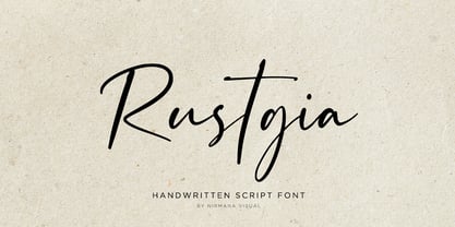 Rustgia with Natural Handwritten Artistic Style, this is perfect for branding, logos, packaging, mastheads and more.
 - DB Borders Birthday by Illustration Ink,
$3.00DB Borders Birthday is a DoodleBat with plenty of Birthday fun. Celebrate with this festive DoodleBat! - Ptilia MF by Masterfont,
$59.00 This font family, of 3 weights, was inspired by old hand painted signs in Tel Aviv.
 - DB Birthday Cheer by Illustration Ink,
$3.00DB Birthday Cheer is a DoodleBat with plenty of Birthday spirit. Celebrate with this festive DoodleBat! - KG Dark Side by Kimberly Geswein,
$5.00 This thick and thin mixed handwriting is perfectly legible and neat but still full of fun!
 - From Where You Are by Kimberly Geswein,
$5.00 Created from real hand-painted letters, this font is designed to look like a painted sign.
 - KG Beautiful Ending by Kimberly Geswein,
$5.00 This font was created by request and has a quirky tone that is playful and unique.
 - Musaf MF by Masterfont,
$59.00 High readability with an historic flavor, this elegant font family is great for signage, headline etc.
 - OCR-A by Bitstream,
$29.99A set of capitals adequate for machine reading only; this barely legible pioneer sees declining use. - Evening River by Letterhend,
$19.00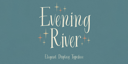 Introducing, Evening River an elegant display typeface. this font is perfect for headline, packaging, branding, etc.
 - Equator by Tour De Force,
$25.00 Equator is modern angular typeface available in two weights ready for traveling all over the world.
 - Eternal Life by PizzaDude.dk,
$20.00This font is named after a Jeff Buckley song. Use with care, best for love letters! - Sleezy by BA Graphics,
$45.00Let you imagination go wild with this extreme font. No holds barred. It is cool stuff. - Welcome by Solotype,
$19.95This is another of those early 20th century, post art nouveau types from Europe. Probably German. - XStarsAndStripes by Ingrimayne Type,
$14.95 These two typefaces contain elaborate star patterns. XSarsAndStripesOne and XStarsAndStripesTwo are mirror images of each other.
 - Planchette by Aerotype,
$29.00 Based on a 19th century Toscanienne typeface, Planchette has two hand ornaments accessible by the < and > keys.
 - Soap Box by Coffee Bin Fonts,
$20.00This font was inspired by lettering found on an old soap box from the 19th century. - Phases On by Comicraft,
$19.00 Blast your way through the alphabet with this stunning font from Comicraft's work on THE PUNISHER!
 - Cityscape by Scriptorium,
$12.00The characters in this font fit together in hundreds of combinations to form different city skylines. - LD Gettysburg by Illustration Ink,
$3.00Celebrate History with LD Gettysburg. This 1800's styled font is unique and sure to please.


