10,000 search results
(0.083 seconds)
- PAG Ministero by Prop-a-ganda,
$19.99Prop-a-ganda offers retro-flavored fonts inspired by lettering on retro propaganda posters, retro advertising posters, retro packages all the world over. This is perfect font for your retrospective project. PAG Minister reminds us of old cinema posters or old magazine advertisements. Its vertical line is extremely bold, some of the stroke are curled and winding. With PAG Minister, usual typed text is changed into impressive design. - Monotype Goudy Catalogue by Monotype,
$29.99Originally designed for American Type Founders, Goudy drew inspiration from the classical old style faces for Goudy Old Style. Round characters have a strong diagonal stress, ascenders are fairly long but descenders are very short. Goudy bold was introduced in 1920; this was designed by Morris Fuller Benton. This typeface has been particularly popular in America where it is extensively used in advertising, book jackets, for labels and packaging. - TT Tsars by TypeType,
$39.00 TT Tsars useful links: Specimen | Graphic presentation | Customization options The TT Tsars font family is a collection of serif display titling fonts that are stylized to resemble the fonts of the beginning, the middle and the end of the XVIII century. The project is based on title fonts, that is, the fonts that were used to design book title pages. The idea for the project TT Tsars was born after a small study of the historical development of the Cyrillic type and is also based on Abram Shchitsgal’s book "Russian Civil Type". At the very beginning of the project, we had developed a basic universal skeleton for the forms of all characters in all subfamilies of the family, and later on, we added styles, visual features, artifacts and other nuances typical of the given period onto the skeleton. Yes, from the historical accuracy point of view it might be that such an approach is not always justified, but we have achieved our goal and as a result, we have created perfectly combinable serifs that can be used to style an inscription for a certain time period. The TT Tsars font family consists of 20 fonts: 5 separate subfamilies, each of which consists of 4 fonts. Each font contains 580 glyphs, except for the TT Tsars E subfamily, in which each font consists of 464 characters. Instead of lowercase characters in the typeface, small capitals are used, which also suggests that the typeface is rather a display than text one. In TT Tsars you can find a large number of ligatures (for Latin and Cyrillic alphabets), arrows and many useful OpenType features, such as: frac, ordn, sinf, sups, numr, dnom, case, onum, tnum, pnum, lnum, salt (ss01), dlig. Time-related characteristics of the subfamilies are distributed as follows: • TT Tsars A—the beginning of the 18th century (Latin and Cyrillic) • TT Tsars B—the beginning of the 18th century (Latin and Cyrillic) • TT Tsars C—the middle of the 18th century (Latin and Cyrillic) • TT Tsars D—the end of the 18th century (Latin and Cyrillic) • TT Tsars E—conditionally the beginning of the 18th century (only Latin) TT Tsars A and TT Tsars B families (both the beginning of the 18th century) have different starting points: for TT Tsars A it is Latin, for TT Tsars B it is Cyrillic. The development of the TT Tsars A family began in Latin, the font is based on the royal serif Romain du Roi. The Cyrillic alphabet is harmoniously matched to the Latin. The development of the TT Tsars B family began in Cyrillic, which is based on a Russian civil type. Characteristic elements are the curved one-sided serifs of triangular characters (A, X, Y), drops appear in the letter ?, the middle strokes ? and P are adjacent to the main stroke. Latin was drawn to pair with Cyrillic. It is still based on the royal serif, but somewhat changed: the letters B and P are closed and the upper bar of the letter A rose. This was done for the visual combination of Cyrillic and Latin and at the same time to make a distinction between TT Tsars A and TT Tsars B. TT Tsars C is now the middle of the 18th century. Cyrillic alphabet itself did not stand still and evolved, and by the middle of the 18th century, its forms have changed and become to look the way they are shown in this font family. Latin forms are following the Cyrillic. The figures are also slightly modified and adapted to the type design. In TT Tsars C, Cyrillic and Latin characters are created in parallel. A distinctive feature of the Cyrillic alphabet in TT Tsars C is the residual influence of the flat pen. This is noticeable in such signs as ?, ?, K. The shape of the letters ?, ?, ?, ? is very characteristic of the period. In the Latin alphabet, a characteristic leg appears at the letter R. For both languages, there is a typical C characterized by an upper serif and the appearance of large, even somewhat bolding serifs on horizontals (T, E, ?, L). TT Tsars D is already the end of the 18th century when with the development of printing, the forms of some Cyrillic characters had changed and turned into new skeletons of letters that we transposed into Latin. The figures were also stylized. In this font, both Cyrillic and Latin are stylistically executed with different serifs and are thus logically separated. The end of the century is characterized by the reduction of decorative elements. Straight, blueprint-like legs of the letters ?, R, K, ?. Serifs are very pronounced and triangular. E and ? are one-sided on the middle horizontal line. A very characteristic C with two serifs appears in the Latin alphabet. TT Tsars E is a steampunk fantasy typeface, its theme is a Latinized Russian ?ivil type (also referred to as Grazhdansky type which emerged after Peter the Great’s language reform), which includes only the Latin alphabet. There is no historical analog to this typeface, it is exclusively our reflections on the topic of what would have happened if the civil font had developed further and received a Latin counterpart. We imagined such a situation in which the civil type was exported to Europe and began to live its own life.
 - Statement Sans by Sudtipos,
$39.00 Statement Sans is a versatile sans serif font family created by the Sudtipos team in the spirit of modern neo humanistic fonts, with a deep grotesk and industrial influence that can be discovered along the system. Developed to express its potential in UX and UI projects, corporative interfaces or editorial web and print layouts, Statement is available in 9 weights with matching real italics, extended latin language support, and also including classic and old style figures as well as plenty of stylistics alternates. Last but not least, Statement Sans includes a one file variable font to join the party.
 - PF Das Grotesk Pro by Parachute,
$79.00 Das Grotesk was inspired by earlier nineteenth-century grotesques, but it is much more related to American gothic designs such as those by M.F. Benton. Due to their pure geometric structure, most grotesque typefaces tend to have a rather monotonous and lifeless appearance, thus failing to express the ideals of the modern creed. Das Grotesk on the other hand is a lively design with several distinguishable characteristics which attract attention when set at large sizes, whilst they become subtle and blend evenly at small sizes, fostering a neutral identity. This is a very legible and space-saving typeface with a narrow structure. It was designed with slanted curved ends and sheared terminals applied on several straight strokes. It has two-storey ‘a’ and ‘g’ but includes single-storey alternates. The family consists of 14 weights ranging from Extra Thin to Black (including true-italics). It provides simultaneous support for Latin, Cyrillic and Greek and is loaded with several advanced typographic features such as small caps. Download its complehensive PDF Specimen Manual for further details.
 - Checkmark by Set Sail Studios,
$14.00 Make your mark with Checkmark; a slick, high energy signature-style script font guaranteed to make a big impression. Digitally hand-drawn, it's super-clean smooth flow and high-intensity pen strokes make an unmistakeable impact in logo/branding projects, large header text and product packaging. Checkmark is packed full of extra features to give you plenty of customization options. This includes; a full set of upper and lowercase alternate letters, 20 ligatures (double letters) to help the script lettering flow more naturally, 26 swashes and a full set of lowercase end forms to give your text that extra flair and finesse. Here's a run through everything in more detail; Checkmark • A smooth-edged signature style font containing upper & lowercase characters, numerals, and a large range of punctuation. Checkmark Alt • This is a second version of Checkmark, with a completely new set of both upper and lowercase characters. If you wanted to avoid letters looking the same each time to recreate a custom-made style, or try a different word shape, simply switch to this font for an additional layout option. Checkmark Swash • A third font containing 26 hand drawn swashes. Simply type any a-z or A-Z character in this font to generate a swash. Perfect for underlining your Checkmark text and adding a bit of extra flair! Ligatures • 20 ligatures (double-letters) are included to help your lettering flow more naturally. Many programs will automatically have this feature switched on for you, but if you need any help accessing them, please feel free to drop me a message. End forms • Are available for all lowercase characters when using the Checkmark font. Use these characters at the end of your word to add a stylistic 'end-swash'. These are accessible via software with opentype capability, by turning on 'Stylistic Alternates', or via a Glyphs panel. Language Support • Checkmark fonts support the following languages; English, French, Italian, Spanish, Portuguese, German, Swedish, Norwegian, Danish, Dutch, Finnish, Indonesian, Malay, Hungarian, Polish, Croatian, Turkish, Romanian, Czech, Latvian, Lithuanian, Slovak, Slovenian.
 - Axeo Sans by Asritype,
$15.00 As mentioned on previous released font Axeo (freeform serif), now, the original sanserif font is released with similar name, Axeo Sans. Axeo was release first when Axeo sans is still in minimal glyphs and font weights. However, Axeo sans is released with more fonts, 7 font in roman and 7 in italic/oblique versions, instead of semi condensed. 7 fonts is in roman form of weight: Light, Regular, Medium, Semi Bold, Bold, Extra Bold and Black; and 7 fonts in italic/oblique versions of its weight, respectively. This font weight offers the user to use the best fit to the usage. Axeo sans is neutral typeface, designed for general use. This font has also more glyphs variations and OpenType features. More than 700 glyphs for each cut. While the OpenType is equipped with: Large unmarked Basic Latin caps (ss02-ss05); normal character variation for some letters (ss01); Small caps (c2sc and smcp); superscript for 1, 2, and 3; ordinals for a and o; 5 basic fractions; standard and discretionary ligature; kerning; case sensitive and ornaments. Large Caps is unique setting, additional letters for font variations lover/user, applicable for first letter of paragraph, sentences, for design mean, just for fun or other usage.
 - Illyrian by Solotype,
$19.95Our font of the original was only ten point, so we had to use our imagination to a great extent. As specialists in Victorian typography, we have found that many people do not like the "center alignment" idea, used on several old time faces, but we have been faithful to the original. So there! - Hetilica - Personal use only

- Bal Harbour JNL by Jeff Levine,
$29.00Inspired by hand lettering on a 1940s toy game spotted on ebay called "Let's Go Shopping", Jeff Levine created "Bal Harbour JNL" and named it after a South Florida community famous for its luxury homes and trendy stores. - Uniform Rounded by Miller Type Foundry,
$25.99 Uniform Rounded is a type family based on the 2014 Miller Type Foundry release, Uniform. This superfamily is comprised of three widths (regular, condensed, and extra condensed) each with six weights. The result is a fun and playful typeface that is extremely versatile and is a great asset for any project on any medium. Uniform Rounded is a multi-width geometric type family designed around the circle. The O of the Regular width is based on a circle, the O of the Condensed width is based on 1.5 circles stacked (with straight sides) and the O of the Extra Condensed width is based on two circles stacked with straight sides as well, and all other characters are derived from this initial concept. This unique idea creates a remarkably fresh type family that bridges the gap between circular geometric typefaces and condensed straight-sided typefaces. Uniform Rounded also includes many opentype features like Old Style Figures, Tabular Lining Figures, Alternate characters, Ligatures and more.
 - Pecot - Personal use only

- MC South Great by Maulana Creative,
$13.00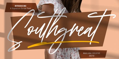 Southgreat is an expressive signature script font. With regular felt-tip stroke, fun character with some of ligatures and extra swash. To give you an extra creative work. Southgreat font support multilingual more than 100+ language. This font is good for logo design, Social media, Movie Titles, Books Titles, a short text even a long text letter and good for your secondary text font with sans or serif. Make a stunning work with Southgreat font. Cheers, MaulanaCreative
 - Qualyters by Maulana Creative,
$14.00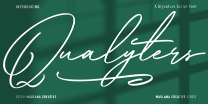 Qualyters is a fancy unique signature script font. With clean mono-line stroke, fun character with a bit of ligatures and extra swash. To give you an extra creative work. Qualyters font support multilingual more than 100+ language. This font is good for logo design, Social media, Movie Titles, Books Titles, a short text even a long text letter and good for your secondary text font with sans or serif. Make a stunning work with Qualyters font. Cheers, MaulanaCreative
 - Eletric Lady by RM&WD,
$49.00 Electric Lady in a light script with a great amount of different possibilities. With Electric Lady font family you can to turn on various features (Ligatures, Stylistic Alternates, Contextual Alternates, Swashes, 3 completely different Stylistic sets) to auto swap out letter sets with alternate versions. - More than 3,000 glyphs - 100 different numbers shapes - 110 different ornaments In the Extra 2 style, you'll find many different standalone words, kitchen icons, menu icons, swashes, and extra fun characters!
 - Ironhopes Monoline Signature by Maulana Creative,
$13.00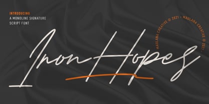 Ironhopes is a casual classic signature script font. With light mono-line stroke, fun character with some of ligatures and extra swash. To give you an extra creative work. Ironhopes font support multilingual more than 100+ language. This font is good for logo design, Social media, Movie Titles, Books Titles, a short text even a long text letter and good for your secondary text font with sans or serif. Make a stunning work with Ironhopes font. Cheers, MaulanaCreative
 - Pinup New by Gleb Guralnyk,
$14.00 Hi, introducing a smooth vintage font - Pinup New. It has a nice tasty shape with a tiny separate accents. Pinup New font supports most of the european languages and also has ukrainian cyrillic characters. Pinup New consists of three fonts with separate accents for more convenient manipulating and recoloring. Also there are an extra characters with modifyed letters shape, such as ligatures and alternates. Make sure that your app does support an OpenType features to access this extra characters.
 - IJF0100 - Unknown license

- Janeiro by IKIIKOWRK,
$19.00 Proudly present Janeiro - Vintage Bold Font, created by ikiiko. Janeiro a bold font that personifies masculinity and retro vibes! This font dances in a contemporary setting with a fluidity that evokes the energy of the past. In a world where conformity sometimes takes center stage, Janeiro boldly challenges convention and invites everyone to join in a colorful and energetic parade. It's more than just a font; it's a typographic carnival that welcomes you to experience the joy of expression and the flow of creativity. This font is very suitable for making a poster, vintage or retro stuff, fashion brand, magazine layout, food & beverages packaging, quotes, or simply as a stylish text overlay to any background image. What's Included? Uppercase & Lowercase Numbers & Punctuation Multilingual Support Works on PC & Mac
 - Evanston Alehouse by Kimmy Design,
$10.00 Evanston Alehouse is the first font in a larger collection of typefaces inspired by years leading up to the American prohibition. For the past two years I was living in Evanston, IL, a suburb of Chicago. After learning it was one of the birthplaces of the prohibition movement, I set out to learn more about it, and decided to develop a type collection that captures the dynamic era in our nation’s history. In the century that prefaced the ratification of the 18th amendment, saloons, taverns and alehouses boomed as the American working class enjoyed beer and discovered whiskey and gin. At the same time, the Temperance League was forming and gaining strength. By the turn of the century, these temperance societies were common in the culture of the country, with individual towns and states already on the move to abolish alcohol consumption. However, it was undeniable that by this time in history, America loved to drink. This font is inspired by the signage seen outside such drinking establishments. Back to the modern era, Evanston Alehouse is a 25 font family that includes 3 weights, 4 widths and 3 heights. It has special features that add depth to the font, with discretionary ligatures and stylistic alternatives. It also includes a complementary set of ornaments, including line breaks, frames, borders, and laurels. Here’s a snapshot of what you get with Evanston Alehouse: 2 Styles/Postions: Sharp (regular) and Round 3 Weights: Light, Medium and Black 4 Widths: 1826 (condensed), 1858 (narrow), 1893 (wide) and 1919 (expanded) 3 Heights: Capitals, lowercase and small caps 2 Alternatives: Discretionary Ligatures and Stylistic Alternatives 1 Ornament font with over 100 graphic extras
 - Lily Wang by Dharma Type,
$19.99 Based on some script in the 19th century. Inky texture gives realistic handwriting appearance. Smooth writing feeling creates antiqued and nostalgic atmosphere. Big flourish and elegant script! There are two other script designed by in the same concept. -Daisy Lau -Lily Wang -Pansy Bo
 - Adelheid by Proportional Lime,
$4.99 Adelheid a wonderfully whimsical excursion into the realm of blackletter typefaces is a font based on a 16th century Swiss publication. With over 500 glyphs many things are added to make it a fully functional font. It is delivered in two flavors OTF, and TTF.
 - Marceta by Fine Fonts,
$29.00 Marceta is based upon the uncial & half-uncial scripts of the fourth to eighth centuries. The font has been designed with different capital and lowercase characters which can be intermixed to give variation to the text and to enable pleasing word patterns to be created.
 - African Elephant Trunk by Dharma Type,
$14.99 Based on retro vinyl records in the early and middle of 20th century. This font includes small caps for advanced typography. There are three other fonts designed by in the same concept. -Moon Star Soul -Rebel Train Goes -Word From Radio -African Elephant Trunk
 - Sweet Titling No. 11 by Sweet,
$39.00 Sweet Titling No. 11 is a 2009 addition to the Sweet Collection of engraved lettering styles from the 20th Century. This obscure, art deco design would have been used for engraved letterhead, business cards, etc., and likely first appeared in the 1920s or ’30s.
 - Sebaldus by RMU,
$25.00 The former hot-metal font Sebaldus Gotisch, a 19th century Berthold in-house design, was carefully redesigned and updated for today’s use. This font contains a long s which you can access by typing alt b or by using the historical alternate OTF feature.
 - Carl Beck by Monotype,
$29.99Cartographer Carl Beckman was appalled by the low standard of lettering in Sweden during the 18th century. He published an instruction and pattern book with four different letter forms in Stockholm 1794. The Carl Beck font is based on his Cursiv Skriften no. 1. - Gothic XS Hand by UrbanPixel,
$18.00 This font is inspired by gothic woodtype fonts from the begining of the last century. Totally hand-drawn, every glyph is unique to improve the handwritten feeling. Different approaches are used to increase the human-hand look: many alternates, double letters, English bigrams, etc.
 - Daisy Lau by Dharma Type,
$19.99 Based on some script in the 19th century. Inky texture gives realistic handwriting appearance. Smooth writing feeling creates antiqued and nostalgic atmosphere. Rising Star on March 2007. There are two other script designed by in the same concept. -Daisy Lau -Lily Wang -Pansy Bo
 - Jugendstil Borders NF by Nick's Fonts,
$10.00 Here's a collection of Art-Noueveau-era border elements, gleaned from the pages of various German type foundry catalogs from the first decade of the twentieth century. Refer to the accompanying PDF guide for instructions on constructing twelve different, distinctive and elegant border sets.
 - CS Courthand by URW Type Foundry,
$39.99 CS are the initials of Carsten Strinkau, a young German graphic and type designer who studied in Hamburg. CS Courthand is based on 16 hundred century English monks handwriting. Text in CS Courthand looks like a pattern, like a text-carpet, but still readable.
 - Elegant Showcard JNL by Jeff Levine,
$29.00 "Baker’s Showcard Book" (1916) was an early 20th Century instructional book on sign lettering. One of the sample alphabets entitled “Decorative Roman” was a spurred serif, Art Nouveau design that has been recreated digitally as Elegant Showcard JNL in both regular and oblique versions.
 - Sandcastle JNL by Jeff Levine,
$29.00 Based on a popular design of the 50s-60s, Sandcastle JNL has the retro-casual charm of many prints ads of that era. It lends itself well to headlines, price tags, announcements, name plates and just about anything that recreates the mid-century panache.
 - Boncaire Titling by insigne,
$22.00 Inspired by the type elements of 17th century Dutch mapmaking, Boncaire Titling provides you with a historic yet adventurous look for your library. This addition from insigne found its muse in a map of Curacao by Dutch cartographer Gerard Van Keulen, a member of the prosperous Van Keulen family from Amsterdam, who were engaged in the manufacture of maps for seafaring. Much thanks on this project goes to The Norman B. Leventhal Map Center, housed at the Boston Public Library. Through the centers kindness, I was able to view a number of period maps in person and to meet with curators, who explained more about the Van Keulen family and the way maps of the period were created. While I studied the maps, I narrowed in on some of the original types unique idiosyncrasies. For instance, the long, exaggerated serifs, which give the forms a sense of stability, aid in the faces legibility--largely a byproduct of the engraving method that was used to create the metal plates for manufacturing these maps. In creating Boncaire Titling, I decided to capture these unique idiosyncrasies, embracing the character of the engravings rather than removing them entirely through over-refining the forms. The result is an elegant family with far more than seafaring potential. This font has a full range of six weights, from thin to black. It also includes a wide variety of OpenType alternates. All insigne fonts are fully loaded with OpenType features. Boncaire Titling is also equipped for complex professional typography, including alternates, smaller titling caps and plenty of alts, including normalized capitals and lowercase letters. There are over 30 autoreplacing ligatures, and the face includes a number of numeral sets, including fractions, old-style and lining figures with superiors and inferiors. OpenType capable applications such as Quark or the Adobe suite can take full advantage of automatically replacing ligatures and alternates. You can find these features demonstrated in the .pdf brochure. Boncaire Titling also includes the glyphs to support a wide range of languages, including Central, Eastern and Western European languages. In all, Boncaire Titling supports over 40 languages that use the extended Latin script, making the new addition a great choice for multi-lingual publications and packaging. Maps are fascinating; they come with the promise of treasure to be uncovered. Examining the map itself, too, you can find great wealth in the details so artfully condensed to that single piece of paper--details carried over into this new insigne font. For your next project, explore the imagination potential in Boncaire Titling.
 - Tauern by ParaType,
$25.00 A family of extra compressed styles designed at ParaType in 1993 by Alexander Tarbeev. For use in advertising and display typography. Decorative versions were added in 1996.
 - George Gibson by Baseline Fonts,
$24.00George Gibson is based on handwriting samples dating back to mid-1800s England. The font features additional characters for foreign language support, as well as extra glyphs. - Cavergiz by Rvandtype,
$9.00 Cavergiz Serif is a cool, thick lettered and assertive display font. Featuring the perfect amount of trendiness, this font will make your designs come to life. Cavergiz is PUA encoded which means you can access all of the glyphs.
 - Synthetic by Gassstype,
$27.00 Hello Everyone, Introduce our new collection Syhthetic - Playful Typeface Font Fun All Caps Font and display for posters, packaging, branding, logotype and more, for your design needs, making your designs more modern and professional for kids,unique and sweety.
 - Florals Bright by Letterena Studios,
$10.00 Florals Bright is a chic and trendy looking serif font. It is PUA encoded which means you can access all of the glyphs and swashes with ease! Add it confidently to your projects, and you will love the results.
 - vtks alcalina - 100% free


