10,000 search results
(0.666 seconds)
- Granity by Nathatype,
$25.00 Do you to make your branding spark? Are you dreaming of creating headings that stand out and inspire creativity, imagination, modernity, and endless fun? Looking for an elegant and stylish font? We've got what you want. Granity- A SansSerif Font Granity is a sans serif font that very suitable for market designs being developed today, this font has a trendy, natural and soft style. You can take advantage of every moment. The great way to highlight your design or project. So beautiful on invitation like greeting cards, logos, fashion, lookbook, marketing promotions. branding materials, business cards, quotes, posters, and more. Features: Ligatures Stylistic Set PUA Encoded Numerals and Punctuation Thank you for downloading premium fonts from Natha Sudio
 - Stitchin Crochet Pro by Adriprints,
$6.00 StitchinCrochet Pro is the third font in the Stitchin Family following StitchinCrochet and StitchinKnit. Unable to find a stylish and easy-to-use crochet symbol font, I decided to make one! StitchinCrochet offers incredibly legible, intuitive symbols that are easily accessible without special numerical codes on the keyboard. StitchinCrochet Pro has updated crochet symbols (compared to StitchinCrochet) and are newly re-drawn, scaled, and have corresponding increase and decrease symbols ranging from single crochet to double treble crochet. StitchinCrochet Pro also includes an updated QWERTY keyboard key, better symbol layout, and symbol guide for both U.S. and U.K. crochet terminology! Choose the “manual install” method to access the .PDF guides and symbol guides.
 - Recton by Ws Studio,
$15.00 Recton is a sophisticated and charming serif with a fashionable touch. Specially designed for luxury, elegant, feminine projects, Recton is perfect for creating modern and chic designs such as logos, packaging, editorials and more. A trendy, classy & modern style serif font for your fancy projects. Elegant, fashion and classic style in the Recton font will be great for any branding project. Many alternatives and binders will help you create a unique and original logo or website header design. Follow My Store For Upcoming Updates Including Additional Glyphs And Language Support. And Please Message Me If You Want Your Language Included or If Any Features or Glyph Requests Feel Free To Message Me. Have a nice day !
 - Blaster by Mozatype,
$19.00 BLASTER is a casual, fun display font, created by using a brush pen. It has an urban and trendy feel and it will most definitely fit a wide range of designs. This font is perfect for brand announcements, packaging, quotes, branding, advertisements, blogs, logos, invitations, and more! This font is PUA encoded which means you can access all of the stunning glyphs and swashes with ease! It also features a wealth of special features including alternate glyphs and ligatures. What’s Included : – Works on PC & Mac – Easy to use ( Installations ) – Easy Convert to webfont – Compabilty Windows, Apple, Linux, Cricut, Silhouette and Other cutting machines Thanks for downloading, and I hope you enjoy it!
 - Maxim by profonts,
$39.99Splendor was originally produced and released in 1930 by Schriftgu� AG, Dresden. The typeface was designed by Berlin designer Wilhelm Berg. Ralph M. Unger, who in the last few years has created a whole series of revivals and redesigns from the hot metal era, ?retrieved? this jewel of a typeface design, redesigning, complementing and digitally remastering it for profonts. Splendor is a broad nip, non-connecting handwriting script of timeless elegance, charm and beauty. It needs tight setting with plenty of space around it. The font contains a number of alternate characters: Two uppercase As, Ss (with descender); in addition, two uppercase Ms, Ns and Zs as well as two lowercase zs. - Flicktoy by Letterhend,
$17.00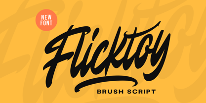 Get trendy with Flicktoy, a brush script font that embodies the essence of modernity. With its stylish strokes and contemporary appeal, this font is perfect for designs seeking a fresh and urban edge. This font perfectly made to be applied especially in logo, and the other various formal forms such as invitations, labels, logos, magazines, books, greeting / wedding cards, packaging, fashion, make up, stationery, novels, labels or any type of advertising purpose. Features : Uppercase & lowercase Numbers and punctuation Alternates & Ligatures Multilingual PUA encoded We highly recommend using a program that supports OpenType features and Glyphs panels like many of Adobe apps and Corel Draw, so you can see and access all Glyph variations.
 - Bellabio by Dora Typefoundry,
$22.00 Introducing, Bellabio is an elegant modern Serif Font that gives a romantic feel to every curve that has smooth edges and a trendy look to your designs. This font also has a very fancy uppercase alternative to combine. Bellabio has 200+ Ligatures included, it's really helpful in creating your project titles: like fashion, magazine, logo, branding, photography, invitations, wedding invitations, quotes, blog headers , posters, advertisements, postcards, books, websites, etc. Features Full set of uppercase, lowercase letters 200+ Ligatures Alternates Numbers, symbols & punctuation Characters with accents Supports Multiple Languages PUA Encoded This type of family has become a work of true love, making it as easy and enjoyable as possible. I really hope you enjoy it! Thank You!
 - Theory Of Signature by Aminmario Studio,
$20.00 This font was created to look as close to a natural handwritten script as possible by including some alternates lowercase, ligature and underlines. Perfect for any awesome projects that need hand writing taste. Comes with regular and italic. Built in Opentype features, this script comes to life as if you were writing it yourself. Also support multilingual. It's highly recommended to use it in opentype capable software - there are plenty out there nowadays as technology catches up with design ... Other than Photoshop, Illustrator and Indesign, many standard simple programs now come with Opentype capabilities - even the most basic ones such as Apple's Text Edit, Pages, Keynote, iBooks Author, etc. Even Word has found ways to incorporate it.
 - Blossomed Script by Zane Studio,
$18.00 Blossomed Script is a new, modern script font with an irregular base line. Since it is trendy and feminine, Blossomed Script looks beautiful in wedding invitations, thank you cards, quotes, greeting cards, logos, business cards, and more. Perfect for use in ink or watercolors. Including beginning and end letters, alternatives and support for many languages. To activate the OpenType Stylistic alternative, you need a program that supports OpenType features such as Adobe Illustrator CS, Adobe Indesign & CorelDraw X6-X7, Microsoft Word 2010 or newer versions. There are additional ways to access alternatives / swashes, using Character Maps (Windows), Nexus Fonts (Windows), Font Books (Mac) or software programs such as PopChar (for Windows and Mac).
 - OMORIKA by Posterizer KG,
$19.00 OMORIKA font is very unique, with rough, rustic and raw handwritten serif typefaces with unformal look. It makes a perfect font to create the hand-made character look, or to supplement illustrations with typography. Technicaly this is a Condensed, Headline, Grunge Serif, Sketch, Hand Display Font. There are plenty of Standard and Discretionary Ligatures to avoid frequent repetition of letters. If you find a single repeating glyphs, you can change that by toggling between Stylistic Alternates. It contains ligatures created for Cyrillic... more then 100 languages supports, and more then 100 dingbats. OMORIKA would look good in headlines, magazines or websites, party flyers, movie posters, music posters, music covers or web banners... all natural and authentically beautiful things.
 - Acklebury by Studio Buchanan,
$32.00 Acklebury is a chunky, reverse contrast, slab-serif typeface available in two styles. It has heaps of personality, plenty of open type features, and a whole host of special characters and dingbats. Although it's drawn from historical sources, Acklebury is not a straight revival, rather more of an homage to the many, varied, extended lining figures of the late 1800's. Acklebury celebrates the once labelled 'hideous' combination of wide rounded forms and hard slab serifs. Only using modern type technology to fix the spacing and kerning issues that would of been impossible with metal or wooden type. Acklebury is not a French Clarendon, neither is it really an Italienne... but it is phat, wide and hella funky.
 - Signature Zetterd by Aminmario Studio,
$20.00 This font was created to look as close to a natural handwritten script as possible by including lowercase swash, ligature and underlines. Perfect for any awesome projects that need hand writing taste. Comes with regular and italic. Built in Opentype features, this script comes to life as if you were writing it yourself. Also support multilingual. It's highly recommended to use it in opentype capable software - there are plenty out there nowadays as technology catches up with design ... Other than Photoshop, Illustrator and Indesign, many standard simple programs now come with Opentype capabilities - even the most basic ones such as Apple's Text Edit, Pages, Keynote, iBooks Author, etc. Even Word has found ways to incorporate it.
 - Angombe by Twinletter,
$15.00 Angombe is a graffiti font that we created by stressing harmony in each letter to create a decent and unique combination of phrases. When you apply this typeface, your project will look to be more appealing, high-quality, classy, and exquisite. Assume that everyone who views your project is astonished and enthralled and that your objectives are readily met. This graffiti font is great for product logos, poster titles, headlines, packaging, film titles, logotypes, gorgeous writing, and trendy graffiti designs, among other things. Of course, if you utilize this font in your numerous creative projects, they will be perfect and outstanding. Use this typeface right away for your one-of-a-kind and remarkable projects.
 - Beletrio by Storm Type Foundry,
$29.00 Beletrio was made as companion to Beletria, it has many shapes in common. We already have plenty of sans-serif fonts with classical proportions in the Stormtype library, such as John Sans, Sebastian or Andulka, but Beletrio is certainly the most peaceful of the bunch – it shares not only the feel of its serif originator, but its soft curves provide lovely visual caress as well. The smooth endings are not visible at first, they are balanced for easy reading as they solve some critical relations such as "rv, ry, rt", but in larger sizes you'll fully enjoy the picturesque details. It handles the smallest point sizes as well as large billboards, fashion magazines and philosophic tractates.
 - Splendor by profonts,
$41.99 Splendor was originally produced and released in 1930 by Schriftgu� AG, Dresden. The typeface was designed by Berlin designer Wilhelm Berg. Ralph M. Unger, who in the last few years has created a whole series of revivals and redesigns from the hot metal era, ?retrieved? this jewel of a typeface design, redesigning, complementing and digitally remastering it for profonts. Splendor is a broad nip, non-connecting handwriting script of timeless elegance, charm and beauty. It needs tight setting with plenty of space around it. The font contains a number of alternate characters: Two uppercase As, Ss (with descender); in addition, two uppercase Ms, Ns and Zs as well as two lowercase zs.
 - Bakeshop by Melvastype,
$29.00 Bakeshop is a casual script font family. It is drawn with rounded marker so the contrast is quite low. It has bumps at the end of strokes where the pen has stopped and the ink has spread. Bakeshop includes three weights and has both connecting and non-connecting versions. Connecting Bakeshop versions has OpenType features like Final Forms, looping connections with lowercase e, high connecting stroke with ascenders and plenty of discretionary ligatures. You can enable Final Forms either enabling Final Form feature or Contextual Alternates. If you want to use the high connection strokes with ascenders enable Stylistic Alternates or Stylistic Set 2. And if you like to use the ligatures just enable Discretionary Ligatures feature.
 - Istoria by Hooper Type,
$12.00 New foundry on the block, Hooper Type, kicks off it's catalogue with a versatile, story-telling serif font. With a love of the magical and a yearning for adventure, Istoria pushes away from the static, drawing in whisps and whirls that entice and excite, without distracting. Unassuming in it's long form, with delicate strokes that draw the eye, it commands attention when used in short punchy titles, or set in caps. Istoria (meaing both history and story in Greek) delights in having unusual curves, curvy straights and twisty feet which emulate those adventures and myths from days gone by. Type shouldn't interfere with the content, but it absolutely can enhance it. Hope you enjoy it!
 - Menor by Twinletter,
$15.00 Menor is a graffiti font with a distinctive and appealing abstract shape that has a unique shape in each character, making this font appropriate for your outstanding project. This font also contains an alternation of enormous letters to beautify your project, so don’t wait. Use this typeface once more to create a lovely and stylish project. This graffiti font is great for product logos, poster titles, headlines, packaging, film titles, logotypes, gorgeous writing, and trendy graffiti designs, among other things. Of course, if you utilize this font in your numerous creative projects, they will be perfect and outstanding. Use this typeface right away for your one-of-a-kind and remarkable projects.
 - Granite Falls by Pen Culture,
$17.00 Introducing Granite Falls, a captivating modern font that effortlessly blends elegance with contemporary style. With its sleek lines and refined letterforms, this font brings a touch of sophistication to any project. The carefully crafted characters maintain a perfect balance between simplicity and uniqueness, making it ideal for a wide range of design applications. Whether it's branding, logos, headlines, or social media graphics, Granite Falls adds a modern and trendy flair. What will you get: Granite Falls SVG file I really hope you enjoy it – please do let me know what you think, comments & likes are always hugely welcomed and appreciated. More importantly, please don’t hesitate to drop me a message if you have any issues or queries. Thank you
 - Payu by Twinletter,
$15.00 Payu display font is a unique, intriguing, and quirky typeface that we present to all of you. This font was created to satisfy the demands of beautiful and quick graphics, allowing you to quickly produce attractive and elegant projects. Take a look at the font’s harmony and harmony; your project will shine like a prima donna. This graffiti font is great for product logos, poster titles, headlines, packaging, film titles, logotypes, gorgeous writing, and trendy graffiti designs, among other things. Of course, if you utilize this font in your numerous creative projects, they will be perfect and outstanding. Use this typeface right away for your one-of-a-kind and remarkable projects.
 - Superfast by Studio&Story,
$19.00 Superfast is a hand-written, flowing, script that will add a fast and sharp movement style to your projects. It charms you right at the beginning. If you are looking for a sensitive font that can respond to the vibe of your design, Superfast is the right choice. On the one hand it is elegant and luxurious, and on the other hand, trendy and modern. Created for beautiful logos, branding projects, posters, blog posts, social media, campaigns, advertising, web design and more! Superfast contains upper and lowercase characters, numerals and a large range of punctuation. Its OpenType features include 41 Ligatures and a large number of alternates, which make everything you write authentic and flowing.
 - Minimal Nahidha by Attype Studio,
$19.00 Minimal Nahidha is a minimalist sans serif typeface with a casual and trendy outlook. Minimal Nahidha was built to balance the geometric qualities of a san-serif typeface with all the benefits of traditional serif fonts, like readability and personality. Minimal Nahidha comes in Regular and Slant version, each with its own unique set of characters & it has ligatures and stylistic alternates that make it easy to customize your designs. The fonts works best as display typefaces or as beautiful headline fonts, but can also be used in other ways to create stunning designs. Features : - Minimal Nahidha Family Font - Ligatures - Stylistic Alternates - Multilingual, US Roman, Latin 1 Support Hope you enjoy with our font! Attype Studio
 - Ace Attitude by Limelight Artistry,
$24.00 Ace Attitude is a friendly, readable font with character and flair. When I started designing this font I wanted something that was readable as well as interesting and appealing. Something that showed character. When I look at this font now I think of an old fashioned aviator. One of those poeple that likes to show off and have fun but can still follow rules. This font is perfect for logo's and branding. But its also very versatile would be great in things like magazines, posters, packaging, billboards, etc. Ace Attitude has an impressive 179 Contextual alternates. These are like ligatures, but oh so much better. These contextual alternates will give any project that personal touch - all without any extra effort. All you have to do is make sure that they are turned on in your program. Unfortunately, these do not yet show up in the sample text. To help with this I have created a demo version of the font so that you can still try it out before you spend the money. Ace Attitude also has Over 800 glyphs and includes features such as small caps, ordinals, ligatures, fractions, tabular numbers, proportional numbers, subscript, superscript, numerators and denominators.
 - Blackduck by Eurotypo,
$60.00 “Blackduck” font is a typical Gothic, usually named “Blackletter” . This typeface was born with the name of “Textur” and developed from Carolingian cursive. It was used in the middle age as sacred script, became increasingly narrower, his vertical lines were emphasized and his strokes very compacted to save space. Along the time the early German print typefaces derived in others styles that were more readable such as Schwabacher and Fraktur, very popular in Germany and sometimes associated to the identity of the country. The font "Blackduck" was inspired mixing carefully the last two “Blackletters”. We try to joine some characteristics of both to reach good legibility without loosing the strong impact and powerfulness of the shapes. Some minuscules like the “o” “c” “e” “d” are rounded on both sides, while both strokes join in an angle at the top and at the bottom. Some other lower cases are formed by an angular and rounded stroke. This font contains a full set of OpenType features; swashes, stylistics alternates, old style figures (Arabic numeral were carefully shape integrated), ligatures and some extras ornaments were added to help in your design. "Blackduck" includes diacritic signs for Central European languages.
 - Breadley Serif by Ardyanatypes,
$10.00 Breadley Serif It was a continuation version of the previous one (Breadley Sans) that come up with Serif type look, surely including small decorative on the ends of some of the strokes that make it more expressive. Still stunning great with an elegant look and stands strongly on its own as a heading and brand logo. This Serif version of BREADLEY fancier within sexy touch for business utilities use like business card, name sign, uniform as brand elevation, and many more. This serif BRADLEY typeface, obviously fit to embossed as an exclusive brand tag or even decorating your enormous office corner. You can view all of the available characters in the screenshots above, and you can try out the brand new BRADLEY SERIF now for any design matter. Breadley Serif also has five weights, plus an extra superbold weight, Ligatures, small caps, old-style numerals, and other OpenType features Latin and multilingual support A guide to accessing all alternatives can be read at http://adobe.ly/1m1fn4Y Adobe Photoshop go to Window – glyphs Adobe Illustrator go to Type – glyphs Thank you and have a nice day
 - MVB Diazo by MVB,
$59.00 Mundane information—the sort you might ignore—often appears in the form of very simple, utilitarian lettering, devoid of personality, the sort of industrial lettering you find on old blueprints, park restrooms, and electrical boxes. MVB Diazo is such a thing. It looks like lettering done earnestly with a plastic template. The monoline caps—constructed from straight lines and simple curves—have rounded details as if rendered by a blunt pen on a topographical survey or by a router on a rustic campground sign. The MVB Diazo fonts are compact, available in two widths: Condensed and Extra Condensed. Each width offers four weights from Light to Black. The fonts are perfect for wherever plain and boring letterforms are required. All widths and weights are also available in two distressed textures (#1 and #2) that accentuate the industrial character of the design. Rough #1 is gritty, with finer texture for use at larger sizes. Rough #2 exhibits more damage, the roughness apparent when used at smaller sizes. The Rough fonts include alternates of a number of glyphs so that variation of texture is possible when letters repeat in a word.
 - Uniform Italic by Miller Type Foundry,
$25.99 Now Uniform comes in Italics! Uniform is a multi-width geometric type family designed around the circle. The O of the Regular width is based on a circle, the O of the Condensed width is based on 1.5 circles stacked (with straight sides) and the O of the Extra Condensed width is based on two circles stacked with straight sides as well, and all other characters are derived from this initial concept. This unique idea creates a remarkably fresh type family that bridges the gap between circular geometric typefaces and condensed straight-sided typefaces. Uniform also includes many opentype features like Old Style Figures, Tabular Lining Figures, Alternate characters, Ligatures and more. Uniform was first drawn starting with the Black weight. This careful process allows each character to look consistent and balanced through all weights. As a result, the typeface does not ‘break down’ or lose its form in the boldest weights like many typefaces do. The three widths of Uniform Italic make an ideal type family for a host of various uses. From branding to web design, book covers to signage, Uniform is a very versatile solution to complex typographic needs.
 - Uniform by Miller Type Foundry,
$25.99 Uniform is a multi-width geometric type family designed around the circle. The O of the Regular width is based on a circle, the O of the Condensed width is based on 1.5 circles stacked (with straight sides) and the O of the Extra Condensed width is based on two circles stacked with straight sides as well, and all other characters are derived from this initial concept. This unique idea creates a remarkably fresh type family that bridges the gap between circular geometric typefaces and condensed straight-sided typefaces. Uniform also includes many opentype features like Old Style Figures, Tabular Lining Figures, Alternate characters, Ligatures and more. Uniform was first drawn starting with the Black weight. This careful process allows each character to look consistent and balanced through all weights. As a result, the typeface does not ‘break down’ or lose its form in the boldest weights like many typefaces do. The three widths of Uniform make an ideal type family for a host of various uses. From branding to web design, book covers to signage, Uniform is a very versatile solution to complex typographic needs.
 - Scarab - Unknown license

- Fresno by Parkinson,
$15.00 Fresno is a two-font family. Fresno Inline and Fresno Black. Fresno Black is a recent addition. It can be used alone, and it is carefully tailored to fit behind the Inline font to add color to the inline. There are alternate characters: A, M & N in the caps and lowercase key positions. Fresno is a square gothic style typical of Mid-20th Century Showcard Lettering. A lettering genre known as “Gaspipe.” Signage samples similar to this still exist on buildings in my home town, Oakland, California. I have designed over a half dozen variations of this form over the years. Including Amboy. Golden Gate Initials, Matinee, Motel, and Hotel. Designed in 2001 by Jim Parkinson, Fresno has recently been refreshed, enhanced, and re-released.
 - Sandokan by Matyas Machat,
$30.00 Sandokan is a brush script font with a character and morphology that nears Oriental calligraphy, Art Nouveau typefaces, psychedelic “flower power” fonts from the Sixties and Tuscan poster fonts from the 19th century. Its main features are the high contrast between thick and thin strokes and the extreme slanted angle in the typewriter imprints, creating inverse shadowing. The letter set is further accentuated by exotic decorative details and the often unusual connectors between small letters. The typeface supports all languages using the universal Latin character set. Sandokan is a slightly sweetened cultural cocktail. As such it looks best on everything that needs to come across as exotic and rather solid but unmistakeably eccentric - such as labels and packaging on exotic delicacies or circus posters.
 - Amboy by Parkinson,
$20.00 Amboy is a two-font family. Amboy Inline and Amboy Black. Amboy Black is a recent addition. It can be used alone, but it is carefully tailored to fit behind the Inline font to add color to the inline. There are alternate characters: A, M & N in the caps and lowercase key positions. Amboy is a square gothic style typical of Mid-20th Century Showcard Lettering. A lettering genre known as “Gaspipe.” Signage samples similar to this still exist on buildings in my home town, Oakland, California. I have designed over a half dozen variations of this form over the years. Including Golden Gate Initials, Matinee, Motel, Hotel and Fresno. Designed in 2001 by Jim Parkinson, Amboy has been refreshed, enhanced, and re-released.
 - Bonhomme Richard by Three Islands Press,
$39.00 Bonhomme Richard evokes the cursive penmanship of Chevalier John Paul Jones (1747–1792), celebrated Continental Navy commander during the American Revolution, in letters from the late 18th century. The font’s name comes from Jones’s famous frigate, lost during his victorious engagement with the British in the Battle of Flamborough Head in 1779. During this battle Jones is said to have exclaimed, when urged to surrender, “I have not yet begun to fight!” (In fact, his likely words were, “I may sink, but I’ll be damned if I strike!” – i.e., surrender.) A legible script, Bonhomme Richard has an elegance about it while also conjuring the colonial era of its source material. Use to simulate historical handwriting in film props, games, formal invitations, product labels, and the like.
 - Pacific Script by Scholtz Fonts,
$19.95 Pacific Script is a font inspired by an alphabet created by Howard Trafton in the 1930s. However, I felt it needed some changes to bring it to the cutting edge of 21st century font design. Though designed as a display font, it works very successfully in longer passages of text, however, it should not be used in font sizes less than about 15 point. Small x height in contrast to extravagant caps gives the font a very dramatic feel. Though it has cursive qualities, the characters in this font do not connect, making it slightly more legible and less like handwriting. The inclusion of 26 alternate upper case characters give the user the freedom to create a hand crafted design. Language support includes all European character sets.
 - Gable Antique Condensed SG by Spiece Graphics,
$39.00 This Art Nouveau typeface was created around the turn of the 20th century by the Bauer Type Foundry in Germany. A unique foot and head serif treatment is the key design feature in this antique revival. Many vertical stems terminate in what has been called “the swooping, pointy-foot look.” A marvel to look at and a joy to set, Gable Antique Condensed will be a lasting asset to your growing typeface collection. Gable Antique Condensed is also available in the OpenType Std format. Some new characters have been added to this OpenType version. Advanced features currently work in Adobe Creative Suite InDesign, Creative Suite Illustrator, and Quark XPress 7. Check for OpenType advanced feature support in other applications as it gradually becomes available with upgrades.
 - Circus Didot by ParaType,
$25.00 Circus Didot typeface presents a rework of a typical neoclassical serif type in a constructivist style. Analyzing the shapes of characters author placed basic geometric figures — triangles, rectangles, circles… above the contours of letters. Resulting constructions staying recognizable letters at the same time bore a resemblance to pictures of Russian avant-garde artists from 20th century. This discovery has brought an idea to design a typeface where the tendency of a modern serif type to rationalism and geometry is realized in maximum possible extent. The prototypes for the project were taken from the works of Didot, lettering experiments of Russian constructivists and art deco artworks. The technique of juggling with shapes and overall grotesque approach to the design explains the selection of the name for the font.
 - Proda Sans by Nasir Udin,
$24.00 Meet Proda Sans, a humanist typeface with geometric construction inspired by the humanist-style sans serif faces that were popular in the mid 20th-century. Its calligraphic influenced letterforms have been adjusted to have geometric’s low-stroke-contrast for better legibility. The medium x-height give it a warm and delicate appearance, and keep your page bright. It's a family of nine weights plus matching italics. The thin and the black weights are great for display purposes. The light, book and regular weights are well suited for longer paragraphs and smaller texts. Proda Sans is developed for advanced typography needs. The OpenType fonts have an extended character set to support 200+ latin-based languages. For full presentation please visit my Behance post.
 - Vallassina by Wilton Foundry,
$29.00 Vallassina is named after Vallassina, a village in the valley of the upper tract of the river Lambro in northern Italy. The most important settlement in the area is the town of Asso, from which the valley takes its name. Spasell is a slang of Insubric language, spoken until 19th century by inhabitants of Vallassina, when they used to go out from the valley for business and they didn't want to be understood by the people. What makes this valley unique is that the locals use a unique whistle language to communicate to each other. Vallasina is confidently irreverent yet curiously attractive. How many ways can you use Vallassina to whistle to your neighbors? Vallasina is available in OpenType format.
 - Zinc Italian SG by Spiece Graphics,
$39.00 As a unique example of late nineteenth and early twentieth century Victorian type, Zinc Italian emits a strikingly beautiful and twinkling luminescence. Oversized initial caps, each containing intricate swirls and curlycues, vibrate stunningly alongside a variety of amusing lowercase letters. Also known as Zinco, this typeface is generously equipped with a charming set of alternate characters including capital figures and some easier-to-decipher lowercase letters. Zinc Italian with Alternates is also available in the OpenType Std format. Some new features including discretionary ligatures and expanded standard ligatures have been added to this OpenType version. Advanced features currently work in Adobe Creative Suite InDesign, Creative Suite Illustrator, and Quark XPress 7. Check for OpenType advanced feature support in other applications as it gradually becomes available with upgrades.
 - Royalbrick by Bake me a font,
$20.00 Royalbrick is a contemporary display unicase typeface. It is a part of upcoming type family — light and condensed style. The font was inspired by factory stamps’ typography on bricks made in 19-20 century on Russian manufactures — this kind of bricks was also called “royal bricks”. It has a unique image with “squashed” stems and dynamic expanding strokes, and there are also some kind of ancient Cyrillic’s vibes in it’s letterforms. It is an excellent example of combining national character with modern trends and expressive graphics. Royalbrick consist of extended Latin and Cyrillic, figures, two sets of punctuation (normal and "thin" with ss01), few ligatures and stylistic alternatives and a special set for letters with accents — ss02 named "Downstairs Accents". The font has 292 glyphs.
