10,000 search results
(0.127 seconds)
- SF Americana Dreams Upright - Unknown license
- SF Americana Dreams Extended - Unknown license
- 612KosheyPL - Unknown license
- SF Americana Dreams SC - Unknown license
- SF Atarian System - Unknown license
- SF Technodelight NS - Unknown license
- SF Solar Sailer - Unknown license
- SF Fortune Wheel - Unknown license
- 612KosheyLine - Unknown license
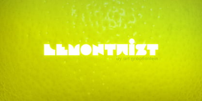
- Lemon Twist by Art Grootfontein,
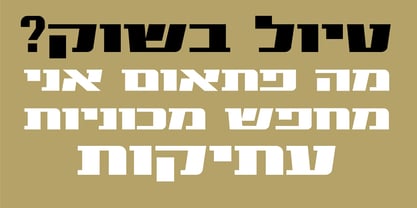
$20.00 - Linear Gothic by BA Graphics,
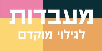
$45.00A great headline face very bold and graphic. Not recommended for small sizes! - Rahel MF by Masterfont,
$59.00 - Geo by BA Graphics,
$45.00A Bold Powerful Geometric design. Great headline face; works well in many applications. - FG Nadja by YOFF,
$13.95FG Nadja is bold and beautiful - with a real artistic flair around her. - Kaine by The Northern Block,
$12.80 - Pigama MF by Masterfont,
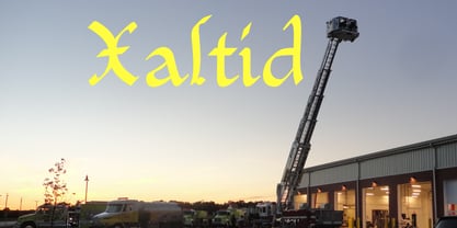
$59.00 - Xaltid by Ingrimayne Type,
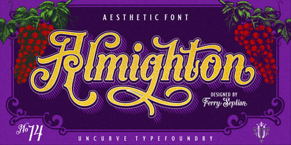
$9.95 - Almighton by Uncurve,
$20.00Almighton is an aesthetic vintage typography font, inspired from the past, elegant signage, gold leaf , sign painting and old label product. Almighton comes with tons of alternates characters to make more eye cacthy . It is suitable for authentic logos, headings, sign painting, posters, letterhead, branding, magazines, album covers, book covers, movies, apparel design, flyers, greeting cards, product packaging, and more. - Cohort by insigne,
$22.00Cohort is a strong and crisp geometric sans serif. Cohort uses a rounded rectangle as its central motif. Although the geometric design is minimalistic, Cohort has a variety of unique letterforms that keep the design from being too predictable and maintains a bit of beautiful nuance with plenty of legibility. Cohort's six different weights give it a great deal of versatility, from its sharp and potent black weight to the fresh and razor sharp thin. Cohort can be used for logotypes, headlines or short blocks of text. Cohort includes many useful OpenType features, including a set of upright italic swash alternates, ligatures, small caps, fractions and old style figures, sharper and more unique counterforms and simplified characters for titling. OpenType-capable applications such as the Adobe suite or Quark can take full advantage of automatically replacing ligatures and alternates. This family also includes the glyphs to support a wide range of latin based languages. - Nazare Exuberant by Ndiscover,
$39.00Nazare Exuberant is the Poster version of Nazare. This version makes the vintage design more elegant and luxurious. It has super high contrast and the semi-serifs were turned into opulent serifs. Some shapes were redesigned by adding a slight calligraphic feel, making it even more vibrant. This way this design got more organic, more human, more serious, more trustworthy and more luxurious. This is the design for your posters, headlines and actually anything where the letters have a big point size. If you need a more text suitable version you can always use the original Nazare. Another feature is the insertion of some Opentype features: Ligatures were added as well as old style numbers. With its six weights you will have plenty of room for many variations. From the Regular that focus more on elegance to the Heavy that focus more on the lavishness. Regardless of which style you choose Nazare Exuberant is so unique that your designs will not remain unnoticed. - Geometria by Brownfox,
$44.99Although geometric Sans Serifs have been in vogue for nearly a century, they have never been as ubiquitous. It is not improbable that the old adage would be phrased: “When in doubt, set it in geometric sans”, had it been composed today. Have we not had enough? We think, not. Postmodern times demand a variety of expressions. The vision behind Geometria was to revisit the perennial favorite to lend subtle individuality to its tried and true forms. Geometria stands out in the crowd of similar fonts thanks to its complicated nature. It combines dynamic elements with a certain degree of stability. A slightly higher waistline of the capitals contributes to their distinctive appearance. If the upper case refers to the American grotesques of the 19th century, the lower case tends toward the forms of the Renaissance in its proportions. Geometria is a typeface of clean shapes that is well-suited for continuous reading, and it sets remarkably well. At the same time, it can be friendly, even flirtatious. Its distinct personality combines seeming opposites. At times it may appear serious, at times playful. On occasion, it may be deliberate, other times dynamic. It could seem rigid, then elegant. It is a typeface that could be perceived either as cutting-edge, or as nostalgic. A careful and discerning typographer will bring out and emphasize those aspects of its multifaceted personality that are needed to solve the problem at hand. Geometria consists of 24 fonts — eight weights with matching italics and narrow styles. The font includes multiple sets of figures and currency signs, alternate glyphs, a variety of experimental ligatures, and punctuation marks for the two cases. The 835 glyphs support 72 languages. Granshan 2013 award. - Sitcom by GroupType,
$19.00If there was an American Typeface Hall of Fame, Bank Gothic, designed by the great Morris Fuller Benton would hold a place of special distinction considering this design has survived so many trends in typographic fashion since being introduced in 1930. It's just as desirable today as it was over eighty years ago; arguably more. Today, Bank Gothic is a very popular choice as a titling face for science fiction books, posters and countless television and movie titles. It is also a popular typeface for use in computer games and digital graphics. GroupType’s 2010 revival of this American classic is true to the design, the period, and Benton’s aesthetic. GroupType worked with some of the most talented and experienced type designers that were historically grounded and sensitive to this design project. Fortunately, Mr. Benton has left us a large selection of other great typefaces for insight and guidance. GroupType’s new revival includes the original three weights in regular and condensed style but also a new small cap and lowercase in each font necessary for 21st century typography. - Bank Gothic by GroupType,
$29.00If there was an American Typeface Hall of Fame, Bank Gothic, designed by the great Morris Fuller Benton would hold a place of special distinction considering this design has survived so many trends in typographic fashion since being introduced in 1930. Its just as desirable today as it was over eighty years ago; arguably more. Today, Bank Gothic is a very popular choice as a titling face for science fiction books, posters and countless television and movie titles. It is also a popular typeface for use in computer games and digital graphics. GroupType’s 2010 revival of this American classic is true to the design, the period, and Benton’s aesthetic. GroupType worked with some of the most talented and experienced type designers that were historically grounded and sensitive to this design project. Fortunately, Mr. Benton has left us a large selection of other great typefaces for insight and guidance. GroupType’s new revival includes the original three weights in regular and condensed style plus two new distressed fonts. All have a new small cap and lowercase in each font necessary for 21st century typography. - Sweet Upright Script by Sweet,
$39.00Sweet Upright Script is the first release for Sweet Fonts Collection, published by MVB Fonts. It is an interpreted revival of a vintage, social engraving lettering style that was popular during the 20th Century. It is probably the first digital version of the design. With the advent of the engraving machine (a pantograph device) around 1900, commercial engraving moved from the use of hand-cut plates to the use of masterplates (lettering patterns). Lettering was traced from the masterplate using the engraving machine, letter by letter, onto a coated steel plate, that would then be etched in a chemical bath. The resulting plate was used to print engraved stationery with the raised print distinctive to the process. Many of these lettering styles were used for decades for commercial and social applications (letterheads, wedding invitations, etc.), but as they were merely traced alphabets, were not "fonts". Many remain unavailable in digital form. Over time, a number of the most popular styles were adapted to phototype, which sped up the process of plating for engraving, avoiding the need to trace each letter by hand with the engraving machine. Later, when type went digital, these phototype fonts were revived as digital fonts. As a result, the styles offered by engravers narrowed over time, as has the range of engraving styles revived in digital form. - Cladey by Craft Supply Co,
$20.00Introducing Cladey – Display Typeface A Striking Serif Display Cladey is a remarkable Display Typeface with a unique twist that sets it apart. Its central serif feature is the key to its stunning appearance. Captivating in Display Cladey is not just visually stunning; it’s also perfectly tailored for attention-grabbing displays. Its distinctive serif at the center adds an extra layer of elegance that captivates the eye. Versatile for Various Designs Going beyond its captivating display prowess, Cladey also boasts versatility. It seamlessly harmonizes with a wide range of creative projects, making it a font of choice for designers seeking flexibility. A Display Typeface with Impact Cladey ensures that your content exudes an aura of elegance and leaves a significant impact on your audience. It commands attention and resonates with viewers, ensuring a memorable experience. In Conclusion In summary, Cladey – Display Typeface is a font that truly stands out in the world of display typography. Its unique central serif feature adds stunning elegance to your projects. Whether it’s for branding, posters, or various creative endeavors, Cladey’s versatile and impactful design caters to a broad readership, ensuring your content leaves a lasting and striking impression. - Camper by Fenotype,
$35.00Camper is an original font collection of sixteen display fonts and extras. Camper’s core is a low-contrast connected script with three weights. In addition there are Sans, Serif and Slab fonts. All Camper fonts have a coherent style of solid forms with soft edges. They all play well together but work as themselves too. Camper’s Print is the same family with rugged “printed” edges and print texture. Camper Script is packed with several OpenType features: Contextual Alternates and Standard Ligatures help to maintain smooth flow while typing and they’re normally on. If you need more flashy characters try Swash, Stylistic or Titling Alternates or seek for even more Alternates from the Glyph Palette. Camper Script is PUA encoded and you can access extra characters in most graphic design softwares even without OpenType support. From Discretionary Ligatures you will find several flashier ligatures and a set of Catchwords: Access them by typing “The”, “And” or “With” with Discretionary Ligatures turned on. Camper Extras is a pack of strokes and swashes designed to go with the script. Many strokes can also be directly combined with a letter to make a custom “swash letter”. Check out posters for more inspiration. All Camper’s fonts have a wide language support — even Cyrillic. Camper is a recognizable and sturdy display pack with smooth and friendly outfit. It’s great for any display project from posters to identities and from online to print. - Smartfair is a typeface that effortlessly bridges the gap between the traditional and the modern, offering a fresh perspective to typography with its unique blend of characteristics. The design philo...
- News Gothic by ParaType,
$30.00A Bitstream version of News Gothic that was created by Morris Fuller Benton for American Typefounders and first appeared in 1908. There is the standard American sanserif of the first two thirds of the twentieth century with narrow proportions and a large x-height. Despite, or perhaps because of, the font’s unconventional relationships in proportion and form, News Gothic has long been a popular typeface for almost any use. Cyrillic version developed for ParaType in 2005 by Dmitry Kirsanov. Greek extension designed by Dmitry Kirsanov in 2009. - Facsimile by Linotype,
$29.99Linotype Facsimile is part of the Take Type Library, which features the winners of Linotype’s International Digital Type Design Contest. Designed by J. Luigs and S. Wicker, the forms were constructed for electronic readers, just as the OCR fonts were. The increasing use of computers accompanied the growing number of fonts suitable for electronic reading. The standard has long been set, but designers are always creating new interpretations and new symbols. Typefaces like Facsimile are here to stay and personify the Zeitgeist of the late 20th century. - Roadbrush by Kustomtype,
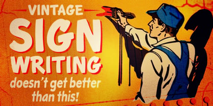
$25.00Roadbrush was inspired by the mid-20th-century hand lettering of Albert Eckhardt, Jr., that I found in a 1950’s sign painting book. Roadbrush is a retro brush-style script that I re-designed and completely re-mastered. Roadbrush is a powerful font that can be used for logotype, packaging, posters, T-shirts, signage & design projects with a retro & vintage feel. Roadbrush comes with four styles that contain all upper and lower case characters, punctuation, numerals and mathematical operators, as well as all accented characters. - Vega by Linotype,
$29.99For Vega antikva, too, 16th and 17th century typefaces stood models. I made a free interpretation of them, with a nice result, if I am allowed to express myself. Vega antikva makes a beautiful impression in books, but even as a web typeface it behaves well. The name Vega can be traced down to a constellation, a mathematician, a writer, a movie character, or a research ship, as you like. Now there is a typeface with that name, too. Vega antikva was released in 1994. - LTC Winchell by Lanston Type Co.,
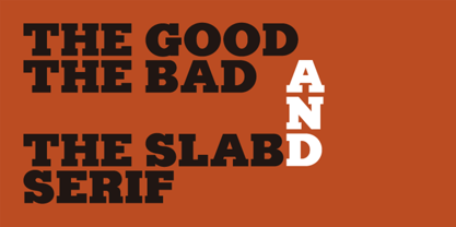
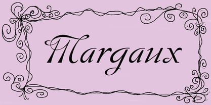
$24.95Winchell is the only identified typeface designed in Buffalo, NY prior to the formation of P22 type foundry. It was created by Edward Winchell of the Matthews-Northrup Printing Works and released by the Inland Type Foundry in 1903. The Winchell typeface was also made in Wood by the Hamilton Manufacturing company in the mid 20th Century. The Winchell typeface is a Clarendon styled slab serif that clearly has the look of a pre-modernist design. E.E. Winchell’s Arts & Crafts tendencies show through in this design - Margaux by Scholtz Fonts,
$19.95Margaux is an elegant, smooth, disciplined italic font, based on French fonts of the early 20th century. It evokes Paris in her heyday - culture, romance, and sophistication. Margaux is beautifully crafted, with simple, neat lower case characters, and upper case characters that are elegant but decoratively curled. This font lends itself to the creation of romantic adverts, wedding stationery, greeting cards, theatre posters, romantic book covers, certificates. Margaux has all the features usually included in a fully professional font. Language support includes all European character sets. - Broken by Canada Type,
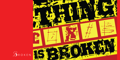
$24.95Broken is a grunge font with two interchangeable sets of uppercase. Its forms are in the Egyptian style of the early- to mid-nineteenth century, and the totality of its setting gives off the impression of a most unfortunate letterpress situation, with badly cut punches, uncontrolled ink spread, and metal shards and slivers strewn all about. Available in all mainstream font formats, Broken works very well and has a very unique appearance in design concepts where the overall visual can benefit from harshness, erosion, destruction or weathering. - Godfrey Sykes Initials by Celebrity Fontz,
$24.99This illustrative alphabet was inspired by the decorations of Godfrey Sykes, whose work was greatly influenced by that of Raphael and Michelangelo. This tile alphabet follows a Venetian 16th-century tradition of letters decorated with figures symbolizing each initial, a High Renaissance style. Includes one set of A-Z ornamental initials conveniently assigned to both the upper and lower case alphabet characters. Perfect for artistic publications, storybooks, fairy tales, and texts conveying the feel of the apogee of the visual arts in the Italian Renaissance. - The Donald NF by Nick's Fonts,
$10.00Something about the swoopy loops in the uppercase characters of this typeface, originally called "Ronde", reminds one of the signature 'do of a certain real-estate-mogul-turned-TV-celebrity, and so this font was named. Delightfully different, this face can be playful or formal, as suits the the occasion. To complete its nineteenth-century creds, the font includes classic bishops fingers at the ASCII tilde and ASCII circumflex positions. Both versions of the font include 1252 Latin, 1250 CE (with localization for Romanian and Moldovan). - Raphael by Monotype,
$29.99Originally drawn in the style of 19th-century woodcut types with interior shading and ornate English swashes, Raphael was updated in 1974, and the interior shading was removed. It now exhibits modern design elements - very wide letter strokes offset by hairlines - and is easily identified by the swashes that curve over the tops of the capitals, turning into crossbars on the A, E, F, and R. Used sparingly, Raphael adds flash to advertisements, announcements, stationery, notices, and business cards. Featured in: Best Fonts for Logos - Monotype Corsiva by Monotype,
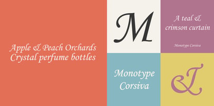
$89.00Monotype Corsiva is an italic typeface made in the style of the early Italian cursives as exemplified by the work of the writing master, Ludovico degli Arrighi, in the sixteenth century. The capitals of the Monotype Corsiva font are of swash design, with characteristic flourishes, designed primarily for use as initial letters. Monotype Corsiva can be used for short text passages in advertising but is best used to add sparkle to invitations, greetings cards and menus and to give a sense of occasion to certificates and awards. - Ongunkan Enochian Script by Runic World Tamgacı,
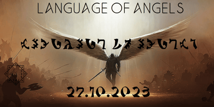
$60.00I drew this font staying true to the original design. The letter table in the relevant book was taken as reference. Enochian (/ɪˈnoʊkiən/ ə-NOH-kee-ən) is an occult constructed language[3] — said by its originators to have been received from angels — recorded in the private journals of John Dee and his colleague Edward Kelley in late 16th-century England.[4] Kelley was a scryer who worked with Dee in his magical investigations. The language is integral to the practice of Enochian magic. - Burlington by ITC,
$29.00Burlington was designed by Alan Meeks in 1985 and is a decorative typeface in the neoclassical style of the middle of the 19th century. Characteristic of faces from this time is the low x-height, which makes the font look as though it is reaching upward. This combined with the white areas in the strokes give Burlington a light, airy feel. The elegant Burlington is particularly good for headlines and can also be used for short texts in point sizes of 12 or larger.


