10,000 search results
(0.251 seconds)
- FS Neruda by Fontsmith,
$80.00 A literary font FS Neruda takes its name from Chilean poet Pablo Neruda, described as “the greatest poet of the 20th century in any language”. As such, it’s a font that references the very best literary typeface traditions. Smart, sharp and classical, FS Neruda bridges the gap between the classical and the offbeat. This font started life in the world of newspapers and books and is the perfect storytelling typeface for savvy, inquiring readers whether in printed journals, hard news, short online missives or poetry. Idiosyncratic precision FS Neruda is clear and legible in body text, while also being a space-saver fitting in more characters on each line than the typefaces that inspired it. In larger sizes it becomes a different beast – livelier, quirkier, but no less sharp. This is a truly classic typeface designed with long text setting in mind, thanks to its large x-heights, and short ascenders and descenders. FS Neruda mixes suave, sharp confidence with a sense of fragility and quirkiness. It’s knowledgeable, informative and idiosyncratic; one for readers and enquiring minds. Subtle weight modifications The construction and details of the letterforms differ across each of the five weights, with each cut separately to evoke different flavours: Thin is typewriter-like, Light is classy, Regular is canonical, Bold is robust, Black is magazine-esque. FS Neruda also boasts a radiant italic companion, a wide set of small caps, lower and uppercase ligatures, case punctuation and spacing, four sets of figures, and some ageless typographic symbols such as manicules, fleurons and teardrop crosses. Suggestive simplicity “The key to success in the current type design landscape is to design a typeface which looks conventional at text sizes but has a few small, suggestive touches visible at bigger sizes that make it distinct,” says designer Pedro Arilla. “Another thing we wanted to achieve with this typeface is simplicity.” FS Neruda is available in ten carefully crafted styles: it’s designed to work perfectly at text sizes, but still glows as a display typeface.
 - Superclarendon by Typodermic,
$11.95 Introducing Superclarendon, a typeface that’s as bold and powerful as its mid-19th Century inspiration. Its chunky slab serifs and subtly squared letterforms give it a timeless appeal that’s sure to make your designs stand out. But Superclarendon isn’t just a nod to the past—it’s a contemporary take on the classic Clarendon that retains all of its booming voice. Superclarendon’s austere curls and sturdy terminals give it a solid construction that’s sure to make an impact. Its squarish, superelliptical curves give it a modern feel that’s perfect for today’s designs. Whether you’re creating a poster, a brochure, or a website, Superclarendon is the typeface that will make your message loud and clear. And with four weights, italics, and old-style (lowercase) numerals, Superclarendon gives you all the tools you need to create stunning designs. So if you’re looking for a typeface that’s as powerful as it is versatile, look no further than Superclarendon. Most Latin-based European writing systems are supported, including the following languages. Afaan Oromo, Afar, Afrikaans, Albanian, Alsatian, Aromanian, Aymara, Bashkir (Latin), Basque, Belarusian (Latin), Bemba, Bikol, Bosnian, Breton, Cape Verdean, Creole, Catalan, Cebuano, Chamorro, Chavacano, Chichewa, Crimean Tatar (Latin), Croatian, Czech, Danish, Dawan, Dholuo, Dutch, English, Estonian, Faroese, Fijian, Filipino, Finnish, French, Frisian, Friulian, Gagauz (Latin), Galician, Ganda, Genoese, German, Greenlandic, Guadeloupean Creole, Haitian Creole, Hawaiian, Hiligaynon, Hungarian, Icelandic, Ilocano, Indonesian, Irish, Italian, Jamaican, Kaqchikel, Karakalpak (Latin), Kashubian, Kikongo, Kinyarwanda, Kirundi, Kurdish (Latin), Latvian, Lithuanian, Lombard, Low Saxon, Luxembourgish, Maasai, Makhuwa, Malay, Maltese, Māori, Moldovan, Montenegrin, Ndebele, Neapolitan, Norwegian, Novial, Occitan, Ossetian (Latin), Papiamento, Piedmontese, Polish, Portuguese, Quechua, Rarotongan, Romanian, Romansh, Sami, Sango, Saramaccan, Sardinian, Scottish Gaelic, Serbian (Latin), Shona, Sicilian, Silesian, Slovak, Slovenian, Somali, Sorbian, Sotho, Spanish, Swahili, Swazi, Swedish, Tagalog, Tahitian, Tetum, Tongan, Tshiluba, Tsonga, Tswana, Tumbuka, Turkish, Turkmen (Latin), Tuvaluan, Uzbek (Latin), Venetian, Vepsian, Vietnamese, Võro, Walloon, Waray-Waray, Wayuu, Welsh, Wolof, Xhosa, Yapese, Zapotec Zulu and Zuni.
 - Blog Script by Sudtipos,
$39.00 Technology is making it so that we’re all connected without the need for the physical-presence kind of being connected. That is strange, fascinating, and has a certain magnetism that is very difficult to resist. What’s at stake is no less than the transformation of centuries of human behaviour, and that’s part of the fascination. But while our existence morphs and we rush headlong into our socially minimalist future, we use our present culture to helplessly signal our nostalgia about our past. We know what our future will be missing, and we’re already full of nostalgia about it, but we know that what little we can do about isn’t going to affect the outcome that much. So, almost in full hindsight now, the DIY implosion of the past few years must have really been a reaction to our technological dis/connection. In typography, the minimalist future is already here, with something as austere as the sans serif having become the preferred expression of progress and fortune, both part of the connected isolation we are undergoing. But when physical interaction must take place, like coffee shops and gin joints, our organic alphabets ride high and mighty. That sense of human heritage — elegance and exuberance in our writing, the use of flaws to charmingly brand our own individualism — keeps turning up in all kinds of places, most unexpected of which is the digital world. The overall message seems to be that we’re still creative, imaginative, and unique. In the digital world, on blogs where we write about our puny music and fashion preferences, we’re just articulating this individualism of ours, this third domain of existence our future seems eager to dismiss. These were the thoughts behind Blog Script, the second collaboration between Carolina Marando and Alejandro Paul, after their successful stint with the Distillery set of fonts. This typeface comes in two weights, alternates for most letters, and a strong aesthetic rooted in individuality and freedom of spirit. Use it to be alone together, to tell the world that we’re still human, for now.
 - Caslon Graphique by ITC,
$29.99 The Englishman William Caslon punchcut many roman, italic, and non-Latin typefaces from 1720 until his death in 1766. At that time most types were being imported to England from Dutch sources, so Caslon was influenced by the characteristics of Dutch types. He did, however, achieve a level of craft that enabled his recognition as the first great English punchcutter. Caslon's roman became so popular that it was known as the script of kings, although on the other side of the political spectrum (and the ocean), the Americans used it for their Declaration of Independence in 1776. The original Caslon specimen sheets and punches have long provided a fertile source for the range of types bearing his name. Identifying characteristics of most Caslons include a cap A with a scooped-out apex; a cap C with two full serifs; and in the italic, a swashed lowercase v and w. Caslon's types have achieved legendary status among printers and typographers, and are considered safe, solid, and dependable. Caslon Antique was designed by Berne Nadall and brought out by the American type foundry Barnhart Bros & Spindler in 1896 to 1898. It doesn't bear any resemblance to Caslon, but has the quaint crudeness of what people imagine type looked like in the eighteenth century. Use Caslon Antique for that old-timey" effect in graphic designs. It looks best in large sizes for titles or initials. Caslon Black was designed by David Farey in the 1990s, and consists of one relatively narrow and very black weight. It is intended exclusively for titles or headlines. Caslon Black has a hint of the original Caslon lurking in the shadows of its shapes, but has taken on its own robust expression. Caslon Graphique was designed by Leslie Usherwood in the 1980s. The basic forms are close to the original Caslon, but this version has wide heavy forms with very high contrast between the hairline thin strokes and the fat main strokes. This precisely drawn and stylized Caslon has verve; it's ideal for headlines or initials in large sizes."
 - Garamond Premier by Adobe,
$35.00Claude Garamond (ca. 1480-1561) cut types for the Parisian scholar-printer Robert Estienne in the first part of the sixteenth century, basing his romans on the types cut by Francesco Griffo for Venetian printer Aldus Manutius in 1495. Garamond refined his romans in later versions, adding his own concepts as he developed his skills as a punchcutter. After his death in 1561, the Garamond punches made their way to the printing office of Christoph Plantin in Antwerp, where they were used by Plantin for many decades, and still exist in the Plantin-Moretus museum. Other Garamond punches went to the Frankfurt foundry of Egenolff-Berner, who issued a specimen in 1592 that became an important source of information about the Garamond types for later scholars and designers. In 1621, sixty years after Garamond's death, the French printer Jean Jannon (1580-1635) issued a specimen of typefaces that had some characteristics similar to the Garamond designs, though his letters were more asymmetrical and irregular in slope and axis. Jannon's types disappeared from use for about two hundred years, but were re-discovered in the French national printing office in 1825, when they were wrongly attributed to Claude Garamond. Their true origin was not to be revealed until the 1927 research of Beatrice Warde. In the early 1900s, Jannon's types were used to print a history of printing in France, which brought new attention to French typography and the Garamond" types. This sparked the beginning of modern revivals; some based on the mistaken model from Jannon's types, and others on the original Garamond types. Italics for Garamond fonts have sometimes been based on those cut by Robert Granjon (1513-1589), who worked for Plantin and whose types are also on the Egenolff-Berner specimen. Linotype has several versions of the Garamond typefaces. Though they vary in design and model of origin, they are all considered to be distinctive representations of French Renaissance style; easily recognizable by their elegance and readability. Garamond Pemiere Pro was designed by Robert Slimbach, and released in 2005." - Movatif by Typodermic,
$11.95 Introducing Movatif, the typeface that effortlessly combines the best of 20th Century sans-serif typefaces into one irresistible mash-up. With seven different weights to choose from, this font has the versatility to make any design stand out. But Movatif isn’t just any ordinary font—it’s packed with OpenType features that will leave your audience in awe. By simply pairing certain letters together, you can create a captivating visual effect that will absolutely freak folks out. Take the letters M and A, for example—they snap together in a way that is both cool and slightly fascinating. But what really sets Movatif apart is the way familiar pieces interact in unexpected ways. With every letter, your design takes on a personalized style that captures the dreary 1970s malaise in a fashionable way. So if you want to create something truly unique, give Movatif a try. With its versatile weights and captivating features, it’s the typeface that will take your design to the next level. Most Latin-based European writing systems are supported, including the following languages. Afaan Oromo, Afar, Afrikaans, Albanian, Alsatian, Aromanian, Aymara, Bashkir (Latin), Basque, Belarusian (Latin), Bemba, Bikol, Bosnian, Breton, Cape Verdean, Creole, Catalan, Cebuano, Chamorro, Chavacano, Chichewa, Crimean Tatar (Latin), Croatian, Czech, Danish, Dawan, Dholuo, Dutch, English, Estonian, Faroese, Fijian, Filipino, Finnish, French, Frisian, Friulian, Gagauz (Latin), Galician, Ganda, Genoese, German, Greenlandic, Guadeloupean Creole, Haitian Creole, Hawaiian, Hiligaynon, Hungarian, Icelandic, Ilocano, Indonesian, Irish, Italian, Jamaican, Kaqchikel, Karakalpak (Latin), Kashubian, Kikongo, Kinyarwanda, Kirundi, Kurdish (Latin), Latvian, Lithuanian, Lombard, Low Saxon, Luxembourgish, Maasai, Makhuwa, Malay, Maltese, Māori, Moldovan, Montenegrin, Ndebele, Neapolitan, Norwegian, Novial, Occitan, Ossetian (Latin), Papiamento, Piedmontese, Polish, Portuguese, Quechua, Rarotongan, Romanian, Romansh, Sami, Sango, Saramaccan, Sardinian, Scottish Gaelic, Serbian (Latin), Shona, Sicilian, Silesian, Slovak, Slovenian, Somali, Sorbian, Sotho, Spanish, Swahili, Swazi, Swedish, Tagalog, Tahitian, Tetum, Tongan, Tshiluba, Tsonga, Tswana, Tumbuka, Turkish, Turkmen (Latin), Tuvaluan, Uzbek (Latin), Venetian, Vepsian, Võro, Walloon, Waray-Waray, Wayuu, Welsh, Wolof, Xhosa, Yapese, Zapotec Zulu and Zuni.
 - Power Grotesk by Power Type,
$15.00 Power Grotesk is a sans serif typeface with details that give typography that has its own characteristics from the thinnest to the thickest that is slightly widened. The goal is to create a typeface with legibility and good contrast between black and white so that it is suitable for different sizes. The typeface has a special feature that aids in reading and reproducing, trapping the right-sized ink for the text to work. The geometric shapes and structures reflect the inspiration and influence of medieval typography. Power Grotesk moves between the vast historical material that makes up modern typography, combining contemporary details with classic styles.
 - 1456 Gutenberg by GLC,
$38.00 Font designed from that used by Gutenberg in Mayence to print the 42-line bible in 1456. The original font has too many characters for a true type font. Many of them have - in 2008 - no more utility. This font include "long s", naturally, as typicaly medieval, but also a lot of ligatures and abbreviations as "...us", "...rum" "...s" "...r...". A render sheet, added, help to identify them on keyboard. Uses include web-site titles, posters and flier designs, editing ancient texts or greeting cards as a very decorative font... This font support easily as enlargement as small size, remaining clear and easy to read.
 - Lucas Brandis by Proportional Lime,
$9.99 In the early days of printing everything had to be worked out from scratch. This set of lettering is based on section headings used by the Printer Lucas Brandis (no known relation), the first printer to operate in the city of Lübeck around 1473. They remind me of a medieval version of the spray paint graffiti so often seen on the sides of trains. A bit on the crude side, but also and importantly extremely noticeable. So whether you use it for creating old styled printing or some wild modern eye grabbing text item, its robust and sturdy shapes will be certain to grab the eye.
 - Zainer by Proportional Lime,
$9.99 Günther Zainer, (or Zeyner or Zeiner), was the first printer to operate in the city of Augsburg. He was active from 1468 to his death in 1478. In that single decade he was responsible for printing 80 works. Most of these editions were for the clergy but he also printed the first Calendar and large-scale illustrated book intended for the wider public. This font is based on one of his more interesting and peculiar fonts. And it has been enlarged to include over a 1,000 defined glyphs for modern use and also for historical purposes many glyphs recommended by the Medieval Unicode Font Initiative organization have also been included.
 - Mollis Gothic by Quatype,
$25.00 Mollis Gothic is inspired by medieval gothic calligraphy. The gothic calligraphy is classical and traditional, I want to add something modern to it. So the letters are simplified as lines and without the handwriting feel, just like a sans font. Meanwhile, the gothic calligraphy visual look remained. It expands the usage area because of the modern feel of this font, such as the package, titles, logo, poster design, etc. In September 2021, we created the thin weight. Although Mollis Gothic Thin is from the font family, the kerning set and capital letters’ height are not as same as the regular weight for suiting the thin font’s usage situation.
 - Cullion by Greater Albion Typefounders,
$9.95 Cullion is a new departure for Greater Albion, being a modern Fraktur, embodying future trends sch as highly stylised glyphs, a single case of lettering and highly evolved letterforms. At the same time it can trace its inspiration back to blackletter traditions, and is inspired by the sort of ironwork to be found in a medieval portcullis. The resulting typeface can sit happily in traditional, modern or futuristic design work. As the gallery images suggest, it does rather lend itself to work with a 'horror' theme, but it could have many other uses too-even in religious work. Cullion is particularly effective in poster headings.
 - Trigot by Volcano Type,
$19.00 Trigot is a modular typeface. Every form and every character is constructed from the basic geometric form of the triangle. The simple construction trigot resembles strongly is a gothic blackletter font. The letters are inspired by the ductus and forms of medieval typefaces and have a similar complex expression. The main singularity of Trigot lies in the strong contrast between clear geometry and the complex expression of a blackletter typeface. The name, "Trigot", hints the gothic influence and the triangular modules. Trigot is a modern display font -- it can be used for posters, striking visuals and titles but also for longer phrases and quotes.
 - Herold by HiH,
$10.00 Herold is a bold Art Nouveau advertising face released by H. Berthold, Berlin, Germany in 1901. It is also seen under the name “Herold Reklame.” The design is attributed to Hermann Hoffmann by the Klingspor Museum. A herold (‘herald’ in English, ‘heraldus’ in Latin) is one who delivers proclamations and announcements. Medieval heralds are often pictured with a horn with which to get everyone’s attention prior to performing his function. His only PA system was his own voice. Left and right glyphs of a herald with horn may be found at positions 137 and 172. Herold is quite compact with a high x-height, just right for making -- what else? -- announcements.
 - Hupp Antiqua NF by Nick's Fonts,
$10.00An enchanting design by Otto Hupp for Gebr. Klingspor in 1909 provided the pattern for this timeless classic, which gracefully and seamlessly combines medieval inspiration with Art Nouveau flair. All versions of this font contain the complete Unicode Latin A character complement, with support for the Afrikaans, Albanian, Basque, Bosnian, Breton, Catalan, Croatian, Czech, Danish, Dutch, English, Esperanto, Estonian, Faroese, Fijian, Finnish, Flemish, French, Frisian, German, Greenlandic, Hawaiian, Hungarian, Icelandic, Indonesian, Irish, Italian, Latin, Latvian, Lithuanian, Malay, Maltese, Maori, Moldavan, Norwegian, Polish, Portuguese, Provençal, Rhaeto-Romanic, Romanian, Romany, Sámi, Samoan, Scottish Gaelic, Serbian, Slovak, Slovenian, Spanish, Swahili, Swedish, Tagalog, Turkish and Welsh languages, as well as discretionary ligatures and extended fractions. - P22 Yule by IHOF,
$24.95 P22 Yule is a series of display fonts inspired by a mélange of ancient inscriptional writing, with visual references to Anglo-Saxon, Celtic, medieval and even a bit of ancient Greek and roman letterforms. Yule is exotic yet familiar and evocative of winter holidays. It has an Alpine look, lending itself to the thoughts of chalets and fondue. Yule Heavy Snow is blanketed in the white stuff, while Yule Light Flurries is dusted with snowflakes. With the addition of the Klein style, which includes a lowercase, Yule becomes infinitely more usable. The Klein variations can work well as an alternative to Neuland when you need the versatility of a lowercase.
 - Prima Script by Wiescher Design,
$24.00 »Prima Script« was designed especially for use in Menus and Cook-books. One of my sons is a chef in Munich and he was always bugging me to make a new font for his menus. I already designed one for him »Konstantin« but he likes to have new stuff every couple of years what I understood. So here is the new »Prima Script« (that’s what he said when he first saw the font). To give it more usability I made alternate initials and end letters as well as medieval cyphers. Then I did a couple of swashes and a handdrawn Sans font to complete the set. Have fun!
 - Giacinta by Okaycat,
$29.50Giacinta is developed as a fresh alternate take on the traditional black-letter style. Rather than simply reproducing the standard uncial or Old English style, Luke William Turvey followed the tradition of Bastarda, making up his own scripted style with the Latin standards in mind. This style was conjured purely from imagination, so while it bares a resemblance to the standards, keeps its own original flavor. Giacinta is extended, containing the full West European diacritics & a full set of ligatures, making it suitable for multilingual environments & publications. Use Giacinta for medieval themed projects, certificates, awards, diplomas, anything that you want to look old fashioned and stately. - Abyssal Gothic by Abyssal Graphics,
$25.00 Introducing "Abyssal Gothic Textura," a hauntingly elegant blackletter font that reimagines medieval dark-fantasy with a modern twist. This font captures the allure of ancient calligraphy while preserving its historical aura. Meticulously crafted, each character exudes gothic grandeur, appealing to both traditionalists and forward-thinking designers. Ideal for sophisticated projects, it lends enigmatic allure to book covers, posters, and invitations. With support for multiple languages and stylistic alternates, "Abyssal Gothic Textura" empowers creativity in diverse designs. Let it guide you into the dark-fantasy realm, where it unveils hidden depths, bridging ancient charm and contemporary allure. Embrace the enigma of history with this captivating typographic gem.
 - Wellingborough by Greater Albion Typefounders,
$11.50 Wellingborough is a family of six late-Victorian inspired faces, principally for display work and headings but also including a text form suitable for use in ‘feature’ paragraphs and short documents. The regular, small capitals and italic forms provides good clear headings, with a modicum of individualism and flair about them, while the Flourish and capital faces carry the family to rather more elaborate-yet still readily legible- heights. The italic form also works well alone to suggest a sense of flow and movement. The whole family is ideally suited for poster and advertising work, as well as book and record covers and period themed signage.
 - Fan Script by Sudtipos,
$99.00 A friend of mine says that sports are the ultimate popular drug. One of his favorite things to say is, “The sun’s always shining on a game somewhere.” It’s hard to argue with that. But that perspective is now the privilege of a society where technology is so high and mighty that it all but shapes such perspectives. These days I can, if I so choose, subscribe to nothing but sports on over a hundred TV channels and a thousand browser bookmarks. But it wasn't always like that. When I was growing up, long before the super-commercialization of the sport, I and other kids spent more than every spare minute of our time memorizing the names and positions of players, collecting team shirts and paraphernalia, making up game scenarios, and just being our generation’s entirely devoted fans. Argentina is one of the nations most obsessed with sports, especially "fútbol" (or soccer to North Americans). The running American joke was that we're all born with a football. When the national team is playing a game, stores actually close their doors, and Buenos Aires looks like a ghost town. Even on the local level, River Plate, my favorite team where I grew up, didn't normally have to worry about empty seats in its home stadium, even though attendance is charged at a high premium. There are things our senses absorb when we are children, yet we don't notice them until much later on in life. A sport’s collage of aesthetics is one of those things. When I was a kid I loved the teams and players that I loved, but I never really stopped to think what solidified them in my memory and made them instantly recognizable to me. Now, thirty-some years later, and after having had the fortune to experience many cultures other than my own, I can safely deduce that a sport’s aesthetic depends on the local or national culture as much as it depends on the sport itself. And the way all that gets molded in a single team’s identity becomes so intricate it is difficult to see where each part comes from to shape the whole. Although “futbol” is still in my blood as an Argentinean, I'm old enough to afford a little cynicism about how extremely corporate most popular sports are. Of course, nothing can now take away the joy I got from football in my childhood and early teens. But over the past few years I've been trying to perceive the sport itself in a global context, even alongside other popular sports in different areas of the world. Being a type designer, I naturally focus in my comparisons on the alphabets used in designing different sports experiences. And from that I've come to a few conclusions about my own taste in sports aesthetic, some of which surprised me. I think I like the baseball and basketball aesthetic better than football, hockey, volleyball, tennis, golf, cricket, rugby, and other sports. This of course is a biased opinion. I'm a lettering guy, and hand lettering is seen much more in baseball and basketball. But there’s a bit more to it than that. Even though all sports can be reduced to a bare-bones series of purposes and goals to reach, the rules and arrangements of baseball and basketball, in spite of their obvious tempo differences, are more suited for overall artistic motion than other sports. So when an application of swashed handlettering is used as part of a team’s identity in baseball or basketball, it becomes a natural fit. The swashes can almost be visual representation of a basketball curving in the air on its way to the hoop, or a baseball on its way out of the park. This expression is invariably backed by and connected to bold, sleak lettering, representing the driving force and precision (arms, bat) behind the artistic motion. It’s a simple and natural connective analysis to a designer, but the normal naked eye still marvels inexplicably at the beauty of such logos and wordmarks. That analytical simplicity was the divining rod behind Fan Script. My own ambitious brief was to build a readable yet very artistic sports script that can be a perfect fit for baseball or basketball identities, but which can also be implemented for other sports. The result turned out to be quite beautiful to my eyes, and I hope you find it satisfactory in your own work. Sports scripts like this one are rooted in showcard lettering models from the late 19th and early 20th century, like Detroit’s lettering teacher C. Strong’s — the same models that continue to influence book designers and sign painters for more than a century now. So as you can see, American turn-of-the-century calligraphy and its long-term influences still remain a subject of fascination to me. This fascination has been the engine of most of my work, and it shows clearly in Fan Script. Fan Script is a lively heavy brush face suitable for sports identities. It includes a variety of swashes of different shapes, both connective and non-connective, and contains a whole range of letter alternates. Users of this font will find a lot of casual freedom in playing with different combinations - a freedom backed by a solid technological undercurrent, where OpenType features provide immediate and logical solutions to problems common to this kind of script. One final thing bears mentioning: After the font design and production were completed, it was surprisingly delightful for me to notice, in the testing stage, that my background as a packaging designer seems to have left a mark on the way the font works overall. The modern improvements I applied to the letter forms have managed to induce a somewhat retro packaging appearance to the totality of the typeface. So I expect Fan Script will be just as useful in packaging as it would be in sports identity, logotype and merchandizing. Ale Paul
 - Blue Typewriter by Ana's Fonts,
$16.00 Blue Typewriter is a bold typewriter font and scans pack (with graphics, text, paper) sampled from old documents, for an authentic vintage look. Use this set in any designs that needs a vintage touch: in long or short texts, in digital collages, branding and packaging, social media posts, logotypes, etc. Included in this product: Blue Typewriter font with variations: underlined, dashed, crossed-out and dashed underline, in SVG and vector versions (with the vector versions created separately, so that the two versions include subtle differences)
 - Felousia by Yahya Type,
$17.99 Felousia – This font have more than 30 unique alternate and ligature that to give your logo, business card and another project to a unique vintage look. Felousia – this style works well for branding projects, logo, wedding designs, social media posts, advertisements, product packaging, product designs, label, photography, watermark, invitation, or whatever project you’re working on. WHAT’S INCLUDED? Uppercase & lowercase letters. numbers. punctuation Ligature & Huge Stylistic alternate. Multilingual support. Still got a question? Send me a message and I’ll be happy to answer! qura.yahya@gmail.com
 - Holen Vintage by Attract Studio,
$17.00 Holen Vintage is a stylish blend of classic serif fonts with modern serifs with bold curves giving it a traditional groovy vibe, luxury and versatility. Holen Vintage is made with a high level of legibility and is perfect for nostalgic moodboard projects, vintage logos, wedding designs, social media posts, advertisements, product packaging, product designs, labels, photography, watermarks, invitations, stationery and any project. Holen Vintage Features: Multilanguange PUA Encoded OpenType features Stylistic alternates, ligatures Check out Sarlotte which is a great pair for Holen Vintage.
 - Denala by Attype Studio,
$16.00 Denala is a delicate signature font with ending swash. Fall in love with its incredibly versatile style and use it to create spectacular designs! Denala is perfect for branding, logo, invitation, stationery, social media post, product packaging, merchandise, blog design, game titles, cute style design, Book/Cover Title and more. What's Included : - Ending Swash - Ligatures - Multilingual Support - Made it into separated file to make it easier to use by beginner & separated file user can use the font with software which doesn't accept open type features.
 - Bosan by Twinletter,
$12.00 Introducing Bosan, our newest san serif that offers beautiful typography for your project needs. type of font that is relaxed and elegant when used both for title words, sentences and other writing. will seem comfortable to look at when reading the contents of the message you want to convey. This font is very suitable as text with displays for various kinds of branding, advertisements, posters, banners, packaging, news headlines, magazines, websites, logo design, banners, social media design and of course you can use a lot more.
 - Winter Bells by Attype Studio,
$10.00 Winter Bells is a delicate and incredibly distinct Christmas display font with dingbats character of bells. Perfect for christmas promotion and christmas design, Fall in love with its incredibly versatile style and use it to create spectacular designs! Winter Bells is perfect for branding, logo, invitation, stationery, social media post, product packaging, merchandise, christmas font, blog design, game titles, cute style design, Book/Cover Title and more. What's Included : - Winter Bells.otf - Winter Bells Display.otf - Beginning & Ending Dingbats - Multilingual Support --- Hope you enjoy with our font! Attype Studio
 - Bradley Jermaine by Grezline Studio,
$23.00 Bradley Jermaine is a modern handwritten script font with an elegant touch. This font is perfect use for fashion-related design. Bradley Jermaine font is also usable in a wide range of works such as website banner, greeting cards, wedding stationery, modern logo/personal branding, social media quotes, and much more! Feature : - Alternate and Ligature Set - Multilingual Language - Works on PC & Mac - Simple installations - Accessible in the Adobe Illustrator, Adobe Photoshop, Adobe InDesign, even works on Microsoft Word. Thank you! Grezline Studio - Akhmad Reza Fauzi
 - Chanilly by MC Creative,
$10.00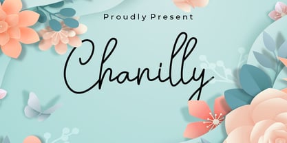 Chanilly is monoline script font which natural movement and elegant for signature style. is perfect for branding projects, logo, wedding designs, social media posts, advertisements, product packaging, product designs, label, photography, watermark, invitation, stationery and any projects that need handwriting taste. What’s Included : Standard glyphs Ligature Works on PC & Mac Simple installations Accessible in the Adobe Illustrator, Adobe Photoshop, Adobe InDesign, even work on Microsoft Word. PUA Encoded Characters – Fully accessible without additional design software. Fonts include multilingual support for; ä ö ü Ä Ö Ü ß ¿ ¡
 - Mix Blimp by Mix Fonts,
$13.00 Introducing BLIMP – a fun, playful, and charming handwritten font. Ideal for adding a personal touch to your social media posts, quotes, packaging, digital crafts, greeting cards, marketing materials, and more. This font was created using an iPad Pro and Apple Pencil for a truly authentic, digital handwriting style. Don’t let boring fonts weigh you down – add some bounce to your designs with BLIMP. – Mix Blimp includes the following characters: ABCDEFGHIJKLMNOPQRSTUVWXYZ abcdefghijklmnopqrstuvwxyz 0123456789 !@$#%^&*()`~♥❤✿•· ÷×+−±≈=≠[]<>‹›:;'",.|/?{}<>“”‘’-–—_…©®™<>«»°¹²³¡¿₱¢€£¥§† ÁÀÂÄÃÅĂĀĄÆĆČÇÐÉÈÊËĖĒĘIÍÌÎÏĪĮŁŃÑÓÒÔÖÕØŌŐŒŚŠȘȚÚÙÛÜŰŪŲÝŸŹŽŻÞ áàâäãåăāąæćčçðéèêëėēęıíìîïīįłńñóòôöõøōőœśšșțúùûüűūųýÿźžżþß Alternates: ff ll tt zz
 - Austaly by Multype Studio,
$14.00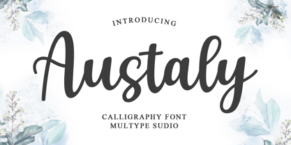 Austaly is a beautiful modern calligraphy font, featuring fun characters with their font characteristics. Austaly is perfect for branding projects, logo, social media posts, wedding designs, advertisements, product packaging, watermark, invitation, stationery and any projects that need handwriting taste. What’s Included : Standard glyphs & Ligature Works on PC / Mac Simple installations Accessible in the Adobe Illustrator, Adobe Photoshop, Adobe InDesign, even work on Microsoft Word PUA Encoded Characters, Fully accessible without additional design software. Multi-lingual support Thank you for your purchase! Hope you enjoy with our font!
 - Carputins by Maulana Creative,
$14.00 Carputins is a casual script font. With bold felt tip stroke, fun character with a bit of ligatures and has a two files lowercase alternates extra swashes. To give you an extra creative work. Carputins font support multilingual more than 100+ language. This font is good for logo design, Social media, Movie Titles, Books Titles, a short text even a long text letter and good for your secondary text font with sans or serif. Make a stunning work with Carputins font. Cheers, Maulana Creative
 - Lilypaly by Sronstudio,
$15.00 Lilypaly is a modern and elegant font with a lot of stylistic alternates for your beautiful project. I made this font carefully so that each letter could be connected well and elegantly either using alternate or not. Lilypaly includes start and ending swash, and middle swash for some letters, this is very easy to use. Lilypaly is perfect for many different project such as logos & branding, invitation, stationery, wedding designs, social media posts, advertisements, product packaging, product designs, label, photography, watermark, special events or anything.
 - Outedis by Twinletter,
$12.00 Outedis is a unique, cute, and charming handwritten font. you can use it for designs with various kinds of creations that require a touch of beauty, this font is the right choice for your elegant project. This font is designed with a natural touch of handwriting refined to create portions and compositions that suit your needs. So this font is perfect for crafts, kids writing, adventure posters, banner titles, wedding invitations, product packaging logos, quotes, social media page covers, furniture banner titles, book covers, and more.
 - Mykilove by Allouse Studio,
$16.00 Mykilove a Fun Lovely Font. Mykilove is perfect for any tittles, logo, product packaging, branding project, megazine, social media, wedding, or just used to express words above the background. Mykilove come with lovely stylistic alternates, ending swash, and Multi-Lingual Support. We highly recommend using a program that supports OpenType features and Glyphs panels like many of Adobe apps and Corel Draw, so you can see and access all Glyph variations. Enjoy the font, feel free to comment or feedback, send me PM or email. Thank You!
 - Monallesia by AEN Creative Studio,
$14.00 Monallesia is a sweet, soft hand-lettered font and monogram. Fall in love with its authentic feel and use it to create gorgeous wedding invitations, beautiful stationary art, eye-catching social media posts, Logo, Brand, and cute greeting cards. This display font is the perfect choice for making original and outstanding designs. This font is PUA encoded which means you can access all of the heart-themed glyphs and swashes with ease! It also features a wealth of special features including alternate glyphs and ligatures.
 - Big Sale by HIRO.std,
$14.00 Oneself is Handwritten Font This font describes about girly, feminist, elegant, dynamic, humanist, easy to use and will bring a good harmony when the letters are connected and paired each other. FEATURES - Uppercase and Lowercase letters - Support Ligatures - Numbering and Punctuations - Multilingual Support - Works on PC or Mac USE Oneself works great in any branding, logos, magazines, invitation, wedding designs, social media posts, advertisements, product packaging, product designs, label, photography, watermark, invitation, stationery, quotes and any projects that need handwriting taste. Enjoy using! Thanks. HIRO.std
 - Bhiver by Maculinc,
$14.00 Bhiver is a san serif font with an angled and curved style in every corner, we made it with a display style that is perfect for making product packaging such as: Coffee Packaging, Ice Cream Packaging, Beauty Packaging, and for Brochures, Templates, Social Media Post, and etc. Bhiver is also equipped with Swash which you can access according to what we have provided, form sentences as you like by combining Swashes to make it look more attractive like the example that I have previewed.
 - Kikyo by Allouse Studio,
$16.00 Kikyo a Bold Handwritten Font that will bring you an a "badass" impression. Kikyo come with Multi-Lingual Suopport. We highly recommend using a program that supports OpenType features and Glyphs panels like many of Adobe apps and Corel Draw, so you can see and access all Glyph variations. Kikyö is perfect for product packaging, branding project, megazine, social media, wedding, or just used to express words above the background. Enjoy the font, feel free to comment or feedback, send me PM or email.
 - Bomber Dreams by Din Studio,
$29.00 Looking for a fun and bold font to captivate your audience, clients or guests? Then we’ve got the font for you! Introducing Bomber Dreams- A Grafiti Font Use this cool and modern graffiti font to breathe a street life vibe into your projects. This font is perfect for logos, printed quotes, cards, packaging, website or social media branding, and many more! Our font always includes Multilingual Support to make your branding reach a global audience. Features: Standart Ligatures Stylistic Set Multilingual Support PUA Encoded Numerals and Punctuation