10,000 search results
(0.038 seconds)
- Aromatic Dream by Letterhend,
$17.00 Introducing, Aromatic Dream- Astylish font with chic & classic looks. This typeface has been made carefully to make sure its premium quality and luxury feel. Very suitable for logo, headline, tittle, and the other various formal forms such as invitations, labels, logos, magazines, books, greeting / wedding cards, packaging, fashion, make up, stationery, novels, labels or any type of advertising purpose. Features : Regular & Slanted Uppercase & lowercase Numbers and punctuation Multilingual PUA encoded We highly recommend using a program that supports OpenType features and Glyphs panels like many of Adobe apps and Corel Draw, so you can see and access all Glyph variations.
 - Shelbie Roger by Letterhend,
$19.00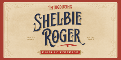 Shelbie Roger is a ornamental serif with classy and classic look with vintage feel, inspired by 60s and 70s signages. This font perfectly made to be applied especially in logo, and the other various formal forms such as invitations, labels, logos, magazines, books, greeting / wedding cards, packaging, fashion, make up, stationery, novels, labels or any type of advertising purpose. Features : uppercase and lowercase numbers and punctuation multilingual & alternate PUA encoded We highly recommend using a program that supports OpenType features and Glyphs panels like many of Adobe apps and Corel Draw, so you can see and access all Glyph variations.
 - Nolde by Brownfox,
$21.99 Nolde is a new titling typeface named after the German-Danish painter and printmaker Emil Nolde, one of the first artists to work in the Expressionist style. Not unlike the work of Nolde the artist, the seemingly rhythmical characters of Nolde the typeface conceal expressive tension of form and nervous line quality. While its letterforms hearken to the early-20th c. foundry types, this font makes a fresh and decidedly current impression, making it suitable for cutting-edge display use. Nolde capitals are available in two weights: regular and outline, and support over 60 languages that employ Latin and Cyrillic scripts.
 - Billrocks by Letterhend,
$19.00 Introducing, Billrocks - A sans serif display typeface. The condensed style make this font looks great and standout for tittle, headline, logo, etc. Perfectly to be applied to the other various formal forms such as invitations, labels, logos, magazines, books, greeting / wedding cards, packaging, fashion, make up, stationery, novels, labels or any type of advertising purpose. Features : uppercase & lowercase numbers and punctuation multilingual alternates & ligatures PUA encoded We highly recommend using a program that supports OpenType features and Glyphs panels like many of Adobe apps and Corel Draw, so you can see and access all Glyph variations.
 - Dankfield by Letterhend,
$17.00 Introducing, Dankfield. A modern display typeface with high contrast and condensed style, very suitable for futuristic and techno theme. This font perfectly made to be applied especially in logo, and the other various formal forms such as invitations, labels, magazines, books, greeting / wedding cards, packaging, fashion, make up, stationery, novels, labels or any type of advertising purpose. Features : Uppercase & lowercase (alternates) Numbers and punctuation Stylistic alternates multilingual PUA encoded We highly recommend using a program that supports OpenType features and Glyphs panels like many of Adobe apps and Corel Draw, so you can see and access all Glyph variations.
 - Wimp Stars by Letterhend,
$19.00 Introducing, Wimp Stars - A nostalgic display typeface. The sharp edges make this font looks great and standout for tittle, headline, logo, etc especially for old and retro style theme. Perfectly to be applied to the other various formal forms such as invitations, labels, logos, magazines, books, greeting / wedding cards, packaging, fashion, make up, stationery, novels, labels or any type of advertising purpose. Features : uppercase & lowercase numbers and punctuation multilingual alternates & ligatures PUA encoded We highly recommend using a program that supports OpenType features and Glyphs panels like many of Adobe apps and Corel Draw, so you can see and access all Glyph variations.
 - HS Future Sans by Hiba Studio,
$59.00 HS Future Sans is the sans serif version of HS Future. It has three weights and was converted to OpenType to support Arabic, Persian and Urdu to be compatible with the various operation systems and modern software. The smoothing of this font and the combination of straight and curved parts without the serif gave the user additional option beside HS Future family. It made it a beautiful typeface appropriate to the titles, and able to meet the desire of the user in the design of ads and modern designs of various types of audio and visual.
 - Fou Pro by URW Type Foundry,
$49.99 The Fou typeface family was designed as an alternative to Trade Gothic condensed bold. During the design process of a normally wide font variant a system developed that responds to white space and changing proportions. Thus, round transitions become rectangular and vice versa, space is made and space is taken away. This system and the associated changes are continued on a model with semi-serifs. Fou can also be used as an alternative to Din or the wider Q-Type, but in comparison offers more room for emphasis with its italics, expert sets and numerous special characters.
 - HVD Comic Serif Pro by HVD Fonts,
$- So many designers hate Comic Sans. They think people who don't know design are overusing this funny little friendly font, which is nearly every time out of place. Some years ago, type designer Hannes von Döhren created a free alternative to Comic Sans. The difference: It has serifs and a much cooler look. The big success of the HVD Comic Serif pushed Von Döhren to create a Pro Version with an eastern, central and Western European language support. “The HVD Comic Serif should spread all over and make the world a little bit better.” says Hannes.
 - Chunky Dressing by Bogstav,
$14.00 A chunky dressing may not sound very delicate, but I remember my grandmother used make a very chunky dressing for the mashed potatoes. I really loved it - actually I wish I had the recipe so that I could reproduce that particular consistency. But instead I made this font in memory of that lovely chunky dressing! :) Chunky Dressing has got a little Garamond in it, Baskerville as well - and even a touch of Times... Each lowercase letter has 5 different versions and they magically cycles as you type, leaving your text very lively with a natural twist of energetic and organic look
 - Slabber by Monotype,
$30.00 Slabber is a big ol’ chunky serif that’s specifically designed for display purposes – headlines, logotype, branding, titles, packaging, signage, etc. Its characteristics include heavy bracketed serifs with a strong 19th century wood type influence, while a very large x-height combined with a small cap height creates an awkward tension that delivers a strong, stylish, contemporary typeface. Slabber is enhanced by 22 alternates that will allow you to add flourishes to your typography. All Latin European languages are covered in this 6-weight typeface. Key features: 6 Weights 22 Alternates European Language Support (Latin) 500 glyphs per font.
 - The Riskeys by Letterhend,
$19.00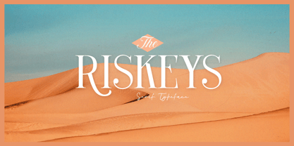 The Riskeys is a stylish and sophisticated modern serif font. This typeface has can be used for modern theme or vintage looks with ligatures & alternates. Very suitable for logo, headline, tittle, and the other various formal forms such as invitations, labels, logos, magazines, books, greeting / wedding cards, packaging, fashion, make up, stationery, novels, labels or any type of advertising purpose. Features : uppercase and lowercase numbers and punctuation multilingual ligatures alternates PUA encoded We highly recommend using a program that supports OpenType features and Glyphs panels like many of Adobe apps and Corel Draw, so you can see and access all Glyph variations.
 - Linotype Scott by Linotype,
$29.99Linotype Scott Mars, from German designer Hellmut Bomm, is part of the TakeType Library, chosen from the entries of the Linotype-sponsored International Digital Type Design Contest 1999 for inclusion on the TakeType 3 CD. Bomm constructed this typeface from a consciously limited repertoire of forms, producing a strictly constructed font with a cool, technical look. Worthy of note are also the exalted numeral forms and the unusual size relation of the lower case and capital letters. Scott Mars is best used for headlines and short to middle length texts in point sizes of 10 or larger. - Ned by Linotype,
$29.99Ned Std. is part of a series of typographic experiments from the young Swiss designer Michael Parson. Using a wide, horizontal hexagonal grid, Parson created the system of letters that make up this font. Text set in Ned Regular takes on a modular, honeycomb-like appearance. For an interesting effect, try overlapping individual letters, or use a few letters together as elements in a logo. A great companion face to Ned Std. is Linotype's Hexatype Bold. Both Ned Std. and Hexatype Bold have been included in the Take Type 5 collection, along with eight further constructions from Parson." - Franceur by Letterhend,
$16.00 Introducing, Franceur. A condensed display typeface with natural hand writing feel. This font is perfectly made to be applied especially for invitations, labels, magazines, books, greeting / wedding cards, packaging, fashion, make up, stationery, novels, labels or any type of advertising purpose. Features : Uppercase and Lowercase Numbers and Punctuation Ligatures and Alternates Multilingual Support PUA encoded We highly recommend using a program that supports OpenType features and Glyphs panels like many of Adobe apps and Corel Draw, so you can see and access all Glyph variations. Email us to letterhend@gmail.com if you need something! Happy Designing!
 - Matterdi by Creativemedialab,
$20.00 Introducing Matterdi, an elegant High-Fashion serif family with tons of unique and fashionable ligatures. This versatile serif family contains 100+ unique, elegant ligatures and alternates. 9 weights available from Thin to Black which gives you many possibilities to layout your next projects. Perfect for word-marks, monograms, logos, branding projects, or to use as web font. Try Matterdi Bold for display titles or Matterdi Thin for a fashionable and elegant look. It is also perfect to pair with a hand-drawn script! How to access alternate? Adobe Photoshop go to Window - glyphs Adobe Illustrator go to Type - glyphs
 - Hintown by Letterhend,
$17.00 Hintown is a unique serif with classy and classic look with vintage feel, inspired by art deco and 1900 signages. This font perfectly made to be applied especially in logo, and the other various formal forms such as invitations, labels, logos, magazines, books, greeting / wedding cards, packaging, fashion, make up, stationery, novels, labels or any type of advertising purpose. Features : uppercase and lowercase numbers and punctuation multilingual PUA encoded We highly recommend using a program that supports OpenType features and Glyphs panels like many of Adobe apps and Corel Draw, so you can see and access all Glyph variations.
 - Ardiland by Dora Typefoundry,
$17.00 Introducing, Ardiland - a stylish serif with beautiful binders and substitutes! Ardiland is a modern serif font to apply to many graphic or editorial design projects. A classy, unique high contrast, and light binding style for your upcoming projects. for feminine logo signs, fashion & editorial design heads, branding projects, Apparel Branding, packaging, magazine titles, advertisements, T-shirts, postcards and other special occasions. Here's what's included: Alternatives & Ligatures Numbers & punctuation Character with accent Support Multiple Languages PUA encoded This type of family has become the work of true love, making it as easy and fun as possible. I really hope you enjoy it! Thank you
 - Hullstain by Letterhend,
$19.00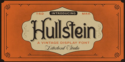 Hullstein is a ornamental serif with classy and classic look with vintage feel, inspired by 60s and 70s signages. This font perfectly made to be applied especially in logo, and the other various formal forms such as invitations, labels, logos, magazines, books, greeting / wedding cards, packaging, fashion, make up, stationery, novels, labels or any type of advertising purpose. Features : uppercase and lowercase numbers and punctuation multilingual & alternate PUA encoded We highly recommend using a program that supports OpenType features and Glyphs panels like many of Adobe apps and Corel Draw, so you can see and access all Glyph variations.
 - Shockbar by Letterhend,
$14.00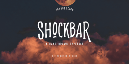 Introducing Shockbar, a hand drawn typeface. This font is made to be applied especially in logos, and the other various formal forms such as invitations, labels, logos, magazines, books, greeting / wedding cards, packaging, fashion, make up, stationery, novels, labels or any type of advertising purposes. Features: Uppercase & Lowercase Numbers and Punctuation Multi-lingual support Alternates PUA encoded We highly recommend using a program that supports OpenType features and Glyphs panels like many of Adobe apps and Corel Draw, so you can see and access all Glyph variations. Email us to letterhend@gmail.com if you need something! Happy Designing!
 - View Night by Gian Studio,
$12.00 View Night is this amazing typeface handmade script font we created in freestyle for those of you who do work and crafts. It's perfect for any type of work you're working various purposes such as logos, wedding invitations, headings, t-shirts, letterheads, signage, labels, news, posters, badges etc. OpenType features with alternative styles, ligatures, and multiple language support. To enable the OpenType Stylistic alternative, you need a program that supports OpenType features such as Adobe Illustrator CS, Adobe Indesign & CorelDraw X6-X7, Microsoft Word 2010 or later. How to access all alternative characters, using the Windows Character Map with Photoshop:
 - Madre Rose by Letterhend,
$17.00 Madre Rose is a sophisticated sans serif with 3 weight style to choose from, bold, thin and regular. It has many beautiful ligatures which you can play around to match your project, whether for a standout headline, or for a tagline, you name it. The unique letterform makes this font one of a kind! Perfectly to be applied to the other various formal forms such as invitations, labels, logos, magazines, books, greeting / wedding cards, packaging, fashion, make up, stationery, novels, labels or any type of advertising purpose. Features : 3 weight style uppercase & lowercase numbers and punctuation multilingual alternates & ligatures PUA encoded
 - North Mountain by Letterhend,
$19.00 Introducing, North Mountain - A nostalgic display typeface. The sharp edges make this font looks great and standout for tittle, headline, logo, etc. There are three styles, regular, edge, stamp. Perfectly to be applied to the other various formal forms such as invitations, labels, logos, magazines, books, greeting / wedding cards, packaging, fashion, make up, stationery, novels, labels or any type of advertising purpose. Features : uppercase & lowercase numbers and punctuation multilingual alternates & ligatures PUA encoded We highly recommend using a program that supports OpenType features and Glyphs panels like many of Adobe apps and Corel Draw, so you can see and access all Glyph variations.
 - Millgrove by Letterhend,
$17.00 Introducing, Millgrove - A condensed display typeface. The condensed style make this font looks great and standout for tittle, headline, logo, etc. There are three styles, regular, edge, stamp. Perfectly to be applied to the other various formal forms such as invitations, labels, logos, magazines, books, greeting / wedding cards, packaging, fashion, make up, stationery, novels, labels or any type of advertising purpose. Features : - uppercase & lowercase - numbers and punctuation - multilingual - alternates & ligatures - PUA encoded We highly recommend using a program that supports OpenType features and Glyphs panels like many of Adobe apps and Corel Draw, so you can see and access all Glyph variations.
 - Ingrid Mono by Jörg Schmitt,
$35.00 The birth of the monospaced types dates back to the past. There was a need for the creation of typesets for typewriters. The difficulty was to align the different glyphs in the same width. This led to particular problems with letters like "M" and "l"; the former seemed to be squeezed into the same width of all letters and the second one appeared way too stretched. Despite - or perhaps because of - the impression of the typewriter it is still popular with Graphic Designers. The Ingrid Mono font family with a high range of glyphs and symbols has that special appearance.
 - Garten House by Letterhend,
$19.00 Garten House is a sophisticated high contrast display serif typeface. The ligature character makes this typeface unique and stands out rather than the regular serif font. Very suitable for logo, headline, tittle, and the other various formal forms such as invitations, labels, logos, magazines, books, greeting / wedding cards, packaging, fashion, make up, stationery, novels, labels or any type of advertising purpose. Features : Numbers and punctuation Multilingual Ligatures Alternates PUA encoded We highly recommend using a program that supports OpenType features and Glyphs panels like many of Adobe apps and Corel Draw, so you can see and access all Glyph variations.
 - Fou Serif CN by URW Type Foundry,
$49.99 The "Fou" typeface family was designed as an alternative to "Trade Gothic condensed bold". During the design process of a normally wide font variant a system developed that responds to white space and changing proportions. Thus, round transitions become rectangular and vice versa, space is made and space is taken away. This system and the associated changes are continued on a model with semi-serifs. "Fou" can also be used as an alternative to Din or the wider Q-Type, but in comparison offers more room for emphasis with its italics and condensed styles, expert sets and numerous special characters.
 - Audela by Fontfabric,
$40.00 Surpassing traditional Antiqua, our new collaborative font family Audela emerges after overcoming time, national borders, language differences, cultural gaps, and professional challenges. Starting off as an exercise project of our very first intern Léa Bruneau in 2018, Audela slowly shaped into a full-fledged elegant serif typeface of 14 styles under the watchful eye of Plamen Motev, Fontfabric’s Type Director. Three years later, Audela is internally regarded as a breaker of limits earning its name from the French “au-delà,” meaning “beyond.” This new rising star features sharp serifs, flowing letterforms, advanced OpenType features, Extended Latin and Cyrillic support, to name a few.
 - TT Tsars by TypeType,
$39.00 TT Tsars useful links: Specimen | Graphic presentation | Customization options The TT Tsars font family is a collection of serif display titling fonts that are stylized to resemble the fonts of the beginning, the middle and the end of the XVIII century. The project is based on title fonts, that is, the fonts that were used to design book title pages. The idea for the project TT Tsars was born after a small study of the historical development of the Cyrillic type and is also based on Abram Shchitsgal’s book "Russian Civil Type". At the very beginning of the project, we had developed a basic universal skeleton for the forms of all characters in all subfamilies of the family, and later on, we added styles, visual features, artifacts and other nuances typical of the given period onto the skeleton. Yes, from the historical accuracy point of view it might be that such an approach is not always justified, but we have achieved our goal and as a result, we have created perfectly combinable serifs that can be used to style an inscription for a certain time period. The TT Tsars font family consists of 20 fonts: 5 separate subfamilies, each of which consists of 4 fonts. Each font contains 580 glyphs, except for the TT Tsars E subfamily, in which each font consists of 464 characters. Instead of lowercase characters in the typeface, small capitals are used, which also suggests that the typeface is rather a display than text one. In TT Tsars you can find a large number of ligatures (for Latin and Cyrillic alphabets), arrows and many useful OpenType features, such as: frac, ordn, sinf, sups, numr, dnom, case, onum, tnum, pnum, lnum, salt (ss01), dlig. Time-related characteristics of the subfamilies are distributed as follows: • TT Tsars A—the beginning of the 18th century (Latin and Cyrillic) • TT Tsars B—the beginning of the 18th century (Latin and Cyrillic) • TT Tsars C—the middle of the 18th century (Latin and Cyrillic) • TT Tsars D—the end of the 18th century (Latin and Cyrillic) • TT Tsars E—conditionally the beginning of the 18th century (only Latin) TT Tsars A and TT Tsars B families (both the beginning of the 18th century) have different starting points: for TT Tsars A it is Latin, for TT Tsars B it is Cyrillic. The development of the TT Tsars A family began in Latin, the font is based on the royal serif Romain du Roi. The Cyrillic alphabet is harmoniously matched to the Latin. The development of the TT Tsars B family began in Cyrillic, which is based on a Russian civil type. Characteristic elements are the curved one-sided serifs of triangular characters (A, X, Y), drops appear in the letter ?, the middle strokes ? and P are adjacent to the main stroke. Latin was drawn to pair with Cyrillic. It is still based on the royal serif, but somewhat changed: the letters B and P are closed and the upper bar of the letter A rose. This was done for the visual combination of Cyrillic and Latin and at the same time to make a distinction between TT Tsars A and TT Tsars B. TT Tsars C is now the middle of the 18th century. Cyrillic alphabet itself did not stand still and evolved, and by the middle of the 18th century, its forms have changed and become to look the way they are shown in this font family. Latin forms are following the Cyrillic. The figures are also slightly modified and adapted to the type design. In TT Tsars C, Cyrillic and Latin characters are created in parallel. A distinctive feature of the Cyrillic alphabet in TT Tsars C is the residual influence of the flat pen. This is noticeable in such signs as ?, ?, K. The shape of the letters ?, ?, ?, ? is very characteristic of the period. In the Latin alphabet, a characteristic leg appears at the letter R. For both languages, there is a typical C characterized by an upper serif and the appearance of large, even somewhat bolding serifs on horizontals (T, E, ?, L). TT Tsars D is already the end of the 18th century when with the development of printing, the forms of some Cyrillic characters had changed and turned into new skeletons of letters that we transposed into Latin. The figures were also stylized. In this font, both Cyrillic and Latin are stylistically executed with different serifs and are thus logically separated. The end of the century is characterized by the reduction of decorative elements. Straight, blueprint-like legs of the letters ?, R, K, ?. Serifs are very pronounced and triangular. E and ? are one-sided on the middle horizontal line. A very characteristic C with two serifs appears in the Latin alphabet. TT Tsars E is a steampunk fantasy typeface, its theme is a Latinized Russian ?ivil type (also referred to as Grazhdansky type which emerged after Peter the Great’s language reform), which includes only the Latin alphabet. There is no historical analog to this typeface, it is exclusively our reflections on the topic of what would have happened if the civil font had developed further and received a Latin counterpart. We imagined such a situation in which the civil type was exported to Europe and began to live its own life.
 - Genica Pro by Ndiscover,
$35.00 This is the design that was always on the drawer. I designed it when I was bored of designing other typefaces, there was no briefing, I just wildly played with the bezier tool. It was something to relax from more serious work, so it feels like a very funny and smiling design. Genica mixes various styles creating a display type with lots of personality.
 - LP Cervo by URW Type Foundry,
$35.99 LP Cervo is a typeface designed by German type designer Peter Langpeter. LP has been running his own design studio since 1995, working as a typeface and logo designer, as a calligrapher, cartographer and illustrator. During this time LP created a large number of excellent new typeface designs. With its styles Grotesk, Lapidar, Semiserif and Serif the LP Cervo is well suited for various design possibilities
 - Argone LC by Graphite,
$22.00 Argone LC is a handmade organic typeface family. It is a variant of Argone typeface, but has lower case letters. It comes in four weights– light, regular, bold and black, which is a feature not seen much in handmade typefaces. This makes Argone LC a versatile and flexible type family. There is also a version of Argone LC which only has upper case letters – Argone
 - Rude ExtraWide by DSType,
$50.00 Rude was designed as a dichotomy between the Grotesque and Humanistic typographic shapes: a no-nonsense Sans and a very muscular Slab Serif companion. Showing the historically demanded consistency for such kind of typefaces, this is one of DSType's most wide-ranging and flexible type systems, introducing seven weights across seven widths, from Thin to Black and ExtraCondensed to ExtraWide, along with a wonderful set of Icons.
 - Rude Condensed by DSType,
$50.00 Rude was designed as a dichotomy between the Grotesque and Humanistic typographic shapes: a no-nonsense Sans and a very muscular Slab Serif companion. Showing the historically demanded consistency for such kind of typefaces, this is one of DSType's most wide-ranging and flexible type systems, introducing seven weights across seven widths, from Thin to Black and ExtraCondensed to ExtraWide, along with a wonderful set of Icons.
 - Rude Slab by DSType,
$50.00 Rude was designed as a dichotomy between the Grotesque and Humanistic typographic shapes: a no-nonsense Sans and a very muscular Slab Serif companion. Showing the historically demanded consistency for such kind of typefaces, this is one of DSType's most wide-ranging and flexible type systems, introducing seven weights across seven widths, from Thin to Black and ExtraCondensed to ExtraWide, along with a wonderful set of Icons.
 - Pulp Magazine JNL by Jeff Levine,
$29.00 For a pulp magazine called Spicy Western Stories, it was unusual that the January 01, 1939 issue had its cover title hand lettered in an extra bold Art Deco style rather than Western influenced lettering. This did not stop the lettering from being used as the design model for a digital type revival. Pulp Magazine JNL, is available in both regular and oblique versions.
 - Rude Slab ExtraWide by DSType,
$50.00 Rude was designed as a dichotomy between the Grotesque and Humanistic typographic shapes: a no-nonsense Sans and a very muscular Slab Serif companion. Showing the historically demanded consistency for such kind of typefaces, this is one of DSType's most wide-ranging and flexible type systems, introducing seven weights across seven widths, from Thin to Black and ExtraCondensed to ExtraWide, along with a wonderful set of Icons.
 - Rude Slab SemiCondensed by DSType,
$50.00 Rude was designed as a dichotomy between the Grotesque and Humanistic typographic shapes: a no-nonsense Sans and a very muscular Slab Serif companion. Showing the historically demanded consistency for such kind of typefaces, this is one of DSType's most wide-ranging and flexible type systems, introducing seven weights across seven widths, from Thin to Black and ExtraCondensed to ExtraWide, along with a wonderful set of Icons.
 - Rude Wide by DSType,
$50.00 Rude was designed as a dichotomy between the Grotesque and Humanistic typographic shapes: a no-nonsense Sans and a very muscular Slab Serif companion. Showing the historically demanded consistency for such kind of typefaces, this is one of DSType's most wide-ranging and flexible type systems, introducing seven weights across seven widths, from Thin to Black and ExtraCondensed to ExtraWide, along with a wonderful set of Icons.
 - Bazoo Tow NF by Nick's Fonts,
$10.00Here's a faithful rendering of the slightly quirky, but thoroughly yeomanlike headline face Basuto, designed by Stanley Baxter and released by the Stephenson Blake Type Foundry in 1927. Bold, brassy and a little sassy, this one will perk up your headlines fer sure. Both versions include the complete Latin 1252, Central European 1250 and Turkish 1254 character sets, as well as localization for Moldovan and Romanian.