3,066 search results
(0.011 seconds)
- CF Cozyscript by CozyFonts,
$25.00 CF Cozyscript is an even weighted connecting script. Created in the spirit of the Old Grade School cursive chart seen above the blackboard in the front of the classroom. Giving students a constant visual reference of the smooth flow of Caps and Lower case script. Neither formal nor casual but a combination of both styles. Cozyscript is currently available in 3 styles: Light, Medium & Rounded. The Light & Medium styles are best suited for Invitations, Notes, Advertising, Personal Letters, and Sensitive Subjects such as Movie Titles, Biographies, Wedding paraphernalia, etc. The Light & Medium Glyphs finish in squared-off ends, whereas the Rounded version is slightly bolder than the Medium version with rounded ends resembling a tubular look. The Rounded version lends itself to effective use in Sports, Music, and Advertising, Graphics, Signage, Branding, Neon effects, Logos, Titles, and Packaging. With over 300 glyphs applicable in over 100 languages, Cozyscript is available for use! Cozyscript is CozyFonts Foundry's 17th Font Family released and 2nd script font by Tom (Cozy) Nikosey, California Designer.
 - Fenomen Sans by Signature Type Foundry,
$38.00 Geometrical drawing of Fenomen Sans typeface goes back to the roots of the Bauhaus aesthetics and the entire architectural and design avant-garde of the 20th century. It is still a symbol of functional rationality, clean aesthetics in relation to shape, and of progressive thinking. Its popularity is timeless and permanent. The set contains eight basic alphabets of a square pattern, eight semicondensed, eight condensed and eight extremely condensed alphabets, all in Latin and Cyrillic alphabets. Every font of the family has four types of numerals, small caps and variant letters. The typesetting can fluently use all fonts simultaneously. The typeface originated between the years 2011–2014 and was subjected to a series of tests for the fluent legibility of narrow fonts even in extreme conditions. Narrow fonts provide this set with the maximum use also for newspaper typesetting. The typeface has an elegant, delicate design in thin fonts and sufficient legibility in bold. Mutual contrast produces creative tension. Font name acronyms described: SCN = SemiCondensed CN = Condensed XCN = ExtraCondensed
 - Switched On by Type Innovations,
$39.00 Switched On and Switched Off where two fonts developed by placing points on a pre-defined square grid template. The experiment was to explore all the variations possible by just using straight connecting lines on a grid. I stumbled on the final concept, almost accidentally, and was amazed by the numerous possibilities. Both designs where created to work together. By adjusting the stroke and inline proportions between the two fonts, I was able to achieve a good overall color balance between 'Switched On' (dark letters on a light background), and the 'Switched Off' design as a knockout treatment (light letters on a dark background). Used in this way, both fonts visually appear similar in overall weight and proportion. They harmonize well together. Used separately, they make for some interesting visual effects and headline treatments. The fonts are best used at large point sizes, but they are still legible in a variety of smaller sizes. I think that by experimenting with these two fonts one can achieve some stunning visual effects. Explore and have fun.
 - Moho Style by John Moore Type Foundry,
$45.00 Moho is inspired by the Victorian sans shapes, movements and expressions of modernism art deco and constructivism, conceiving a decorative and elegant font, modern and readable display. This provides a retro look style of elegance of the 30s. Moho Condensed font family is straight, vertical, with joints and links or curvilinear or angular. Moho provides an innovation in the form of letters, to replace traditional forms of curves by straight or vice versa. Condensed Moho is a category of inline square letter, has an efficient OpenType programming for all Moho family, and basic for Moho Std Style family to compose texts in European languages of East and West, having im Pro a wide set up to 610 glyphs. Designed to hold and typesetting over 14 pts or less increasing readability depending on the tracking. Moho Condensed is ideal for publishing newspaper and magazine design, convenient for the design covers and labels due to its space saving. Moho Condensed typefaces are closely related to the arts and fashion are very useful in creating logos and brands.
 - ITC Kabel by ITC,
$40.99 The first cuts of Kabel appeared in 1927, released by the German foundry Gebr. Klingspor. Like many of the typefaces that Rudolf Koch designed for printing use, Kabel is a carefully constructed and drawn. The basic forms were influenced by the Ancient Roman stone-carved letters, which consisted of just a few pure and clear geometric forms, such as circles, squares, and triangles. Koch also infused Kabel with some elements of Art Deco, making it appear quite different from other geometric modernist typefaces from the 1920s, like Futura. Linotype has two versions of Kabel in its library. Kabel has a shorter x-height, with longer ascenders and descenders, making it a bit truer to Koch's original design than the second version, ITC Kabel, which was designed by Victor Caruso. This version, also known in the United States as Cable, has a larger x-height, shorter ascenders and descenders, more weights ,and a diamond shaped i-dot. Typefaces in the same oeuvre include Avenir Next, ITC Avant Garde Gothic, Metrolite, Metromedium, Metroblack, and Erbar, just to name just a few."
 - Organica Pro by Sudtipos,
$39.00 Just as most buildings are based on a structure of vertical columns, horizontal floors, square angles and the occasional arch, most Latin typefaces are designed within a largely uniform, static, alphabetic structure that provides a framework for playing with the style of the terminals —serif, sans-serif, slab-serif, flared, Tuscan— without significantly modifying the deep anatomy of the letters. Orgánica Pro, by contrast, proposes a different structure: curvilinear, subtle and sophisticated, beyond the typical «sticks and balls» model. Organic anatomy, in one word; deliberately dynamic and asymmetrical. Over this radically distinct structure, terminals play a characteristic, expressive role that challenges easy classifications: Is this a serif or a sans font? A semi-serif? A semi-sans? For text or display? Modern or ultra-modern? Joke or serious? All answers are valid. Anyway, its six stylistic variants allow for multiple, diverse uses in text setting, headings and logotypes. In spite of —or perhaps thanks to— its innovative, uncommon structure, Orgánica’s personality is sweet to the eyes, wittily elegant and surprisingly legible.
 - Home Style by FontMesa,
$25.00 Home Style is a revival of a very old font previously thought to have been designed by Joseph Gillé in or around the year 1820, however recent evidence from France suggests that an artist by the name of Silvestre from the same time period may be the true designer of this font. You may have seen this font in the past under the names of Circus, Roma, Madame and Gillé Classic. Originally designed in France, this very decorative font was only available in uppercase including numbers. Today this font has been re-mastered and updated with the addition of a newly designed lowercase set of letters. Home Style with its diagonal or cast shadow lines breaks away from the original design which has squared off shadows. If you're looking for the original version of this font please refer to the FontMesa version named Maison Luxe. New in 2016 for Home Style is an uppercase German Double S (versal eszett), opentype features including case sensitive forms and old style numerals.
 - Enamela by K-Type,
$20.00 Enamela (rhymes with Pamela) is a monoline square sans that is available in normal width and condensed versions. Although rooted in the early years of sans serif type, the Enamela fonts have a timeless quality that is practical and unpretentious. The letterforms derive from vitreous enamel signage dating from the Victorian era and widely used in Britain for street nameplates, Post Office signs, the plates on James Ludlow wall postboxes, railway signs and direction signs, as well as for circular Automobile Association wayfinding plaques throughout the first half of the twentieth century. The quirky terminals, stemming from the compression of geometric type, invite comparison with the Charles Wright fonts used for UK vehicle registration plates. Enamela and Enamela Condensed are both available in three weights – regular, medium and bold – and as italics (optically corrected obliques). A commonly used alternative M with a vertex that touches the baseline is provided at the Alt-M (µ) keystroke on a Mac, or Alt-0181 on Windows. A commonly used G with a plain vertical throat, no crosspiece, is assigned Unicode FF27 (full width capital G).
 - Pragmatik by Christopher Stahl,
$24.90 Pragmatik is a carefully crafted Square Sans by Christopher Stahl, awarded with a Commendation at the Art Director's Club Germany Junior Competition 2011 and selected as Font of the Week 42.2011 by Typolution.de. The design is influenced by the heritage of German industrial typesets like DIN, yet the use of forms and proportions feels modern and fresh. The family consists of three weights with matching italics, thus making a total of six fonts. The high x-Height and the sturdy design provide a good legibility in body text, while in larger sizes the exciting details and alternates create headlines full of atmosphere. Features: - 350 glyphs supporting central and western European languages as of DIN 16518 - over 500 manually adjusted kerning classes and pairs - available in Open Type with a host of Open Type features, such as: - proportional lining, lining table and proportional oldstyle number figures - 7 default and 16 discretionary ligatures that especially cater the needs of the German and English language - a variety of stylistic alternate figures like a stencil like i and j or an old-style Eszett.
 - HS Sondos by Hiba Studio,
$40.00 HS Sondos is an Arabic display typeface designed specifically for titles and graphic projects. Drawing inspiration from Modern Kufi calligraphy, the font features a harmonious fusion of sharp and curved lines, resulting in a visually captivating and innovative take on square shapes and geometric structures. The distinctive sharp endings at the bottom of each character add an extra touch of aesthetic appeal. With three available weights -regular, bold, and black- HS Sondos offers versatility and variety. The black weight introduces a novel concept by maintaining the same horizontal dimensions as the regular weight but expanding the vertical dimensions, creating a uniquely bold appearance. Supporting Arabic, Persian, and English languages, HS Sondos opens up a world of possibilities for designers looking to enhance their Arabic typography. Its visually striking and flexible nature makes it an excellent choice for projects that demand attention and creativity. Overall, HS Sondos stands as a testament to the beauty and adaptability of Arabic typography, empowering designers to bring their visions to life with a captivating and versatile typeface.
 - Core Slab M by S-Core,
$25.00 Core Slab M is the serif companion to Core Sans M (Text family of the month. May, 2013). This font family has open and square letter shapes, and overall rounded finishes and serifs provide a soft and friendly appearance but also it is strong in headline. Simple and modern shapes with a tall x-height make the text legible and the spaces between individual letter forms are precisely adjusted to create the perfect typesetting. Core Slab M Family consists of 2 widths (Condensed, Normal), 7 weights ExtraLight, Light, Regular, Medium, Bold, ExtraBold, Heavy), and Italics for each format. Combination fonts such as Core Slab M Ice, Berg and Iceberg are also available. Each font includes support for Superiors and Inferiors, Fractions, Tabular numbers, Arrows, Box drawings, Geometric shapes, Block elements, Mathematical operators, Miscellaneous symbols and Opentype Features such as Proportional Figures, Tabular Figures, Numerators, Denominators, Superscript, Scientific Inferiors, Subscript, Fractions and Standard Ligatures. We highly recommend it for use in books, web pages, screen displays, and so on.
 - FS Elliot Paneuropean by Fontsmith,
$90.00Rooted Rooted in 1960s Brit modernism and infused with a fresh, contemporary spirit, FS Elliot is a future-proof, workhorse sans serif, well-suited to any assignment. Open and harmonious, its clear, fluid shapes lend words a distinctive and optimistic bounce. Britishness FS Elliot came out of a desire to create something squarely in the British modernist tradition, drawing on influences such as Design Research Unit’s portfolio of type for famous British brands and products, and Margaret Calvert and Jock Kinneir’s work on the British road sign system. Nick Job took the openness and simplicity of that style and injected warmth and wide appeal, coming up with a highly practical, multi-purpose family of faces. Enduring appeal “The great thing about having an eye on the future,” says designer Nick Job, “is that most of it is unknown. It’s what encourages us to take risks. And it leaves an uncertainty which, I believe, gives the best work its enduring appeal.” FS Elliot is available in a Pro version with full language support and a full range of Roman, Cyrillic and Greek weights. - Platz Groteske FJ by Frncojonastype,
$27.00 fj Platz Groteske™ is the new font from frncojonastype project that culminates after almost 5 years of learning and development. fj Platz Groteske™ is a Neo-grotesk font with slight geometrical proportions with humanistic terminations. For this occasion, this font will show the normal version, however, the entire project contemplate condensed family, extended and the development of alphabets as Cyrrilic and Greek. This proposal is to improve the legibility in the Neo-grotesk fonts with generous gaps, vertical and square counter form and ascendents that exceed slightly the capitals. Counts with old numbers, small caps, modern numbers, tabular, numerators and denominators to fraccions, reference numbers to notes and formulas to face confidant and complex different stages. Ideal to editorial projects of informative content - scientific and titular of a huge impact because of the various alternative characters, stylistic options and a optometrical version to risky designers. To exclusive licenses and to follow the develop of this project, please visit frncojonas.com (WIP) Learn about upcoming releases, work in progress and get to know us better! Instagram: @frnco.jonas
 - Eurotypo BKL by Eurotypo,
$28.00 Eurotypo BKL is a family of fonts inspired in on one of the most beautiful British Typography ever done. This version of Baskerville tries to reflect the taste of his fine style, compatible with the bluntness of the digital present. As many other designers and foundries, our intention has been to represent the atmosphere of Baskerville's style, than simply relive the shapes of its letters. Actually, capitals fits almost to a square proportions, lowercases are more open, ascenders and descenders are shorter, offering more space for enlarge the "x" high. The beauty of his letterforms can enrich headlines; this font can also be used as body text for its good legibility and accurate kerning. John Baskerville (1706-1775) was born 1706 in Wolverley, England. He was a great typographer and printer who published a remarkable edition of Virgil in 1757. His typefaces were greatly admired by Benjamin Franklin; He also has improved and developed many innovations in printing, paper and ink production. Baskerville’s typefaces are regarded as transitional types that represents the link between Old Roman Style and Modern Roman typography.
 - FS Elliot by Fontsmith,
$80.00 Rooted Rooted in 1960s Brit modernism and infused with a fresh, contemporary spirit, FS Elliot is a future-proof, workhorse sans serif, well-suited to any assignment. Open and harmonious, its clear, fluid shapes lend words a distinctive and optimistic bounce. Britishness FS Elliot came out of a desire to create something squarely in the British modernist tradition, drawing on influences such as Design Research Unit’s portfolio of type for famous British brands and products, and Margaret Calvert and Jock Kinneir’s work on the British road sign system. Nick Job took the openness and simplicity of that style and injected warmth and wide appeal, coming up with a highly practical, multi-purpose family of faces. Enduring appeal “The great thing about having an eye on the future,” says designer Nick Job, “is that most of it is unknown. It’s what encourages us to take risks. And it leaves an uncertainty which, I believe, gives the best work its enduring appeal.” FS Elliot is available in a Pro version with full language support and a full range of Roman, Cyrillic and Greek weights.
 - Codelia by Tabular Type Foundry,
$- No matter if you're professional or beginner, your work should be fun. And if you are a coder/programmer, your coding font should be something you enjoy looking for very long time. Square and crisp coding fonts might be easy on the pixels, but are they easy on your eyes? Do they keep you entertained at work? Codelia is a monospaced humanistic typeface designed for coding with focus on comfort and fun without sacrificing legibility or coding functionality. It's fun but not a joke. Its round shapes are easier on the eyes and make the code look less intimidating. It is not designed to make maximum use of every pixel on screen, but to make you forget about pixels. The italic is full of personality but sober enough to not draw unnecessary attention. Codelia works great for coding, but also in presentation, education as well as packaging and branding. Codelia is available in two families, one with coding ligatures and one without; ligatures in the latter are still present in Diescretionary Ligatures feature (dlig).
 - Tessie Some More by Ingrimayne Type,
$12.00 A tessellation is a shape that can be used to completely fill the plane without gaps or overlaps—simple examples are isosceles triangles, squares, and hexagons. Tessellation patterns are eye-catching and visually appealing, which is the reason that they have long been popular in a variety of decorative situations. TessieSomeMore has two family members, a solid style that must have different colors to be useful and an outline style. They can be used separately or they can be used in layers with the outline style on top of the solid style. For rows to align properly, leading must be the same as point size. To see how patterns can be constructed, see the “Samples” file here. Shapes that tessellate and also resemble real-world objects are often called Escher-like tessellations. Most of the shapes in TessieSomeMore are Escher-like. Over half are either bug-like and bird-like shapes. There are also a few animal and other object shapes as well as some geometric or abstract shapes that have visual appeal.
 - Kuma Rounded by L'île Foundry,
$35.00 In Ancient Greek, Kuma means wave. This wavy, dynamic and poetic all-caps display typeface is useful for headlines or short texts. Kuma is the result of a graphic and perceptual game that, using experimentation as a working method, explores the possibilities of writing as an image. This grid-based typeface creates different shapes and directions, never predictable. There are different types of waves created by the wind. That's why there are three different versions of Kuma: Kuma, Kuma Rounded and Kuma Square. Each version is available in seven weights which can be combined together. In their black and white rhythm, they guarantee global readability and balance. Kuma Rounded was designed by Jérémy Ruiz. Supported languages: Afrikaans, Albanian, Basque, Bosnian, Breton, Catalan, Croatian, Czech, Danish, Dutch, English, Esperanto, Estonian, Faroese, Fijian, Finnish, Flemish, French, Frisian, German, Greenlandic, Hawaiian, Hungarian, Icelandic, Indonesian, Irish, Italian, Latin, Latvian, Lithuanian, Malay, Maltese, Maori, Moldavian, Norwegian, Polish, Portuguese, Provençal, Romanian, Romany, Sámi (Inari), Sámi (Luli), Sámi (Northern), Sámi (Southern), Samoan, Scottish Gaelic, Slovak, Slovenian, Sorbian, Spanish, Swahili, Swedish, Tagalog, Turkish, Welsh.
 - Core Sans CR by S-Core,
$20.00 Core Sans CR family is a rounded version of Core Sans C; a part of the Core Sans Series, such as Core Sans N, Core Sans M, Core Sans E, Core Sans A, Core Sans D, Core Sans G, Core Sans R and Core Sans B. Core Sans CR is inspired by classic geometric sans (Futura, Avenir, Avant Garde etc.). It is based on geometric shapes, like near-perfect circle and square. It has a much higher x-height (height of lowercase letters), an effect which promotes readability especially at small print sizes. The Core Sans C Family consists of 9 weights (Thin, Extra Light, Light, Regular, Medium, Bold, Extra Bold, Heavy, Black) and Italics for each format. Core Sans C supports complete Basic Latin, Cyrillic, Central European, Turkish, Baltic character sets. Each font includes proportional figures, tabular figures, oldstyle figures, numerators, denominators, superscript, scientific inferiors, subscript, fractions and case features. Core Sans C is an ideal font family for use in magazines, web pages, screens, displays, and so on.
 - TessieBugs by Ingrimayne Type,
$23.95 A tessellation is a shape that can be used to completely fill the plane—simple examples are isosceles triangles, squares, and hexagons. Tessellation patterns are eye-catching and visually appealing, which is the reason that they have long been popular in a variety of decorative situations. These Tessie fonts have two family members, a solid style that must have different colors when used and an outline style. They can be used separately or they can be used in layers with the outline style on top of the solid style. For rows to align properly, leading must be the same as point size. To see how patterns can be constructed, see the “Samples” file here. TessieBugs contains shapes that resemble insects such as moths, ants, butterflies, and weevils. (Earlier tessellation fonts from IngrimayneType, the TessieDingies fonts, lack a black or filled version so cannot do colored patterns. The addition of a solid style that must be colored makes these new fonts a bit more difficult to use but offers far greater possibilities in getting visually interesting results.)
 - Hinnual by Jipatype,
$27.00 Hinnual เป็นฟอนต์ที่ผสมผสานระหว่างรูปทรงสี่เหลี่ยมและทรงกลมเพื่อสร้างสไตล์ที่ไม่เหมือนใคร ชื่อมาจากคำไทย 2 คำ คือ Hin แปลว่า หิน และ Nual แปลว่า อ่อน ผสมผสานองค์ประกอบที่แข็งและอ่อนนี้สะท้อนให้เห็นในแบบอักษร ซึ่งมีเส้นที่สะอาดตาและเส้นคมซึ่งถูกทำให้อ่อนลงด้วยมุมโค้งมน ฟอนต์มีให้เลือกถึง 18 แบบ มีตัวเลือกหลากหลายให้คุณได้เลือกใช้ Hinnual เหมาะอย่างยิ่งสำหรับใช้ในพาดหัวและพาดหัวย่อย ซึ่งลักษณะที่โดดเด่นสามารถช่วยดึงดูดความสนใจของผู้อ่านได้ เส้นสายที่สะอาดตาและสไตล์ที่เป็นเอกลักษณ์ยังทำให้เป็นตัวเลือกที่ยอดเยี่ยมสำหรับแบรนด์ โลโก้ และงานออกแบบอื่นๆ ที่ต้องการภาพลักษณ์ที่น่าจดจำ โดยรวมแล้ว Hinnual เป็นฟอนต์อเนกประสงค์และสะดุดตาที่ผสมผสานองค์ประกอบทั้งความแข็งแกร่งและความนุ่มนวล การออกแบบที่เป็นเอกลักษณ์ทำให้เป็นตัวเลือกที่ยอดเยี่ยมสำหรับนักออกแบบที่ต้องการสร้างผลงานที่น่าจดจำ Hinnual is a font that combines the square and rounded shapes to create a unique visual style. Its name comes from two Thai words - Hin, which means stone, and Nual, which means soft. This juxtaposition of hard and soft elements is reflected in the font's design, which features clean, sharp lines softened by rounded corners. The font comes in 18 styles, providing a range of options for designers to choose from. Hinnual is particularly well-suited for use in headlines and sub-headlines, where its bold and distinctive appearance can help to grab the reader's attention. Its clean lines and unique style also make it a great choice for branding projects, logos, and other design elements that require a memorable. Overall, Hinnual is a versatile and eye-catching font that combines elements of both strength and softness. Its unique design make it an excellent choice for designers looking to create impactful visual content.
 - Mingo Gothic SG by Spiece Graphics,
$39.00 This typeface appears to be straight out of a science fiction movie thriller. Mingo is a slightly condensed, somewhat vain gothic with thick vertical strokes proudly tapering downward. Capitals which are normally completely round are now square inside with curving outside corners. Lowercase letters carry the same design traits. And, in the capital A and H, crossbars extend on both sides helping give the face a pronounced retro look. Mingo Gothic is a close cousin to Raleigh Gothic and is an excellent choice for book covers and large display settings. Small caps, fractions, and alternate characters have also been developed for greater layout versatility. Mingo Gothic Bold is now available in the OpenType format. Some new characters have been added to this OpenType version as stylistic alternates, historical forms, small caps, oldstyle figures, ornaments, and f-ligatures. These advanced features work in current versions of Adobe Creative Suite InDesign, Creative Suite Illustrator, and Quark XPress. Check for OpenType advanced feature support in other applications as it gradually becomes available with upgrades.
 - Verbatim by Monotype,
$25.99 This extensive 60-font type family was inspired by the best (and worst) of 1970s science fiction TV shows and movies. Verbatim aims to extract the essence of futuristic type from that era, add a dash of modern style and conjure a cinematic typeface for the 21st century. From the extremes of the thin condensed, all the way through to the black extended, Verbatim has the scope to add drama to your titles and headings, and finesse to your logo and branding projects. Distinguishing features include a large x-height and open counters that aid legibility. This typeface crosses a few boundaries of type specification in that it is both rounded and square, it is part geometric in construction with a touch of humanistic flair and stroke contrast – giving Verbatim a distinctive and confident air. Key features: • 6 weights in Roman and Oblique • 5 Styles – Condensed, Narrow, Regular, Wide, Extended • Small Caps and 7 Alternates • European Language Support (Latin) • 600 glyphs per font. See more detailed examples at the Verbatim microsite.
 - Toboggan by Jeremy Nelson,
$11.00 TOBOGGAN | Utility Display Typeface Toboggan is a utility display typeface with classically influenced proportions, calligraphic elements, and sporting roots. With 9 weights, upright, and true italics, Toboggan comes in a total of 18 fonts. With flexibility from a crisp Thin weight to an imposing Super in both upright and italic, Toboggan thrives as a utility font spanning the columns of extended text, in artful editorial layouts, eye-catching motion graphics, or commanding headlines in a title role. First drafted around the frame of a perfect circle, Toboggan evolved by taking inspiration from the sweeping contours of the automotive world, expanding into wider proportions, and adopting an abrupt set of constructed features. Sturdy with the spirit of sport, Toboggan’s final form preserves a human connection through features of the written hand, while minimal contrast and its chopped terminals bring a decisive tone with clinical precision. Features: - Nine weights and true Italics - Multilingual support (Extended Latin - Includes Western European coverage and more) - OpenType features including small-caps, stylistic sets, contextual punctuation & more - Extensive numeral sets including stylistic sets, circled, and squared numbers
 - Absalon by Michael Nordstrom Kjaer,
$39.00 Absalon has square letter shapes. It has some characteristics semi-sharp and semi-rounded corners and it has a relatively tall x-height for legible text. To create the perfect typesetting the spaces between individual letter forms has been precisely adjusted. The Absalon font family is perfect for the web as well as for print, for display as well as longer text, for motion graphics, on the side of a van, t-shirts, logotypes and so on. The font family consist of 5 weights or 10 styles and it has 410 glyphs. A total of more than 4000 glyphs. The styles are: Light, Light Italic, Regular, Italic, Medium, Medium Italic, Bold, Bold Italic, Extra Bold & Extra Bold Italic. It has OpenType features such as automatic fractions, subscript, superscript, numerators, denomerators, ordinals and the “f” ligature set. Absalon has extended language support (most Latin-based scripts are supported). The name of the font family is Absalon and it is a reference to a Danish bishop in the middle ages. He was a key figure in the founding of Copenhagen, the Capital of Denmark.
 - DT Partel by Dragon Tongue Foundry,
$9.00 DT Portal: This stylised, partially serifed font, made with a slightly rounded square form, may have been inspired initially by old cathode ray tubes and computer screens. Although not intended to be purely a ‘tech’ font, it can have a strong tech feel to it. More suited to being a headline font than body text. It also appears to have a monospaced look to it, since most letters, (other than letters like ‘i, l and t’), do have the same width. There is some automatic contextual shape adjustment happening in places, to avoid taking up too much space, so contextual ligatures should be turned on. As is the case with most of my fonts, when given the choice, ‘metric’ spacing should be used in preference to ‘optical’. Initially this font was going to be called ‘DT Portal’, because its form was similar to that of a window or doorway. But due to other fonts already having that name, I chose to rename it as ‘DT Partel’, for no reason other than it is only a very small change visually.
 - Coconut Milk by Susan Brand Design,
$10.00 Coconut Milk Script is a fun new handwritten font with lots of personality. It contains multi-lingual support with accented characters for international Western European users, as well as a special double "tt" ligature and stylistic alternative.
 - America by Peliken,
$14.00 America otf color font. Letters and numbers in national flag design, stripes of red and blue, white stars ornament for festive decoration.You can use this font for design logos, quotes prints on t-shirts, Presidential election posters and other. OpenType-SVG Font was designed with Fontself Maker in Illustrator CC. WARNING Color fonts are pretty new technology - they currently show up in Photoshop CC 2017+, Illustrator CC 2018 and some Mac apps. Learn more about color font support on third-party apps here: https://www.colorfonts.wtf/
 - Aleut by Peliken,
$14.00 Tribal Aleut OTF color font. Native Historic font, traditional ethnic characters in style of customs and traditions of national culture. You can use this font for design logos, quotes prints on t-shirts and other. OpenType-SVG Font was designed with Fontself Maker in Illustrator CC. Contains only uppercase letters and digits. WARNING Color fonts are pretty new technology - they currently show up in Photoshop CC 2017+, Illustrator CC 2018 and some Mac apps. Learn more about color font support on third-party apps here: https://www.colorfonts.wtf/
 - Brighty by SSI.Scraps,
$15.00 Brighty is a fun and friendly sans serif font with a beautiful alternates. Fall in love with its timeless elegance. it is suitable for heading and outline. you will love it. Support multilingual. it is consist of Basic Multilingual Plane, Basic Latin, Latin-1 Supplement, Latin Extended-A & B, general punctuation, super and subscripts, currency symbols, letterlike symbols and Alternate characters on PUA. The file includes OTF, plus bonus editable SVG Papercut and template can be downloaded here: https://www.dropbox.com/s/xen5i6h2o3f6oz6/Brighty%20MF.zip?dl=0
 - Dead Face by Eotype,
$12.00 Dead Face is an experimental black letter font that has a strong, abstract and segmentive appearance. Dead Face is a black letter font with unique fractures, where each fracture tends to be soft in synergy with thin strokes. Each glyph is crafted originally, so it can stand alone which can be used for logos or clothing designs. This font is also suitable for banners and posters. This font has alternate features and ligatures that are packaged in otf format. Have fun being creative using this font!
 - PRONK Clean by wearecolt,
$9.00 Introducing PRONK. By Wearecolt. This is a tall, bold and round display font designed for retro-modern designs. This font is perfect for your next logo design or magazine titles. Taking inspiration from many tall fonts and American number plates i created a display font that would be my 'go to' for a neat tall, bold font. I also wanted something which would be able to take a good amount of treatment like stamp effects and grunge. The PRONK pack includes: .otf and standard webfont file types
 - Street North by Jehansyah,
$12.00 Street North this is a modern serif font, which is very elegant, and also looks very luxurious, make this the choice of your large project, it is suitable for all titles, or large writing, there are several alternates that you can use and combine, and supported by PUA encode , meaning you can easily access all the letters with a glyph, perfect for e-mail, magazines, book titles, movies, notes, brands, logos, and much more include : Street North otf punctuation numeric alternate Thank you very much
 - Zero To Hero by Olivetype,
$18.00 Zero To Hero is a bold handwritten font, carefully handcrafted to become a true favorite. Its casual charm makes it appear wonderfully down-to-earth, readable, and ultimately, incredibly versatile. Zero To Hero will look outstanding in any context, whether it’s being used on busy backgrounds or as a standalone headline! This font is supporting Multi-Languages, which includes: Afrikaans Albanian Catalan Danish Dutch English Estonian Finnish French German Italian Norwegian Portuguese Spanish Swedish Zulu. You will get : Zero To Hero OTF Thank you
 - Tombstone by Factory738,
$15.00 This year's Halloween is fast!!! When it comes to Halloween projects, Tombstone is a great. Use its scary atmosphere as a springboard for your Horror project. Numbers, punctuation, and multilingual letters are all included. For whatever your imagination may conjure up, these ligatures will come in handy. 7 Styles Basic Latin A-Z and a-z Numerals & Punctuation Stylistic Ligatures Multilingual Support for ä ö ü Ä Ö Ü ... OTF file format Free updates and feature additions Thanks for looking, and I hope you enjoy it.
 - Javyer by Din Studio,
$29.00 If you’re looking for a gorgeous font to attract your audiences or customers then we’ve got the font for you! Introducing Javyer- A Handwritten Font This handmade font typeface with elegant style looks very interesting for loads of different projects and promotions. It is perfect to be used on your website, for your social media branding, Pinterest banners, printed products, and more! Includes: Javyer (OTF) Features: Beautiful Ligatures Stylistic Set Swashes Multilingual Support PUA Encoded Numerals and Punctuation Thank you for downloading premium fonts from Din Studio
 - Delisha by Nissa Nana,
$20.00 Delisha is a beautiful script font. It has a classy, elegant, and modern look which can be used for logos, branding, invitations, stationary, wedding designs, social media posts, and every other design which needs a handwritten touch. What's included: Delisha OTF Numeral and Punctuation Stylistic Alternates , Ligatures, and Swashes International Language Works on PC & Mac Simple installations Accessible in Adobe Illustrator, Adobe Photoshop, Adobe InDesign, even works on Microsoft Word. Thank you for your purchase! Hope you enjoy with our font! Best Regards, Nissa Studio
 - Ascetic 2D by 2D Typo,
$28.00 This decorative font is based on Cyrillic Vyaz of XV-XVI centuries. This type of letters were used as display faces in sacred texts. In Vyaz, the letters are characteristically fitted to each other so the letter sequences look as one solid ornamental frieze. The font is rich in discretionary ligatures which help to accentuate the style of Vyaz. In addition to letters and standard characters there is a number of monograms and Christian symbols. These and other features are available in OTF format.
 - Hi Virginia by Good Java Studio,
$23.00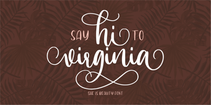 Hi Virginia handlettering font is a beauty & modern handlettering font. It's perfect for logo, invitation, stationery, wedding designs, social media posts, advertisements, product packaging, product designs, label, photography, watermark, crafting, special events or anything. This font include : Hi Virginia OTF, Standar Ligatures, Stylistic Sets, and also Multilingual support. Very simple installation PUA Encoded open Very great for branding, logotype, handletteing, invitations, or fashion branding. Multilingual Support Support for Adobe Illustrator, Corel Draw, Indesign, Adobe Photoshop or Procreate 4.3 (Updated) Support for MAC or WINDOWS
 - Palisade by profonts,
$51.99 Palisade Pro is a new, very elegant script family developed and manufactured in OpenType Pro format by profonts studio. Each of the eight weights contains approximately 1250 characters! The character range includes the complete Latin layout for Western and Eastern Europe, including the Baltic states, Romania and Turkey. Moreover, the character set contains a large selection of handcrafted ligatures (about 450 per font!), character combinations and alternative characters, which make this attractive script perfect for OTF-enabled applications such as InDesign and Quark Xpress version 7and later.