8,913 search results
(0.016 seconds)
- H74 Eastern Star by Hydro74,
$17.00 - Be A Star by One Line Design,
$19.99 Be a Star font brings the universe into your creative designs. Use this font for posters, vinyl creations, logos, t-shirts, and many more projects. It’s written in the stars to make your design unique and fun! Use glow-in-the-dark vinyl or paper to make these letters stand out- of this world. There are 286 glyphs. These include upper and lower case letters, numbers, punctuation glyphs, latin extension, constellations, astrology signs, and letter alternates for upper case letters.
 - MC Rocket Stars by Maulana Creative,
$12.00 Rocket Stars is a classic display serif font. With medium low contrast stroke, fun character with a bit of ligatures and alternates. To give you an extra creative work. Rocket Stars font support multilingual more than 100+ language. This font is good for logo design, Social media, Movie Titles, Books Titles, a short text even a long text letter and good for your secondary text font with script or serif. Make a stunning work with Rocket Stars font. Cheers, Maulana Creative
 - Bright Star Script by Sulthan Studio,
$8.00 Bright Star is a signature that comes in a natural style, and it also comes with the usual script style, plus beautiful swashes on the lowercase characters at the beginning and end. this will create many choices to use according to your wishes. Bright Star, The alternative characters were divided into several Open Type features such as Stylistic Alternates, and Ligature. The Open Type features can be accessed by using Open Type savvy programs such as Adobe Illustrator, Adobe InDesign, Adobe Photoshop Corel Draw X version, And Microsoft Word. And this Font has given PUA unicode (specially coded fonts). so that all the alternate characters can easily be accessed in full by a craftsman or designer. Bright Star Features : Uppercase & Lowercase International Languange & Symbols Support Punctuation & Number PUA Unicode Range Standard Ligatures Discretionary Ligatures Stylistic Alternates Stylistic Set 01 Character
 - A10 STAR Black by Mogtahid,
$90.00 As a former typographer / lino and calligrapher, Abdallah NASRI had recourse to the nature of the idea of an "INTERCHANGEABLE" collection for types who in reality offer a police collar parallel to the complex typeface of the variable. Our fashion is outlined by a simple calculation defined by superimposed geometric circles where we used only its ¼ to fill the need for the angles of each of our letters. Always with the idea of having in the same allocated space, the same letter nested as many times as fat example from Hairline to Ultrabold. It was in this way that I was able to obtain a large number of styles, with a very interesting kerning which prompted me to extend the font to other languages with +1000 characters and +600 glyphs. I have always been treasured by the all in "1". I assure you that I sought to obtain the maximum of Visibility for a use S / Titling TV, WEB Pages and Typography Typo; once the difficult thing was done, I was rewarded by a font that has countless typographic openings for the world of graphics with 10 styles of weights in hand, and again I am happy to have personalized the charm of each letter by new details; I do not regret the time spent on thinking about it so that it is useful and at the same time pleasant as a working tool, finally profitable in all sectors and more multilingual, without forgetting that it is a family of inter change c ' is to say: All the types occupy the same height of the body and it is their fats which differs in the same space width of each of the letters, therefore no interference in spacing. Here, an additional alternative, a participation of a septuagenarian in the service of the love of modern digital typography. • TEST: At 50% screen in a body of 12 pixels, the A10 STAR Alphabet subjected to a test, has a clear Readability / Visibility. • P.S: A10 STAR integrates Diacriticism in all its forms. Texte d'origine : Abdallah NASRI a eu recours en étant ancien typographe/lino et calligraphe à la nature de l'idée d'une collection "INTERCHANGEABLE" pour les types qui en réalité offre un collier de police parallèle à la fonte complexe du variable. Notre mode est esquissé par un calcul simple défini par des ronds géométrique superposés où on a utilisé seulement son ¼ pour garnir le besoin des angles de chacune de nos lettres. Toujours dans l’idée à avoir dans le même espacement alloué, la même lettre imbriquée autant de fois de graisse exemple du Hairline à Ultrabold. C’est de cette manière que j’ai pu obtenir un grand nombre de styles, avec un crénage très intéressant ce qui m’a incité à étendre la police à d’autres langues avec +1000 caractères et +600 glyphes. J’ai toujours été prisé par le tout en « 1 ». Je vous assure que j’ai cherché à obtenir le maximum de Visibilité pour une utilisation S/Titrage TV, Pages WEB et Maquette typo ; une fois le difficile fait, j’ai été récompensé par une police qui possède d’innombrable ouverture typographique pour le monde du Graphisme avec comme atout en main 10 styles de graisses, et encore je suis content pour avoir personnalisé le charme de chaque lettre par des détails nouveaux ; je ne regrette pas le temps passé dessus à réfléchir pour qu’il soit utile et à la fois agréable comme outil de travail, enfin profitable tous secteurs confondus et en plus multilingue, sans oublié que c’est une famille d’inter change c’est-à-dire : Tous les types occupent la même hauteur du corps et c'est leurs graisses qui diffère dans un même espace largeur de chacune des lettres, donc aucune interférence dans l’espacement. Voilà, une alternative supplémentaire, une participation d’un septuagénaire au service de l’amour de la typographie numérique moderne. • TEST : A 50% d'écran dans un corps de 12 pixels, l'Alphabet A10 STAR soumise a un test, présente une nette Lisibilité / Visibilité. • P.S : A10 STAR intégre la Diacritique dans toutes ses formes.
 - Screen Star JNL by Jeff Levine,
$29.00 The opening credits to the original (1937) version of “A Star is Born” starring Janet Gaynor and Frederic March was hand lettered in an Art Deco style with rounded terminals that emulated the look of neon signage – alluding to the glitz and glamour of 1930s Hollywood. Screen Star JNL is the digital revival of that lettering, and is available in both regular and oblique versions.
 - Ingy Star Tilings by Ingrimayne Type,
$9.00 IngyStarTilings allows one to create a variety of patterns that have stars. Some of them are quite common and others less so. A sample file is available that shows possible patterns that can be constructed with this typeface, including some non-star repeating patterns. As the posters indicate, some of the patterns constructed with the regular version are intended to be multicolored.
 - From The Stars by Typodermic,
$11.95 Welcome to the world of industrial design and technology with From the Stars, the pragmatic sans-serif rectilinear typeface that will take your design game to the next level. Inspired by the ultra-modern industrial design, From the Stars is a powerful typeface that features a tight style and closed curves, making it an ideal choice for designers seeking to create clean and contemporary layouts. This typeface is a perfect reaction to the popularity of open types in the 1990s and 2000s, offering a new level of sophistication and professionalism to your designs. From the Stars’ compact aesthetic and rounded rectangular form are tailored to complement new industrial design and technological gadgets. Whether you’re designing for digital products or creating prints, From the Stars is the ultimate typeface that will make your work stand out. With seven weights and italics, From the Stars provides unparalleled flexibility to your designs, allowing you to achieve the perfect balance between elegance and readability. Its versatility makes it suitable for various applications, from bold headlines to body copy, making it an excellent choice for designers looking to make a statement. Embrace the power of pragmatic design with From the Stars, the typeface that will elevate your work and make you stand out from the crowd. Most Latin-based European writing systems are supported, including the following languages. Afaan Oromo, Afar, Afrikaans, Albanian, Alsatian, Aromanian, Aymara, Bashkir (Latin), Basque, Belarusian (Latin), Bemba, Bikol, Bosnian, Breton, Cape Verdean, Creole, Catalan, Cebuano, Chamorro, Chavacano, Chichewa, Crimean Tatar (Latin), Croatian, Czech, Danish, Dawan, Dholuo, Dutch, English, Estonian, Faroese, Fijian, Filipino, Finnish, French, Frisian, Friulian, Gagauz (Latin), Galician, Ganda, Genoese, German, Greenlandic, Guadeloupean Creole, Haitian Creole, Hawaiian, Hiligaynon, Hungarian, Icelandic, Ilocano, Indonesian, Irish, Italian, Jamaican, Kaqchikel, Karakalpak (Latin), Kashubian, Kikongo, Kinyarwanda, Kirundi, Kurdish (Latin), Latvian, Lithuanian, Lombard, Low Saxon, Luxembourgish, Maasai, Makhuwa, Malay, Maltese, Māori, Moldovan, Montenegrin, Ndebele, Neapolitan, Norwegian, Novial, Occitan, Ossetian (Latin), Papiamento, Piedmontese, Polish, Portuguese, Quechua, Rarotongan, Romanian, Romansh, Sami, Sango, Saramaccan, Sardinian, Scottish Gaelic, Serbian (Latin), Shona, Sicilian, Silesian, Slovak, Slovenian, Somali, Sorbian, Sotho, Spanish, Swahili, Swazi, Swedish, Tagalog, Tahitian, Tetum, Tongan, Tshiluba, Tsonga, Tswana, Tumbuka, Turkish, Turkmen (Latin), Tuvaluan, Uzbek (Latin), Venetian, Vepsian, Võro, Walloon, Waray-Waray, Wayuu, Welsh, Wolof, Xhosa, Yapese, Zapotec Zulu and Zuni.
 - Bright Little Star by Gassstype,
$22.00 Here comes a New font,Introducing Bright Little Star It's Unique Display Font is a Typeface Natural Style and classy style, this font is great for your creative projects such as watermark on photography, and perfect for logos & branding, invitation,advertisements,product designs, stationery, wedding designs,label ,product packaging, special events or anything that need handwritting taste. Bright Little Star a natural Hand Drawn feel. This handmade font will make your design has a beautiful natural touch for each details. It is perfect for any design project as Invitation,logo, book cover, craft or any design purposes,photos, photography overlays, signs, window art, scrapbooking, tags and so much more! That is has charming, authentic and relaxed characteristic more natural look to your text.
 - HWT Star Ornaments by Hamilton Wood Type Collection,
$24.95 Star Ornaments are seen as a long standing companion to many wood type poster layouts. Various manufacturers managed to derive many variations of the five pointed star motif and offered them as a ubiquitous ornament option in almost all of their catalogs. Manufacturers such as Wm. H Page, Morgans & Wilcox, Tubbs Mfg. Co. and of course, Hamilton Wood Type each had their own slight variations. This digital font features almost 100 glyphs of mostly stars, but it also features a unique star border that can create boxes just like the modular offerings of the 19th century. The twist on this digital version is the inclusion of additional connection options that become a unique lettering 'kit' that can create typography or maze-like connections using a limited set of component parts.
 - Jaded Rock Stars by Throndsen,
$10.00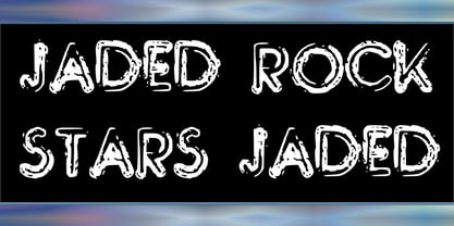
- IA Morning Star by Invisible Art Studio,
$14.99 IA Morning Star is a readable universal comic book dialogue font that adorns any book. The family includes Regular, Italic, Bold, and Bold Italic. Added a set of European characters, Cyrillic; auto ligatures to replace repeating characters, and contextual autoreplacing crossbar "I" in words like I, I'm, etc.
 - KG Counting Stars by Kimberly Geswein,
$5.00 The uppercase letters have no stars and the lowercase letters have stars. This provides 2 unique options for titles.
 - Stars And Type by Tim Kirkman,
$22.00 Stars & Type is a display font inspired by a road trip around the USA. It is bold, abstract and experimental and is meant for attention grabbing large headlines. Utilising stars to give a sense of Americana, it would be suited to editorial, advertising and display typography.
 - JWX Twisted Star by Janworx,
$19.95 Being a Star is one thing, but being a Twisted one is even better! JWX Twisted Star incorporates your deep desire for stardom into each alpha and numeric glyph, in a bold bordered font. The upper case letters sport a trailing accent, making them shooting twisted stars. This is a single bold typeface, and is intended to be used at a large size in graphics work, adding a not-so-subtle statement to everything from screen printed t-shirts to posters or even embroidery (available at www.janworx.com).
 - Tru Star Imperial by T-26,
$29.00 - Stars Stripes RH by Enrich Design,
$-The recent tragedies in America have resulted in a tremendous need for donations. This new font was created to benefit the victims in New York. This font is a great opportunity for artists, designers and computer users to show their support. The font needs to be big, 36 points or higher is recommended. It can be used at smaller point sizes, but there is little detail at smaller sizes. I felt a need to do something, ever since I saw those two beautiful buildings collapse in New York. You see, I went to school in New York, and I learned so much there. I truly love New York, and this is a way for me to show my support to the Big Apple. A $20.00 donation to the Twin Towers Fund is requested for those who download this font. Please send the donation to: Twin Towers Fund General Post Office P.O. Box 26999 New York, NY 10087-6999 Special thanks to those who reviewed my font and offered advice on what needed to be done to complete the font. - Five Star Final by Solotype,
$19.95Introduced by the American Type Founders Co. at the time of the Spanish American War and advertised as suitable for "War Scare Headlines"! Used by many papers for years after because the narrow type was suitable for narrow single column heads. - Rotund Outline BRK - Unknown license

- you found me - Personal use only

- Rotund Outline (BRK) - Unknown license

- California Bound JNL by Jeff Levine,
$29.00 California Bound JNL is based on the hand lettering found on the side of the old California Zephyr passenger trains; the route now being a part of Amtrak. This somewhat unusual Art Deco design is more utilitarian than decorative, yet it still captures the "Streamline Era" perfectly.
 - UCT Found Receipt by uppercaseTYPE,
$12.99Inspired by the idea of found paper objects, this font centers around a strict grid. Combining dot-matrix printers with subtle serifs, it combines old and new. Recommended usage is as a display font. - On The Ground by Fascination Workshop,
$10.00 On the Ground is a picture font made from drawings of found objects. These object were found on the ground while walking around different cities in the United States. The font uses varying drawing styles (from detailed to pictographic) but they all have a similar irregularity, unifying the characters. Perfect for animations, signs, greeting cards, posters, etc.
 - Garmisch Rund NF by Nick's Fonts,
$10.00Emil Rudolf Weiss's eponymous Rundgotisch of 1937 provided the pattern for this streamlined version of classic German blackletters. All versions of this font include the Unicode 1250 Central European character set in addition to the standard Unicode 1252 Latin set. - OnO Display Pro by David Engelby Foundry,
$30.00 Go grab this rock’n’roll display typeface especially suited for posters and headlines in general. This typeface also has many banner dingbats which can be combined in many ways, but there are also finished banner dingbats ready to use. The quality doesn’t stop there, as you can also make use of Central European characters, adjusted Scandinavian characters and fine ligatures. Enjoy!
 - Mon de Tresor by Reyrey Blue Std,
$14.00 Mon De Tresor is an elegant and thin lettered sans serif font. Perfect for editorial projects, Logo design, Clothing Branding, product packaging, magazine headers, or simply as a stylish text overlay to any background image. It will add a luxury spark to any design project that you wish to create! Includes: Uppercase and Lowercase Ligatures Stylistic Alternate
 - Mon Petit Cahier by Hanoded,
$15.00 My family and I are stuck in quarantine for a week; my eldest son tested positive for Covid19 (but everyone else tested negative), so we can’t go out. That means that the kids follow classes online. I noticed their notebooks and suddenly realised that a notebook used to be called a ‘cahier’, which is a French word meaning the exact same thing. I guess it sounded sophisticated at the time. Mon Petit Cahier (meaning: My Little Notebook) is a handmade script font. It is not meant to be awe-inspiring, nor do you want to use it for headlines or posters. It is a nice little font that feels at home wherever an unobtrusive script is needed. Comes with all the diacritics you want and a set of cool double letter ligatures.
 - Adieu Mon Ami by Hanoded,
$15.00 No, I am not leaving and none of my friends or relatives have packed up and left. I needed a more ‘letter-like’ name for this font and I found Adieu Mon Ami (farewell, my friend in French). Adieu Mon Ami is a handmade pencil font that will add that extra ‘je ne sais quoi’ to your designs. It comes with joie de vivre, un petit peu de vilain, but can be doux comme de la soie as well. Bonne chance!
 - Portilla Rounded Bold Sans Font by Maulana Creative,
$15.00 Portilla is a modern round sans serif font. Bold stroke, fun character with a bit of ligatures and alternates. To give you an extra creative work. Portilla font support multilingual more than 100+ language. This font is good for logo design, Social media, Movie Titles, Books Titles, a short text even a long text letter and good for your secondary text font with script or serif. Make a stunning work with Portilla font. Cheers, Maulana Creative
 - Trade Gothic Next Soft Rounded by Linotype,
$53.99 In 1948, Mergenthaler Linotype released the first weights of Trade Gothic, designed by Jackson Burke. Over the next 12 years, Burke, who was the company’s Director of Typographic Development from 1948 through 1963, continued to expand the family. Trade Gothic Next is the 2008 revision of Jackson Burke’s design. Developed over a prolonged period of time, the original Trade Gothic showed many inconsistencies. Under the direction of Linotype’s Type Director Akira Kobayashi, American type designer Tom Grace, a graduate of the MA Typeface Design in Reading, has redesigned, revised and expanded the Trade Gothic family. Many details were improved, such as the terminals and stroke endings, symbols, and the spacing and kerning. Moreover, there are newly added compressed widths and heavy weights perfect for setting even more powerful headlines. Trade Gothic Next brings more features and better quality for today’s demanding typographers. Trade Gothic Next Soft Rounded introduces a new friendliness and warmth to the family.
 - Talking to the Moon - Personal use only

- WC Mano Negra Bta - Unknown license

- Le Monde Courrier Std by Typofonderie,
$59.00 A rounded slab in 4 styles In our age, since the arrival of microcomputing, the majority of professional letters have been composed in quality typefaces. Typewriters & the typestyles they used have become antiques. A letter set in Times or Helvetica & printed with a laser printer at 600 dpi or more are of such quality that one can no longer distinguish it with a document produced by offset printing. But letters composed in this way appear overly institutional when a bit of informality is needed. Le Monde Courrier, designed by Jean François Porchez, attempts to re-establish a style halfway between writing and printing. Informal neo-tech style This rounded slab serif returns the informal character of “typewritten” fonts to letters and suit well all bad conditions, from inkjet printed memos to webfonts use. With a unique typographic colour, it integrate itself with the rest of the Le Monde family with effective contrast. The verticals metrics and proportions of Le Monde Courrier are calibrated to match perfectly others Typofonderie families. Bukva:raz 2001 Type Directors Club .44 1998 European Design Awards 1998
 - Le Monde Journal Std by Typofonderie,
$59.00 A highly legible typeface in 4 series Le Monde Journal by definition is intended for newspaper use & at small sizes. It’s an economical and workshorse typeface adapted to any extrem condition of uses. Even though it has the same colour as Times, it appears more open. The reading flow has been made more fluent & less abrupt. The glyphs counters are bigger, as if they were “alluminating the interior.” The form, characterized by its serifs, remains embedded in our visual memory. Intermediate weights like Book can be considered as a grade supplement of the Regular. Italics accompany Le Monde Journal. With a more delicate design & a distinctive rhythm, they remain noticeable when used with the romans. Its companion, Le Monde Sans can extend your typographic palette. For beautiful page layout, use it in conjunction with Le Monde Livre for titling sizes. The verticals metrics and proportions of Le Monde Journal are calibrated to match perfectly others Typofonderie families. This family was designed in 1994 as bespoke typeface family for the French newspaper Le Monde. The family is not used any more by this newspaper from November 2005. Bukva:raz 2001 Type Directors Club .44 1998 European Design Awards 1998
 - Moho FX Shadow Pro by John Moore Type Foundry,
$40.00 A display font collection for fantasy headlines within the concept of Moho Condensed based in letters with shadows as Moho Umbra Regular and Italic, or simple shadow effect as Moho Shadow Regular and Italic, or font effects to be used in color layers. all ideal for interesting lettering to magazines, posters and labels design.
 - MFC Haute Monde Monogram by Monogram Fonts Co.,
$19.95 The source of inspiration for Haute Monde Monogram is the 1934 "Book of American Types" by American Type Founders. Found in that specimen book was a wonderfully elegant traditional smallcap-Capital-smallcap monogram alphabet known as “Elite Monogram Initials”. This elegant typeface is now digitally remastered and updated for modern use with functionality beyond its original intentions. Download and view the MFC Haute Monde Guidebook if you would like to learn a little more. MFC Haute Monde Monogram comes complete with Pro format fonts. You will require with programs that can take advantage of OpenType features contained within the Pro fonts.
 - Le Monde Livre Std by Typofonderie,
$59.00 A text face in 4 styles Before the arrival of Phototypesetting, each font size had a specific design. Le Monde Livre, designed by Jean François Porchez, along with Le Monde Journal re-establishes this practice. When Le Monde Journal was developed specifically for use at small point sizes (below 10 points.) Le Monde Livre works beautifully for book typography, magazine settings. In comparison to the italics in Le Monde Journal, Le Monde Livre’s italics are of a totally different design, closer to the models of the Renaissance. The families match well together on the same page, Le Monde Journal for small sizes settings, Le Monde Livre for large settings. The verticals metrics and proportions of Le Monde Livre are calibrated to match perfectly others Typofonderie families.
 - Monte Carlo Script NF by Nick's Fonts,
$10.00This elegant monoline script is based on a typeface called "Médicis" from a Deberny and Peignot catalog, circa 1920. Graceful but robust, it is equally suited for invitations, announcements and headlines. Both versions of this font contain the Unicode 1252 (Latin) and Unicode 1250 (Central European) character sets, with localization for Romanian and Moldovan. - TE Mona Tharwat Emara by Tharwat Emara,
$35.00 TE Mona Tharwat Emara," a masterpiece of Arabic calligraphy crafted by the renowned Egyptian calligrapher, Tharwat Emara. This exquisite Ruqaa font seamlessly blends tradition with innovation, offering a timeless elegance that captures the essence of Arabic script. Tharwat Emara, a distinguished figure in the world of calligraphy, has lent his artistic prowess to create a font that is not merely a collection of characters but an embodiment of cultural richness. Each stroke of the pen reflects the heritage of Egyptian calligraphy, echoing the historical echoes of an ancient civilization. "TE Mona Tharwat Emara" stands as a testament to Emara's dedication to perfection. The font's graceful curves and meticulously designed letterforms pay homage to the classical Ruqaa style, while subtle contemporary touches infuse it with a modern flair. It is a harmonious blend of tradition and innovation, making it an ideal choice for projects that demand sophistication and cultural resonance. Designed with precision and passion, this font is not just a typographic tool; it's a work of art that brings the beauty of Arabic calligraphy to the forefront. Each character is a brushstroke of inspiration, contributing to a seamless flow that captures the eye and mesmerizes the reader. Whether you are working on a branding project, publication, or artistic endeavor, "TE Mona Tharwat Emara" adds a touch of timeless class. Embrace the elegance of Arabic script with this font, where every detail reflects the expertise of a master calligrapher. As you embark on your creative journey, let "TE Mona Tharwat Emara" be your muse. Elevate your designs, captivate your audience, and embrace the heritage of Arabic calligraphy with this exceptional font. Embrace the legacy, embrace the art – TE Mona Tharwat Emara awaits, a font that transcends time and tradition


